Introduction
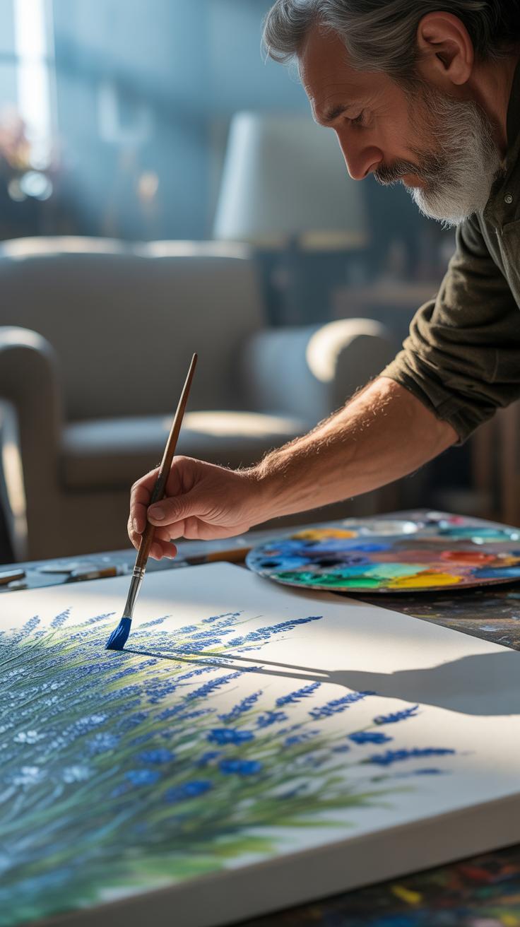
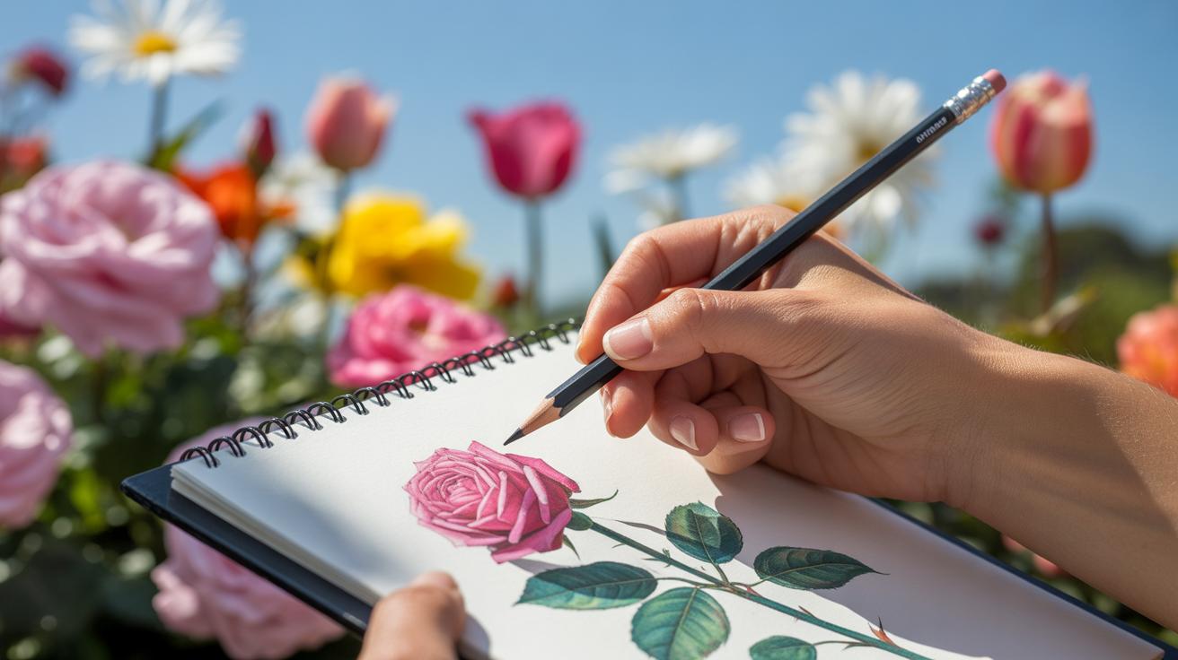
A watercolor sketchbook is a vital tool for artists to practice and develop their painting skills. However, many painters unknowingly make mistakes in their sketchbook work that can spoil the final outcome of their paintings. These errors can range from technical issues with paper and paint to the way colors and techniques are applied.
Recognizing and correcting these common errors can improve the quality of your watercolor art significantly. This article highlights key watercolor sketchbook mistakes that ruin your paintings and offers practical solutions to help you avoid them. By learning these tips, your sketchbook will become a more effective platform for creativity and skill-building.
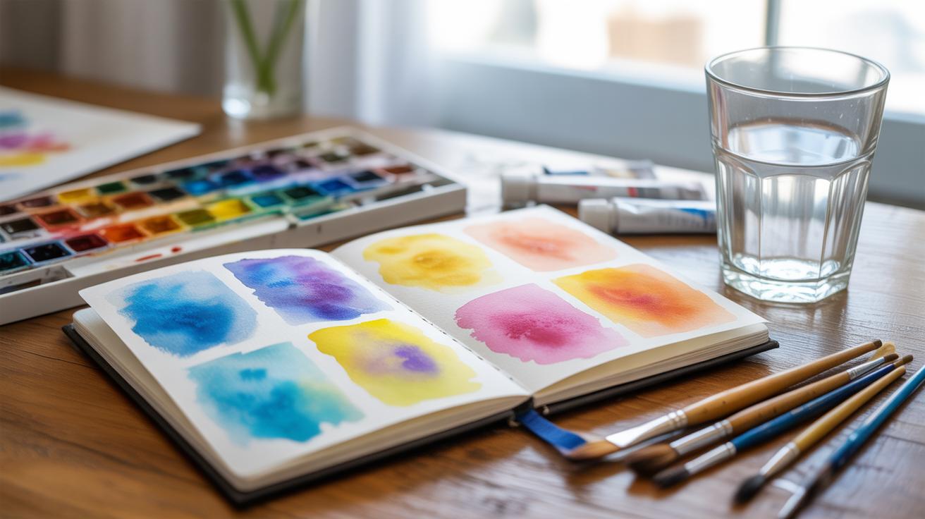
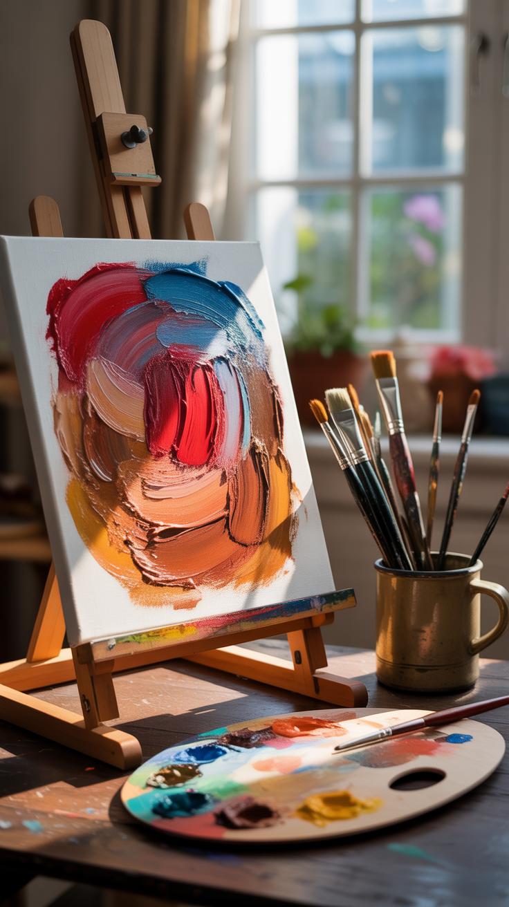
Choosing the Right Sketchbook Paper
The type of paper in your watercolor sketchbook isn’t just a backdrop—it actually shapes how your paint behaves. Different papers soak up water differently; some hold pigment well, others let colors run in unexpected ways. If you’re working in a sketchbook not designed for watercolor, the paper might buckle or tear, and that alone can frustrate your flow.
So, why does it matter? Because paper texture and weight influence everything from color intensity to blending. Even if your brushwork is solid, the wrong paper can mute your colors or create unwanted granulation. Personally, I underestimated this at first—it seemed like all sketchbooks were pretty much the same until I tried a heavy, cold-pressed paper and saw how much clearer my washes looked.
The sketchbook paper should support your style, but also your patience, since some surfaces demand more layering and control. Think of your paper as a partner in the process. Choosing it carefully can save you from annoying surprises and help your ideas come through more clearly.
Paper Weight and Texture Guide
Paper weight typically ranges from about 90 lb (190 gsm) to 300 lb (640 gsm). Lighter papers—say, under 140 lb—often buckle when wet, which might be okay if you like a textured, rough look or plan to tape your pages down. Heavier papers hold up better but also cost more and add bulk to your sketchbook.
Texture plays a surprisingly big role. Cold-pressed or “NOT” papers have a medium texture, offering a bit of tooth without being too rough. They’re versatile and work well for layering. Hot-pressed papers are smoother and better if you want detail and fine lines, but sometimes they feel slippery and less absorbent. Rough paper has a pronounced texture, which can create granulated effects but may also catch your brush awkwardly.
For quick sketches, lighter paper with a bit of texture might be fine. For more deliberate work, leaning toward 140 lb cold-pressed often feels like the safest bet. But, honestly, personal preference sneaks in. Some artists swear by smooth, some by rough—it’s worth trying all and seeing what clicks with your style.
Common Paper Mistakes to Avoid
Picking a cheap sketchbook without checking the paper type is a classic trap. Sketchbooks labeled “mixed media” can be misleading—some don’t resist water well, so paint pools or lifts off unexpectedly. Another mistake: ignoring paper weight. Thin paper deforms easily, ruining washes and making it hard to layer.
Also, some artists don’t consider sizing—the treatment that prevents paper from soaking up too much water. Unsized papers soak water right in, which can dull colors and make blending tricky. Finally, overworking on smooth paper can cause pilling, where the surface fibers break down, creating lumps.
To avoid these pitfalls: test papers before committing, peel back the first sheet to inspect thickness, and try a small wash. Treat your paper with care, and don’t rush. Sometimes, buying a few sample sheets or a smaller sketchbook helps you feel out what suits your hand and pigment better before settling on a favorite.
Avoiding Overworking Your Paint
Overworking watercolor paint in a sketchbook can quickly sap the freshness and spontaneity from your work. When you keep layering or scrubbing, the paper tends to weaken, colors dull, and muddy spots emerge. It’s like the paint loses its natural flow, and your sketch feels stiff—less lively than you intended.
You can spot overworked areas when the paper looks worn or pilled, almost like it’s starting to peel. Colors may lose their transparency, becoming flat or grayish. Sometimes brush marks vanish under multiple layers, or the paint seems blotchy in places you’d want smooth washes instead. Does your sketch look tired? That’s often a sign.
To keep your paintings vibrant, try these approaches:
- Work in thin layers—let each one dry before adding more.
- Use a light touch; heavy scrubbing wears the paper down faster.
- Plan your strokes ahead to avoid excessive corrections.
- Limit the number of washes over the same spot; sometimes less is more.
- Trust the unpredictability of watercolor rather than fighting it.
I remember once trying to fix a small mistake by adding layer after layer—ended with a dull patch instead of clarity. That stuck with me. Don’t hesitate to pause and step back from your sketchbook before pushing paint further. Sometimes restraint is the best tool.
Proper Color Mixing Practices
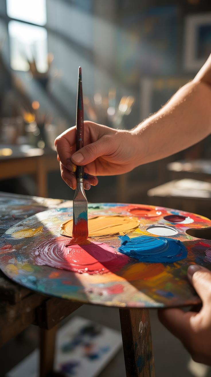
You might think color mixing is straightforward—just blend two paints and get a new shade. But in watercolor sketchbooks, how you mix colors can make or break the entire painting. Mixing without intention often leads to dull or lifeless hues that drain your work of its freshness. It’s not just about combining colors; it’s about understanding their properties and how they interact with water and paper.
Using a limited palette can feel restrictive at first, but it helps keep your colors in harmony. When you stick to fewer pigments, your paintings naturally avoid greenish or brownish muddiness, which usually happens when too many paints clash. I found myself overwhelmed when I tried every tube in my box at once; the mess wasn’t worth it. Fewer colors force you to think more deeply about each choice.
Why do colors become muddy? It’s often due to mixing complementary colors in large amounts or mixing too many pigments at once. For clean mixes, avoid combining more than two colors and test small amounts on scrap paper first. One trick I like is layering transparent washes instead of mixing on the palette. That way, colors stay vibrant, not muddy.

Have you noticed that some colors lose their brightness once mixed? That’s because some pigments dominate or dull others. Learning which colors maintain their integrity when combined is a subtle skill but crucial for sketchbook success. Sometimes, what seems like a good mix on your palette ends up disappointingly flat on paper.
Water to Paint Ratio Control
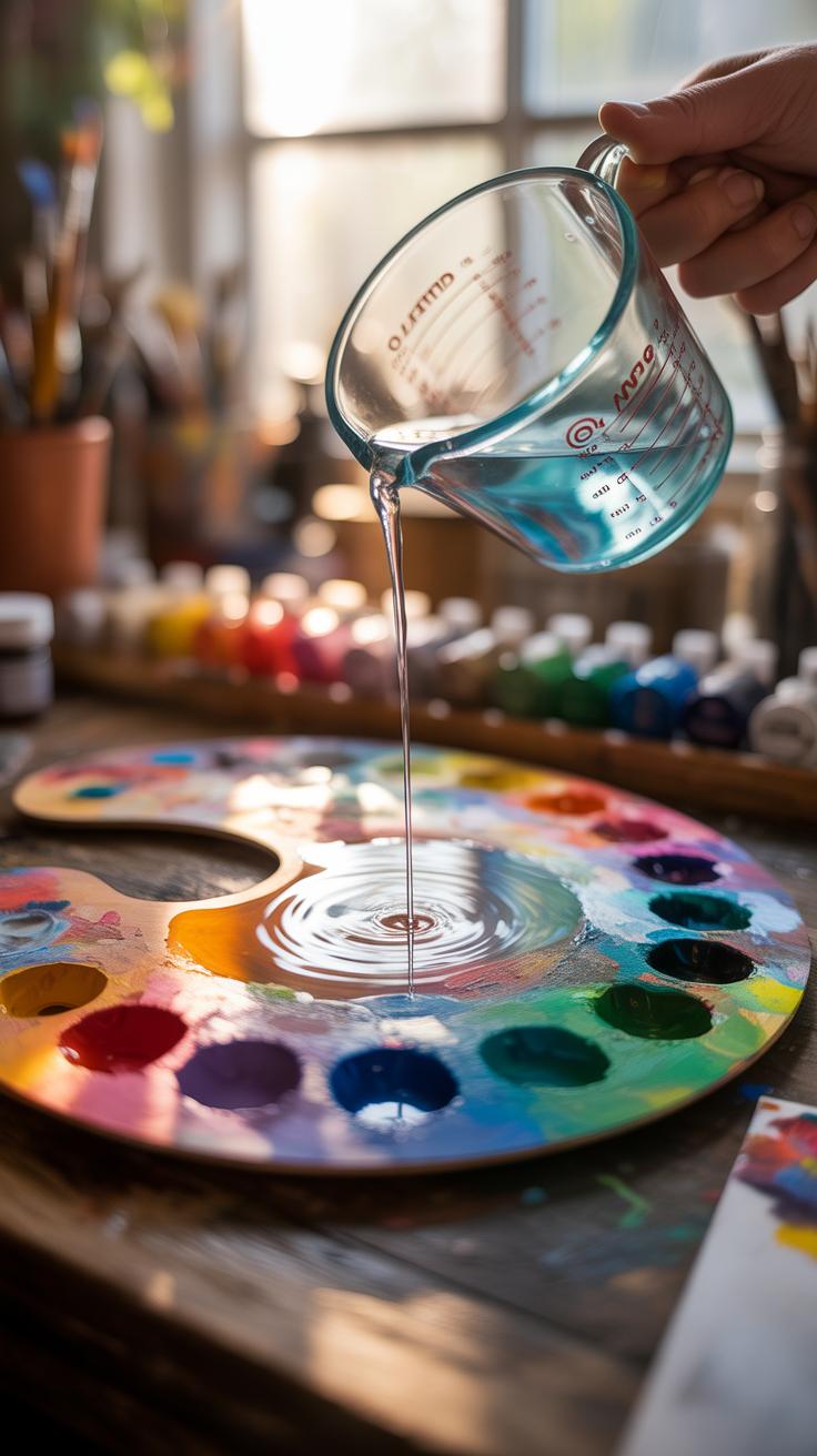
In watercolor sketchbooks, the amount of water mixed with your paint changes everything—the texture, the flow, even the way colors settle on the paper. Too much water can make pigments spread uncontrollably, resulting in blurred edges and muddy colors. Too little water, though, often means stiff brushstrokes and uneven coverage. Finding that middle ground is tricky. Sometimes I think less water gives more control, yet the looseness of wetter washes brings life that dry layers lack.
Effects of Too Much Water
When you overload your brush or paper with water, pigment pools in unpredictable ways. You might notice blooms, those watery spots where paint suddenly spreads. They catch your eye, but not always for the right reasons. The paper can buckle or wrinkle too, especially in a sketchbook that isn’t designed for heavy washes. Plus, colors lose their strength because they’re diluted. You probably want to stop this by blotting or drying quickly, but sometimes that just shifts the mess elsewhere.
Finding the Right Balance
Start by testing your brush moisture on a scrap piece. You want it wet but not dripping—just enough for the paint to flow smoothly. Try loading your brush with pigment first, then add tiny touches of water bit by bit. Work in layers rather than trying to cover everything at once. Also, the paper in your sketchbook matters; some absorb quickly, others hold water longer. Knowing how your paper reacts helps you guess the right amount of water to use. It might take a few tries, but you’ll get better at reading how paint and water behave together.
Layering and Drying Techniques
Benefits of Layering

Layering in watercolor sketchbooks brings more than just color—it creates depth. When you apply a second or even third wash over a dry layer, the colors mingle in a way that feels alive, not flat. Each layer adds subtle variation; it’s like building a mood rather than just filling space.
You might think one strong wash does the job, but layering can transform a simple shape into something richer. For example, I once painted a leaf with only one layer, and it looked dull. Adding several thin layers made the veins and shadows emerge softly. It’s almost like letting the paper breathe bit by bit.
Still, layering is an awkward dance—you can’t rush it or it all blurs together. The trick isn’t just slapping colors on top; it’s weighing how each layer alters what’s underneath. You might find your own rhythm. Maybe one layer for color, another for shadow, or a few translucent washes for texture.
Drying Time Importance
Drying isn’t just waiting around—it shapes the whole painting. When a layer isn’t dry, and you add another, the paint pools or blurs unexpectedly. That might be fine if you want soft edges, but more often, it means losing control. Your crisp lines melt into nothing, or colors mix into an unintended mess.
Some artists rush this stage, thinking they can fix things as they go. I’ve fallen into this trap too—impatiently layering wet on wet, hoping for magic. Instead, I got muddy tones, no depth, and frustration.
But here’s a subtle point: dryness isn’t always obvious. A surface might feel dry but still react with fresh paint underneath. Testing a small area helps. Or using a fan or blotting carefully might speed drying without harm. Still, every sketchbook and paint combo behaves differently, so watch closely.
Has a painting ever gone sideways because layers mixed too soon? It’s a common hurdle, but paying attention to drying times can change how your sketchbook pages look altogether.
Comparing Brushes for Watercolor
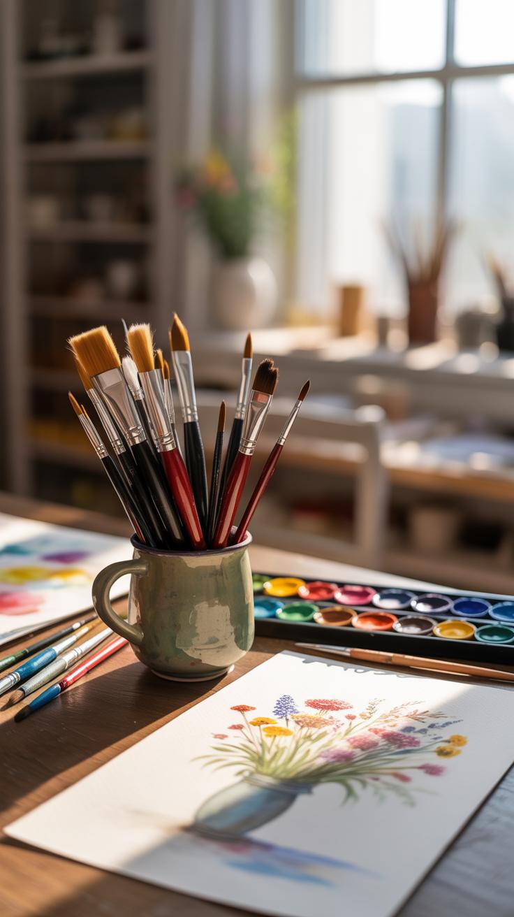
Choosing the right brush can feel like a small thing, but it shapes how your watercolor sketchbook pages come to life. Different brushes handle paint in unique ways, which affects texture, detail, and even how quickly you finish a piece.
Round brushes are probably what you’ll reach for most. They offer versatility—fine lines or broad strokes depend on how you hold it. Flat brushes spread color evenly, which is great for washes or sharp edges. Mop brushes hold lots of water and pigment, making them perfect for large, soft backgrounds or blending. Then there are fan brushes—some artists swear by them for texture, though others find them tricky to control.
Oddly, sometimes a brush that’s “wrong” for a task can spark creativity. I’ve had moments when a small detail brush ended up creating a misty background simply by accident. It’s worth experimenting to see what feels right for your style.
Brush Shapes and Uses
Here’s a quick look at what common brushes do:
- Round: Great all-rounders. You can sketch, detail, or wash with these.
- Flat: Good for bold, straight strokes and controlled washes.
- Mop: Holds water well, useful for smooth gradients.
- Fan: Creates texture and foliage effects but demands some skill.
- Rigger: Thin, long hairs for fine lines—edges and stems.
Ask yourself what you want your brush to do before you dive in. Sometimes I underestimated flats for detail, but you can get sharp edges with the right angle.
Brush Care Checklist
Brushes don’t last on their own—simple care extends their life and protects your work:
- Rinse often with clean water during painting to avoid pigment buildup.
- Shape the brush tip gently after washing, don’t just toss it aside.
- Dry brushes flat or upright to prevent bristle damage.
- Keep brushes away from harsh detergents and hot water.
- Occasionally swirl bristles in mild soap for a deeper clean, but don’t overdo it.
I once ruined a fine sable brush by neglecting a proper rinse. It seemed okay then but lost its spring soon. Also, letting brushes dry with paint stuck inside can feel like a shortcut, but it usually backfires. You want your brushes flexible and responsive, not stiff and broken.
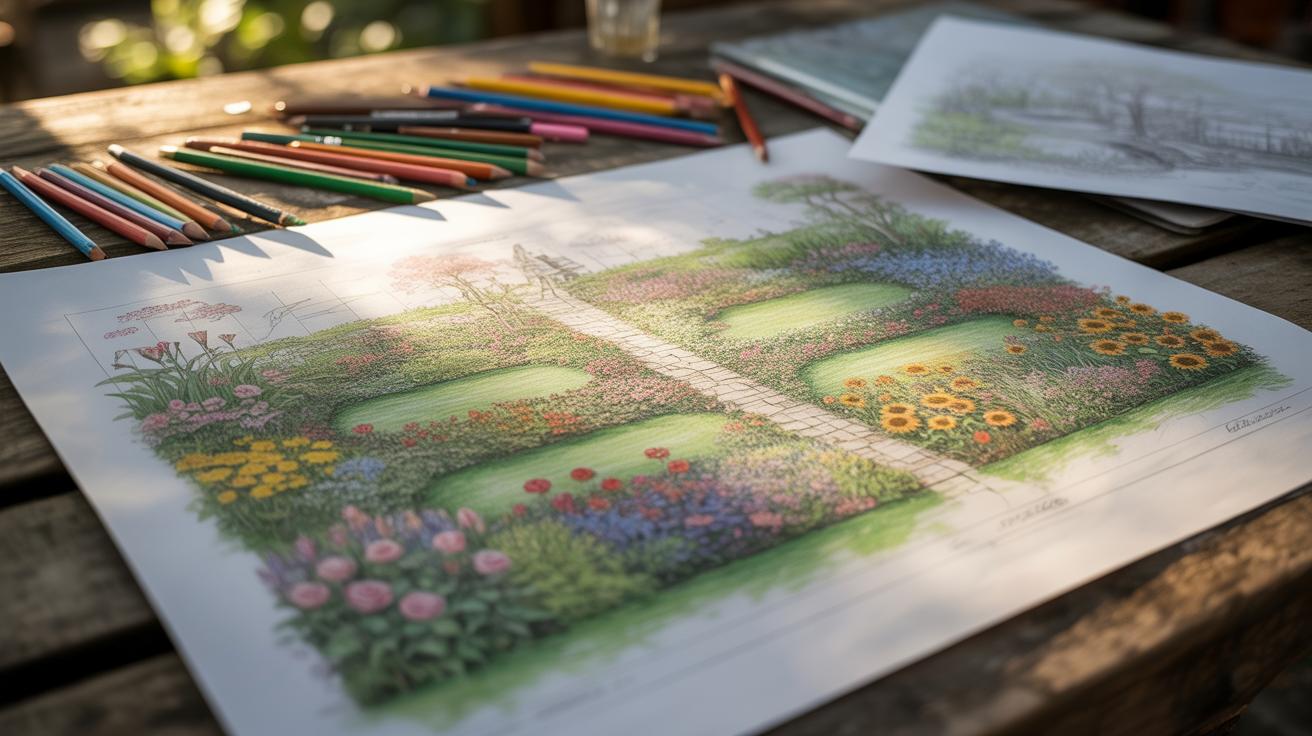
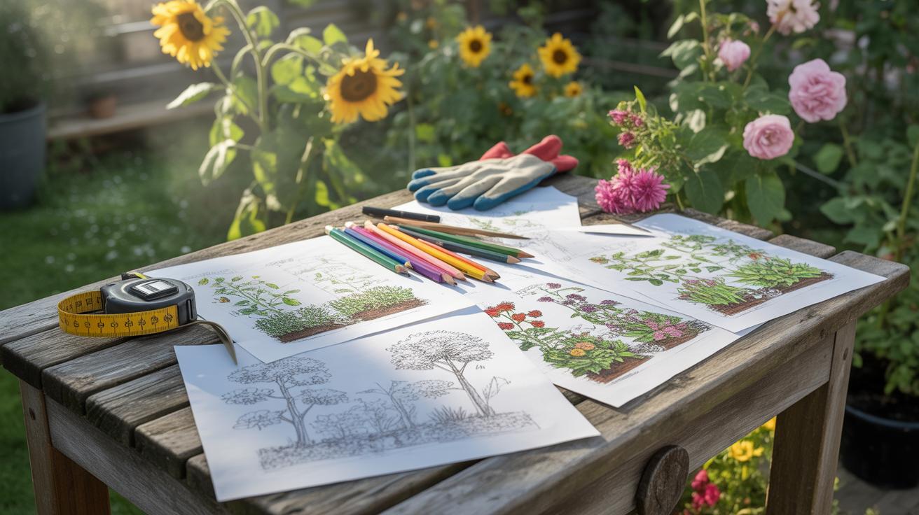
Checking Composition and Layout
When working in your watercolor sketchbook, planning your composition can make a big difference. It’s easy to jump straight into painting without thinking much about how your elements fit together. But spending a bit of time arranging your shapes, lines, and focal points first tends to pay off, even if it feels slow or fussy at times.
Some simple rules can guide you. For example, the rule of thirds often works well—imagine dividing your page into nine equal parts and placing key details along those lines or intersections. It’s a basic trick that forces you to move the main subject off-center, which usually looks more interesting than just centering everything. But of course, you might want to break that if it feels right.
Other basics include leading the viewer’s eye with directional lines, balancing heavy and light areas, and avoiding clutter. Sometimes I try to keep one main focal point—it keeps the message clear, though you could experiment and get away with multiple points if the whole feels unified.
Thumbnail sketches are a big help here. They’re small, quick studies where you don’t worry about details, just the big shapes and layout. When I make several little thumbnails before painting, I get a range of ideas without committing too soon. It’s easier to spot awkward spots or dead spaces when everything’s tiny. So try sketching five or six thumbnails with different arrangements and pick the strongest one to develop further. You might find yourself surprised by which designs feel right once you start working bigger.
Fixing Common Mistakes Early

When working in your watercolor sketchbook, catching a mistake early can save you a lot of trouble later. But how do you really know when something’s off before it gets out of hand? Often, it’s subtle—a slight color muddying, an unintended hard edge, or a wash that flows where it shouldn’t. These little hints might not scream “disaster,” but they quietly signal that the painting isn’t behaving as you want.
Look out for areas where the paint pools oddly or where colors bleed too much into one another. If your brush strokes start to lose their definition or if the paper begins to warp unevenly, these could be early warnings. Sometimes, the sketchbook page might react differently than expected—maybe it feels too saturated or the pigment looks dull, which doesn’t match your usual experience.
Once you spot these signs, try lifting the color gently with a damp, clean brush or a soft tissue—this often lightens and diffuses mistakes without harming the paper. Another approach is to blot carefully rather than rub, especially if the paper feels fragile. Sometimes, you might need to wait for the layer to dry and then add a correcting wash or glaze on top to adjust tone or shape without rewetting the entire area.
It’s a bit of trial and error, honestly. Sometimes fixing one thing creates another—not always a straight path. But staying attentive and responding quickly can turn a near-mistake into a chance to discover something unexpected in your painting. Have you noticed how some of your best effects happen from “fixes” that you almost didn’t dare try?
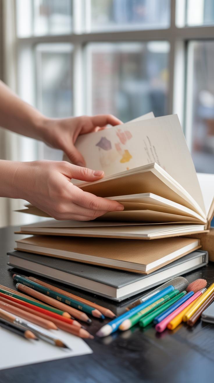
Using Your Sketchbook for Practice
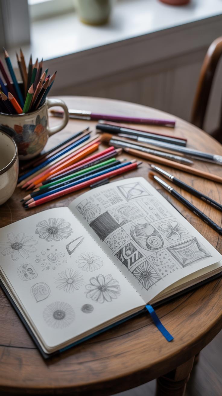
A watercolor sketchbook can be more than just a place to jot down ideas—it’s a hands-on tool for growth. If you treat it as a workbook, you start seeing patterns in your mistakes and strengths. Each page becomes a kind of experiment, where you can try out washes, color blends, or shapes without fear of ruining a final piece. This freedom to play quietly, without pressure, helps your skills develop naturally over time.
Try to use your sketchbook regularly, even if just for quick, loose sketches. Over days and weeks, those small, offhand attempts add up. They reveal subtle improvements, like better brush control or more confident layering, that you might not notice otherwise. The sketchbook is like a private workshop where every failure or odd result teaches you something.
Practice Ideas and Exercises
Filling pages doesn’t have to be random. You could focus on specific themes or challenges. Here are a few approaches I’d suggest:
- Pick an object or color palette and paint it daily, changing only the angle or light each time.
- Try quick gesture sketches to loosen your hand and get comfortable with speed.
- Experiment with different paper techniques, like wet-on-wet versus dry brush.
- Challenge yourself to capture simple shapes with minimal brushstrokes.
These exercises keep you engaged without overwhelming your sketchbook with “perfect” work. Sometimes, repetition in small doses sparks unexpected creativity.
Tracking Progress Over Time
Looking back through your sketchbook can be surprisingly motivating. You might be surprised how a shaky first attempt slowly turns into something more controlled and expressive. I find it helpful to date each page, so you can trace your learning curve. Spotting where you improved (or got stuck) helps set goals for what to try next.
That sense of progress, even if small or irregular, keeps you curious. It’s tempting to compare your early sketches with your recent ones and wonder about what still needs work. Sometimes, the lines between “messy practice” and “actual art” blur, but that’s part of the process. Your sketchbook quietly charts your journey—and that can push you forward more than you expect.
Conclusions
Keeping a watercolor sketchbook free of common mistakes is essential for producing quality paintings. Paying attention to paper choice, paint application, and composition can prevent many problems early on. Using the suggested steps to fix errors will help you recover from mistakes and learn faster.
Ultimately, your sketchbook is a space for growth. Embracing challenges and applying careful techniques ensures your paintings will improve consistently. Stay aware of these pitfalls, and your watercolor art will become more vibrant and successful each time you paint.