Introduction
Creating a village drawing is a popular artistic approach for many landscape artists. However, common mistakes can easily spoil the overall effect of your work. These errors range from poor composition to incorrect details, which reduce the charm and authenticity of your village scenes.
This article highlights typical village drawing mistakes that ruin your landscape artwork. We break down these errors and offer practical advice on how to avoid them, helping you produce more accurate and appealing village sketches and paintings.
Common Perspective Mistakes

Perspective errors often arise because village drawings involve multiple buildings and streets converging in complex ways. When you don’t pay attention to how those lines meet, the scene feels off, almost awkward. For example, windows that don’t align or rooftops that clash can make your village seem less believable.
Incorrect perspective disrupts depth, making objects look flat or strangely sized. That can break the immersion you want in your art. Beginners might struggle because it’s easy to guess where lines go instead of measuring properly.
To avoid this, start by studying simple shapes and how they recede in space. Don’t rush through. Try sketching boxes or cubes before tackling houses. Use rulers, and don’t be afraid to erase when something looks wrong. Perspective is a skill you refine bit by bit.
How To Set Vanishing Points Correctly
Vanishing points anchor your drawing’s perspective. To set one, pick a horizon line—your eye level. Place a dot somewhere on that line where parallel lines will converge. That’s your one-point perspective.
If your village scene has streets or buildings turning corners, you’ll need two points, usually spaced apart on the horizon line. All lines for each building’s edges should meet at these points, guiding how they shrink with distance.
Try this simple exercise: draw a road stretching away from you. Put a dot for the vanishing point, then draw lines from the bottom widening towards the dot. Add a couple of boxes along the road, making sure their edges align to the point(s). This builds depth.
Impact of Skewed Angles on Visual Balance
Skewed angles in village drawings often make structures look crooked or unstable. This can unsettle the eye, throwing off the harmony in your scene. I’ve noticed that when roofs tilt unnaturally or walls lean too far, it feels… distracting.
To catch these issues, use a ruler or a straight edge to compare angles throughout your sketch. Don’t guess; measure. Sometimes a building might look “right” to you, but double-checking prevents unwanted visual tension.
If an angle feels off, try redrawing it lightly and compare. A slight adjustment can bring back balance, making your village feel calm and composed instead of chaotic. Your eye will thank you for it.
Mistakes in Composition Layout
When drawing village scenes, overcrowding elements is a common slip-up. You might feel the urge to fill every inch with houses, trees, and roads—yet that usually just overwhelms the eye. Instead of drawing the viewer in, the scene becomes a jumble that’s hard to scan or enjoy. A cluttered layout stops the eye from resting anywhere, causing confusion rather than interest.
Poor focal points make matters worse. If no single element stands out, the viewer struggles to find where to look first. Imagine a village where every building has equal detail and importance—nothing guides your gaze, and you end up bouncing around without focus. In contrast, a clear focal point, like a distinctive church or a solitary tree, anchors the composition and invites exploration.
To arrange elements better, think of your village as a path for the eye. Position key buildings or features to create a visual flow—perhaps leading from the foreground to a distant hill. Leave some breathing room around the main subjects. Let the eye rest before moving on. This isn’t about strict rules, but rather a sense of balance that feels natural and inviting.
Checklist for Balanced Village Scenes
Here’s a quick checklist to keep your village compositions in check:
- Are buildings varied in size but balanced across the scene?
- Is there enough open space to prevent overcrowding?
- Do natural features like trees or water break up the built environment?
- Have you placed a clear focal point that draws attention first?
- Does the eye travel smoothly from one element to another?
- Are pathways or roads guiding movement through the scene?
- Have you avoided placing too many similar shapes or colors together?
Running through these questions can highlight weak spots and help reshape the layout before details and color pile on.
Using Negative Space for Clarity
Negative space often gets overlooked, but it’s critical in village drawings. The empty areas around buildings or between clusters aren’t just “leftover” space. They define shapes and create a sense of order. Good use of negative space clears visual clutter and makes important elements easier to read.
Try to think about where you want the viewer’s eye to pause. Leaving blank or less detailed spaces there can improve focus. For example, a quiet patch of sky between rooftops or an open field beside a barn adds breathing room, making the main subjects pop out more. On the other hand, too much empty space might feel like your drawing is incomplete—so it’s a balance, really.
When unsure, squint at your drawing or step back. If the composition feels “busy,” consider increasing the negative space. It might feel like you’re leaving parts unfinished, but this technique often leads to a clearer and more compelling village scene.
Color Usage Errors in Drawing Villages


Color choices in village drawings can make or break the mood and realism. One common slip is using unnatural hues—too bright, too saturated, or oddly tinted colors that don’t reflect actual village scenes. For example, overly vivid reds on rooftops or impossible greens on grass can jar the viewer and detract from the sense of place. It’s tempting to pick colors that “pop,” but if they feel out of place, the whole piece can suffer.
Poor contrast also trips many artists up. Without enough difference between light and shadow areas, buildings and landscapes appear flat and lifeless. Contrast helps create depth and draw attention to focal points. But too much contrast can feel harsh or unrealistic, so it’s about balance—soft shadows, subtle highlights, and nuanced shifts in tone.
When choosing colors, try to stay close to what you see in real life or good reference photos. Look at how natural light affects surfaces throughout the day. Don’t shy away from muted hues; village scenes often thrive on gentle, earthy colors that carry history and texture. Layer your colors and experiment with blending to avoid flatness—use shading, glazing, or crosshatching techniques to make the scene breathe.
Have you ever noticed how a slightly off-color roof or a strange patch of grass pulls your eye away from everything else? That’s the kind of error worth catching early. You want your colors to support the story you’re telling, not weaken it. Sometimes, less is more—avoid overcomplicating your palette. Instead, focus on subtle variations that speak to the environment and mood you want to capture.
Ignoring Local Architectural Details

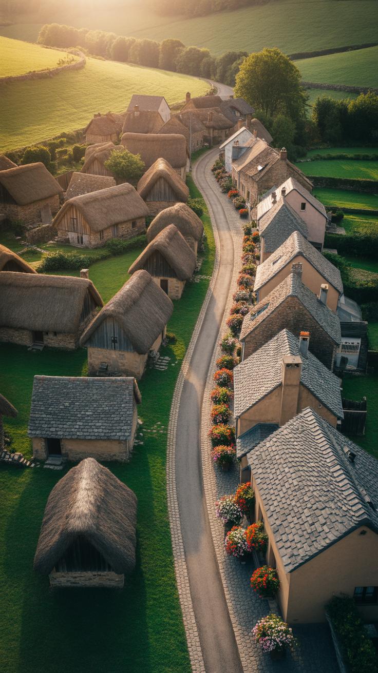
When drawing villages, skipping over or simplifying distinct architectural features can really make your work feel generic. It’s tempting to just sketch rooftops and walls quickly, but those details—the shape of a roof, the style of windows, or the texture of materials—are vital for realism. Without them, your village feels like any place, not a specific place.
Try to notice small but defining traits: Are the roofs steeply pitched or flat? Do windows have shutters, and if so, how are they shaped? What materials make up the walls—stone, plaster, wood? These features might seem minor, but getting them right connects your artwork to the village’s unique character. For instance, I once missed stone chimneys in a Breton village sketch, and it looked off immediately.
For better results, photos help a lot because you can zoom in and study details carefully. If you can, visit the villages. Sketch on the spot, even if it’s quick scribbles. You’ll catch subtle, often overlooked aspects like weathering patterns or carved doorframes. Don’t just rely on memory or imagination here—those references make all the difference and keep your drawings honest.
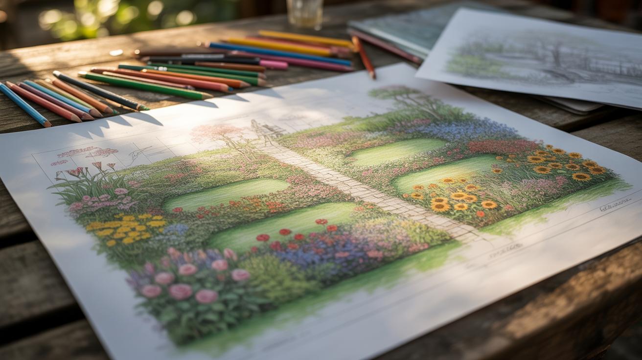
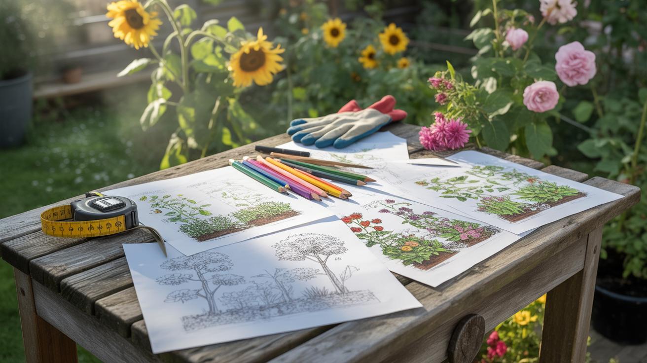
Failure To Plan Your Village Drawing

Jumping straight into a village drawing without some kind of plan often leads to awkward compositions and confusing perspectives. You might find buildings crammed together or oddly sized, and the whole scene can lack cohesion. I’ve seen this happen more times than I’d like to admit—where the lack of an initial layout ends up making the final image look cluttered or flat.
Before you pick up your pencil for the detailed work, start with these steps:
- Sketch rough layouts to arrange houses, streets, and key features. Don’t worry about details yet—just focus on balance and flow.
- Experiment with different viewpoints—bird’s eye, eye-level, or angled perspectives—to find the one that brings your scene to life.
- Choose which buildings, trees, or roads will appear. It’s okay to try out several combinations to see what feels right.
One trick I use is making multiple small sketches or thumbnails. These quick versions let you test composition and perspective without investing too much time. They’re like little experiments, helping you avoid committing to a setup that doesn’t work.
Also, decide on your drawing scale early on. It’s tempting to wing it, but setting a scale keeps everything in proportion and prevents details from getting lost or oversized. Think about how large houses will appear relative to people or trees, and keep that consistent from the start.
Planning might feel like a chore, but skipping this step often means fixing problems later—a much harder process. So, before you dive in, take your time with rough sketches, perspectives, and scale.
Over Detail Versus Minimalism

When drawing villages, it’s tricky to find the right point between too much detail and too little. I’ve seen drawings that cram every roof tile and windowpane, and while they’re impressive technically, they can feel overwhelming. The eye has nowhere to rest, leaving viewers a bit lost in the noise.
On the other hand, drawings that are too minimal risk feeling empty, as if the village lacks life or character. Sometimes a few simple shapes and lines just aren’t enough to convey what makes that place special. So, how much detail is enough?
Think of a street scene: if every cobblestone, chimney, and flowerpot is meticulously rendered, it might be stunning but also confusing. But if you reduce clutter by leaving some walls smooth or roofs plain, the key buildings—like the village church or an old well—can stand out. This middle ground invites viewers to explore rather than just skim.
When To Stop Adding Details
Knowing when to stop is more of an instinct than a rule, but some signs help. If you catch yourself adding detail just because it’s “there” and not because it adds meaning or focus, it’s probably time to pause. Ask: does this new detail guide the viewer or just fill space?
Also, if your drawing starts feeling cramped or heavy, with elements competing for attention, that’s a good cue. Sometimes stepping back or taking a break helps—you might return with fresh eyes and realize some areas don’t need more fuss at all.
Using Simplification To Your Advantage
Simplifying certain parts while emphasizing others creates a visual hierarchy, leading the viewer’s eye naturally. I try to add more detail to focal points like a village square or an old farmhouse, while leaving background houses or distant trees lighter and simpler.
Doing this doesn’t mean ignoring the less important areas but reducing their complexity. This keeps the drawing readable and interesting, and it’s surprisingly satisfying to decide what to leave out. Simplicity can be as powerful as detail—often, it’s what makes a village drawing hold attention without feeling cluttered.
Lighting Mistakes In Village Art
Lighting errors often sneak into village drawings without you even realizing it. One common problem is failing to commit to a single light source. You might see a rooftop lit from the left while the wall below it catches light from the right. This inconsistency pulls the viewer out of the scene and flattens what could be a lively composition. Sometimes, artists spread the light too evenly, removing any sense of volume or depth. Flat lighting makes buildings and trees look cartoonish or lifeless, dulling the atmosphere.
Consistent Light Source Placement
Pinpointing your light source early in the process helps keep everything believable. Ask yourself where the sun—or lamp—would realistically be. Then stick to that choice everywhere: shadows on buildings, rooftop highlights, the shade under trees. If the light’s low and warm, like an afternoon sun, shadows will stretch and soften. If it comes from directly overhead, shadows tighten and shrink. You can almost sketch the light direction before even placing details. If you struggle, try drawing a simple arrow to remind you where light flows from. It keeps things honest and clear.
Using Shadows To Create Depth
Shadows aren’t just dark spots—they give your village form and texture. Look closely at real villages or photos: shadows wrap around corners, curve under eaves, and fall beneath thick tree branches. To paint with shadows effectively:
- Start with general shapes—large shadow areas that mark where light can’t reach.
- Add softer gradients to show curved surfaces, like round walls or tree trunks.
- Use sharper, smaller shadows to indicate details, such as window ledges or fence posts.
Even simple cross-hatching or layered tones can add a lot of life. I remember struggling to capture that feeling until I forced myself to observe how shadows shifted during the day. It’s almost like the village breathes when you get shadows right.
Choosing The Right Tools

When it comes to village drawing, the tools you pick can either help you or slowly drag your work down. Sometimes, artists jump right into sketching with whatever pencil or paper is at hand, expecting the magic to happen. It rarely does. Certain pencils and papers just don’t match the fine detail and textures that village scenes demand.
If you’re aiming for crisp architectural elements and nuanced shading, softer pencils like 2B to 6B are your allies—they capture shadows and subtle tones well. Still, keep a couple of harder pencils like H or 2H close for sharp lines and details. It’s a mix that makes your drawing more layered and alive.
Paper choice isn’t just about texture. For example, a smooth Bristol board supports intricate designs without the distraction of heavy grain, while a heavier toned paper offers different mood effects but can mute details if you’re not careful. I’ve found that experimenting with paper weights around 150-200 gsm usually strikes a good balance for detailed village sketches.
Shifting gears to digital, many artists try to replace traditional methods outright and miss out on the strengths of both worlds. Tablets are fantastic for quick edits and layering, but leaning too heavily on undo or zoom tools might make your drawing feel less intentional. Digital brushes can feel too uniform, losing the human touch. My tip? Use digital tools to complement, not substitute. Trace rough sketches digitally after you nail down the basics by hand. It’s about balance—not dumping all your process into pixels. What’s your experience with mixing digital and hand sketches?
Improving Your Work Through Reviews

Spotting mistakes in your village drawing can be surprisingly tough when you’re too close to the work. You might think everything looks fine, only to miss subtle issues like awkward proportions or misplaced details that quietly throw off the whole scene. That’s why stepping back and reviewing your drawing is more than just a routine check—it’s a way to peel back layers you didn’t notice before.
One simple trick I often use is flipping the image upside down or viewing it in a mirror. It suddenly makes awkward shapes or imbalance obvious, as your brain can’t rely on familiar assumptions. Standing a few feet away or squinting also helps you see the village as a whole rather than getting stuck on small parts.
Sharing your work with fellow artists can open your eyes to things you’d never spot alone. But just handing it over isn’t enough. Try asking specific questions like, “Do the buildings look natural?” or “Is the scale consistent?” This guides the feedback toward real solutions rather than vague praise or criticism.
Listening carefully to others’ opinions, then deciding which points actually resonate with your vision, is a skill of its own. Sometimes feedback conflicts or clashes, and that’s okay—it can push you to rethink and improve parts otherwise overlooked. The point isn’t to please everyone but to make your village drawing clearer, more believable, and overall stronger.
Conclusions
Village drawings demand close attention to detail and thoughtful composition. Avoiding common errors such as neglecting perspective, overcrowding, or ignoring local architectural features will improve the integrity of your work. Following clear steps in planning and executing your piece makes a significant difference.
By focusing on balance, correct use of color, and careful observation of village elements, you create landscape artworks that capture the essence of village life. This process ensures your drawings resonate with viewers and hold visual interest.