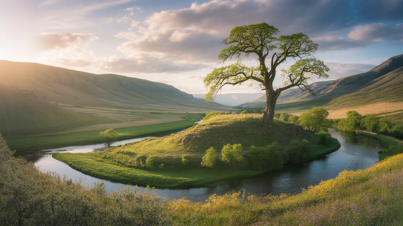
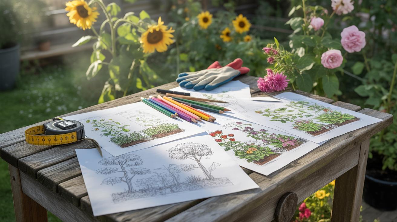
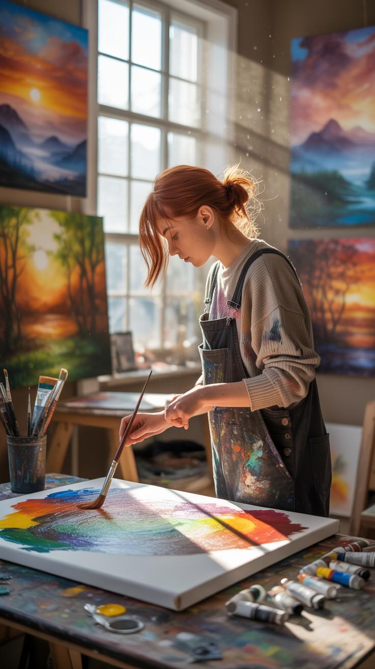
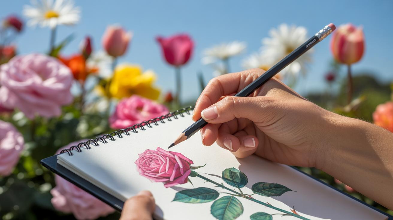
Introduction
Landscape pencil drawings offer a unique way to depict natural scenes with simplicity and detail. By using skillful shading and precise lines, artists can bring depth and atmosphere to their drawings, making them more lifelike and engaging. This article will focus on how to achieve these effects effectively using pencils.
You will learn about important techniques that create depth and atmosphere in your sketches. We will explore the tools needed, the steps to follow, and common challenges with practical tips. This guide is designed to help you improve your landscape pencil drawings step by step.
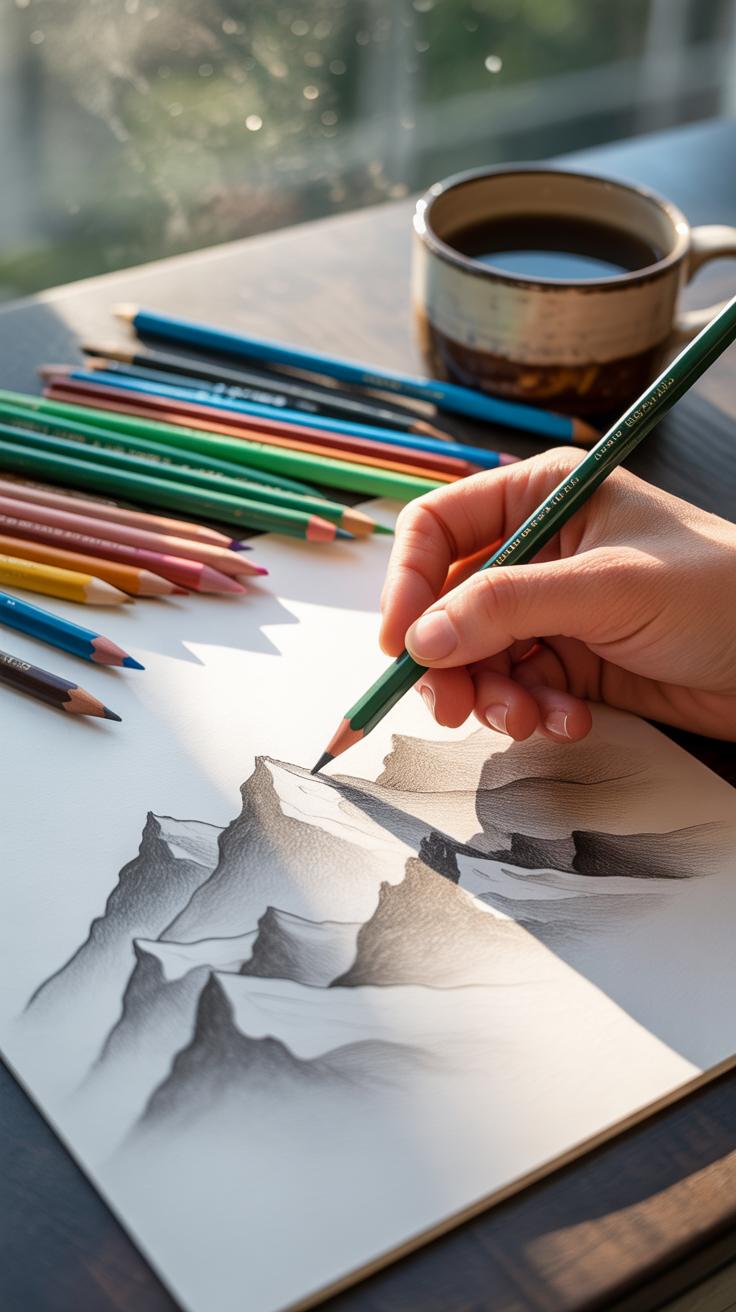
Essential Pencil Tools and Materials
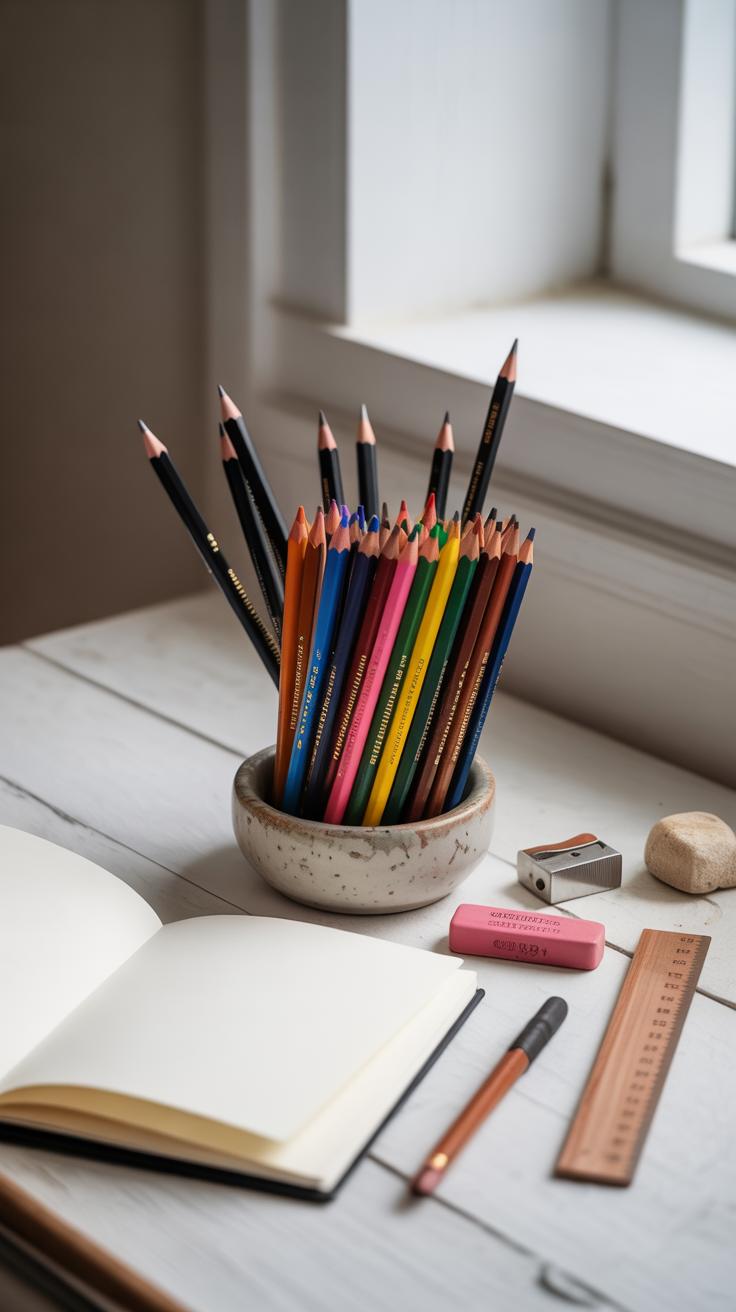
When you start a pencil drawing—especially one that aims to capture depth and atmosphere—the tools you choose matter more than you might guess. Pencil grades, paper texture, erasers, and even sharpeners all play subtle roles in how your scene comes to life.
For pencils, having a range from hard (H) to soft (B) choices gives you freedom. Hard pencils create sharp, light lines great for fine details or distant elements, while soft pencils offer rich, dark tones for shadows and texture. I often switch between them mid-drawing without even realizing it.
Paper choice is surprisingly critical. Smooth papers allow clean, precise lines perfect for intricate tree branches or rocks, but something with a bit of tooth gives you better shading grip for atmospheric effects like fog or rolling hills. Rougher textured papers can add a natural feel but might limit tiny details.
Then there are erasers—not just for fixing mistakes. Kneaded erasers, for example, lighten shadows subtly by lifting graphite rather than wiping it away, which helps build layered depth. A classic rubber eraser can be harsh, so I use it sparingly.
Keep your pencils sharp, but not too sharp. Overly fine points risk scratching the paper and breaking mid-sketch. A good, handheld sharpener or a craft knife gives you control. You might notice how the point influences not just line thickness but also the texture of shading.
These tools might seem basic, yet their qualities shape the subtle contrasts and depth that make your drawing feel real. Choosing them thoughtfully is a quiet step toward capturing meaningful atmosphere.
Choosing the Right Pencil Types
Not all pencils are created equal, especially for detailed drawings where subtlety counts. Grades run from hard (like 4H) to soft (like 8B), each affecting your shading and edges differently.
Hard pencils leave faint, clean lines—sweet for precise outlines, distant elements, or delicate textures. But they struggle to create rich darks. Soft pencils, in contrast, give you those deep blacks and smooth gradients but can smudge easily and lose sharpness fast.
In my experience, combining several grades works best. For example, I use 2H or H pencils to sketch basic shapes or light distant hills. Then, switch to softer pencils—2B, 4B, maybe even 6B—for foreground textures and shadows. This layering mimics how light behaves in real scenes, giving your drawing a living feel.
Consider also the pencil’s core quality. Some feel waxy, some chalky, affecting smoothness and blending. Trying different brands might feel like a minor detail, but it can suddenly make shading and textures easier—or frustrating.
Paper Choices for Texture and Detail
Paper texture matters a lot more than I first thought. When aiming to capture atmospheric depth, the right paper assists or limits your pencil work.
Smooth Bristol or hot press papers let you draw fine details with precision—ideal for distant foliage or intricate rock faces. Because the surface is slick, shading requires gentle layering to avoid unwanted shiny buildup.
On the other hand, cold press or textured drawing papers provide tooth that grabs graphite. This helps create richer, more varied tones without heavy layering. But you might lose tiny details in deep textures, as the pencil tends to skip over crevices.
Choosing between these depends on what part of the scene you want to emphasize. Sometimes it’s worth having a few paper types around—to switch textures mid-composition or experiment with different brushstrokes and shading techniques.
Fine, you might ask: does this really change how I see the drawing? In practice, yes. The paper shapes how much effort you put into layering tone and how your marks interact with light. It nudges your style in subtle but important ways.
Mapping Your Landscape Sketch
When you start a landscape pencil drawing, it helps to step back and think about where the main features will sit on your paper. You don’t want to rush into details right away. Instead, try to place key elements—trees, hills, water—so they balance each other out. This balance not only steadies the composition but also leads your viewer’s eye naturally across the scene. You might find yourself shifting things around a little—sometimes the tree looks better a bit left or the horizon slightly higher.
Sketching Basic Shapes and Lines
Begin by spotting the big shapes you see. Is there a line where the sky meets the ground? That’s your horizon. Draw it lightly. Then, look for simple forms: a triangle for a mountain, an oval for a bush, or broad curved lines for rolling hills. Don’t worry about details yet. Using these basic shapes, you’re creating a skeleton on which everything else will rest. I often find that starting with a few confident lines is enough to stop the drawing from feeling flat. Sometimes simple curved lines give more life than complicated outlines at this stage.
Balancing Composition in Your Drawing

Think about the drawing’s flow. If you put a big dark shape on one side, add something to balance it on the other—maybe a light patch or an open space. But this doesn’t mean perfect symmetry. In fact, too much symmetry can make your scene feel stiff or predictable. Instead, aim for a comfortable tension between elements. You want the eye moving around, pausing just long enough to appreciate different parts. Sometimes placing a pathway or a river gently curves into the distance works well. It’s a subtle trick, but it really helps in guiding the viewer without shouting “look here!”
Techniques to Add Depth in Drawings
When you’re working to create depth with pencil, the way you handle shading can really change how the scene feels. Using techniques like hatching and cross-hatching lets you suggest texture and volume without getting too heavy-handed. You might start with loose, light strokes that gradually build into denser lines, which helps your drawing avoid looking flat. Blending comes in when you want smoother transitions—softening harsh lines, almost like fading the light.
Think about darkness and light as tools that tell a story of distance and form. Dark tones tend to bring objects closer, while lighter tones push them back—at least, usually. But occasionally, a lighter object in the foreground can stand out thanks to sharp detail, messing with up-close and far-away expectations.
Layer your shading from the lightest areas, slowly moving into stronger shadows. For example, with trees or hills, start with a faint outline, then build subtle shadows within each form. You want to catch natural curves and angles: shade the parts that face away from your light source darker, and leave the sun-facing areas lighter. This gradual layering breathes life into what could be a lifeless sketch.
Contrast affects how your eye reads distance. The foreground often has stronger contrast—darker darks, lighter lights—while distant objects blend into a softer, less distinct range. So, pushing down your graphite firmly in nearby rocks or trunks and keeping distant hills faint and blurry helps push that background back. But sometimes, leaving a distant sky sharp can create unexpected tension and depth. There’s no single rule that fits all.
When you draw, ask yourself: where does my eye naturally want to rest? Are those tonal shifts guiding it properly? Playing with these shading essentials changes a simple drawing into a scene that feels like it has real space and air around it.
Using Atmosphere to Enhance Your Art
Creating atmosphere with pencil goes beyond just copying what you see. It’s about suggesting weather, light, and mood in ways that pull the viewer in. You might try softening edges or fading details to hint at distance or haze. Sometimes, less is more—leaving parts of the paper nearly blank can suggest bright, washed-out light, while heavier shading might imply an overcast day or approaching storm.
Think about how different weather conditions change a scene. A rainy day feels different from a crisp morning. You can use pencil strokes to show that difference: delicate, erratic lines for rain or smooth gradations for calm skies. Light plays a huge role, too. Position your shadows carefully to indicate the sun’s angle, or flick tiny highlights to simulate dappled light under trees.
Atmosphere also shapes how the viewer feels about your drawing. A misty scene can evoke quiet or mystery; sharp, sunny light might make it feel energetic or lively. Question what mood you want before you start shading. Sometimes the easiest route—the one that feels natural—produces a more genuine emotional pull than trying to force effects.
Creating Fog and Mist with Pencil
Suggesting fog or mist with pencil involves pulling back on intensity. You don’t draw every detail. Instead, you soften edges, making them less defined, almost blurry. One trick is to use a blending stump or tissue lightly to smudge certain areas, creating that “veiled” feel. You can also lift graphite gently with an eraser to lighten parts of your drawing, mimicking how fog scatters light.
Remember, fog rarely spreads uniformly. It might be denser near the ground or fade around objects. You can play with contrasts; darker areas can peek through the mist, offering a layered sense of depth. This subtle approach works well when you want to suggest early morning or damp weather without drawing too much attention to the atmosphere itself.
Capturing Light and Shadow Effects
The way light and shadow appear in your drawing can completely change the sense of time and weather. Morning light tends to be warmer and long; shadows stretch and soften. By contrast, midday light is harsher, with clear, sharp shadows. You have to decide how strong or faint your shadows are—this choice affects the mood immediately.
Using pencil pressure and layering thoughtfully can help. Light, gentle strokes build up soft shadows, while firmer marks give deep shade. Pay attention to the angle of light and how it interacts with surfaces. Shadows cast by trees, hills, or even clouds add complexity. You might even want to experiment with reflected light, which can illuminate shadowed areas subtly.
Sometimes it helps to step away and squint at your drawing, seeing the big shapes of light and dark instead of getting caught in tiny details. It’s these broad contrasts that often give a strong atmospheric punch. Keep asking yourself: does the light in the scene match the feeling you want to create?
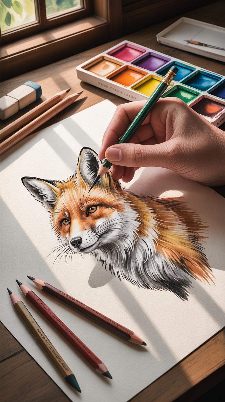
How to Draw Trees and Foliage
When drawing trees and foliage with pencil, capturing texture and volume is key. You can’t just sketch outlines and hope it looks full—foliage demands varied strokes and shading to feel alive. Try layering light, quick marks for leaves, mixing directions to avoid flatness. The texture mimics nature’s irregularity, where leaves bunch and scatter unevenly.
Bark can seem tricky but think in terms of roughness and lines wrapping around the trunk’s form. Short, jagged strokes work well to suggest bark’s rugged surface without overworking. Darker, heavier shading along the trunk’s shadows adds dimension—don’t be shy about pushing contrast here. If you let yourself, the pencil almost guides you toward natural patterns.
Placement matters too. Trees in the foreground should have more distinct textures and sharper edges, while those farther back fade with lighter, softer marks. Overlapping branches and trunks help push depth by creating layers within your scene. Often, I find myself adjusting tree sizes or angles after sketching other elements, to keep the scene believable—trees don’t just stand isolated, they engage with their surroundings.
- Use varied pencil pressures for leaf clusters to mimic depth and light catching.
- Apply cross-hatching or small marks to suggest bark ridges without detailing every part.
- Place trees in groups or staggered rows to create spatial hierarchy.
- Think about light direction; shadowed sides have stronger volume.
- Don’t hesitate to leave some gaps or light patches within foliage to avoid monotony.
Is your tree looking flat? Try stepping back and squinting at it—does it blend into the background too much or fight to stand out? Balancing these feels a bit like a negotiation with your pencil and patience.
Capturing Water Surfaces and Reflections

Water bodies can be tricky to draw, but they add a lot of life and atmosphere when done right. The first thing to remember is that reflections aren’t just mirror images. They tend to be softer, sometimes blurrier, and shift in value compared to the objects being reflected. You’ll often find that the reflected shapes lose some detail and contrast, which means pushing your shading carefully. Think of it as less precise, more impressionistic.
To catch that right, start by blocking in the main reflected shapes with light strokes. Avoid hard edges; instead, use gentle smudging or cross-hatching with varied pressure to suggest the water’s surface. Notice how the reflection darkens when the water is still and breaks up with ripples. Capturing that subtle texture is key.
When it comes to ripples and movement, line work becomes your friend. Short, flowing strokes can indicate gentle water movement, while more erratic, angular lines capture disturbances like wind or passing boats. Cross-hatching with varied spacing creates shadows under ripples, giving depth. Be cautious, though—too many lines make the surface look cluttered and confident simplicity often works better.
Another technique is layering. Begin with soft shading to create an even tone for the water, then selectively lift or erase to indicate highlights or reflections that catch light. You might find yourself repeating this—shading, lifting, refining—to get that sense of constantly shifting texture. It’s almost like you are sketching the water’s mood rather than a static image.
Try looking at photos or real water surfaces and ask yourself: where does the reflection break? Where do ripples distort shapes? Experiment with loose strokes, then tighten details only where the focus lies. This mix keeps the drawing lively but believable.
Avoiding Common Sketching Mistakes
When drawing scenes with pencil, beginners often stumble over a few predictable issues. One big pitfall is misjudging proportions. It’s tempting to just sketch what seems right at first glance, but small errors in size can make your drawing look off. For instance, trees that should recede into the distance might end up the same size as ones in the foreground. To catch this, step back frequently and compare objects against one another, asking yourself if their sizes reflect their supposed distance.
Shading is another tricky area. People tend to go either too light or too heavy-handed. Overworking a shaded area can kill the texture and flatten the form, while underworking it leaves things vague and lifeless. You want to build layers gradually—maybe start with light strokes and add depth bit by bit. This way, you preserve the natural feel and keep the details intact.
Then there’s composition. Sometimes the scene feels cramped or oddly spread out. It helps to think about where your eye should travel and arrange elements so the drawing breathes. Avoid packing everything into one corner or centering the main feature too stiffly. While rules like the “rule of thirds” might guide you, don’t be afraid to trust your instincts if something just feels off.
Errors in Perspective and Scale
Spotting perspective mistakes can be frustrating. When objects don’t diminish properly with distance, or lines fail to converge, your drawing looks flat or skewed. A quick fix is to lightly sketch horizon and vanishing lines early on. Use them as anchors to position elements correctly. If a building seems too tall compared to a tree far away, double-check if your perspective matches the viewpoint. Sometimes, erasing a single misplaced line can fix an entire scene’s balance.
Also, objects may appear out of scale because of inconsistent foreshortening. Try measuring key points with your pencil or thumb held up to the scene. This old trick helps keep things proportional when translating to paper. It feels a bit tedious, sure, but it’s often the difference between a believable sketch and a confusing jumble.
Overworking vs Underworking Shading
Striking the right balance with shading is a constant dance. Too much pressure with your pencil can create heavy, dark spots that distract rather than add depth. On the other hand, being too faint leaves your sketch weak and unresolved. To avoid this, switch between pencils with different hardness—softer ones for dark shadows and harder for fine light areas.
It’s useful to stop regularly and squint at your drawing. This helps you judge overall values instead of getting lost in tiny details. Shading shouldn’t feel like an endless task—there’s such a thing as “enough.” If you find yourself erasing and reworking the same patch, take a break or try a different area; sometimes fresh eyes catch what you missed.
StepbyStep Landscape Drawing Process
Planning and Outlining Your Scene
Begin by deciding on the key elements that will form your composition. It helps to start with a very light sketch, just enough to position objects without committing too much. You might want to think about the horizon line first, as it anchors your entire scene and influences the perspective.
Try placing the main features—trees, hills, rivers—roughly where you feel they belong. Don’t worry about perfection here; the goal is to get a sense of balance and flow. If something feels off after a while, erase and adjust. This early stage isn’t about detail but rather about spacing and scale.
Remember to consider depth. Objects closer to you should be larger and placed lower on the page, and those farther away smaller and higher. This simple rule often slips my mind, but when I remind myself, the scene suddenly feels more three-dimensional.
When sketching, use short, loose strokes rather than heavy lines. This allows easy changes and keeps the drawing feeling fresh. You can lightly mark where shadows will fall or where textures like grass or rocks might appear, but keep it minimal. Planning in this way lays a solid foundation so your later work doesn’t feel forced or cluttered.
Building Layers and Final Touches
Once your layout feels right, it’s time to think about shading and layering. Build your shadows gradually, starting with soft, light tones and slowly intensifying where needed. This method helps create a sense of atmosphere—the kind of subtle light and shadow shifts that draw the eye and suggest depth.
Try to notice how the light interacts with surfaces in your reference or memory. For instance, a rock’s texture differs from grass, so the shading should show that distinction. Don’t just shade blindly; follow the form.
Adding details can be tricky. Too many, and the drawing looks busy; too few, and it feels flat. I often find that pausing between layers helps me see what’s really necessary. Maybe a few well-placed blades of grass or sharply defined leaves can lift a scene more than a flood of sketchy lines.
Finally, use an eraser to create highlights or lighten areas. Sometimes, I even erase a little on top of some shading to add texture. It’s a simple trick but effective to mimic light hitting uneven surfaces. Building layers like this isn’t just about copying reality but interpreting it in a way that keeps your scene alive on paper.
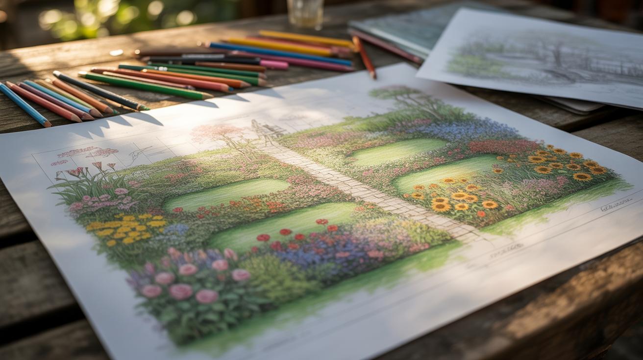
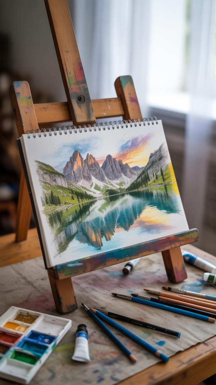
Examples of Effective Landscape Pencil Drawings
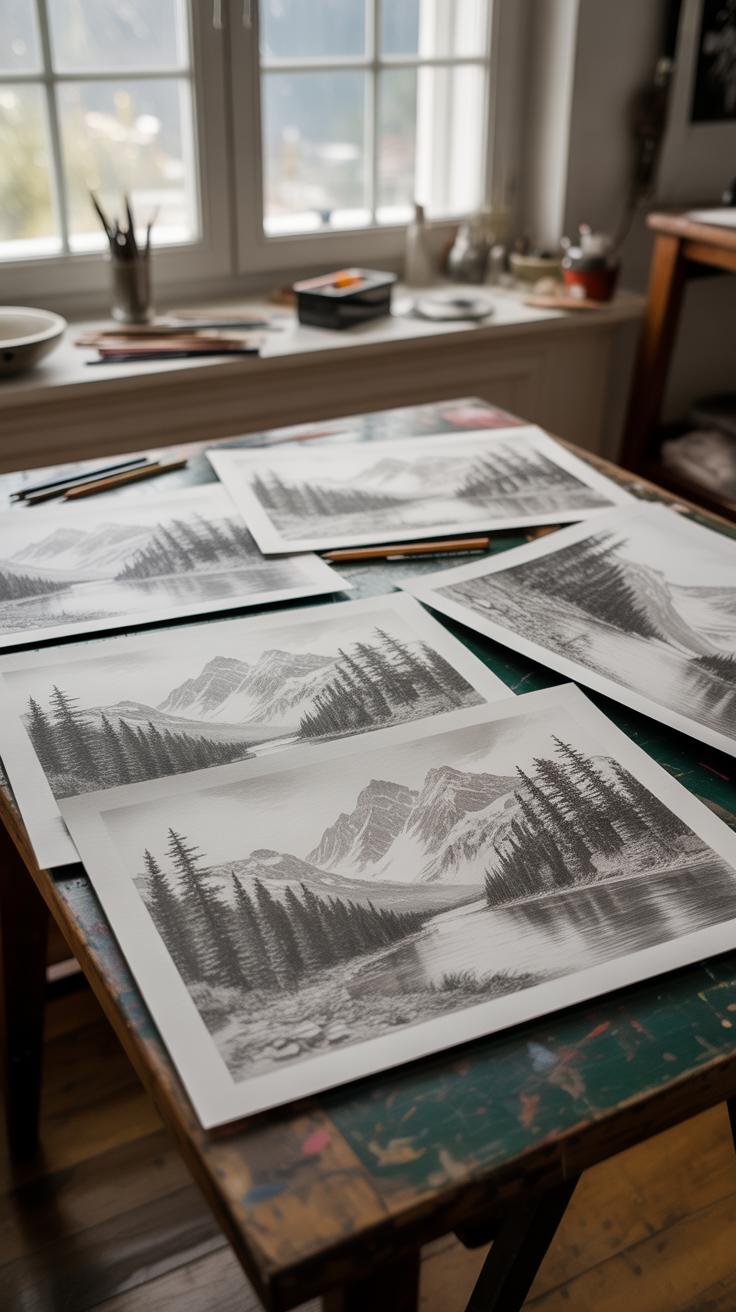
Looking at pencil drawings that truly capture depth and atmosphere can really change how you approach your own work. Take, for example, sketches where foreground details are sharply defined, while distant elements fade softly. This contrast creates a natural sense of space, pulling the viewer in.
What makes some drawings stand out often isn’t just talent but how the artist manages light and shadow, and the subtle gradations between. Some of these drawings feel almost photographic in depth, yet they retain a loose, almost restless energy—like a moment caught in motion rather than frozen.
One lesson to carry with you: don’t be afraid to let some areas remain less detailed. It can help create focus and suggest atmosphere without overworking every inch.
Famous Artists’ Pencil Landscape Examples
Think about artists like Albrecht Dürer or John Constable, who took different routes but found similar results with their pencil work. Dürer’s detailed cross-hatching builds volume and texture, while Constable’s looser lines often capture fleeting weather conditions and moods.
Learning from their techniques means experimenting—whether it’s layering strokes patiently or embracing rough, quick marks. Notice how they balance precision with spontaneity, which keeps the drawings alive.
You might wonder if a more refined or freer approach suits you better. Trying both could reveal what feels more natural or effective in your hands.
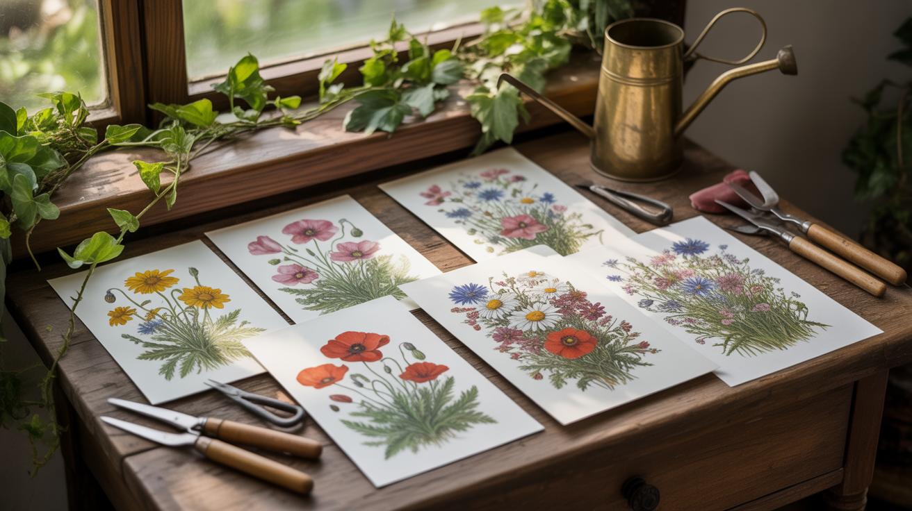
Everyday Scenes Captured in Pencil
Sometimes the most ordinary scenes—like a row of trees, a small hill, or a quiet street—become compelling through the pencil’s subtlety. The magic lies in how simple tonal shifts suggest air, weather, or time of day without needing color.
Bringing these humble subjects to life often involves close observation: noticing how shadows fall, how forms overlap, or how textures change with distance. Even minimal marks can evoke a calm morning mist or a fading sunset.
Have you ever paused just to sketch something ‘unremarkable’ and ended up surprised by the atmosphere you could create? These moments teach patience and seeing deeply, aspects that go beyond technical skill.
Tips for Practicing and Improving Drawing Skills

Drawing well—especially when working with pencil—takes steady practice, the kind you actually stick with. Try setting aside a small chunk of time each day, even just 15 minutes. It might feel like barely anything, but that consistency adds up. The key is to sketch regularly, even if the results aren’t perfect. Don’t wait to feel inspired or to have the “right” subject; just draw anyway.
Here are a few practical ways to keep at it:
- Start with quick studies of simple objects or scenes. It helps loosen your hand and sharpens observation.
- Keep a small sketchbook with you and catch bits of nature or cityscapes as you move.
- Set mini-challenges, like focusing on drawing just textures or outlines in one session.
- Review your earlier drawings every few weeks to see where you’ve improved and what still trips you up.
It often helps to alternate between focused practice and more freestyle sketches. You’ll notice different parts of your drawing skills improving at different rates, which sometimes gets frustrating but also keeps things interesting.
Practice Exercises for Shading and Texture
Shading and texture don’t come magically—they’re skills you build, piece by piece. Try a few targeted exercises to strengthen these areas:
- Fill a page with different shading techniques: cross-hatching, stippling, smooth gradients. See what feels natural and what challenges you.
- Create texture swatches by drawing leaves, bark, clouds, rocks—focus just on representing the feel of the surface.
- Experiment with pencil hardness. Softer pencils make richer darks, but harder ones give fine detail. Mix and match as practice.
- Use your fingers or blending tools sparingly to practice smooth transitions, but also learn when to keep marks visible for texture.
Don’t rush these exercises. Some days your shading will feel flat, other days more alive. Both are part of learning what works.
Studying Nature for Better Sketches
Nature isn’t just there to be copied—it’s an ongoing lesson. When you study trees, rocks, or skies, do so slowly. Watch how light falls and how shadows shift. Notice irregularities and decide whether to include or simplify them. This observation isn’t always easy; sometimes you think you see one thing, but it’s actually quite different.
Try asking yourself questions as you observe:
- What’s the main shape? How does it change from different angles?
- Where are the darkest shadows and softest highlights?
- What textures stand out most? How could I recreate them with my pencil?
Regularly stepping outdoors with your sketchbook can change your drawings dramatically. Even if conditions aren’t perfect, those brief moments sharpen your eye. And, you might find yourself more patient. After all, nature moves slowly—your drawings can, too.
Conclusions
Mastering depth and atmosphere in landscape pencil drawings requires practice and attention to detail. The right techniques, tools, and approaches will help you create drawings that feel real and immersive. Each scene you draw can tell a stronger story through the layers of shading and careful use of space.
Keep experimenting with lines, shadows, and light to bring your natural scenes to life. With focus and consistent effort, your pencil drawings will capture the true essence of landscapes and engage viewers in new ways. Remember, your skill grows with each drawing you complete.