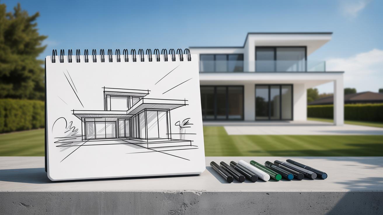
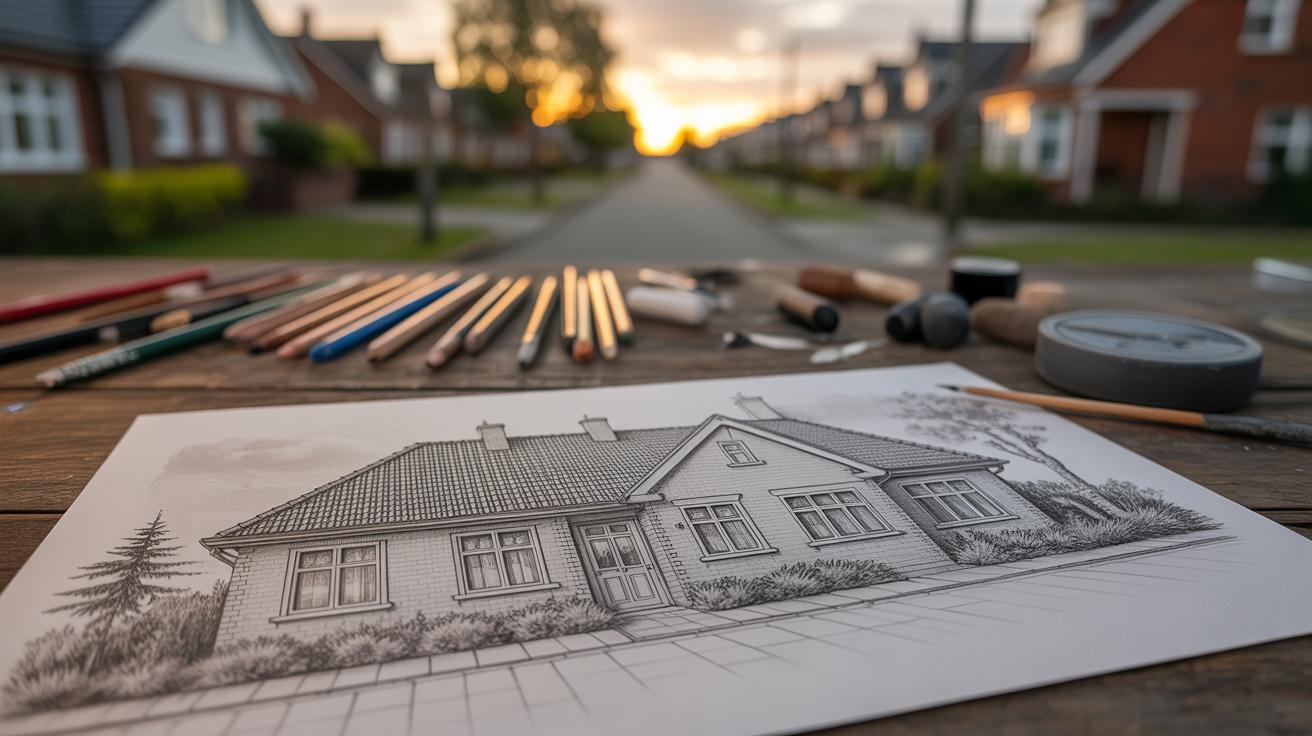
Introduction
Urban landscapes hold stories beyond the buildings and streets. Crafting mood in your urban landscape illustration means giving those stories life through feeling. You guide viewers to experience your scene as you imagine it.
In this article, you will learn simple and clear ways to create mood in your urban artwork. We will explore what elements change how a scene feels and how to use colors, shapes, light, and details to tell your story. Your next urban illustration will invite viewers inside a mood you designed.
Why Mood Matters in Urban Landscape Art
Mood in urban landscape illustrations shapes how people connect with the scene before them. It’s not just about what you draw—streets, buildings, or sidewalks—but how those elements make someone feel. A quiet, misty alley can evoke mystery or calm, while a bustling market painted with sharp contrasts might create a sense of chaos or energy. You might gaze at an illustration and sense unease or nostalgia without fully realizing why. That’s the power of mood.
When mood is well-crafted, it pulls viewers deeper into the artwork. Instead of seeing a city block as mere architecture, they experience a moment—a story unfolding. Your illustration can invite someone to pause, imagine, or even recall personal memories tied to urban spaces. That emotional layer often stays with a viewer longer than specific details.
In practical terms, controlling mood lets you guide how an urban scene is interpreted. Are you sharing a forgotten corner, a lively street festival, or the quiet after rain? Mood becomes the invisible thread between the art and its audience, making your work more than just visually interesting. It becomes memorable.
How Mood Changes Storytelling
The stories told through urban landscape art depend heavily on mood. You can depict the same street under different times or weather conditions, and the feeling it leaves shifts dramatically. A sunny morning can suggest hope or freshness. But twilight shadows might hint at solitude or suspense. Which story you choose matters—maybe the street holds a secret, or perhaps it’s simply peaceful.
It’s tempting to think mood is just decoration, yet it’s more like the tone in a conversation. For example, a dimly lit alley with muted colors might feel threatening or lonely, making viewers wonder what lies beyond. Conversely, a brightly lit park scene can feel welcoming, inviting people into the frame. That emotional response shapes what kind of story viewers tell themselves about the place.
In some cases, mood can even contradict the content, creating tension. A lively city street colored in eerie greys or blues might make viewers question what’s really happening, sparking curiosity or concern. This ambiguity keeps the story open rather than handing it all over at once.
Mood’s Role in Visual Impact
Different moods create varying visual impacts, influencing how memorable an urban scene appears. A moody, fog-filled street can linger in your mind because it taps into familiar feelings—maybe mystery or nostalgia. Bright, chaotic city scenes shout for attention but might fade faster in memory if the emotions don’t stick.
Sometimes, a quiet mood has stronger visual impact because it stands out against the usual hustle of urban imagery you see every day. When you slow an environment down, even through color and lighting choices, you invite closer inspection. You might notice textures, shapes, or little stories you’d overlook otherwise.
On the flip side, energetic moods can overwhelm or energize a viewer, which works well if you want to convey vitality or movement. But that intensity could also risk losing subtlety. Mood helps balance this by either softening or sharpening your visual message, letting you control what stands out and what fades into the background.
So, while crafting an urban scene, ask yourself what feeling you want to leave behind. That feeling shapes its impact, its endurance, and the way people remember your work.
Basic Elements That Create Mood
When you’re working on an urban scene, the mood you want to convey depends heavily on a few core elements. Color, light, weather, and composition aren’t just technical tools—they’re the way you tell a story without words. Each can shift the feeling of your piece in subtle or striking ways.
Color, for example, hits your viewer immediately—even before they notice details. The shades you pick can whisper calm or shout energy. Warm colors, like reds and oranges, often bring a sense of life or even chaos. Cool colors—blues and greens—can suggest quiet, distance, or even coldness, though not always.
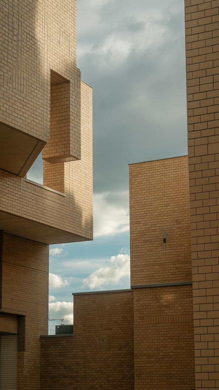
Lighting and shadows do more than just shape buildings and streets. They create mood by emphasizing contrast or softness, highlighting certain areas, or hiding others. Think of a foggy morning with diffused light: it feels completely different from a sharp, midday sun casting harsh shadows. Both say something, right? They also add depth, making your urban space feel real and layered instead of flat.
Weather plays its role by changing the atmosphere—a drizzle can feel gloomy or reflective; a bright, clear sky might feel hopeful or sterile. Composition pulls it all together, guiding the eye and controlling the story’s rhythm. Tight, cluttered compositions may feel crowded or tense, while open spaces can suggest freedom or loneliness. And yes, these elements interact in ways you might not expect, sometimes creating moods you didn’t plan.
Using Color to Set Tone
Colors aren’t just pretty choices—they carry emotional weight. In urban scenes, warm colors often inject energy or a sense of urgency. Imagine a sunset tint splashing over skyscrapers. It suggests the day’s winding down, but maybe hints at activity still alive below. On the flip side, cool colors can evoke calm or distance but can also feel cold or uninviting.
You might find yourself mixing both, which can create tension or complexity. For example:
- Warm-colored streetlights glowing against a cool, blue night create both comfort and a little eeriness.
- Bright, warm graffiti in a gray, cool alley can shift the mood towards rebellion or hope.
Deciding on which temperature to emphasize affects your viewer’s mood—often without them realizing why.
Light and Shadow Effects
Light isn’t just about visibility. It sculpts your scene. Long shadows might feel mysterious or lonely. Bright, direct light could feel harsh or exhilarating. Soft light tends to be forgiving and calm. You can play with these effects to make urban spaces feel menacing or inviting.
Think about how shadows fall on a wet street—slick reflections can add depth and movement, making the scene alive but also somewhat unpredictable. And everywhere you place shadows, you add depth. This layering stops the city from looking flat and instead makes it feel like a place you could walk through.
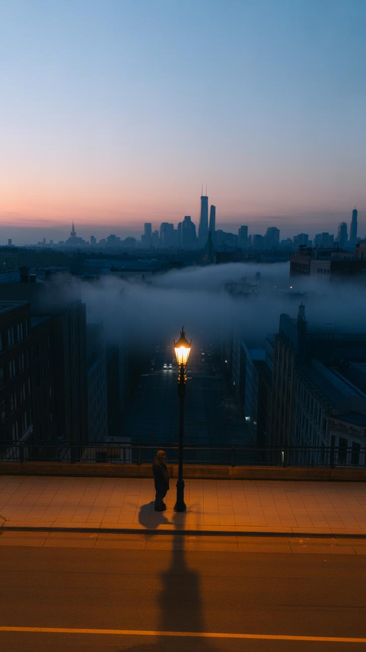
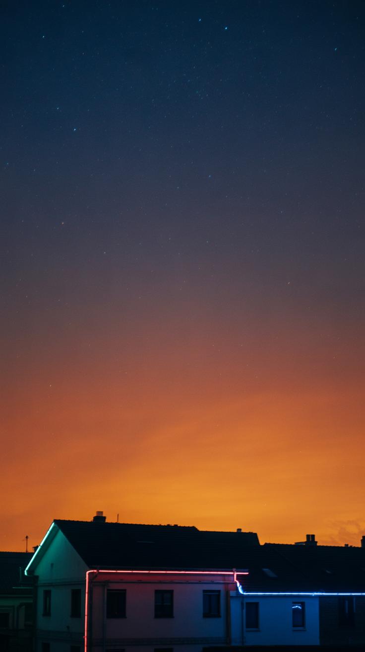
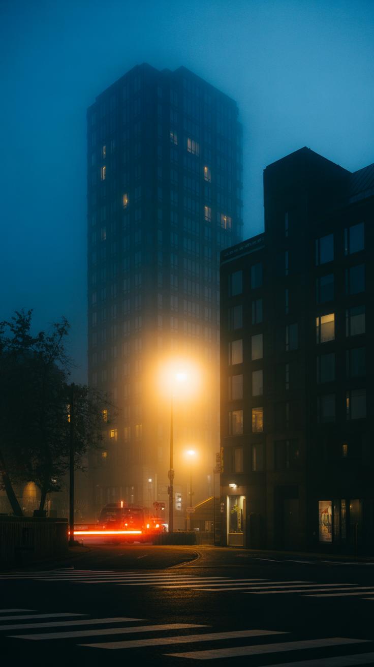
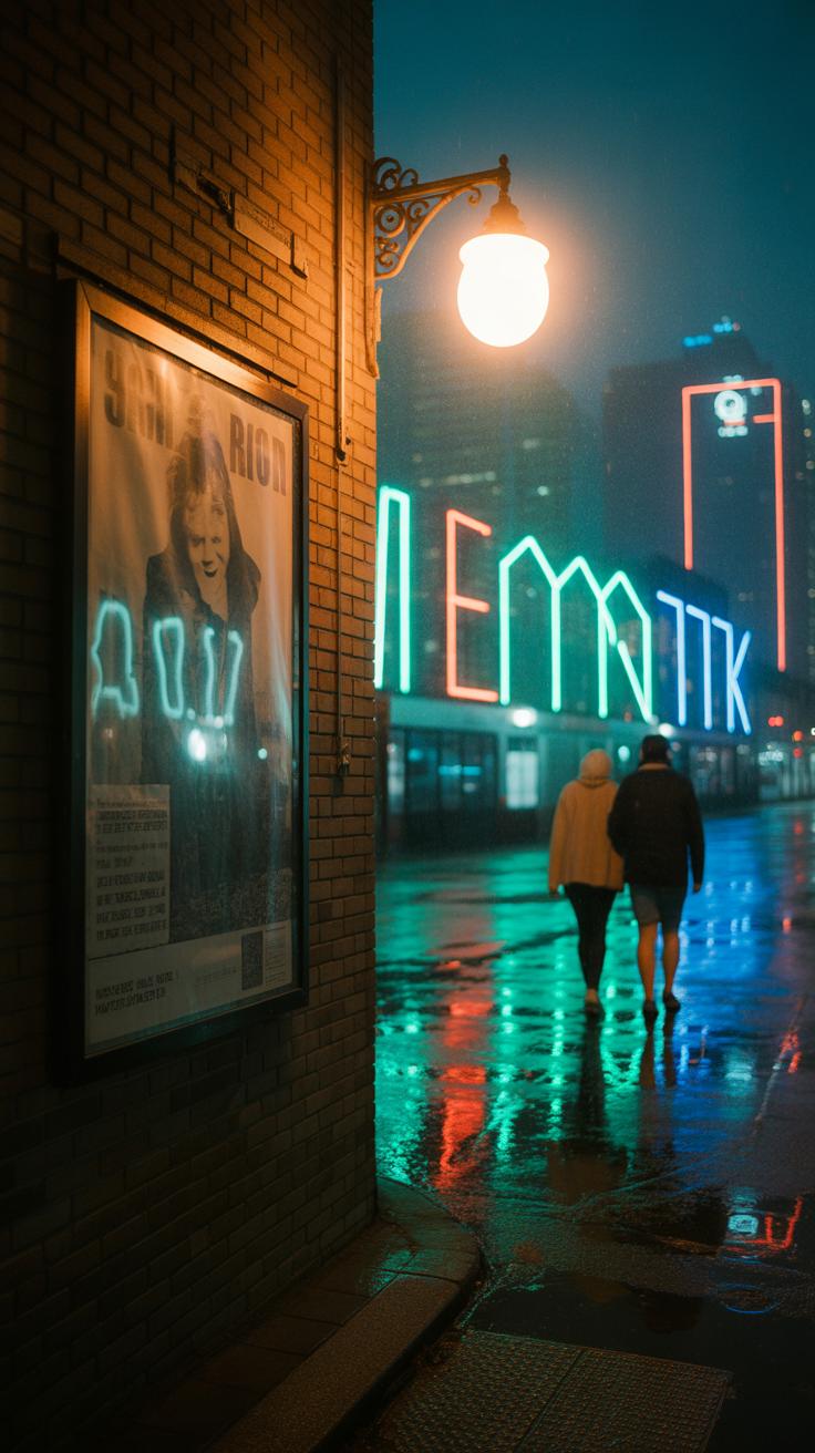
Sometimes, less obvious light, like the glow from a window or distant neon, tells a quiet part of your story. It can make a scene feel intimate without saying anything loud. So consider what your light highlights and what it leaves in darkness, because that balance can make or break the mood you want.
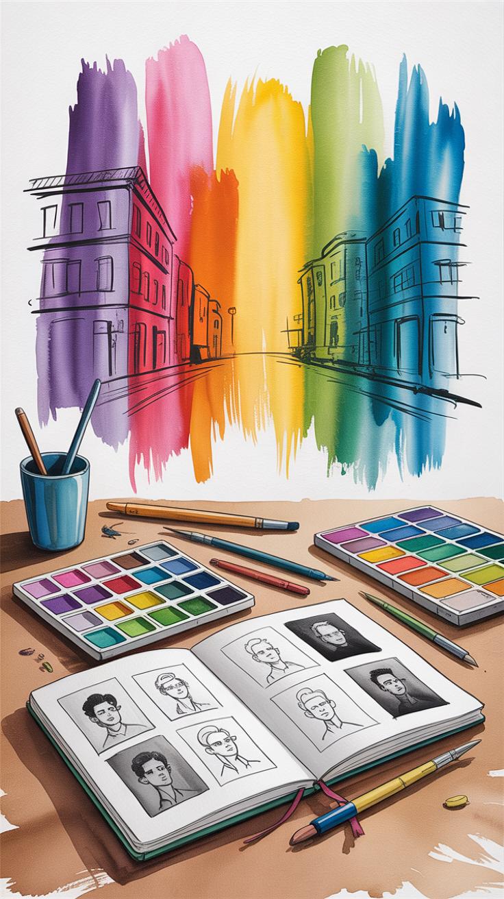
Choosing Color Palettes for Mood
Calm and Peaceful Colors
When you want your urban illustration to feel calm, certain colors tend to work better than others. Soft blues and muted greens naturally come to mind—they have this quiet, soothing effect. Think about a quiet city park at dawn or a foggy morning by a river. These colors don’t shout; they almost ask you to pause and breathe.
It’s not just about picking blue or green blindly. The saturation matters too. Colors that are too bright might break the peacefulness you’re aiming for. Instead, leaning towards pastel tones or desaturated hues keeps things gentle.
I find that adding small hints of warm neutrals, like soft beige or warm grays, balances cold shades and makes the scene feel more inviting. But sometimes too much warmth can disturb calmness—there’s a delicate balance. Also, consider areas of negative space or minimal detail; these let the colors work quietly without overwhelming the viewer.
Energetic and Busy Colors
Now, contrast that with a bustling city street full of movement. Bright reds, yellows, and electric blues jump out and keep the eye moving. When you want to show energy, clashing colors or sharp contrasts often do the trick. The kind of colors that feel noisy, vibrant, maybe even a bit chaotic.
But I’ve noticed, if you don’t think through the palette, those bright hues can become exhausting to look at — like visual noise without rhythm. It’s worth mixing intense colors with more neutral or dark tones to give the eye places to rest.
Using contrasting colors in specific spots—like a bright taxi on a deep blue street—can create focal points and suggest activity without clutter. Sometimes just a splash of red in an otherwise cool-toned scene makes everything pop with life.
In the end, your choices ask: do you want the viewer to feel rested, or caught up in the rush? The palette holds a lot of power there.
Lighting Techniques to Build Atmosphere
Soft Morning Light
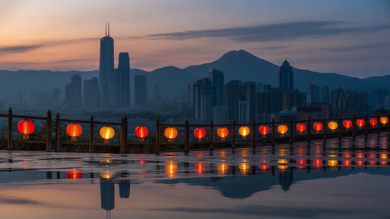
Morning light can feel quite different from other times of day. It’s often soft, spreading gently across buildings and streets, casting long, subtle shadows. This kind of light can bring a quiet calmness, maybe a hint of hope or renewal. When you paint or draw an urban scene bathed in early light, you invite the viewer to pause, to sense a beginning rather than an ending. Colors appear muted but warm—almost as if the city is still waking up. Sometimes, that softness can make details less sharp, which might frustrate you if you want precision, but it adds a layer of mood that’s hard to replicate at other times. Have you noticed how a few orange streaks here and there can change everything? That’s morning light working its magic.
Harsh Midday Sun
The harsh midday sun is totally different. It hits hard, creating crisp, unrelenting shadows that slice through the scene. The intensity can make buildings seem sterner, streets busier, almost aggressive. Shadows form bold shapes, punctuating the space and adding a strong visual rhythm. It’s less about gentle feelings and more about energy, pressure, or even confrontation. Sometimes it feels too bright—maybe overwhelming—especially if the whole illustration is lit this way without breaks. Yet, that intensity can be powerful when you want to show heat, movement, or a city at its busiest. If you focus too much on fine detail under this light, the mood might feel flat. But playing with contrast and shadow shapes can bring the scene to life with tension and drama. Are you using hard edges well enough to convey the city’s pulse at noon?
Weather Elements to Showcase Mood
Rain and Gloom
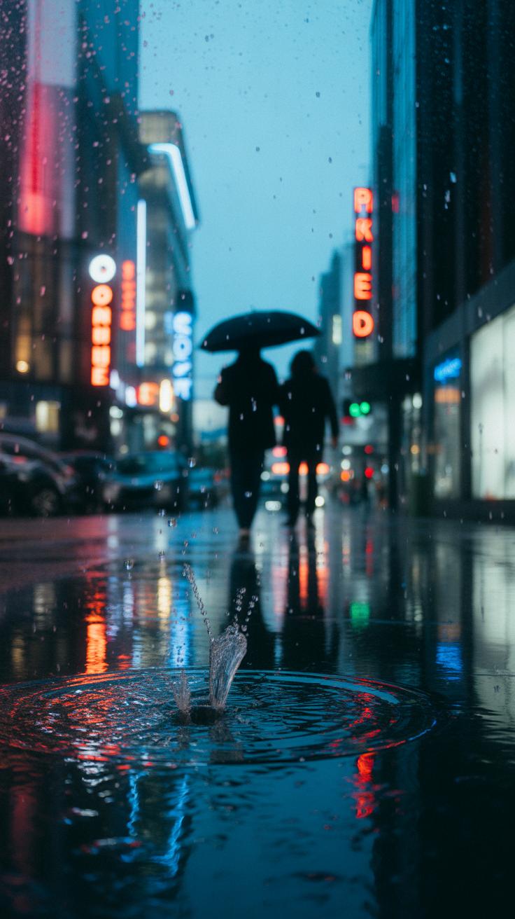
Rain in urban scenes can carry a heavy weight of feeling. When you picture rain-drenched streets with puddles reflecting dim city lights, there’s often a quiet sadness or a kind of calm that settles in. Overcast skies, with their muted tones, strip away vibrancy, leaving behind a mood that feels introspective or even lonely.
But it’s not always bleak. Sometimes rain softens the city’s edges, slows down the rush, creates a moment of pause. Maybe you’ve noticed how footsteps splash more deliberately, or faces tucked under umbrellas appear more thoughtful. Using rain in your illustration invites viewers to slow down with you, to see the city with a different kind of focus.
Still, rain’s effect depends on how you show it—a light drizzle might feel soothing, while a heavy downpour could heighten tension. The gray sky coverage tends to mute colors, which naturally dims the scene’s energy. Do you want your urban painting to echo melancholy or gentle calm? Getting the rain right can steer your audience’s feelings in subtle but clear ways.
Sunshine and Clarity
Warm sunlight changes city scenes in quite a different way. When clear weather floods an illustration, it often brings a sense of openness and energy. The sharp contrasts of bright highlights and crisp shadows give a feeling of clarity and optimism. Streets come alive, buildings seem more inviting, and people might appear more engaged or hopeful.
Sunshine can make details pop—the gleam of glass, the saturation of colors, even the small textures of concrete or brick seem more defined. That sharpness often suggests a fresh start or a moment of joy. Yet, sunshine isn’t always about happiness in a simple sense. Sometimes, harsh sunlight reveals loneliness, with long shadows stretching empty sidewalks. It depends on how much light you use, and where you focus it.
Would your urban scene feel different if you painted it under bright midday sun versus the soft golden hour? Each impression influences how viewers experience the city emotionally—and thinking carefully about sunshine can guide those feelings without overwhelming the story you want to tell.
Composing Your Urban Scene for Mood
When you start framing your urban illustration, the choices you make about composition shape much more than just how your scene looks. They influence how someone feels when they glance at your piece. Take perspective, for example. A low-angle view, looking up at tall buildings, can make the city feel imposing or overwhelming, even a bit intimidating. On the other hand, a bird’s-eye view might give a sense of control or detachment—sometimes openness, sometimes coldness, depending on how you arrange your elements.
Focal points direct the eye, and where you place them matters a lot. If you highlight a bustling intersection, the scene feels alive, energetic, maybe even chaotic. Focus on a single glowing window in an otherwise dark building, and suddenly the mood shifts to something more intimate or mysterious. Those little decisions can subtly—or not so subtly—change the story your image tells.
Close Ups and Intimacy
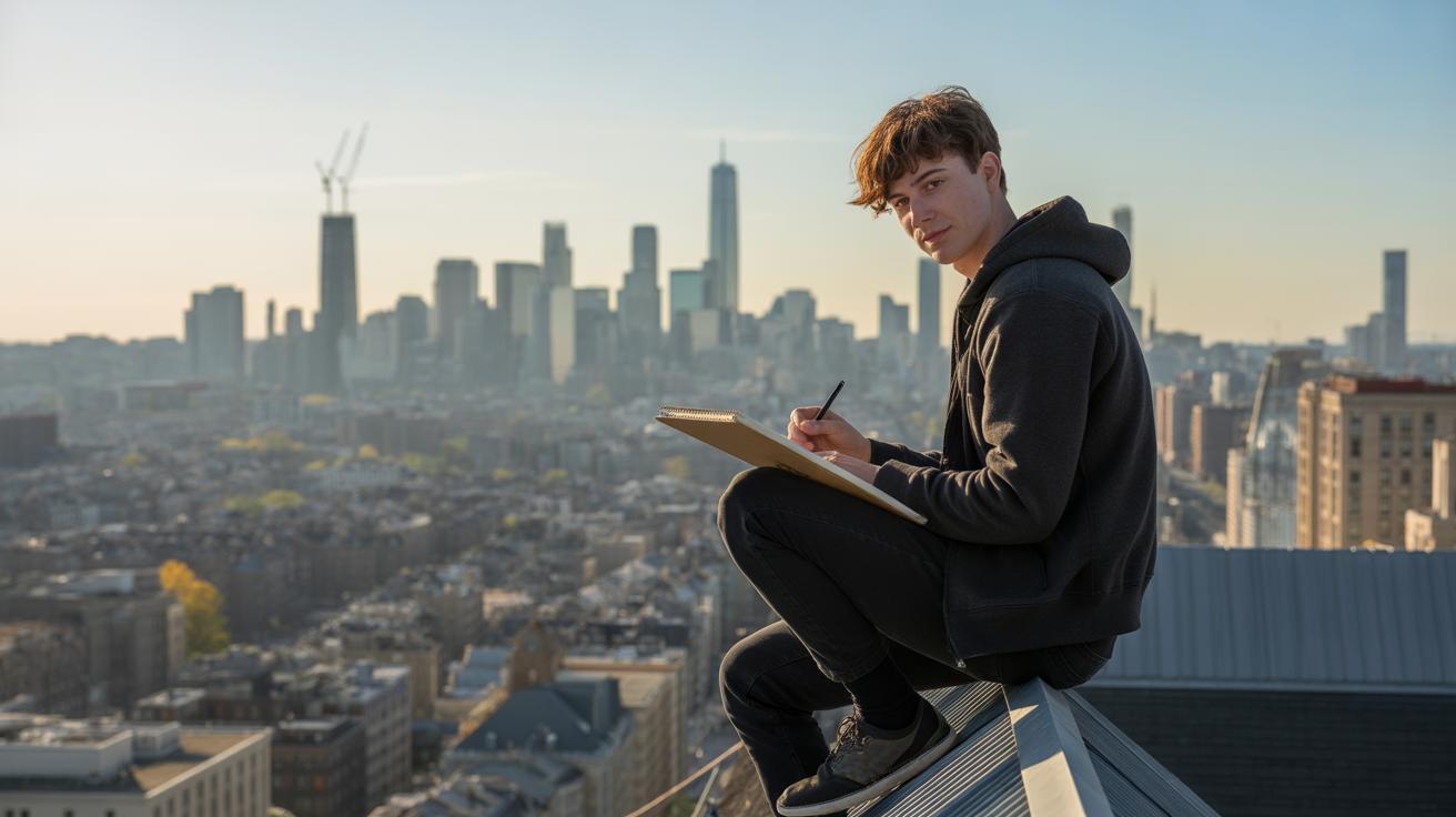
Zooming in on details narrows the viewer’s focus and often brings them closer to the human element or texture of the city. A cracked sidewalk, peeling paint on a lamppost, or the expression on a passerby’s face—these hints can evoke personal feelings. The mood becomes intimate, like a quiet moment in an otherwise busy place.
Sometimes I find that getting close makes me feel more connected—or even a bit claustrophobic. It depends on the details. That’s the trick; the same close-up can feel warm or unsettling. You’re inviting the viewer into a corner of the city that’s private, almost a secret. This can create a mood of comfort, nostalgia, or isolation. It’s worth experimenting to see what pops for you.
Wide Views and Openness
When the scene pulls back to take in wide, open views of an urban environment, the mood can swing in different directions. Large expanses with few details might suggest freedom—endless possibilities, space to wander. But they can also feel empty, or lonely. You might catch yourself wondering if anyone else is out there or what it’s like to be alone in a crowd.
Wide compositions give room for silence and thought. They let the city breathe, but sometimes that breathing feels a little hollow. That ambiguity is something I often think about while sketching cityscapes. What does the open space tell your viewer about the city and its people? Are they invited in, or left outside looking in? Those unanswered questions can haunt a piece in a good way.
Adding Details That Support Mood
People and Life
The presence of people in an urban scene can completely shift the feeling you create. Crowds buzzing with energy bring a sense of liveliness, even chaos at times. Empty streets, by contrast, can feel eerie or calm — sometimes both at once. I’ve noticed that a single figure, placed thoughtfully, can add mystery or solitude. Think about what the people are doing: are they rushing, waiting, chatting? Each action sends a different emotional signal.
Sometimes, leaving people out altogether makes the environment feel abandoned or timeless. But it can also risk feeling flat if there’s no sign of life. So, deciding how many people to include — and what they’re doing — invites you to control a fundamental part of your scene’s mood.
Nature’s Role
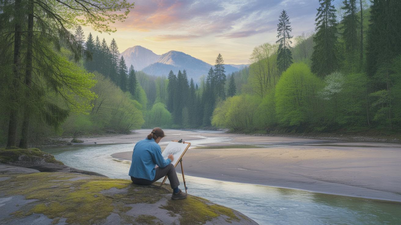
Urban scenes usually focus on buildings and streets, but inserting elements of nature can soften or sharpen the atmosphere. Trees lining a sidewalk can add warmth, a hint of calm trying to break through concrete and glass. Wild plants growing in cracks sometimes feel rebellious, a quiet pushback against the city’s order. Animals, even subtle ones like birds or a stray cat, introduce movement and unpredictability.
Sometimes, nature contrasts the urban setting so strongly it changes the mood altogether. A lush park scene amidst tall buildings offers relief—maybe nostalgia or an idealized escape. At other times, sparse greenery accentuates the city’s hardness. I’ve found that balancing these natural elements is less about rules and more about your gut feeling: what feels right in the context of your story or mood?
Using Technology and Tools to Craft Mood
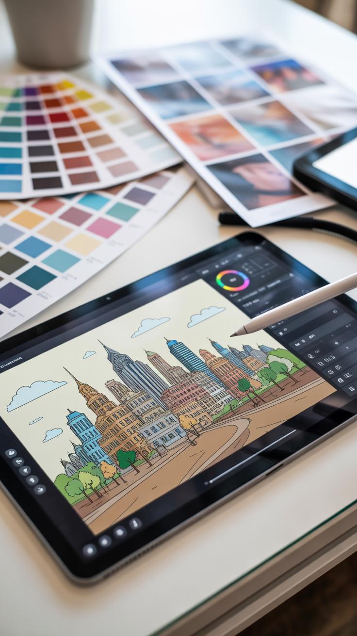
When you’re shaping mood in your urban illustration, the tools you choose can make a huge difference. Digital software has this incredible ability to tweak scenes quickly, though sometimes that makes it tempting to overdo it. Using filters and effects, you can shift the entire atmosphere in seconds—say, turning a bright midday scene into a gloomy, rain-soaked street with a few clicks.
Software like Photoshop and Procreate offer layers of control—blur effects soften harsh lines, color adjustments push warmth or coldness, and blending modes mix elements to create a particular tone. Personally, I’ve found that experimenting with subtle vignette filters can add focus and a feeling of intimacy, which really draws you into the street corners or alleyways I’m working on. But there’s a catch—too much reliance on these can flatten the mood if you don’t balance it with other techniques.
Switching to traditional tools, mood emerges differently. Brush strokes aren’t just marks; they carry emotion. A rough, jagged line might hint at chaos or tension, while soft, smooth strokes evoke calm. Pencil shading, for example, adds texture that feels tactile, something digital often struggles to fully replicate. Paper texture itself plays its role—rough paper brings depth and grit, matching an urban grit vibe, while smoother paper suits cleaner, quieter moments. I sometimes enjoy leaving those pencil smudges visible; they make the scene feel alive, like it’s still breathing.
Maybe the biggest lesson is this: mixing digital and traditional often leads to unexpected moods. Combining the control of software with the imperfections of hand-drawn marks can reflect the contradictions in city life—order and disorder, calm and noise—without forcing one mood to dominate entirely. What’s your take? Do you lean more on tech or hands-on approach? Or something in between?
Storytelling Through Urban Mood
When you create an urban scene, you’re not just sketching buildings and streets—you’re telling a story. The mood you choose can make your city feel welcoming, lonely, chaotic, or calm. That mood acts like a silent narrator, shaping what your audience feels without any words.
Think about a rainy evening with dim streetlights and empty sidewalks. That kind of setting rarely feels cheerful—you might sense isolation, or maybe quiet reflection. On the other hand, a bustling market scene with bright colors and sunlit streets invites energy and optimism. The mood sets the emotional stage for everything else.
Mood also directs attention. In urban art, shadows might pull your eyes toward a distant figure, or warm light on a window might hint at untold stories inside. The way you control light and shadow, color intensity, and even the weather can push viewers to focus on what matters most in your story, whether that’s a single character or a whole neighborhood’s atmosphere.
It’s tricky because emotions in cities are often mixed—crowds that feel alive but overwhelming, or quiet alleys that are peaceful but a bit eerie. That tension makes your scene feel more real, and mood helps carry those contradictions forward, nudging your viewers through the complex story you’re telling.
Practice and Experiment to Master Mood
You won’t really get a feel for mood until you try creating it yourself again and again. It’s like learning anything new—there’s no magic shortcut. Keep sketching urban scenes and nudging their atmosphere in different directions. Some attempts will fall flat. That’s normal. What matters is noticing what works and what doesn’t.
Looking at well-known urban artworks can spark ideas. I remember studying Edward Hopper’s city paintings and being struck by how quiet emptiness felt so alive. Seeing how others use light or shadow to imply loneliness or energy can help you understand subtle mood tools. Try to figure out why a particular piece makes you feel a certain way.
Feel free to experiment beyond what feels “safe.” Swap out usual color schemes for something unexpected, or play with unusual times of day. Maybe a city bathed in neon pastels or thick fog. Your style will evolve through surprises and mistakes—don’t hesitate to leave your comfort zone when shaping mood.
Conclusions
Your urban landscape illustration is more than what you see on paper or screen. It’s about the mood you create by choosing colors, weather, and how you arrange your scene. These choices pull viewers into the feeling behind your picture.
Try mixing different times of day, lighting, and details to express a unique mood. Keep practicing with these ideas. Your ability to craft mood will grow, and your cities will speak with feeling through your art.


