Introduction
A small gallery wall can be a powerful design element in your home. It allows you to showcase your favorite art, photos, or prints without overpowering the space. When done right, your small gallery wall can look big and make your room feel more personal and inviting.
This article explores smart ideas and practical steps to create a small gallery wall that draws attention and adds style. You will learn how to pick the right pieces, arrange them creatively, and use wall space smartly to achieve a big look. Let’s dive into ideas that you can easily apply.
Understanding Small Gallery Walls
A small gallery wall is exactly what it sounds like: a curated, compact arrangement of artwork or photos on your wall. Unlike sprawling gallery walls that cover large sections of a room, small gallery walls focus on a limited space—often a single narrow wall, a hallway nook, or above a tiny desk. If you live in an apartment or a compact house, this approach can be surprisingly effective.
What makes these gallery walls so appealing is their ability to add personality without taking up much space. You get to showcase your interests, memories, or style in a way that fits neatly into your living environment. It doesn’t feel overwhelming, nor does it leave your walls bare and uninspiring.
Usually, small gallery walls range from about 12 to 36 inches in width and roughly 18 to 48 inches in height, though this varies. The size sets them apart from larger walls that might span entire rooms or wall sections. Small walls don’t focus on quantity but rather thoughtful selection, drawing the eye to a few meaningful pieces rather than a crowded display.
One of the benefits of a small gallery wall is that it can transform a plain corner into a focal point. It makes your space feel lived-in and personal. You can easily change or update the collection without much hassle—making customization intuitive and, frankly, fun. The compact size also demands more attention per piece, so the impact tends to be sharper and more intimate than with larger, less defined groups.
Does having only a few paintings or photos limit your expression? Not really. Sometimes less is more, and small gallery walls prove that. They allow your room’s character to shine through without stealing the show, and they hold just enough visual interest to keep you—and your guests—engaged.
Selecting Art for Your Gallery
Picking artwork for a small gallery wall can feel a bit tricky, especially when you want it to reflect your personal taste without overwhelming the space. Think about the kinds of images or pieces that really speak to you—whether it’s a favorite photo, a print that catches your eye, or even a quirky painting. It helps to gather works that share something in common, but don’t force a perfect match. Sometimes, I find it’s the small differences that make the wall more interesting.
When choosing themes or colors, it’s useful to settle on a general direction. Maybe you lean toward calm blues and greys or warm earth tones. Or, you might prefer a black-and-white palette that feels clean and cohesive. Sticking to a color scheme gives a sense of unity, which your eye easily picks up on, making the collection feel planned rather than random.
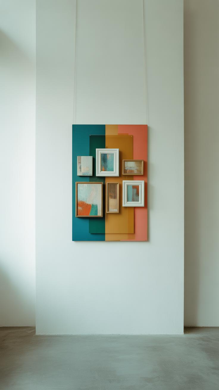
Mixing art styles is not off-limits—even on small walls. Photos, paintings, prints, or even textiles can coexist if you’re mindful. One way to keep harmony is by balancing scale and spacing. For instance, pair a bold graphic print with a delicate pencil sketch nearby. The contrast can bring energy, but if the styles clash too much, well, the wall might just feel chaotic rather than curated. Trust your gut on this; sometimes what looks a little off in theory works great in practice.
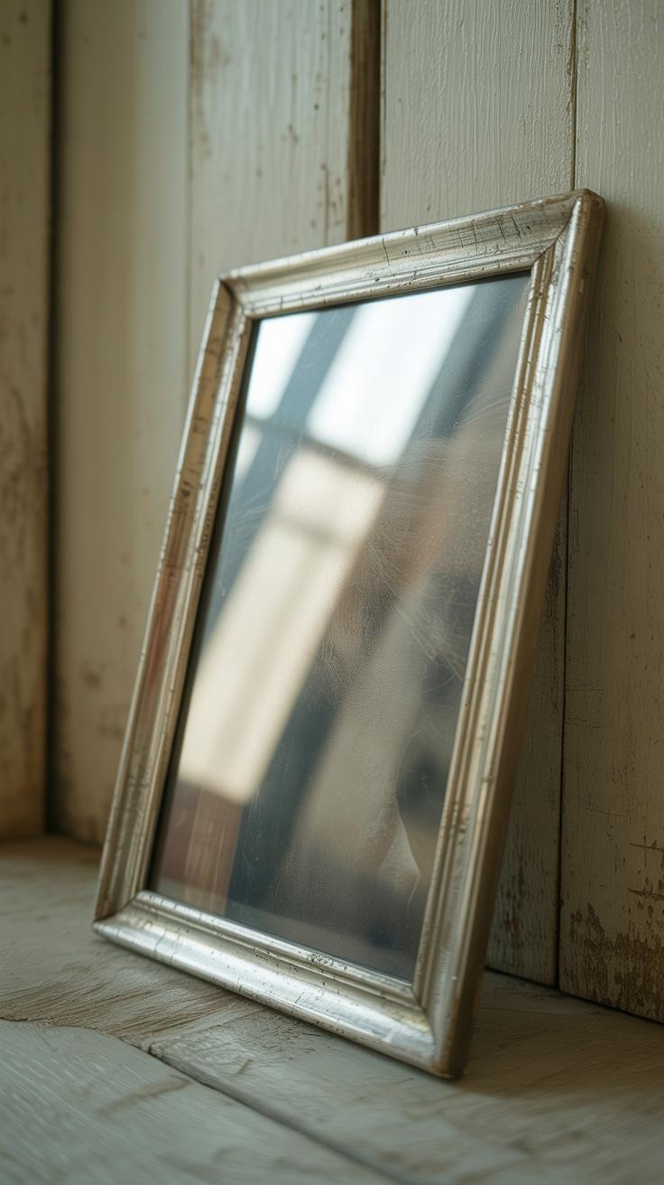
Picking the Right Frames
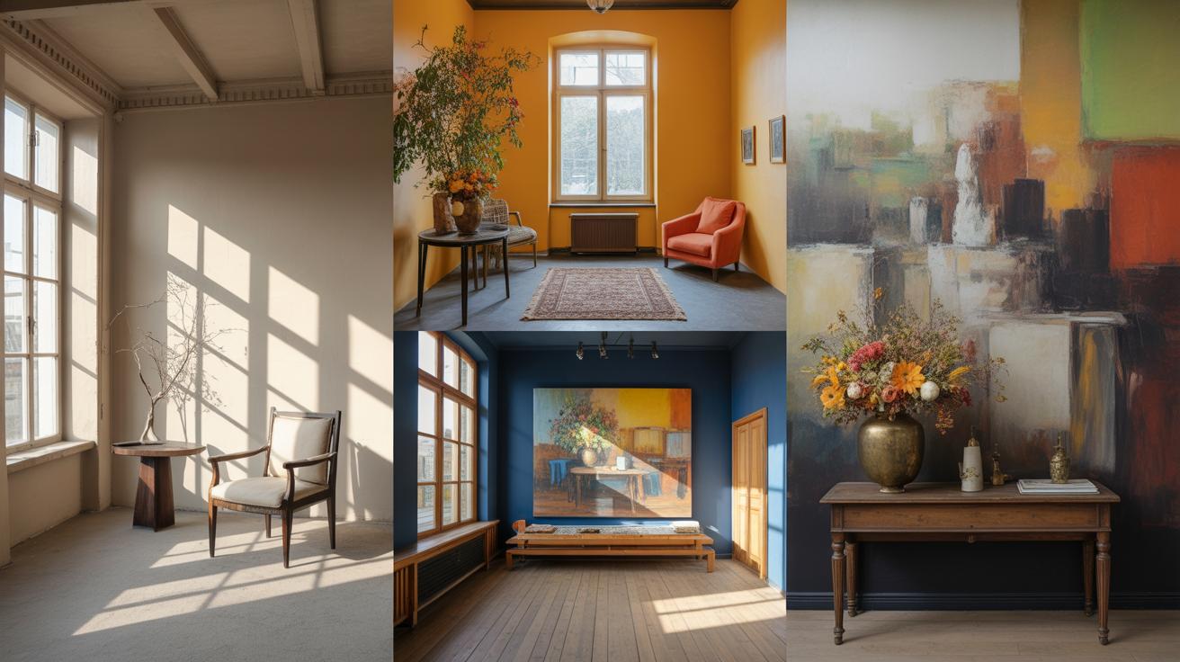
Frames do more than just hold your artwork—they shape how you see it and how the entire wall feels. When dealing with a small gallery wall, the frame choices can make the difference between a cluttered mess and a thoughtfully curated display. You want frames that bring out your artwork without overwhelming the space.
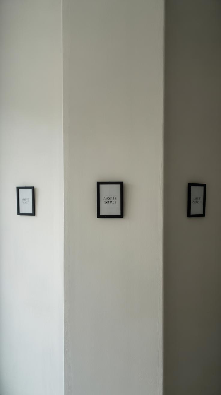
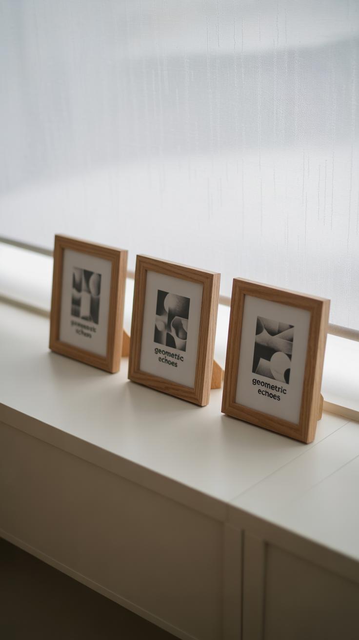
Frame size is surprisingly influential. Big, chunky frames tend to shrink a small wall—they claim too much visual space, drawing attention away from the art itself. Smaller, slimmer frames work better here, letting each piece breathe. Sometimes mixing a few sizes helps, but if you’re going that route, keep the difference subtle to avoid chaos.
As for style, simple frames often win. Think minimal borders or delicate profiles. Ornate or overly detailed frames might weigh down the wall and distract rather than enhance. Sometimes, a consistent frame style—matching thickness, for instance—can unify varied artworks and create a sense of cohesion, even when the pieces differ widely.
Color and finish play their part too. Black frames offer a clean, modern look that anchors a small wall, but they can feel harsh if you have softer artwork or pale wall colors. Wooden finishes with light or medium tones introduce warmth without dominating the view. White frames tend to recede and make the wall feel more open, but they can blend too much if your wall color is also light.
Matte finishes tend to blend in more, while glossy ones might reflect light, adding a bit of interest—or glare, depending. It’s a small detail, but one that can alter the room’s feel in subtle ways. Choose finishes that complement both your artwork and the room’s overall style.
Picking frames can be tricky—do you want them to pop or just fade into the background? Sometimes, the answer isn’t clear right away. Testing a few options, or even placing frames on the floor before hanging them, might save you from framing regrets later.
Creative Layout Ideas
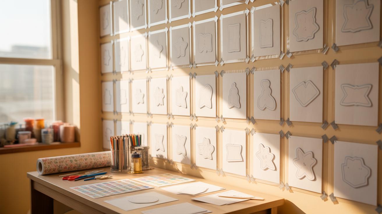
When it comes to arranging artwork on a small gallery wall, the layout you choose can change everything. You want something that feels intentional but doesn’t overwhelm the space. Let’s break down a few approaches that people often overlook but work well in smaller areas.
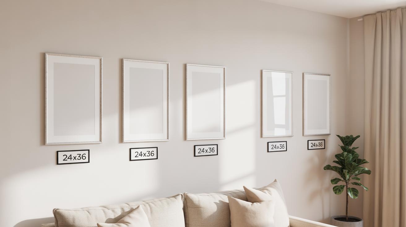
Grid Layout
The grid layout is pretty straightforward: square or rectangular frames aligned neatly in rows and columns. It gives your wall a structured, organized look, which can make a small space seem larger because the eye follows the clean lines. I’ve noticed that when I’m surrounded by neat rows of art, the room feels less chaotic—even if the wall is tight.
The benefits are clear:
- Creates visual order, which helps to avoid clutter
- Lets you mix similar or different artworks without losing balance
- Enhances the illusion of space, especially when the frames are uniform
But here’s the catch — it can sometimes feel a bit too uniform or rigid if overdone. So, if you go for a grid, maybe mix frame styles a little or choose varied artwork sizes within that grid to keep it from being boring.
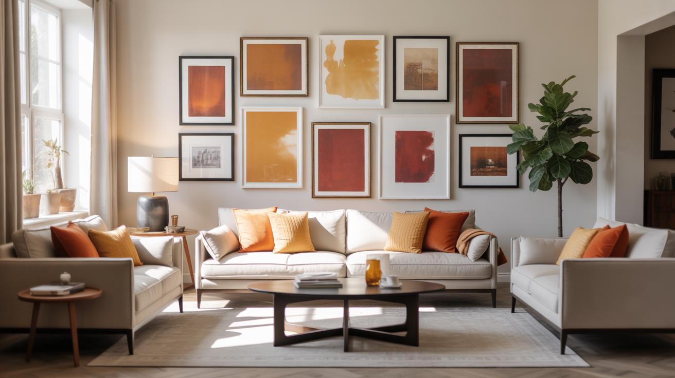
Salon Style Layout
Salon style is where you hang multiple pieces close together, filling the wall in a seemingly random, eclectic way. It originated from those old European art salons, and it feels a lot freer—less predictable. For small walls, this can be surprisingly effective if you’re careful with scale and spacing.
Here’s why it might work for you:
- Allows mixing art of different sizes and mediums, making the space feel personalized
- Encourages creativity in placement, so no strict rules to follow
- Gives off a cozy, collected vibe instead of a sterile gallery look
Though, I’ve seen it get cluttered pretty fast. It’s tempting to cram everything you love onto the wall, but the trick is editing down and giving pieces room to breathe—otherwise, you lose the appeal.
Other layout ideas like linear arrangements or tiered groupings can also work, but these two remain staples because of their clear visual impact in small spaces. Trying a blend sometimes makes sense too—you aren’t limited to one style if you don’t want to be.
Spacing and Arrangement Tips
When dealing with small gallery walls, spacing between your frames can make or break the whole look. You don’t have to cram every inch with art—actually, leaving about 2 to 4 inches between frames often works best. Closer than that, and things start feeling crowded; wider gaps might make the collection seem disconnected. It’s a tricky balance, and sometimes you might want to experiment depending on your room’s scale and the art sizes.
Think of the spacing like breathing room for your eyes. If you pinch frames together tightly, the wall feels busy and cramped. But if you scatter them too far apart, it loses its sense of unity. I’ve tried both extremes, and I find that a little unevenness often looks more natural than rigid even spacing.
Negative space plays a quiet but strong role too. Leaving empty spaces around your gallery, or even within, lets the wall “breathe.” It can create a sense of openness that tricks the eye into seeing the area as larger than it is. You might decide to leave a blank spot mid-layout or access some wall space above or below the cluster—that empty land prevents your gallery from becoming a visual blockade.
Sometimes, less is more—even when it feels like you should fill every gap. Would a few isolated frames spaced apart tell a story better than a packed cluster? That question can guide how you approach negative space. In many parts of my own home, stepping back to add intentional emptiness made a small gallery feel like it mattered more, not less.
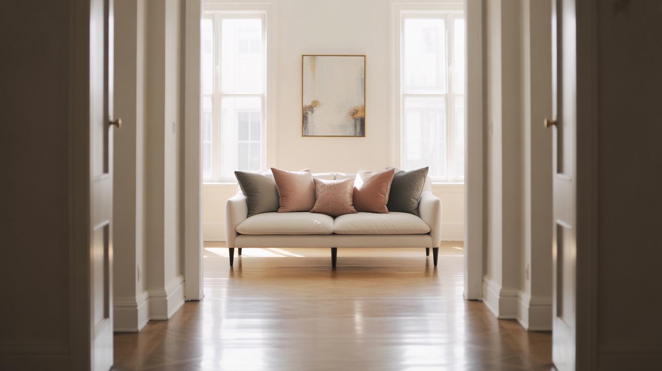
Using Wall Color and Background
Wall color can change how your small gallery wall feels, sometimes making it seem bigger than it really is. A lighter, neutral paint tends to open up the space, offering a clean canvas for your artwork to shine. Yet, darker or bolder shades can also work if you want the wall to feel cozy or dramatic—though that might bring a sense of intimacy more than extra space.
Choosing the right wallpaper is trickier but fun. Subtle patterns or textures can add depth without stealing focus. For instance, a delicate linen or soft geometric print might create visual interest behind your frames without making things visually busy. You want your art to be the priority, not the backdrop fighting for attention.
Contrast plays a surprisingly big role in perception. Dark frames against a pale wall boost the art’s presence, making each piece pop and appear larger. On the flip side, matching frame colors with the wall can create a seamless, lighter effect that almost extends the wall, giving the gallery a floating, airy quality. It really depends on whether you want your gallery to grab the eye or blend softly into the room.
Try to consider: does your space feel cramped or open? Are you looking for the gallery to stand out sharply, or do you prefer it to be a gentle complement? Playing with color and contrast is a quiet but powerful way to change your perception of size—and sometimes, just that small shift makes all the difference.
Adding Lighting to Highlight Art
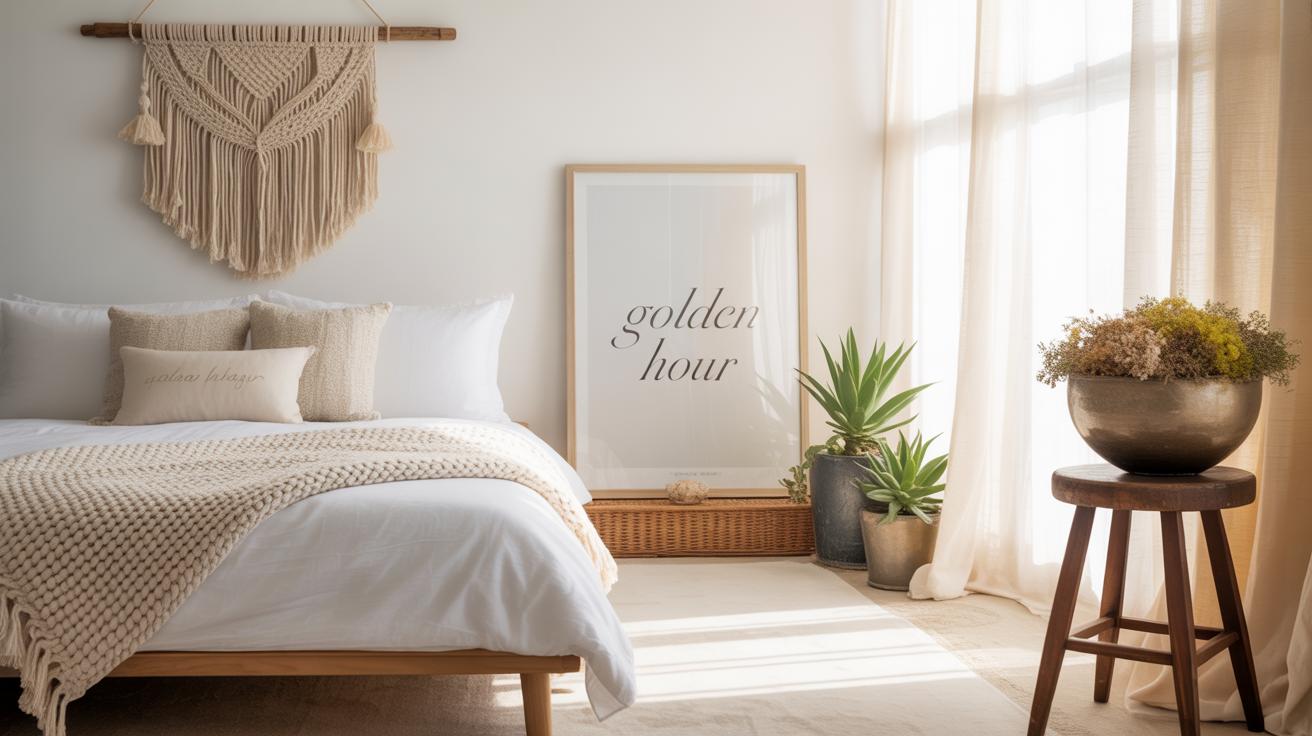
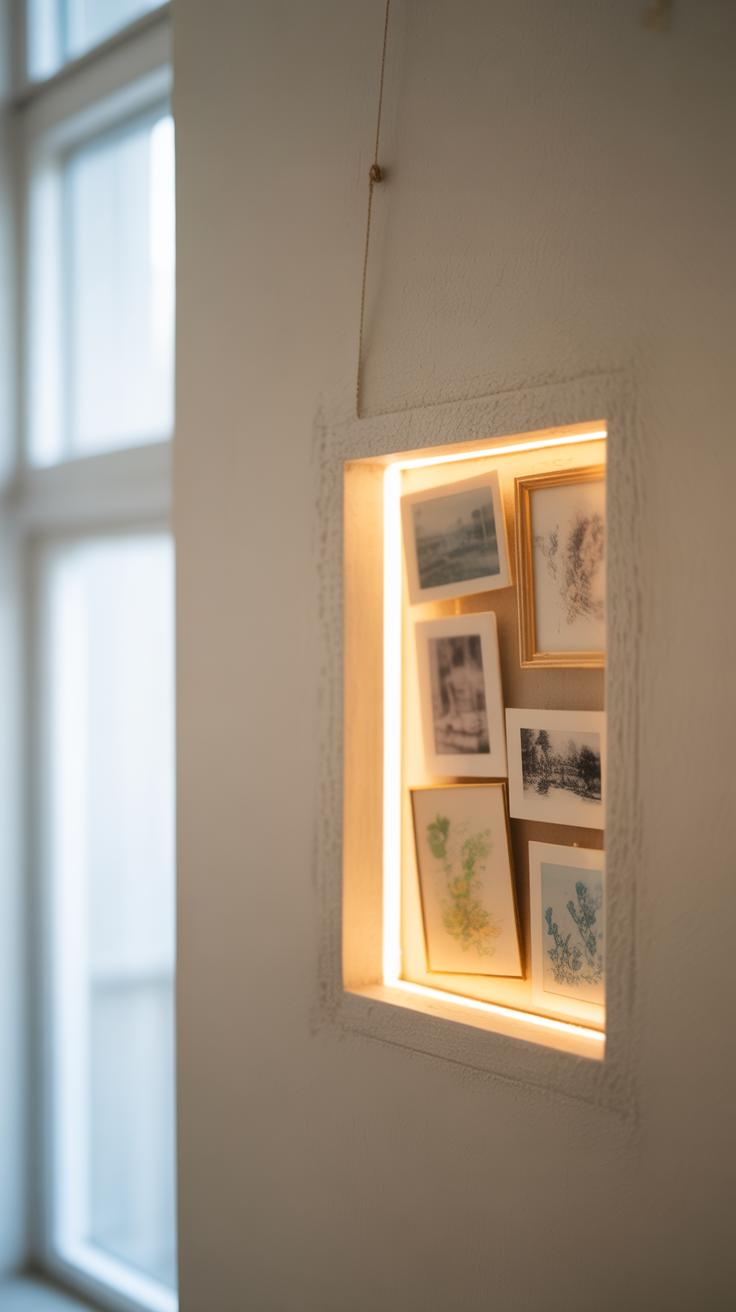
Lighting can completely change how your small gallery wall looks and feels. Natural light is often the best—there’s just something about sunlight that makes colors pop and details easier to see. Positioning your gallery near a window can be a good move, but be mindful of direct sunshine. It might cause fading over time or create harsh shadows that distract more than help. If you can angle the wall to catch gentle morning or afternoon light, that usually works well. Just imagine sitting nearby on a sunny afternoon, seeing your art come alive in that shifting glow. Of course, not every space has the luxury of sun, so that’s where artificial light steps in.
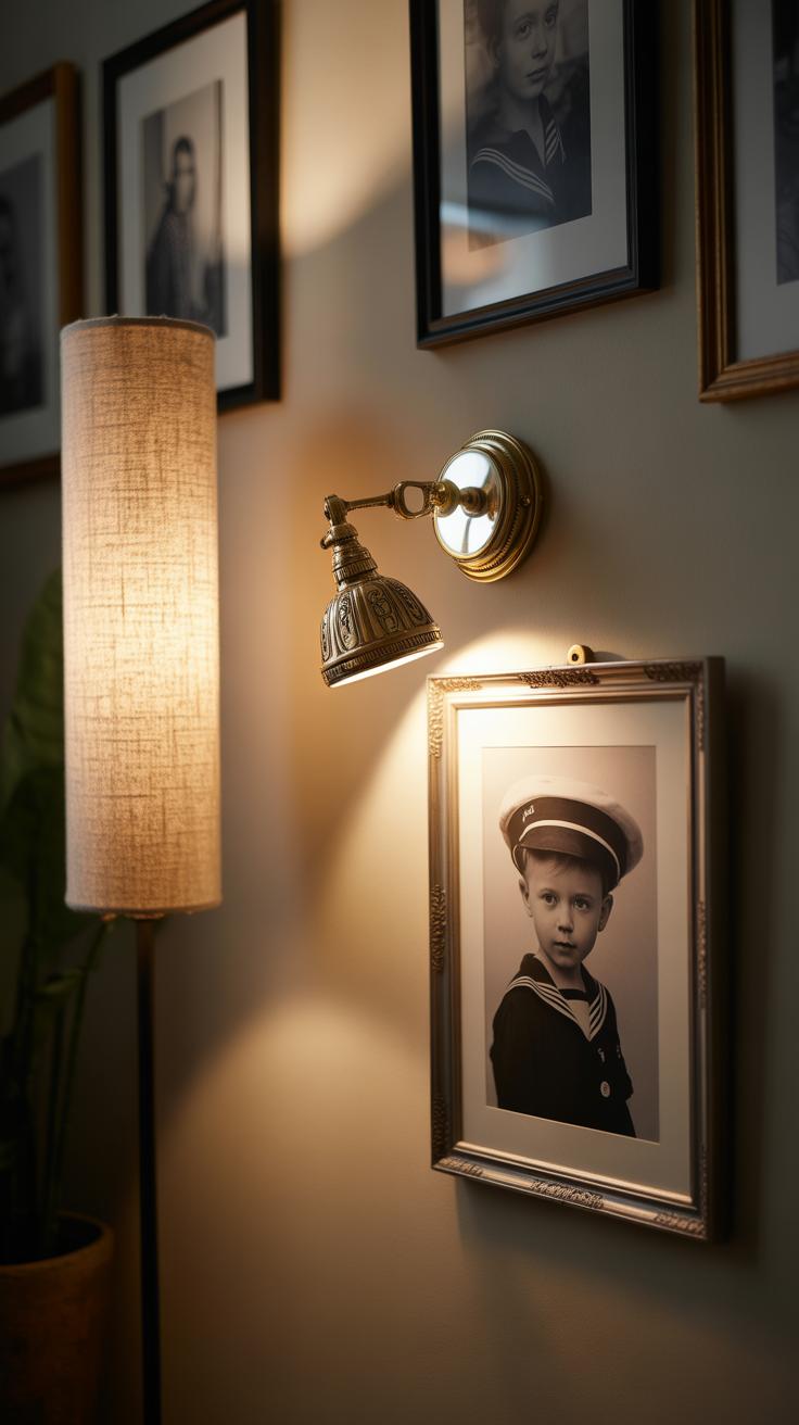
Spotlights and picture lights are popular choices. Spotlights can be ceiling-mounted or attached on a track to shine focused beams on each piece. They’re great if you want to highlight specific details or create contrast. Picture lights, usually mounted above a frame, add a warm wash of light that feels intimate and dedicated. You might want to try LED bulbs—they get bright without overheating, which is handy close to your artwork. Installing these lights does demand a little planning. Think about wiring early, and whether you want a switch for each light or one for the whole gallery. Placement matters too—too close, and a glare spoils the view; too far, and the impact fades. Sometimes, a mix of both natural and artificial lighting offers the best balance, even if it means adjusting the setup seasonally. Have you noticed how different your art looks at different times of day? That interplay can actually add a subtle, ever-changing appeal to your small gallery wall.
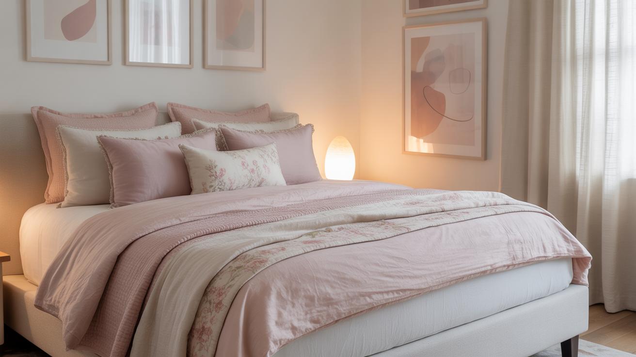
Incorporating Personal Items
Mixing art with personal items can turn your gallery wall into a space that really feels like yours. It’s not just about hanging pictures; it’s about layering memories and stories alongside visual pieces that catch your eye. When you include family photos, you add warmth that no print or painting can quite capture.
Try grouping photos in different sized frames rather than matching ones. This contrast can break the monotony and draw attention to the moments that matter most. You might even mix in candid shots with posed portraits—that rawness can bring life to the arrangement.
Memorabilia and small objects are also great to include. Think about special keepsakes like a small vintage clock, a pressed leaf from a memorable trip, or a miniature sculpture. These tactile items invite curiosity and make people stop and linger.
To display these, consider shadow boxes or small shelves integrated into the gallery. Floating shelves work well for objects that need a bit more space. Don’t be afraid to play with depth — layering a tiny object in front of a picture can create a sense of dimension without cluttering.
Will including these personal touches make the wall too busy? Possibly. But that might be exactly what you want. The key is balancing meaningful items with artistic ones without feeling forced. In the end, isn’t the gallery wall supposed to be a reflection of you, in all your imperfect, beautiful complexity?
Maintaining Your Gallery Wall
Keeping your gallery wall looking good over time takes a little care, but it isn’t complicated. Frames attract dust and fingerprints, so gentle cleaning is key. Use a soft, dry microfiber cloth for glass or acrylic surfaces. Avoid spraying any liquid directly on the artwork or frame. Instead, lightly dampen the cloth if needed, then wipe carefully. For wooden or metal frames, a gentle dusting usually works; harsh cleaners risk damaging finishes or artwork edges.
Artwork itself needs some attention too. If you notice fading or warping, it might be time to rotate pieces or switch their positions with less exposed spots. Sometimes your tastes change or you find something new that fits better—don’t hesitate to tweak the layout slightly rather than keeping it exactly the same forever. A subtle refresh could make your wall feel new again without taking it down completely.
Try to check your wall every few months. Look for signs like fading colors, loose frames, or dust buildup. Those little details add up more than you’d expect. Changing a frame’s position or swapping in a new piece can create a fresh story for your space. It’s almost like the wall grows with you—as your style shifts, so should your gallery.
Troubleshooting Common Problems
Fixing uneven layouts
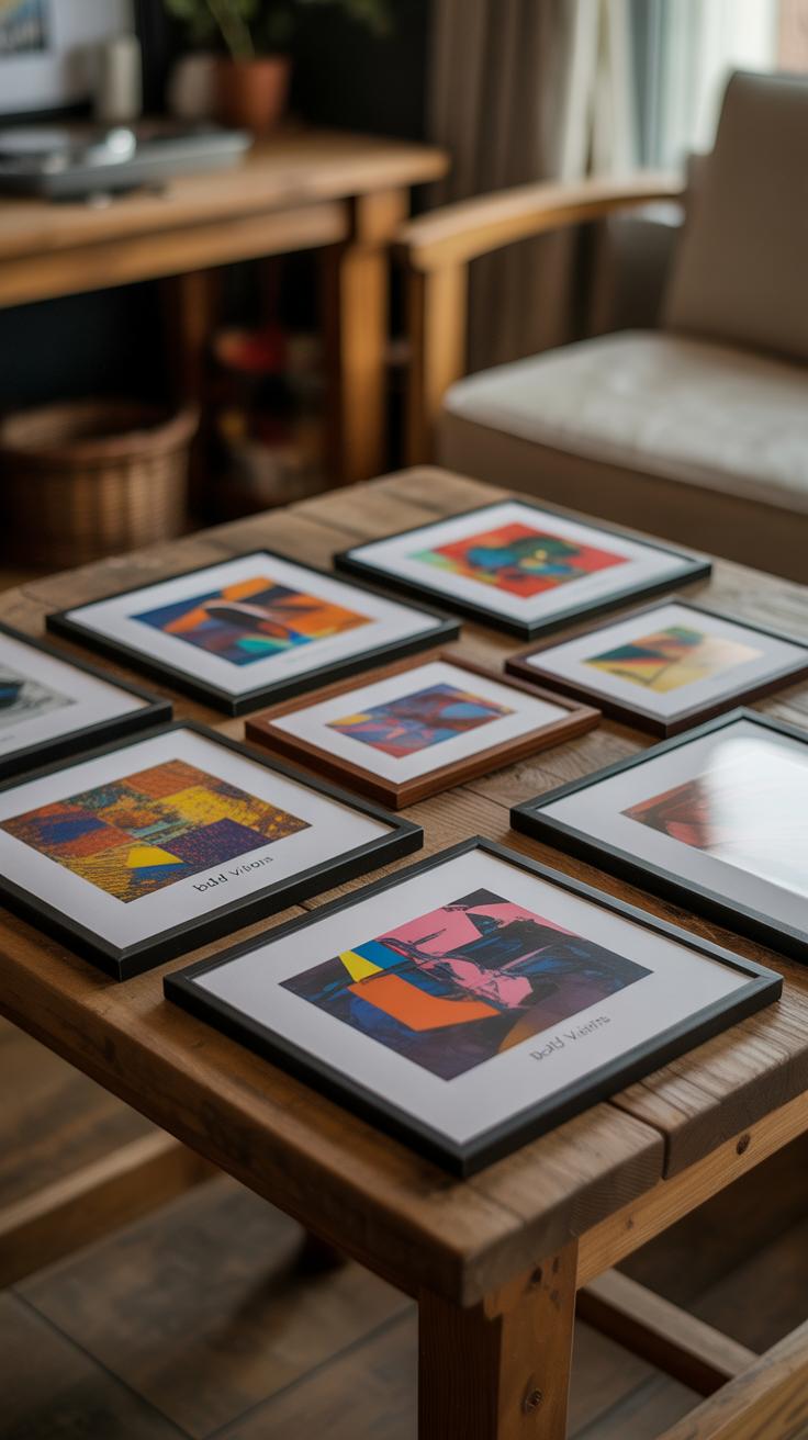
When your gallery wall looks crooked or just… off, it can be kind of frustrating. The first thing I usually suggest is stepping back and seeing where your eye naturally falls. If things feel lopsided, try shifting larger pieces toward the area that feels light. Sometimes it’s as simple as adjusting the spacing between frames—uneven gaps are often the culprit.
An easy fix is to lay your pieces out on the floor first, arranging and rearranging until the balance feels right before hanging. Measuring tape and a level should be your best friends here, but don’t obsess—sometimes a little imperfection makes the wall more interesting.
If you notice your whole gallery leans to one side, try realigning the top or bottom edges of key pieces to create a visual anchor. This small adjustment can make a big difference in harmony.
Avoiding cluttered walls
Overcrowding your gallery wall can quickly overwhelm the space, making it feel cramped rather than curated. When in doubt, less really can be more. A good approach is to limit the number of pieces and focus on their arrangement—think clean lines or deliberate groupings.
One trick is to mix smaller pieces with open space around them rather than filling every inch. White or neutral space can ease the eye and enhance each individual work’s impact. You might also consider having a few statement pieces and fewer accessory frames.
It’s tempting to include everything that has meaning or looks nice—don’t fight that urge too much, but try to be selective. Ask yourself what tells the story you want and which pieces might be better off in another room or rotated seasonally.
Conclusions
Creating a small gallery wall that looks big is about choosing art that resonates, using frames effectively, and arranging pieces in a way that maximizes space without clutter. Simple shapes, bright frames, and thoughtful layout make all the difference.
Your small gallery wall can become a personal statement. Use the tips shared here to explore your style, mix different shapes and sizes, and create an eye-catching wall. With a bit of effort, your small space can have a big style impact.