Introduction
The Rococo style is a unique and ornamental art form that began in France in the 1730s. It is known for its dramatic decoration using curves, gilding, pastel colors, and natural motifs. Understanding Rococo style helps art enthusiasts and creators add elegance and charm to their work.
This article will guide you through the key features of Rococo style. You will learn about its history, the common elements used by artists, and how you can recognize and incorporate them into your own art projects. By the end, you’ll have a clear idea of what makes Rococo special and how to spot it.
History and Background of Rococo Style

How Rococo Began
The Rococo style started in France during the 1730s, when many artists and patrons were growing weary of the Baroque style’s heaviness and seriousness. Baroque was grand and dramatic, often tied to religious and royal power, but by the early 18th century, a lighter, more playful approach felt refreshing. Artists wanted something that expressed leisure, pleasure, and the delights of everyday life instead of drama and tension.
This new style embraced elegance and grace with a little whimsy sprinkled in. You might say it was a bit of a rebellion against the rigidity of Baroque. It focused on intimacy over monumentality, with interiors and artworks that felt more personal, even flirtatious at times. The aristocracy liked this—it suited their salons and private spaces better than the bold, public displays of Baroque art.
Rococo’s Spread Across Europe
After its start in France, Rococo didn’t stay put. It spread to Italy, Germany, Austria, and Russia, though each place adapted it differently. In Italy, the style mixed with local traditions, often showing up in ornate church decorations. Germany and Austria embraced Rococo for architecture and interior design, especially in palaces and churches, where curves and elaborate details became common.
Russia, especially under the reign of Catherine the Great, saw Rococo in palaces and court settings, often blending with emerging neoclassical elements. Beyond painting, Rococo influenced furniture design, decorative arts, sculpture, and even theater set design, highlighting its broad reach.
It’s interesting how the style’s charm lay in this wide appeal—but also in its adaptability, which probably helped it travel so fast. Perhaps you can see the echoes of Rococo’s lightheartedness in certain modern designs and art forms, even if they don’t call themselves Rococo outright.
Key Visual Elements of Rococo Art
Curves and Asymmetry
One of the most striking features of Rococo art is its playful use of curves. Artists favored flowing, sinuous lines that twist and turn, almost like they want to keep moving. These curves often avoid strict symmetry, which might seem a bit odd if you’re used to the balanced forms of earlier styles. But that’s exactly what gives Rococo its lively, informal feel. Instead of perfectly mirroring shapes, compositions lean toward uneven, unexpected arrangements that surprise the eye.
Imagine a decorative panel where the scrolls and swirls appear to dance, or a painting where the figures and backgrounds follow irregular paths to suggest motion and spontaneity. This approach made Rococo art feel lighter, almost breezy. It can feel a bit chaotic at times, or maybe flirtatious — depending on what you’re looking at. It’s the difference between something stiff and something that almost breathes.
Pastel Colors and Nature Motifs
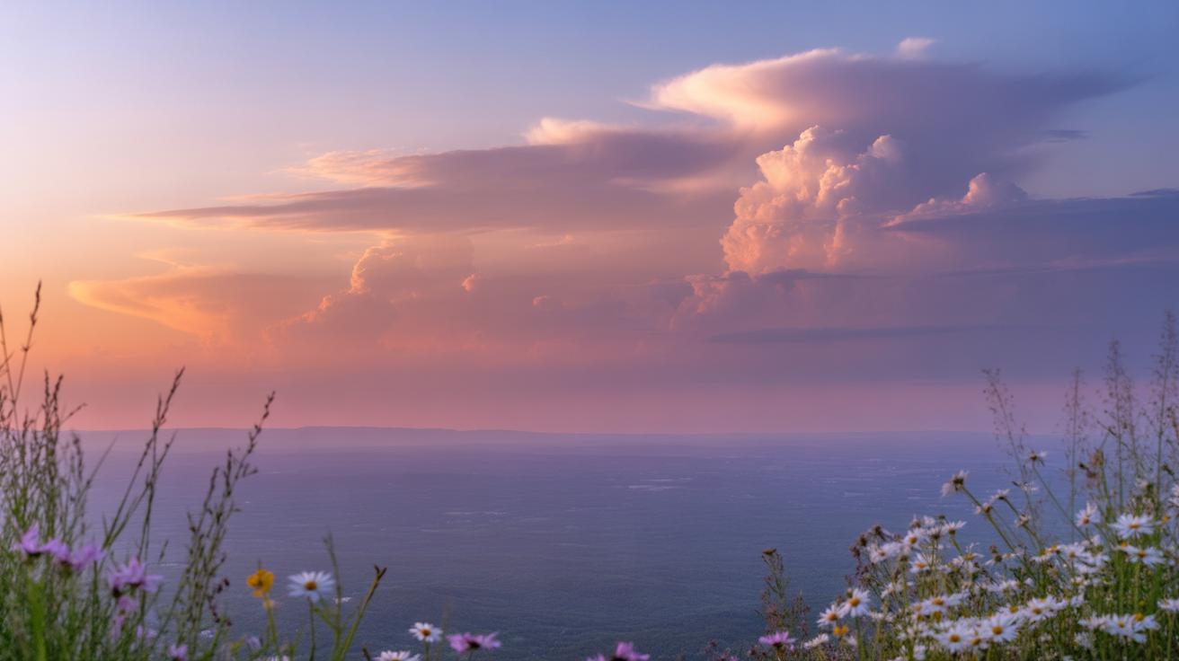
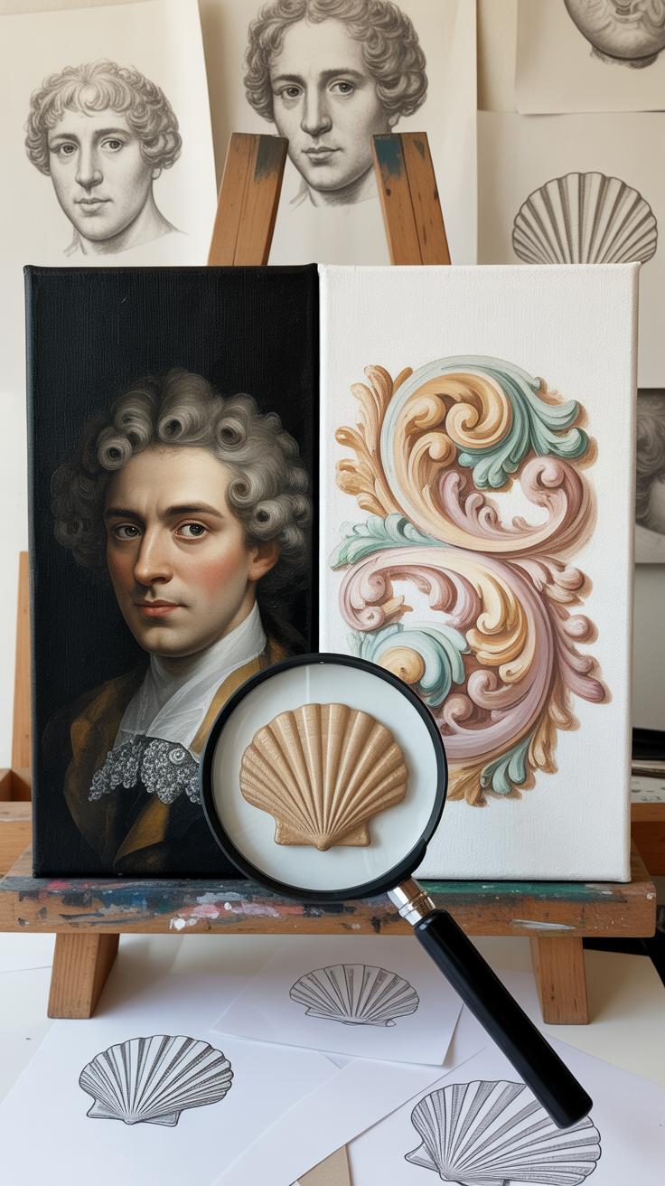
Rococo’s color palette usually sticks to soft, pastel tones like pale pinks, light blues, creamy whites, and gentle greens. These shades create a delicate atmosphere, inviting rather than overwhelming. They blend together smoothly, lending the art a sense of gentleness that feels easy on the eyes. But it’s not just the colors; it’s how they work with the decorative elements drawn straight from nature.
Look closely, and you’ll often spot motifs inspired by flowers, leaves, and seashells delicately woven into the details. These organic shapes aren’t just decoration—they speak to a fascination with the natural world, but seen through a fanciful lens. The designs might feel a little over the top or eccentric, but that’s kind of part of the charm. They invite you to notice small, playful touches, maybe a tiny shell curling on a frame or a cluster of blossoms tucked into a corner.
Thinking about these elements together, it’s easy to sense why Rococo art gives off that light, airy vibe—both visually and emotionally. You almost want to reach out and touch the delicate petals or follow the curves as they swirl away. Would you agree that this style seems to invite more than just looking, perhaps even a bit of daydreaming?
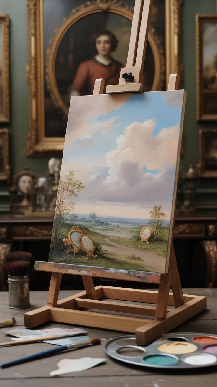
Rococo in Architecture and Interior Design

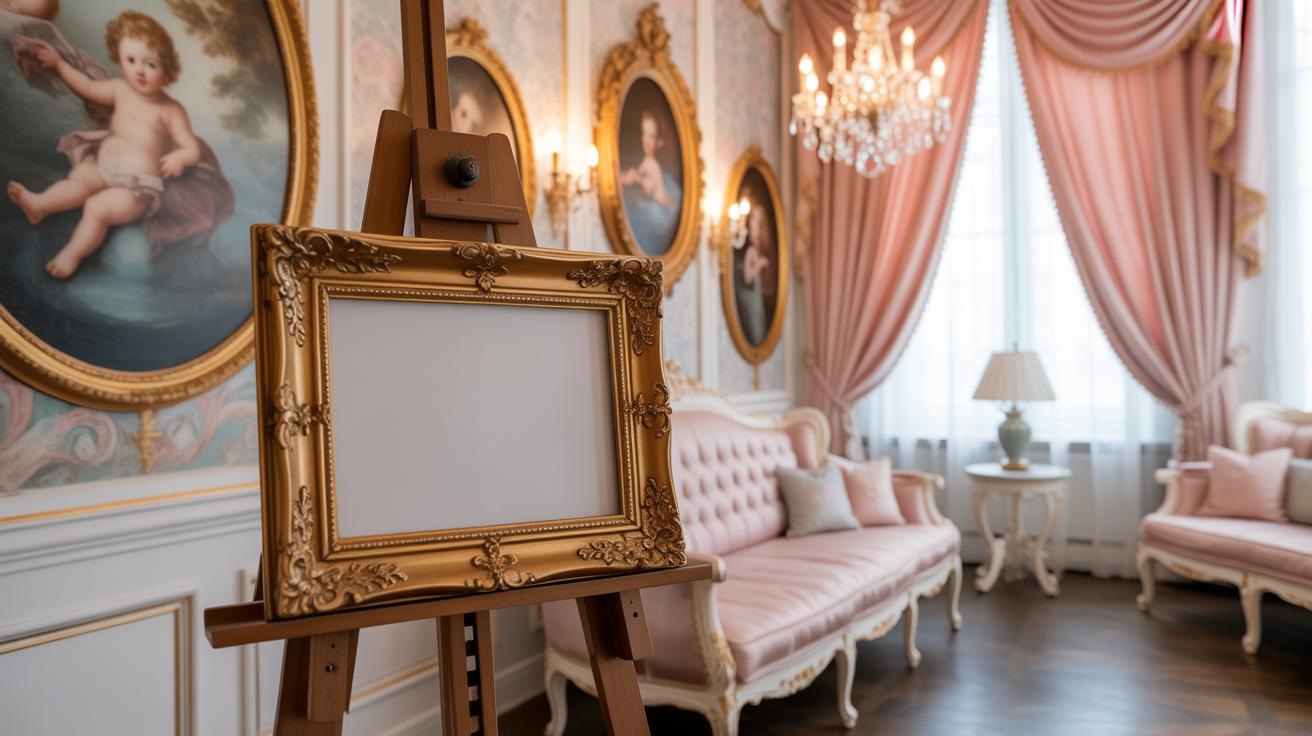
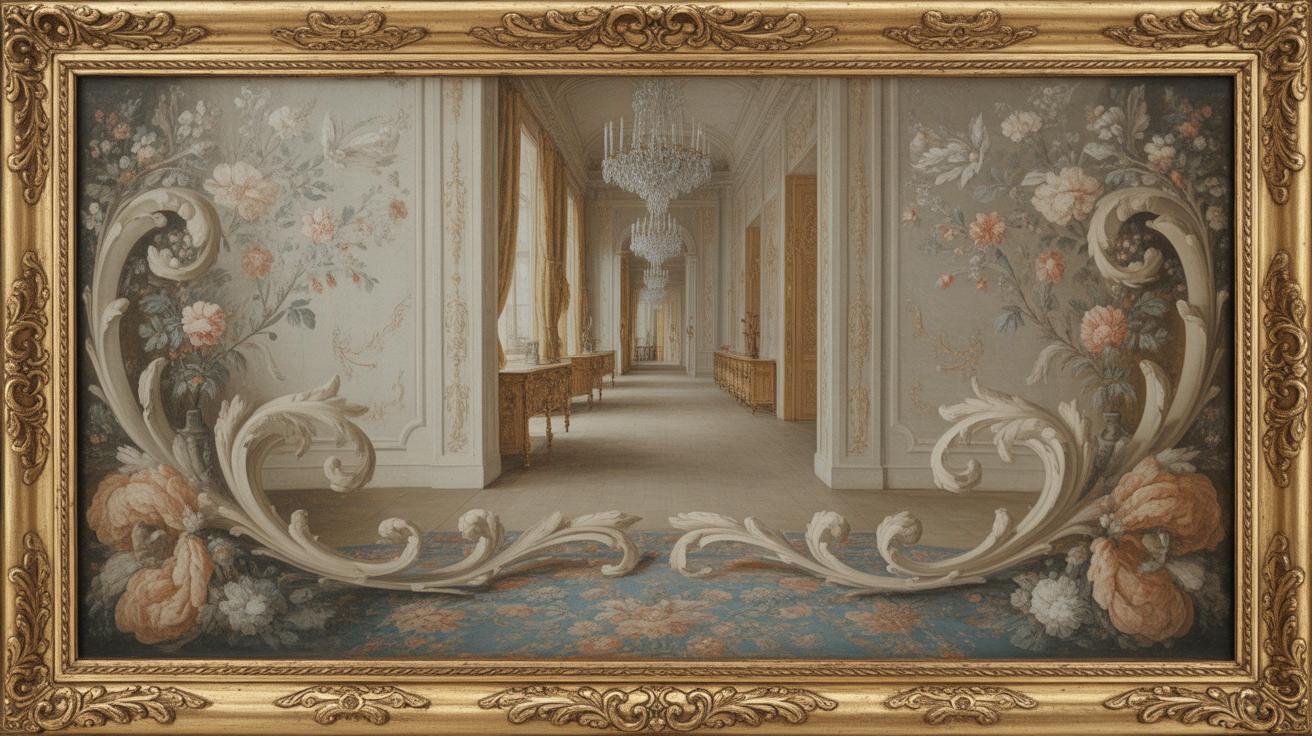
The Rococo style left a distinct mark on building design, especially in grand palaces and churches where interiors took center stage. It’s easy to notice how walls and ceilings became canvases for intricate decoration. Gilded mouldings twist in delicate, asymmetrical patterns, wrapping spaces with a sense of movement that almost feels alive. Imagine walking through a staircase where every banister and baluster is carefully carved and finished with gold leaf, making the whole structure feel both fragile and lavish.
Ornamented Interiors
Inside, Rococo artists didn’t hold back. Walls and ceilings were covered in stucco and carved details, often featuring playful shells, flowers, and scrolls. These elements weren’t random—they worked together to draw your eyes upward and around the room, creating an impression of endless motion. You might wonder if all this decoration was just for show, but it actually helped soften the architectural lines and invite closer observation.
Some rooms feature delicate mirrors set within curved frames that reflect light in a subtle dance. Ceilings often display elaborate frescoes, sometimes blending natural scenes with mythological figures. It’s as if these spaces were designed to make people linger, to feel enveloped in luxury and whimsy all at once.
Use of Illusion and Light
One fascinating aspect is the clever use of illusion. Rococo ceilings commonly include illusionist paintings, where clouds, cherubs, and open skies seem to extend the room beyond its physical limits. This trick makes even modest rooms feel more spacious, challenging your sense of reality. Coupled with pale, pastel tones on walls and furnishings, rooms appear bright and airy.
Light colors weren’t just a stylistic choice; they changed how light moved through space, creating a soft glow that enhanced elegance without heaviness. It’s worth thinking about how these techniques might inspire your own interior projects—how you could manipulate light and detail to shape atmosphere and perception.
Rococo Style in Painting
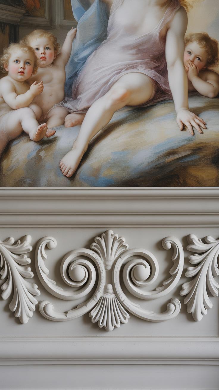
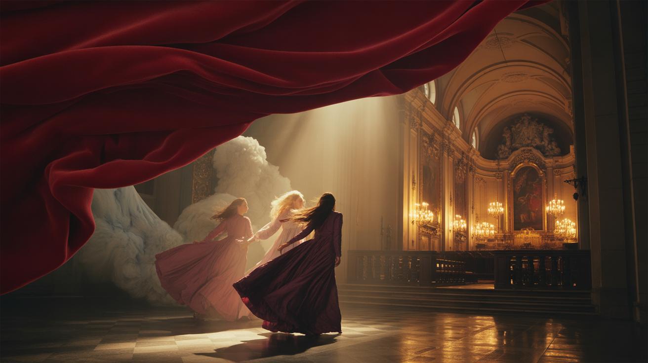
When looking at Rococo paintings, you quickly notice a certain lightness—like the art itself feels fragile yet lively. The scenes often revolve around playful moments or romantic stories, where the mood feels almost like a private glimpse into a joyful world. You might find couples in flirtatious exchanges or witty conversations in garden settings, which makes you wonder if the artists were as interested in human emotion as in aesthetics.
Common themes tend to focus on love, nature, and social gatherings, but not the grand or serious kind—think intimate, charming, sometimes even mischievous meetings among the elite or nature spirits. These subjects don’t just appear randomly; they create a mood that’s easy to get lost in, almost like the painting invites you to join the scene.
Artists used soft, pastel tones—with pinks, blues, and creams dominating—to keep the images gentle rather than overwhelming. Light brushwork adds to this effect, creating textures that seem to breathe. Shadows in Rococo pieces don’t bring drama; they add subtle depth, making characters and landscapes feel more immediate, more alive. It’s almost as if the light itself becomes part of the story, casting a kind of warmth that’s hard to define but easy to feel.
Sculpture and Decorative Arts in Rococo
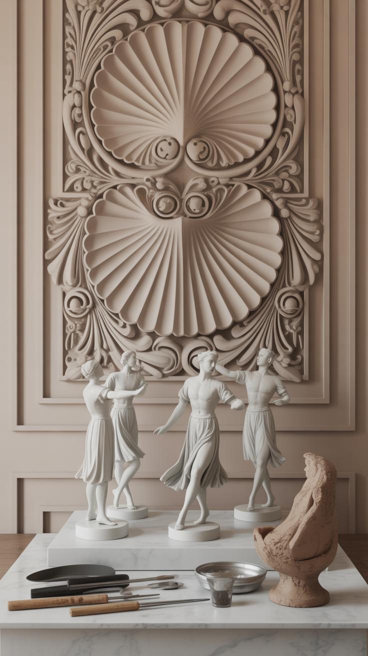
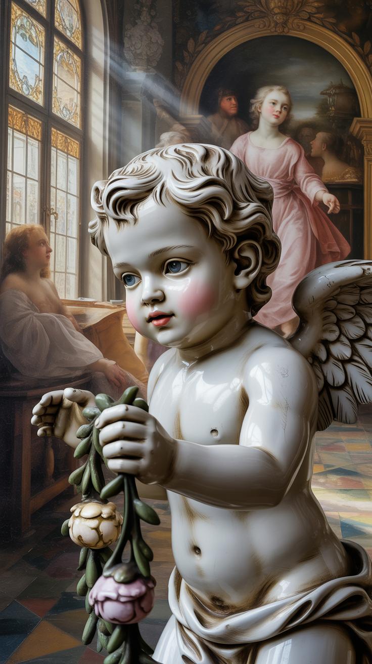
Rococo sculptures seem almost alive, wriggling and twisting with energy. You can often spot natural shapes like leaves, shells, and flowers bending and curling in unexpected ways. These forms avoid harsh straight lines and instead mimic the soft, organic curves found in nature. It’s as if the sculptures breathe, caught in a moment of movement rather than frozen in time. This sense of motion makes them feel light and playful, reflecting the Rococo’s emphasis on elegance and charm rather than grandeur.
When you look at Rococo furniture and decorative objects, the same flowing qualities appear. Chairs, tables, and cabinets often feature sinuous lines that seem to glide across space. Gilding highlights the delicate carvings, catching the light and adding a sense of luxury without feeling heavy. Soft pastel colors like pale pinks, blues, and greens cover surfaces, blending with the often intricate floral or shell motifs. This makes the pieces feel part of the room rather than just objects inside it.
- Curved shapes dominate, avoiding straight or rigid forms.
- Delicate details—tiny scrolls, acanthus leaves, and shells—decoratively enhance surfaces.
- Pastel palettes soften the feel of furnishings and ornaments.
- Gilded edges add subtle sparkle and emphasize ornate carving.
- The overall effect is to create spaces and objects that feel natural, light, and elegant.
Sometimes I wonder whether these details were meant to delight the eye or to distract it—making you notice the craftsmanship as much as the function. Either way, Rococo sculpture and decoration invite you to get closer, to look for the small touches. In doing so, they make a room feel less like a collection of things and more like a carefully woven experience.
Rococo Style in Modern Art and Design

You might be surprised how often Rococo elements show up in contemporary art and design. Artists today don’t simply recreate 18th-century paintings, but they borrow the playful spirit, the ornamental curves, or the soft, pastel palettes that defined the style. Take, for example, the work of some modern painters who blend Rococo’s dreamy, romantic atmospheres with a modern twist—like Kehinde Wiley, whose portraits sometimes echo Rococo’s ornate backdrops and delicate detailing, yet challenge traditional power dynamics.
In fashion, Rococo’s influence still quietly shapes choices. Designers frequently bring in curved, flowing lines that reflect the style’s organic shapes. Pastel colors—soft pinks, blues, creams—have seen a comeback in seasonal collections, evoking Rococo’s gentle, lighthearted moods without looking dated. Accessories with intricate embellishments or floral motifs also nod back to that era, but in a way that feels fresh rather than overly elaborate.
For interiors, Rococo is alive in the subtle curves of furniture legs and mirrors, and in wallpapers rich with swirling patterns or nature-inspired designs. You might notice Rococo-inspired pieces mixed with minimalist décor, creating an interesting tension between old and new. It makes you wonder—why do these delicate, decorative elements stay appealing when a clean, simple look is often favored?
- Modern artists use Rococo-inspired color schemes and forms to explore themes of beauty and excess.
- Fashion shows often feature pastels and delicate embroidery reminiscent of Rococo clothing details.
- Home décor subtly integrates Rococo through curved furniture, light fabrics, and floral patterns.
So, when you see soft hues paired with intricate, flowing designs—whether in a painting, a dress, or your friend’s living room—there’s a good chance Rococo’s influence is still at play, shaping creativity in unexpected ways.
How to Identify Rococo Art
When you’re looking closely at a piece and wondering if it’s Rococo, start with the shapes. Rococo doesn’t stick to strict, balanced forms. Instead, it favors curves that seem to flow almost like water—soft, looping lines that feel casual but are carefully crafted. You might notice the design leans toward asymmetry, with details that don’t quite match on either side but work together to create a lively whole. It’s almost like the art is alive, refusing to be boxed in by perfect symmetry.
Look for places where things twist or curl unexpectedly. Scrolls and whorls, for instance, are everywhere—on furniture, picture frames, even in the way figures are posed. These shapes give Rococo a playful kind of elegance that can feel like it’s constantly moving.
Decorative details are another strong signal. Shells appear often, sometimes embedded into carvings or painted as delicate motifs. Flowers aren’t just background filler—they take center stage, blooming across surfaces in intricate patterns. And then there are those lighthearted scenes—think of playful gatherings, flirtatious exchanges, or whimsical mythological moments. These little touches tell you that the artist is less interested in weighty subjects and more in moments of joy or charm.
If you think you’ve spotted these signs, don’t rush. Rococo can be subtle, and sometimes what looks elaborate at first glance turns out to be something else. But if the curves pull your eye, the details delight your attention, and the scene feels both elegant and slightly mischievous, you’re probably looking at Rococo.
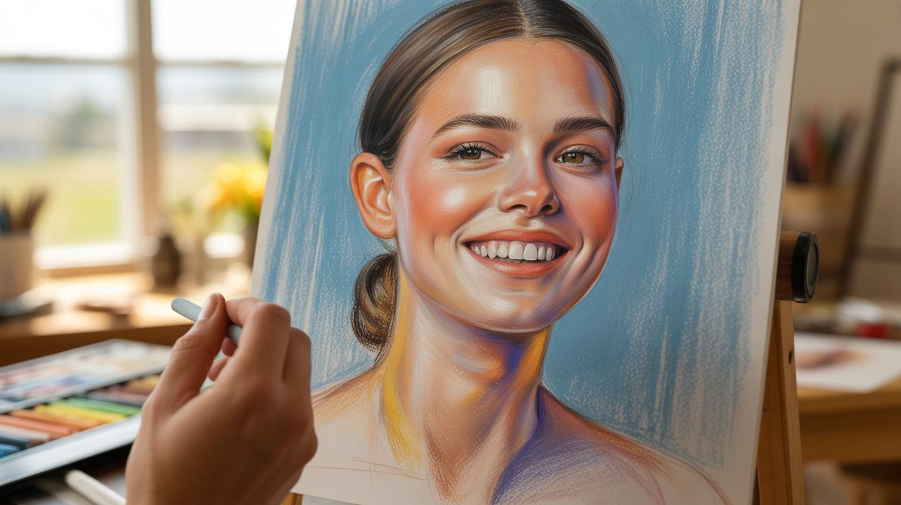
Creating Your Own RococoInspired Art
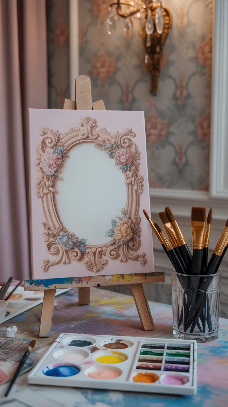
Starting with your color choices, lean toward light pastels—soft pinks, pale blues, gentle greens, and creamy whites. These shades set the delicate, airy tone that Rococo favors. But don’t feel completely bound to these hues; sometimes a slightly richer color peeking through can add unexpected depth without losing that lightness.
Next, focus on shapes. Flowing, organic curves are key. Imagine the way vines twist or waves ripple—use those natural forms in your lines and outlines. If you’re drawing a figure, let the posture be loose and elegant rather than stiff or symmetrical.
When you move on to details, it’s all about ornamental touches. Think about including small flowers, curling leaves, or even shells woven into your design. These elements don’t have to be perfectly rendered; a bit of sketchiness or subtle roughness might actually enhance the charm. Texture isn’t flat here—it pokes out and plays with light, so layering paint or varying your strokes can help create that tactile feel.
Try adding these details gradually and stepping back often to see how balanced the overall piece feels. Does it still look spontaneous? That casual grace is a big part of Rococo’s appeal. And if you’re unsure where to place a decorative flourish, ask yourself what feels natural rather than forced. Sometimes less is more, but sometimes, well, more is what makes it truly Rococo.
The Meaning and Impact of Rococo Style
Expressing Elegance and Movement
When you look at Rococo art, you can almost feel the sense of motion. It’s not static—there’s a swirl of delicate curves and intricate details that pull your eye around the scene. The decorations aren’t just there to fill space; they bring life and a sort of playful rhythm to the work. You see lightness—soft pastels, gentle lines, but also a busy energy that hints at joy and freedom. It makes you wonder, does the spirit of the art itself invite you to step inside that lively, carefree world? Sometimes, it really feels like the details—shell shapes, floral motifs, and scrolls—are dancing alongside the figures, echoing their smiles and gestures.
Rococo art doesn’t shout grand messages or deep moral lessons. Instead, it whispers about pleasure and ease, a celebration of day-to-day delight. The style’s characteristic curves and flourishes seem designed to capture an informal elegance without feeling forced or heavy. Can something so ornamental really carry such a strong emotional effect? It appears so, as it continues to captivate viewers, making the space feel light and inviting.
Rococo’s Place in Art History
Rococo often gets boxed as a fleeting or superficial style, but that feels a bit unfair. It came at a particular moment in European art when people were shifting away from the serious, dramatic Baroque. Instead of grandeur meant to inspire awe, Rococo brought intimacy and personal charm to the forefront. Tracking its place in art history can be tricky because it sits somewhere between the baroque’s boldness and the neoclassical return to formality.
Its influence extended beyond France, leaving marks on painting, interior design, and decorative arts, shaping a more playful and ornate chapter in European taste. Even today, you’ll see echoes of Rococo in unexpected places—fashion, graphic design, and various artistic revivals. This shows that while some dismiss it as merely decorative, its legacy quietly persists, reminding us that art can be lighthearted yet still meaningful. You might find it curious that what was once seen as trivial now offers fresh inspiration for artists seeking to bring elegance without stiffness into their work.
Conclusions
Rococo style is about more than just decoration. It tells a story through curves, colors, and natural forms. When you learn to identify these features, your art appreciation and skills will grow. You can use this knowledge to create works that reflect this charming and detailed style.
Keep exploring Rococo art by practicing its elements in your creations. Think about how each curve and color plays a role. With practice, you will understand and enjoy this elegant style even more. Your journey into Rococo art will open new doors to creativity and artistic expression.


