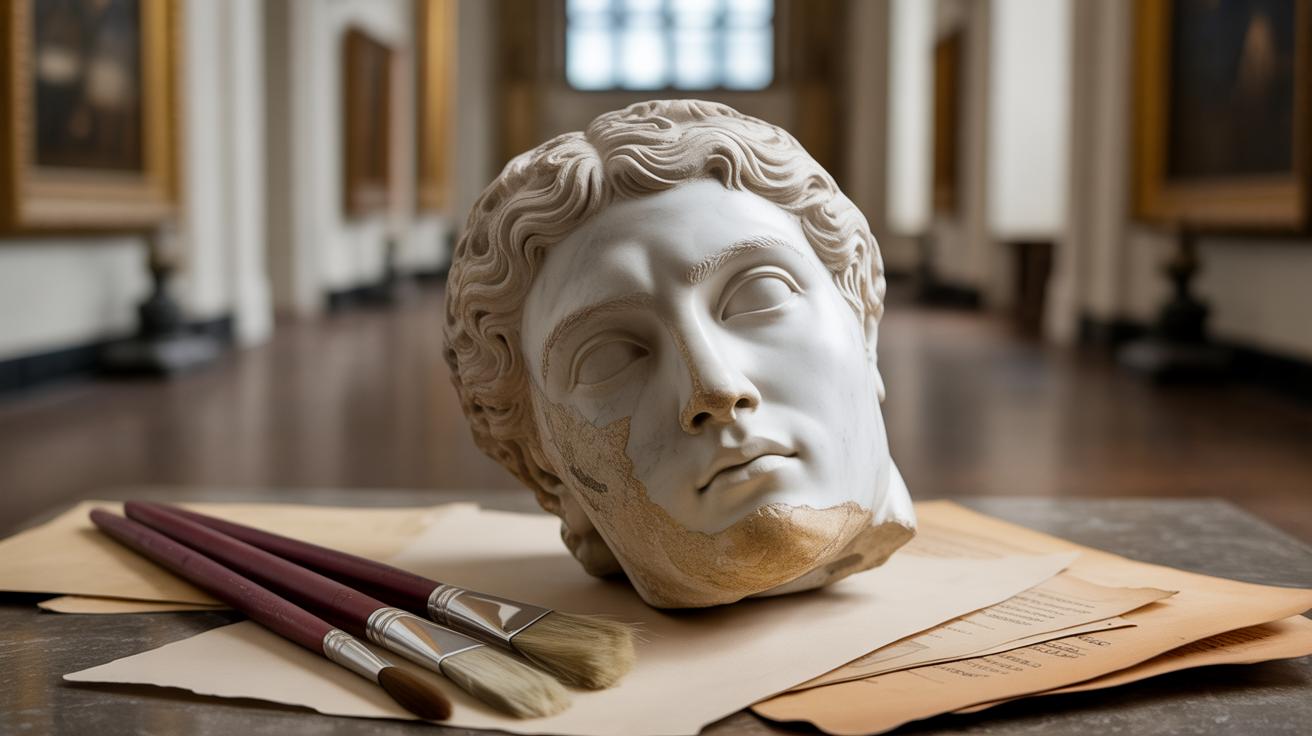
Introduction
Rococo painting brings a particular style that emerged in Europe during the 18th century, recognized for its delicate, detailed, and ornamental brushwork. These painting techniques use soft colors, curves, and intricate patterns to create elegant and lively images. Understanding and practicing these techniques can help you create art that reflects the charm and grace of the Rococo style.
This tutorial will guide you through the main features of Rococo painting. You will learn about the tools used, how to apply brush strokes, and how to bring the style to life in your own works. Whether you’re a beginner or an advanced painter, these techniques will enrich your artistic skills with a focus on producing ornate and captivating artworks.
The History and Origins of Rococo Painting
How Rococo Painting Began
Rococo painting emerged in early 18th century Europe, largely as a response to the grandeur and seriousness of the Baroque period. The shift wasn’t abrupt but more like a gradual move away from the heavy drama and intense emotion that defined Baroque art. The French aristocracy, craving more playful and intimate art that reflected their leisure and elegance, played a big part in this change. They wanted to surround themselves with lighter, more personal imagery that suited their refined social gatherings—away from the grand religious or political themes of the earlier century.
This new style arose in a society that was slowly becoming less formal. The court life at Versailles, for example, was obsessed with delicacy and charm rather than strict power displays. Games, love, and nature became common subjects, showing a world more focused on pleasure and ornamentation than on morality or heroism.
Key Elements of Rococo Style
What you’ll notice first in Rococo paintings are the light colors—they almost seem to float rather than weigh down the canvas. Pastel tones dominate, lending softness where Baroque used deep, dramatic contrasts. Then there’s the ornamental detail: intricate patterns, swirling curves, and delicate brushstrokes that create a sense of movement without harsh edges. The compositions feel playful, often with asymmetry that seems intentional but keeps the eye engaged.
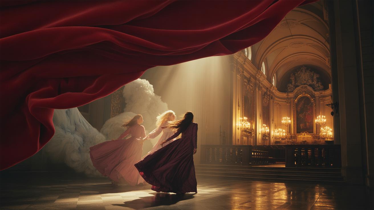
Themes tend toward the frivolous or romantic, with lovers, mythological figures, and garden scenes appearing frequently. It’s less about telling a grand story and more about capturing a moment or mood. The paintings invite you in, almost whispering rather than shouting their presence. Compared to Baroque art’s solid, often monumental feel, Rococo feels buoyant and, well, sort of coy.
Thinking about these traits, you might wonder how painting techniques evolved alongside social tastes. That question is key to mastering the ornate brushwork we’ll explore next—it’s not just about style, but about how artists captured the spirit of their era with each delicate stroke.
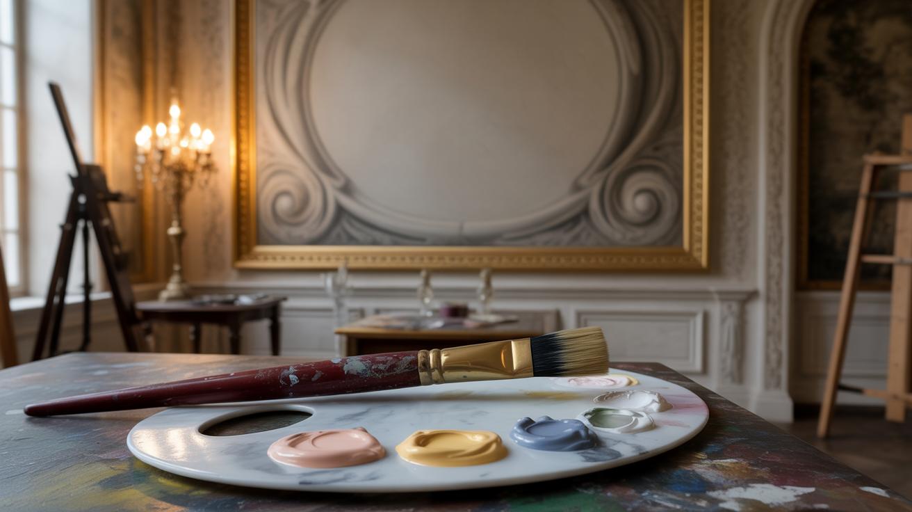
Essential Tools for Rococo Painting
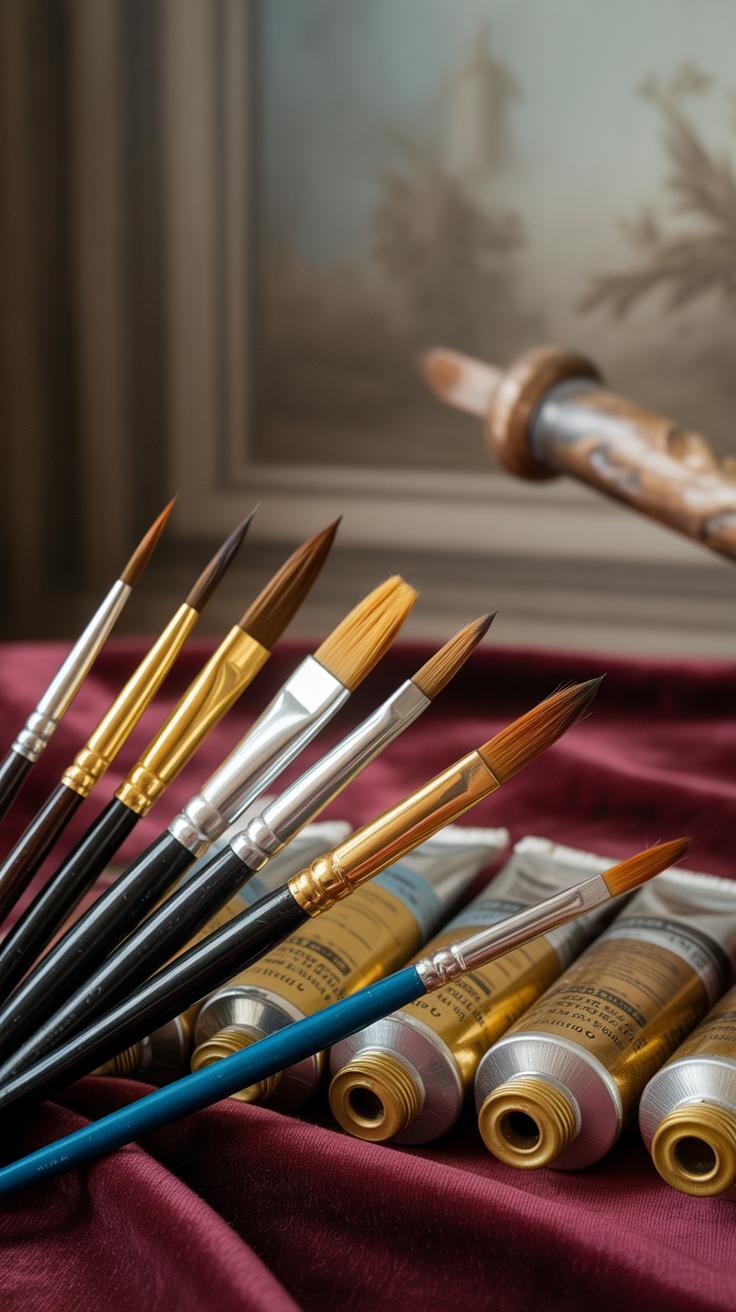
Choosing the Right Brushes and Paints
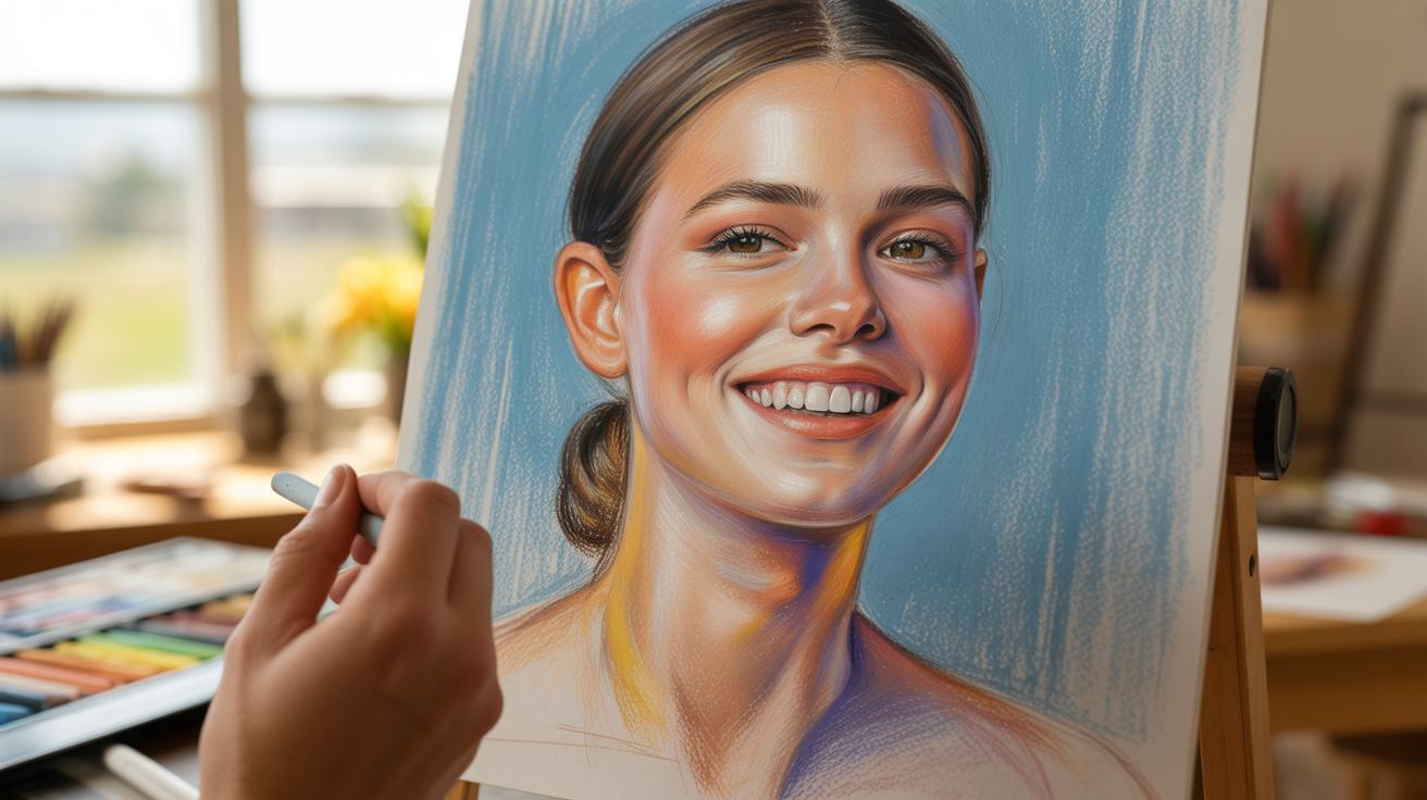
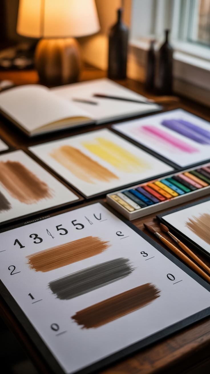
For Rococo painting, brushes are more than mere tools—they shape the delicate, ornate strokes that define the style. You’ll want a selection of fine sable or synthetic brushes with pointed tips. Sizes between 0 and 4 often work best for the intricate detailing. Flat brushes might come in handy for soft backgrounds but rely on small rounds for those curling, graceful lines that feel almost like whispering.
The paint itself needs to match that delicacy. Traditional oil paints remain popular for their smooth blending and luminosity, especially in pastel hues—the pale pinks, creams, and soft blues that Rococo favors. But acrylics can work if you thin them appropriately and allow drying time to avoid harsh edges. Think carefully about your pigments; muted shades with subtle shifts convey that refined lightness. You might wonder if brighter colors fit—but they rarely do without losing that characteristic softness.
Preparing Your Workspace
Setting up your painting space feels surprisingly important when tackling detailed, intricate work. You need good natural light or a daylight-balanced lamp. Shadows can frustrate your fine brushwork. Keep your brushes moist but not dripping. Having a palette with small wells for mixing is useful; Rococo’s subtle color transitions demand control.
Keep distractions away and arrange your materials so that everything lies within easy reach—but not crowded. You don’t want to accidentally sweep over a wet section or smudge your work. Some painters like to place a magnifying glass nearby, especially as the details grow finer. You might try this too, or it may just slow you down. There’s no single right way. The key is finding a setup where your focus flows naturally, letting those delicate brush strokes come alive.
Basic Brushwork Techniques in Rococo Painting

Rococo painting depends a lot on subtle, small brush strokes. These are not the bold slashes you might see in other styles. Instead, the key is to keep each stroke light and precise, almost hesitant at times. You have to be patient, letting the brush glide gently, rather than push aggressively.
For instance, when I first tried to mimic those delicate touches, my strokes were too heavy, and the lightness was missing. It took a while to loosen up and master that softness. Think about how each tiny stroke adds texture without overwhelming the image.
Creating Soft Lines and Curves
To get those iconic flowing lines, it’s not just about movement but control. Hold your brush loosely near the end, letting it curve naturally as you sweep. You want to avoid sharp edges. Instead, aim for graceful, almost tentative curves that define the elegant shapes typical of Rococo—whether it’s a floral motif or a figure’s silhouette.
Have you noticed how those curving contours invite your eye to linger? Practicing gentle wrist motions seems to help, and sometimes, I find switching between different brush sizes mid-stroke can produce a subtle variation in line thickness that feels more alive.
Layering Colors for Depth
In Rococo, the depth comes from layers of translucent paint rather than thick applications. The trick is to build up those layers patiently. Thin washes of pale colors applied repeatedly create a glowing luminosity that almost vibrates beneath the surface.
Trying this, I often felt tempted to rush toward the final effect. But those delicate layers need drying time, and the order you apply colors changes everything. For example, a pale pink over cream gives a different shimmer than cream over pink. So, experimenting here is key to finding what works for your particular scene.
How deep do you want your piece to feel? Sometimes less is more; other times, multiple soft layers can add richness without becoming muddy. That balance often feels elusive but is rewarding once you catch it.
Advanced Ornate Detailing Techniques

When you move beyond basic brushwork in Rococo painting, the true challenge lies in weaving intricate patterns and fine details that make the artwork feel alive and ornate. Those little flourishes—curled leaves, delicate lace, and swirls—aren’t just decoration. They create depth and bring a sense of movement to the canvas that you can almost touch.
Drawing Floral and Natural Motifs
Flowers and nature motifs are staples in Rococo art, but painting them well takes patience. Start with gentle outlines of petals and leaves, then gradually build up layers with delicate strokes. Notice the natural irregularities: not every leaf is perfect, and blossoms often tuck behind one another. This unevenness adds realism.
- Focus on varying the pressure of your brush to mimic organic textures.
- Try mixing a touch of muted greens or soft pinks to avoid flat colors.
- Keep an eye on how petals overlap; subtle shadows between them help define form.
I often find that stepping back helps me see if the arrangement feels natural or too staged. It’s a fragile balance—too much detail can feel busy, too little might seem empty.
Using Highlight and Shadow Effects
Highlights and shadows do more than suggest three-dimensionality—they show texture. In Rococo painting, emphasizing the tactile quality of fabrics, petals, and curling vines impacts how the details come alive.
- Apply highlights with a fine brush in small, selective spots where light would naturally hit.
- Shadows should be soft but deliberate, placed beneath folds or behind clustered elements.
- Think about the direction of your light source and stay consistent to maintain believability.
Sometimes, too stark contrasts can flatten the richness, oddly enough. Making your shadows and highlights blend just a bit produces a more sensuous effect. It’s subtle, but those nuances matter—especially when your goal is that ornate elegance seen in Rococo works.
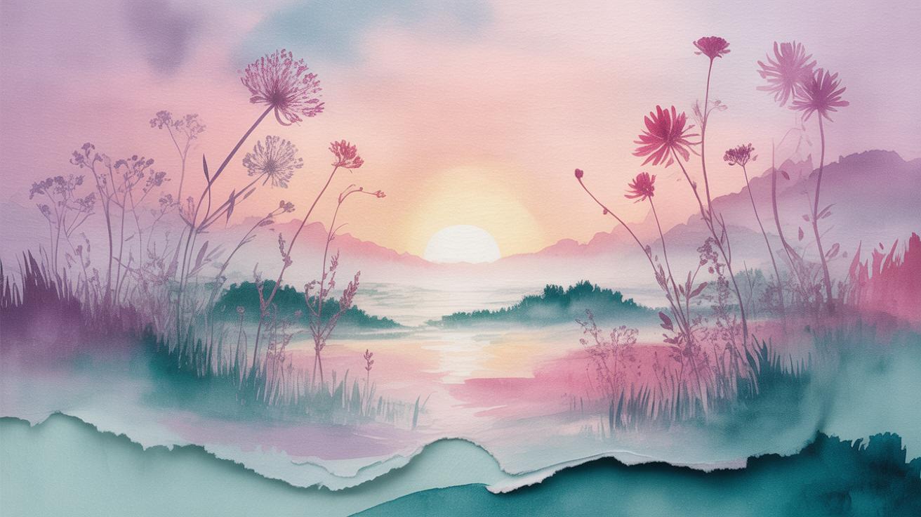
Color Palettes in Rococo Painting
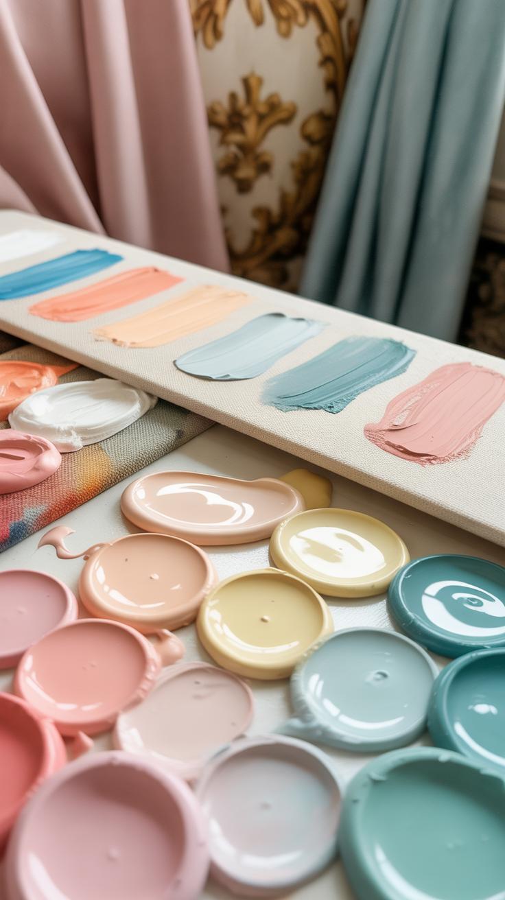
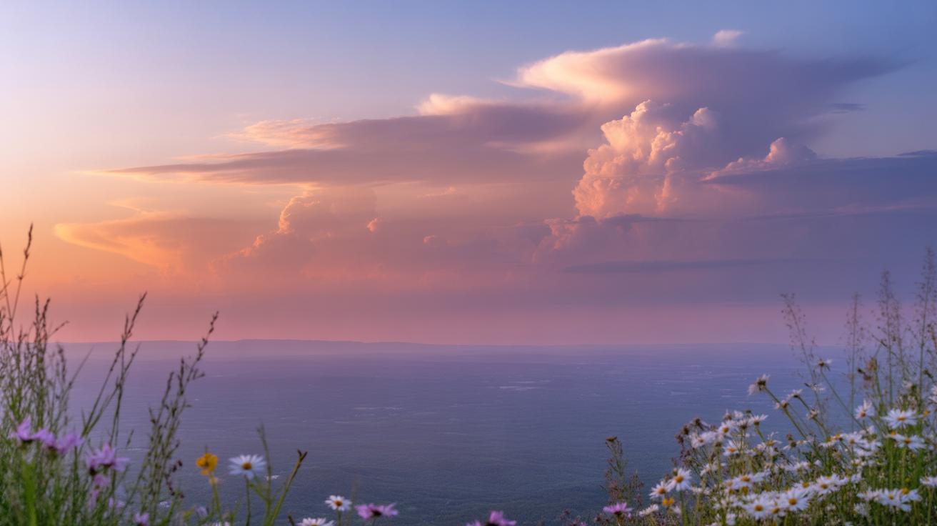
The Rococo style often feels light, playful, even airy. A big part of this stems from its color choices. Soft pastels dominate the scene here—think gentle pinks, powder blues, pale greens, and creamy yellows. These shades don’t shout for attention but invite the eye to linger, creating that delicate balance between subtlety and elegance.
When selecting colors, it’s tempting to pick the brightest pastels, but that can feel off. Instead, lean toward muted versions. For example:
- Blush pink mixed with a touch of beige softens the tone.
- Mint green diluted with white keeps it fresh but gentle.
- Light lavender paired cautiously with soft gray prevents it from being too sweet.
Mixing colors to achieve this softness can be a bit tricky. It’s not just about adding white; sometimes a hint of an earth tone or a complementary pastel balances the mix. For instance, a pale blue gains depth when a whisper of warm peach is introduced. Experimenting with tiny amounts can make a big difference.
Think about how colors interact. Pastels can clash if placed side by side without thought. You want combinations that feel natural, almost like they belong together. For example, a rose pink and soft green can work well because they sit opposite on the color wheel, but in Rococo, they’re used in muted tones to avoid harsh contrast.
At times, muted golds play a subtle supporting role, adding warmth and a slight shimmer, but they must be used sparingly to avoid overpowering the gentleness. So, while you want variety, the palette stays cohesive by sticking mostly within these soft, related hues.
Ask yourself: does this color invite touch, a gentle look, or a sense of whimsy? If yes, it’s probably on the right track for Rococo. This stage requires patience and a willingness to tweak repeatedly—color mixing might feel slower but yields results much closer to the authentic feel you’re aiming for.
Composing a Rococo Painting
When planning a Rococo painting, striking the right balance can be tricky. The style thrives on elegance but avoids the rigid precision of classical compositions. I think it helps to start by considering where you want the viewer’s eye to land first—usually a figure or a delicate detail. Then, arrange other elements so they lead naturally toward that focal point, without feeling forced. It’s almost like guiding a gentle dance through the canvas.
Another thing to keep in mind is that Rococo compositions often rely on asymmetry rather than strict balance. This generates movement and keeps the scene lively. So, instead of placing objects evenly on each side, try offsetting shapes or colors. Imagine a lush bouquet tipping slightly to one side or a figure lounging in an informal posture—that kind of subtle shift invites the viewer to explore more deeply.
Incorporating Rococo themes matters too. Love, nature, and playfulness can be shown with soft gestures, fluttering skirts, or fluttering birds. Think about how these elements interact with your composition. Could a shy smile or a teasing glance become your central story? These gentle narratives bring warmth without overwhelming the visual flow.
Don’t worry too much about perfection in layout. Sometimes the most charming paintings feel a bit spontaneous, like someone caught in a fleeting moment. So experiment with arrangements until you find that delicate balance—elegant, yet slightly unexpected.
Practicing Rococo Brushwork with StepbyStep Exercises
When working on Rococo brushwork, patience is your friend. Start by practicing slow, deliberate strokes using soft brushes, as the style demands lightness and intricate detail. One useful exercise is to try painting thin, curved lines that imitate the curls and swirls found in Rococo ornamentation. Focus on steady hand control; don’t rush the movement even if it feels unnatural at first.
Next, reproduce simple Rococo patterns. Begin with a single, flowing scroll design. Break it down into basic shapes—loops, leaf-like forms, and small flower buds. Paint each shape separately, paying attention to delicate shading to give volume and softness. Step-by-step copying helps internalize the rhythm of Rococo decoration and improves muscle memory for the brush.
Then, try small portrait elements which need a gentle touch. Practice painting eyes, rosy cheeks, and detailed lace collars using tiny brushes. Observe how subtle shifts in color and quick, light strokes build delicate textures. It might seem challenging to balance detail with softness, and that’s okay. Mistakes here often teach you how to control pressure better.
Overall, break down each element of Rococo brushwork into manageable steps. Repetition is key, but remember to pause and reflect on what each exercise reveals about your technique. Have you noticed how some strokes can feel rigid while others flow smoothly? Practicing with a mindful eye lets you slowly master those nuances.
Common Challenges and How to Overcome Them

Handling Fine Details
Working on tiny, delicate elements in Rococo painting often feels like a game of patience and precision. Beginners tend to struggle with shaky hands or brushes that seem just a bit too big for the task. One trick I found helpful is switching to a round, fine-tipped brush that’s slightly damp, not wet. It lets you glide smoothly without excess paint blobs. Also, resting your little finger or pinky against the palette or canvas can steady your hand. It’s like creating a small anchor, giving your brush more control.
Sometimes, stepping back too soon or rushing the detail can mess things up. So, pause regularly, zoom out mentally to check your progress. If a line feels off, don’t hesitate to lift the paint carefully with a clean brush or a damp cotton swab and try again. It’s better to redo gently than to force a trembling stroke into submission. These small adjustments helped me keep my focus without frustration taking over.
Blending Colors Smoothly
Blending those soft pastels and light shades without washing out details can be tricky. It’s easy to lose the crispness of your delicate motifs when the colors merge too much. What I often do is use thin layers and blend while the paint is still wet but not overly saturated. A fan brush or a soft, clean brush works well here to feather the edges gently.
Another useful approach is to limit your strokes to one direction or tiny circular motions—random scrubbing tends to muddle the colors. Experiment with glazing, too: build color gradually by applying transparent layers rather than mixing heavily on the palette. It keeps the surface alive and prevents the fine lines from disappearing. That said, sometimes I struggle to find the balance myself, so I end up undoing some blends more than once. Maybe it’s just part of the learning curve.
Bringing Your Rococo Painting to Life

Using Varnishes and Finishing Layers
Once you’ve captured the delicate details and swirling elegance typical of Rococo brushwork, the next step—applying varnish—can make a surprising difference. Varnishes serve a dual purpose: they protect your painting from dust, humidity, and minor abrasions, but they also deepen the colors, making them more luminous. It’s easy to overlook how a well-chosen finish can bring out the subtle tonal shifts in pastels or the glimmers in gold leaf accents.
Whether you prefer a glossy, satin, or matte finish, testing on a small area first often helps you avoid disappointment. For example, a soft matte varnish might keep your delicate brushwork soft and subtle, while a gloss could risk overpowering the fine details you worked so hard on. Personally, I find a satin varnish strikes a nice balance, allowing colors to pop without overwhelming the intricate textures.
Remember that finding the right varnish takes some experimentation. It’s natural to hesitate before coating your work, but trying different options on test pieces can build confidence. And the impact? It can feel like your painting is finally ready to breathe, to live in the light just as the masters intended.
Displaying Your Artwork with Style
How you frame and present your Rococo painting can change how viewers experience it. The ornate details of Rococo art often call for framing choices that complement but don’t overshadow the delicate brushwork. Think of subtle gilding or soft wood tones—nothing too heavy or dark that might clash with those light, airy compositions.
Simple frames with delicate carvings echo the period without stealing focus. Also, consider how lighting plays a role. Placing your piece where natural light hits gently, or using soft, adjustable gallery lighting, can reveal the subtle layers beneath the surface varnish. Oddly, too bright or harsh light might flatten the texture or saturate the colors unnaturally.
Do you prefer traditional frames, or has your décor nudged you toward a more minimalist approach? Both can work, but the idea is to keep the painting as the focal point. Sometimes even a floating frame adds an unexpected lightness that pairs well with Rococo’s playful elegance. Displaying your work isn’t just about protection — it’s part of telling the story your painting holds.
Conclusions
Mastering Rococo brushwork techniques allows you to create paintings filled with elegance and intricate detail. These techniques focus on delicate strokes, light colors, and fluid forms that come together to define Rococo’s unique style. By practicing these methods, you develop control and expressiveness in your art.
Your journey into Rococo painting will expand your skill set and deepen your appreciation for fine and detailed artwork. With patience and attention to detail, you’ll be able to produce pieces that reflect the aesthetic beauty and cultural richness of the Rococo tradition.


