Introduction
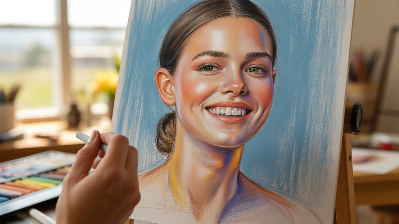
Portrait painting is about showing a real person, not just their face, but their character and feelings too. Soft pastels can help you do this in a beautiful and gentle way. This article will show you how to use pastels to make faces that feel alive and true to the person.
You’ll learn easy steps to start painting portraits with soft pastels. From choosing materials to capturing small details that show personality, this guide will help you paint portraits that don’t just look like the person but seem to tell their story.
Understanding Portrait Painting
What is Portrait Painting
Portrait painting goes beyond simply copying someone’s face. At its core, it’s about creating an image that represents a person’s presence in a moment—more than just their physical features. Artists paint portraits to preserve identity, to capture a unique individual among many. Sometimes it’s a way to remember a loved one, other times it’s a study of human nature itself. Portraits can be formal or casual, but they always try to speak to something deeper than skin and bone.
When you look at a portrait, you don’t just see a face; you see a person. The subtle lines, the way light hits their eyes, slight shifts in expression—all of these reveal something beyond the visible. Painting a portrait means trying to freeze that in time, even if it’s just for a fleeting instant.
Why Personality Matters
Capturing personality in a portrait is tricky, but it makes all the difference. A painting that misses this can feel lifeless—like a mask or a snapshot. Personality shows through posture, expression, moods in the eyes, even the way the colors and strokes interact. These details give the viewer a sense of who the subject really is.
Think about the portraits you connect with most. Isn’t it because you sense something unique about the person? It might be confidence or vulnerability, or maybe a hint of mischief. Without this, a portrait risks becoming just another picture. For many artists, including myself, discovering that personality hidden beneath the surface is the most rewarding—and sometimes frustrating—part of portrait painting.
What makes your portrait subjects tick? How do you bring those invisible traits to life with pastels? These questions define how portrait painting moves beyond the external and into the realm of the personal and the vital.
Choosing Your Materials
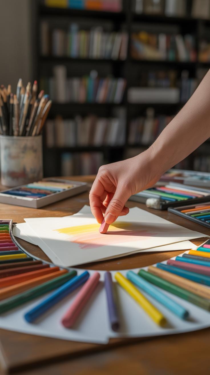
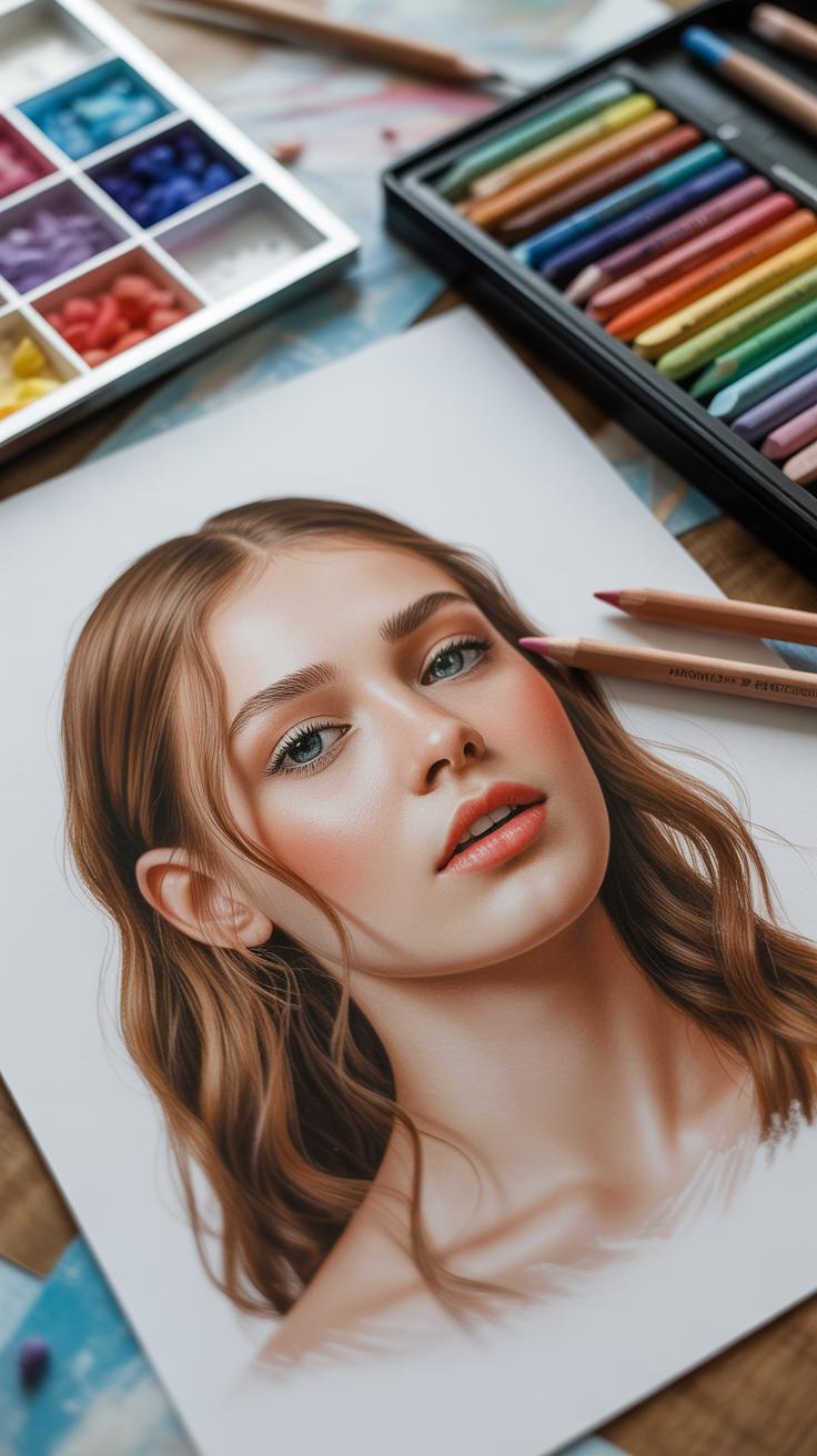
Selecting Soft Pastels
When picking soft pastels for portrait painting, you’ll notice a range from student-grade to professional quality. The difference? Pigment richness and blending ease. For portraits, soft pastels with high pigment concentration are usually better—they deliver vivid colors and subtle skin tones. But sometimes, softer pastels can be a bit crumbly, so you might want to try a few brands to find what feels right under your fingers.
Look for softer sticks that allow layering without too much smudging yet hold their shape long enough for fine details. Some pastels lean more chalky and dusty; others are creamy. Creamier ones might feel more like drawing than painting, which can be helpful or frustrating depending on your style.
Try to build a small set of neutral tones mixed with a few rich colors for shadows and highlights. It’s tempting to grab every bright pigment, but subtlety matters when portraying personality. I usually recommend starting modestly and expanding as you get comfortable.
Picking The Right Paper
Paper can make or break how your pastel portrait turns out. You want a surface with enough tooth to grab the pigment but not so rough it eats through your pastels too fast. Papers labeled for pastels usually have that texture, but even within those, variations can surprise you.
Many artists prefer pastel boards or textured paper like sanded pastel paper for layering. They hold pigment well, so you can build deep shadows and delicate midtones without constant reapplying. That said, surfaces with too much grit may complicate blending skin tones smoothly.
Colored pastel papers offer an interesting starting point. A mid-tone paper, for example, can act as the middle value in your portrait, saving you time on base layers. But it also means you must adjust how you apply both dark shadows and bright highlights carefully so they don’t overpower the base color.
Have you experimented with different papers yet? Sometimes, the best surface is simply the one that challenges you to rethink your approach and brings out unexpected nuances in your portraits.
Starting Your Portrait Drawing
Drawing Facial Shapes
Begin with simple shapes — this is where the foundation of your portrait starts. Most faces can be broken down into an oval or an egg-like shape, though no face is perfectly symmetrical. Try sketching lightly with a pastel pencil or a soft charcoal stick before going in heavier. Keep the proportions in mind; the face generally divides into three horizontal sections: from hairline to eyebrows, eyebrows to the bottom of the nose, and nose to chin. These guides create a rough layout but don’t take them as strict rules. I remember once deviating from these standards and finding a fresher, more engaging likeness in the process. The key is to stay loose and open to adjusting the shapes as you go.
Positioning the Features
Placing features is trickier than you might expect. Start by drawing a faint centerline down the face to help with alignment. The eyes usually sit halfway down the head, but their spacing differs for every person. You can use the eye width as a unit: the distance between the eyes should roughly equal one eye’s width. Then, place the nose — it typically sits just below the midpoint between the eyes and chin, though faces vary. The mouth falls about a third of the way between the nose and chin. Don’t be afraid to step back and assess if these placements feel natural; sometimes what looks correct in measurement doesn’t resonate with the subtle character you want. It’s these nuances that breathe life into a portrait before you even touch color.
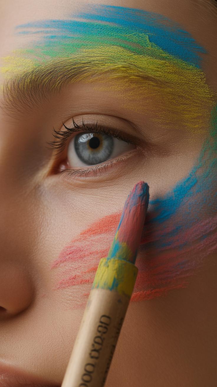
Layering Colors The Right Way
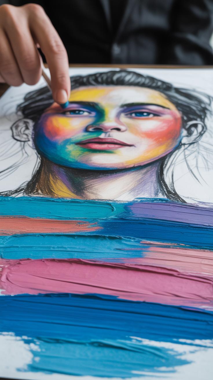
Base Layers
When you start applying colors with soft pastels, you want to think of the base layer as the foundation of your portrait’s skin tone and shadow. Don’t rush it. Begin with broad strokes that cover key areas—these are often warm midtones mixed with cooler shadows where the face curves or recedes. It’s tempting to add too much detail too soon, but trust me, letting the colors settle creates a better sense of depth later on.
Try lightly layering a few complementary colors rather than sticking to one flat tone. For example, a faint pink under a tan can warm the skin, while a touch of blue in shadowed areas adds realism without making the colors clash. Press softly—you want the paper’s texture to grab the pastel, not saturate it immediately. This way, you’ll have a subtle map of tones to build on.
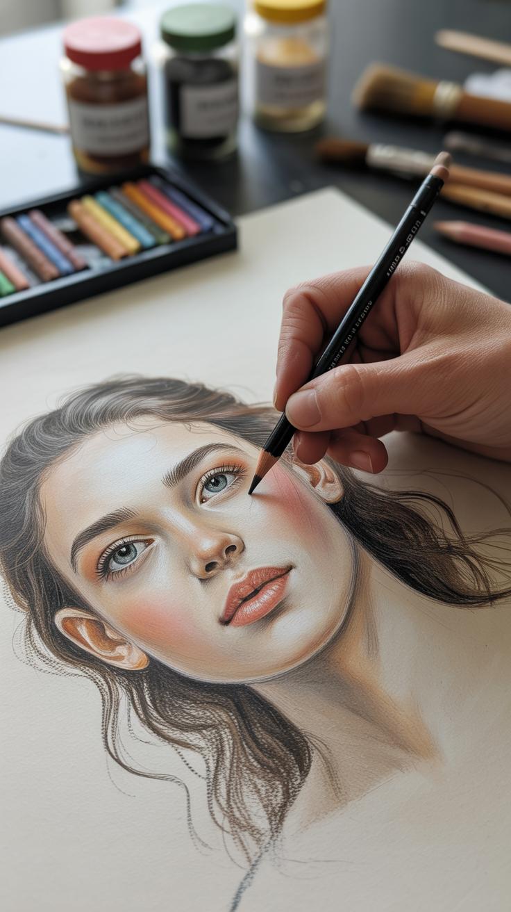
Adding Highlights and Details
After your base layer feels stable, it’s time to bring out the personality with highlights and details. These lighter strokes don’t just sit on top; they play against what you laid down first. Highlights should hit places like the bridge of the nose, cheekbones, and the corners of the eyes—areas that catch light naturally. A soft white or gentle peach can work wonders here.
Focus on small, deliberate marks for features—those tiny lines around the lips, the subtle creases on eyelids, or the shine on the iris. They pull viewers in, making the portrait feel alive. Don’t overdo it, though. If you add too many details too fast, the softness and vitality of the pastel might vanish beneath them.
One trick that’s helped me: step back frequently. See if your layers feel too flat or if they’re starting to breathe with character. Then, adjust—add more warmth, deepen shadows, or brighten a highlight here and there. Layering isn’t just about stacking colors; it’s a balance between control and letting the medium’s texture show through.
Using Blending to Soften Your Work
Blending is where soft pastels truly show their strength in portrait painting. When you smooth out edges and color transitions, you begin to create skin that feels alive rather than flat. You can use a variety of tools—your fingers, blending stumps, or even soft cloths. Each offers a distinct effect, so I suggest experimenting to see what fits your style and the mood of the portrait. Sometimes the subtle warmth of a fingertip is just what you need to gently merge a cheek’s highlight into shadow without jarring lines.
Effective blending means maintaining softness without washing away the details that bring character to a face. Here are some ways to blend colors softly:
- Start with light pressure when rubbing colors together to avoid muddy shades.
- Use small circular motions for gradual transitions, especially around the eyes or lips.
- Work layer by layer; blend only after applying each layer enough to hold a bit of texture.
- Try folding a paper stump for precise blending in tight areas like nostrils or hair strands.
Yet, it’s easy to overdo it. Over-blending tends to blur essential features and flattens the image. Sometimes, the portrait loses its spark, as if the personality got smudged along with the pastel. You want to avoid turning your carefully built layers and sharp contours into an indistinct haze.
To keep your portraits crisp, blend selectively. Allow harder edges to remain where the facial planes shift abruptly, like the jawline or the crease of the eyelid. That contrast between soft and sharp keeps the viewer’s eye engaged—a kind of push and pull that feels more real.
Capturing Expression With The Eyes
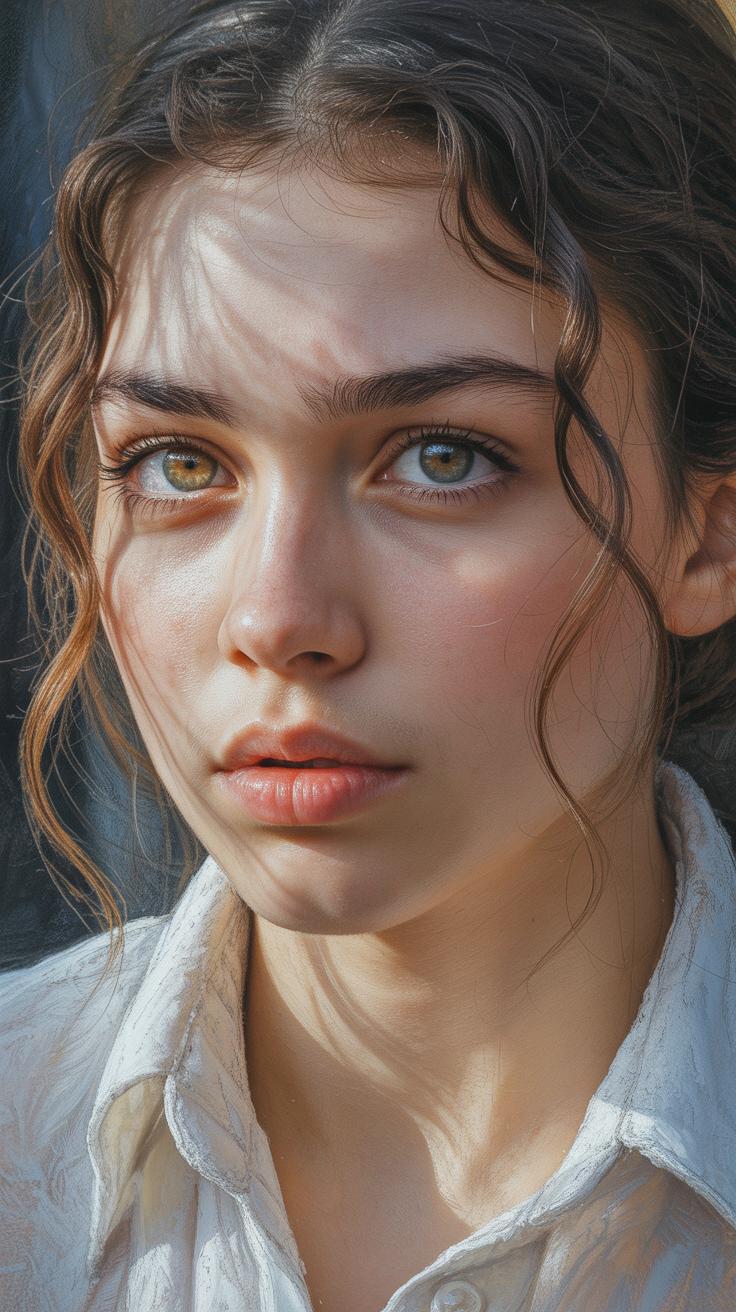
The eyes are often called the windows to the soul, and when it comes to portrait painting, they really do carry much of the personality and emotion of your subject. Soft pastels shine here because they allow you to layer colors delicately, building up subtle depth that brings eyes to life in a way other mediums might struggle with. But focusing on eyes isn’t just about getting the shape right; it’s about capturing the essence of a look that reveals feeling.
Drawing Realistic Eyes
Start by observing the eye closely—not just the iris, but the whites, shadows, and even the tiny veins visible in certain light. Sketch the shape lightly, remembering eyes aren’t perfect ovals; they vary with emotion and anatomy. Place highlights thoughtfully; they create the illusion of moisture and roundness.
- Begin with a light outline of the eyelid contours and iris.
- Map out the pupil and keep the iris edges slightly fuzzy to avoid a flat look.
- Use soft, layered strokes for eyelashes instead of harsh lines.
- Shade the sclera (the white part) with faint blues or greys to add dimension.
- Don’t forget the tear duct—its pinkish tone gives backstory to the eye.
This process isn’t always linear. Sometimes the eye looks off, or too stylized. You might adjust several times, blending a bit, lifting gently with pastel shavings, and then layering again. Eyes come alive when you treat small imperfections as part of their story.
Showing Emotion Through Eyes
It’s fascinating how tiny shifts make a huge difference. Tilted eyebrows, half-closed lids, or a widened gaze can express curiosity, sadness, or surprise without a word spoken. Soft pastels lend themselves well to these subtleties because you can smudge lightly for softer edges or sharpen lines to add tension.
Experiment with these:
- A slight squint can suggest concentration or suspicion.
- Raised inner brows often show concern or sadness.
- Bright, open eyes appeal to joy or innocence.
- Darker shadows beneath the eyes may hint at tiredness or worry.
Don’t shy away from uncertainty here. Sometimes a direct gaze feels honest, but other times, a sidelong glance tells a richer story. The right expression often emerges from mixing the expected with a touch of ambiguity. And honestly, as someone who’s wrestled with this part for ages, I find it’s worth revisiting eyes multiple times before the feeling just clicks.
Adding Final Details and Textures
When you reach the final stage of your portrait, those little tweaks can make a surprising difference. Fine lines, such as delicate hair strands or subtle facial wrinkles, bring a level of intimacy that often feels missing in earlier layers. You might find yourself switching between pastel sticks and pencils here—each tool serves a purpose. Pastel pencils let you draw precise, sharp strokes for single hairs or tiny creases. Meanwhile, sticks can be softly sharpened to add slightly thicker strands or texture variations.
Try layering these details carefully. Don’t rush to cover every part; instead, focus on areas that catch light or naturally stand out, like the edges of hair or the fine lines around eyes and lips. Sometimes, less is more—too many lines may clutter the face rather than enrich it.
The texture of skin and clothing deserves attention too. Skin can be hinted at with gentle, short strokes that follow the contours of the face, suggesting pores or slight unevenness. For fabric, the direction and pressure of your pastel strokes help imply different materials—soft silk might need smooth, wispy motions, but a coarse sweater benefits from rough, broken strokes that mimic weave or knit.
- Use fine pastel pencils for hair strands and facial details.
- Layer strokes gradually to avoid overdoing lines.
- Follow natural contours for skin texture with short, light strokes.
- Match fabric texture by adjusting stroke pressure and direction.
- Focus detail where light naturally highlights features.
I sometimes notice how these final touches challenge me to balance finesse with restraint. It’s tricky not to overwork the piece at this point, but the right small details give your portrait a sense of life that really pulls the viewer in. Have you noticed how a simple stray hair or a faint wrinkle can suddenly tell a story on its own?
Preserving and Displaying Your Portrait
Fixatives and Protection
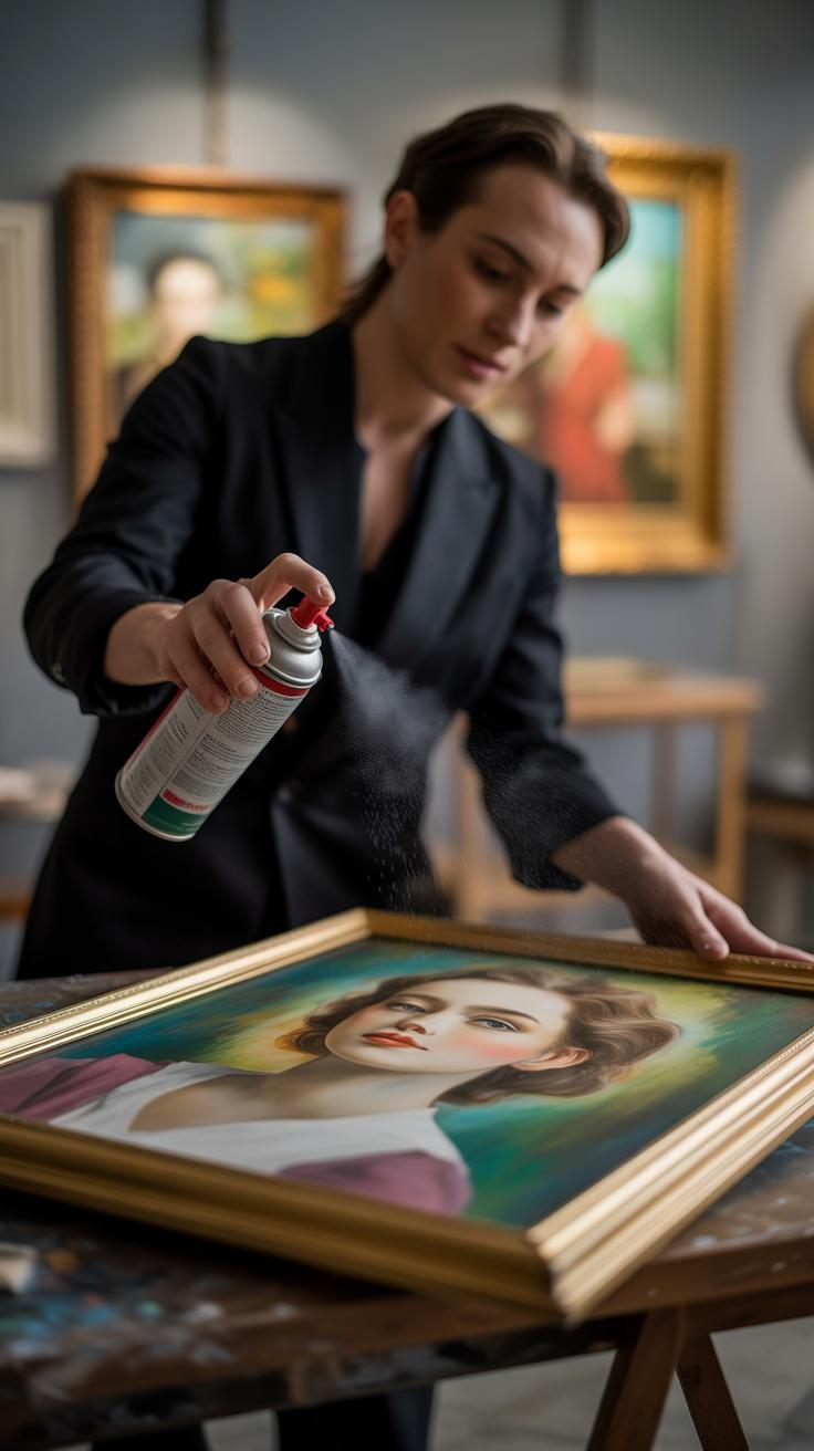
You’ve put so much effort into capturing personality with soft pastels, so protecting that work feels essential. Using fixatives can help keep the pigment in place without dulling the colors. But, here’s the tricky part—if you apply too much, your vibrant hues might lose their life. I’ve learned that spraying fixative lightly from a distance—about 12-18 inches away—works best. Multiple thin layers instead of one thick one. It’s a bit like waiting between coats of paint; patience pays off.
Also, try fixatives on a test piece first. Different brands react differently, so a bit of trial could save you frustration. I find workable fixatives helpful when I want to keep working on a portrait, but for finished pieces, final fixatives provide better long-term security. Just remember, fixatives aren’t magic—they help reduce smudging, but soft pastel can remain delicate.
Framing and Display Ideas
Framing your pastel portrait is more than just protection; it can highlight your subject’s character. Using a frame with glass is almost a must to shield the pastels from dust and touch. Some artists prefer non-reflective glass to avoid glare that steals subtle details.
One thing I’ve noticed is the choice of matting. Cream or off-white mats tend to make pastel colors pop more than pure white or darker tones. And let the mat be wide enough; tight margins can feel cramped and distract from the portrait’s expression.
Lighting is another consideration that often gets overlooked. Soft, natural light near a window can beautifully reveal pastel’s texture. But direct sunlight risks fading colors over time. Instead, try diffused LED lights angled to reduce shadows and glare. The goal is to invite viewers close without overwhelming the delicate pigment.
Have you experimented with displaying your portraits in different spaces? Sometimes, just moving a piece near complementary colors in a room changes how alive it feels. Maybe your portrait even benefits from occasional rotation, so it never feels static or forgotten.
Conclusions
Painting portraits with soft pastels takes practice and patience. You’ll find that soft colors and shades can capture the kind of feelings and expression that photos often miss. Every stroke counts in showing who a person really is.
Try these pastel techniques in your next portrait project. Notice how they help you see and show the unique spirit in the faces you paint. With these steps, capturing personality in your portraits will become a rewarding experience.


