Introduction
Ink drawing is a traditional and precise art form where artists use ink to create detailed images on paper or other surfaces. This technique allows for strong lines, contrasts, and textures which make the artwork vivid and clear. If you want to improve your drawing skills or create striking artworks, mastering ink drawing techniques can help you achieve that.
In this article, you will find practical guidance on ink drawing tools, different styles, and methods. You will learn how to prepare your materials, choose the right techniques, and explore examples that demonstrate how ink drawing can be applied effectively. This will give you a clear path to create your own impressive ink art pieces.
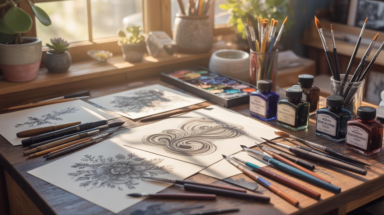
Essential Ink Drawing Tools
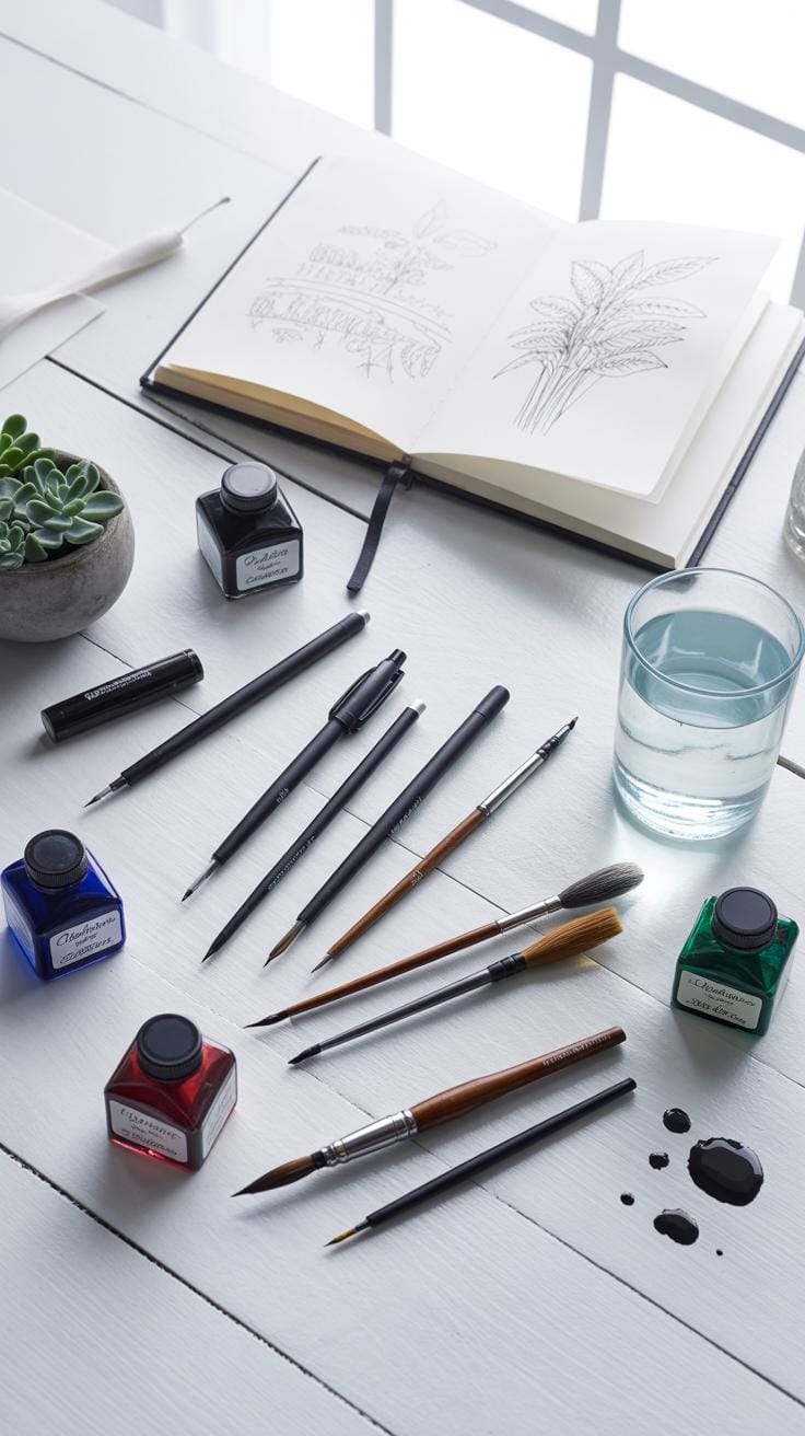
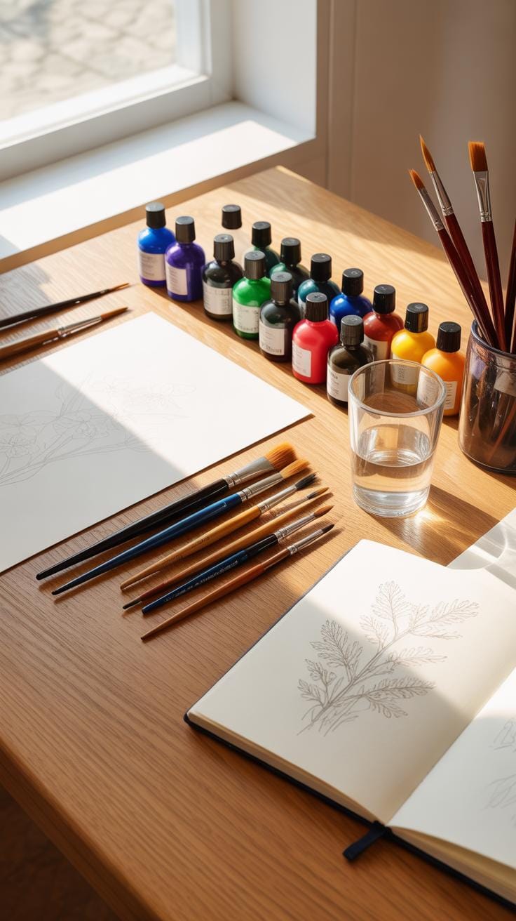
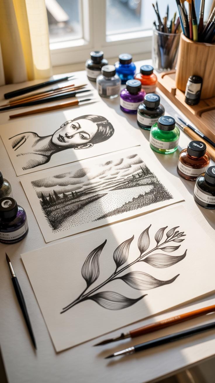
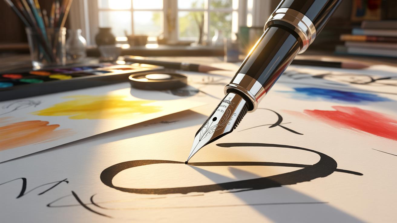
When starting with ink drawing, choosing the right materials can feel overwhelming. There’s more to it than just grabbing a pen and paper. The type of ink you use can change your entire piece. India ink is probably the most common—its rich black color and permanence make it a favorite. But acrylic ink, which is water-resistant and has a bit of a sheen, can offer different effects. You might prefer one over the other depending on whether you want a matte or glossy finish, or if layering is part of your plan.
For pens, there’s quite a range: dip pens offer control and variety in line thickness but demand some skill and patience. Fountain pens flow smoothly and feel more intuitive, yet might limit you if you want finer details. Brush pens, on the other hand, bring a dynamic, expressive quality with their flexible tips—perfect if you enjoy varied stroke widths without switching tools constantly.
Brushes themselves add another layer of nuance. A fine-tipped sable brush will deliver delicate lines, while a flat synthetic brush lays down bold washes. Your choice of brush affects line fluidity and texture more than you might expect. Paper choice completes the setup. For strong ink, smooth hot-pressed paper lets lines stay sharp, but cold-pressed papers add texture, sometimes enhancing a more spontaneous style.
Think about what effect you want. Do you want crisp, detailed drawings or loose, lively sketches? Your tools should support that. I’ve noticed that switching from dip pen to brush pen nearly changed the way I approach shading altogether. Sometimes, it’s not just a matter of preference—it’s about what will push your art forward, even if it takes a moment to adjust.
Techniques For Line Drawing
Lines are the backbone of any ink drawing, but how you use them decides everything. Line weight—how thick or thin your lines are—can dramatically change what your drawing communicates. Think about the bold outlines in a comic versus the delicate lines in a botanical sketch. Both serve different purposes. Consistency in line weight helps create uniformity, but variation adds interest and life. It’s this balance that often feels tricky to master.
Controlling line weight comes down to pen pressure and speed. Press harder, and the line thickens; slow down, and you get a darker, more deliberate stroke. Speed can affect the texture too—a fast line might feel loose or sketchy, while a slow one appears controlled and smooth. Try working on small doodles, just focusing on pushing and pulling your pen to see what happens to the lines.

Lines also do more than outline shapes—they show form and texture. Curved lines can suggest volume by following an object’s contours, while short, varied strokes mimic roughness or subtle shading. For instance, crossing lines tightly layered can make shadows, while feathered lines suggest softer edges. Sometimes, blending these approaches creates a more believable surface, though that depends on how subtle or bold you want your drawing to feel.
Have you noticed how some artists use almost a scribble yet still convey depth? That comes from confident line variation. So, wouldn’t it be worth experimenting with how your own lines shift, rather than sticking to one style? It might be a bit messy at first, but it often reveals unexpected textures and moods in your work.
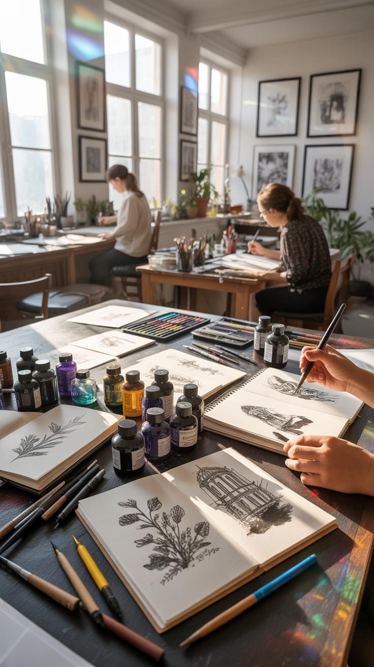
Using Crosshatching And Stippling
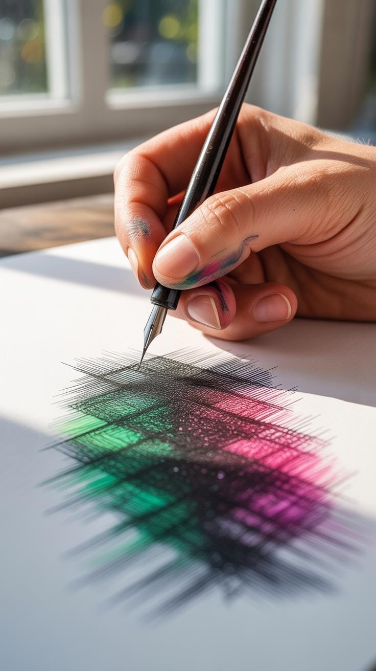
When you move beyond simple outlines, crosshatching and stippling become tools that let you build tones and textures with ink. Crosshatching uses layers of lines, which you can place at different angles and distances to suggest shadow and volume. Stippling, on the other hand, relies on dots scattered in varying densities to create gradients and surface details.
Crosshatching isn’t just about drawing lines parallel to each other. Think of it as layering—lines crisscross in several directions. When the lines are close and thick, you get darker shadows. When they’re looser, the effect lightens. You might find that experimenting helps you see which angles create a fuller sense of depth. Sometimes, overlapping three or four sets of lines can be overwhelming, but other times, it makes the form more convincing.
Stippling creates textures that feel more organic. Dots packed tightly produce shadows; spread out, they offer light tones. The tricky part is patience. It takes time to build up shading through dots, and your hand might cramp if you’re not careful. But the payoff can be worth it—these tiny dots can mimic the roughness of fabric, petals, or even weathered stone in ways lines can’t. You might wonder, does the way you space dots really matter? Yes, it shapes how smooth or grainy the surface looks, and sometimes that’s exactly what your drawing needs.
Both techniques challenge you to think about value without color. They require controlled but expressive hand movements. Maybe you’ll find one more intuitive than the other, or use them in combination. Either way, practicing with crosshatching and stippling lets your ink drawings leap from flat outlines to something richer and more tactile.
Ink Drawing Preparation Steps
Before your ink meets paper, there are a few steps you might want to consider for a smoother drawing experience. Starting with a light pencil sketch can be a good way to map out your subject—think of it as a rough guide rather than a detailed blueprint. Keeping marks soft helps them fade under the ink or erase later without much fuss. I often find myself pressing too hard at first and then regretting it, so try to resist that urge.
Choosing the right paper isn’t just about texture or thickness; it’s also about how your ink behaves on it. Rough surfaces might catch your pen tip unexpectedly, while very smooth sheets could cause ink to smear if it takes longer to dry. It’s worth testing a few scraps if you can—something I don’t always do, but it does save headaches.
Setting up your workspace for drawing is more than just neatness. Good lighting makes a huge difference—you want to avoid shadows that trick your eyes or strain your focus. Natural light is great, but if that’s not an option, a cool-toned desk lamp positioned to the side usually works. Arrange your brushes, pens, and ink bottles within easy reach so you don’t break your flow hunting for tools. I find a cluttered desk distracts me, but others might thrive in chaos. Think about what suits you.
- Lightly sketch your idea with a soft pencil, avoiding heavy lines
- Select paper with a texture and weight suited to your ink and nib
- Organize tools where they’re easily accessible
- Ensure good lighting to reduce eye strain and shadows
Have you noticed how these small preparations can change your entire drawing process? Sometimes, the difference is subtle but enough to keep you focused longer without irritation. What part of your prep routine do you overlook, maybe thinking it doesn’t matter much—only to realize later it does?
Comparing Ink Drawing Styles
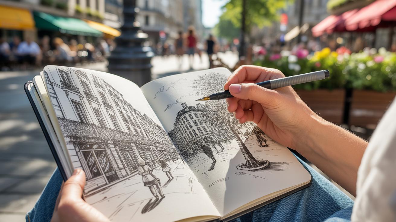
Ink drawing stretches across cultures and centuries, and comparing styles reveals how different approaches shape what we see on paper. Traditional Asian ink painting often focuses on fluid brushstrokes and varying shades created by ink washes. These strokes aren’t just lines; they carry meaning, mood, and a rhythm that feels almost alive. The technique leans heavily on spontaneity and the play between wet and dry ink, inviting subtle gradations and soft edges.
On the other hand, Western technical drawing emphasizes precision and clarity. Lines are clean, sharp, and methodical, designed to communicate exact dimensions or forms. It’s less about mood and more about information—every mark has a purpose. You might notice rigid line weights and an absence of the kind of softness Asian ink wash celebrates. Visual effects are controlled, often aiming for readability over emotional impact.
Switching gears, modern comic artists mix these traditions with their own twists. They use ink for everything—from crisp outlines to textured shadows. The lines vary dramatically in thickness, creating a sense of movement or depth. Tools range from traditional brushes to technical pens and even digital styluses. The goal isn’t just representation but storytelling through visual energy. Comic inking can feel both deliberate and free, oscillating between uniform coverage and explosive bursts of texture.
Thinking about these styles together, you might wonder: which ink tradition resonates with you? Do you prefer the expressive brush flows of Asian ink wash, the clean exactness of Western line art, or the bold contrasts of comic inking? Maybe you’re drawn to a mix—a blend that fits your artistic voice.
Common Mistakes And How To Fix Them

Ink drawing can be unforgiving. One slip and you might face smudges, uneven lines, or stubborn ink blotches that seem impossible to remove. These issues are common—almost every artist hits them at some point. The key is learning how to prevent and address them without losing your momentum or confidence.
Preventing Ink Smudges
Smudging is annoying. You finish a delicate line, only to accidentally drag your hand across the wet ink. To avoid this, give your work plenty of drying time. Sometimes I’ve been impatient, glancing back too soon, and regretted it. Try setting your piece aside, or use a blotter sheet to protect already inked areas.
Hand placement also matters—a simple trick is to use a piece of scrap paper under your palm as a barrier. It helps keep your hand steady and away from wet ink. Using fixatives can lock your work in place but test them on a spare page first to see how your ink responds. Some fixatives change the surface gloss or slightly alter the ink’s color. It’s a bit of trial and error, really.
Correcting Uneven Or Broken Lines
Lines that are broken, shaky, or too thick can ruin a drawing’s flow. But don’t rush to start over. Sometimes, you can turn these ‘mistakes’ into textures or interesting details. For example, broken lines can suggest roughness or movement if you let them be. If they truly distract, consider layering over them once dry. You can retrace the line carefully to even it out or add shading nearby to mask imperfections.
Sometimes, I use white gel pens or correction fluid to carefully clean up spots where the ink bled too much or made an unwanted blotch. It’s tricky to do this without calling attention to corrections, but with a steady hand, it’s possible. What’s more, embracing these small flaws might make your work feel more personal—after all, perfect lines aren’t everything.
Step By Step Ink Drawing Process
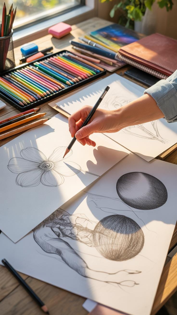
Planning And Sketching Your Drawing
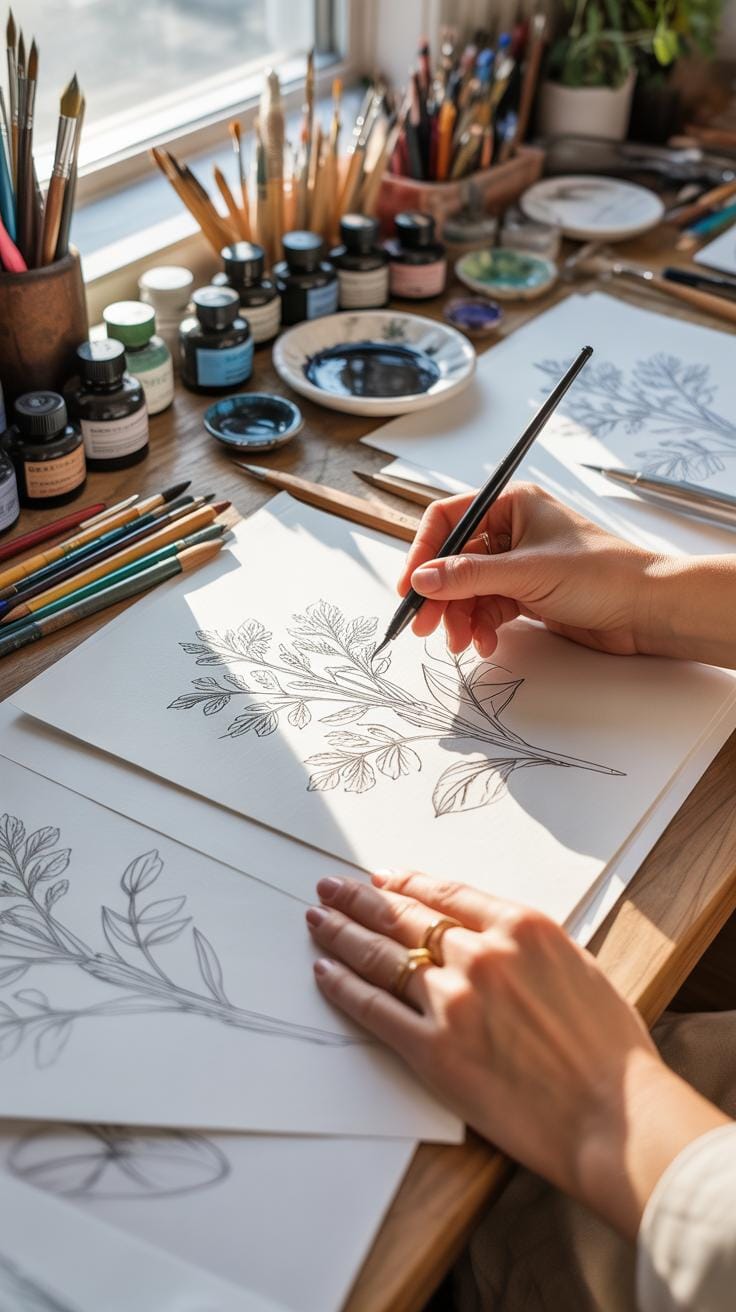
Choosing what to draw can be trickier than it seems. Sometimes, a subject calls to you—an object, a person, a scene—but other times, you just have to push yourself to pick something manageable. Start with something simple if you’re unsure. It’s easier to get a feel for the process that way.
Once you have your subject, sketch lightly—very lightly. Use a pencil with a soft touch to avoid heavy lines that are hard to erase or that might show through your ink later. I tend to keep my sketches minimal and loose, just enough to capture the basic shapes and proportions. You don’t need a perfect drawing here; the goal is to create a roadmap for your inking.
Before you dip your pen in ink, check your work. Look for any awkward sizes or misplaced details in your sketch that could throw off your final drawing. Make corrections at this stage, even if it feels tedious. The cleaner your sketch, the more confident you’ll feel when you start inking. Then, prepare your workspace—good lighting, a steady hand, and the right tools within reach. You don’t want to be fumbling halfway through because you forgot something.
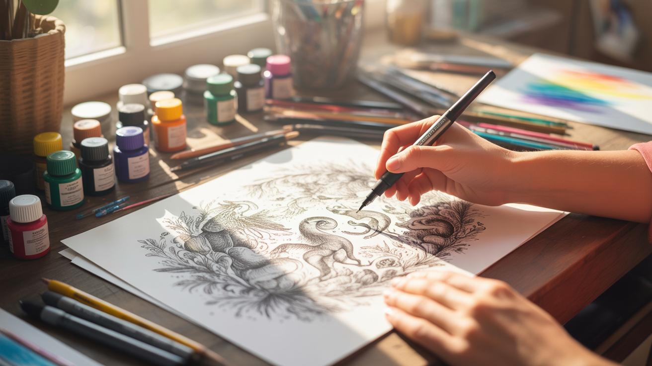
Inking And Adding Details
Start inking with the main outlines first. Focus on capturing the strongest shapes before moving on to smaller elements. It can be tempting to jump into details right away, but if you lock down the big forms first, the rest falls into place more naturally.
Use different pen sizes to vary line weight. Thicker lines can suggest shadows or edges closer to the viewer, while thinner lines give delicate texture or distant forms. Don’t try to make every line perfectly smooth—little imperfections actually add character and even a sense of motion.
Once the outlines feel solid, begin shading. Hatching and cross-hatching are your best friends here. Experiment with the density of lines to create areas of light and shadow, but avoid packing too many lines in one spot — it can look muddy quite fast. I sometimes find myself going back and forth; adding some shading, then maybe simplifying some parts again because it felt overdone.
Last, step back and look at the drawing as a whole. Add final touches sparingly to enhance contrast or texture. These finishing details might be tiny dots, short hatches, or just a bolder line here and there. The key is balance. Too much and the drawing feels cluttered; too little and it lacks life.
Does your drawing pull you in, or does it feel flat? That’s always a good question to ask before calling it done.
Examples Of Ink Drawing Applications
Ink Drawing In Fine Art
Ink has a unique ability to capture detail and emotion, which is why many artists turn to it for fine art. Portraits created with ink can express subtle moods through lines and shading. You might notice how some artists leverage pure black ink to create intense contrasts that bring faces to life, while others use delicate cross-hatching to suggest softness or shadow.
The unpredictability of ink, with its fluidity and permanence, forces artists to be thoughtful with each stroke. Some artists even embrace this unpredictability, using it to add a raw energy or immediacy to their work. It’s not just portraits; landscapes and abstract pieces also benefit from ink’s versatility. You might find yourself experimenting after seeing how much depth and texture ink can add, even without color.
Using Ink For Comics And Illustration
In comics and illustration, ink plays a key role in defining characters and setting moods. It’s the backbone of storytelling here, where clarity and expression matter a lot. Every line counts. Whether outlining a figure or adding shadow, the choices in inking can influence how a story feels—dramatic, playful, dark, or lighthearted.
Commercial art leans on ink for its crispness and reproducibility. The bold, clean lines typical in comic art often come alive because of how ink interacts with paper. Story pacing and dynamism often depend on the artist’s skill with inking tools—thick or thin lines can guide the reader’s eye or create tension.
While digital tools have become common, many artists prefer traditional ink for its tactile quality. You might wonder why some modern illustrators still choose ink pens or brushes—often, it’s about control and the unexpected little imperfections that bring a piece character.
Conclusions
Ink drawing requires patience and practice but can produce remarkable results with the right techniques. By selecting proper tools and methods, you can create strong lines and delicate shading that bring your ideas to life. Your attention to detail will increase as you explore various styles like cross-hatching and stippling.
Applying the guidance in this article will improve your drawing foundation and expand your creative options. Remember to experiment regularly and observe real examples to enhance your skills. With commitment, your ink drawings will grow richer and more sophisticated, reflecting your growing expertise.