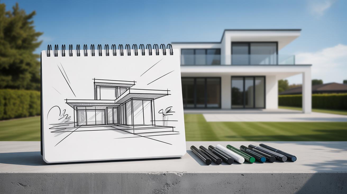
Introduction
House sketches are fundamental in creating realistic residential artworks. Whether you are an aspiring artist or a hobbyist, mastering the basics of house sketching sets the foundation for producing detailed and lifelike drawings. A well-executed house sketch captures the essence of architecture and brings your artistic vision to life.
This article explores the essentials of house sketching, guiding you from initial layout concepts to advanced detailing techniques. Through clear instructions, practical tips, and easy-to-follow steps, you will learn how to craft realistic and engaging house sketches that enhance your artistic portfolio.
Introduction to House Sketching
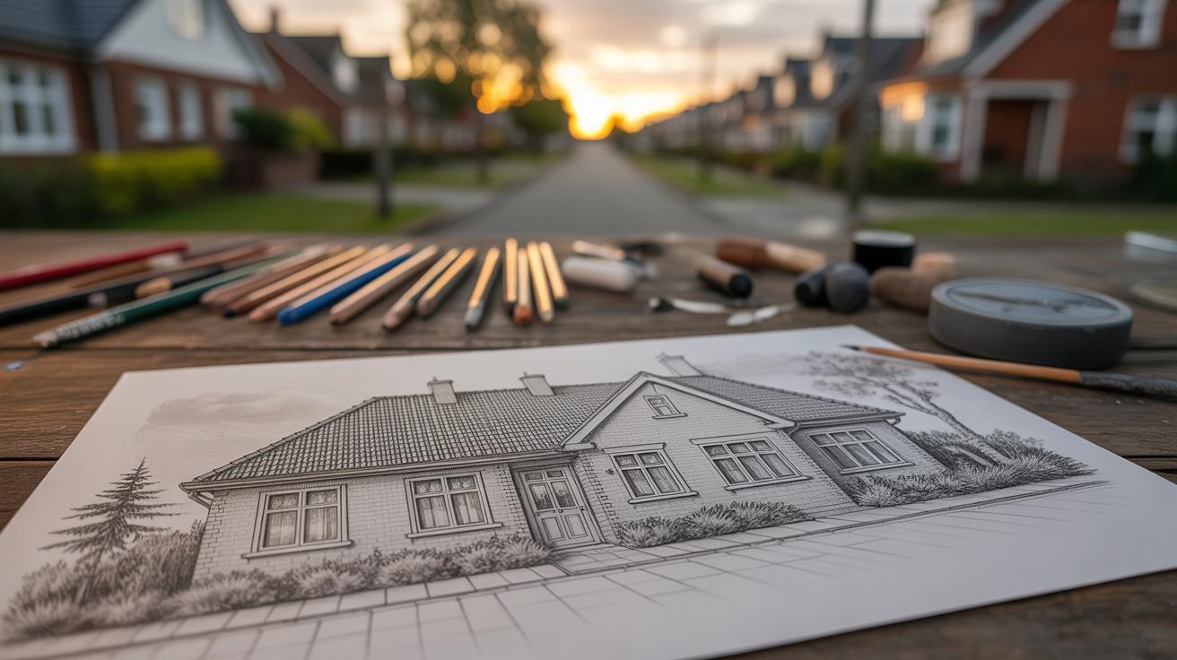
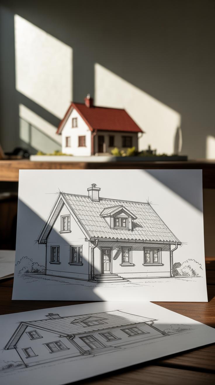
House sketching is the initial step of visually capturing the essence of a residential structure on paper. It involves creating a basic, often loose, drawing of a house’s form, layout, and key features. This practice is crucial when aiming for realism in residential artworks because it sets the groundwork for accurate proportions, perspective, and detail later on.

For artists, learning how to sketch houses means gaining the skill to truly see beyond the facade—to understand shape, scale, and space. It’s not just drawing walls; it’s decoding the story a building tells through its angles and shadows. This kind of observation sharpens your eye and improves your ability to represent any architectural subject honestly.
The Purpose of House Sketches
House sketches often act as the blueprint for detailed architectural drawings or finished artworks. Think of them as the skeleton before flesh. They allow you to explore ideas, adjust proportions, and try out perspectives without committing to intricate details right away. This flexibility is key in visualizing spaces and how a design fits within its environment.
By sketching, you create a visual reference that can evolve into more precise representations. It’s where imagination and reality meet—a necessary step to conceptualize volume, light, and structure before adding texture and color. Skipping this phase usually leads to inaccuracies, leaving artworks that feel off or flat.
Tools Needed for House Sketching
When starting with house sketches, keep your toolkit simple but effective. Here are some basics that I find handy:
- Pencils in varying hardness (2B for soft lines, HB for general sketching, and 4H for fine, light lines)
- An eraser, preferably a kneaded one for gentle corrections
- A ruler or straightedge for drawing clean, straight lines—essential for architectural subjects
- A sketchbook with good quality paper that can handle multiple erasures and light washes
Choosing your tools can influence how comfortably you sketch. Softer pencils yield expressive marks but can smudge easily, while harder ones give precision but feel less fluid. Try a mix to find what feels right. For me, a well-used HB pencil and a reliable ruler are always close by—that balance between control and ease matters more than perfect tools.
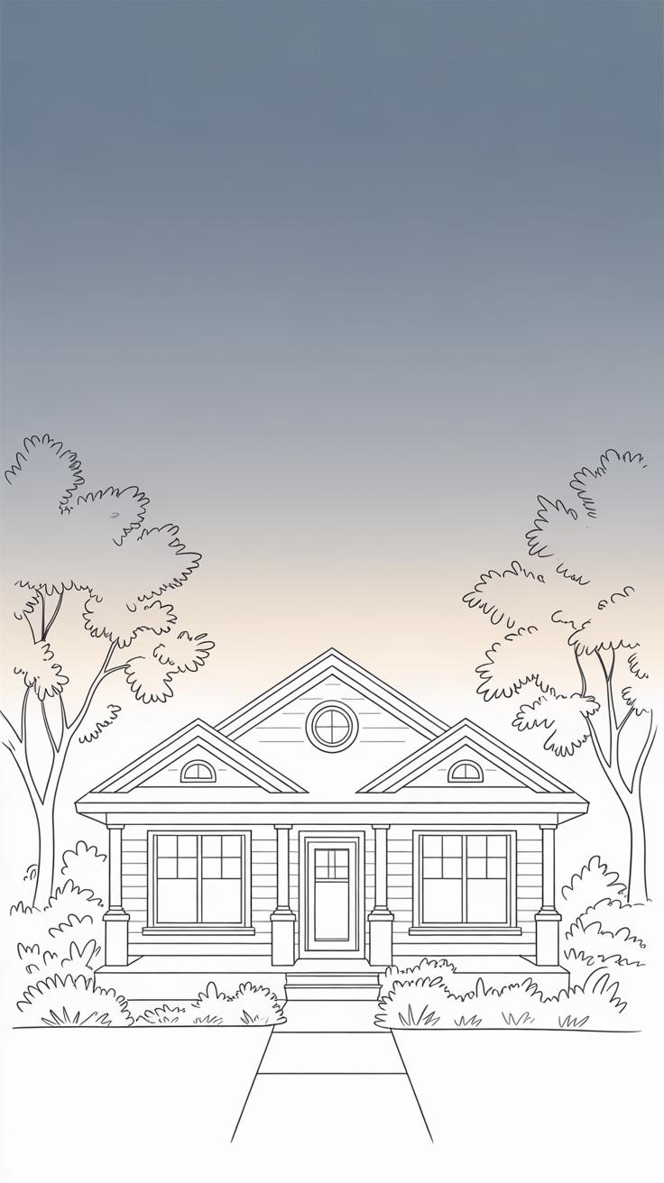
Understanding Basic Shapes and Forms

When you look at a house, it’s easy to get overwhelmed by all the details. But if you step back and try to see it differently, you’ll notice something simpler—houses are basically made up of basic shapes. This idea is key. Before you dive into drawing, try to spot the cubes, rectangles, and triangles hidden in the structure. These are your building blocks.
Think about the walls: they’re often like big rectangles or cubes. Roofs usually come down to triangles or slanted rectangles. Windows can be seen as smaller rectangles or squares. Breaking down a complex object—like a house—into these shapes helps your hand move confidently instead of hesitating over details.
Using Cubes, Rectangles, and Triangles
Sketching a house isn’t about drawing every shingle or brick upfront. Start with cubes and rectangles for the main body. Imagine the front facade as a large cube or rectangular prism. From there, add other rectangles to suggest extensions, porches, or chimneys.
Next, rooftops – mostly triangles or slanted rectangles. These define the silhouette, the shape that makes a house recognizable. Windows and doors fit neatly into rectangles or squares, placed carefully on walls. Sometimes, you may notice odd shapes, but they’re always variations or combinations of these basics.
Sketching the Basic Layout
Once you’ve identified the shapes, arrange them loosely on your paper. This doesn’t have to be tight or precise right away. It’s more like a playground for your eyes where you test positioning and size relationships.
- Start with a big rectangle or cube for the main structure.
- Add smaller rectangles for side walls or annexes.
- Place triangles or sloped rectangles on top for roofs.
- Sketch rectangles for windows and doors, noting their alignment and spacing.
This basic layout sets the stage. Don’t fret about lines being perfect here—they can be rough, light, or even a little messy. The idea is to capture the essence before refining. I find it helpful to step back at this point and ask myself: Does this feel like a house? Are the parts roughly in the right places? Sometimes, you’ll realize a shape is too big or a roof too steep. That’s okay—it’s part of the process.
Learning Perspective for Depth
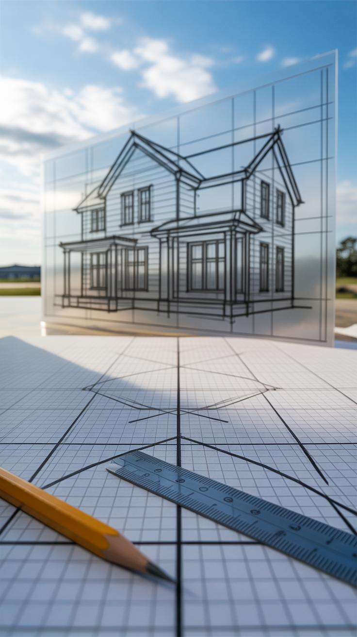
Perspective is what gives your house sketches a sense of depth and realism. Without it, drawings tend to look flat, almost like cut-outs on paper. It’s tricky at first but once you grasp the basics, your sketches can pop right off the page, creating a believable space where viewers feel they could walk around the house.
Think of perspective as a set of rules that guide how objects appear smaller as they recede into the distance. It’s all about your viewpoint and the horizon line—where the sky meets the ground in your drawing. The concept might seem technical, but it’s really about how to organize shapes so they don’t just sit there awkwardly.
One-Point Perspective
One-point perspective is the simplest type. Imagine you’re looking directly at the front of a house. You pick a single vanishing point right on the horizon line. All parallel lines that lead away from you converge there.
When you sketch houses this way, you start by drawing the front face square on, then extend lines back to that vanishing point. Walls, roof edges, sidewalks—they all shrink toward the same spot. It’s great if your subject faces you dead-on, and it helps organize the drawing without too much fuss.
Using one-point perspective often feels controlled but also a bit rigid. Rooms and buildings can seem boxy, but that’s partly the style—it forces clarity. It’s also easier to manage when you’re just starting out or want quick sketches that feel grounded.
Two-Point Perspective
This style kicks up the complexity. Instead of facing the house straight ahead, you look at it from a corner—meaning two sides are visible. Here, you use two vanishing points placed far apart on the horizon line.
Each side of the house leads to a different point. So, lines on the left edges disappear toward one vanishing point, while the right edges head to the other. This way, the house bends into space, feeling more natural and dynamic.
Two-point perspective is trickier but also more flexible. It captures how we often see buildings in real life—not just flat fronts but corners, angles, and depth. You might find your sketches look more interesting but require more thought. It’s not always perfect, though—sometimes the angles throw off proportions if you rush through.
Both perspectives are tools—you’ll likely move between them depending on your sketch’s goal. Maybe start with one-point for practice, then experiment with two-point to add more life and dimension. Question yourself: how does my viewpoint influence the lines I draw? That’s where perspective starts making sense.
Adding Architectural Details
Windows, doors, and rooflines are not just structural elements; they breathe life into your house sketches. These details give your drawing personality and make it feel tangible. Sketching windows and doors means more than just drawing rectangles on a wall. You have to think about their placement, size, and how they sit within the perspective of the building. For example, a window farther away will look smaller and slightly skewed—watch those proportions carefully.
When drawing doors, consider their height relative to the house’s scale. A too-tall door might look awkward; too short, and it loses functionality. Don’t feel tied to perfect symmetry—sometimes uneven placements or slightly varied sizes add charm, especially in older or less formal houses.
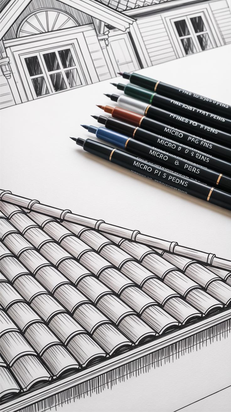
Rooflines shape the silhouette and influence the overall character. Common roof types you might encounter include gabled, hipped, and flat roofs. Each has a distinct form and demands a different approach when sketching. Gabled roofs, with their triangular peaks, are probably the easiest to start with. Rendering shingles or tiles calls for subtle repetition—but avoid mechanical patterns. Instead, try small irregularities to make the texture believable. Remember, shadows between shingles or slight curvature can sell the idea of depth and material.
Sometimes, I find myself focusing too much on exact details and forgetting to keep a natural, imperfect quality that feels more alive. Maybe you’ve noticed that, too. Realism doesn’t mean flawless—it’s the small quirks and details that catch the eye and hold attention.
Rendering Textures and Materials
When sketching houses, the materials making up the structure bring the drawing to life. You want viewers to almost feel the roughness of a brick wall or the grain of wooden siding. It’s not enough to just outline shapes; textures convey the building’s character—and that’s where your focus should be.
Sketching Brick and Stone
Bricks and stones have distinct patterns but capturing them doesn’t mean drawing every single piece. Instead, suggest the pattern by sketching irregular rectangles for bricks or uneven shapes for stones. Let some lines be faint, others stronger; this unevenness makes it look real. Shading is key. Think about the light source—shadow between bricks deepens the texture. Use cross-hatching or tiny dots to imply rough surfaces without cluttering your sketch. Sometimes, fewer bricks are drawn near edges or in shadowed areas, creating a sense of depth.

I find it useful to scan a real brick wall before drawing—it helps to notice which parts catch the light and which dissolve into shadow. Don’t stress if not every brick looks perfect. Imperfections make it authentic.
Wood and Siding Textures
Wood has a softer, linear texture compared to stone. Use long, parallel lines to hint at grain, but avoid making them too uniform—nature rarely draws straight lines perfectly. Add subtle knots or slight bends in the lines to suggest natural irregularity. For siding, horizontal or vertical strokes represent boards; emphasizing gaps between boards with thin shadows helps separate each piece visually. Sometimes scraping a pencil lightly over the paper creates an uneven texture that mimics wood grain surprisingly well.
Pay attention to how weather affects wood. A newer plank looks different from an old weather-beaten one. You might want to darken certain areas or add tiny cracks. It’s a bit of trial and error. And don’t forget, textures should support other features like windows or rooflines, so keep everything balanced.
Using Light and Shadow
Light changes everything in a house sketch. It defines form, reveals depth, and can even shift the mood of your drawing. Before putting pencil to paper, you need to pick where your light is coming from. Is it morning sunlight casting long shadows, or a softer afternoon glow? This choice is not just about realism; it directs where your shadows fall and how strong they appear.
Try to imagine or even sketch a simple arrow indicating the light source. That arrow anchors your decisions throughout the drawing. Once fixed, shadows follow naturally—on walls opposite the light, under roof eaves, behind window frames.
Basic shading is your tool for showing these shadows. Hatching, where you draw parallel lines, helps to suggest even shadow. Cross-hatching, where those lines overlap in different directions, builds richer tone and dimension. You don’t have to be overly meticulous. Sometimes rougher strokes can bring freshness or realism.
Think of shadows as shapes rather than just dark spots. Look at how shadows hug corners or fall unevenly depending on house details. You might hesitate about how dark to make them—lighter shadows can imply softer light, while heavy shading hints at harsher or more direct beams.
What happens if you shift the light source slightly? The mood changes. Experiment with this. Shadows are your map for volume and space in a flat sketch. Use them thoughtfully, and your house will feel solid, grounded, and believable.
Composing the Scene Around the House
Sketching Gardens and Yards
When you start adding garden plants and yards near your house sketch, think about what feels natural rather than forcing perfect symmetry. Maybe a small cluster of shrubs near one corner, with a few scattered flowers here and there. You don’t need to get overly detailed—just a few quick, varied strokes can suggest greenery and texture. For instance, a gently scribbled bush can contrast nicely against clean lines of the house walls, giving the scene a little life. Sometimes I find adding a lone tree off to one side brings balance without crowding the composition.
Try to avoid overloading the yard with too many elements at once. A simple grass texture, a few tufts of taller grass or small plants by the windows, these small touches can really make the house feel lived-in. You might hesitate to place plants near the entrance—yet even a small potted plant or a vine climbing a trellis can hint at personality without clutter.
Including Pathways and Fences
Pathways are tricky but useful—they should guide the eye. A gently curved path leading from the front edge of the drawing to the door naturally pulls the viewer in. Don’t fret if your path isn’t perfectly straight; sometimes a slight bend suggests a more inviting, casual route. Use varied line thickness to imply depth: thicker lines closer, thinner or broken lines further away. Play with texture in the path, maybe some cobblestones or loose gravel marks to keep it interesting.
Fences add structure but can feel stiff if drawn too rigidly. Let your lines waver a bit and try uneven fence posts or a gate that isn’t quite centered. That imperfection adds charm and realism—you want it to look human-made, not machine-perfect. Think about how fences intersect with paths or plants, and use overlaps to tie elements together in the scene. These details help the house stay the focal point but makes the overall sketch richer.
Correcting Mistakes and Refining Your Sketch
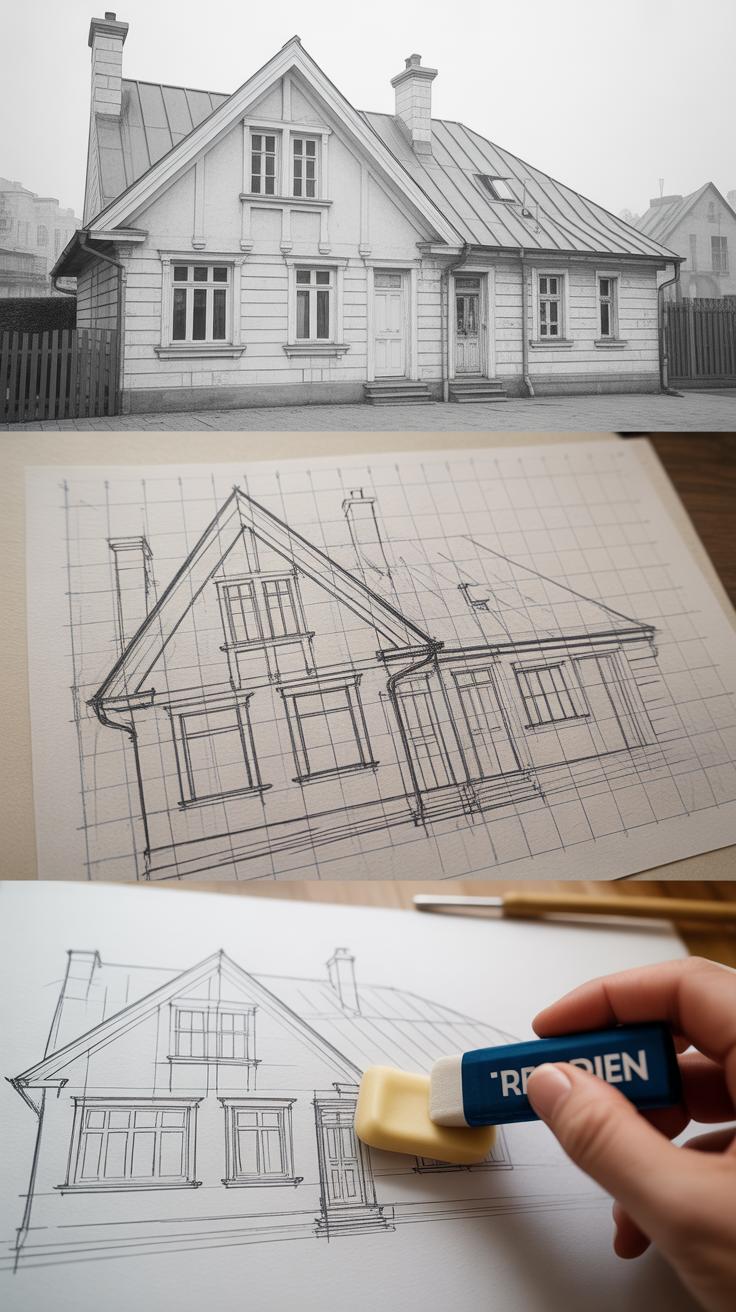
When you step back and look at your house sketch, it’s easy to miss little errors that throw off the whole picture. But spotting those mistakes comes with practice—and patience. One trick I’ve found useful is to flip the sketch upside down or view it in a mirror. This strange angle helps reveal uneven lines or warped perspectives that your brain might have overlooked.
Beginners often struggle with:
- Disproportionate walls or rooflines—if the roof leans oddly or a wall seems too wide compared to others, try measuring with a pencil on your paper and adjusting accordingly.
- Misaligned windows and doors—it’s tempting to draw these freehand quickly, but using light guide lines for alignment saves headaches later.
- Flat perspectives—many sketches look stiff because they ignore subtle depth clues. Adding slight angle variations can breathe life into the facade.
To fix these, don’t erase aggressively. Instead, use a kneaded eraser to lift graphite gently, preserving your paper and allowing for smoother corrections.
Once the big issues are sorted, refining lines becomes key. Lightly go over the primary outlines with a sharper pencil or a fine liner. I suggest varying line weight—thicker lines for edges closest to the viewer, thinner for details—to give the drawing a sense of dimension. It’s tempting to make every line equally bold, but that often flattens the image.
Finally, small details bring clarity. Adding subtle brick textures, window panes, or shading under eaves ties the house together. But be mindful not to clutter. Sometimes less is more, especially when your sketch still needs coloring later. What details belong, and which ones complicate the view? It’s worth asking yourself.
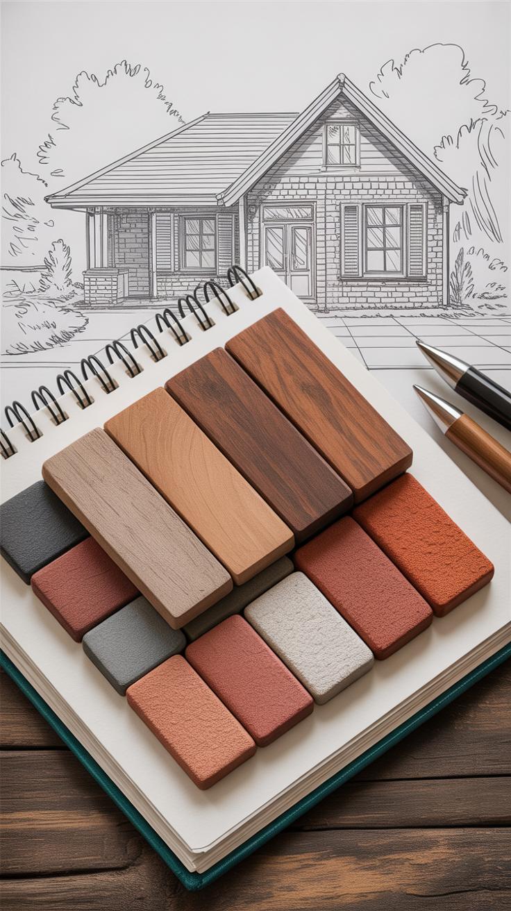
Coloring and Final Presentation
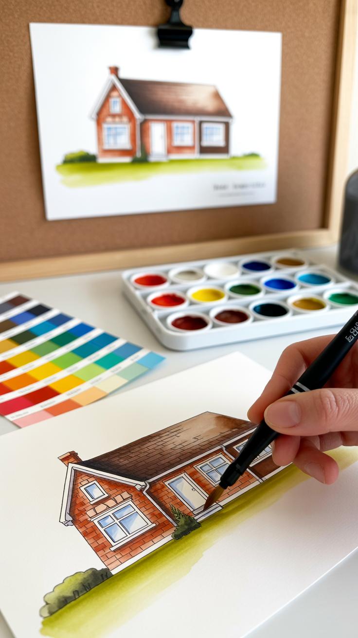
Adding color to your house sketches can be both rewarding and tricky. You might find yourself unsure where to start, especially when deciding which medium fits your style best. Colored pencils offer control and subtlety, great for layering and fine details. Markers give vibrant, clean color, but blending can be less forgiving. Watercolor, though less predictable, can bring a soft, natural feel that sometimes surpasses other methods. Trying different tools on small tests helps here—don’t rush into the final sketch without some experimentation.
Choosing the right colors is about more than just picking “nice” shades. Look closely at the real materials you’re depicting: weathered wood isn’t a flat brown; it has gray, sometimes hints of green or orange. Roof tiles reflect light differently based on their angle and surface—cool shadows, warmer highlights. You might ask yourself if the sunlight is midday or early morning; this affects the color temperature. Does the light feel warm, casting golden hues? Or is it cool and subdued? Small adjustments here make a big difference in believability.
When applying color, layering is key. Start light, with gentle strokes, then slowly build up tone and depth. Blending is not always about perfect smoothness; a bit of texture can add interest and realism. You might use a blending stump for pencils or a damp brush for watercolors. Don’t forget to leave some areas lighter to suggest reflective surfaces or brighter light. Sometimes, less is more. In one of my own sketches, I found rough, uneven layering conveyed the texture of brickwork better than a polished flat finish. Experiment with pressure, overlaying colors, and varying speed to see what fits your approach.
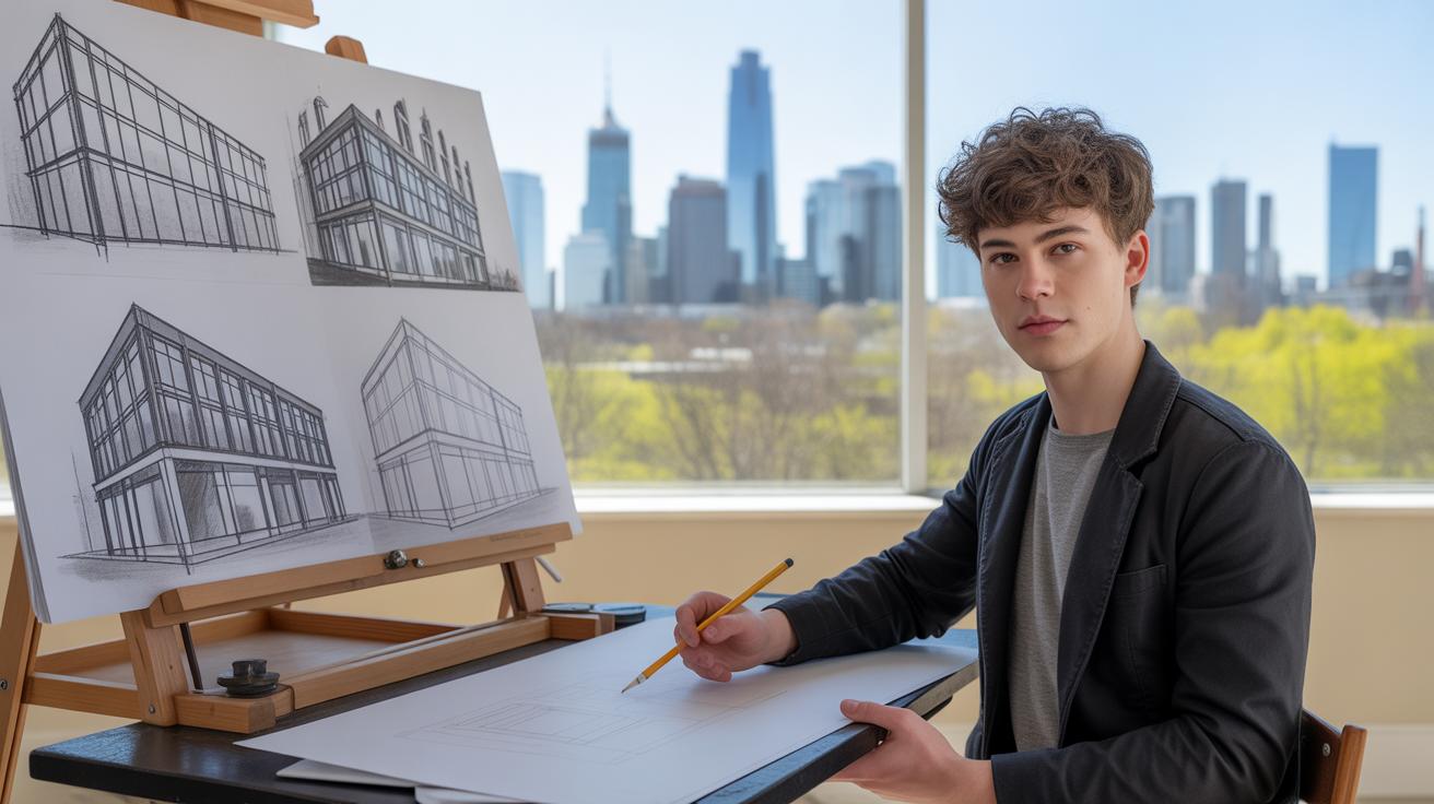
Practicing and Improving Your House Sketching Skills
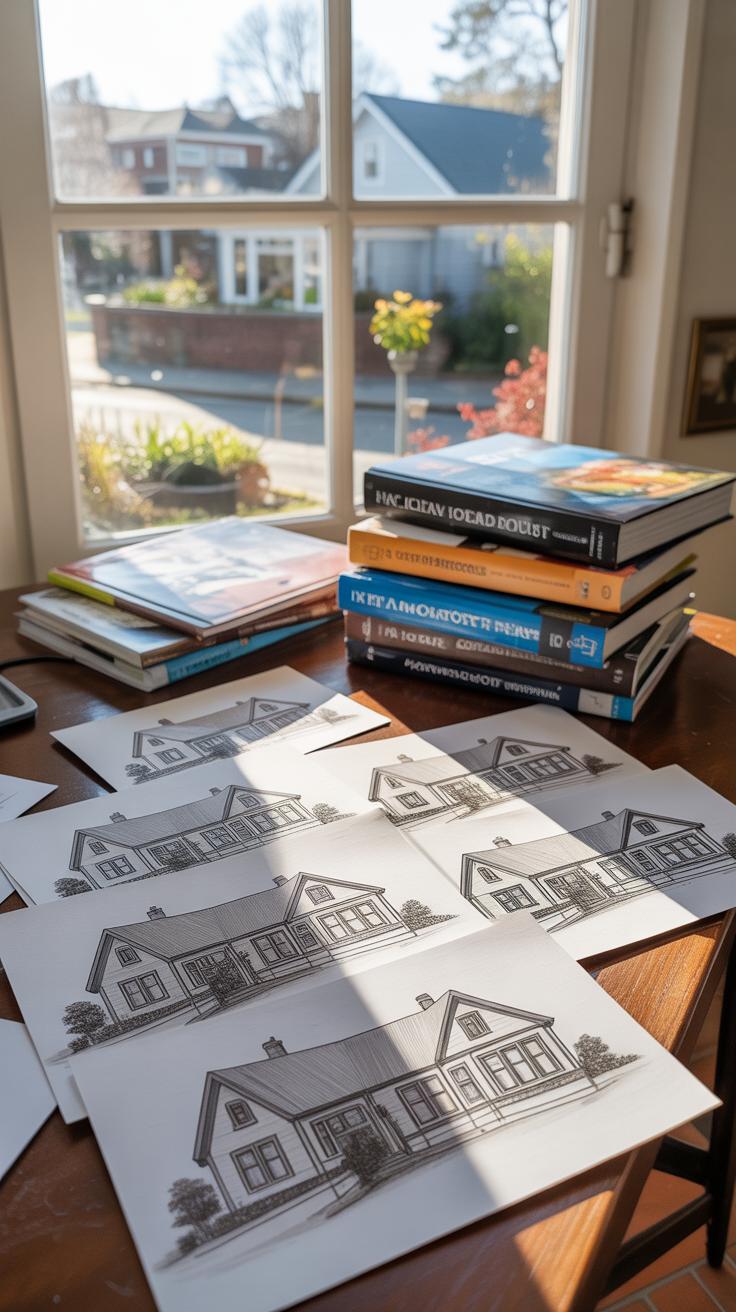
Practice is really where the magic starts—and sometimes, where frustration quietly creeps in. Drawing houses isn’t just about knowing perspective or shading; it’s about training your eye and hand to work together consistently. You might sketch one house that feels nearly perfect, then struggle with the next. That’s normal. The key is to keep at it.
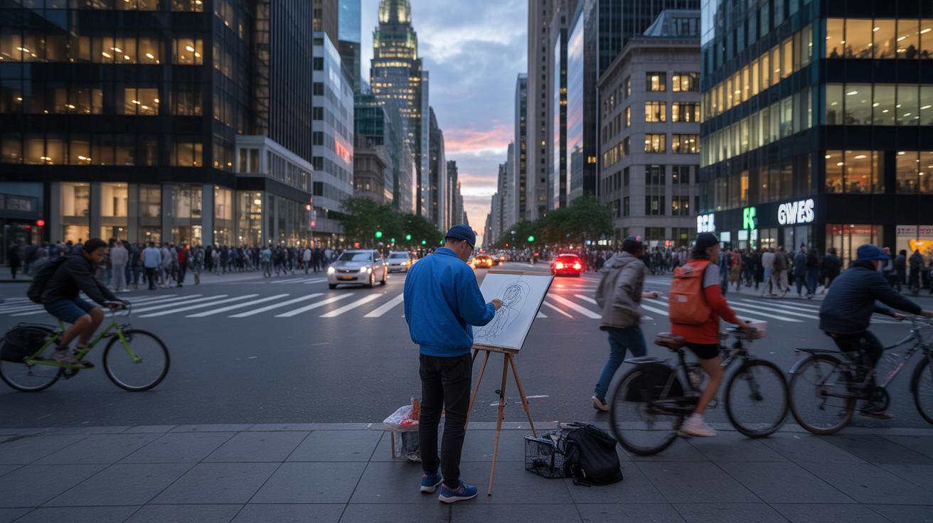
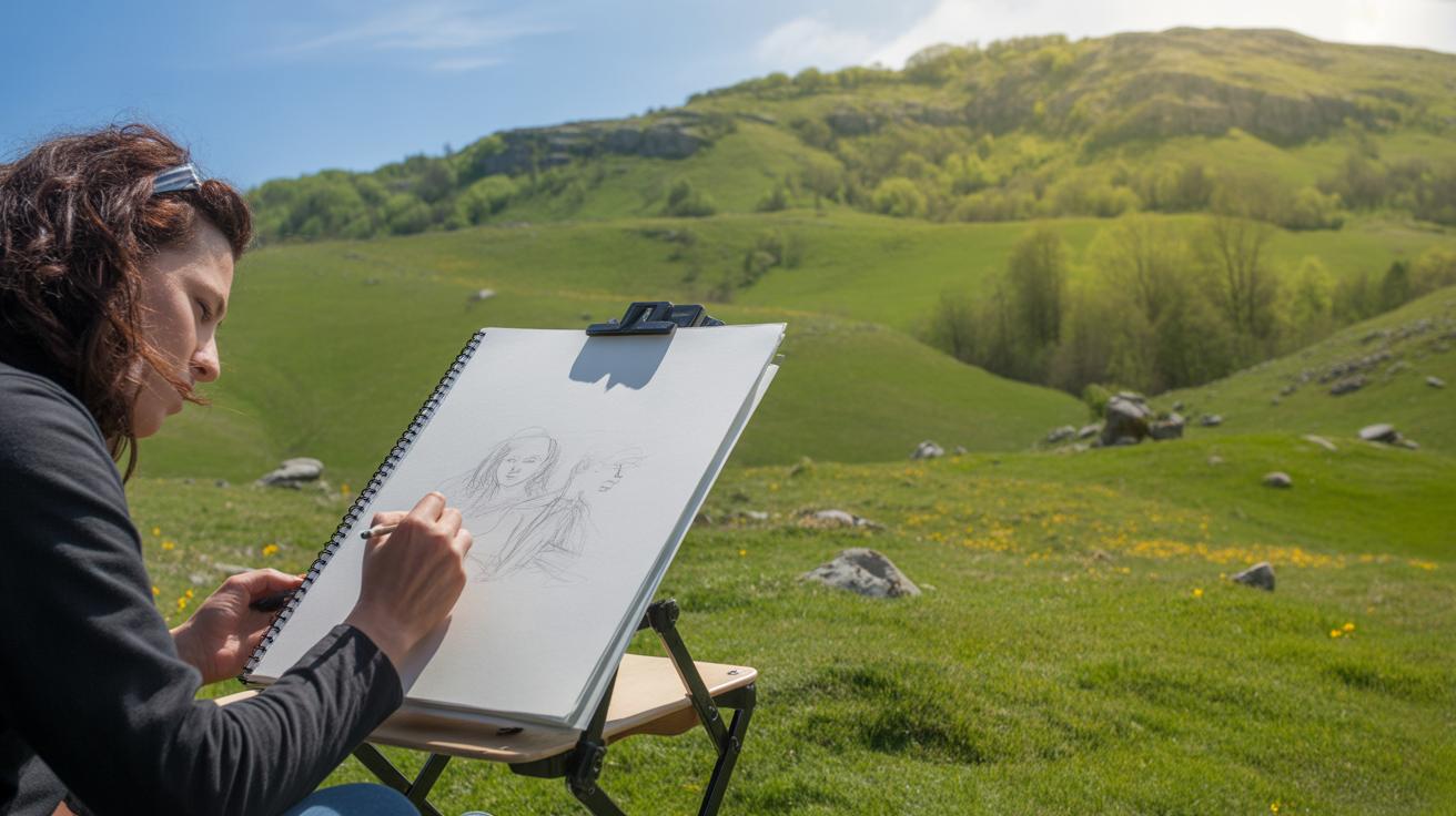
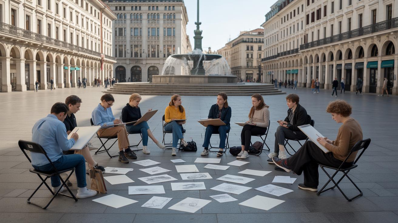
One of the best ways to sharpen your skills is to study real houses up close. Find a neighborhood or spot where you can sit quietly and observe. Notice how the light plays on different materials, how windows differ from one house to another, or how roof angles shift. Try quick sketches on the spot—don’t aim for perfection but for capturing shapes and proportions. Over time, your brain will start to pick up on details you otherwise would miss.
Keeping a sketchbook dedicated to houses can really help you track progress and ideas. It’s not just a portfolio—it’s a space where you can experiment without pressure, jot down notes, or try a new technique. Some days your sketches will feel clumsy, others surprisingly confident. Looking back after a few weeks or months, you’ll see subtle changes you might’ve overlooked.
- Sketch regularly—short, focused sessions often work better than rare, long ones.
- Observe from multiple viewpoints, even the ones that feel tricky or odd.
- Use your sketchbook to test new styles or details that catch your eye.
- Ask yourself what you noticed but didn’t capture—why not?
Maybe you’ll find that some houses inspire you more, or that certain features are tougher to draw. That’s the kind of insight sketching real subjects can reveal. You don’t have to master every angle right away. Just keep drawing—sometimes imperfectly—and watch your understanding grow.
Conclusions
House sketching combines technical skill and creative observation. By understanding the structure, perspective, and details, your sketches become realistic portrayals of residential buildings. Practice and attention to detail are key in making your artworks stand out.
Use these essentials as a guide to improve your skills over time. Draw regularly, pay attention to architectural elements, and explore different techniques to achieve the desired realism. Your journey in house sketching will become more rewarding with each new artwork you create.


