Introduction
Creating a gallery wall can change the look of your room by adding personality and style. A gallery wall template with sizes helps you plan the arrangement before hanging anything, ensuring a balanced and appealing display. This article explores how to select and use gallery wall templates with sizes for a perfect layout.
You will learn how to choose a template that fits your space, select frame sizes that complement each other, and arrange your gallery wall to achieve harmony and visual interest. Following these simple strategies will help you design a gallery wall that showcases your favorite photos and artwork beautifully.
Understanding Gallery Wall Templates
What is a Gallery Wall Template
A gallery wall template is basically a visual guide or layout that helps you arrange your picture frames or artwork before actually hanging them. Think of it as a blueprint for your wall décor. Instead of guessing where each piece should go, you place cutouts or printouts of your frames on paper or tape shapes directly to the wall. This way, you can see how everything fits together in the space without making holes or moving things around endlessly.
In interior decoration, a gallery wall template acts like a preview. It shows you the size, spacing, and placement of each frame so you can maintain balance and proportion. It’s not just about looks either—it helps you plan practical details, like making sure the frames are evenly spaced or aligned with other elements in the room.
Benefits of Using a Template
Using a template really saves a lot of guesswork and frustration. For starters, it reduces the chance of errors—such as drilling a hole in the wrong spot or realizing your layout feels cramped or awkward only once it’s permanent. I once wasted hours trying to fix a misaligned gallery wall until I decided to use a template. It was a game changer.
Another advantage is the time savings. Instead of trial and error directly on the wall, you can experiment quickly with different arrangements on paper or the floor. You get a clearer picture of the final outcome before committing. Plus, it makes coordinating sizes easier. You can check if a large frame overwhelms the others, or if a small frame looks lost, long before hanging anything up.
So, while some might skip this step thinking it’s unnecessary, using a template is a small step that can prevent bigger headaches later. If you want your gallery wall to look intentional and polished, it’s worth the effort.
Selecting the Right Wall Space for Your Gallery
Choosing the right wall space makes a big difference when setting up your gallery wall. It’s not just about finding an empty spot—it’s about imagining how the space interacts with your art over time. You want enough room for your layout without crowding, but sometimes a smaller area can create a more focused display.
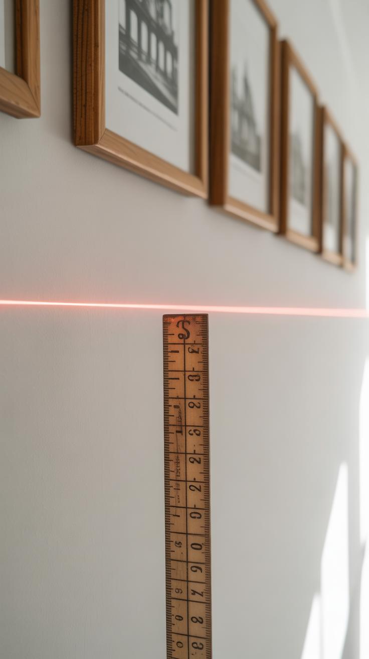
Start by measuring the width and height of the wall surface you want to use. Use a tape measure and jot down the dimensions. Pay attention to doorways, windows, and furniture that might interrupt the space. Odd shapes or slants in the wall shouldn’t scare you off; they just call for a bit more creativity. Sometimes, a narrow strip above a sofa or a hallway stretch can work better than a large, blank wall.
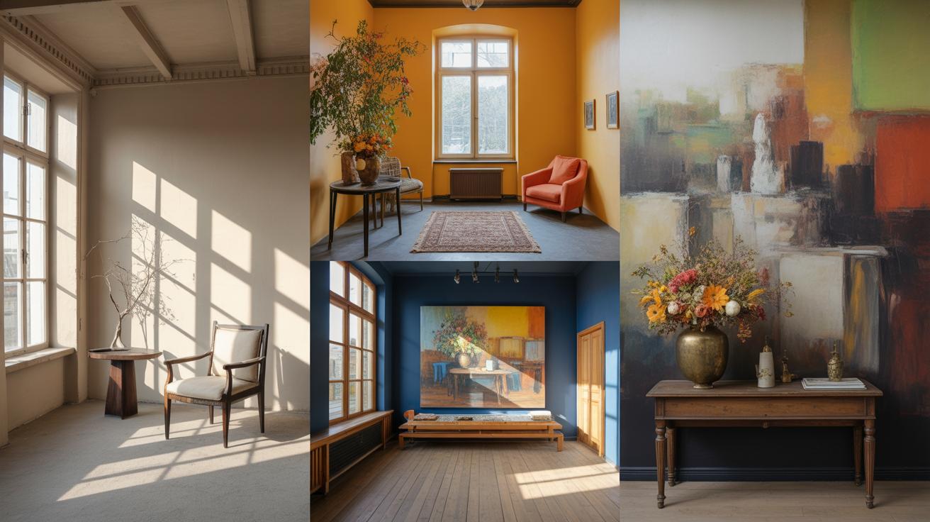
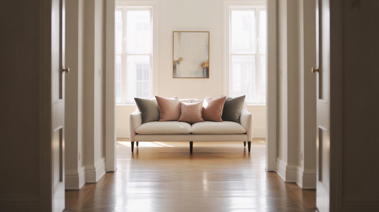
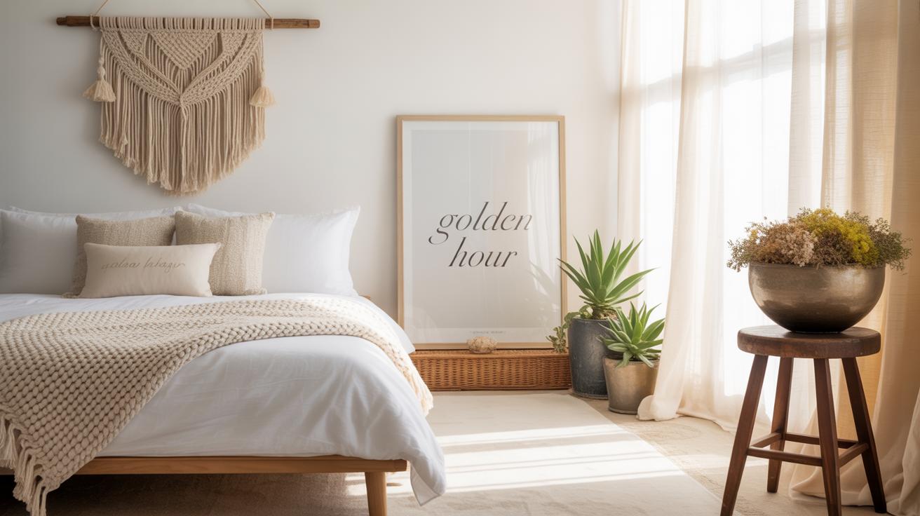
Lighting affects how your gallery wall reads at different times of day. Natural light can bring out textures and colors in your pieces, but too much sun might fade artwork or cause glare. Think about where lamps or overhead lights fall—warm light can soften an edgy set of photos, while cool light might highlight sharp lines. The wall’s color also plays a role. A white or neutral background usually helps art pop, but don’t ignore darker walls if you want something more dramatic. Just realize your images might blend differently depending on contrast.
Ask yourself: Does the wall give your collection breathing room? Will the light highlight or mask important details? These questions help you decide if you’ve found your gallery’s home or if you should keep looking.
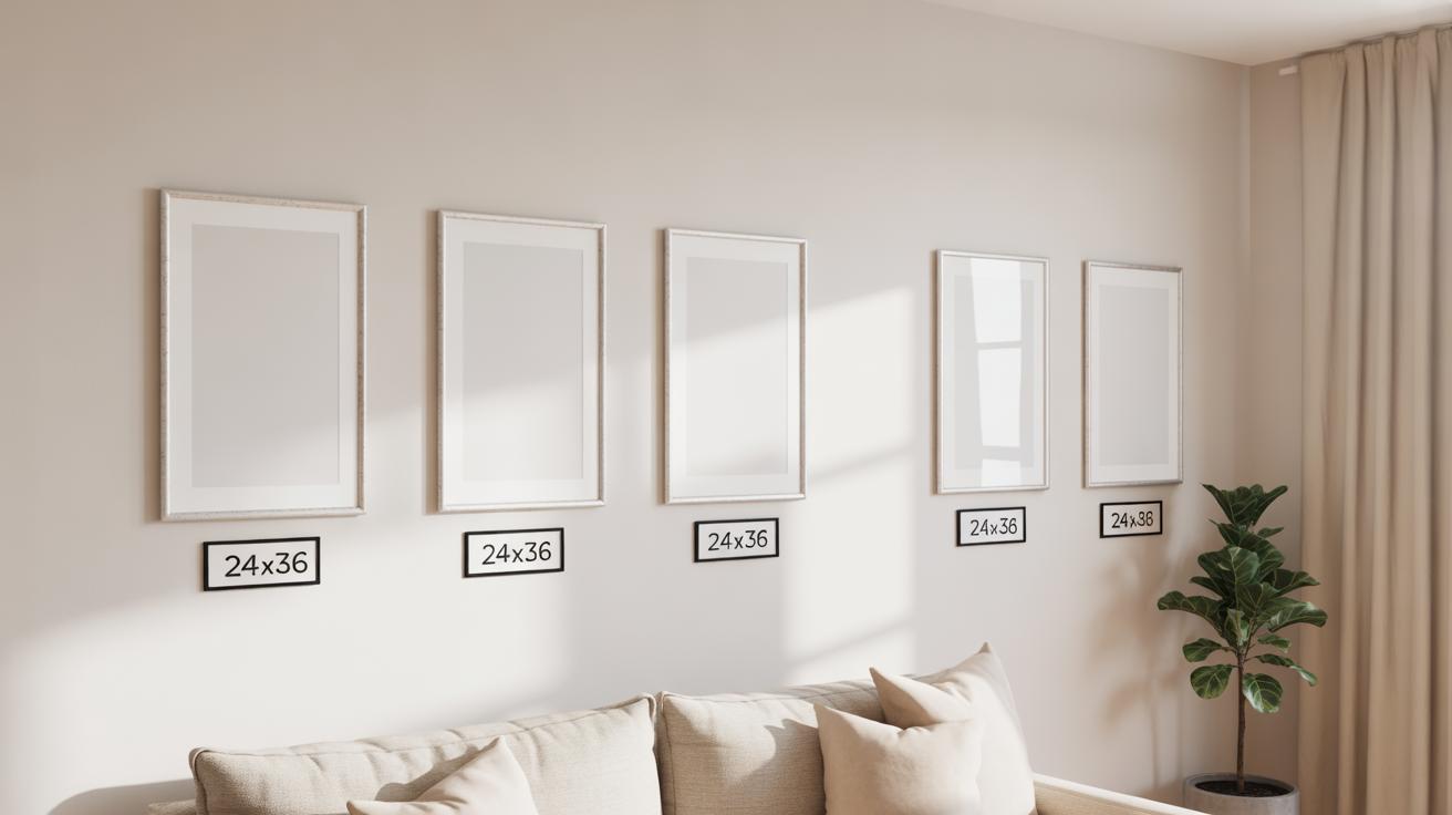
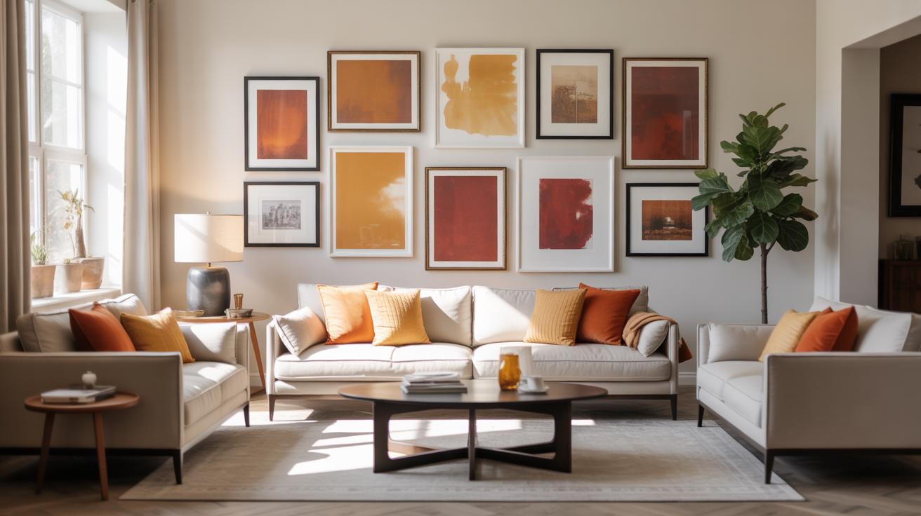
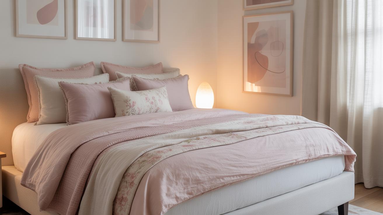
Choosing Frame Sizes for a Balanced Gallery Wall
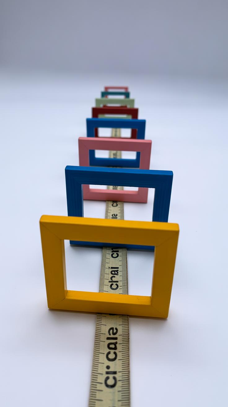
Picking the right frame sizes for your gallery wall can feel a bit tricky. You want variety without chaos. Too many big frames all scrunched together may overwhelm a small wall. But too many small frames might leave the space feeling sparse, like something’s missing. I find the best approach is to mix sizes to create a natural rhythm—something that guides your eye without tiring it.
Start with one or two larger frames to anchor the arrangement. They draw attention first and set a scale. Then, fill in around them with medium and smaller frames. This layering adds depth and interest.
Some tips to keep balance:
- Use at least one large frame, around 16×20 or bigger, if your wall allows.
- Mix several medium sizes like 11×14 or 12×16 for variety.
- Intersperse smaller pieces, such as 5×7 or 8×10, to break up the space.
Don’t be afraid to play with asymmetry. Sometimes the most balanced walls look a bit off-kilter, and that’s okay. Think about how your eye moves across the wall and try to avoid clusters of similar sizes too close together. The goal is harmony, not uniformity.
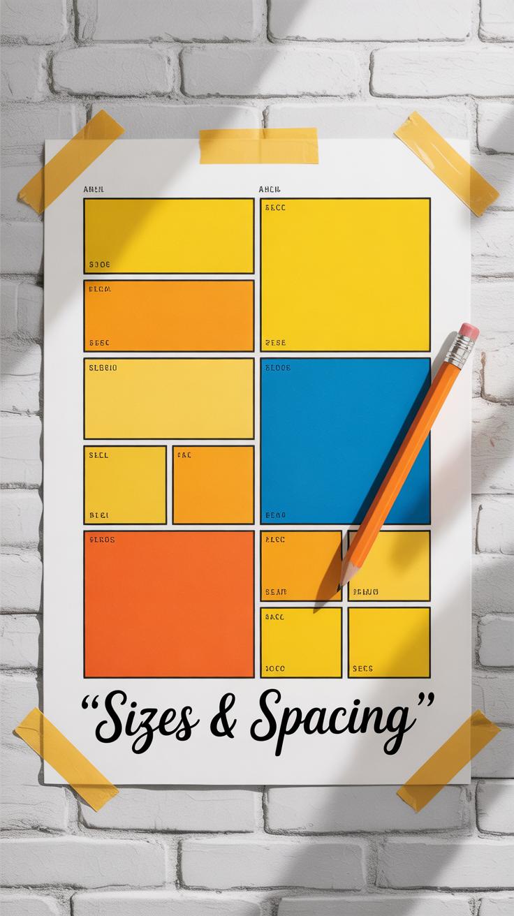
Planning the Layout Using Template Grids

Grid-Based Layouts for Neat Arrangements
Using template grids to plan your gallery wall can feel like drawing a map before a trip—it helps you see where you’re going. These grids come with precise frame sizes printed on paper or digital formats, letting you arrange and rearrange pieces virtually before any nails hit the wall. With grid layouts, the frames align both vertically and horizontally, creating a sense of order that many find calming.
This type of layout works especially well if you want a clean, structured look. The equal spacing and uniform alignment eliminate guesswork—you simply place your frames within the designated squares or rectangles. I remember trying a grid with different sized prints once, and the template helped keep the visual weight balanced even when sizes varied. The symmetry can highlight the uniqueness of each piece without overwhelming the space.
Still, it’s not always a perfect fit for every style or room. If you’re craving something less rigid, the grid might feel too ‘stiff’ for your space. But for sheer simplicity and neatness? It’s tough to beat.
Freeform Layouts with Template Guidance
Freeform gallery walls can look spontaneous and relaxed, but that doesn’t mean they need to be chaotic. Template grids can still guide these casual arrangements, providing a framework that prevents your wall from feeling cluttered or off balance. You might think, “Why bother with a grid if I want randomness?” Well, using a subtle template underneath encourages you to respect margins and spacing without locking you into perfect rows.
When working freeform, I like to think of the grid as a gentle suggestion rather than a strict rule. You can place larger frames on certain template blocks while letting smaller items spill over adjacent sections. It helps keep your eye moving comfortably across the wall, even if the layout isn’t perfectly symmetrical. The balance between planned and spontaneous can make your gallery wall feel both personal and polished.
Ultimately, templates are tools—not constraints. Whether you prefer rigid grids or freeform layouts, using sizes and grids as reference points can ground your creativity while making sure everything fits well on your wall.
Spacing and Alignment Techniques
Spacing and alignment can make or break your gallery wall’s look. It’s easy to overlook, but uneven or inconsistent gaps between frames make the whole arrangement feel a bit off. You might think a tiny mismatch isn’t noticeable, but it often is, especially when the eye tries to find order.
The usual spacing recommendation lies around 2 to 4 inches between each frame. I tend to stick closer to 3 inches—it often feels just right, not too tight, not too loose. Of course, the size of your wall and frames matter; smaller frames can handle less space, bigger ones need more breathing room.
For alignment, the trick is to keep some frames lined up along either their tops, bottoms, or centers. You could align frames horizontally, which creates a steady flow across the wall, or vertically, which brings a sense of rhythm. I sometimes mix a bit, aligning some rows at the centers, others at the edges, to avoid rigidity. It’s about guiding the eye without stifling it.
Try measuring and marking lightly with a pencil before hanging. An off-center mark can cause hours of reworking—been there, done that. But sometimes, a slight offset adds charm rather than a distraction. So don’t be afraid to break the rules a little, if it feels right to you.
Do you want your frames to feel connected as a group or stand out individually? That goal shapes your spacing and alignment choices more than fixed rules do, I’ve found. The balance between uniformity and variety is what keeps a gallery wall engaging.
Tools for Creating and Using Gallery Wall Templates
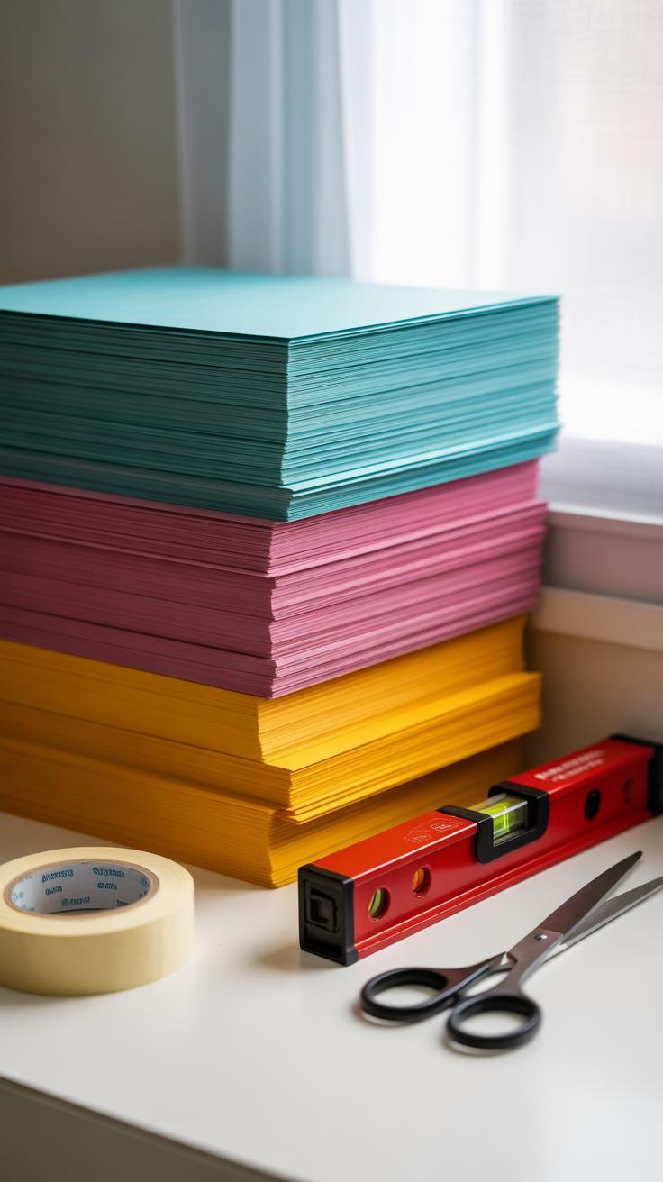
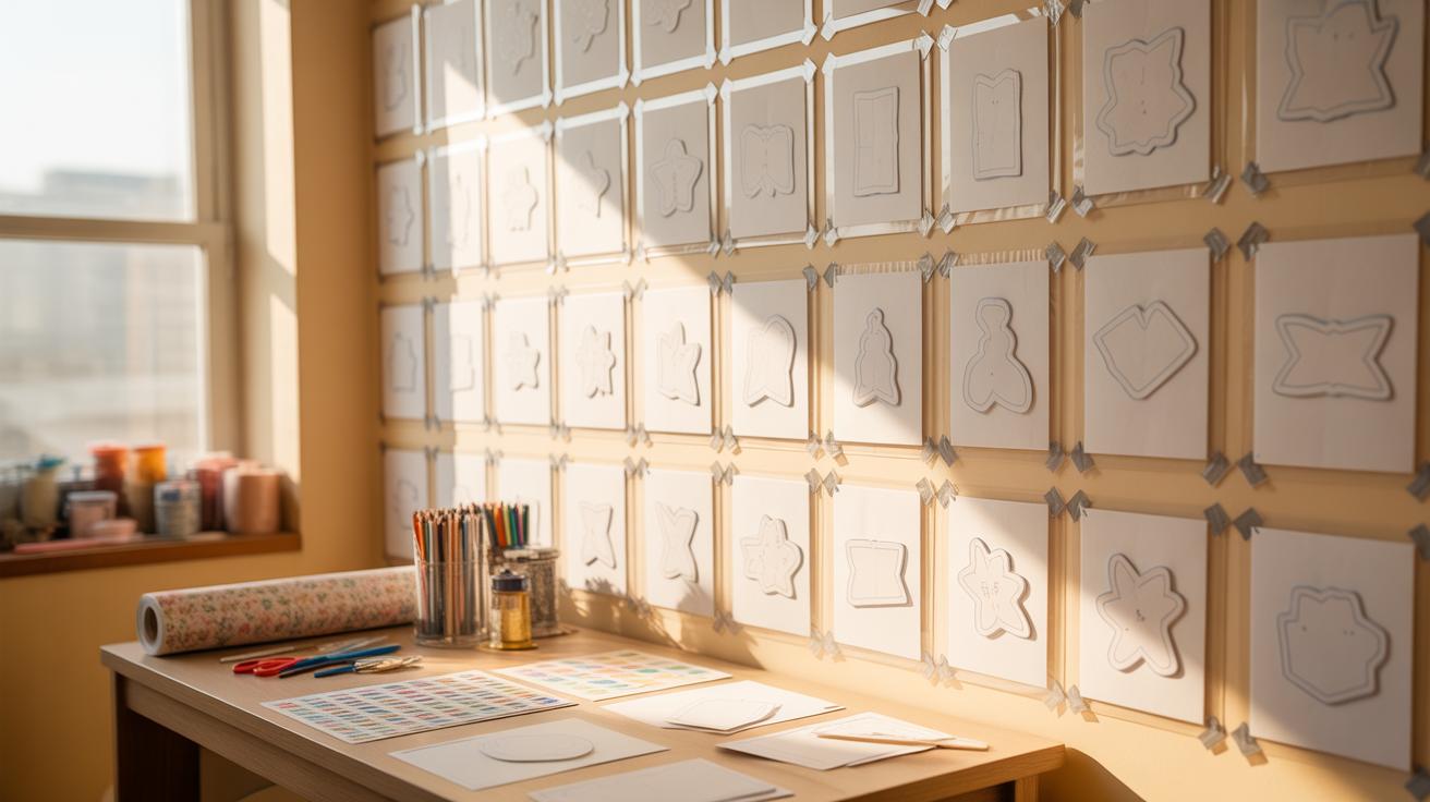
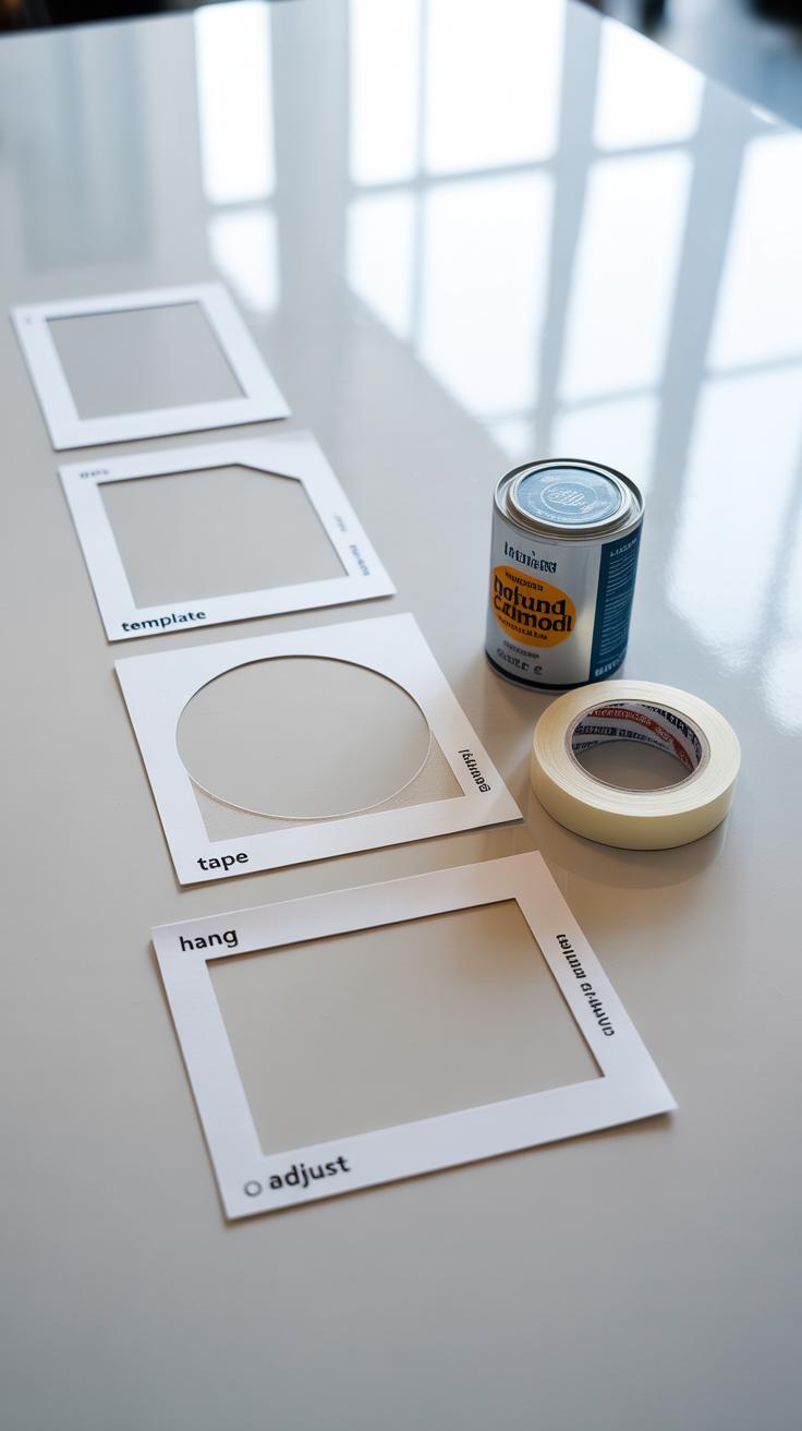
When designing a gallery wall, having the right tools can make a big difference in how smoothly the process goes. You might want to start with simple paper templates. Cutting out scaled shapes of your frames can give you a hands-on feel. It’s a bit old-fashioned, sure, but sometimes you just can’t beat moving things around physically on your floor or wall before committing. Plus, printouts let you experiment without fiddling with screens all the time.
On the flip side, digital templates offer more flexibility. They allow precise measurements and quick adjustments without needing to recut anything. You can zoom in, swap frames, or tweak spacing in seconds. That said, it might feel less tactile—some people find staring at a screen less inspiring than actual pieces of paper scattered on the floor.
As for apps and software, several options cater to different needs. For instance:
- Canva: Handy for creating simple layouts with drag-and-drop ease, plus it lets you adjust sizes manually.
- Roomstyler 3D: If you want to visualize your wall in a virtual room, this tool gives a more realistic preview of how works of art interact with your space.
- WallApp: Designed specifically for gallery walls, this app lets you upload photos of your frames and map out exact sizes and placements.
- SketchUp: A bit more technical, but it can give you detailed spatial layouts if you’re keen on precise dimensions.
Which tool to pick really depends on your comfort level. Sometimes, I’ve found juggling between both paper and digital approaches worked best—starting with physical cutouts, then switching to apps for fine-tuning. Do you prefer something tangible? Or does a digital planner sound like your thing? Either way, these resources offer some solid starting points for laying out your ideal gallery wall.
StepbyStep Setup of Your Gallery Wall
Preparing Your Wall and Materials
First things first: get your wall ready. Clear the space of anything hanging or leaning on it. You want a clean, smooth surface—this makes measuring and aligning easier. If the wall needs a fresh coat of paint or a quick patch-up, it’s better to do that now rather than later. Dust off the area, too. Small debris can throw off your template placement.
Next, gather all your frames. Lay them out on the floor in roughly the order you want. Check each one for sturdy hooks or hanging hardware. You might find some need extra nails, wire, or mounting strips. Tools you’ll want handy include a tape measure, level, pencil, a hammer or drill, and painter’s tape. Tape is surprisingly useful to attach your size template or mark spots without damaging the wall.
Applying the Template and Hanging Frames
With your sizes mapped out on a paper or cardboard template, it’s time to transfer that to your wall. Start by measuring the center point where you want the gallery to sit—often eye level is best, but that depends on your room and furniture height.
Use painter’s tape to attach the template squares on the wall, mimicking the layout you created. It’s like a rough sketch in place, giving you a chance to step back and assess before putting nails in. Move pieces around if something feels off; it’s easier now than after hanging frames.
When the arrangement looks right, pick a frame and start hanging it at the corresponding template spot. Use a level to keep it straight—nothing disappointing like a crooked frame. Repeat for each one. As you work, remove each piece of tape once the frame is secured. It’s a tidy way to avoid clutter and confusion.
Don’t rush the process. Sometimes, pausing and living with the layout for a few minutes helps you notice things you may want to tweak. You might think you got it perfect the first time, only to realize later that a slight shift makes a huge difference.
Maintaining and Updating Your Gallery Wall
Keeping your gallery wall looking fresh can feel like a small ongoing project, but it’s quite manageable if you approach it step by step. Think about the artwork and frames—dust tends to settle, and fingerprints or spots might show up over time, so regular cleaning helps maintain the overall impression. Use a soft, dry cloth for dusting frames, and if the glass needs a wipe, a slightly damp microfiber cloth usually works best. Avoid harsh cleaners that can strip finishes or damage delicate prints.
Protecting your artwork from direct sunlight or excessive humidity also matters. Some frames have UV-protective glass, which helps, but shifting the arrangement away from sunlit walls when you can keeps colors from fading faster. Slight shifts in temperature or moisture can affect certain materials, so a bit of caution pays off.
If you’re wondering how to refresh your layout without starting anew, the gallery wall template provides flexibility. Add a new piece by using the existing size guidelines or replace smaller artworks with something larger to change the focal point. You could swap an artwork seasonally or introduce different mediums—maybe a mix of photos and textiles. Livening up the arrangement by adjusting spacing or swapping frames can give your wall a subtle yet noticeable update. Do you feel like the wall reflects where you are now, or could a little tweak help it better match your current mood or room?
Conclusions
A well-designed gallery wall starts with a solid plan. Using a gallery wall template with sizes lets you visualize the overall layout and make changes before putting holes in your walls. This preparation saves time and avoids frustration.
Remember to consider the size of your wall area, balance large and small frames, and maintain equal spacing. With patience and creativity, your gallery wall will become a focal point that reflects your taste and style. Start with a template today and enjoy the process of creating your perfect gallery wall.