Introduction
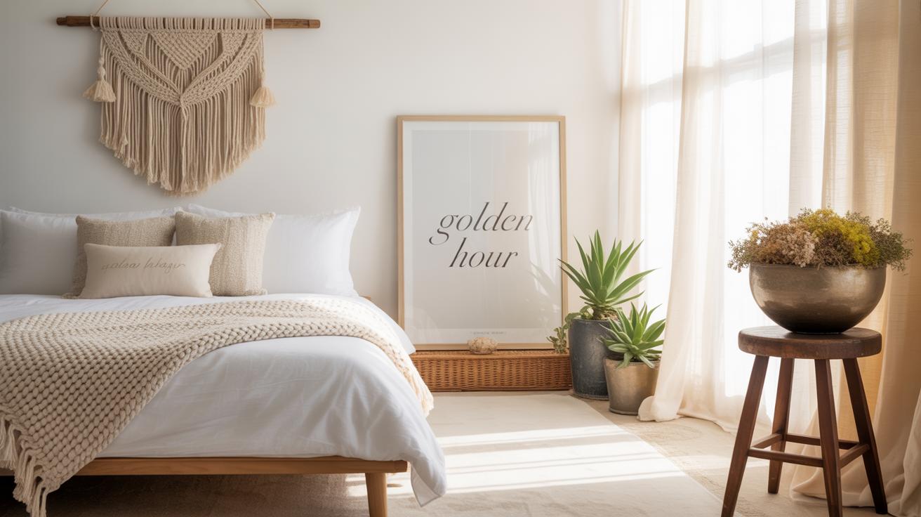
Transform your bedroom into a personal haven with dreamy gallery wall ideas. A gallery wall in the bedroom can add a unique touch to your space, reflecting your personality and style. Whether you prefer photos, art prints, or a mix of different items, a gallery wall is a creative way to bring life to your room.
You will find helpful tips on selecting artworks, layout ideas, and practical advice on creating a beautiful and harmonious gallery wall. This article guides you through nine detailed chapters packed with actionable ideas to help you successfully design your dream bedroom gallery wall.
Planning Your Gallery Wall Layout
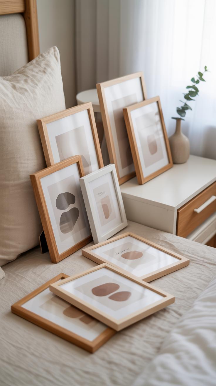
Figuring out where and how to place your art pieces can feel a bit overwhelming, but it’s really about balance and flow. You want the wall to feel intentional without looking too rigid or forced. That means playing with different arrangements before committing—sometimes a pattern you imagine won’t work quite as well when hung.
Try starting with paper cutouts or cardboard shapes the size of your artwork. Tape them to the wall and move them around to see what feels right. Notice how spacing affects the overall vibe; tighter clusters create coziness, while wider distances can be more airy and relaxed.
Don’t feel pressured to stick to perfect grids. Mix vertical and horizontal pieces or layer smaller frames near bigger ones for an interesting dynamic. Think about your eye’s path. Where does it land first? You might want a standout piece in a central spot.
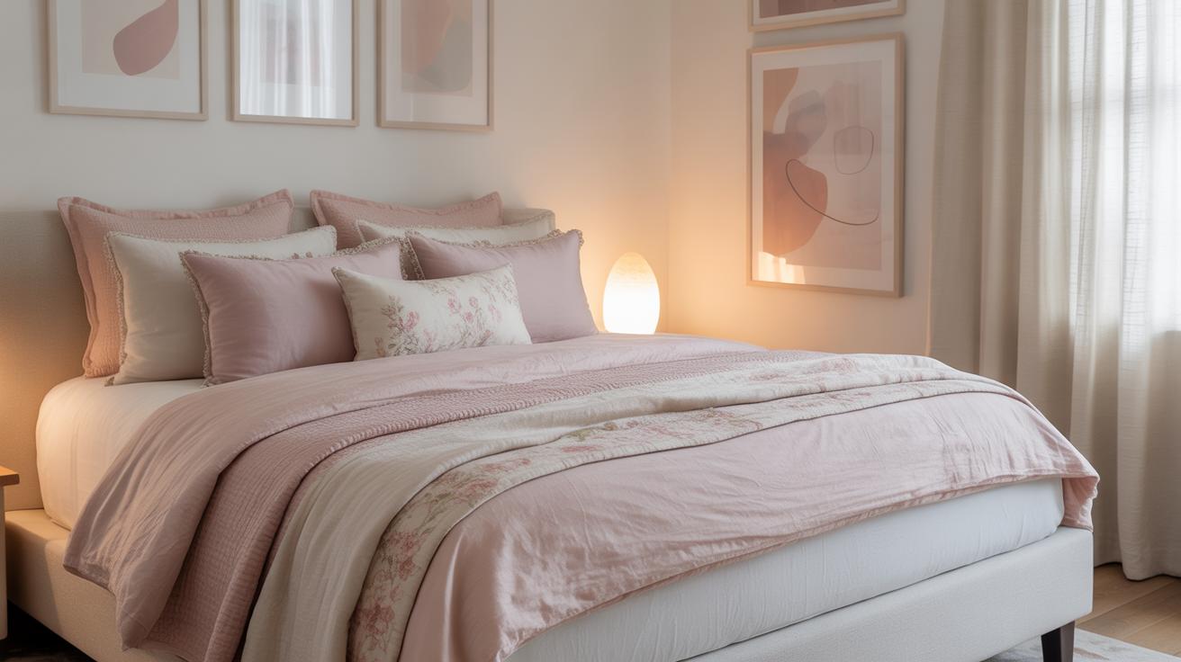
Consider how the gallery interacts with furniture and lighting too. A gallery wall above the headboard, for instance, might need frames hung a bit higher than usual, so they don’t feel cramped. And shadows cast by lamps can add depth or distract, depending on placement.
Sometimes a piece doesn’t need to be perfectly aligned with another—just close enough to suggest a connection. Experiment with asymmetry. Odd numbers often work better in groupings, giving a natural rhythm.
Have you noticed how certain walls make you linger? That’s often the result of thoughtful layout. It invites you to look longer, discover details, and feel connected to the space. Your gallery wall can do that too, if you let it breathe and evolve as you live with it.
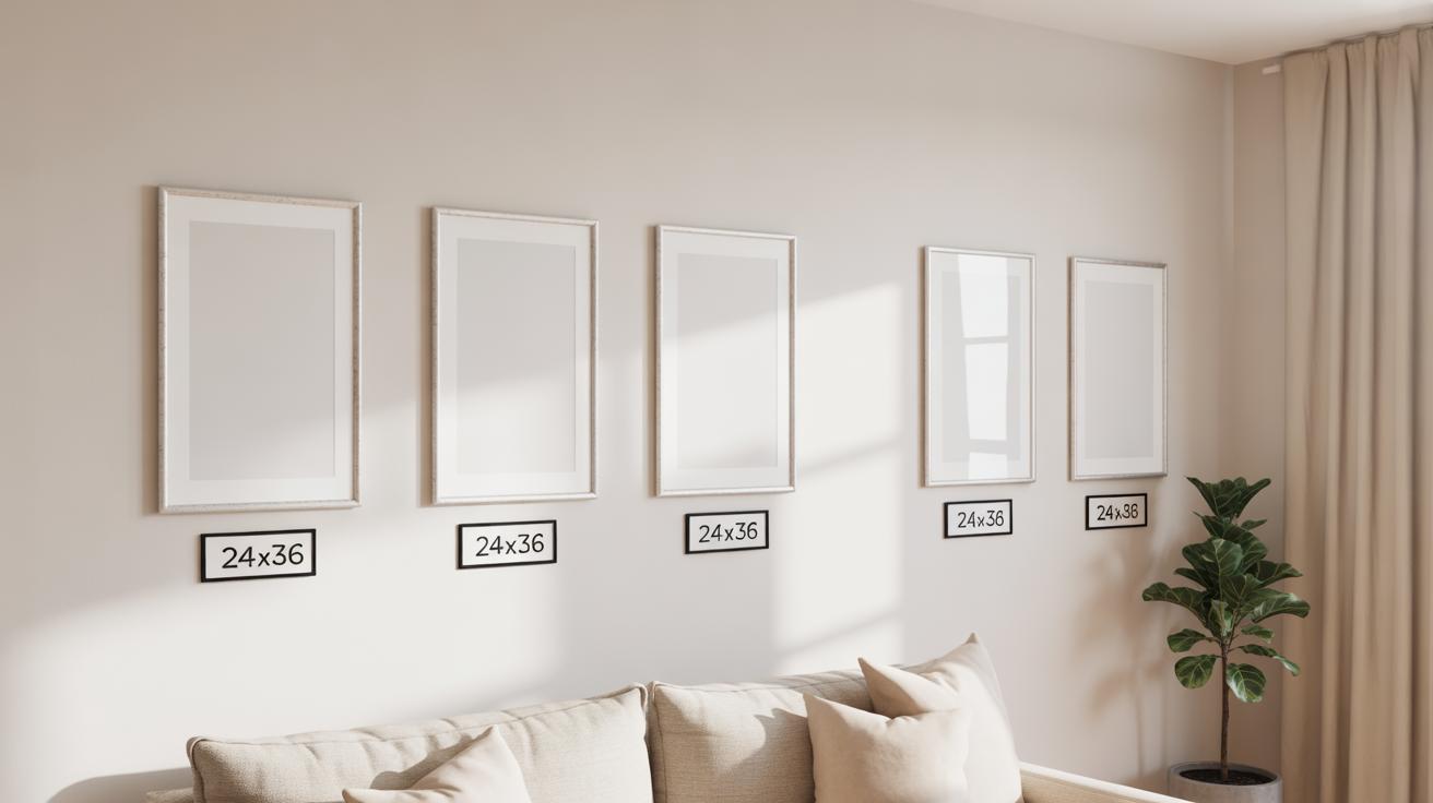
Measuring and Mapping
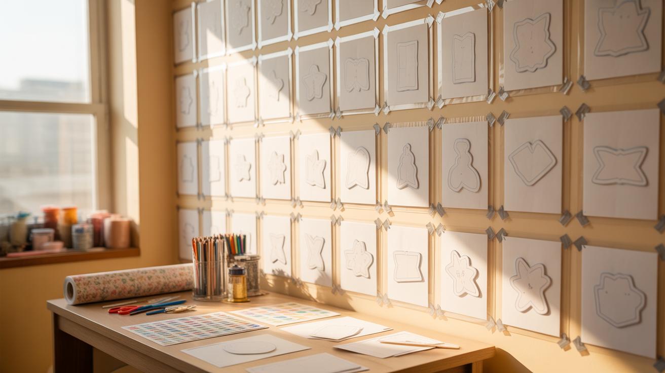
After measuring, try making a simple paper template for each artwork piece. Cut out paper shapes that match the size of your frames—you can even mark the matting. Use painter’s tape or blue tack and stick these paper shapes onto the wall. This lets you experiment with placements and rearrange before committing to nails. It can feel a bit fiddly, but it saves lots of holes and re-hanging later. Also, stepping back frequently helps—view the composition from across the room to check the balance as a whole.
Balancing Sizes and Shapes
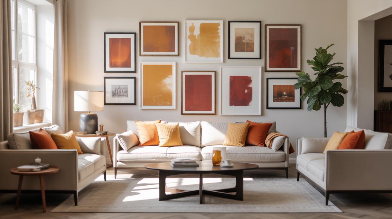
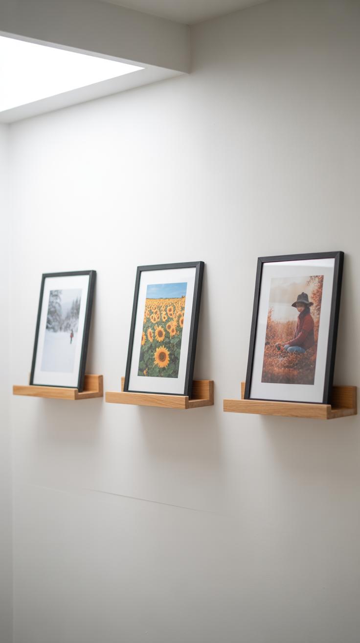
Mixing frame sizes and shapes adds interest but balancing them is crucial. You don’t want all big frames lumped together or tiny ones stuck in one corner. Spread out the larger pieces so they anchor different parts of the arrangement. Pair round or oval frames with rectangles, but avoid clustering similar shapes too tightly—that may look repetitive rather than varied. Odd numbers tend to work better visually, so maybe go for three or five main pieces rather than two or four. Yet, don’t stress if you end up with an even number. Sometimes the eye still finds harmony in that.
One trick I like is to imagine an invisible grid or spine down the center and arrange pieces around that axis with some uneven spacing. That keeps things balanced without being too symmetrical or rigid. Remember: the goal is a comfortable flow that invites the eye to move, rather than a static block. So, take your time. See if you can play around with gaps and overlaps just enough to feel lively but not messy. That little tension between order and chaos often makes a gallery wall feel personal and real.
Choosing Frames To Complement Your Art
When selecting frames for your bedroom gallery wall, it’s easy to get caught up in the art itself and overlook how the frame shapes the overall vibe. Frames do more than hold art; they connect the pieces to your room’s style. Think about the materials first. Wooden frames offer warmth and a cozy feel, often blending well with softer, natural bedroom elements like linen or wicker furniture.
Metal frames can feel sleek or industrial, which may suit a modern or minimalist space better. But what if your room mixes styles? Maybe a cool metal frame next to a warm wood one can work—if done carefully. Mixing frame styles isn’t off-limits; it just needs a bit of balance.
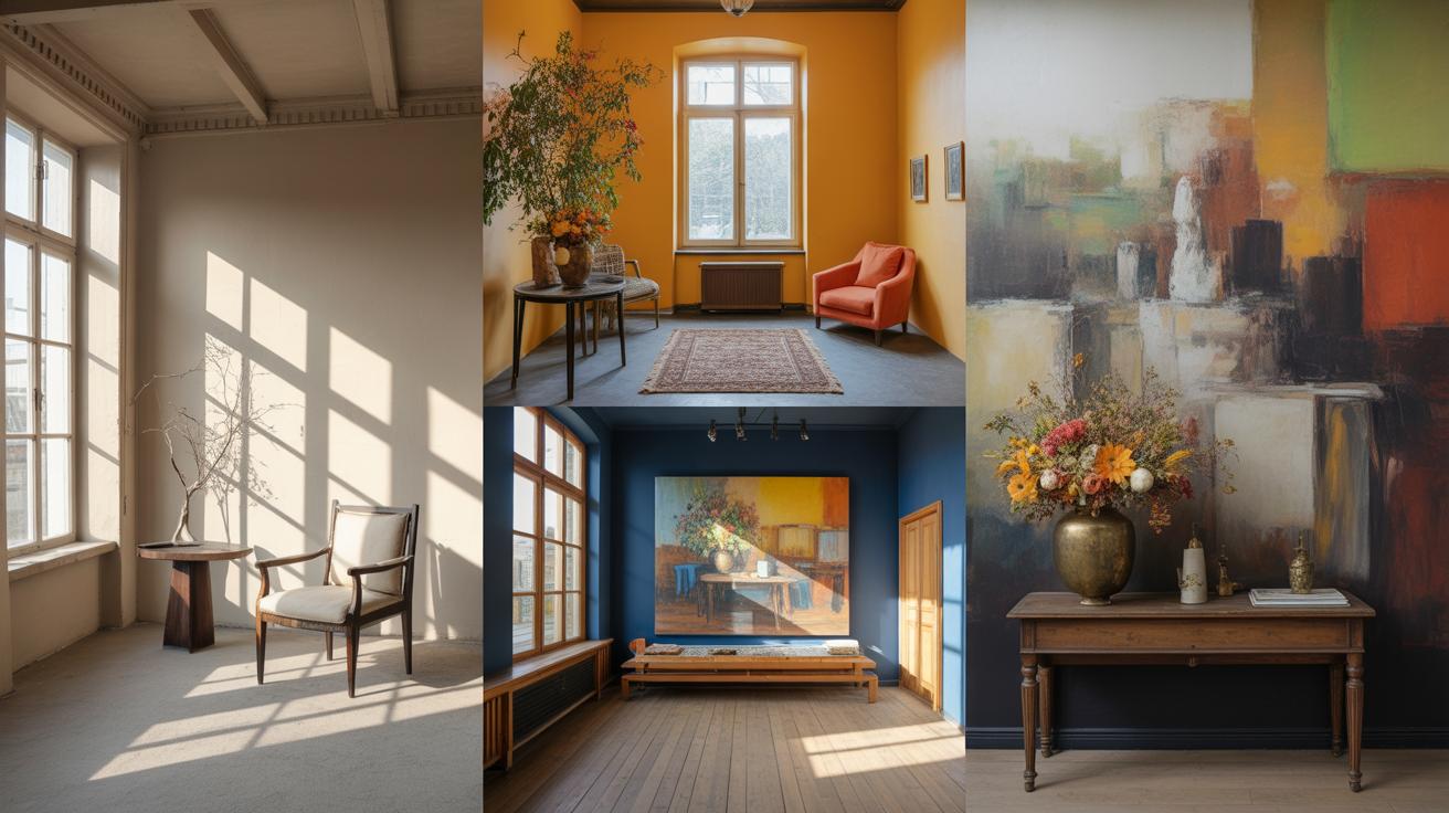
Color choices matter too. Dark frames can ground brighter artwork or contrast pastel shades nicely, while white or light frames can make busy prints feel lighter. You can echo colors from other bedroom accents—like a lamp base or pillow—to subtly tie the look together.
When mixing frames, try to keep at least one thing consistent, such as thickness or finish. For example:
- Different woods but all matte finishes, or
- Various metals but all thin profiles.
This way, the variety feels intentional rather than chaotic. Sometimes, sticking to a single frame style creates calm, but other times, a mix adds character. It depends on what you want your space to say. Have you tried mixing frame styles before and felt unsure? Sometimes a little experiment is all it takes to find your personal balance.
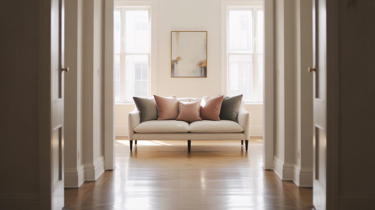
Creating A Focal Point With Your Gallery Wall
Designing a gallery wall that grabs attention in your bedroom starts with clear intention. You want a visual anchor—a spot the eye naturally falls on. This transforms a collection of art into a cohesive statement rather than just a random display. Think of it like a conversation: one piece says the main thing, the rest respond to it.
Choosing The Centerpiece
Picking a centerpiece is trickier than it seems. The piece should be larger or more detailed than the others. It could be a painting with bold lines or a photo that holds personal meaning. Maybe a mirror or an intriguing object fits better, especially if you want to break from traditional art. The key is balance—too grand and it overshadows the rest, too subtle and it disappears. I remember once using a vintage clock as my centerpiece; it gave the wall personality without stealing all the attention.
Using Color And Contrast
Color and contrast help your eye settle where you want it. Bright or saturated colors make something pop, while neutral tones recede. Using a splash of deep blue or vibrant red in your centerpiece pulls focus instantly. Dark frames around lighter images also create contrast that guides the gaze. Sometimes, a single unexpected color splash inside a mostly muted gallery wall can work wonders. But keep in mind, too much contrast can be disorienting. The trick is to make the centerpiece distinct but still connected to the whole look.
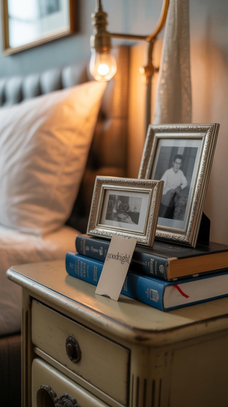
Adding Personal Touches To Your Gallery Wall
Your bedroom gallery wall becomes much more than just décor when you weave in personal elements. Think beyond framed art. Small keepsakes, meaningful mementos, or even a child’s drawing can add layers of warmth. It’s not about perfection or matching tones perfectly; it’s about what makes you feel at home, really.
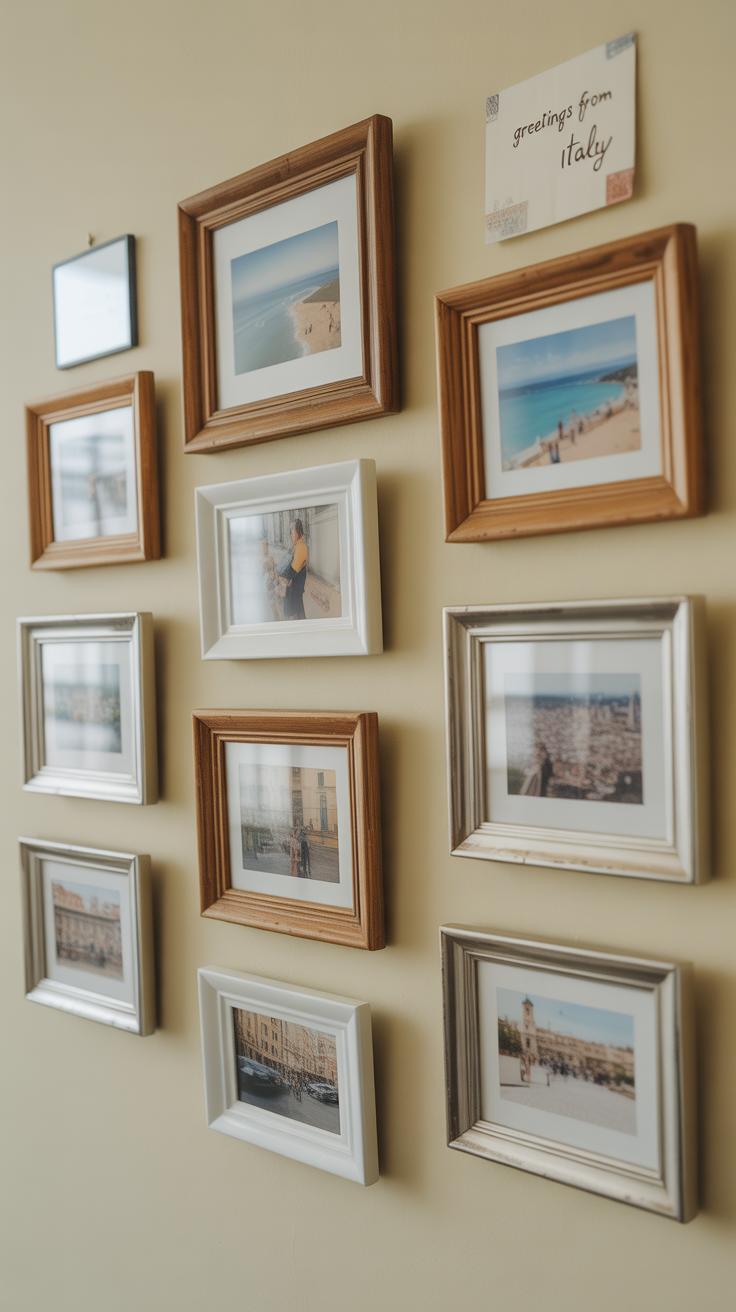
Family photos don’t have to dominate the space or feel like a separate cluster. Instead, mix them in gently with other pieces. Consider black-and-white shots or ones edited for a consistent palette, so they blend naturally rather than standing out awkwardly. Travel photos work the same way—select those that tell a story, then frame them simply to echo the other art styles around.
Then there’s charm in handmade or DIY art. Maybe you painted something years ago, or crafted a simple collage from magazine cutouts. Including these tells a story only you can tell. They invite a closer look and often spark memories or conversations. Don’t worry if they’re a bit rough—that adds character. A gallery wall should feel personal, not sterile.
Ask yourself which objects make you pause and smile. Those pieces are your anchors. Place them thoughtfully. They’ll turn a beautiful wall into a living space, one that’s unmistakably yours.
Maintaining Flexibility And Changing Displays
Designing a gallery wall in your bedroom that can evolve with your tastes is a smart move. You don’t want to feel stuck with a set arrangement or specific pieces forever, right? Planning ahead for easy updates means you won’t have to pull out a hammer every time you crave a change.
Think about using removable hooks and frames that open from the front or have simple clips. They allow you to swap art without hassle. I remember trying command strips for one wall, and it made switching photos painless—plus, the walls stayed clean.
When you choose frames, look for ones with standard sizes or a similar style so mixing and matching doesn’t get overly complicated. This keeps things feeling cohesive, even as the pieces change.
Seasonal shifts or new themes can give your wall new life. Maybe a crisp, leafy print for fall or soft pastels in spring. Adding lightweight pieces makes rotating easier, even considering changes for holidays or moods. Sometimes, even just swapping a couple of frames refreshes the whole vibe without a major redo.
Have you thought about how often you might want to refresh your space? Your wall can be a living part of your room if you design it like one.
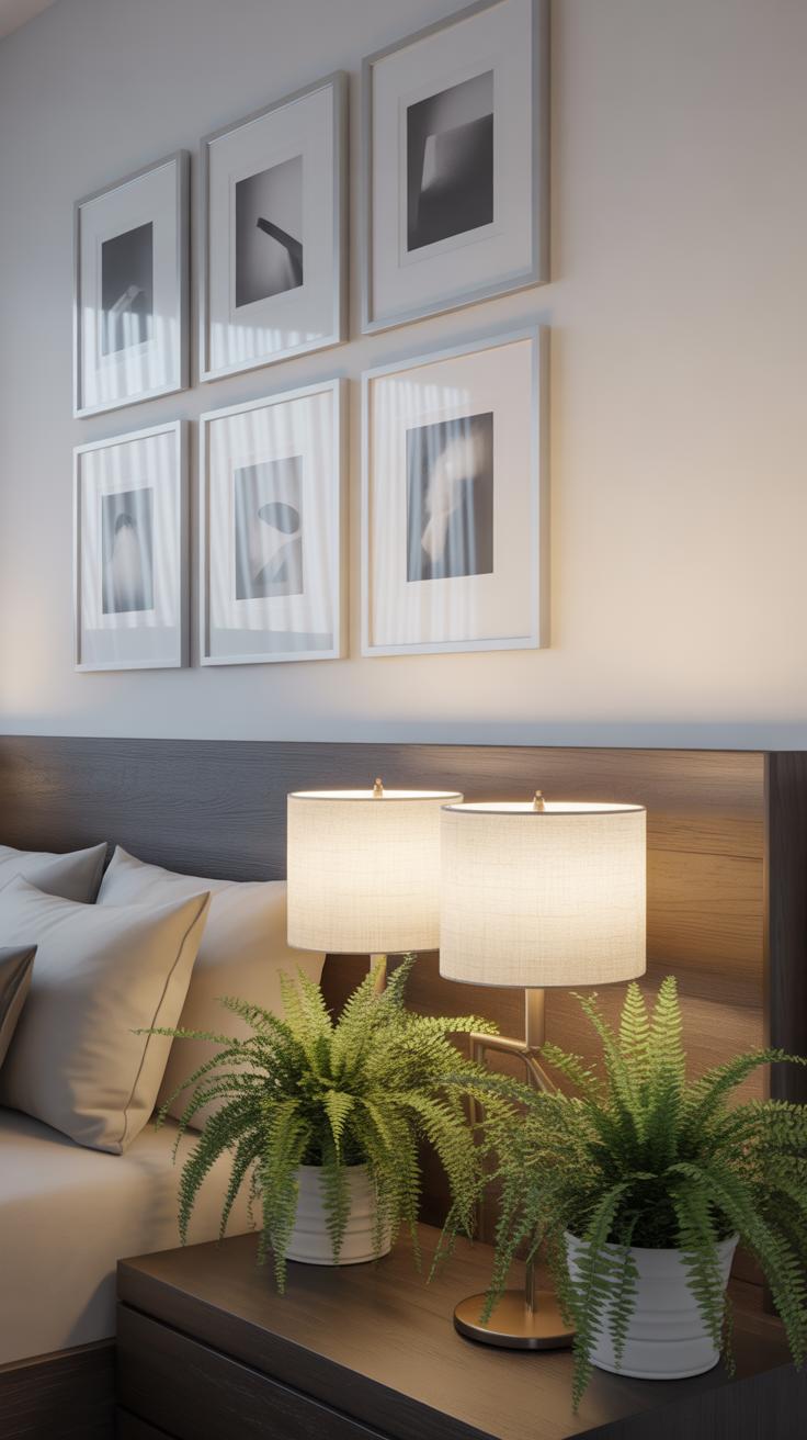
Lighting Your Gallery Wall
Lighting makes a bigger difference than you might expect when it comes to showing off your bedroom gallery wall. Good lighting can pull the eye right to your artworks and add depth, while poor lighting can render even the best pieces dull and overlooked. I’ve noticed that without thinking about light, some of my favorite prints ended up looking flat or washed out. So, thinking about light isn’t just an afterthought—it should be part of how you plan your gallery wall from the start.
Natural Light Considerations
Natural light tends to be everyone’s go-to, right? It brings warmth and shifts throughout the day, which can be quite nice. But it’s tricky—too much direct sunlight can create glare and even fade your art over time. Try placing your gallery wall where the sun’s harsh rays don’t hit directly or use window treatments to soften the light. Sheer curtains help without blocking the daylight you want. You could even rotate pieces occasionally if you’re worried about uneven fading. So it’s a bit of a balancing act: enjoy the natural brightness, but protect what you love.
Artificial Lighting Options
Artificial lighting gives more control, which can be a relief. Spotlights, for example, let you highlight a specific piece or area. They work well if you want to emphasize one or two focal artworks instead of the whole wall equally. LED strips are subtle and spread light along the gallery, creating an even glow that won’t overwhelm. I’ve found warm white LEDs are easier on the eyes at night compared to cool whites—but that’s just a personal thing, really.
Think about where shadows might fall, and don’t hesitate to experiment with dimmers to adjust intensity. The right light can actually bring out textures and colors in surprising ways.
Combining Gallery Walls With Bedroom Furniture
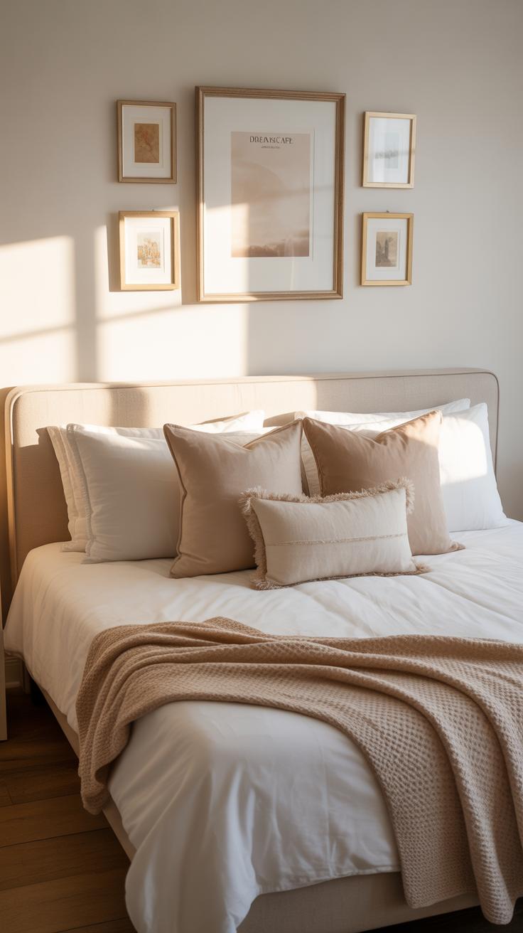
When you set out to create a bedroom gallery wall, figuring out how it plays with your furniture can be a bit tricky. The thing is, a gallery wall shouldn’t feel like it’s just slapped on the wall above your bed or dresser. It needs a sort of dialogue with the furniture beneath it. Think about the scale first—large, heavy frames over a small nightstand might feel off, while tiny prints over a king-size bed could get lost. You want a balance that feels natural but not forced.
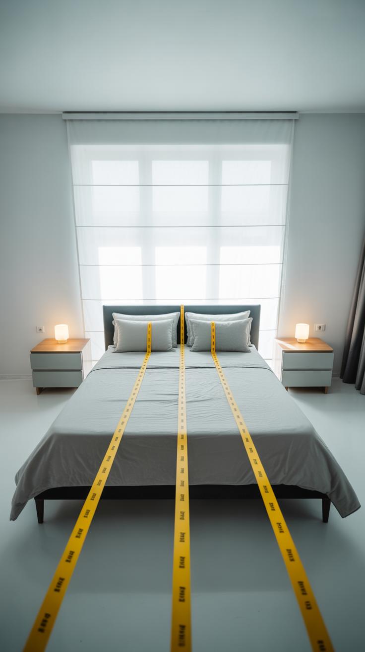
Positioning your gallery wall above furniture means paying attention to height. A good rule of thumb is to hang the bottom edge about 6 to 12 inches above the furniture’s top. But, honestly, that’s flexible depending on the piece and your room’s proportions. Too high, and the art disconnects from the furniture; too low, and it feels cramped. Spacing between artworks should also breathe enough so the wall doesn’t feel cluttered—around 2 to 4 inches usually works well.
Then, there’s the question of style matching. Coordinating your gallery wall with bedding and furniture themes can make the whole room feel intentional, not just a random collection. If your bed linens lean toward soft pastels or muted tones, choosing prints with complementary or neutral palettes helps keep things cohesive. For bedrooms with modern furniture, abstract or minimalist art fits better, while more rustic beds might benefit from nature-inspired prints, vintage photos, or handmade pieces. But sometimes, mixing contrasting styles gives an interesting edge—like a sleek metal frame next to a cozy wooden dresser.
Ultimately, it’s about how the wall and furniture ‘talk’ to each other in your space. How does your furniture influence the kind of gallery wall that fits? Have you noticed how different heights or frame styles change the room’s vibe? Maybe you’ll try something unexpected and find it just right. Trusting your eye here often beats any rulebook.
Gallery Wall Ideas For Small Bedrooms
Working with a small bedroom means the walls can’t always host sprawling gallery displays. Yet, this doesn’t mean you have to skip a gallery wall altogether. Instead, you might want to think vertically. Arranging your art in a tall column-like layout can draw eyes upward, making the room feel taller without crowding the limited horizontal space. This approach can feel less cluttered while still allowing you to show off your favorite pieces.
When picking artwork, lighter colors and simpler designs often help keep the room from feeling boxed in. Imagine soft pastels or subtle line drawings rather than bold, busy patterns—they tend to open the space up visually. You could also mix frames strategically, swapping darker ones for slim, lighter-toned frames to avoid heavy visual blocks.
One trick I’ve noticed works well is using a few larger pieces spaced with some breathing room instead of lots of tiny frames tightly packed. It’s a balancing act, really—too many pieces can feel cramped, but too few might feel incomplete. Have you tried leaning into fewer, cleaner visuals? It’s not always what you’d expect, but it tends to leave the room feeling calmer, even if it’s small.
So, while small bedrooms don’t offer much wiggle room, you can still create a gallery wall that’s impactful. Vertical setups and lighter art give you that personal touch without making the space feel stuffy or overwhelmed. Maybe it’s about quality over quantity, or about letting the wall breathe as much as the room does.
Conclusions
Your bedroom gallery wall is more than just decoration—it is a chance to express yourself. By thoughtfully choosing your art and arranging it thoughtfully, you can create a space that feels inviting and inspiring. Gallery walls offer endless possibilities to showcase what you love.
Remember, the key is to enjoy the process and personalize your bedroom gallery wall to suit your taste. With patience and creativity, you will build a dreamy, one-of-a-kind space that you look forward to retreating to every day.