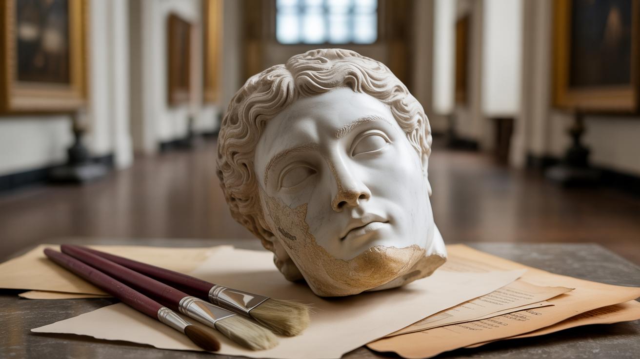
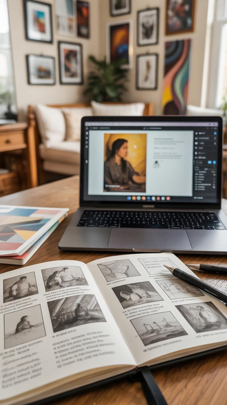
Introduction
Analyzing composition in famous art paintings is a valuable way to find inspiration for your own creative projects. Composition is how an artist organizes elements in their artwork to guide the viewer’s eye and create balance and interest. By understanding what makes a painting appealing, you can improve your own skills and appreciate art on a deeper level.
In this article, we will explore the basics of composition, examine examples from well-known paintings, and offer practical tips to use in your own work. You will learn how to recognize the techniques artists use to tell stories and express emotions through their arrangement of shapes, lines, colors, and space.
The Role of Line and Shape in Famous Paintings
Lines and shapes are like the skeleton of a painting. When you look closely at famous artworks, you’ll often notice how artists carefully place lines to guide your eye or create a sense of motion. For example, in Leonardo da Vinci’s “The Last Supper,” the strong horizontal and vertical lines of the table and walls help organize the scene and focus attention on the central figure, Jesus.
Shapes work a bit like blocks or puzzles. Think about Pablo Picasso’s “Guernica,” where sharp, angular shapes create tension and chaos that match the painting’s grim theme. The shapes are jagged, almost like broken glass, which makes you feel uneasy. This is no accident; Picasso arranged these shapes to tell a story without words.
Sometimes, lines curve smoothly to make things feel calm or soft. Claude Monet’s water lilies use gentle, round shapes to capture a peaceful pond. Other times, jagged or zigzag lines can feel stressful or energetic. You might notice how Van Gogh’s brushstrokes swirl in “Starry Night,” using lines to add a sense of movement in the sky.
Looking at these examples, do you see how lines and shapes are more than just marks? They build the structure and mood of the whole painting. When you’re creating your own art, thinking about where your lines go and which shapes you use can make a big difference. It’s almost like deciding which parts of a story you want to show first or how you want people to feel while looking.
Next time you see a famous painting, try tracing the lines with your finger or imagining how the shapes fit together. It might help you understand what the artist wanted to say, or how they made their image come alive. What do you think—can lines and shapes really change the story in a painting?
The Role of Line and Shape in Famous Paintings
Lines and shapes do more than just fill space in a painting—they form its bones and muscles. Take Leonardo da Vinci’s “The Last Supper.” The straight, horizontal lines of the table pull you across the scene, while the vertical lines of the apostles draw your eyes up, creating a sense of order and focus on the central figure, Christ. Those lines create structure but also a kind of rhythm, like a carefully arranged dance.
Or think about Picasso’s “Les Demoiselles d’Avignon,” where sharp, angular shapes break the space into tense, fragmented forms. These shapes create a sense of movement and conflict—your eye jumps quickly from one figure to the next, unsettled but engaged. It’s by no means a smooth flow, yet that’s exactly what makes it so gripping.
Using Lines to Guide the Eye
Lines guide you—there’s no doubt—but not all lines behave the same way. Straight lines tend to stabilize and ground a painting. For example, the strong diagonal lines in Eugène Delacroix’s “Liberty Leading the People” thrust you forward into the chaos, pulling your focus up the banner. Curved lines, like in Botticelli’s “The Birth of Venus,” gently lead your eye in a soft, circular movement, creating a feeling of grace. Diagonals often create tension or movement, straight verticals command attention, and curves offer calm. You might find one kind more compelling, depending on what emotions you want to evoke in your art.
Shapes that Build the Picture
Shapes act like the building blocks of composition. In Grant Wood’s “American Gothic,” the triangular shape formed by the roof behind the figures echoes the pointed pitchfork, connecting space and object in a simple, memorable way. Shapes aren’t always obvious blocks—you might find that circles frame faces or irregular shapes frame shadows. These give a painting its internal order, helping you tell what’s important. Sometimes shapes overlap or break apart and confuse you—that can be intentional, sparking curiosity or tension.
So, when you look at famous paintings, try picking out the lines and shapes first. Ask yourself: Where do they lead? What space do they create? There’s everything from calm order to deliberate chaos—all shaped by these basic elements. You might find it easier to see how artists build a scene or lead your eye before even thinking about color or texture.
Understanding Color and Its Impact
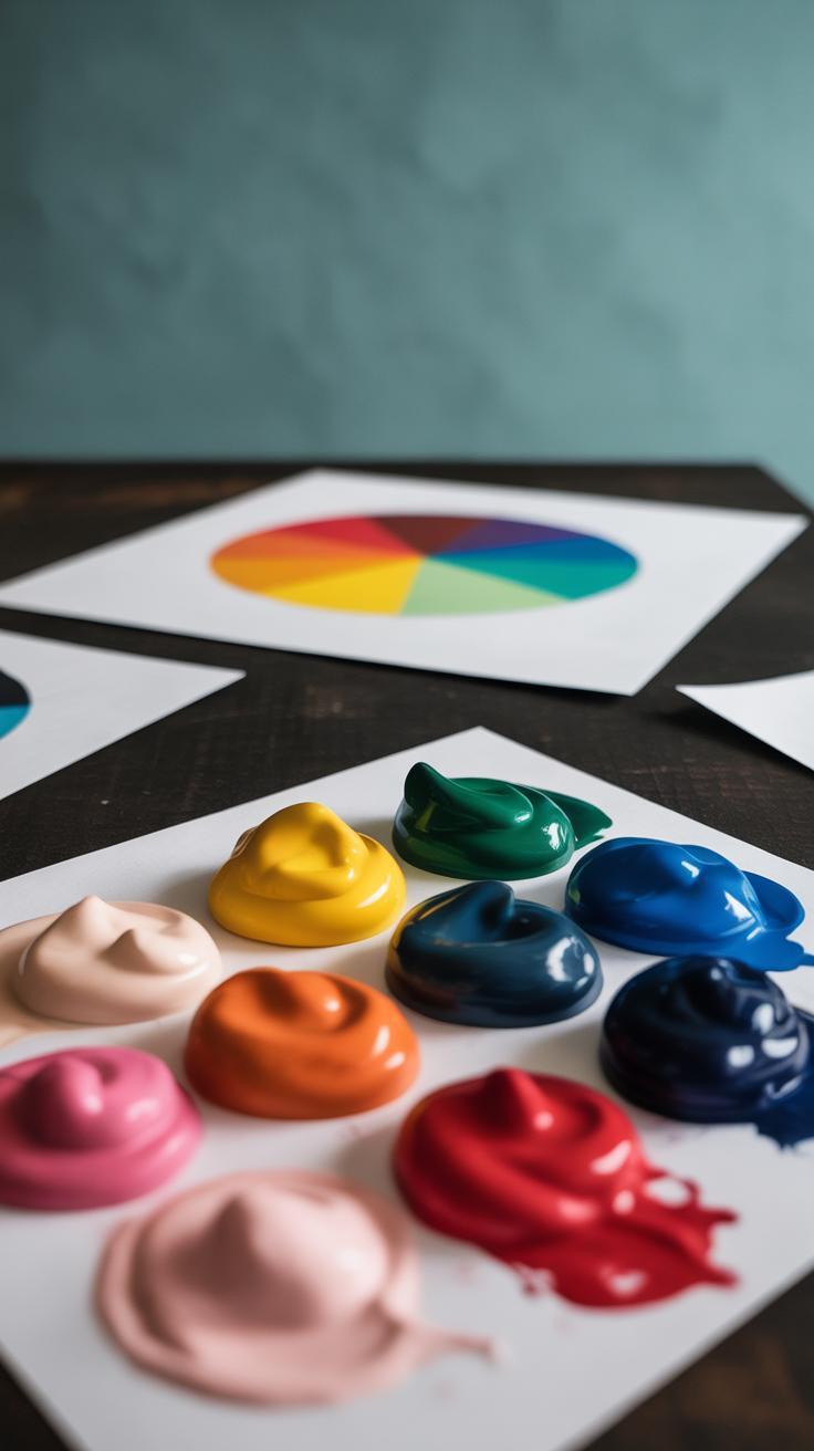
Color often carries an emotional charge in famous paintings, guiding your reaction more than you might realize. Think about Van Gogh’s Starry Night, where the swirling blues and yellows don’t just decorate the sky—they evoke a restless energy, almost a nervous excitement. Colors are never random; artists choose them carefully to spark feelings, whether calm, joy, or even discomfort.
Color Choices and Emotions
Artists tend to rely on a few basic associations:
- Soft blues and greens can soothe, inviting calm and contemplation.
- Bright yellows or reds often bring warmth or liveliness, pushing your mood toward happiness or passion.
- Darker, muted tones may invoke sadness, introspection, or tension.
Look at Picasso’s Blue Period—his dominant use of blue shapes an atmosphere filled with melancholy and isolation. What’s interesting is sometimes the same color can create opposing moods depending on context or shade, making color choice both powerful and tricky. So, when you pick your own palette, ask yourself: what feeling do I want to stir?
Color Contrast and Focus
Beyond mood, color differences can also direct where your eyes go. Caravaggio’s dramatic use of deep shadows against highlighted flesh pulls you right to the figures’ faces and hands. This sharp contrast isn’t just for drama; it isolates key parts of the story and demands attention.
Think of complementary colors—like red and green or blue and orange—as natural magnets. When placed near each other, they seem to pulse, making areas pop. You’ll see this in Monet’s water lilies, where the bright flowers stand out sharply against cool green leaves.
Color contrast might be subtle or bold, but either way, it’s a key tool for artists to control focus. What happens if you tried dialing back contrast in your compositions? Would the emphasis vanish, leaving the viewer unsure of where to look?
The Use of Light and Shadow

Creating Depth with Light
Light and shadow play a crucial role in making paintings feel dimensional rather than flat. When you look at Caravaggio’s works, for example, the stark contrasts between light and dark give a sculptural quality to his figures. It’s almost like you can reach out and touch their skin or clothing. Shading here is not just about tone—it becomes a way to model forms, suggesting volume and space.
Think about how subtle shifts from light to shadow define curves and edges, turning a simple surface into something palpable. In Velázquez’s portraits, shadows softly wrap around the face, shaping features with nuance instead of harsh lines. That delicate gradation helps you sense the roundness of cheeks or the depth of eye sockets, making the subject look alive.
You might wonder if all types of light can create this effect. Actually, directional light—something coming from a specific source—tends to be the most effective in sculpting forms. Diffused light often flattens images, so when artists deliberately use sharp lighting, they can build more spatial complexity.
Highlighting Subjects
Artists often guide your eyes through a painting by controlling where light falls. Rembrandt’s portraits exemplify this beautifully: faces emerge from deep shadows, with light focused precisely on the eyes or hands. This doesn’t just illuminate features—it signals what matters most.
In a way, light acts like a spotlight, isolating important elements amid the surrounding darkness. You might notice that less essential parts fade into shadow, receding quietly so they don’t compete for attention. It’s a simple yet powerful way to prioritize within the composition.
Interestingly, some painters play with this by placing unexpected highlights, creating a tension between what you expect to see and what actually draws your glance. It’s not always straightforward or predictable. That ambiguity invites you to linger, to question, and that can deepen your connection with the artwork.
As you study these techniques, consider how your own use of light and shadow might add emphasis and dimension. What parts of your art do you want viewers to notice first? How might controlling light transform a flat sketch into something more compelling?
Balance and Symmetry in Art
Balance and symmetry are core ideas in art that help create harmony on the canvas. When a painting feels balanced, the elements within it neither crowd nor clash; instead, they seem to fit together calmly. It’s not always about perfect mirroring, though. Sometimes, balance comes from subtle shifts in weight across the artwork, guiding your eye gently from one point to another without making you feel off-kilter.
There are two main types of balance to watch for:
- Symmetrical balance arranges elements evenly on both sides, like Leonardo da Vinci’s “The Last Supper.” The figures are almost mirrored, making the scene feel steady and formal.
- Asymmetrical balance scatters elements differently but still achieves a kind of equilibrium. Look at Van Gogh’s “Starry Night” — its swirling skies and calm village balance without matching exactly. It feels lively, yet stable enough to hold your gaze.
Balanced compositions often make you feel relaxed, settled, almost like everything is in order. Unbalanced paintings, though, might create tension or invite curiosity because your eyes keep moving, seeking resolution. This tension isn’t bad—it can add energy—but it’s something to be aware of when you compose your own work. Do you want a peaceful scene or one that keeps people restless, maybe just a little?
Famous Paintings That Showcase Great Composition

When you look at Leonardo da Vinci’s The Last Supper, you immediately notice how everything seems to draw your eye toward the center, where Christ sits. Da Vinci masterfully uses lines—like the walls and ceiling panels—to guide your gaze inward. This creates a kind of invisible web that holds the scene together. It’s almost like the architecture itself participates in the story, balancing the crowd’s energy with an ordered calmness around Jesus. I find myself caught in the tension between the chaos of the apostles and the stillness of Christ. That balance makes the narrative clear without oversimplifying the emotions involved.
Then there’s Vincent van Gogh’s Starry Night. The composition isn’t about strict order; it’s about movement. The swirling skies pull your eye across the canvas in unpredictable ways. It almost feels like the wind is alive. The colors don’t just sit side by side—they clash, blend, and pulse. This creates an emotional rhythm, a kind of visual music that might make you feel uneasy or amazed, sometimes both at once. What’s fascinating is how this restless energy contrasts with the dark, sleepy village below. It makes you wonder if van Gogh was more interested in emotion than in any precise scene.
Both paintings use composition in ways that don’t feel obvious or forced. They invite you to look again—and again—to understand what the artist wants you to feel or see. And perhaps that’s a good takeaway for your own work: a strong composition doesn’t always mean everything has to be neat or predictable. Sometimes it’s about what lingers or unsettles you subtly, pulling you deeper into the story.
Common Composition Mistakes to Avoid
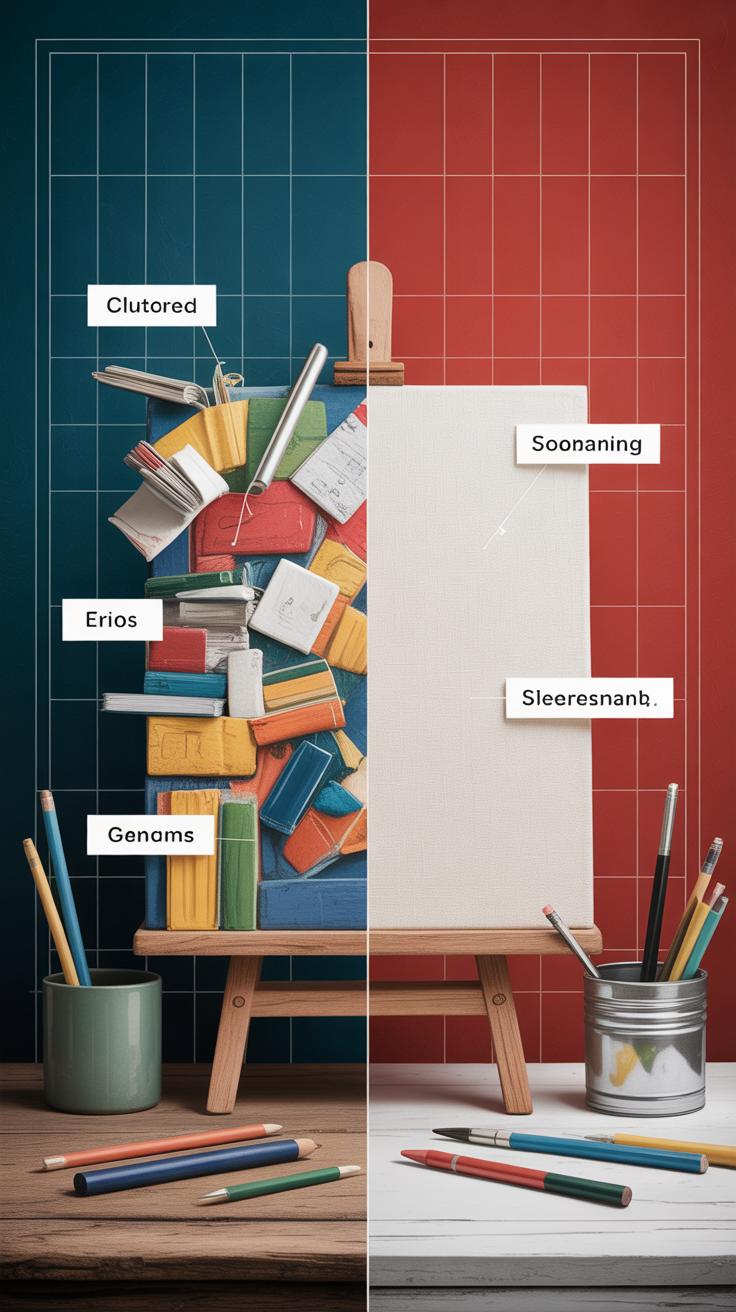
Cluttered Space
Sometimes, you might find yourself adding too many things into a painting, thinking it makes the image richer. But the truth is, too many elements can overwhelm the viewer. When a painting looks crowded, the eye doesn’t know where to settle. It’s like trying to listen to several conversations at once. You lose focus and interest.
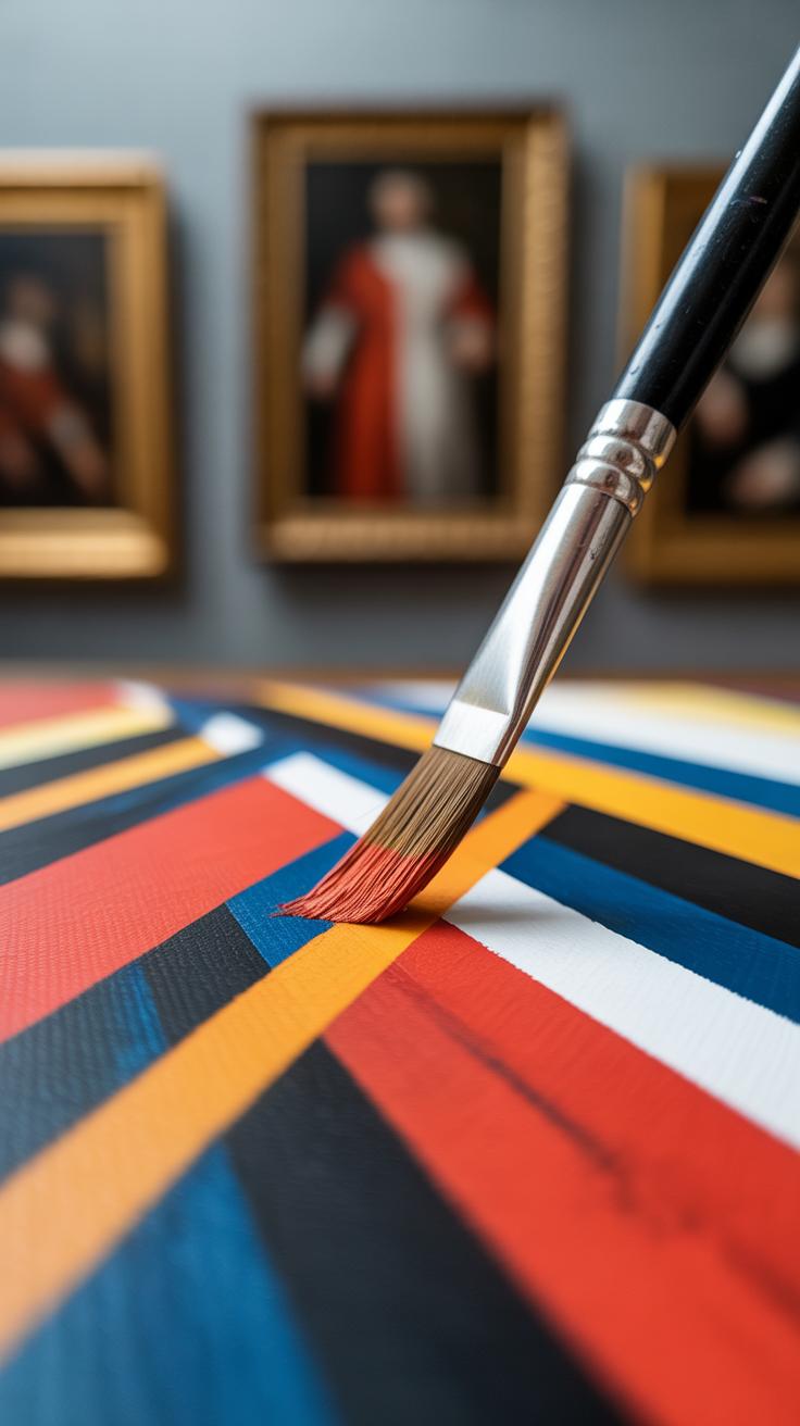
To fix this, try limiting the number of elements. Ask yourself what really matters in your painting. Remove or simplify anything that doesn’t support your main idea. Look at Picasso’s “Guernica”—even though it’s complex, it doesn’t feel cluttered because each part clearly relates to the others. Balance between simplicity and detail keeps things clear. You don’t have to fill every inch; some empty space can actually help organize the scene.
Ignoring Focal Points
Many artists struggle with not picking one clear focus. Without a strong focal point, your painting can feel directionless. The viewer’s eye wanders without rest—or worse, gets bored and looks away. Think about Leonardo’s “Mona Lisa.” Her face grabs your attention immediately—and holds it. That focus is intentional and key.
If your painting lacks focus, try isolating one element as the star. Use contrast, size, or placement to make it stand out. It doesn’t mean everything else disappears, but they should support the main subject, not compete with it. Sometimes, you only realize what your focal point is after stepping back or showing the work to someone else. Don’t hesitate to revise until it feels right.
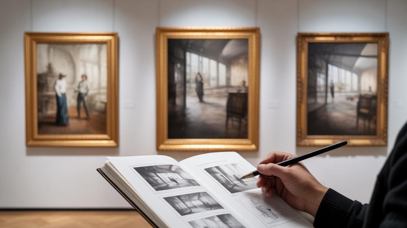
How to Analyze Composition in Paintings
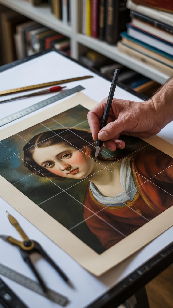
When you look at a famous painting, the first thing to do is slow down and really watch how it’s built. Start by focusing on the lines and shapes in the artwork. Don’t try to understand the entire picture at once—break it into smaller parts. Notice whether the lines are straight, curved, or diagonal. Are they leading your eye somewhere? For example, in Leonardo da Vinci’s “The Last Supper,” the lines of the ceiling and table all guide your gaze toward Jesus at the center. That’s no accident.
Next, pay attention to the shapes. Are they mostly geometric, like squares or triangles? Or are they more organic, irregular forms? Think about how these shapes create balance or tension. Sometimes, artists use large shapes next to small ones to create contrast, or patterns of shapes to repeat a rhythm you might not catch immediately.
Now, colors and light. Watch how colors interact—do they clash, or blend smoothly? Notice if the light source is obvious or subtle. In Rembrandt’s portraits, for instance, light falls sharply on the face but fades into darkness at the edges. That contrast gives the painting depth and drama. See if the colors direct your attention or keep you moving around the canvas. Sometimes the brightest color isn’t in the center but off to the side, pulling your eye in unexpected ways.
Ask yourself questions like:
- Which lines shape my path through the painting?
- What role do shapes play—do they organize or disrupt?
- How does light influence the mood or focus?
- Do colors feel large and overwhelming or subtle and guiding?
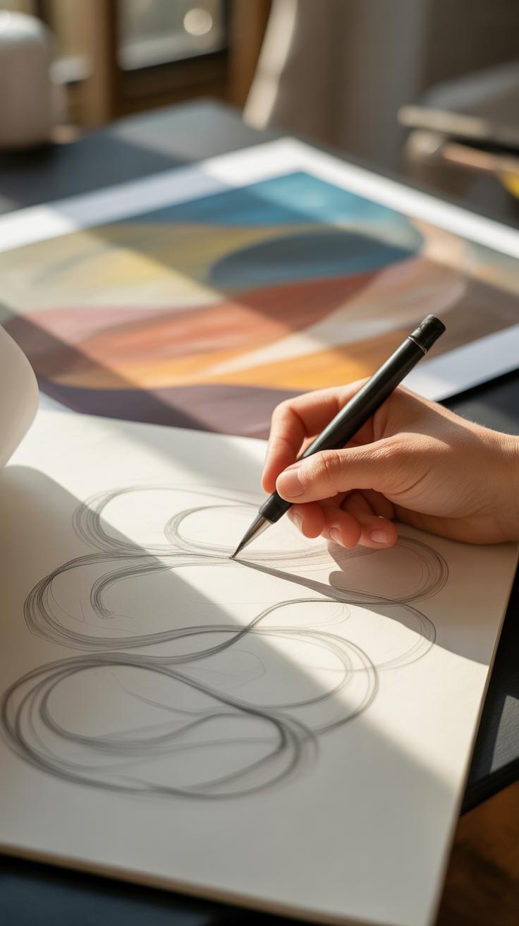
Try scribbling simple sketches of these lines and shapes. It can clarify what you might miss just by staring. Don’t worry if some aspects feel confusing—composition often invites multiple readings, and that’s part of what makes it interesting.
Applying Composition Lessons to Your Own Art
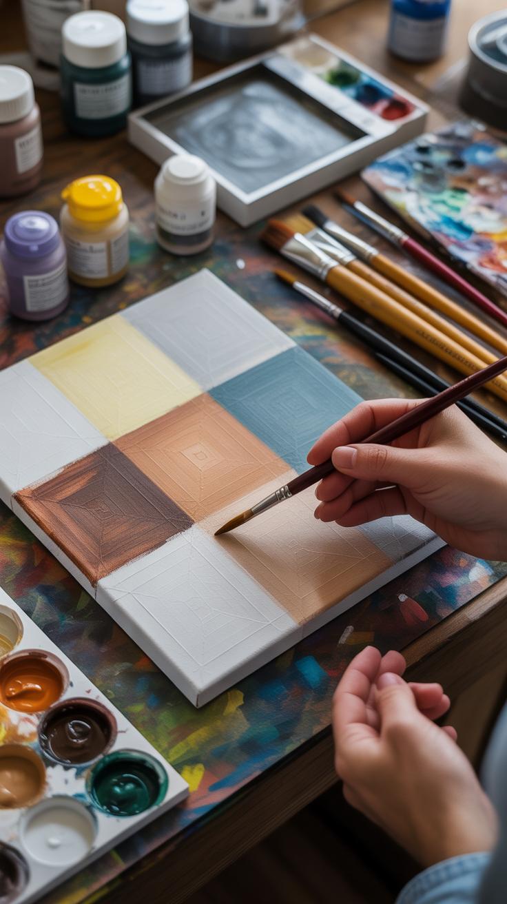
Once you’ve spent time examining how famous paintings use composition, the next step is to bring those ideas into your own work. It’s tempting to dive straight into painting, but planning your layout first can save a lot of frustration. Think about it as giving your work some structure before you add detail.
Try sketching thumbnails, small rough sketches that test the arrangement of shapes and spaces. It doesn’t have to be pretty—these sketches help you explore where the main focus will sit and how other elements support it. For instance, you might notice that a painting like Caravaggio’s use of dramatic lighting paired with a tight composition guides your eye in a specific path. Try to translate that feeling into your own sketches.
Simple exercises can help too. Set a timer for 5 minutes and sketch a few different compositions for the same subject. You could position your main object off-center one time, then try a more symmetrical setup next. Pay attention to what feels natural or compelling. Sometimes the best ideas come from these quick, imperfect attempts.
What happens when you notice emptiness in one corner or too much clutter in another? These are clues. You learn what balance looks like on your canvas. It’s a slow process, and some compositions won’t work at first—but that’s exactly where the creativity lives. Keep asking yourself: what makes this placement effective? How does the eye move through this scene? If it piques your curiosity, you’re on the right track.
Continuing Your Journey with Composition
Studying More Famous Paintings
Keeping your eyes on famous paintings can open up endless possibilities. Regularly looking at works by artists like Vermeer, Caravaggio, or Turner lets you notice details you might’ve missed before—the way light falls, how figures balance a scene, or unexpected focal points.
Try to spend a little time each week just observing. Don’t rush to analyze everything at once; sometimes, just letting a painting sit with you can spark ideas you didn’t expect. You might begin to spot recurring patterns or compositional tricks that weren’t obvious at first glance.
Ask yourself questions like, “Why does this arrangement feel stable?” or “What makes this moment engaging?” Over time, these reflections become part of your creative toolkit, ready to inform your own work.
Experimenting with Your Style
It’s tempting to settle into a comfortable style once you find something that works. Yet, mixing things up—the structure, brushwork, even the viewpoint—can lead to discoveries you might not get otherwise.
Maybe try something that feels strange at first: a composition with off-center subjects, or a chaotic layout instead of order. What happens when your usual focus shifts abruptly? Playing with contrasts, imbalance, or layering can help you find your own voice, even if you don’t stick with those experiments forever.
Think about Picasso’s Blue Period versus his Cubist phase. Staying open to change isn’t always easy, but it pushes your creativity forward. Your style might evolve, sometimes in surprising directions, and that’s okay.
Conclusions
Knowing how composition works in famous paintings equips you to see art more clearly and to express yourself more effectively. Every detail, from the position of figures to the use of light and shadow, serves a purpose in creating impact. When you analyze these choices, you unlock the secrets behind memorable artworks.
As you practice applying compositional ideas in your own art, remember that creativity grows with study and experimentation. Use the methods described here to guide your eye and hand, and you will start to create pieces that hold meaning and catch attention. Keep exploring famous paintings and be curious about the choices artists made. This will inspire your journey to become a stronger artist.


