Introduction
Ink illustrations create striking images using black ink and fine lines. These illustrations bring out details and depth by combining strokes and dots. Many artists choose ink because it allows control and precision. For beginners, ink illustration is a practical way to practice drawing skills while seeing clear results in black and white.
This article covers how to start with ink illustrations using graphic pens. You will learn what ink illustration is, how to pick the right pens, basic techniques to try early, and common mistakes to avoid. By following this guide, you can build a strong foundation for creating your own ink art pieces with confidence.
Understanding Ink Illustration
What Is Ink Illustration
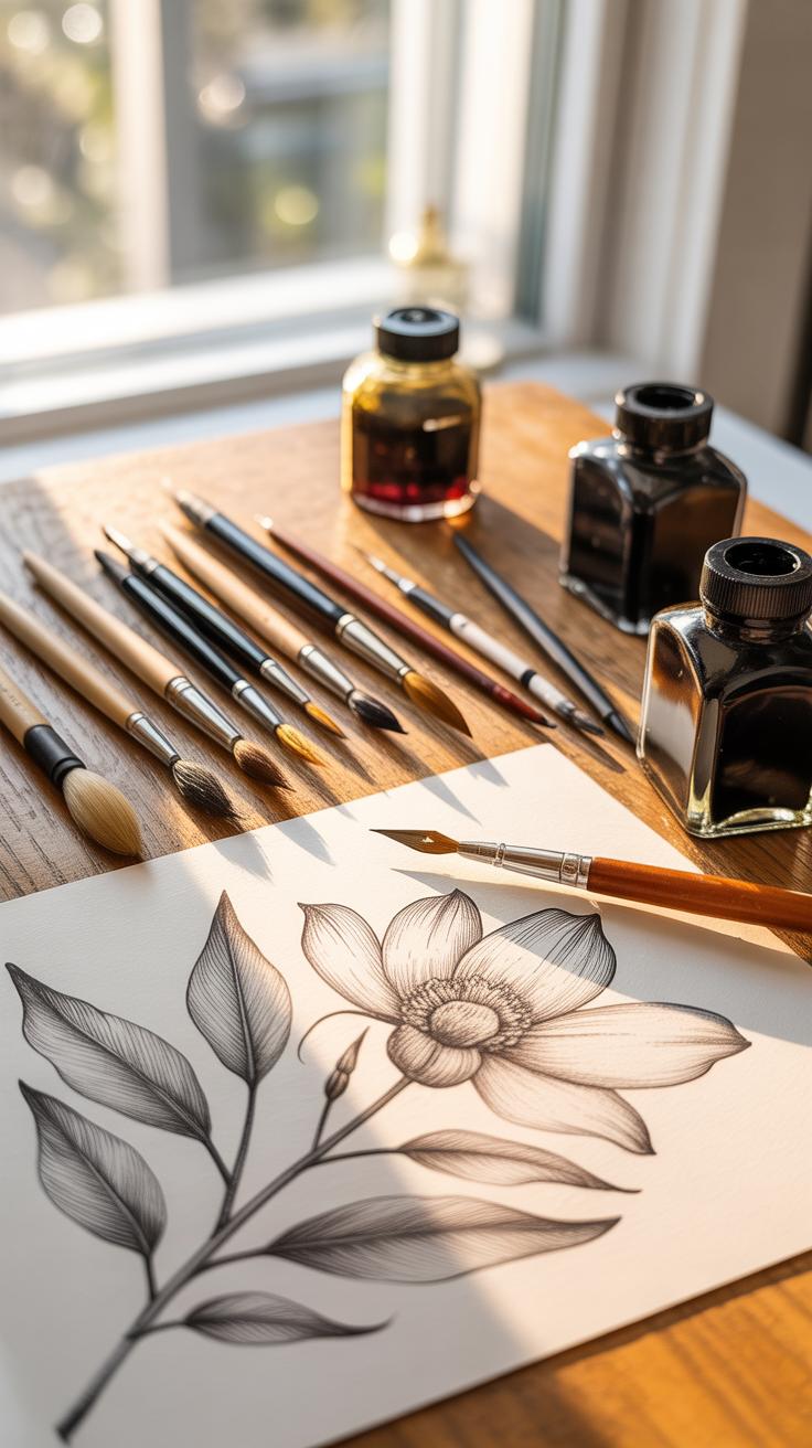
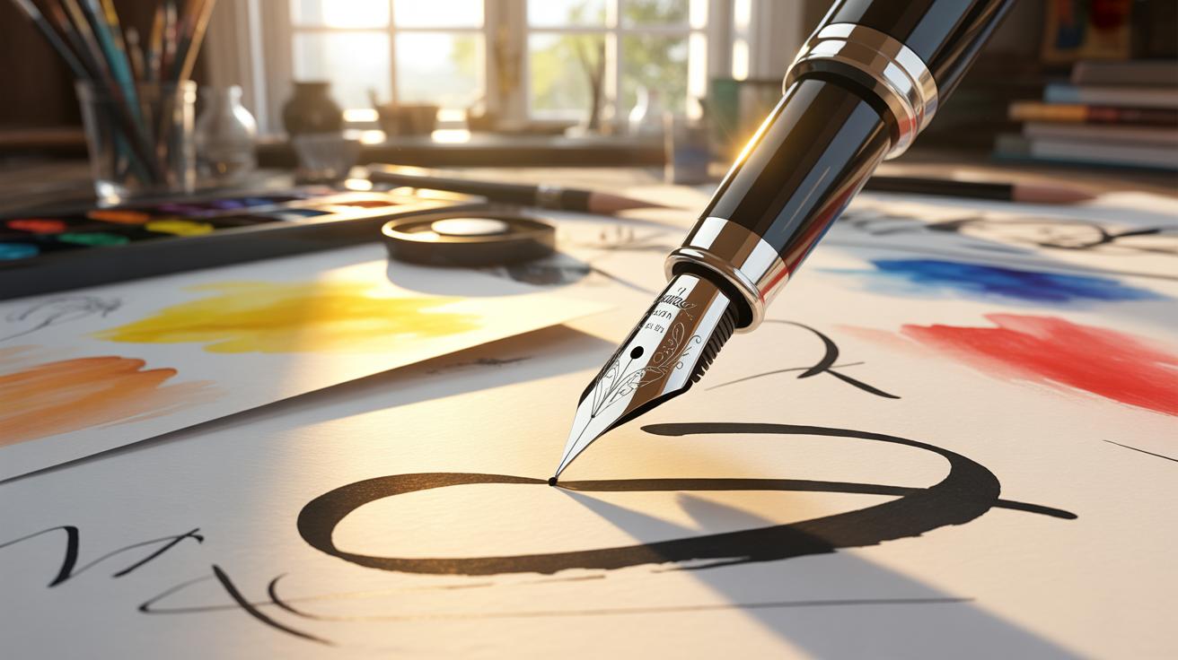
Ink illustration is, simply put, making images with ink on paper. Artists usually use pens or brushes to create lines, shapes, and textures. The focus is often on black ink, but colored inks are also common. The marks can vary from thin, delicate lines to bold, heavy strokes.
Unlike pencil sketches that might be smudged or erased, ink illustrations tend to be more deliberate since the ink is permanent. This means each stroke counts, leading to a distinctive style. You’re working directly with contrast and clarity, which can make the artwork stand out sharply.
History And Uses
Ink illustration has roots that go way back, to ancient times when people first used ink for writing and drawing. It was widely used in manuscripts during the Middle Ages, with artists drawing intricate designs and scenes. Later on, with the invention of printing, ink illustrations played a key role in books and newspapers, making images widely accessible.
Today, ink illustration still holds solid ground. It shows up in editorial work, comic books, advertising, and product packaging. Many designers and illustrators appreciate its simplicity and the strong visual impact it provides. It’s a practice that connects past craftsmanship to present creativity.
Have you noticed how ink brings a sense of permanence to an image? Sometimes it feels a little intimidating but rewarding because it forces precision. Compared to other drawing methods like watercolor or charcoal, ink is less forgiving but also more graphic and direct, which might appeal to your style if you like clear lines and bold designs.
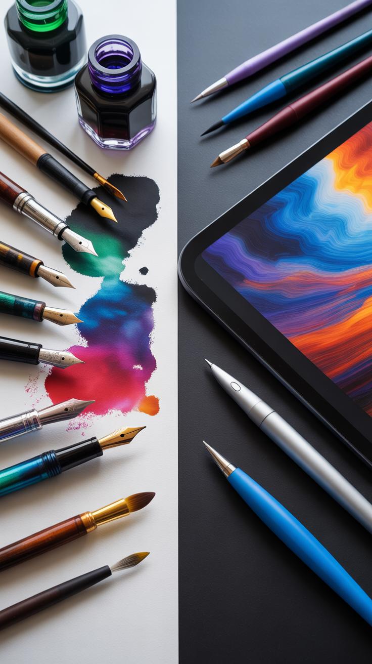
Selecting Graphic Pens For Ink
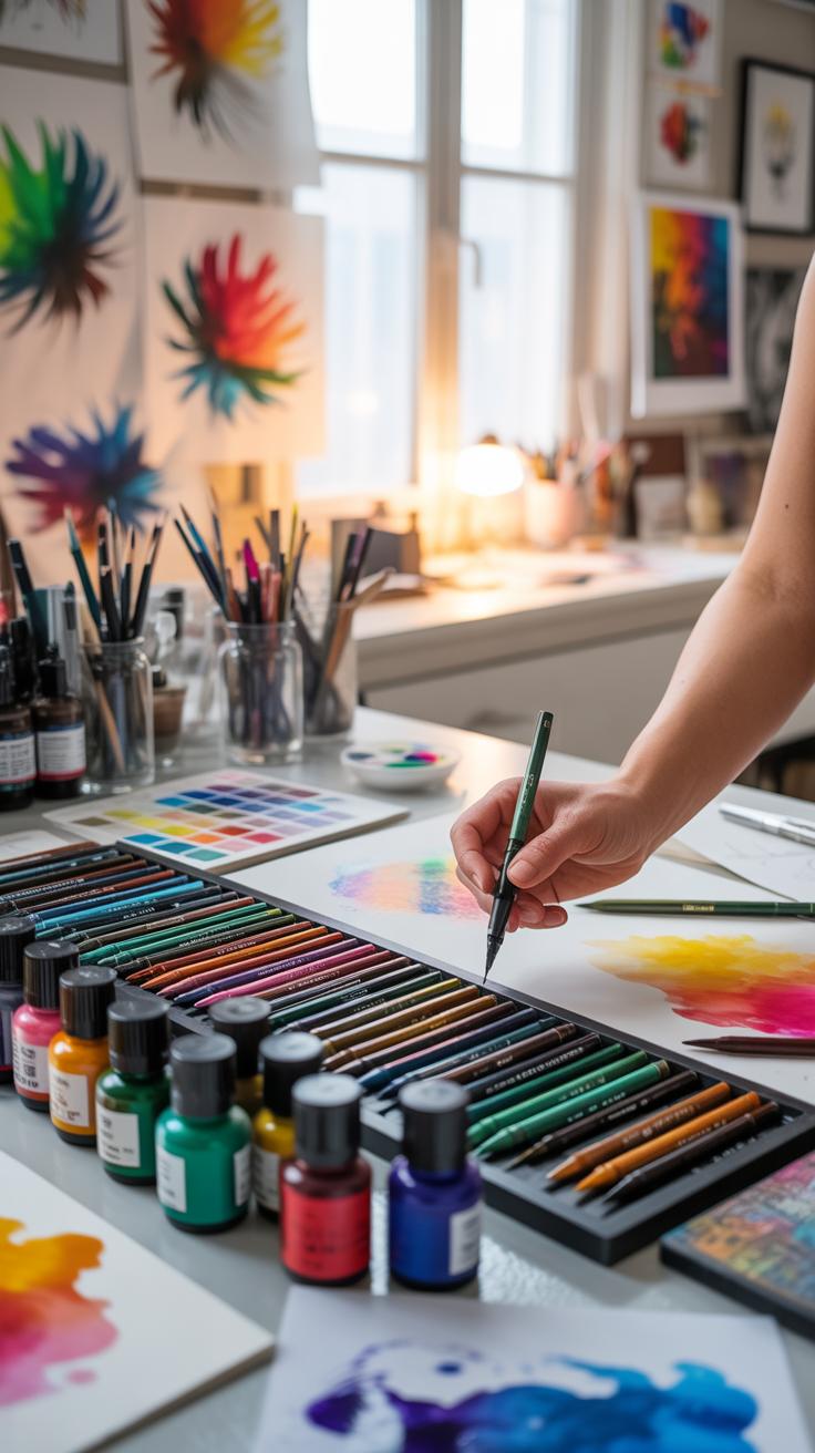
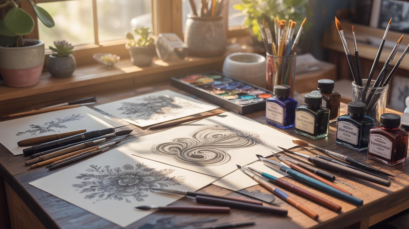
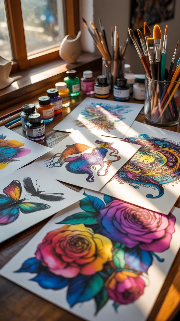
Choosing the right graphic pen can feel confusing, especially with so many options. It helps to know what nib types you might want to explore first. Fine liners offer a steady, precise line, usually in sizes from 0.05mm to about 0.8mm. They’re great for detail and control, which beginners often appreciate. Brush pens, on the other hand, mimic a brush’s flexibility—lines vary with pressure and angle, adding expressiveness but maybe a little challenge initially. Dip pens provide the most variety in nibs and line widths but require more maintenance and skill, so perhaps better for when you’re ready to experiment more.
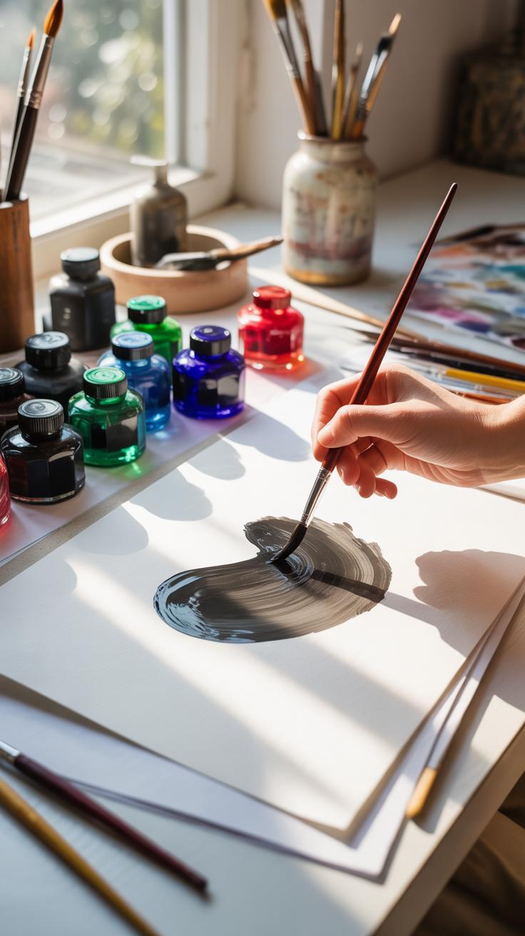
Ink quality matters, too. Pigment-based inks tend to be waterproof and lightfast, lasting longer without fading—good if your work is meant to last or be scanned seriously. Dye-based inks may bleed or fade faster but sometimes feel smoother on paper. Don’t overlook affordability. A set of fine liners can be budget-friendly and durable, lasting through many projects, while brush pens might wear out faster. Dip pen nibs are cheap on their own, but the whole setup calls for care and patience.

When it comes to maintenance, cleaning your pens regularly avoids clogs and keeps lines consistent. Fine liners often come with disposable nibs or cartridges, simplifying refills, but the refillable brush or dip pens need soaking or wiping after use. Store pens horizontally or nib-up to prevent drying issues. I’ve noticed that taking just a minute to clean my brush pens after a session made a big difference—skipping it once or twice and you feel it the next time you draw. Have you tried mixing nib types in one drawing? That might guide what you really want to keep on hand.
Basic Ink Drawing Techniques
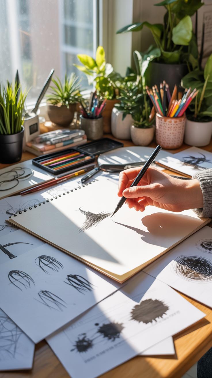
Starting with ink drawing means getting familiar with some core techniques that build up your control and expression. One fundamental approach is line drawing. Using simple lines, you can define shapes and forms. Try drawing an everyday object—maybe a coffee cup—with clean, confident strokes. Don’t worry if the lines aren’t perfect; they show character. You’ll notice how varying the pressure or thickness changes the energy of the line.
Next, there’s hatching, where you use closely spaced parallel lines to suggest shading or volume. For practice, sketch a sphere and fill it with sets of parallel lines that get denser toward the shadowed side. It’s a quiet way to create depth without shading with a brush—kind of meditative, honestly.
Cross-hatching builds on that but layers lines at different angles, usually perpendicular or diagonal, increasing darkness and texture. Try cross-hatching the same sphere, overlapping sets of lines. It feels a bit like weaving threads but on paper.
If lines aren’t your thing, stippling offers an alternative by using tiny dots. Gradients or textures emerge through dot density—more dots mean darker areas. A simple exercise is to create a gradient from light to dark using only dots. It’s slow work but oddly satisfying, though some fingers may cramp.
Finally, shading with ink often mixes these methods—lines and dots—to convey volume and form. You can experiment by shading a leaf, varying from hatching on one side to stippling on the other. See how each technique changes the mood of your piece.
How do you find your line control? Maybe try mixing techniques in a small sketchbook page. That way, you’ll start understanding which approach fits your style or subject best.
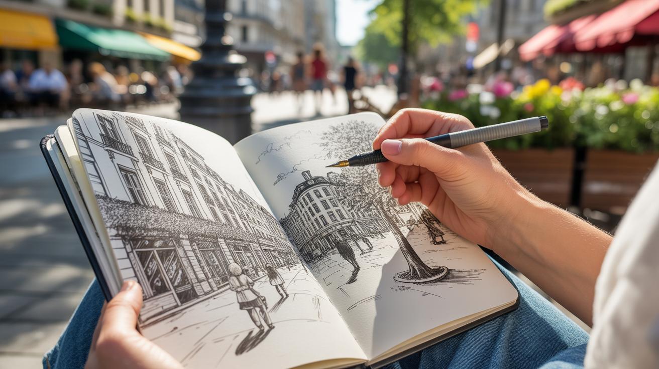
Creating Your First Ink Artwork
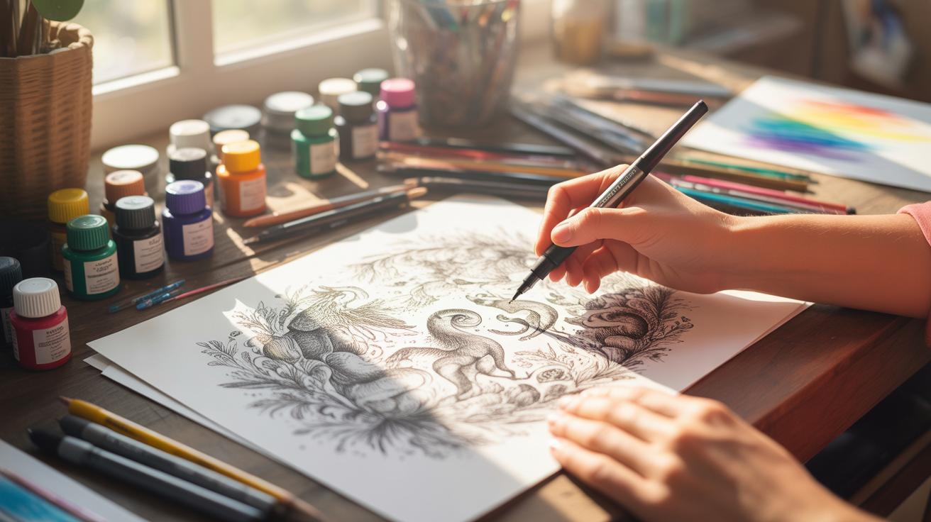
Starting your first ink illustration can feel a bit daunting, but taking it step-by-step helps. Begin by setting up a clean workspace with good lighting. Have your drawing paper, pencils, erasers, and your ink pens ready. You might want to pick a simple subject, maybe a leaf or a small animal, something manageable to keep things from becoming overwhelming.
Sketching The Design
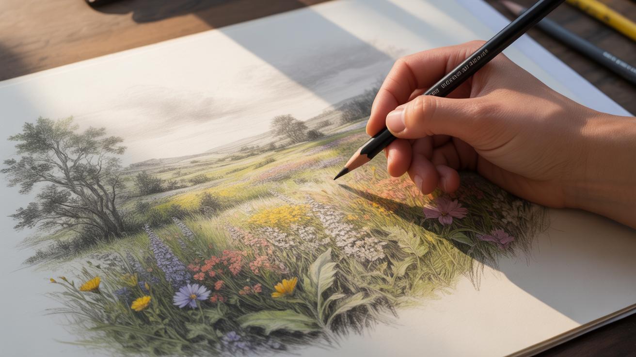
Always start with a pencil sketch. This draft doesn’t have to be perfect; it’s just your map. Use light, loose lines to outline the basic shapes and forms of your subject. It’s perfectly fine to erase and adjust sections—this part is about exploring and figuring out your composition. Sometimes I find that using reference images can clarify shapes or details I hadn’t considered. Don’t be afraid to look at photos or even real-life objects for cues. Try to keep your sketch simple because heavy pencil marks can interfere when you add the ink later.
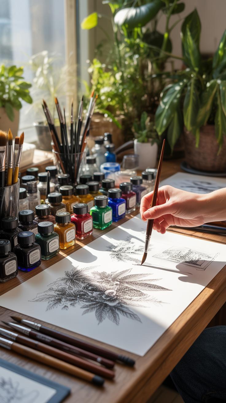
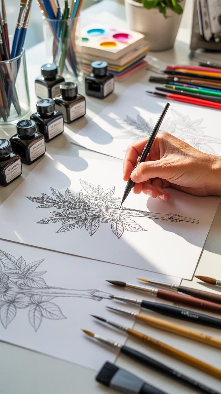
Layering Ink And Details
Once your pencil outline feels ready, it’s time to bring in the ink. Start with the larger shapes and basic outlines using a thicker pen, then let the finer pens gradually add details. This layering approach means you’re not pressured to get everything perfect immediately. Build depth by overlapping lines, adding spots of shadow with crosshatching, or varying your strokes. You might notice some lines smudge at first or feel unsure about where to add texture—this is normal. If you feel stuck, take a moment and step back. Often, what feels like a flaw early on turns into a unique detail later. The key is patience and going slowly, slowly, layering your details a bit at a time.
Comparing Ink Tools And Digital Pens
Traditional Graphic Pens
Working with traditional graphic pens brings a certain tactile satisfaction that digital tools can’t quite replicate. You feel the nib glide or catch slightly against the paper—sometimes perfectly smooth, other times stubbornly rough, depending on quality and paper choice. There’s also the variety: fine liners, brush pens, dip pens loaded with rich liquid ink. Each has its own character and quirks.
Benefits include the tangible nature of the work—you see the ink dry, you smell the paper, you physically hold your creation, which can be deeply rewarding. It can lead you to slow down, appreciate the process, and accept mistakes as part of the craft, since edits are far less forgiving than digital.
Drawbacks? Well, ink can smudge, pens run dry, and mistakes mean either starting over or incorporating imperfections. You might need various nibs and inks to explore different effects, which adds to cost and storage. Also, portability can be limited—you can’t always carry a full range of supplies with you.
Digital Pens And Tablets
Digital pens paired with tablets offer a different kind of flexibility. Software mimics ink flow, brush pressure, even texture to a certain extent. Undo buttons mean you can experiment without fear of permanent errors—something I often appreciate when learning new styles or trying complex shading.
Advantages include convenience and speed. You can create layers, adjust lines, and tweak contrast after the fact. The learning curve can be steep at first, though—sometimes the feel of the stylus on a glass screen disconnects you from the flow of drawing.
Limitations come from the lack of physical feedback. Digital pens don’t always offer the slight resistance or unpredictability of real nibs on paper. Some find this less satisfying or less authentic. Plus, costs rise quickly when factoring in tablets, software subscriptions, and upgrades.
Which tool fits you best depends on your goals. If you want that traditional, hands-on experience and value texture and permanence, graphic pens might be your choice. If you prioritize versatility, easy editing, and combining multiple techniques, digital tools could be better. Or maybe, like many, you’ll find value in both, depending on the project or your mood.
Common Ink Illustration Mistakes
Ink spills are more common than you might expect when you’re starting out. The temptation to dip the pen too deeply or shake it off too vigorously can backfire quickly. A small spill can ruin areas you’ve already worked on. Try to control the amount of ink on your pen and practice on scrap paper to get a feel for the flow.
Uneven lines are another frequent problem. It’s tempting to press harder to get darker lines, but uneven pressure often creates wobbly or blotchy strokes. Keep your hand relaxed. Moving the pen more smoothly, and at a consistent angle, helps keep lines uniform. Try to vary thickness intentionally rather than by accident.
Overworking your inked sections can leave the paper muddy and damaged. Once ink is down, resist the urge to go back and “fix” details by layering too many lines. Let dry time work for you rather than against you. Frequent breaks to step back help you notice when an area is getting overdone.
Avoiding Ink Smudges
Ink smudges sneak up on you, especially if your hand brushes over fresh ink. Avoid resting your hand directly on the drawing. A simple solution is using a clean sheet of scrap paper beneath your hand as a shield. Also, working from top to bottom or left to right (if you’re right-handed) reduces the chance of smearing.
Patience matters here—don’t rush through layers. Even if the ink feels dry quickly, give it extra time. Thin paper absorbs ink differently and increases smudge risk, so consider a heavier stock when starting out.
Keeping Consistent Line Quality
Uniform lines demand steady hand pressure and a mindful pen angle. It’s easy to hold the pen too tightly, which stiffens your movements and makes lines look forced or uneven. Loosen your grip and let the pen follow your natural wrist motions.
Try to keep the pen nib at roughly the same tilt throughout your stroke. A changed angle can cause sudden shifts in line width and texture. Some days it feels trickier than others, and that’s okay. Practicing slow, deliberate strokes often helps train your muscle memory to stay consistent over time.
Setup Checklist For Ink Drawing
Paper And Workspace Needs
Picking the right paper can feel surprisingly tricky. You want something that handles ink without bleeding through or feathering, but what exactly works? Technical drawing paper or heavier Bristol board usually fits the bill well. Both offer a smooth surface that lets your pen glide while keeping lines crisp. Some folks swear by hot-pressed watercolor paper for texture, though it can cause uneven ink flow, so it’s a bit of a gamble.
Your workspace setup shapes how your drawing flows. Bright, natural light is best if you can get it, but a daylight-balanced lamp can do the trick too. Pay attention to shadows your hand might cast—angle lights to avoid dark spots on your page. I often mess around with repositioning lights until it feels right; it’s a subtle thing but makes a difference.
Finally, clear your desk of distractions. Keep pens, ink, and paper neatly arranged within reach. This minimizes fumbling around and breaks your concentration less often. Maybe a small container or tray for tools could help you stay focused.
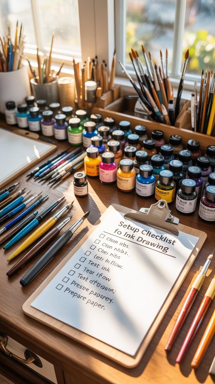
Essential Tools Checklist
Here’s what you’ll really need to keep close by when working on ink illustrations:
- Graphic pens: Fine liners from 0.05mm to 0.8mm cover most line weight needs.
- Brush pens: For variable lines and filling larger dark areas.
- India ink or pigmented ink: Waterproof and fade-resistant types are best.
- Pencils: For quick sketches and layout before inking (usually softer leads like HB or 2B).
- Eraser: A kneaded eraser is gentle and useful for lightening pencil marks.
- Cleaning materials: Paper towels or soft cloths to wipe spills or clean pen nibs.
Oh, and if you haven’t tried different nibs, it’s worth experimenting. Each offers a unique drawing feel—some smooth, others with more texture. You may find you prefer certain tools for fine details and others for broader strokes. It takes some trial and error, but that’s part of the fun, don’t you think?
Stepwise Process For Ink Illustration
Initial Sketching To Final Ink
Start with a rough sketch—don’t worry about perfection here. Capture the main shapes and layout using light pencil strokes. This stage is more about exploring your idea than nailing every detail. It’s fine to be loose or even messy; you want to understand your composition first. I often sketch multiple thumbnails to decide what works best before committing to a bigger piece.
Once the sketch feels right, transition to refining lines. Clean up the outlines and solidify the structure in a more deliberate way. You might want to use a harder pencil or a fine mechanical one for precision. At this point, avoid pressing too hard. The goal is clarity for the next phase—the ink.
When ready to ink, select your pens thoughtfully—varying nib sizes for different effects can enhance depth. Start by tracing the main contours with a steady hand. It can help to hold your breath sometimes—seriously, it feels like calming your nerves! Build up texture and shading after establishing the main form.
Take your time as you move from rough to final lines. Rushing often shows in uneven strokes. I’ve found shorter sessions with breaks work better than marathon attempts. Your hand and eyes need to stay fresh to avoid slip-ups.
Review And Corrections Tips
Once the ink is down, step away for a moment if possible. Distance offers fresh perspective; details you missed can become obvious. When you return, check for inconsistent lines, smudges, or areas where ink bled too much. These small flaws can rob your piece of polish if ignored.
If you spot something, use a white gel pen or an ink eraser for minor fixes. But don’t try erasing pencil under ink—you risk damaging the paper. In some cases, it might be better to embrace those quirks; they add personality. Not every line must be perfect, and sometimes small “mistakes” bring life.
Ask yourself, “Does this convey my idea clearly?” Sometimes overworking can clutter the image. Knowing when to stop is tricky but crucial. Also, consider showing your work to someone else; a fresh pair of eyes can catch what you cannot. Do you do this, or hesitate to share half-finished work?
Ink Illustration Examples To Try
When starting out with ink illustrations, picking simple subjects can help you focus on technique without feeling overwhelmed. Try drawing a single leaf, a piece of fruit like an apple, or even a common household item such as a coffee cup. Work with basic line drawing and add depth using stippling—small dots that build shading and texture. This approach forces you to slow down and observe details you might usually ignore. You might be surprised how much character a simple sketch can gain through careful dot placement and varied line weight.
Next, practicing patterns and textures can improve your control and make your illustrations more interesting. Create a page filled with repeating shapes: leaves, circles, squares, or unexpected doodles. Focus on alternating thick and thin lines or combining hatching with dots to suggest different materials like wood grain, fabric, or rough stone. These exercises aren’t just busywork—they help you get comfortable with your pen’s flow and how ink reacts to pressure. Plus, they can spark ideas for larger compositions later on.
Have you ever noticed how some textures look easier to replicate than others? Maybe try breaking down complex textures into simple repeated marks first. This way, you can build confidence before attempting more detailed scenes. Small scenes, like a windowsill with a plant and a book, are another great stepping stone. Don’t worry about perfect perspective or realism; instead, focus on how line and stippling define volume and contrast. The goal isn’t perfect drawing, but getting a feel for how ink behaves across various surfaces and forms.
Conclusions
Ink illustration allows you to craft detailed art using simple tools like graphic pens. With the basics of pen selection and mark-making techniques, beginners can create effective images with high contrast and texture. Regular practice helps improve control and creativity.
Focus on creating lines with purpose and paying attention to light and shadow. Avoid rushing and practice patience when working on fine details. By doing this, you will steadily get better at managing ink flow and capturing your ideas clearly with graphic pens.