Choosing the Right Gallery Wall Layout
Gallery walls have become a popular way to showcase your personality and style in your home. They add character and can turn a blank wall into a stunning focal point. Whether you have a large space or a small corner, the right gallery wall layout can make all the difference.
In this article, we explore the best gallery wall layout ideas for any space. You will learn how to plan your gallery wall, choose the art and frames, decide on the layout, and make sure your display looks balanced and appealing. Ready to create a gallery wall that you will love? Let’s dive in.
Understanding Gallery Wall Basics
What is a Gallery Wall
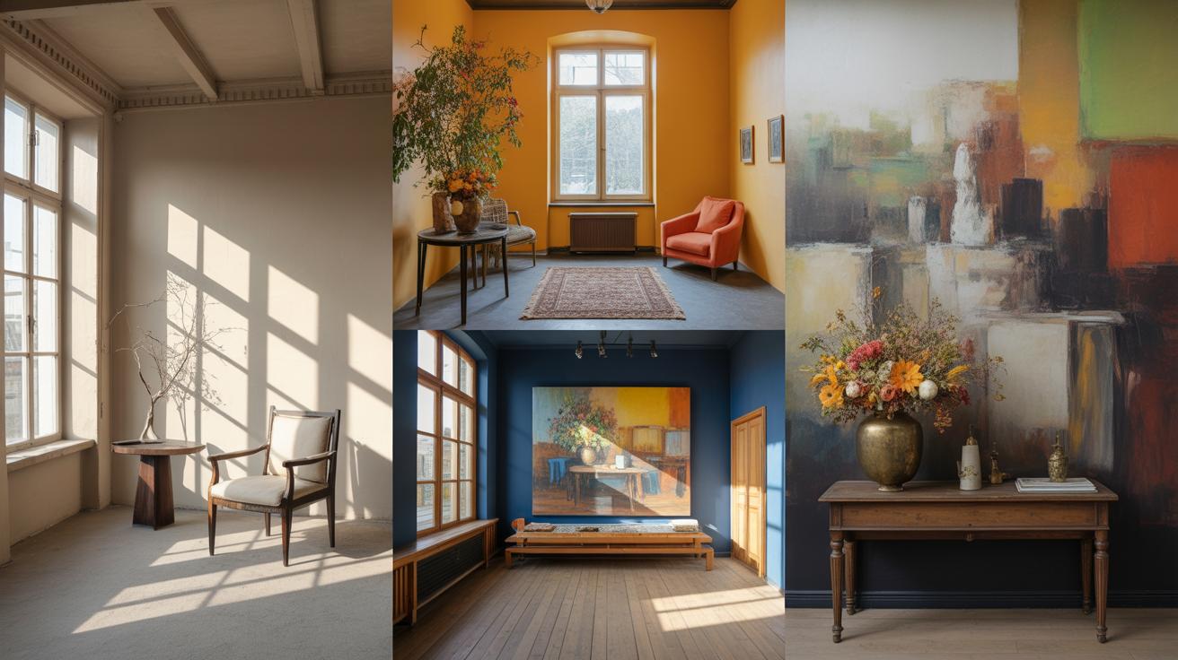
A gallery wall is simply a curated arrangement of artwork, photos, or decorative objects grouped together on a single wall. Think of it like a small personal museum right in your home. You often see these in living rooms, hallways, or even bedrooms—places where people spend time and want a bit of character or warmth.
It’s not just about hanging pictures side by side. A gallery wall usually mixes various frame styles and sizes, offering a bit of visual interest and texture. The wall space itself plays a big role—sometimes a blank wall turns into a statement feature with the right pieces arranged thoughtfully. Sometimes the space is tight, other times, it’s a large expanse, but either way, the outcome can change the feel of the room.
Why Create a Gallery Wall
Why put in the effort? Personally, I find gallery walls to be a fantastic way to express yourself without saying a word. They capture memories, interests, or artistic tastes. Plus, they break the monotony of plain walls. You get a mix of personality and style that’s hard to replicate with a single large artwork.
There’s also a practical side to it. Gallery walls can transform awkward spaces into something meaningful—like turning a blank corridor into a walk-through storybook or making a corner feel inviting. It’s not just decoration; it can really set the tone of a space. Maybe it’s a collection of travel photos, or a series of abstract prints—it all depends on what you want to say, or sometimes, just how you want the room to feel.
So, a gallery wall seems simple, but it’s more about shaping an atmosphere and giving a room a little extra personality. It’s also flexible—you can always swap pieces, shift arrangements, or grow the collection over time, which makes it something living, rather than just a one-time decision.
Planning Your Gallery Wall Space
Choosing the Perfect Wall
Not every wall is ready-made for displaying your gallery. You’ll want to look for a spot that naturally draws the eye, but also makes sense for the room’s use. Maybe that’s the blank stretch above your sofa, or the wall beside a hallway where people often pass by. In kitchens, walls near dining areas can work well if they aren’t too cluttered already. Bedrooms might call for something softer — a wall where your eyes land when you’re sitting or lying down.
Think about the wall’s current function, too. For example, a wall cluttered with shelves or a TV might not give your art the breathing room it needs. Also consider whether the wall holds any focal importance in the room—sometimes, a less obvious wall can surprise you with better results. Picking the “right” wall isn’t always straightforward and often involves weighing your room’s flow and your personal habits.
Measuring and Visualizing Space
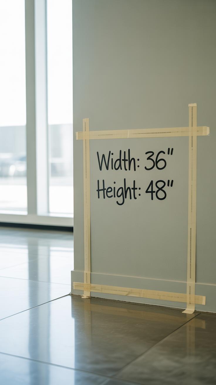
Grab a tape measure—preferably one with clear markings. Measure the height and width of your chosen wall section, but then pause and ask yourself: how much space should the gallery really take? You might think filling the entire wall is great, but sometimes less is more. Leaving some negative space can actually help each piece stand out better.
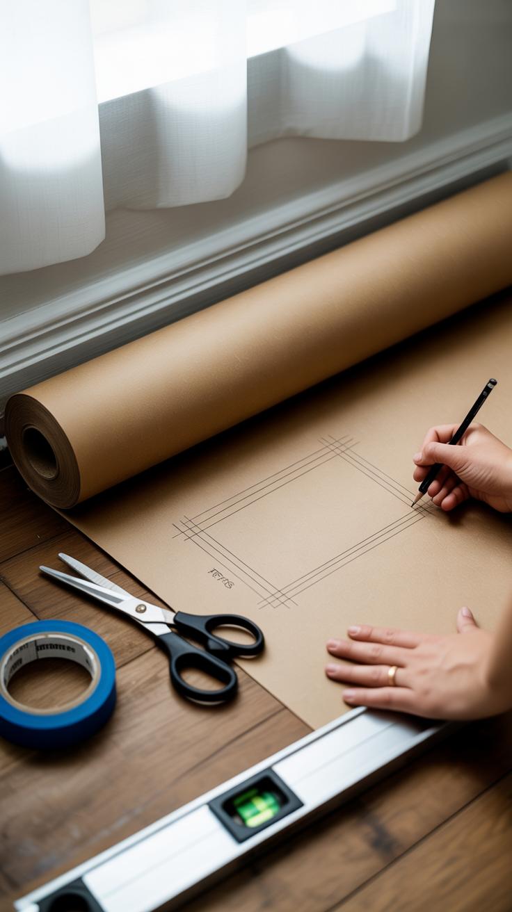
Once you have those numbers, try sketching the area on paper or using digital tools. I’ve found cutting newspaper or scrap paper into the sizes of your frames and taping them on the wall first gives a real sense of scale and layout. Digital mockups can be neat, but they don’t replace the physical interaction you get from moving actual shapes around. Also, take note of lighting at different times of day—natural light can change how colors look, and some pieces might fade or glare when hit directly.
Wall color plays a silent but strong role. A lighter wall could enhance bold artwork, but on a darker wall, lighter or framed pieces can really pop. You might have to experiment a bit to see what feels right, considering both the art and the wall itself.
Selecting Artworks and Frames
Choosing the right artwork for your gallery wall can feel a bit overwhelming. You might start with what catches your eye first or what fits the room’s mood, but it’s often more nuanced. Think about size carefully—large pieces can anchor the display, while smaller works add detail and texture. If your space is small, a few medium to small pieces might work better to avoid crowding the wall.
Color also plays a role, not just in the art itself but in how it interacts with your room’s palette. You don’t have to match everything perfectly—sometimes contrasting colors bring a fresh energy, but if you prefer calm, stick to tones that complement your walls and furniture.
When it comes to themes, it’s tempting to go all one style. Yet mixing themes could reflect your personality more honestly. A vintage botanical print next to a modern abstract could seem mismatched on paper but feel right in your space.
Picking Art That Speaks to You
Your gallery wall will probably be around for a while, so choose art that resonates with you, even if it feels quirky or unexpected. Ask yourself: Does this piece evoke something? Does it feel like an extension of your thoughts or memories? It’s okay if some art is more about the feeling than a clear image.
Consider the room’s function too. In a bedroom, softer, soothing images might be better than something too bold. Or maybe your living room calls for action and vibrancy. The balance between what you love and the room’s purpose isn’t always easy, but it makes the space feel more intentional.
Frame Styles and Colors
Frames do more than hold the art—they affect how you experience it. You can play it safe with uniform frames, which create a tidy, cohesive look. But mixing wood, metal, and painted frames can add layers and depth. Don’t be too rigid; sometimes a random assortment feels more personal.
Color and texture matter. Dark frames often ground lighter prints, while white frames can brighten colorful pieces. If your walls are busy, simple frames might work better. On the other hand, intricate frames could enhance art that needs a bit more presence.
Try laying frames on the floor or using paper templates on the wall to see how different styles look together. This step can prevent surprises and give you confidence before making holes in the wall.
Creating a Balanced Gallery Wall Layout
The way you arrange your gallery wall can totally change the vibe of the room. When you start thinking about layout design, a few key ideas come into play: symmetry, balance, and spacing. These don’t have to be perfectly strict rules, but they shape how your wall feels—calm, lively, or somewhere in between.
Symmetry is all about mirroring elements on either side. If you want something that feels orderly and traditional, symmetrical layouts work well. Picture two matching frames flanking a centerpiece—that kind of thing. It’s predictable, but that predictability can be comforting in a living room or dining area.
On the flip side, asymmetrical layouts mix sizes, shapes, and orientations without mirroring. That can spark more energy and interest but can also feel a little chaotic if not done right. The trick is balancing visual weight. For example, a large, dark frame on one side might be offset by several smaller, lighter frames on the other. It’s less about exact matches and more about how your eye moves across the wall.
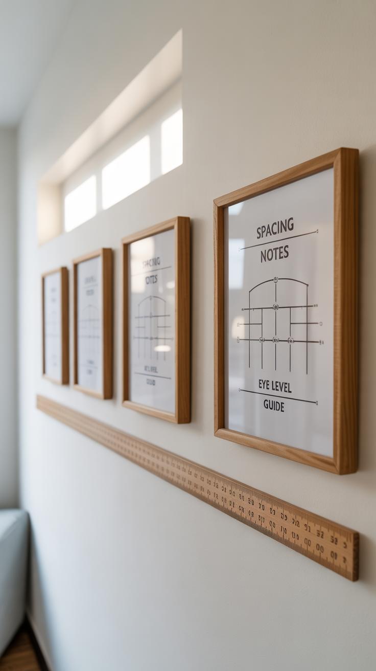
Spacing matters way more than you might expect. Give each frame enough room to breathe—usually between 2 and 4 inches works well. Too tight and the wall looks cluttered. Too wide and it feels disconnected. When aligning, try to keep either the tops, bottoms, or centers of frames in a line. This simple step pulls everything together and makes the overall display feel intentional.
In my experience, starting with paper cutouts taped to the wall helps figure out spacing before hammering in nails. Do you prefer everything balanced and neat? Or do you lean toward a freer arrangement that surprises you every time you glance? Your answer will guide these choices.
Popular Gallery Wall Layout Styles
When thinking about gallery wall layouts, it helps to know the main styles out there. You might have heard of grid, salon, linear, and clustered layouts—they each bring something different to the table.
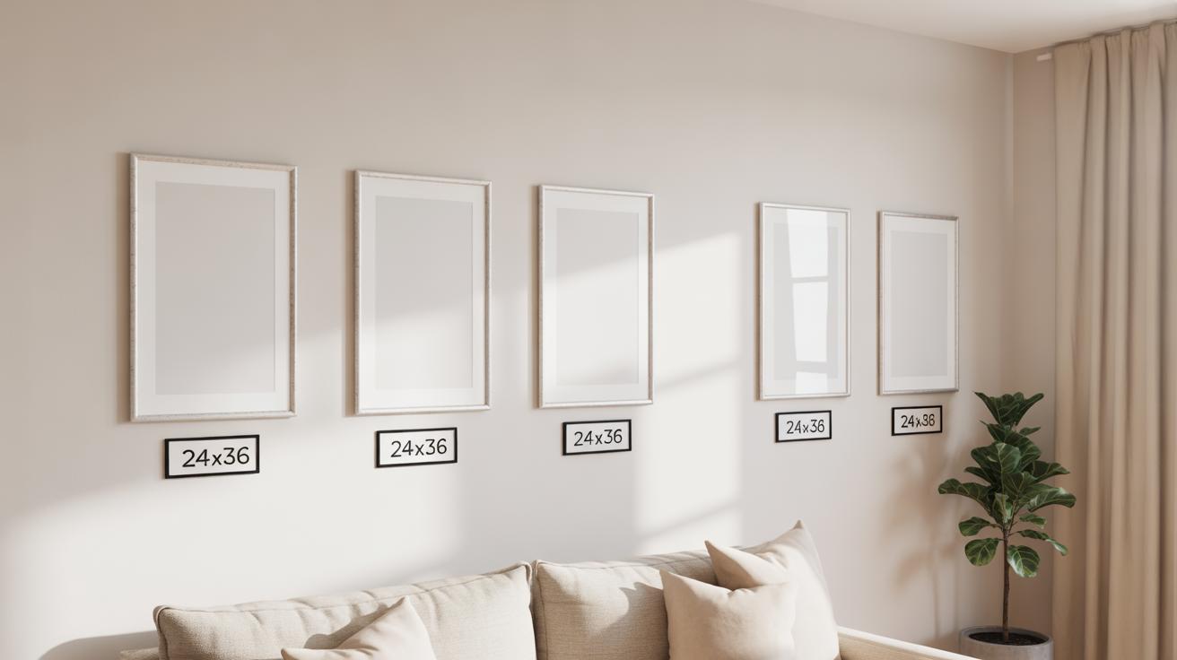
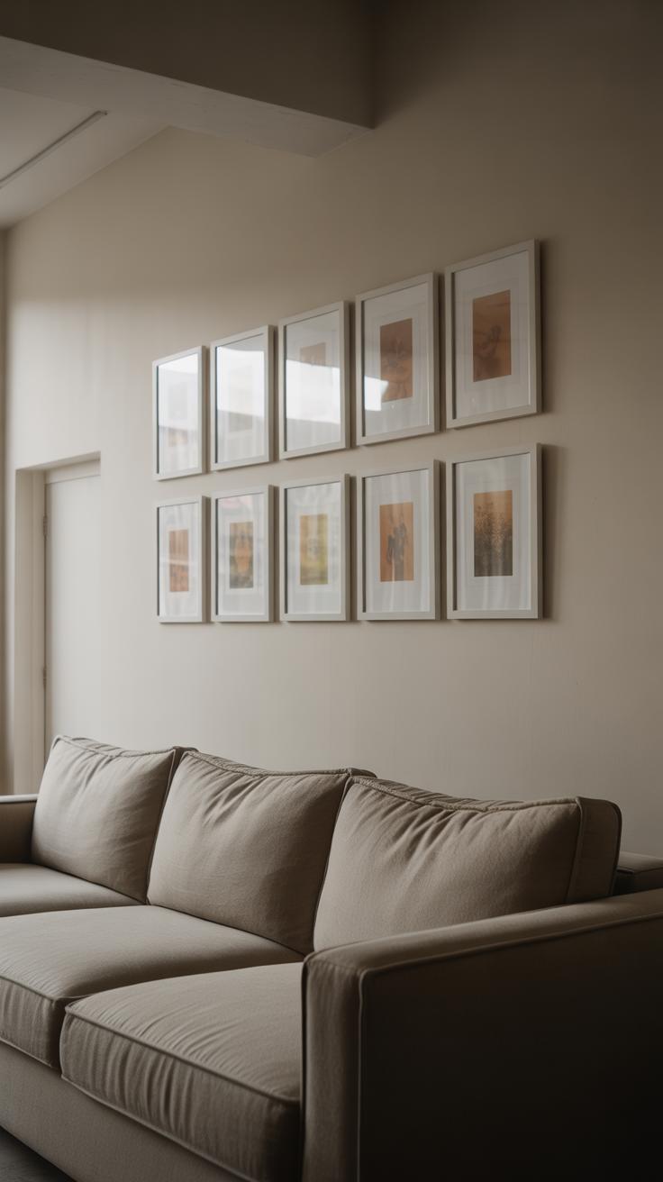
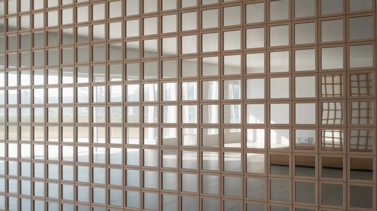
Grid and Linear Layouts
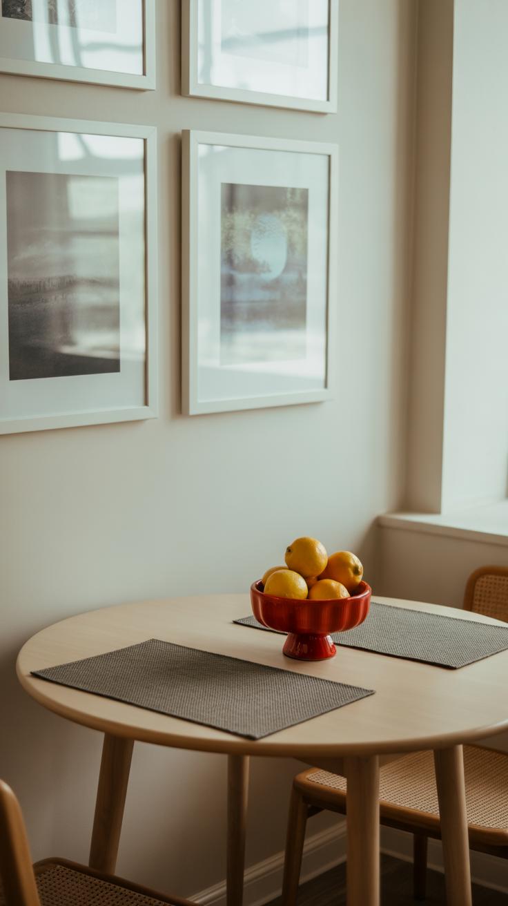
Grid and linear layouts offer a clean, orderly look. They’re great if your frames are mostly the same size and shape. Imagine a tidy rectangle or square made of evenly spaced images, lined up perfectly both vertically and horizontally. This style is straightforward and often feels calming because of its predictability.
For example, a grid works well in offices or hallways where you want something formal yet attractive. Linear layouts stretch images in a row or column, which is nice for narrow walls or spaces above furniture like sofas or sideboards. I once hung a linear layout above my desk with identical frames—there was comfort in the symmetry, even if it felt a bit rigid at times. Still, if you prefer neatness without any fuss, these layouts might suit you best.
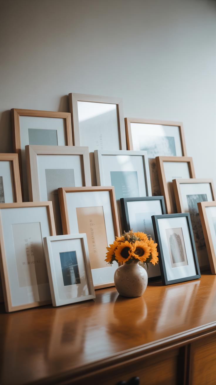
Salon and Clustered Layouts
Salon and clustered galleries are the more relaxed cousins to grids. They don’t rely on uniformity. Instead, these styles let you mix frame sizes, shapes, and art types freely. The salon style, inspired by old European art shows, typically fills a whole wall with dense groupings of artworks, appearing almost like a collage. It screams personality—and sometimes chaos.
Clustered layouts feel more like a casual collection. You might think of it as controlled randomness: art pieces arranged so they feel grouped but not confined. I remember trying this style in my living room with various prints and family photos. It felt personal, but getting the balance right took some trial and error. Both styles work well if you want your wall to tell a story. Though, it’s easy to overdo and end up with clutter if you’re not careful.
Which style fits your space or mood? Do you crave order or a bit of artful mess? Your choice here shapes the vibe more than you might expect.
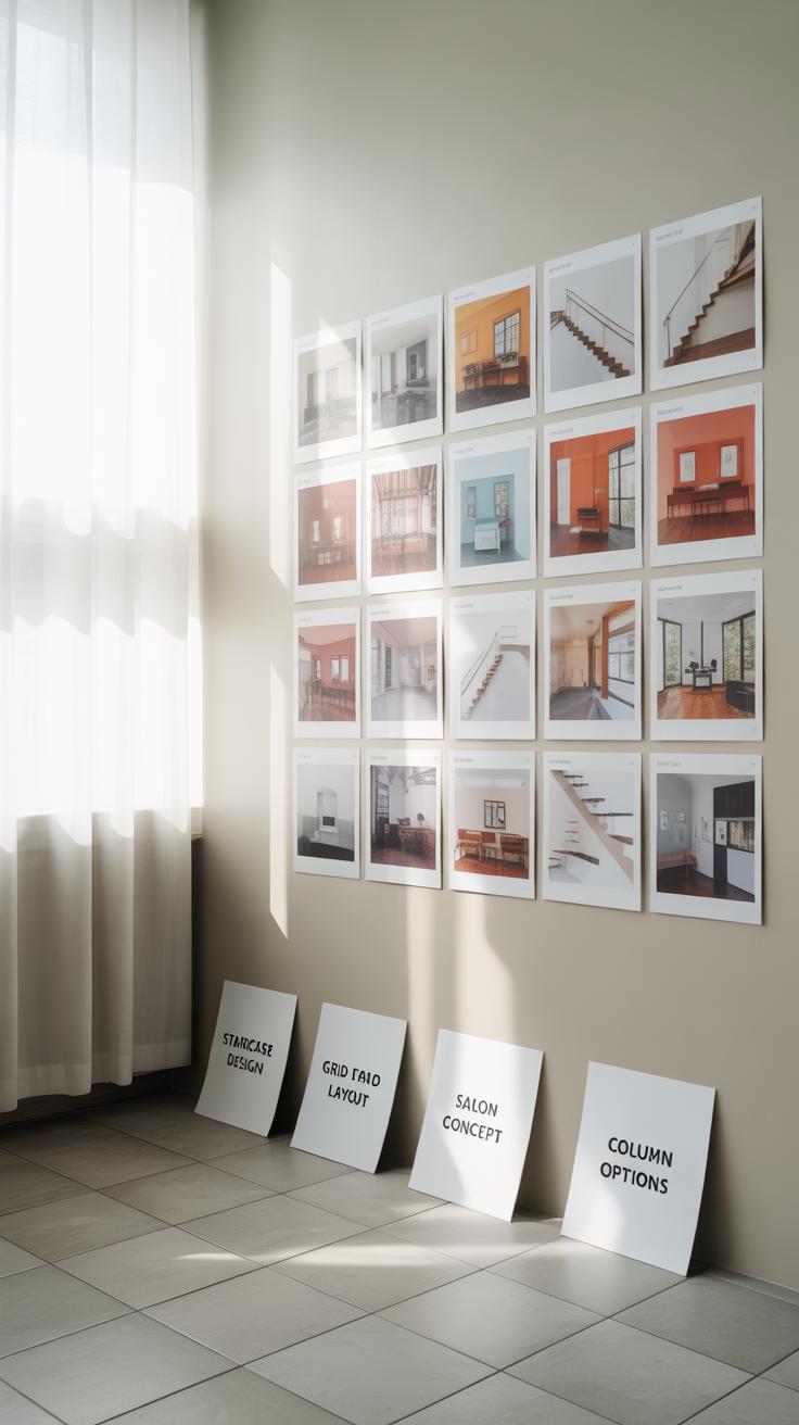
Using Templates and Tools for Layout Planning
Before hammering nails into the wall, it’s smart to play around with your gallery wall design. That’s where templates and simple tools come in handy. They let you see the overall look—without any commitment.
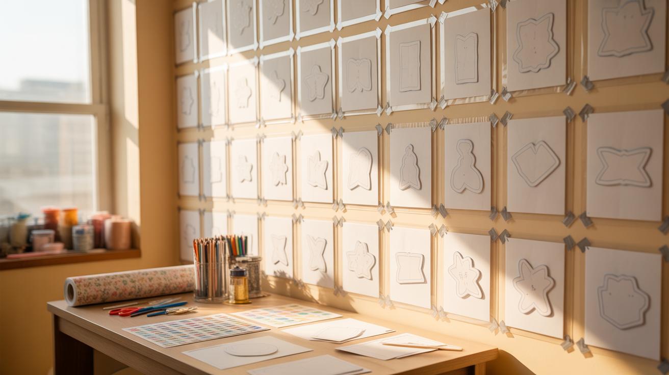
Paper and Tape Method
This approach might feel a bit old-school, but it works surprisingly well. Cut sheets of paper to match your frames’ dimensions. Then, tape them to the wall with painter’s tape, which won’t damage paint when removed. You can rearrange these paper “frames” endlessly, mixing and matching positions to find what feels right.
I once spent a good hour moving paper cutouts around before settling on a loose salon-style grouping. It’s visual, tactile, and a little more reliable than imagining how art will look on a bare wall.
- Measure your frames precisely and cut paper accordingly.
- Use painter’s tape so the wall stays unharmed.
- Step back frequently to get the bigger picture.
- Don’t hesitate to try awkward or asymmetrical layouts—sometimes the unusual works best.
Digital Layout Tools
If you prefer a less hands-on method, digital apps offer intriguing options. Some apps let you upload photos of your artwork, then drag, drop, and resize them on a digital “wall.” This can help you explore lots of configurations quickly, especially if your walls are tricky shapes or you’re short on time.
Apps like “WallApp” or even simple design tools built into some smartphone operating systems can be surprisingly helpful. Though they can’t replace the real-life sense of scale, these tools offer an easy way to test ideas and share concepts with others for feedback.
- Upload clear pictures of each piece and input their sizes.
- Explore different layout styles without tape or ladders.
- Save multiple versions for comparison.
- Use the app’s guides or grids to maintain even spacing.
Neither method is perfect on its own. But mixing these approaches can make gallery wall planning less stressful—and even a bit fun.
Hanging Your Gallery Wall
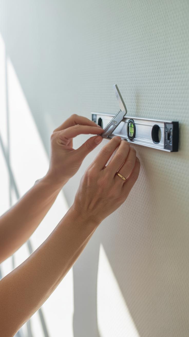
Before you start hammering nails into the wall, gather your tools. You’ll need a measuring tape, a level, a hammer, nails or picture hooks (depending on frame weight), and some pencil marks to guide you. Sometimes I forget the level and end up with a slightly crooked frame—it’s a small detail but it sticks out more than you’d think.
Start by deciding where the central piece of your gallery wall will go. Mark the spot lightly with a pencil. Use the level to draw a faint horizontal line—this will keep things straight across. Measure the distance between your frame’s hanging hardware and the top edge to help you place nails exactly where needed.
When it comes to nails or hooks, think about weight. Lighter frames can hang on simple picture hooks, but heavier pieces might need wall anchors. Try not to rush—the key is to be precise before driving the nail. I usually double-check measurements at least twice, though I sometimes still guess and fix later.
Once everything’s marked, gently hammer your nails or install hooks. Hang your frames and step back often to check alignment; small shifts can change the whole balance of your layout. If you want to avoid a lot of holes, consider using removable adhesive hooks, but keep in mind they might not hold as well over time.
Have you noticed that even with perfect measurements, your eyes can trick you? Sometimes a frame looks off center even if it’s not. Trust your gut as much as your tools. This process takes a little patience, but once the pieces are up, that wall feels really…right, don’t you think?
Maintaining and Updating Your Gallery Wall
Keeping your gallery wall looking fresh doesn’t mean starting over every time you get bored. It’s more about small, thoughtful tweaks and consistent care. Dust builds up quickly on picture frames, especially if they have glass. I usually grab a microfiber cloth and gently wipe the surfaces every couple of weeks. Avoid harsh chemicals; plain water or a mild cleaner works fine, but test first on a small spot. Dusters with long handles help if the wall is hard to reach.
When it comes to art itself, pruning and switching pieces can give new life without the effort of a full redo. For instance, swapping out a few prints based on seasons creates a subtle shift—perhaps lighter, warmer tones in spring and cooler blues in winter. You can also play with layout changes, moving a frame here or there to shift the balance. Sometimes what felt perfect before suddenly looks off when you switch just one piece. It’s a bit unpredictable, but that keeps things interesting.
Ask yourself: Does this gallery still feel like ‘you’? If not, which pieces have lost their charm? Sometimes the best update isn’t replacing art but adding something unexpected—a small sculpture on a nearby shelf or a textured textile in a frame. That way, your wall evolves but remains a familiar backdrop. It’s about slow, patient edits rather than drastic overhauls.
Inspiring Gallery Wall Ideas for Different Rooms
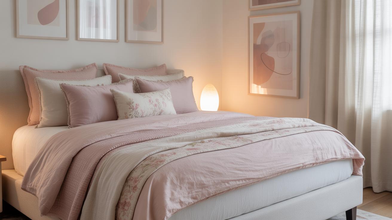
Living Room and Bedroom Displays
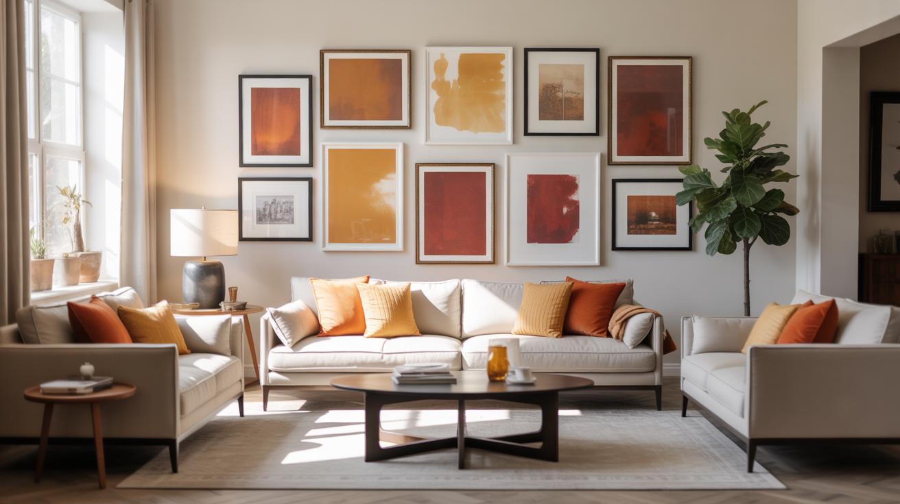
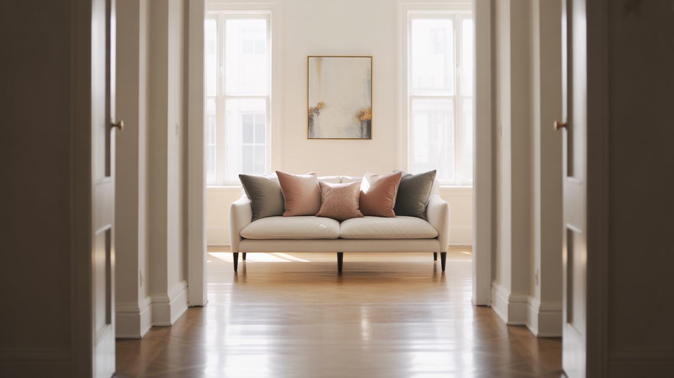
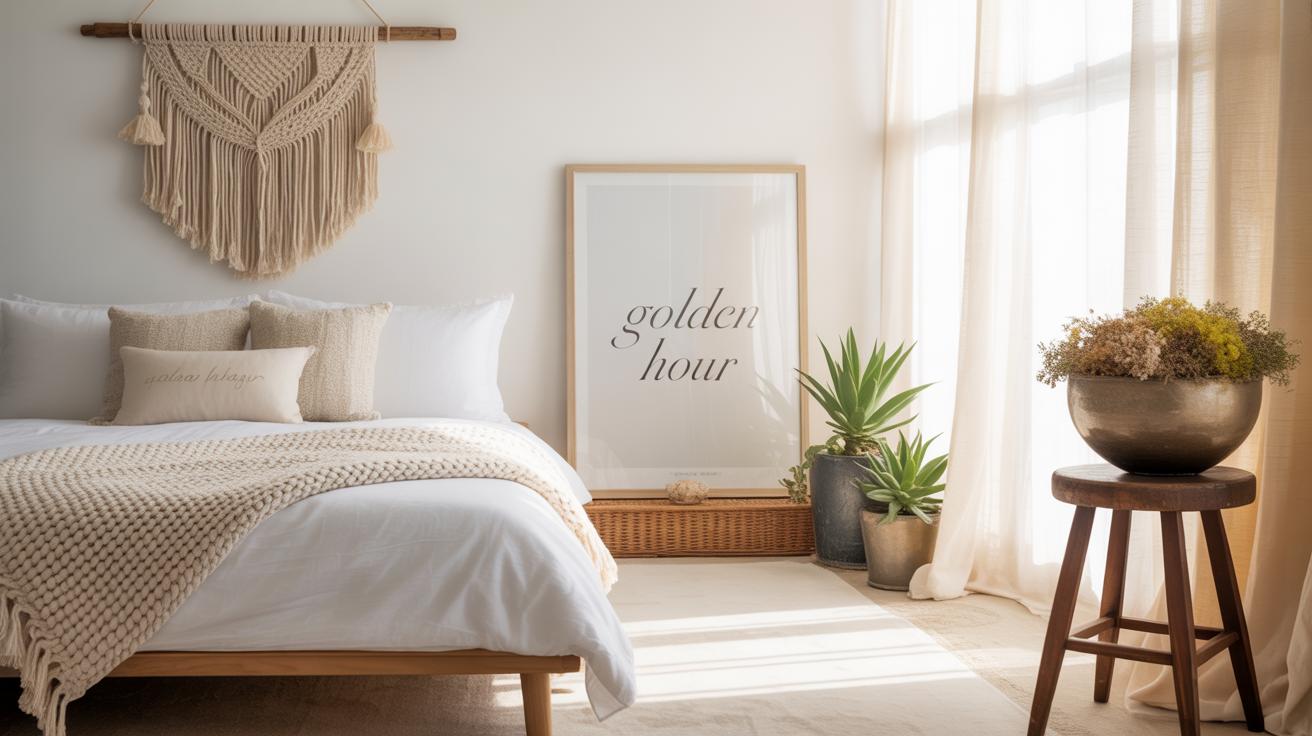
If you have a larger room like a living room or bedroom, gallery walls can create a really warm vibe. Think about mixing different frame sizes—not everything needs to be uniform. A combination of large statement pieces with smaller prints can make the space feel layered and inviting, rather than just… well, hung. Try grouping art above your sofa or bed, but don’t feel pressured to fill every inch. Negative space can actually enhance the overall look.
One trick I’ve found useful is to anchor your gallery wall with a consistent frame color or mat style, which helps unify something that might otherwise feel too chaotic. And don’t forget to play with textures—adding a woven wall hanging or a wooden frame among your prints can soften the arrangement and add depth. Bedrooms especially benefit from this approach, since the wall needs to feel cozy without overwhelming the room.
Small Space and Hallway Solutions
Narrow hallways and small spaces often get neglected, but they’re perfect for thoughtful gallery walls. Because the areas are so tight, you have to be a bit strategic. For example, lining up a series of small frames in a single row works surprisingly well, almost like a visual rhythm guiding you through the space.
Don’t shy away from vertical gallery walls either. In places where width is limited, stacking pictures up the wall helps draw the eye upward—making the room feel taller. For tiny nooks, a cluster of tiny pieces can keep things interesting without feeling cluttered. Also, consider the subject matter: personal photos and simple graphics often fit better here than larger, more complex artworks. It’s kind of about balancing what fits the space and what keeps you wanting to stop and look.
Conclusions
Choosing the right gallery wall layout is key to creating a visually pleasing and personal display. By planning carefully and selecting art that speaks to you, any space in your home can become more lively and inviting. Remember to consider the size of your wall, the themes of your artwork, and your personal taste when designing your gallery.
Take your time to experiment with different layouts on the floor or using templates before hanging. A well-arranged gallery wall is a great way to express creativity and turn your house into a home. Now that you know the ideas and tips, it is your turn to design a gallery wall you will enjoy every day.