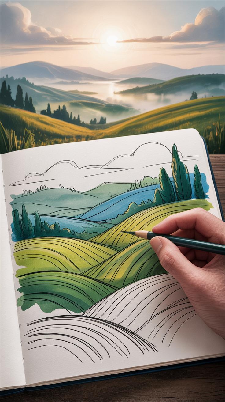
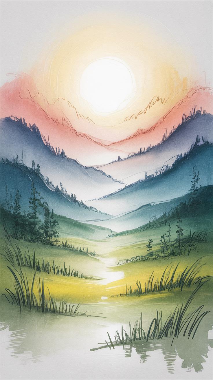
Achieving Realism in Landscape Pencil Sketches
Pencil sketches have long been a favored way to capture the beauty of nature. Unlocking realism in pencil sketches landscape studies requires understanding how to represent depth, texture, and light effectively. This skill allows artists to translate the scenes they observe into engaging and lifelike sketches.
In this article, you will explore key techniques, tools, and approaches to improve your pencil sketches of landscapes. From choosing the right pencil and paper to mastering shading and perspective, each chapter builds on the previous to guide you towards realistic and expressive landscape sketches.
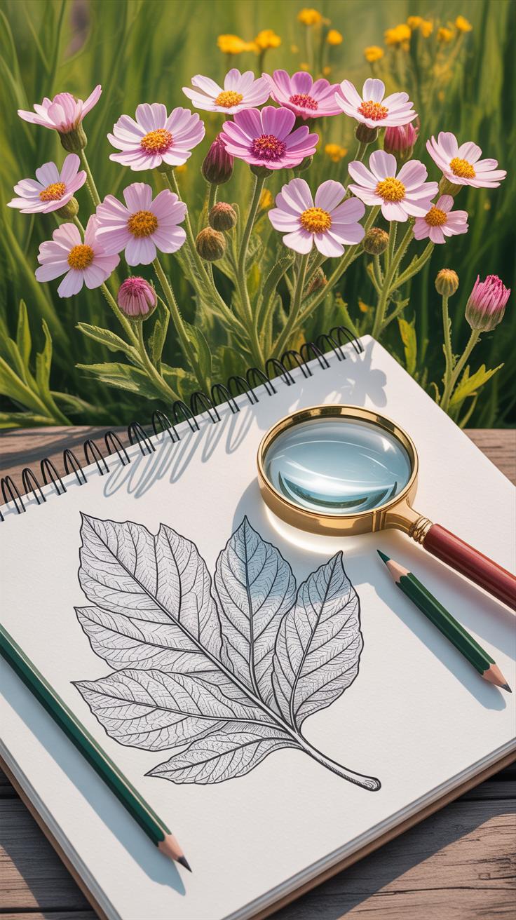
Gathering The Right Materials For Pencil Landscape Sketches

Selecting Pencils That Help You Capture Details
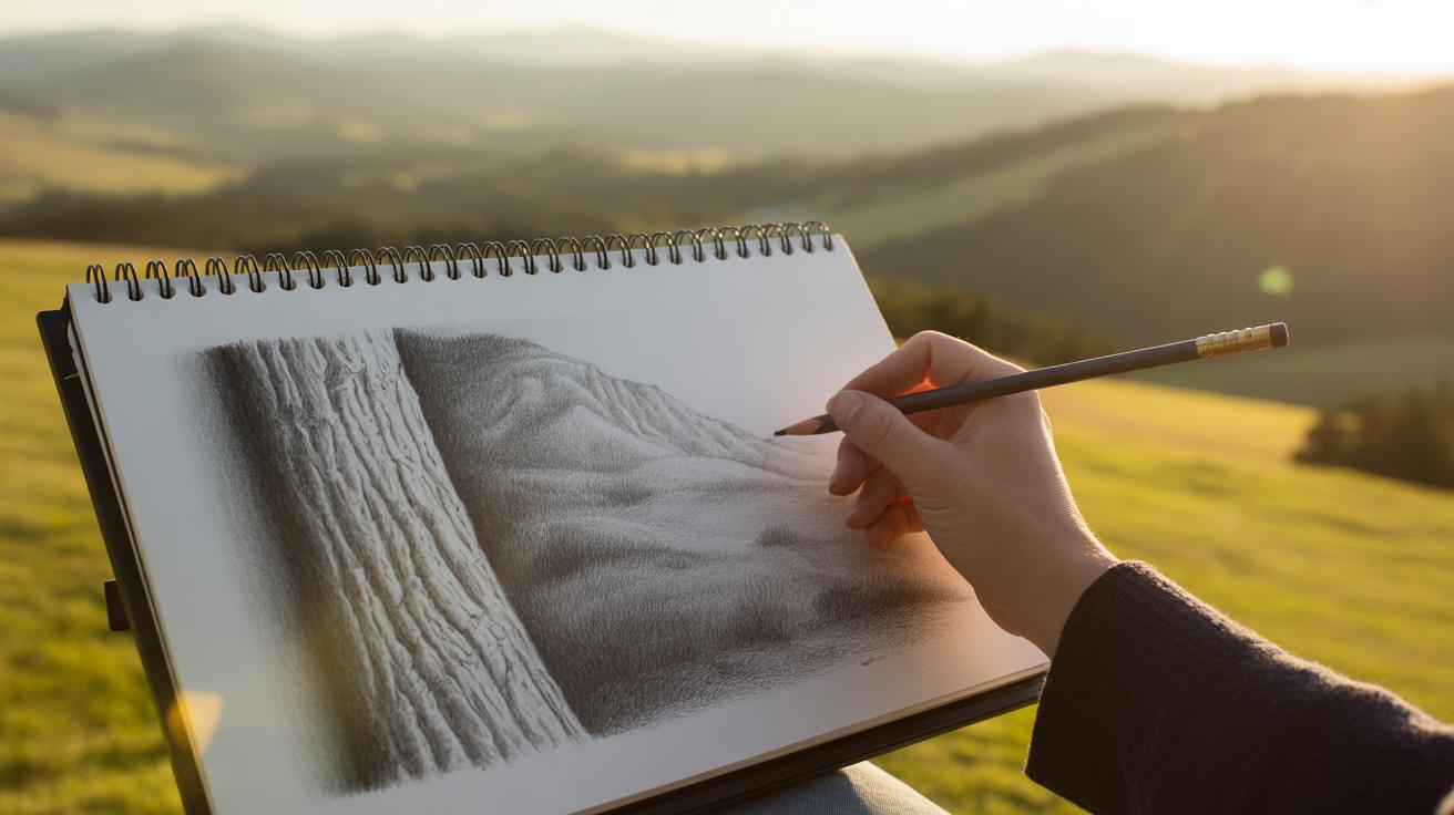
Not all pencils are created equal, especially when you want to capture the variety of textures found in natural scenes. Choosing the right pencil grade makes a real difference. For instance, softer pencils like 6B or 8B are great if you want deep, rich shadows or loose, expressive marks. They smudge easily, which can both add character and create unwanted blurs—so be careful.
Harder pencils, such as 2H or 4H, offer sharp, faint lines that are perfect for finer details like tree branches or distant foliage. I remember once trying to sketch telephone wires with a 4H—it held up well without overpowering the softer shading around it. In between, pencils around HB and B are versatile. They allow for smooth gradients and balanced textures but may feel limiting if you rely heavily on either sharp lines or broad shading.
By mixing these grades within one sketch, you can mimic real-world textures: the scratchy bark, soft grass, and distant hills all come to life. Try testing your pencils beforehand on your chosen paper. The feel and pressure needed varies and can be a bit surprising at first.
Choosing Paper That Supports Your Style
Paper choice? It’s more crucial than many realize. Different textures give your sketch a different personality. Rough paper, with lots of tooth, holds the graphite well and is forgiving with shading, which can be excellent if you like blending. On the downside, that grainy texture might distract from delicate detail work.
Smoother papers feel different under the pencil. They allow for crisp lines and finer detail but can be tougher for smooth shading unless you use light pressure. When I switched to smoother Bristol board from a rougher cold press paper, I found it easier to achieve subtle gradients, though it took a bit longer to build depth.
Weight matters too. Thin paper may buckle when erasing or layering, while heavier papers stand up better to repeated work. You might want to keep a variety of paper on hand—sometimes your approach to a scene changes halfway through, and your materials should keep up.
Lastly, think about size and format. Larger sheets invite more expansive scenes but require more patience and control. Smaller paper pushes you to get straight to the essentials.
Understanding The Basics Of Landscape Composition
When you start sketching nature, the way you arrange elements matters more than you might expect. The horizon line, for example, sets the stage. It’s not just a line where sky meets land or water; it’s the backbone of your entire sketch. Placing it too high or too low can change how open or closed your scene feels. I’ve noticed that shifting the horizon just a bit can make the difference between a flat drawing and one with real depth.
Focal points are next. These are the parts where you want the viewer’s eye to rest. It might be a solitary tree, a textured rock, or a bend in a river. Choosing what to highlight isn’t straightforward—sometimes less obvious areas hold more interest. The trick is to lead the eye, but not force it. Let the viewer discover the details slowly.
Balancing elements is another subtle art. If one side of the drawing feels too heavy, the whole thing can seem off. You don’t need symmetry here, just a sense that things belong together. Sometimes that means grouping a few small bushes to counterbalance a large cliff, or scattering distant shapes to break emptiness. It’s less about perfect balance and more about harmony you can almost feel.
Setting The Horizon To Establish Depth
The horizon line does more than just split your paper—it defines perspective. Place it low, and you emphasize the sky, making the land seem vast, maybe endless. Put it high, and you draw attention to the ground, perhaps focusing on texture or detail. I’ve played with both and found that changing the horizon can shift the entire mood of a sketch.
It also tells the viewer where they stand. Is the viewpoint elevated, like looking down from a hill? Or close to ground level? The horizon is your anchor point for these choices. When you get it right, you create a believable space—even on plain paper. When it’s off, the drawing can feel distorted or flat, which kind of ruins the natural vibe you want to capture.
Using Focal Points To Direct Viewer Attention
You don’t want your viewer’s eye to wander aimlessly. Picking a focal point gives the sketch a purpose. Maybe it’s a lone tree in the foreground or a bridge crossing a creek. Where you place this point matters—a bit off-center usually works better than dead center. It creates a natural flow, as if the eye is gently invited to explore.
Think about relationships between elements too. The focal point should connect with other details, forming a path for the gaze to follow. Sometimes that means drawing lines—paths, rivers, tree branches—that subtly guide attention. It doesn’t feel forced when it’s done right, but it’s clear enough to keep the viewer engaged. Finding that balance took me a while; honestly, it still does.
Mastering Perspective To Enhance Realism
One-Point Perspective In Landscape Sketching
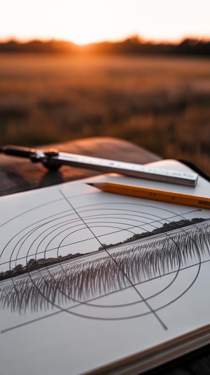
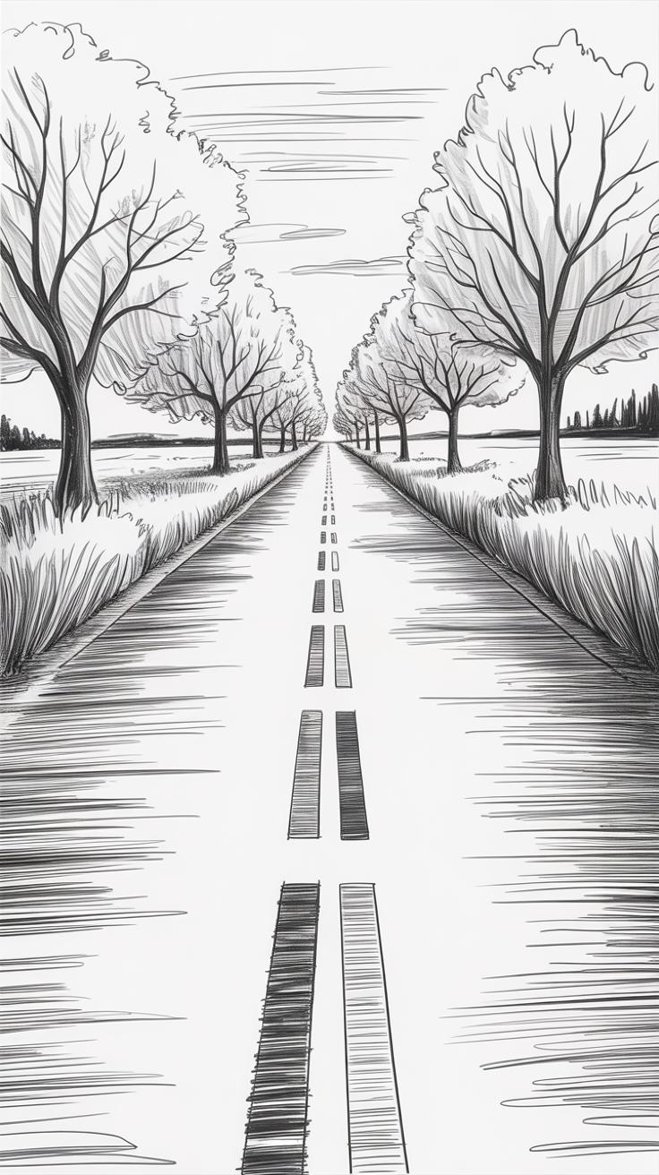
One-point perspective often feels like a straightforward starting point, but it can bring surprising depth when used well. Imagine a road stretching toward the horizon or a river narrowing far away—these scenes rely on a single vanishing point. You begin by setting your horizon line, which represents the eye level, then placing one vanishing point on it. From that point, guide your lines outward to frame objects receding in space.
When sketching, say, rows of trees along a riverbank, draw parallel lines converging toward the vanishing point. This creates that sense of distance—trees closer to you appear bigger, while those further away shrink naturally. Maybe you’ll notice sometimes the road doesn’t head straight but slightly curves; here, bending those lines just a bit keeps the sketch believable, even if it’s not rigidly perfect.
The key is to keep your eye on spacing. Objects in the foreground should have wider gaps between them, narrowing as they disappear. This method can feel mechanical at first. But try mixing in irregular shapes and soft edges, and it becomes more lifelike.
Two-Point Perspective For Complex Scenes
Two-point perspective gets trickier but also opens up more possibilities. It’s ideal for showing corners or angled elements like buildings tucked into hillsides or fences turning along terrain. Instead of one, you place two vanishing points on the horizon, usually spaced apart. Lines then radiate to either point, helping you capture those angled forms with more accuracy.
Think of a farmhouse sitting at a slight angle to your spot. Its walls vanish toward two different points, suggesting real volume. When sketching hills or cliffs that slope in varying directions, this method can offer a richer depiction of space and form.
I’ve found it’s easy to get lost trying to line up everything perfectly here. But a little looseness can add character—you don’t have to nail every angle exactly. Sometimes, objects overlap or fade into shadows in ways that perspective alone won’t fully explain; that’s where your observation and judgment fill in the gaps.
So, when you apply these perspective techniques, don’t hesitate to experiment. They form the backbone for creating a believable scene, but you’re not limited by strict rules. Your pencil will learn to balance precision with personal interpretation as you go.
Using Line Work To Describe Landscape Forms
Line weight and type are some of the most powerful tools you have for defining shapes and textures in pencil sketches. Changing how you draw a line changes how the viewer reads that part of your drawing. Sometimes, using a heavier line can anchor an object, making it feel solid and closer, while lighter lines suggest distance or fragility.
Bold lines work best when you want to frame the main elements—like the trunk of a tree, a large rock, or a building’s outline. They help to ground these features within your composition. Think of them as the skeleton of your sketch; without them, the major features might float or get lost. But be careful not to overdo it. If everything is bold, nothing really stands out, and the drawing becomes noisy instead of clear. I often find myself starting with bolder lines and then deciding during the sketch if some should soften or fade out.
On the flip side, fine lines let you capture the subtle stuff: blades of grass, tiny leaves, or small distant forms. They help add texture without overwhelming the eye. Gentle hatching or faint strokes can suggest softness or distance, giving your sketch layers of detail that invite a closer look. Yet, faint lines can sometimes disappear too easily, especially if you’re working quickly or outdoors. That’s why I always keep an eraser handy—to tweak the faint lines once the bolder shapes are settled.
Have you noticed how much difference a few well-chosen line variations can make? It’s almost like the pencil is speaking several voices in one drawing, and your job is to decide who shouts and who whispers. It’s a balance, and that balance might shift depending on the subject or even your mood while sketching.
Shading Techniques To Add Volume And Texture
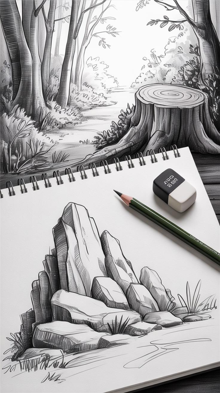
Shading is key when you want your pencil sketches to breathe with depth and detail. Without it, even the most carefully drawn outlines can feel flat or lifeless. When you shade, you’re essentially suggesting form and texture, showing how surfaces catch or lose light. This allows your sketch to stand out beyond simple shapes. It’s not just slapping graphite around; it’s about controlling pressure, direction, and layering.
Think about where your light source is and how it hits different parts of your scene. Shadows can be soft or sharp, depending on the material and distance. Adding volume means you want to create contrasts—from dark to light—so a rock or tree trunk doesn’t look like some vague shape. You might find that working from mid-tones towards darks, or the other way around, works better for certain textures. Experimentation helps here.
Hatching And Cross-Hatching For Texture
Hatching? It’s not just a fancy word for lines. When you draw those parallel strokes, you’re laying down a texture that can suggest roughness or smoothness. By varying length, spacing, and angle, you can mimic grass blades or even bark patterns. Cross-hatching adds complexity. Layering lines that cross over each other at different angles builds density and depth.
For example, to suggest grass, short, slightly curved lines applied in clusters work well. Bark, on the other hand, might need longer, rougher strokes, layered in somewhat unpredictable ways to capture its uneven surface. Stone surfaces? Look for small, varied cross-hatches that create subtle irregularities. It’s not a formula but observing real life and translating that into simple lines layered thoughtfully.
Blending For Smooth Gradations

Blending is what softens the transitions between shadows and lights. You might think smudging is just lazy, but when done with care—and tools like blending stumps or even just a clean finger—it can produce those delicate gradations that make hills roll gently or clouds look fluffy. Still, too much blending can erase the texture you’ve carefully drawn. So it’s a balance.
Use blending sparingly to smooth out harsh edges or unify tone areas, but keep the pencil marks visible where texture is needed. You can even lift some graphite up with a kneaded eraser afterward to add highlights. It’s a back-and-forth process. I sometimes find that blending helps me rethink the scene, pushing my drawing beyond simple lines into something more tactile, something that feels closer to what I actually saw.
Capturing Light And Shadow To Create Mood
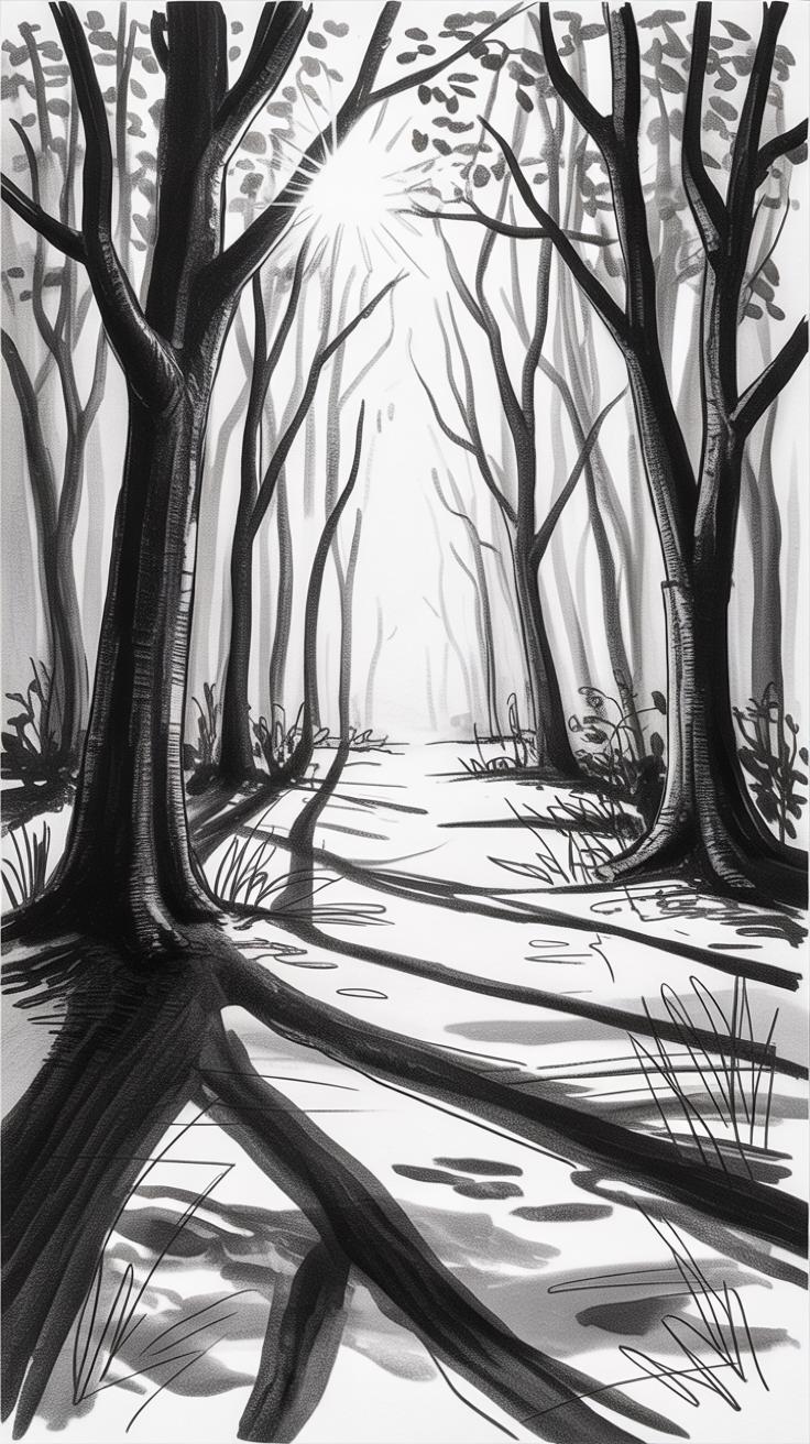
Light and shadow do more than shape objects; they set the entire feeling of a scene. When sketching, paying close attention to how sunlight falls across hills, trees, or water can turn a flat outline into something evocative. Think about the long shadows early or late in the day—those deepen forms and invite a quiet, sometimes somber mood. That’s not just about dark and light areas; it’s about how they interact to form volume and atmosphere.
Observing Natural Light Sources
Watching where the sunlight hits helps you decide where shadows should lie. Notice how the sun’s angle alters throughout the day and how this affects everything. For instance, a rock might cast a short, crisp shadow at noon but stretch long and soft near dusk. Try sketching the same spot at different times to see how light changes shape and size. This practice can make your drawings feel more believable—because they’re responding to actual, observed effects, not imagined ones.
Using Contrast To Highlight Key Areas

Contrast grabs attention and can guide the viewer’s eye to the most important parts of your sketch. That might mean darkening the shadow beneath a tree to pop it against a lighter background or brightening the sunlit side of a path to suggest warmth. Pushing contrast selectively adds a sense of drama—without overdoing it, or the scene feels forced. Sometimes, just a single spot of deep shadow makes everything around it come alive. Don’t be afraid to lean into those differences; they create a kind of tension that holds interest.
Incorporating Atmospheric Effects In Your Sketches
Drawing Distance With Faded Details
When sketching nature, distance isn’t just about shrinking size; it’s about losing detail, too. Think about the far-off trees or hills you saw on your last hike—because they’re farther away, their edges aren’t sharp or clear. In pencil sketches, you can mimic this by softening outlines and reducing texture for objects that sit in the background. Instead of defining every leaf or crack, use lighter strokes, less contrast, and gentle smudging to suggest shapes rather than spell them out.
You might find that this approach not only creates a sense of depth but also adds atmosphere to your drawing. It sometimes feels tricky—how far do you fade those details? Too much could flatten your image; too little can clutter it. Trust your eye. Step back and squint; that’s exactly what distant shapes look like to the human eye. It’s a subtle balance between clarity and haze.
Adding Weather Elements Like Fog Or Rain
Now, adding fog or rain isn’t about drawing raindrops everywhere or outlining every fog swirl. Instead, it’s about suggesting change in light and texture. You can do this by blending pencil marks with a tortillon or a soft cloth, lifting some of the graphite to create a milky, hazy effect. This makes parts of your sketch look like they’re shrouded in moisture or mist.
For rain, try quick, light diagonal strokes that don’t dominate the scene but hint at movement and wetness. Layering soft shadows around objects can imply damp surfaces without clearly drawing every drop. The atmosphere changes how we see each part of nature. Sometimes less detail, some blurred volume, and faint texture do more to evoke weather than heavy lines. It might take practice to strike this subtlety. But when you do, your drawing feels alive and real, even without color.
Developing Your Observation Skills For Accurate Sketching
To draw a scene that feels truthful, you need to train your eye first. Observing isn’t just looking—it’s about really seeing the subtle shapes, shifts in light, and how textures vary across the forms before you even touch your pencil. Try this: stand still for a moment and let your eyes wander slowly over the view. Notice how a shadow gradually fades or how a leaf’s edge catches the sun differently from the trunk next to it. These are small details that often get lost if you rush in.
Spending extra time studying the scene before sketching pays off. Don’t rush to capture every tree or rock immediately. Instead, break the view down—look for basic shapes, patterns, and contrasts. Ask yourself, what’s the simplest way to describe what I see? By doing that, your sketch becomes not just a copy, but your interpretation of the view, which makes it feel more original.
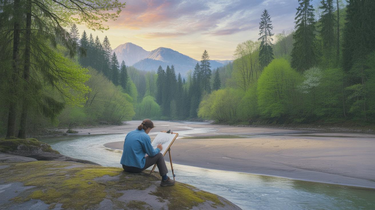
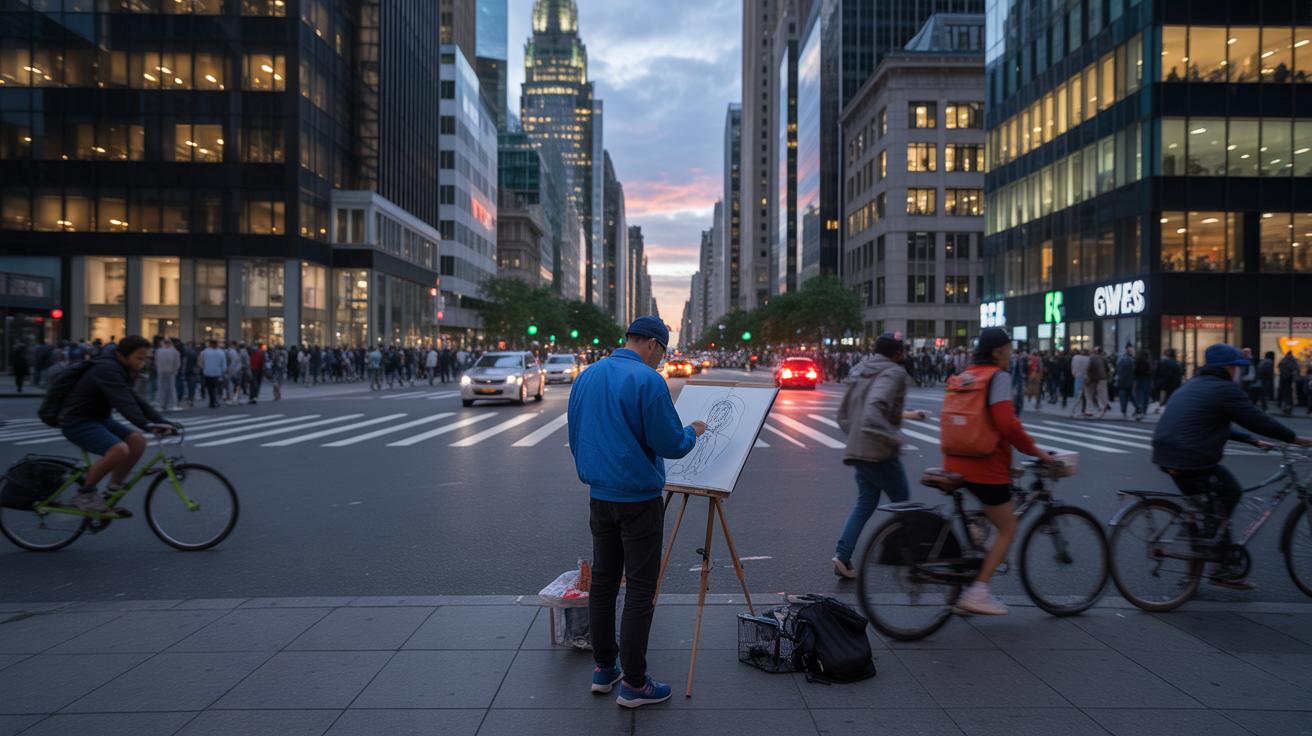
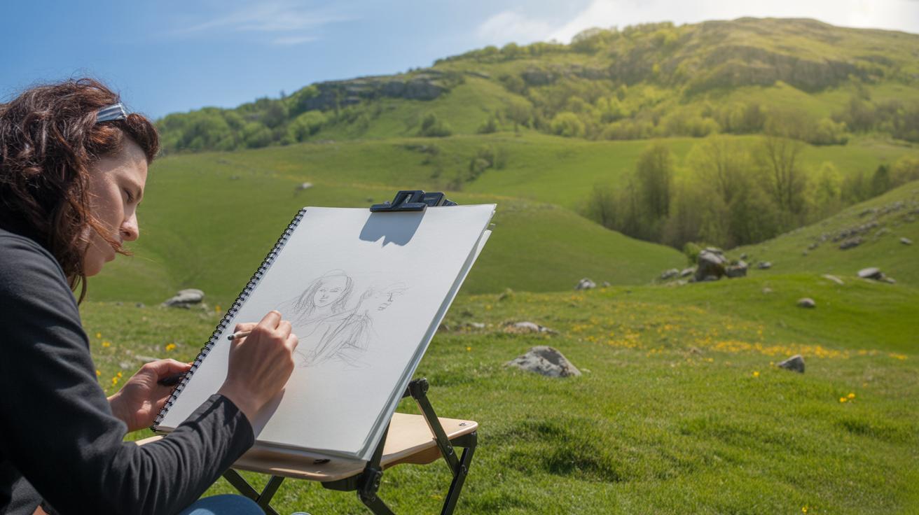
Sketching outdoors, en-plein-air, offers a fresh connection to the scene. Quick studies help you catch fleeting light or the way the wind shifts a branch. It forces you to respond quickly, which can boost your instinct. Working from photos, on the other hand, gives you time to slow down and dive deeply into textures or subtle shading. Each method sharpens different skills. I find some days I prefer the rush of outdoor sketching; other times, a photo lets me zoom in and focus on details I might otherwise miss.
Which approach works best depends on your goals and mood. Why not try both—take your pencil outside for spontaneity, then use photos to refine and deepen your understanding? Your observational skill will grow, inch by inch, with every drawing you make.
Practicing Regularly To Build Confidence And Skill

Drawing often is one of those pieces of advice that feels obvious but still gets overlooked. I mean, you don’t have to spend hours every day, but trying to sketch something—even if it’s just a quick, rough outline—helps you slowly build muscle memory. A few minutes now and then add up. You might notice your hand feels more steady or ideas come faster, which is kind of encouraging, isn’t it?
Try setting small, manageable targets. Say, a five-minute sketch while you’re waiting for your morning coffee or a quick look at a tree during your walk. These tiny moments keep you connected with your pencil and the subject, without pressure. It’s easier to stick with it if you don’t feel like you’re committing to a grand project every time.
Don’t shy away from mixing things up. Different pencils, from softer to harder leads, can change how your lines behave. You might find a certain shading style that clicks with your style. Even switch your focus between open fields, rocky hills, or dense trees. Trying variety can be a bit confusing at first, but it’s where you figure out what really feels right for you. Sometimes you’ll like a technique one day, and then the next, it feels off. That’s just part of exploring.
What do you enjoy capturing the most? Maybe that’s a clue to your next experiment. Keep poking around until it stops feeling like a task and starts being more of a habit—one that surprises you with small improvements over time.
Conclusions
Realistic pencil sketches of landscapes come from dedicated practice and attention to detail. Every element you add, from the rough bark of a tree to the distant hills, contributes to a believable scene. Using techniques like shading and perspective correctly will greatly improve your ability to depict natural environments.
By applying the methods and tips shared here, your pencil sketches will gain depth and life. Your connection to the landscape will grow stronger as you practice. Keep experimenting, observing closely, and allowing your personal style to emerge while aiming for realism in your work.


