Different Styles of Drawing City Life
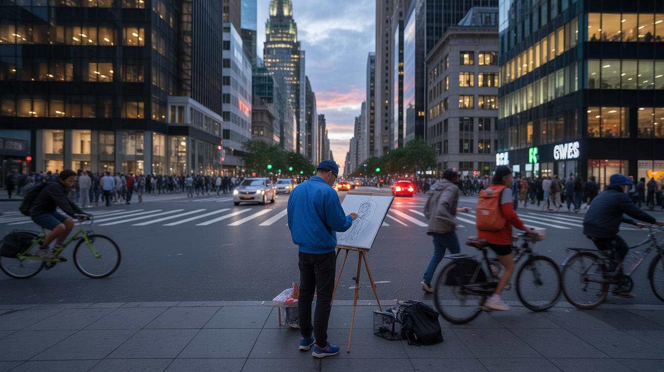
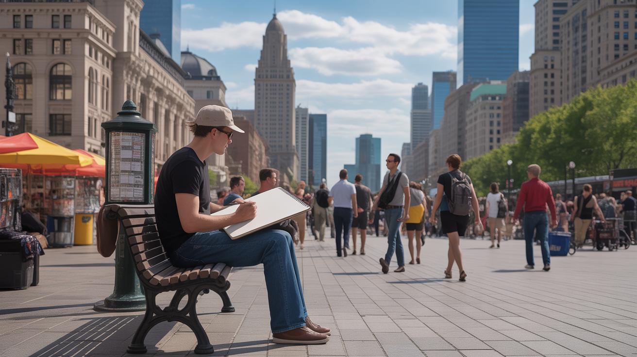
Drawing cities is a unique way to capture their energy. It mixes the details of buildings, streets, and people with the artist’s view. This article looks at how different styles of city drawing can show more than just shapes and lines. They tell the city’s story and feel.
You will learn about styles that show city life, ways to draw buildings and streets, and ideas to make your city drawings full of energy. This guide is for anyone who wants to see the city through art, whether you are a beginner or want to try new drawing methods.
The Role of Architectural Drawing in City Representation
What is architectural drawing
Architectural drawing is basically the visual language architects use to express ideas about buildings and city layouts. It’s more than just sketches or random lines on paper; it’s a carefully measured and precise way to show dimensions, shapes, and relationships between spaces. You might think of it as a blueprint or roadmap, but with more detail and a much clearer structure.
Architects rely on these drawings because they help translate abstract ideas into something everyone can understand. You can’t just imagine how a building fits in without seeing it drawn to scale. These drawings guide not only construction but also how spaces relate to one another within a city, making them essential tools for both design and communication.
How architectural drawing helps capture cities
Architectural drawings reveal more than just walls and roofs. They show how spaces connect, how streets flow, and how buildings interact with public areas. That sense of spatial order and harmony comes through lines that define streets, blocks, parks, and structures in relation to one another.
Such drawings give a clear, almost tangible sense of a city’s structure. When you look at them, you can almost feel the rhythm of urban life — where people might walk, gather, or pass through. I remember seeing a drawing of a city square once, and it felt like I was standing right there, sensing the openness and the flow of movement. That’s the power of architectural drawing: it captures the blueprint of urban life, combining technical clarity with a hint of atmosphere.
While these drawings aim for precision and clarity, they sometimes miss the messiness of real life. Still, they remain one of the best ways to show how cities are built and how they function. And in planning, they serve as a universal language. They help everyone involved—from planners to builders to the public—understand complex ideas clearly and avoid endless confusion.
The Essential Professional Toolkit for City Drawing
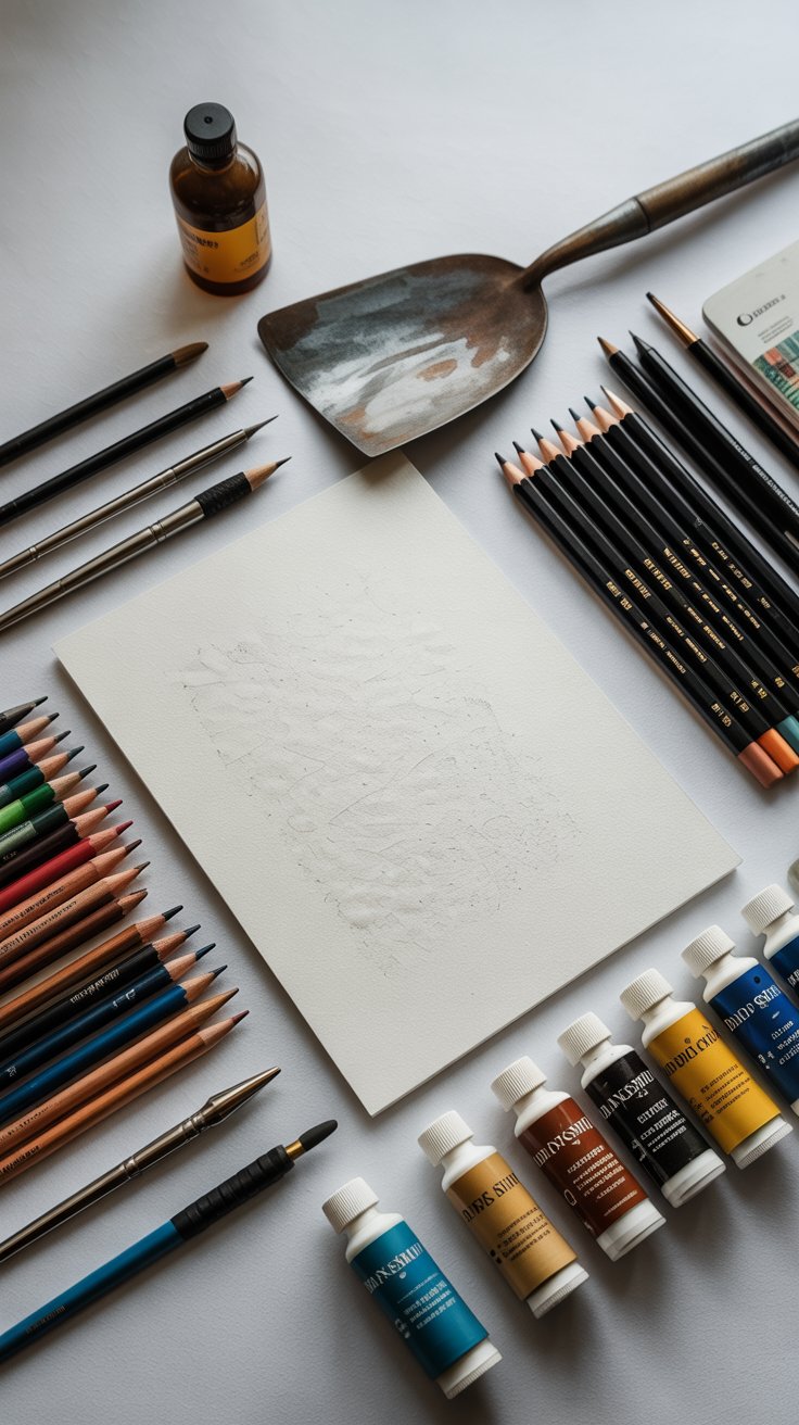
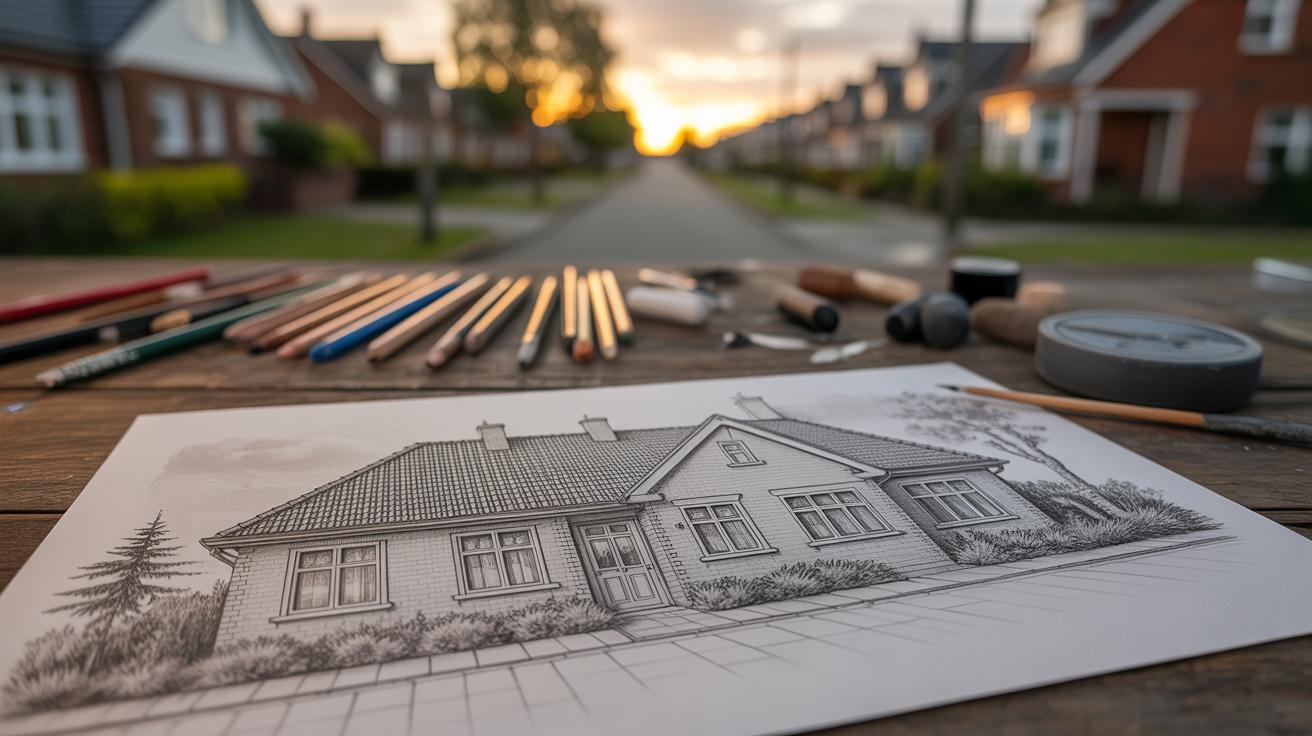
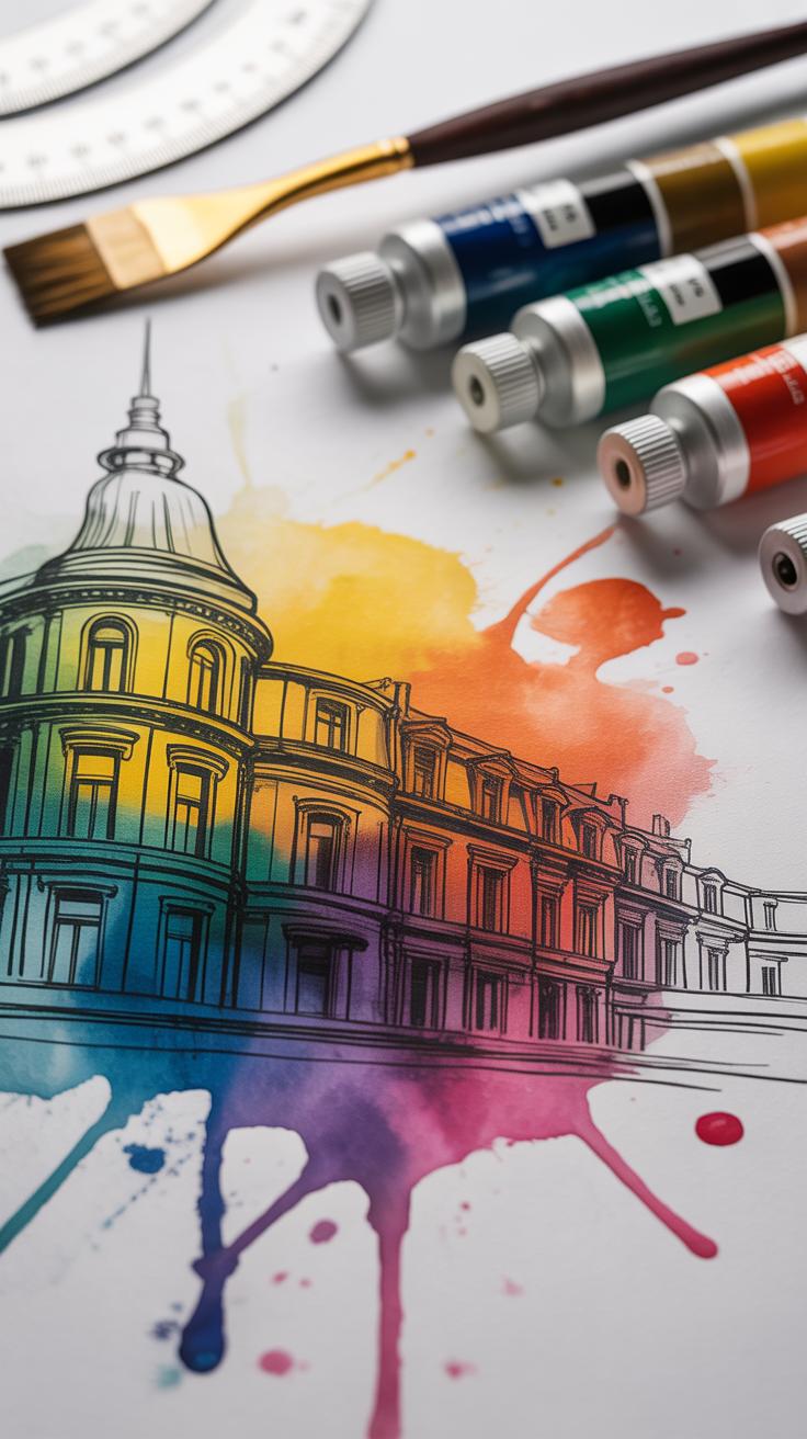
To move beyond generic sketches, an artist must select materials that allow for both precision and expressive texture. While basic pencils are the starting point, professional results often depend on high-quality surfaces like Arches ‘Cold Pressed’ watercolor paper, which provides the necessary grain to hold complex layers of pigment or graphite. Choosing the right foundation ensures that your work captures the “tactile feel” of the urban environment rather than appearing flat or uniform
Premium Paper and Precise Graphite
The foundation of city drawing relies on a careful combination of mechanical pencils for precise architectural details and various graphite grades to create depth. Softer pencils are ideal for producing rich, dark shadows typical of urban canyons, while harder leads deliver the sharp lines essential for conveying structural elements clearly.

Artists moving into color should use professional-grade paints like Daniel Smith or Winsor & Newton. These brands offer excellent lightfastness and vibrant hues, which are crucial for achieving the dynamic effects characteristic of modern impressionism.
Specialized Brushes and Custom Tools
Professional urban artists often go beyond traditional brushes to craft distinctive marks that convey a narrative. For instance, some employ custom-made spatulas fashioned from sheet metal to layer paint boldly, echoing the “geometric complexity” found in modern architecture. These innovative tools allow them to build texture and structure in their work, creating a dynamic visual language unique to the urban environment.
Artists rely on materials like masking fluid to preserve sharp highlights throughout the layering process. This technique safeguards details such as the sun’s reflective glint on glass or the crisp glow of streetlights, which might otherwise fade or blend unnoticed. Such careful methods ensure that contrasting light elements remain vivid, enriching the overall composition with clarity and depth.
Basic Tools and Materials for City Drawing
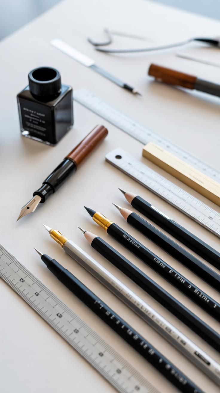
Traditional Tools for Drawing
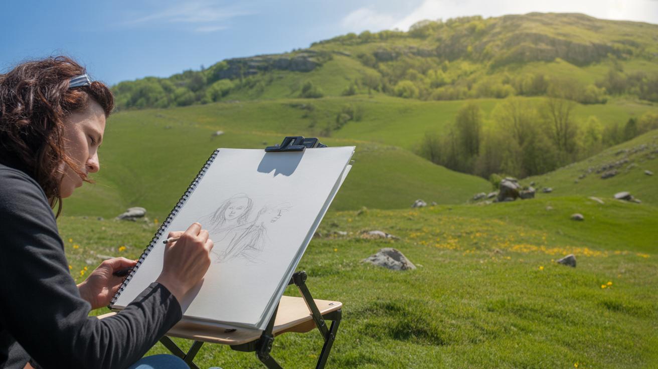
Pencils and paper remain the backbone of city drawing for many artists. You might find a simple sketchbook, a mechanical pencil, or a range of graphite degrees—each affecting the texture and depth of your lines. Softer pencils create richer, darker strokes, lending weight to buildings or shadows, while harder leads offer sharper, lighter details. Paper choice matters too. Rougher grains can catch the pencil’s graphite in unexpected ways, adding character but requiring more control.
Using these tools often slows you down, which can be a blessing. There’s a certain intimacy with pencil on paper, a tactile feel that digital just can’t mimic. On the other hand, mistakes can be costly to fix, so you draw carefully. Sometimes, this nudges your style toward precision rather than spontaneity or boldness.
Using Digital Tools
Digital tools open doors to different possibilities altogether. Tablets, like an iPad with apps such as Procreate or Adobe Fresco, let you experiment with layers, undo mistakes instantly, and switch brushes at will. For city drawing, this means more freedom to combine sketching with color washes or architectural details without fear of ruining the entire piece.
Yet, there’s a trade-off. The smoothness of digital brushes can make drawings feel too uniform, too perfect. That can mask the quirks or rough edges that sometimes reveal a city’s true spirit. Plus, digital requires a bit of learning curve—something as simple as a wrist rest or pen pressure settings can alter your style significantly.
So, whether you stick with your classic pencil or venture into digital realms, your tools shape not just how you draw, but how the city itself emerges on your page. Which do you find more revealing—the carefully shaded street corner or the bold, misaligned pixel of a digital sketch?
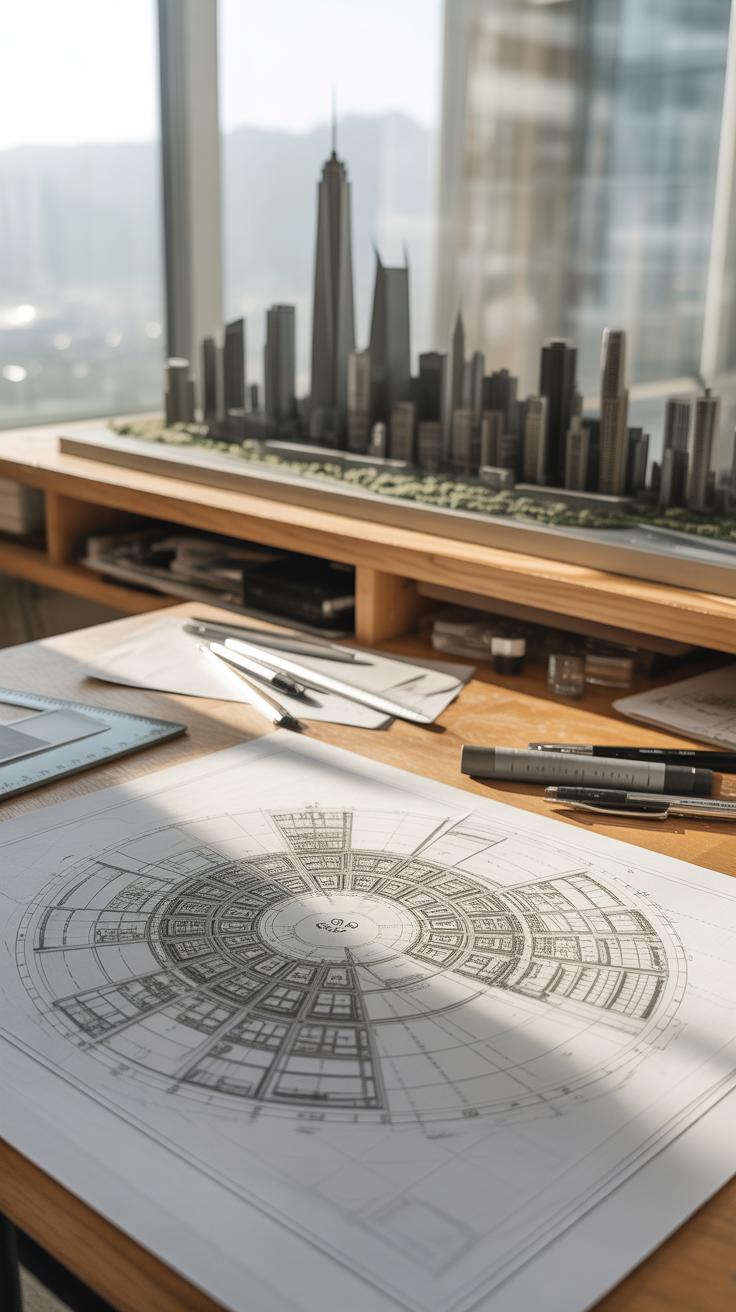
Understanding City Layout Through Floor Plans
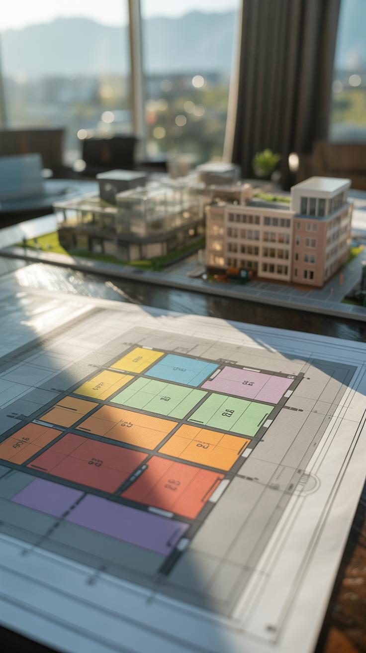
A floor plan is a simple drawing that shows a city from above, like looking down from a bird’s eye view. It lays out buildings, streets, and open spaces as flat shapes on a page. This kind of map isn’t about height or texture but about where things sit next to each other. Imagine tracing the blocks and pathways you walk daily but from up above—that’s basically what a floor plan does.
When you look at a floor plan, you see how buildings cluster, how streets carve through the city, and where public spaces might appear. The view is stripped down, clear, and direct. No distractions from windows or colors—just shapes and lines that tell you about order and arrangement. This aerial perspective can expose patterns that often go unnoticed when walking through the city.
Artists use floor plans as a foundation to build their city drawings. Starting with this overhead sketch lets you place streets and blocks accurately before adding more details. You don’t need to reinvent the layout; the plan guides you. If you work digitally, tracing floors can save time, and if by hand, it helps you focus the composition. It’s like setting the stage before actors move in. I’ve found that even rough floor plans give drawings a sense of coherence that feels harder to achieve otherwise.
Capturing City Movement and Energy
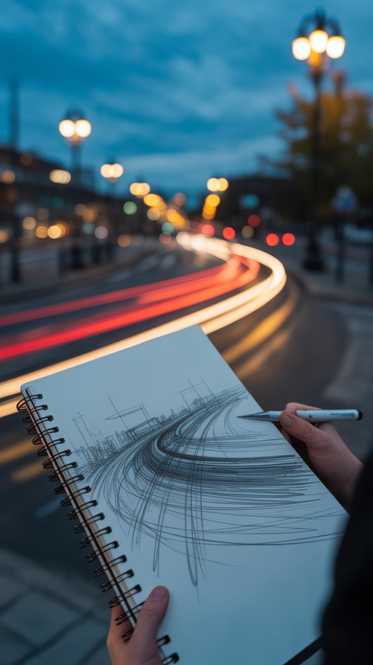
Showing movement in city drawings isn’t just about what you draw—it’s about how you draw it. Lines, shapes, and colors all play a part in suggesting the bustle and flow. Quick, sweeping lines can hint at rushing traffic or hurried footsteps. Jagged shapes might capture sudden noise or interruptions in flow. Soft, faded colors suggest distance or slower movement, while sharp, contrasting hues pull your eye to spots of intensity.
Drawing People and Traffic
When sketching figures and vehicles on the move, speed is key. Use loose gestures, not details, to catch the essence of movement. Think of drawing someone crossing the street: a few quick strokes for legs in mid-step, perhaps a dash of color for a passing jacket. Vehicles can be simple shapes with slanting lines to suggest speed rather than careful outlines. I sometimes find myself erasing parts mid-sketch when something looks too rigid; that looseness often breathes energy back into the scene.
Using Lines and Colors
Lines don’t have to be straight or calm. Curved, sweeping lines evoke organic city rhythms. Broken or dashed lines work well to show interruptions—like a cyclist weaving between cars or a crowd milling around a corner. Colors, when chosen carefully, can either calm or excite. Bright reds or yellows draw attention and suggest loud or fast spots, while blues or grays can cool the pace down. Mixing hues unpredictably can also mirror the chaos of city life—sometimes lines and colors clash, but maybe that’s the point.
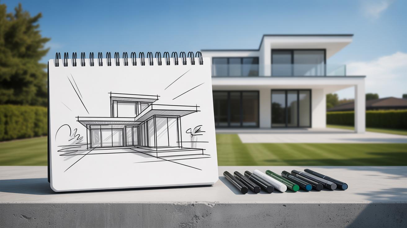
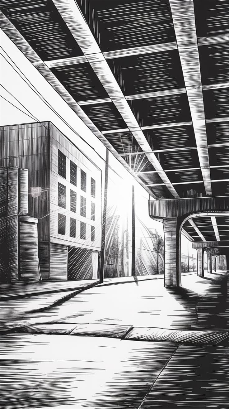
Expressive Drawing Styles to Show City Character
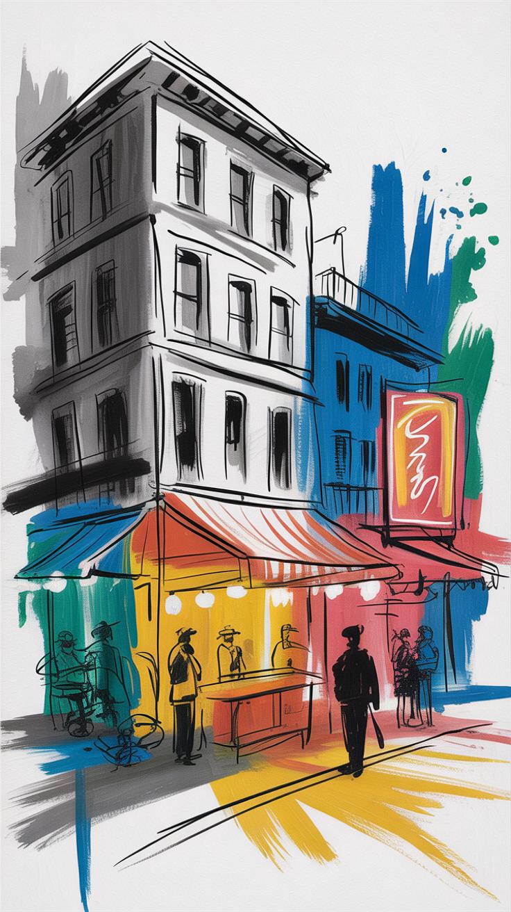
Different drawing styles capture urban spirit in distinct ways. Sketchy, loose lines often convey a city’s quick, restless energy. When you see a city drawn with rough, rapid strokes, the liveliness almost bursts through the page. These lines hint at movement, chaos, and a pulse that keeps things from ever feeling static. Imagine the bustle of a busy street or a crowded market caught with a few flicks of a pen—that immediacy tells you something about the city’s personality, maybe even its mood.
On the other hand, detailed and precise styles speak of the city’s structure and order. Fine lines and careful shading reveal architecture, planning, even history embedded in facades and street grids. They make the urban environment feel palpable and grounded. A careful drawing might focus on the uniformity of a row of buildings or the geometry of a bridge, helping you see how the city holds itself together, its shapes balanced and deliberate—though maybe a bit rigid, too.
Neither style fully captures a city alone. Sketchy drawings might lose clarity, while detailed ones might feel static. Each approach shows different layers. Sometimes, combining these styles gives a more rounded sense of place—an invitation to think about how cities are both alive and ordered, chaotic yet shaped by human hands. What part of a city’s soul do you find more compelling to reveal through your drawings?
Using Scale and Perspective in City Drawing

What is Scale in Drawing
Scale in drawing means the size relationship between objects on the paper and their real-world counterparts. When you sketch a city, getting the scale right helps your buildings look believable—not too big or too small compared to each other. It’s like translating the city’s size into a smaller form that still feels true.
For example, if a skyscraper dwarfs nearby houses, your drawing’s scale should reflect that difference clearly. This avoids confusion about the city’s layout and ensures the viewer understands how spaces relate at a glance. Sometimes, artists shift scale deliberately to emphasize parts of the city, but usually, a consistent scale grounds the drawing in reality.
Understanding Perspective
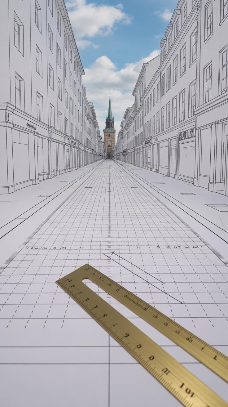
Perspective adds depth and space to your city drawing—it’s what makes your flat sketch feel three-dimensional. By using perspective, you show how buildings shrink as they move away, how streets narrow, and how the skyline bends into the distance.
There are different types, like one-point, two-point, or even atmospheric perspective. I find one-point perspective useful when drawing a long street, making it easy to lead the eye far into the scene. Using perspective properly gives your city life and scale—it’s more than shapes on paper; it’s about feeling the space people move through.
What’s tricky, though, is when perspective clashes with your scale choices, creating awkward proportions. That’s when a drawing feels off, even if the details are sharp. Balancing these two elements takes some trial and error but shows the city’s structure more clearly than details alone ever could.
Adding Details That Tell City Stories
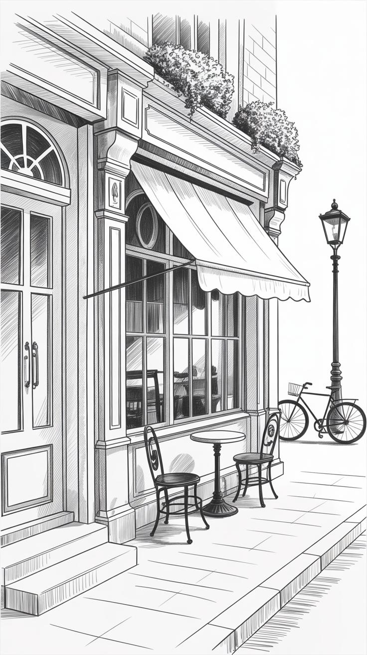
Small details like weathered signs, flickering streetlights, and worn textures make a city drawing feel alive. They ground the image in a specific place and time, pulling you in. Without these little elements, a city can look flat, generic, almost empty—even if the big shapes are right.
Details carry stories. A cracked sidewalk might suggest years of use or neglect. A neon sign announces the character of a neighborhood. Even a stray piece of litter or graffiti can hint at social tension or a community’s spirit. These minute touches invite viewers to look closer, to wonder about what’s happening beyond the surface.
When choosing which details to include, it helps to think about what truly defines the city’s culture or history. Does a particular pattern of brickwork speak to an old tradition? Are certain symbols or storefronts recognizable locally? Not every detail needs to be shown—sometimes less is more—but the ones you do pick should resonate with the city’s identity.
Have you ever paused to notice how street signs vary not just in language but style, revealing layers of past influences or changing times? Such choices shape the mood of your drawing. They hint at stories without spelling them out. In the end, it’s those small, almost overlooked things that connect a viewer emotionally to the place drawn, making it, well, feel like a real city.
Mixing Artistic Freedom with Accurate Representation
When drawing a city, you want to capture more than just its shape. Accuracy matters because it anchors the viewer’s understanding. Streets, landmarks, and building positions—these create a mental map. Without them, the city can feel like… a blur. Familiarity helps people recognize the place, connecting emotionally but also practically.
Still, pure accuracy can feel, well, dull. That’s where creativity steps in. What if a street looks too straight or a building too plain? Sometimes exaggerating curves, stretching proportions, or playing with colors can reveal how a city *feels* rather than just how it looks. Perhaps a cramped alley turns impossibly narrow to express claustrophobia, or rooftops rise taller to show the city’s ambition.
Finding a balance means deciding which details serve clarity and which serve expression. I remember drawing a cityscape that kept the main avenues true, but I distorted smaller buildings to emphasize the chaos of a busy neighborhood. Some viewers asked why the proportions seemed off. Others said it made the drawing come alive.
- Keep key landmarks and street grids clear to guide the viewer’s eye.
- Use exaggeration in shapes or line work to evoke emotions or highlight atmosphere.
- Experiment with departures from reality—it’s okay if not everything is true-to-life.
- Consider the mood you want to convey. Should the city feel welcoming, overwhelming, or mysterious?
It’s tricky, maybe even contradictory, but that tension between truth and interpretation is where expressive city drawing thrives. You want your city to be recognizable, yes, but also to speak with a unique voice. What parts of the city’s character are worth bending? That choice shapes the whole drawing.
Incorporating Light and Shadow to Enhance City Drawings
Light and shadow do more than just define shapes in your city drawings—they can tell a story about time, mood, and space. When you place shadows just right, a street corner can feel like early morning fog or the golden warmth of late afternoon. It’s tricky though, because the same scene can appear totally different depending on how you handle light.
To capture time of day, try thinking about the angle and intensity of light sources. Sharp, long shadows suggest late afternoon or early morning; softer, less defined shadows might hint at midday or overcast skies. You don’t have to be exact about it—sometimes, just the suggestion of light direction can guide the viewer’s eye and mood.
Shading plays a crucial role in giving your buildings and streets a three-dimensional feel. By gradually darkening areas away from the light source, you add volume and depth. Keep in mind:
- Use varying pressure with your pencil or tool to create smooth transitions.
- Experiment with cross-hatching or stippling to express texture as well as shadow.
- Remember that shadows aren’t always black; sometimes, they carry color or reflected light, especially in urban settings.
When I first tried shading city scenes, I sometimes overdid the darkness, which flattened the image instead of deepening it. It takes a bit of restraint and observation—looking at how real shadows behave rather than just copying the darkest spots. How might your city drawing shift if you focused on subtle contrasts rather than stark ones? Could softer shadows evoke a different emotional response?
The mood you set with light and shadow can completely change how the viewer experiences the cityscape. Maybe a rainy evening calls for blurred shadows and scattered light, while a bright noon demands crisp, defined edges. Sometimes, the most powerful drawings aren’t those that perfectly mimic reality, but those that use light and shadow to suggest a feeling or capture a fleeting moment.
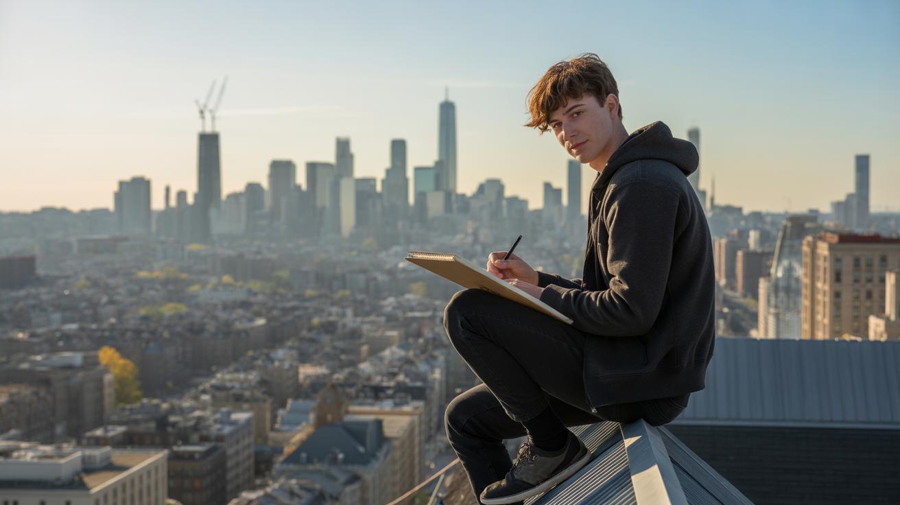
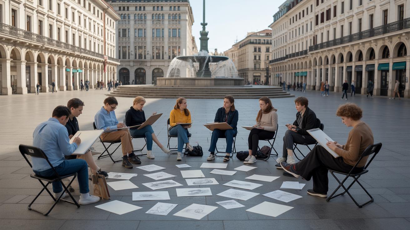
Developing Your Own Expressive City Drawing Style
Finding a personal drawing style for urban scenes takes time and a bit of trial and error. Don’t feel pressured to settle on one look right away. You might try sketching the same street with different tools or approaches—loose lines one day, detailed architecture another. See what feels natural or sparks curiosity. Sometimes, you’ll surprise yourself.
Simple practice exercises can open doors to fresh ideas:
- Draw a quick cityscape with only one line, no lifting your pen.
- Use different pens or brushes—thick, thin, soft—to reinterpret the same corner.
- Create a drawing focusing on shapes and forms, ignoring details altogether.
- Sketch scenes at varying times of day, noticing how your hand reacts differently to lighting.
Look closely at your city. What stands out? Is it the cluttered wires tangled above old shops, or the clean lines of glass skyscrapers? Maybe it’s the way people move through narrow alleys or the corners where street art thrives. Draw those Bits and pieces that feel genuine to you. Let your work reflect what feels unique, even if it’s small or overlooked.
Remember, styles evolve as you grow. Some drawings may feel odd or unfinished—that’s part of the process. Keep experimenting. Keep noticing.
Conclusions
City drawing is more than copying buildings. It is about feeling and showing the city’s lively spirit. Different styles offer ways to express this energy, from careful lines to free shapes.
By using the right techniques and focusing on what makes a city unique, you can create drawings that bring a city to life. Your drawings can make others see and feel the city as you do.


