The Playful Elegance of Rococo Art
Rococo art stands out with its elegance and playful details that have enchanted art lovers for centuries. This style began in 18th century France as a light, ornamental reaction to the strict Baroque designs. It is known for its fluid curves, rich decorations, and bright pastel colors that create an elegant yet lively atmosphere.
In this article, you will explore the main features of Rococo art and learn practical tutorials to create your own Rococo style pieces. Whether you are a beginner or have some art experience, the following chapters will guide you through the charm and techniques of Rococo art in an easy and engaging way.
History and Origins of Rococo Art
Rococo’s Beginnings in France
The Rococo style started in France around the 1730s. It came after the Baroque period, which was all about grand, dark, and heavy designs. Rococo was quite different—lighter, more playful, and often a bit silly, some might say. While Baroque focused on drama and deep emotion, Rococo went for charm and grace. It favored delicate shapes and soft, pastel colors instead of bold and strong contrasts. France’s royal courts, especially under King Louis XV, really embraced this new style. People wanted art that felt less serious and more about comfort and pleasure, and that’s where Rococo found its home.
How Rococo Spread Across Europe
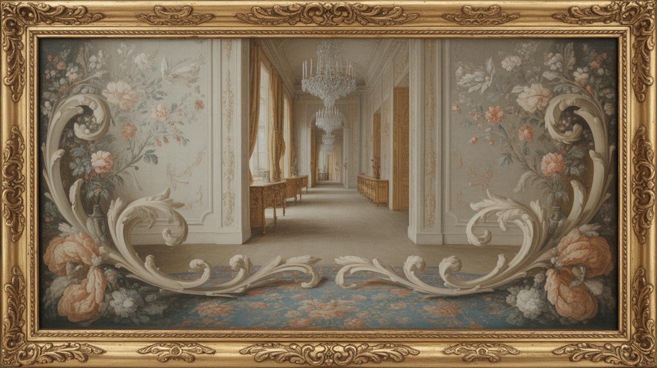
From France, Rococo didn’t stay put. It traveled, slowly at first, and then more widely across Europe. Countries like Germany and Austria picked it up, especially in their palaces and churches. You can also see Rococo influences in Italy and even parts of England. Each place gave it a slightly different twist. For example, in Germany, the style was often more ornate and detailed. The spread of Rococo shows how styles can shift with culture and taste, even if sometimes it fueled debate about art getting too frivolous. Yet, its lightness and decoration found many fans beyond France, changing the look of European art in that period.
Key Characteristics of Rococo Art
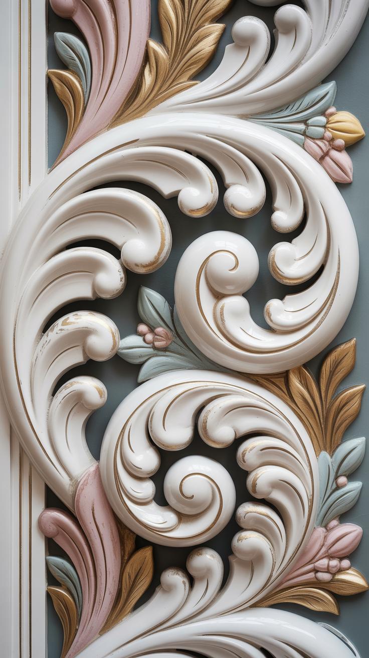
The most striking feature of Rococo art is its elaborate decoration. You’ll often find delicate shells, curling leaves, and soft floral patterns woven throughout the composition. These details aren’t random; they are carefully arranged to create a sense of lightness and elegance that almost feels alive. Sometimes playful figures, like cherubs or dancing nymphs, pop up, giving the artwork a lively, almost mischievous character.
Colors in Rococo paintings tend to be soft and pastel—think pale pinks, gentle blues, creamy whites, and light greens. These shades help create a dreamy atmosphere. Light is used not just for illumination but to create illusions of depth and breathability. Some artworks might surprise you with their intricate play of shadow and glow, as if they’re inviting you closer to step inside their world.
What’s curious is how these motifs and colors work together. The decorations could feel overwhelming, but instead, they bring a sense of joy and fluidity. It’s not just about richness but a kind of playful sophistication. You might wonder whether the artists intended their work to be an escape or a mirror of their own ornate society. Either way, these features define Rococo’s unmistakable charm.
Tools and Materials Used in Rococo Art
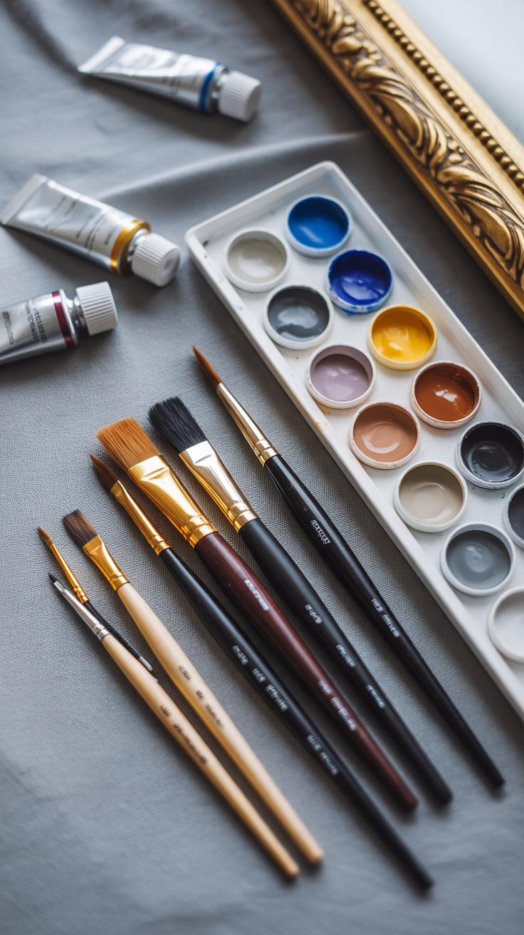
Traditional Materials in Rococo Art
Rococo artists often worked with materials that feel quite tactile and natural, even if their finished works look elaborate and delicate. Stucco was frequently used—soft enough to mold into swirling, intricate shapes, perfect for those playful curves that define the style. It’s somewhat surprising how much the texture and form of stucco influenced Rococo’s characteristic ornate surfaces.
Wood also played a key role, especially for furniture and architectural elements. Carved wood frames and panels provided a sturdy base for gilding, which artists applied to bring a shimmering, luxurious touch. Gilding—usually gold leaf—was often layered on top of paint or varnish, creating a subtle depth you wouldn’t necessarily notice at first glance, but the effect grows on you.
About paints: oil and tempera were common, grounded in tradition but flexible enough for Rococo’s pastel palette and fine detailing. The materials were sometimes mixed with binders to enhance their softness, allowing for gentle gradations of color and lightness, rather than harsh edges. It’s interesting how these choices shaped the ethereal mood of many Rococo works.
Modern Tools for Rococo Inspired Artwork
If you want to create Rococo-inspired pieces today, you might think traditional materials are necessary but, surprisingly, modern art supplies can replicate the look quite well. Acrylic paints, for instance, dry faster than oils and allow layering techniques that mimic the soft tonal shifts used in Rococo painting. They’re more forgiving, too, if you want to experiment.
For the sculptural aspects, polymer clays or air-dry modeling compounds offer a practical alternative to stucco. They’re easier to handle and less messy but still allow for detailed molding and carving. That means you can try those elaborate flourishes without the same level of commitment or cleanup.
And for gilding? Gold-tone leaf or even metallic paints deliver a similar sense of luxury without the cost or fragility of real gold leaf. Brushes come in various sizes and stiffness, letting you capture delicate highlights or broader sweeping strokes—tools you’ll want to have on hand depending on your style.
Are you surprised that Rococo’s ornamental richness can be approached with both historic and modern methods? It’s worth trying a mix—sometimes old and new work better in tandem than you expect.
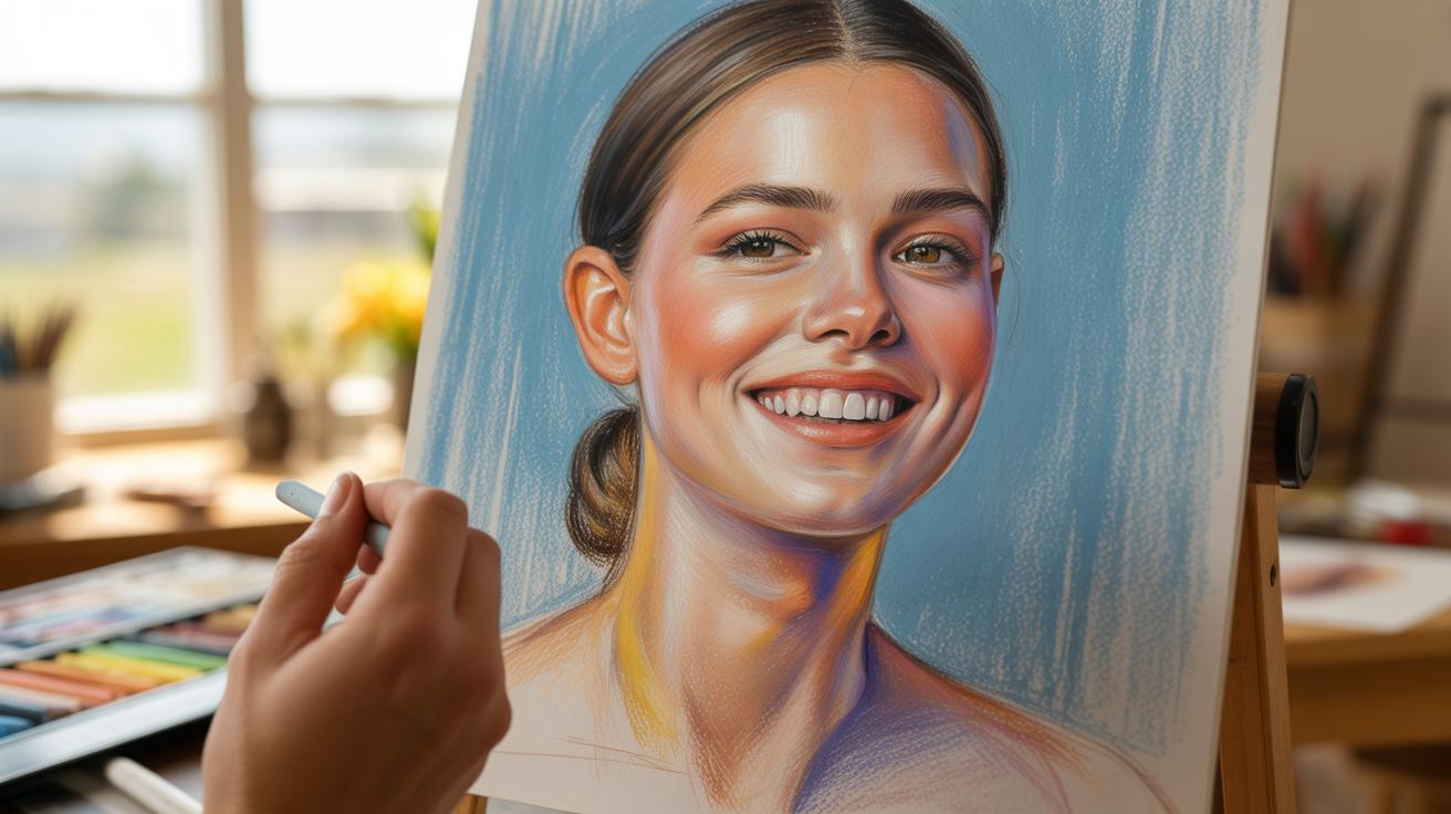
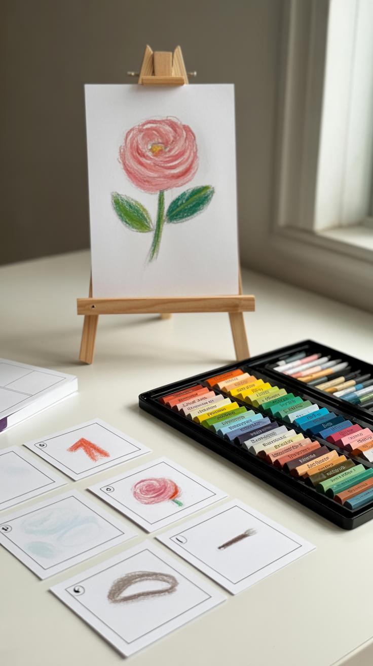
Basic Drawing Techniques for Rococo Style
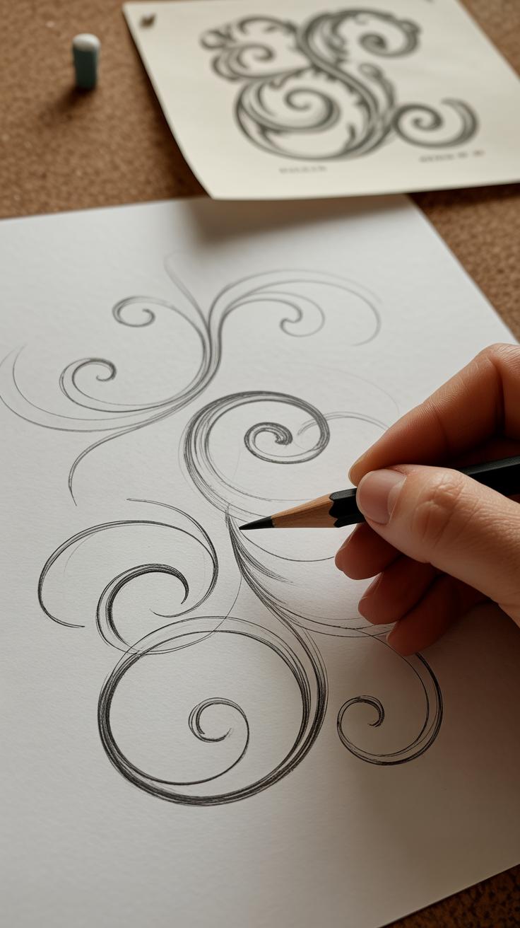
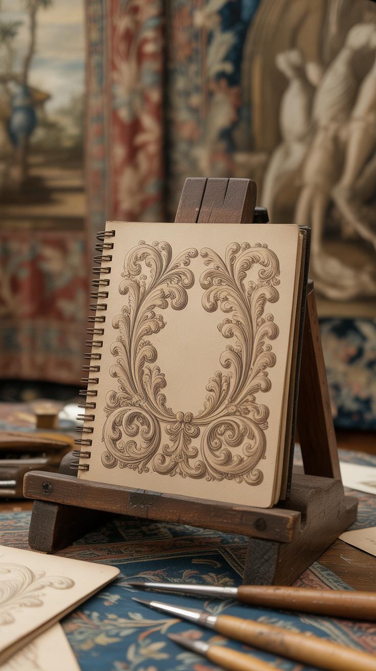
When you start drawing Rococo curves, you’ll want to get comfortable with flowing, almost whimsical lines. These aren’t stiff or mechanical shapes. Think of them like gentle waves or soft spirals. Begin with simple strokes—light, loose motions that let the pencil dance across the paper.
Drawing Curves and Twists
Start by sketching elongated S-shapes; these form the backbone of that playful Rococo motion. From there, add smaller loops or shells along these curves, building up complexity step-by-step. It might feel a bit challenging at first—getting that natural loop to look effortless—but keep practicing. Try drawing a series of shells with a faint spiral at their core, almost like a snail’s shell. Focus on smooth transitions between curves rather than perfect shapes.
It helps to think about the way Rococo designs flow; a curve should lead your eye smoothly into the next twist. Don’t worry if your lines overlap or look cluttered initially. This layering is part of what gives Rococo its lively depth.
Adding Flourishes and Floral Elements
Once you’re comfortable with basic curves, start incorporating leaves and flowers. Begin by sketching simple leaf shapes—oval or teardrop forms with subtle veins. Leaves in Rococo aren’t rigid; they have a soft, fluttering quality. You might find yourself repeating a shape several times to get it just right. That’s perfectly normal.
Flowers tend to layer petals gently, so draw soft, rounded petal shapes overlapping one another. Don’t worry about exact symmetry. Rococo florals often look wild but balanced, like they grew naturally rather than being forced onto the page. Add tiny dots or curls around your flowers to simulate ornamental flourishes—you’ll notice this gives your design more character.
Practicing in small sections can help here. Focus on a single flourish or flower at a time before expanding. It might take time to feel comfortable, but those delicate details really bring Rococo art to life.
Coloring and Painting in Rococo Style
Choosing the Right Colors
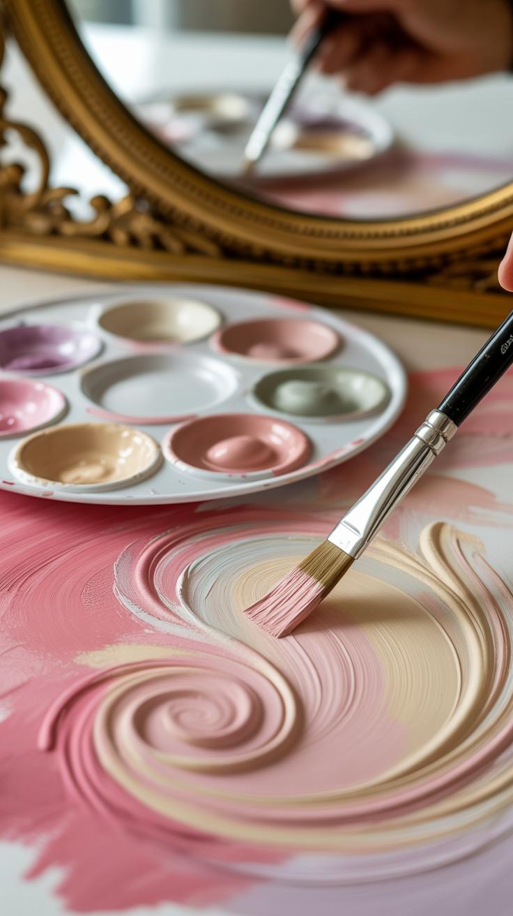
When picking colors for Rococo-inspired artwork, focusing on pastels is key. Think soft pinks, pale blues, gentle greens, and creamy yellows. These tones carry the light, airy feel that Rococo often embodies. But don’t limit yourself strictly to these—sometimes, a touch of muted lavender or a faded peach can subtly shift the mood without losing that delicate charm.
It can be tempting to use pure pastels straight from the tube, yet mixing them with a bit of white or light gray helps make these colors feel more natural, softer, and less flat. I’ve noticed when painting, slightly desaturating the hues creates something that looks worn-in or sun-kissed, much like the original Rococo artworks.
Choosing colors isn’t just about hue. Think about how they interact—pair a blush pink with a cool, almost translucent seafoam, or a warm cream with a soft lilac. The balance might feel tricky at first, but leaning toward contrast without starkness keeps things lively without overwhelming the eye.
Painting Soft Shadows and Highlights
Rococo paintings rarely have harsh shadows. Instead, shadows appear faint and diffuse, as if lit by gentle daylight. To imitate this, try blending shadows into the base colors with soft brushes or even gentle wiping techniques. Use slightly darker tones of your pastels but keep them light—almost like a whisper rather than a strong shape.
Highlights are just as subtle. They shimmer faintly rather than shine boldly. Using a nearly white shade mixed with a hint of your base color can achieve these soft highlights, applied sparingly on edges or raised surfaces. It’s that delicate flick of light that adds dimension without creating sharp distinctions.
Sometimes, I find it helpful to apply thin glazes over shadows or highlights—layers so sheer they feel almost accidental, revealing more of the color beneath. This layering builds a softness that feels more natural. Have you tried layering washes like that? It’s a slow process, but trust me, it changes how flat paintings feel.
All in all, the goal here isn’t precision but evoking lightness. Shadows and highlights should feel fleeting, as if the scene might shift in a moment—perfectly capturing that soft Rococo air.
Creating Rococo Inspired Decorative Art
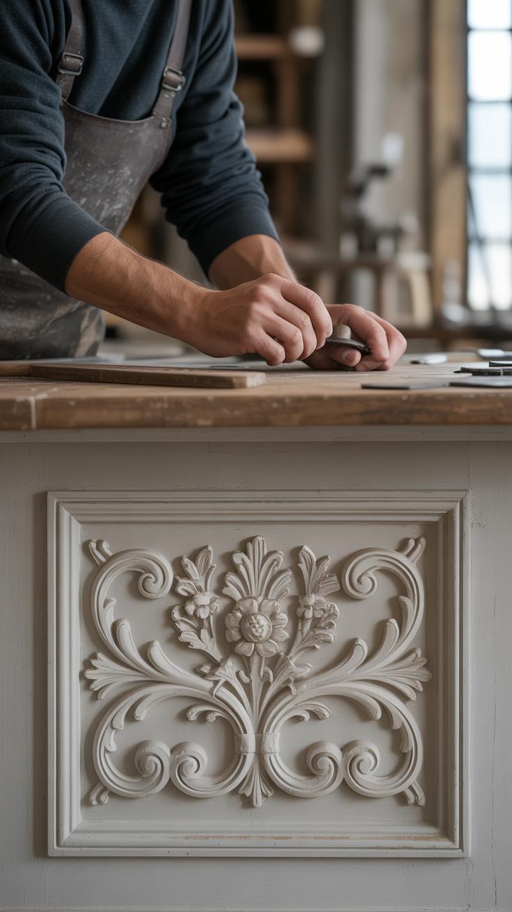
Designing decorative pieces in the Rococo style is about capturing that playful elegance, but it’s not just about piling on details. When you work on frames, furniture ornaments, or wall art, start by thinking small. Small elements often carry the whole character of Rococo—think shells and flowers, those signature motifs that feel both natural and fanciful.
For shell motifs, study the curves carefully—they’re never perfectly symmetrical. Try sketching spirals with soft edges, letting lines wiggle a bit instead of being too rigid. I found that using layered shading helps give depth without making it look heavy. For flowers, look at delicate petals with uneven shapes and fine veins. Don’t stress about perfection; natural imperfections make it feel authentic.
When combining these motifs into a decorative composition, balance is key but don’t aim for strict symmetry. Let some pieces extend more on one side or overlap in an unexpected way. Place shells near flowers, but not always evenly spaced. Playing with scale can bring the design to life—large blossoms paired with small, subtle curls. In my experience, the trick is to keep it light and flowing, like a gentle dance rather than a stiff pattern.
Try arranging your motifs loosely first, then tweak until it feels right. Ask yourself: does this look playful enough? Too tight? Too empty? Your eye is usually the best judge when it comes to Rococo’s charming messiness.
Famous Artists and Their Impact
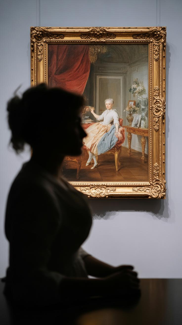
When you look at Rococo art, certain names inevitably stand out. Two of the most recognized figures are François Boucher and Jean-Honoré Fragonard. Both artists captured the playful spirit and elegance typical of the style, but they did so in very distinct ways.
Boucher’s works often feature soft colors, delicate textures, and mythological themes. His paintings feel almost like daydreams, filled with light-hearted charm and detailed ornamentation that draw you in—there’s a kind of flirtation with the viewer, one that’s hard to ignore.
Fragonard, on the other hand, embraces spontaneity and movement. His brushstrokes seem looser, more energetic, while still keeping the light and whimsical essence of Rococo. His scenes often suggest intimacy and a kind of joyful secrecy.
Studying these artists isn’t just about admiring pretty pictures. Observing how Boucher layers detail or how Fragonard plays with light and shadow can deepen your understanding of Rococo’s character. It teaches you to see beyond the surface, to notice the balance between elegance and playfulness that defines the style.
Practical Tips for Your Rococo Art Projects
When starting your Rococo art journey, remember it doesn’t have to be complicated right away. Begin with simple motifs—maybe a single shell or a delicate scroll—and gradually add complexity as you feel more confident. Trying to recreate a full Rococo scene too soon can be overwhelming, and honestly, it might dampen your enthusiasm.
Practice regularly. Even short daily sketches can sharpen your eye for those playful curves and intricate details Rococo is known for. I found that committing just ten minutes to drawing ornamental shapes helped me notice subtle flourishes I’d otherwise miss.
Look closely at Rococo details in the world. Museums, books, even historic furniture contain small twists and lighthearted forms that can inspire your own designs. Don’t hesitate to copy parts you like—this can teach you how artists balanced elegance with ease.
Ask yourself: What catches my eye in these pieces? Which elements feel alive, and which fall flat? Not every detail you try will work, but that’s part of learning. Maybe some ideas feel too busy or artificial. It’s okay; art isn’t about perfection, after all.
Try mixing delicate patterns with fresh colors or different materials. You might be surprised what happens when Rococo meets your own style. Besides, the joy often lies in experimentation rather than a finished product.
Conclusions
Rococo art offers a unique blend of elegance and playful details, which makes it a fascinating style to study and recreate. By understanding its history, motifs, and techniques, you gain tools to appreciate and produce your own artworks inspired by this cheerful style.
We encourage you to apply the step-by-step tutorials shared here to bring a touch of Rococo’s lightness and beauty into your creations. Embrace the flowing curves and delicate ornaments to express your artistic voice with this splendid art form.


