Introduction
Watercolour painting is a widely appreciated art form with a rich history dating back to ancient times. It involves using paints made from pigments suspended in a water-based solution. This method creates transparent layers and delicate effects that are perfect for capturing the essence of landscapes. Whether you are a beginner or an experienced artist, understanding watercolour techniques can open new doors to your creativity. Landscape painting is one of the most popular themes in watercolour art. It allows artists to represent natural scenes like mountains, rivers, forests, and skies with vibrant colours and spontaneous brushwork.
In this article, you will learn practical ways to get inspired and improve your landscape watercolour paintings. Emphasis will be placed on colour theory, useful techniques, and approaches to finding subject matter that excites you. Have you ever wondered how some watercolour paintings seem so alive and full of energy? The answer lies in mastering colour combinations and brush control. You will also discover how to bring depth and light into your landscapes. By exploring this content, your skills and passion for watercolour landscapes will grow stronger.
Understanding Watercolour Basics

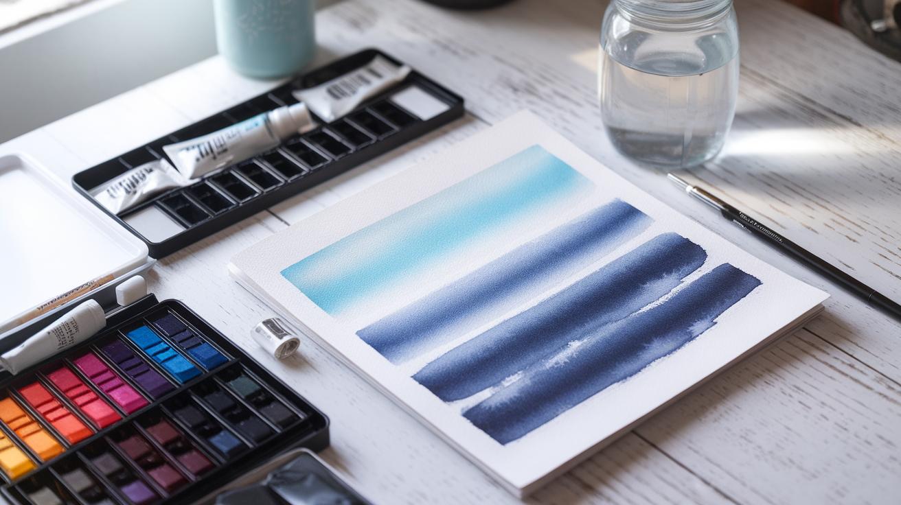
Watercolour paint consists of pigment particles suspended in a water-soluble binder. When you add water, it thins the pigment and changes how much color appears on your paper. The more water you add, the lighter and more transparent the paint becomes. This transparency lets you build layers that glow from underneath, giving your landscapes depth and life.
Quality pigments hold more color and resist fading better over time. Cheaper paints often mix with fillers that dilute color strength. When you understand how pigment and water interact, you can control the hues and vibrancy in your work.
The type of paper you choose also plays a major role. Watercolour paper is designed to absorb moisture while supporting the pigment. This balance prevents buckling and helps create clean, crisp washes. Different textures and weights change how paint spreads and settles.
Do you notice how some paintings feel soft and blurry while others look sharp? That effect often starts with your pigment and paper choices. What textures and shades fit your style best?
Pigments and Transparency
Pigments mix with water to form thin, transparent layers. This transparency defines watercolour’s unique look. When you paint lightly, you let the paper shine through and brighten your colors. More opaque layers cover the paper more, changing the light’s path.
The strength of your pigment affects how intense your colors can get. High-quality pigments contain more color molecules, so even when diluted, they shine bright. Low-quality paints may look dull, and layering them won’t fix that.
Understanding which pigments stay vibrant when diluted helps you avoid muddy colors. Have you tried mixing small amounts of your paint with lots of water to see how the color changes? This simple test shows your paint’s true power before painting your landscape.
Choosing Watercolour Paper
Watercolour papers differ by texture and weight. Cold-pressed paper has a slightly rough surface that holds water and pigment unevenly. This texture creates natural granulation and soft edges, perfect for landscapes.
Hot-pressed paper feels very smooth. It absorbs paint evenly, allowing fine details and sharp lines. Choose hot-pressed if your landscape style favors precision.
Thickness matters too. Heavier papers (300gsm or more) handle multiple washes without warping, while lighter papers might buckle under wet paint. Testing different papers helps you find what fits your brushstrokes and paint flow best.
Which textures make your brush feel most comfortable? Try swatching colors on both types to see where your paint behaves best before starting your next landscape.
Essential Watercolour Techniques
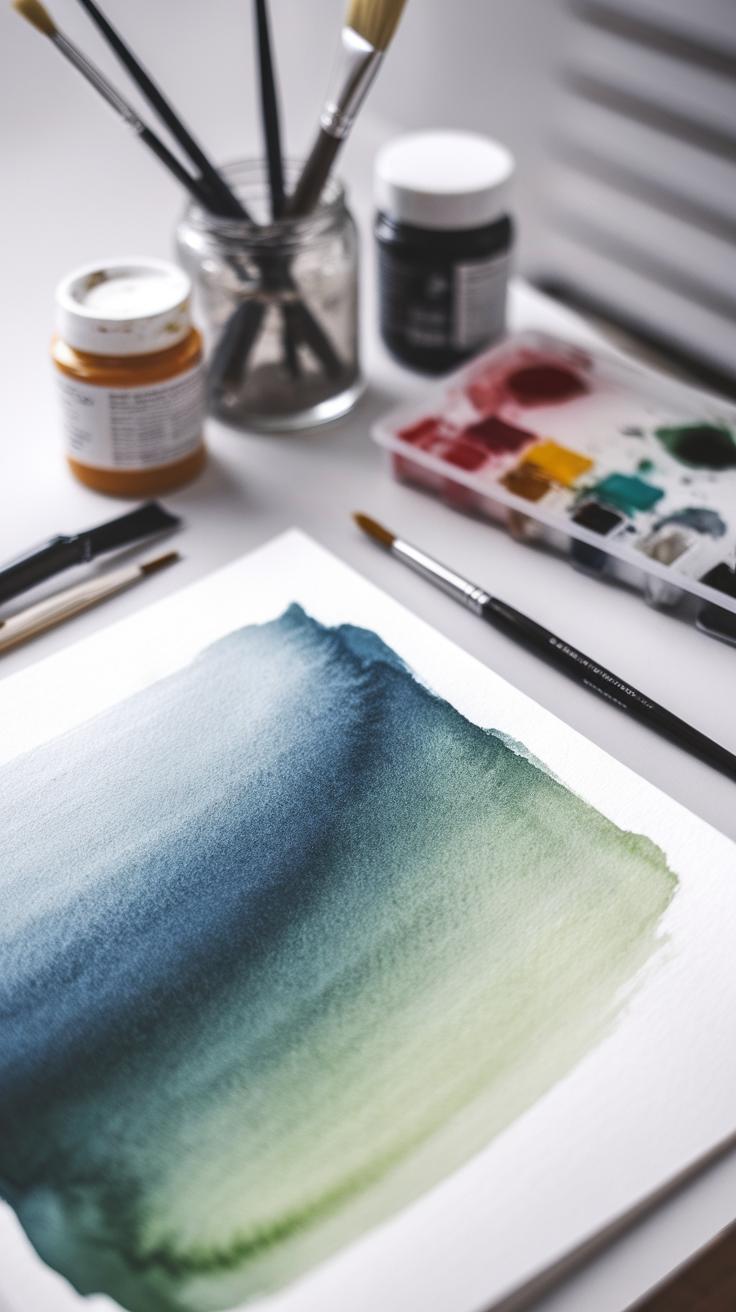
Mastering practical watercolour techniques will strengthen your landscape paintings. Use washes to create broad, even areas of color that form the sky or distant land. Applying a flat wash demands controlled brush strokes and consistent pigment to avoid streaks or uneven spots. Graded washes add interest by shifting color intensity smoothly, useful for sunsets or misty horizons.

The wet-on-wet method blends colors by applying wet paint onto a wet surface. This produces soft edges and natural gradients, perfect for cloud shapes or gentle water reflections. Using this technique, you let colors mix on the paper, which offers unexpected effects you can guide but not fully control.
For texture and sharp details, use the dry brush technique. This method applies pigment with a brush that’s almost dry, resulting in broken, textured strokes. It works well for grass blades, tree bark, or rocky surfaces. Experimenting with different brush pressures can help you vary the textures in your landscapes.
Which areas of your landscape need smooth transitions, and where do you want texture? Choosing the right technique lets you express your vision clearly and adds depth to your painting.
Creating Washes
Flat washes cover large sky or background areas without visible brush marks. To achieve this, load your brush evenly with paint and move it steadily across the paper. Maintain a wet edge to avoid hard lines. Mixing enough pigment before starting saves time and keeps colors consistent.
Graded washes shift from dark to light or between colors. Start with a strong pigment load and add clean water to your brush as you move downward or across the paper. This technique is great for painting fading sunsets or hills moving into the distance.

Pay attention to paper quality and drying times. Work quickly on cold-pressed paper for smoother washes, and practice controlling your brush to maintain even, flowing strokes. Remember, patience and practice improve your wash quality faster than trying to rush the process.
Wet-on-Wet and Dry Brush
The wet-on-wet technique means applying wet paint over a still-wet layer. This causes colors to flow and blend naturally, producing soft shapes and gradients. Use it early in your painting to suggest clouds, water reflections, or soft backgrounds that need gradual transitions.
Dry brush contrasts this by using a nearly dry brush on dry paper. You’ll get scratchy, broken lines or textures, ideal for detailed elements like tree branches, grass, or rough terrain. This technique emphasizes surface detail and adds interest close to the viewer.
Try combining both in one painting. Use wet-on-wet for loose backgrounds, then apply dry brush for foreground textures. How could you balance flowing washes with sharp details to bring your landscape to life?
Applying Colour Theory for Vibrant Landscapes

Understanding colour theory helps you create vibrant and eye-catching watercolour landscapes. Primary colours—red, blue, and yellow—are the building blocks for mixing virtually any colour you need. Using these provides a strong, clear base for your palette.
Complementary colours sit opposite each other on the colour wheel, such as blue and orange or red and green. Pairing these creates strong contrast, which can make elements in your painting pop. For example, using warm oranges against cool blues can highlight the glow of a sunset or the depth of a shadow.
Harmonizing colours means balancing these contrasts so they work together rather than fight. Think about which areas you want to stand out and where you want softer transitions. Adjust the saturation and value to guide the viewer’s eye and add energy to your landscape.
Ask yourself: Which tone do you want to emphasize? What mood are you aiming for? Your decisions will shape the atmosphere and impact of your work.
Primary and Complementary Colors
You can create dynamic contrast by placing primary colours next to their complementary partners. For instance, a bright yellow field next to purple shadows creates vibrancy without overwhelming the eye.
Primary colours also help maintain clarity in your landscape. A strong blue sky or a vivid red flower acts as an anchor. Mixing secondary or tertiary colours from primaries allows you to control warmth or coolness throughout your scene.
Balance is key. Too much complementary contrast in one area can feel harsh. Spread complementary pairs thoughtfully to maintain harmony. Try painting a green forest beside a cluster of red berries or orange sunlight on blue water.
Experiment with how pure or muted you keep these colours. Changing intensity influences whether your painting feels calm or lively.
Color Harmony and Mood
The colour combinations you choose affect the mood of your landscape. Cooler colours like blues and greens tend to suggest calm, peace, or distance. Warmer hues, such as reds and yellows, give energy, warmth, or closeness.
You can create tranquil scenes with a limited cool palette, perhaps a misty morning lake. Or, generate drama with sunsets that merge fiery reds and purples. Mixing both warm and cool colours helps achieve balance and natural light effects.
Consider the emotional response you want from viewers. How do your colours guide their feelings about the scene? Using analogous colours—those next to each other on the wheel—can create unity, while split complements offer subtle contrasts.
Think about your subject’s story. Will your landscape feel inviting or brooding? Your palette shapes that perception before any detail is added. How will you use colour harmony to tell that story?
Choosing and Preparing Your Landscape Subject
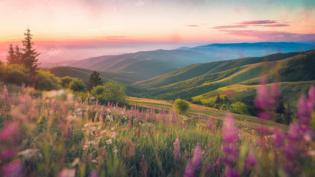
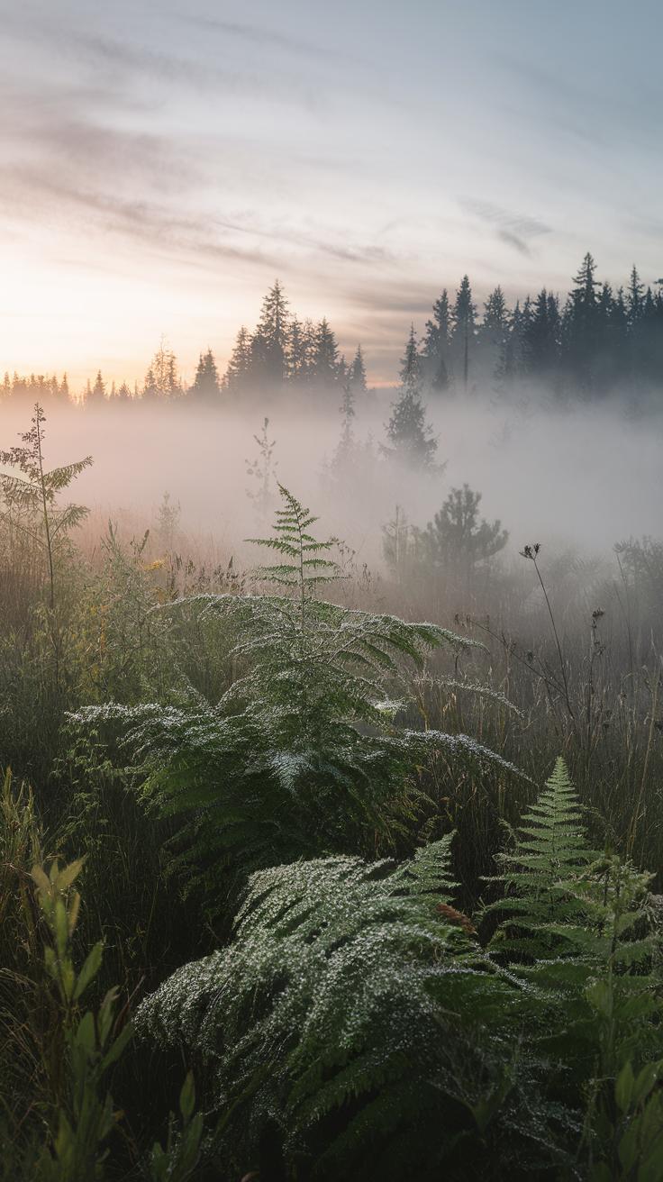
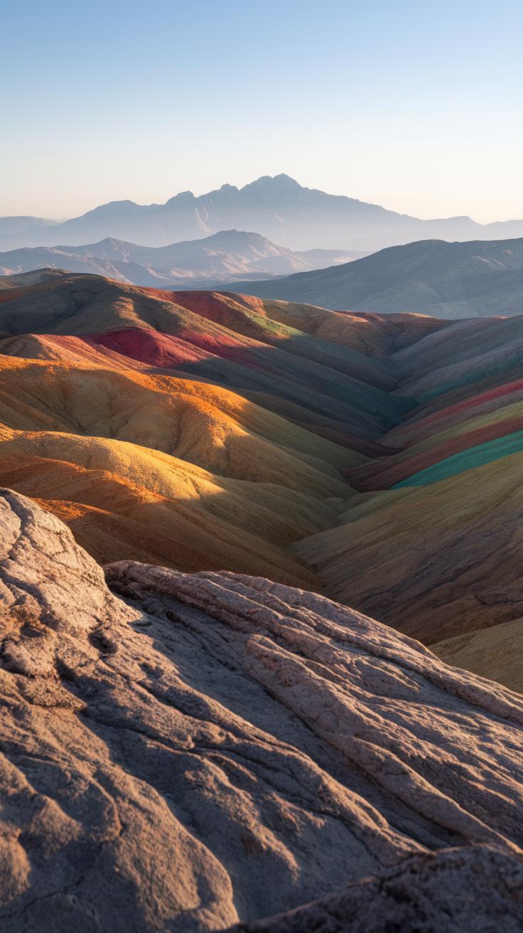
Finding a landscape that excites you will shape the energy of your painting. Look for scenes that hold your attention—whether it’s a quiet forest trail or a sweeping mountain view. Spend time observing your subject. Ask yourself what draws you to it. Is it the patterns in the trees or the way light hits the water?
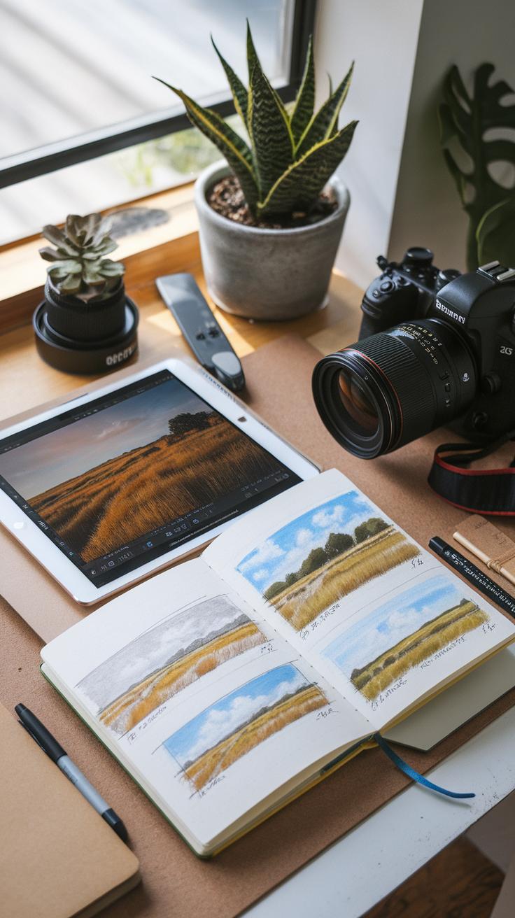
Taking photos can help capture details you want to include. Try snapping shots from different angles and distances. Use these to create simple sketches. Sketches let you focus on the main shapes and elements before adding color. Preparing in this way saves time and clarifies your vision.

Composition plays a key role in how your landscape feels. You want the viewer’s eye to move naturally through the painting. Position main elements thoughtfully, balancing empty space with detail. What mood do you want to create? Choosing and preparing your scene with care builds a strong base for vibrant, expressive watercolours.
Finding Inspiration
Nature offers endless chances to find a landscape subject that speaks to you. Walks in parks, hikes, or quiet riverbanks can reveal interesting views. Pay attention to unusual shapes or color contrasts you might not normally notice.
If you prefer photos, browse through collections online or your own albums. Look for images that evoke feelings or memories. Ask yourself which light, textures, or patterns catch your eye.
Certain questions help you identify inspiring scenes: Does this landscape tell a story? Does it make you want to add your personal touch? Inspiration grows when you connect with the subject beyond just how it looks.
Composition Essentials
The rule of thirds helps you arrange your landscape by dividing your view into a grid of nine equal parts. Place key elements along these lines or where they cross. This prevents your painting from feeling static or centered.
Leading lines draw the eye through your work. Paths, rivers, or fences can guide a viewer’s gaze toward your chosen focal point. Use these lines to create depth and movement.
Focal points give your landscape a clear subject. It might be a tree, rock, or distant hill. Highlight this area by using contrast or sharper details. Ask yourself what part of the scene you want people to notice first. Clear composition steps help build paintings that hold attention and communicate your vision clearly.
Capturing Light and Atmosphere
Watercolour thrives when you capture natural light and atmosphere in your landscapes. Focus on how light interacts with the environment. Layering thin washes helps create the glow of sunlight shining through trees or reflecting off water.
Use wet-on-wet techniques to suggest fog or haze. These soft blends make distant shapes look muted and indistinct. Try lifting paint with a clean, damp brush to reveal highlights and mimic sparkling reflections.
Consider the direction of the light source. Painting lighter tones where sunlight hits gives life to your scene. Cooler colors often work well for shaded areas or shadows. Are you paying attention to subtle shifts in tone and color in your reference photos?
Combine sharp edges with soft transitions. Hard edges can define objects closer to the viewer, while soft edges create atmosphere in the distance. Experiment with glazing to build translucent layers that imitate real atmospheric effects.
Depicting Light and Shadows
Strong contrasts between light and shadow give your landscape depth and form. Use a darker mix of colors to represent shadows instead of just pure black. This keeps your painting natural and vibrant.
Observe how shadows vary in color depending on what they fall on. Shadows on grass will look different from shadows on rocks or water. Vary your brushstrokes and pigment density to reflect these differences.
To make light areas pop, leave sections of the paper bare or lift paint while it is still damp. Try placing shadows carefully to suggest the shape and texture of objects. Are your shadows consistent with the light source in your scene?
Representing Atmospheric Conditions
Mist, haze, and reflections add mood to your landscapes. Use multiple lightly tinted washes to build a sense of depth in fog or haze. Let washes dry slightly before adding new layers. This prevents colors from muddying.
To paint reflections on water, mirror shapes softly and reduce contrast. Reflections often have a blurred, diffuse look due to the water’s movement. Use horizontal strokes with a damp brush to achieve this effect.
Soft edges communicate distance and atmosphere. Use a damp brush to soften hard edges after drying to create this effect. What techniques help you capture the feeling of cool morning mist or shimmering sunlight?
Building Depth and Perspective
Creating depth in landscape watercolors makes your painting feel real and inviting. You achieve this by controlling three main things: color intensity, level of detail, and perspective. Colors closer to you should be strong and rich, while distant areas need softer, lighter colors to look farther away. When you add more detail to objects in the foreground and less detail as things recede, your painting gains a natural sense of space. Using simple perspective rules will guide where you place objects and shapes, helping the viewer’s eye travel through the scene. Try painting a tree up close with sharp, dark leaves, then soften the colors and edges of trees on the horizon. How can you adjust your brushwork or color to push parts of your scene backward or pull others forward? Think of depth as a tool that breathes life into your landscapes.
Using Color to Show Distance
Atmospheric perspective depends on how air affects color over distance. As objects get farther away, their colors grow lighter and less saturated. Blues, grays, and cool colors dominate distant views because the atmosphere adds a hazy filter. Start with your foreground colors at full strength. Gradually add water or mixing colors to mute the tones in the middle ground and background. Observe your surroundings: do distant mountains look faded or sharp? When you plan your washes, leave those far elements soft and pale. You can test this by painting a row of hills using decreasing color intensity. What kind of mood does a soft background create versus a bold one? Playing with this effect lets you control how wide or narrow your landscape feels.
Linear and Overlapping Perspective
Linear perspective relies on guiding lines and shapes to build space. Objects closer to you appear larger, and those farther away become smaller. Use converging lines, like a path or river, leading toward the horizon to draw viewers into your scene. Overlapping shapes also create a sense of order and depth, placing one form in front of another. Begin a landscape sketch by blocking major shapes. Think about where the horizon line sits and how your elements relate to it. When you overlap trees or rocks, make the front ones darker and clearer to stand out. Do you notice how these tricks help your eyes understand distances? Mastering these basics will add more structure to your landscape designs, making them feel balanced and believable.
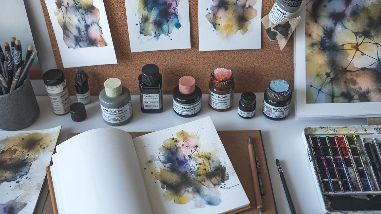
Adding Texture and Details

Adding texture to your landscape paintings brings them to life. You want trees to feel tangible, rocks rugged, and water ripples lively. Start by observing your subject closely. What patterns do leaves make? How does light touch rough bark or smooth stones? Use brushes with different shapes and bristle stiffness to mimic those textures.
Scratching with a palette knife or using sponges can create natural-looking textures for rocks or foliage. You might also try splattering paint lightly to suggest clusters of leaves or grass. Think about the direction of your brush strokes—they should follow the form of what you’re painting, like horizontal strokes for water ripples or jagged strokes for craggy rocks.
Adding details carefully ensures your painting stays fresh and engaging. What small touches will make your landscape believable? Use textures to invite viewers to look closer and explore your work.
Using Dry Brush for Texture
Dry brushing mimics rough surfaces and fine details well. To try it, wipe most of the paint off your brush so it feels almost dry. When you drag this brush lightly over your paper, it lays paint unevenly, creating a textured effect. This works perfectly for tree bark, grasses, or rocky ground.
The key is controlling pressure. Too much pressure covers smoothly; too light barely leaves a mark. Test strokes on scrap paper before applying. Dry brush can also add soft texture to clouds or distant hills by using gentle, broken strokes.
Experiment with dry brush to capture the feel of surfaces. How might you use it to show the roughness of a stone path or the delicate veins on leaves? Try it out and notice how it changes your textures.
Layering Details
Layering subtle details after your initial washes brings depth without overwhelming your work. Wait for the first layers to dry, then add finer marks like thin branches, highlights on rocks, or glimmers on water.
Keep these details light and sparse. Too many crowded lines can flatten your painting and distract from the overall composition. Use a fine brush and mix your paint with a little water to avoid heavy, harsh marks.
Think about which details are most important to your scene. Highlight areas that catch light or have distinct features. How will you decide which textures to add and which to leave soft? Layering with care helps your landscape feel real and inviting.
Troubleshooting Common Challenges

Watercolour landscape painting often brings challenges that can block your progress. One frequent issue is color muddying. This happens when colors mix too much, losing their brightness and becoming dull. You can avoid this by carefully mixing colors on your palette instead of directly on your paper. Plan your layers so that lighter colors go down first and darker shades come later. Wait for each layer to dry before adding the next. This keeps colors clean and vibrant. Think about the colors you want to blend—do they complement each other, or will mixing them create a murky tone?
Another challenge is paper warping. When you add too much water, your paper can buckle, making it harder to paint smoothly. To prevent this, stretch your paper before starting by soaking it and taping it to a firm board. Use a gentle amount of water on your brush and avoid flooding the paper with paint. Try painting in sections rather than all at once. This control helps keep the paper tight and prevents bumps. What tools are you using to hold your paper? Choosing the right setup can make a big difference in your results.
Avoiding Color Muddying
Mixing colors directly on paper often causes muddy tones. Instead, combine your colors on a palette first. This lets you see how they will look before applying them. Use clean water and brushes to avoid unintentional mixes. Limit the number of colors you mix at one time. Fewer colors combined usually keep results clearer. Plan your painting layers carefully. Lay down lighter washes first and add darker details later to keep colors bright. You can also test small patches before working on the main painting. Are your colors losing vibrancy? Try adjusting the drying time between layers to let them stay distinct.
Managing Paper and Paint
Proper paper preparation can stop warping early. Wet your paper evenly and tape all edges to a board before painting. This keeps it stretched while drying. Use heavyweight paper designed for watercolors; it holds paint and water better. When painting, control your water load on the brush. Too much water causes puddles and wrinkles. Work with smaller amounts of water and build color gradually. If your paper starts to warp while painting, let it dry fully before continuing. Painting on warped paper can affect brush control and your final look. What dry times fit your style best? Finding your workflow can protect your paper and improve your results.
Developing Your Personal Style

Your watercolour landscape style grows through your choices and actions. Combining the techniques you have learned with what feels natural to you allows your work to stand out. Each brushstroke should reflect a mix of skill and unique perspective.
You can start by changing one thing at a time. Try different ways to apply washes, adjust your palette, or vary your brush pressure. Notice what excites you and what feels forced. Keep track of these moments through quick sketches or notes. This simple habit guides you toward your preferences.
Ask yourself how your surroundings or memories shape the landscapes you paint. Do certain colors or shapes remind you of a place or mood? Allow your feelings to guide your choices in composition, color, and brushwork. Your experiences make your art personal and meaningful.
Experimentation and Practice
Experiment often. Mixing techniques like wet-on-wet with dry brush creates textures unique to your style. Try layering soft washes with bold strokes and observe how they interact. Each attempt teaches you something new.
Set small challenges, such as using only three colors or focusing on one brush technique. These limits promote creative thinking. When mistakes happen, view them as lessons rather than failures. They often point to new directions.
Keep a dedicated practice sketchbook. Paint daily or regularly, even if it’s just a quick study. Over time, patterns and preferences will emerge clearly.
Finding Your Artistic Voice
Your voice in landscape painting comes from your life and emotions. Consider moments when nature affected you deeply. These memories influence your color choices and how you frame a scene.
Do you prefer calm, cool blues or vivid, lively greens? Does your brushwork flow gently or remain sharp and precise? These decisions send a message about how you see the world.
Try journaling about your painting sessions. Writing about what you felt or noticed can reveal themes to explore in your art. Sharing your experiences with others may also spark new ideas about how you want to express your landscapes.
Conclusions
Watercolour landscape painting offers endless opportunities to express your artistic vision. By understanding the paint’s properties, practising varied brush techniques, and applying colour theory, you can create vibrant and engaging scenes. Inspiration can come from nature walks, photographs, or imaginative concepts. It is essential to experiment and allow yourself to explore different styles and compositions. Watercolour is a medium that rewards patience and observation, so keep refining your work through continual practice.
Your journey with watercolour landscapes can become deeply satisfying as you discover your unique style and preferences. Remember to focus on the basics like mixing colours, layering washes, and controlling light and shadow. Ask yourself which landscapes capture your emotions or memories and start painting them. With consistent effort, you’ll notice visible improvements in your creations. Embrace challenges as learning chances, and enjoy the process of turning simple water and pigment into beautiful landscapes that engage viewers.