Introduction
Creating digital art that captures the look and movement of flowing water demands a clear reference and technique. Water’s unique properties, such as its transparency, reflection, and movement, offer both challenges and inspiration for artists working in digital mediums. This article outlines practical steps and insights to create convincing flowing water in digital artworks.
You will learn how to use water references effectively and apply digital art techniques to produce realistic and dynamic water visuals. Each chapter covers a distinct aspect, helping you understand materials, observe water behavior, and use software tools to convert water references into digital masterpieces.
Importance Of Water Reference
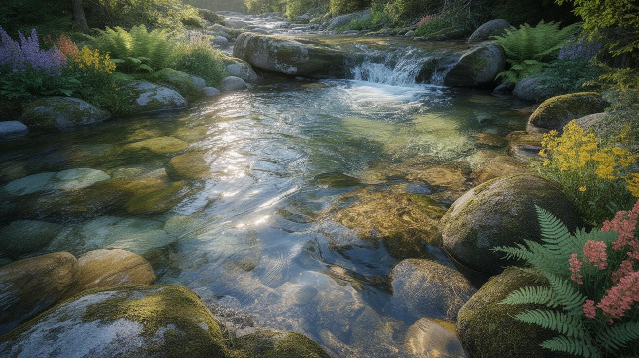
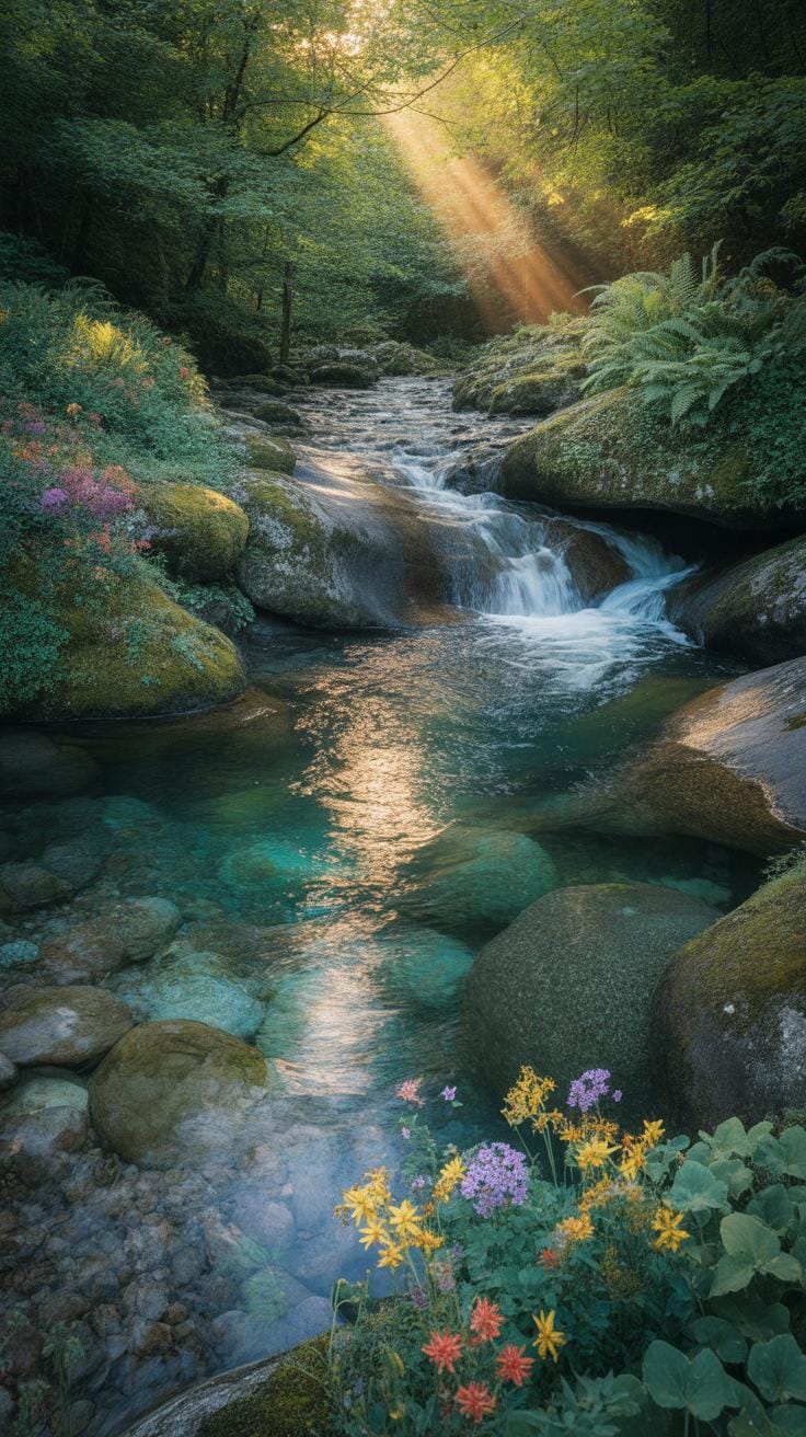
Using real water references is crucial when creating believable digital water art. You might think you can just imagine how water looks or moves, but there’s no substitute for closely observing actual water. When you watch water carefully, you start to notice little details—like how light bends and fractures through flowing water, or how the surface ripples with wind or obstacles. These details give digital water depth and realism.
Water’s properties are subtle. It can be smooth in one part and frothy in another. It’s constantly shifting in form and texture, and only by studying real water can you hope to capture that dynamic nature. When you work from observation, your art gains authenticity—it doesn’t feel flat or fake.
How Water Moves And Changes Form
Water is always on the move, and its motion profoundly influences its appearance. Flowing water isn’t just about currents; it swirls, splashes, and cascades in an endless variety of patterns. Sometimes it slows down and pools quietly; other times it rushes over rocks or drops in a waterfall.
When creating digital water art, think about these motions:
- How water accelerates and decelerates around obstacles.
- The way it stretches into thin sheets or breaks into droplets.
- How gravity pulls it downward, creating different textures along its path.
Each movement changes how light interacts with the surface, affecting color and highlights. Observing these nuances can help your digital water look alive.
Capturing Water’s Transparency And Reflection
Water’s transparency and reflectiveness are tricky to get right but vital to its realism. Transparent areas let you glimpse objects beneath the surface—a leaf, stones, or the sandy bottom. Reflective parts mirror the environment subtly, creating a layered visual effect.
To represent this digitally, try these techniques:
- Use layering effects to simulate seeing both beneath and on the surface simultaneously.
- Include subtle distortions where reflections bend and ripple with the water’s motion.
- Tweak opacity carefully to balance transparency without losing the water’s physical presence.
For example, in a digital river scene I worked on, I noticed how sunlight caught tiny waves creating tiny sparkles and how the riverbed peeked through shallow spots. Trying to replicate that, I adjusted light and shadow layers repeatedly. It wasn’t perfect, but it added the depth I was aiming for.
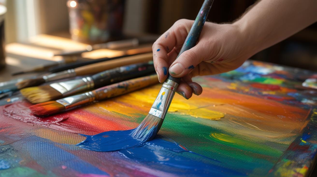
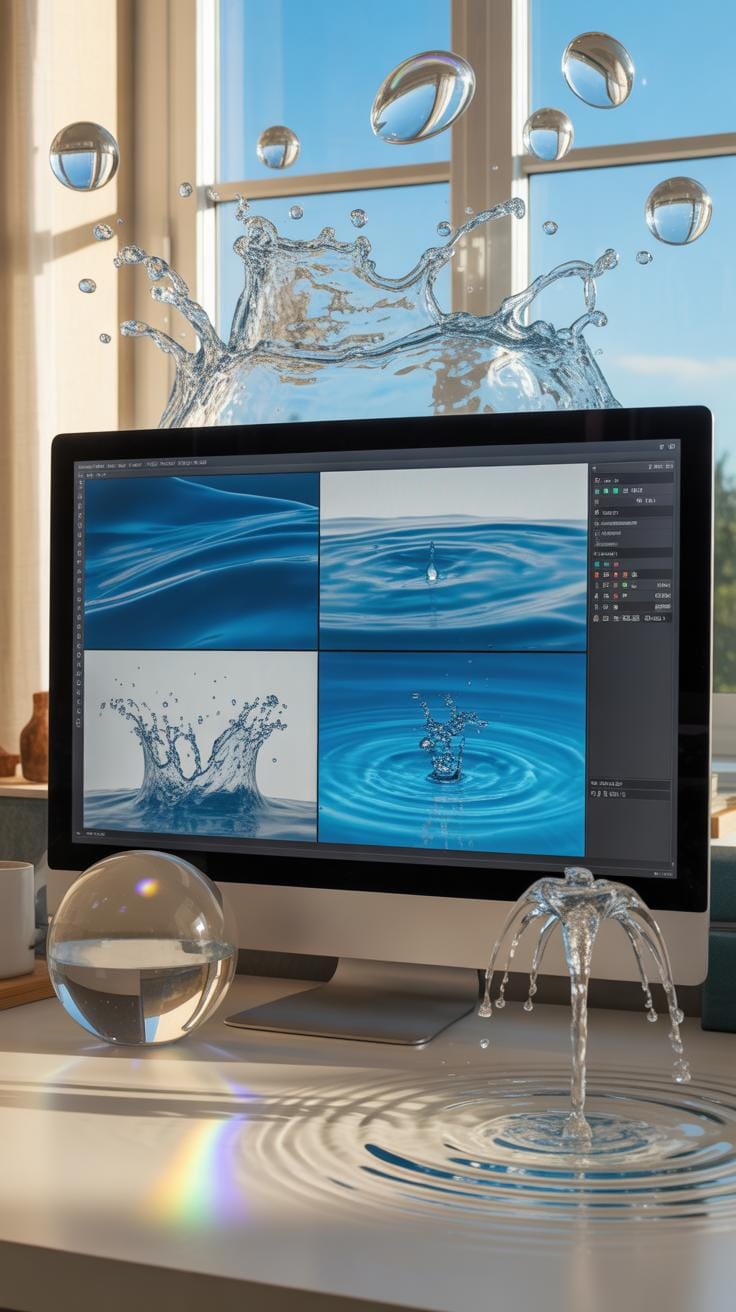
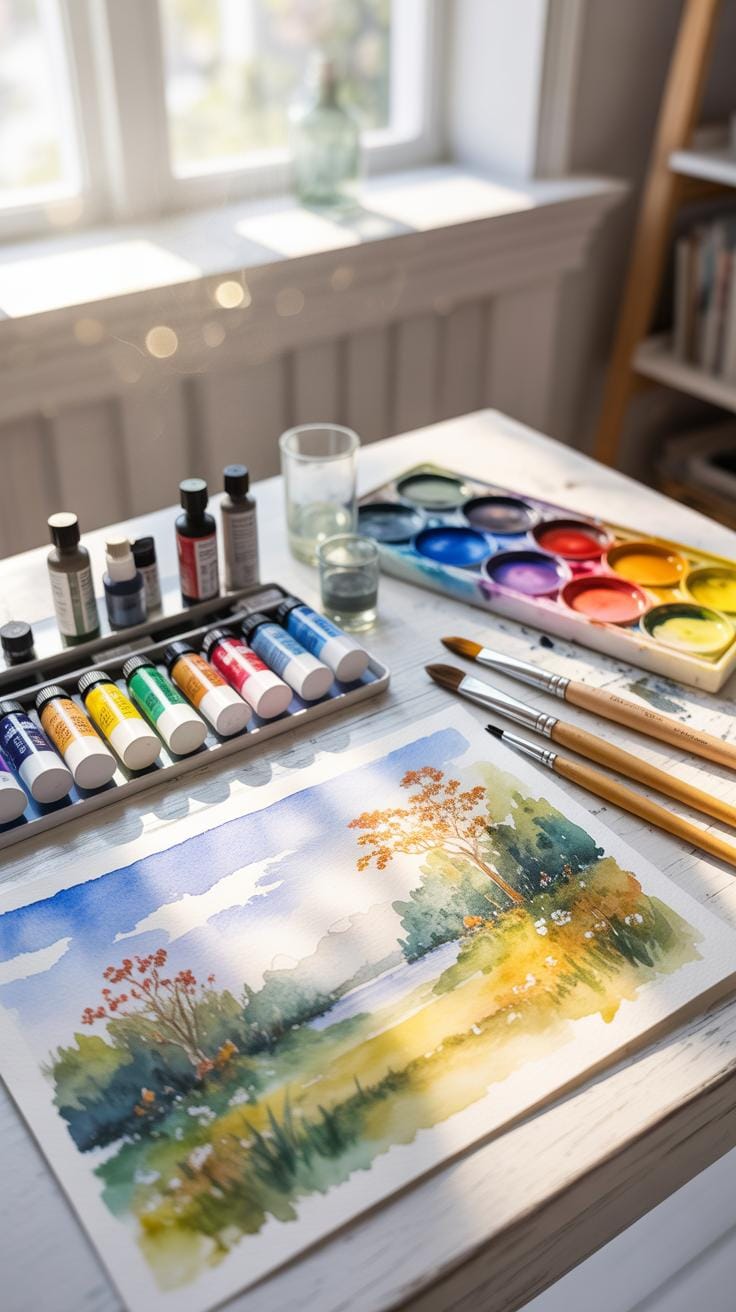
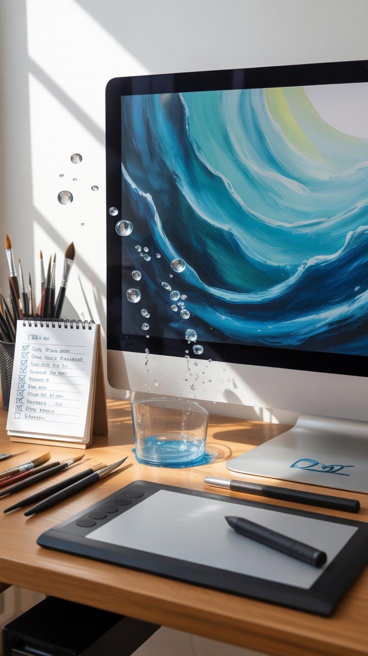
Setting Up Digital Canvas Correctly

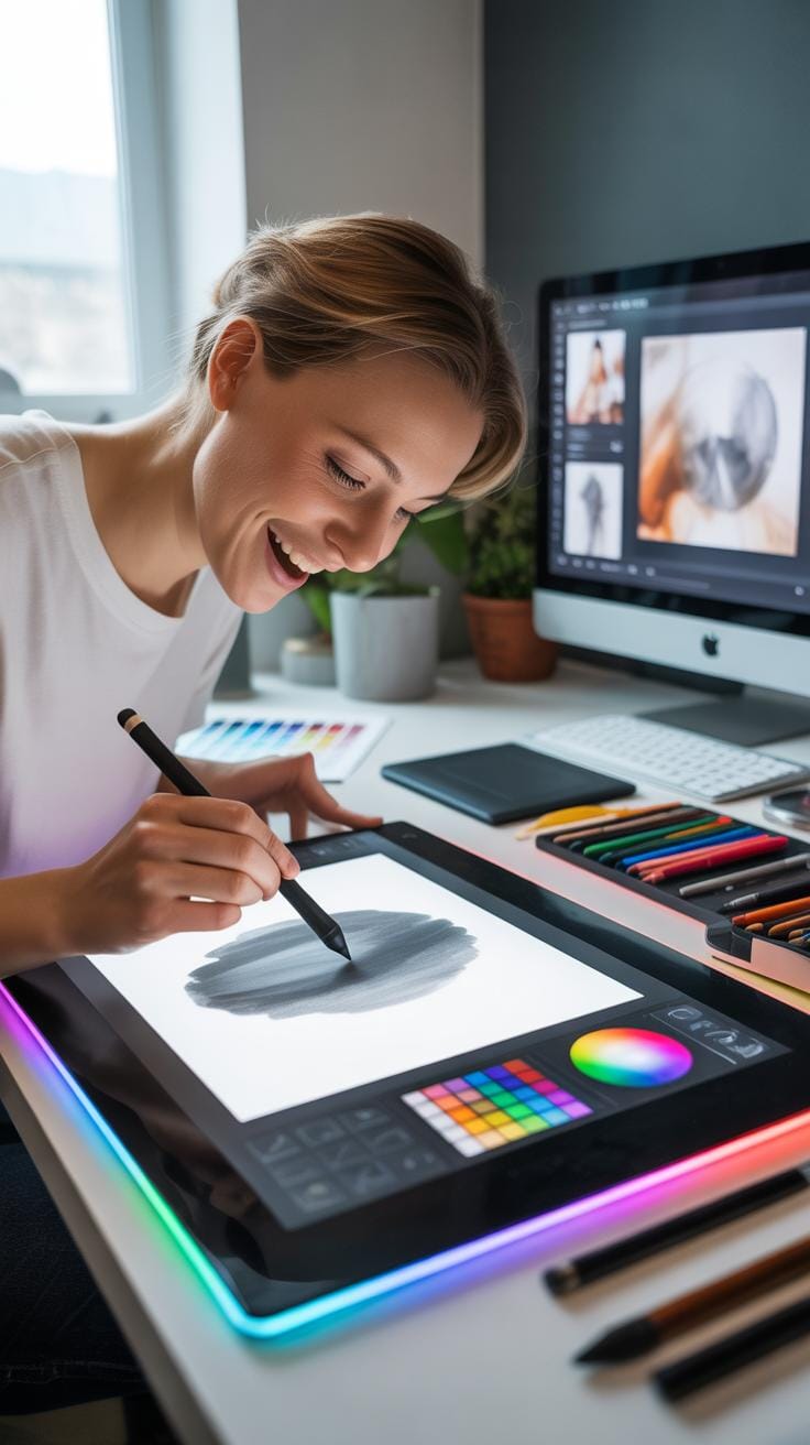
When you start creating flowing water effects in digital art, setting up your digital workspace matters a lot. There’s software and canvas details to consider that directly affect how your water flows on screen. Choosing the right software means looking at the brushes, layer management, and blending modes available. Tools like Adobe Photoshop and Corel Painter are favorites because they offer a wide variety of brush textures which imitate water’s smooth, transparent qualities well. On the other hand, more affordable options like Krita and Procreate can also do the job, especially if you want apps more specialized on tablets.
Canvas size and resolution are equally important. A larger canvas with high resolution lets you capture subtle ripples and reflections, though it demands more memory, which can slow your computer. I’ve noticed working around 300 to 600 dpi with a canvas size of about 3000 by 2000 pixels hits a good balance—you get enough detail but avoid constantly waiting on your system to catch up. Also, think about your final output. If it’s for online display, resolutions closer to 150 dpi might suffice. But if you’re aiming for printed art or detailed close-ups, higher values matter.
Preparing the workspace might seem technical, yes, but it sets the stage. A well-chosen software and right canvas size can turn digital water from flat and lifeless into something you almost want to reach out and touch. What tweaks have you made that helped your water art spring to life?
Observing Flowing Water Features
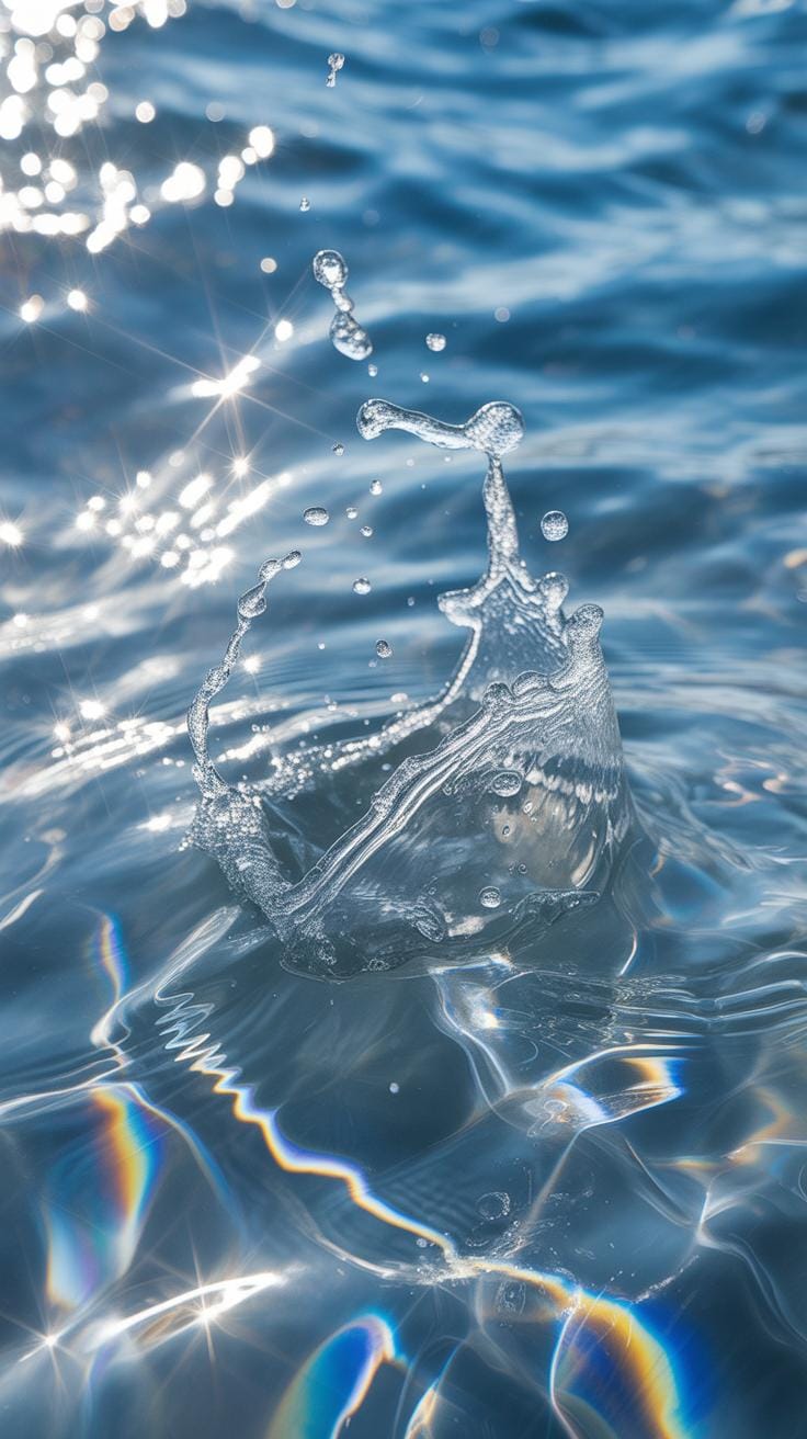
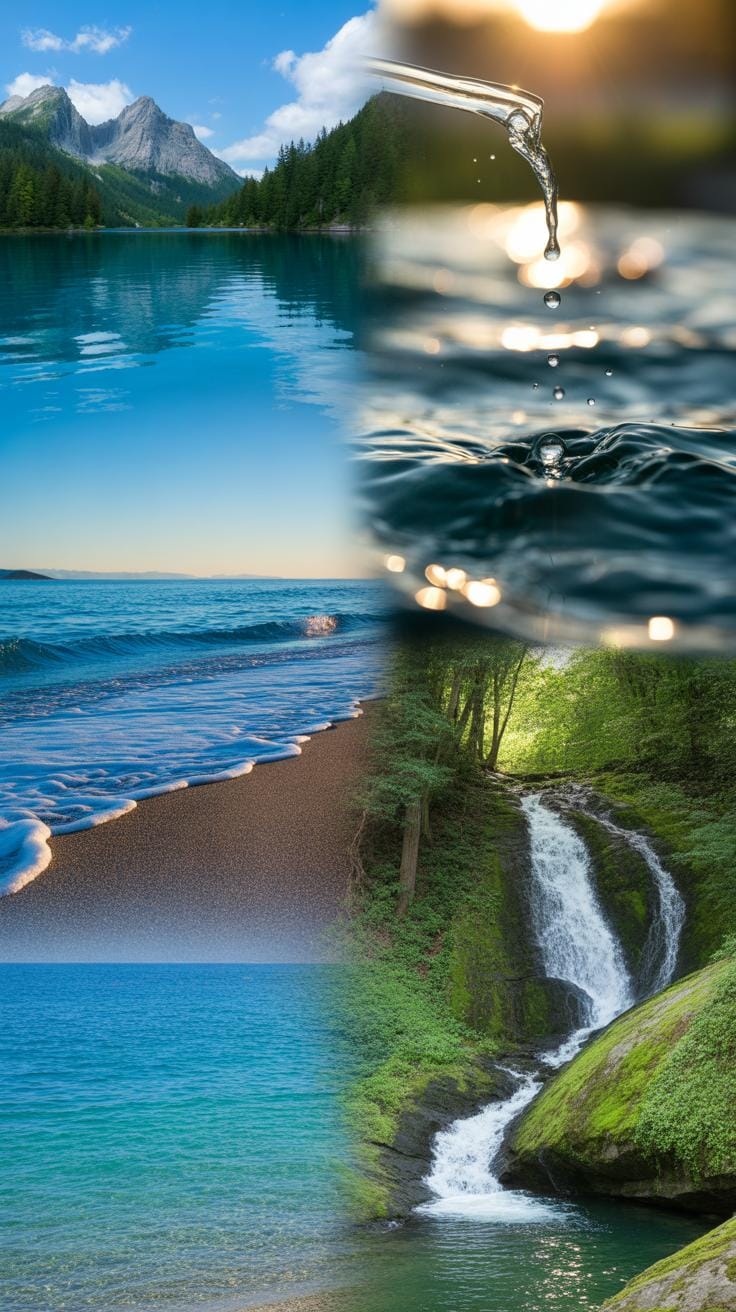
When you set out to study flowing water for your digital art, start by watching actual water in motion. It’s surprisingly tricky—water never really looks like itself, always morphing, shifting, and reflecting light in unpredictable ways. Look closely at how water flows around objects: the way it curves, splashes, and swirls. Waves aren’t just rounded shapes; they have crests, troughs, and often, small ripples on their surfaces.
Observe bubbles too. They’re not always perfect spheres and can cluster or pop quickly. The shadows and highlights they cast tell you a lot about the water’s depth and movement. Spending time by rivers, oceans, or even a fountain can open your eyes to these subtle details. Try to notice how different conditions—wind, current, obstacles—change the shapes and behavior of the water. It’s about seeing beyond the obvious.
Identifying Key Water Patterns
To make your art believable, focus on a few common water features:
- Surface ripples caused by wind or small disturbances
- Wave crests and troughs, with their dynamic shapes
- Refractions and reflections on the water’s surface
- Foam and bubbles, especially where water breaks or flows fast
- Transparency variations, showing depths or objects beneath
Each of these plays a crucial role in replicating water convincingly. I tend to sketch out each pattern separately before combining them. Sometimes, focusing too much on one aspect, say, reflections, can make your water look flat or artificial.
Using Photos And Videos As References
Rely on photos and videos that capture water in different states—calm, turbulent, transparent, or opaque. Still images freeze a moment; videos show movement and transitions. Both are useful, but videos can be more insightful for understanding flow and timing.
When selecting references, pick clear, high-quality visuals with good lighting and angles that reveal the water’s surface details. Try not to overly depend on edited or commercial images—they often exaggerate effects. If you can, shoot your own footage; even a smartphone video of a dripping tap can reveal much.
When using these media as references, analyze frames carefully: note how shadows move, where light hits the water, how bubbles form and disappear. Don’t copy blindly. Instead, extract features that you can adapt. Your goal is to translate real-world behavior into your digital creation, not replicate a photo.
Color Selection For Water
Choosing the right colors for water can really make or break your digital art. Realistic water colors shift a lot depending on how light hits them and the environment around them. For example, in bright sunlight, you might see blues mixed with touches of crisp whites from reflections, while murkier waters lean toward greens and browns. It all depends on a bunch of factors — atmospheric conditions, the water’s depth, and even what kind of surface lies beneath.
Here are some tips you might find useful:
- Observe natural water bodies if you can. Notice subtle color shifts instead of expecting a single uniform tone.
- Choose cooler tones like blues and teals for clear, deep waters. Warmer tones like greens and yellows work for shallower or algae-rich waters.
- Consider the time of day. Early morning or late afternoon creates warmer light, changing water hues dramatically.
- Don’t forget about reflections. Water often mirrors its surroundings, mixing those colors into your palette.
Picking water colors is more art than science — trial and error can lead to unexpected yet striking results. Sometimes, colors that seem off in theory feel just right in practice.
Natural Colors Vs Artistic Choices
Water rarely comes in just blues. Natural water reveals a spectrum from emerald greens to smoky grays, depending on sediment, aquatic plants, and sky reflections. Capturing this complexity can get tricky. You might aim for accuracy, but there’s also room for creative liberty.
Artistic choices let you bend reality. Adding exaggerated hues or contrasting colors can heighten mood or drama in your piece. One time, I shifted lake water tones toward deep purples instead of blues to hint at a mystical setting. It didn’t “look real,” but felt emotionally true.
While natural colors ground your work, don’t be afraid to enhance or distort them. The trick is to strike a believable balance — enough creativity to evoke feeling but not so much that the water loses its essence.
Layering Colors To Create Depth
Water isn’t flat, so your colors shouldn’t be either. One technique I often return to is layering colors to suggest depth and transparency. It helps the water feel alive and tangible.
Here are some layering ideas:
- Start with a dark base color to anchor the depth.
- Add progressively lighter or more saturated layers on top, blending softly.
- Include subtle glimmers or highlights to represent surface reflections.
- Use semi-transparent brushes or opacity changes to show shifting water density.
Sometimes you want to see through the water to stones or plants beneath. Layering makes that possible without clutter. It can be slow going at first but gives a richness that single-layer washes can’t match. You might even find yourself adjusting layers back and forth, chasing just the right blend.
Creating Water Textures
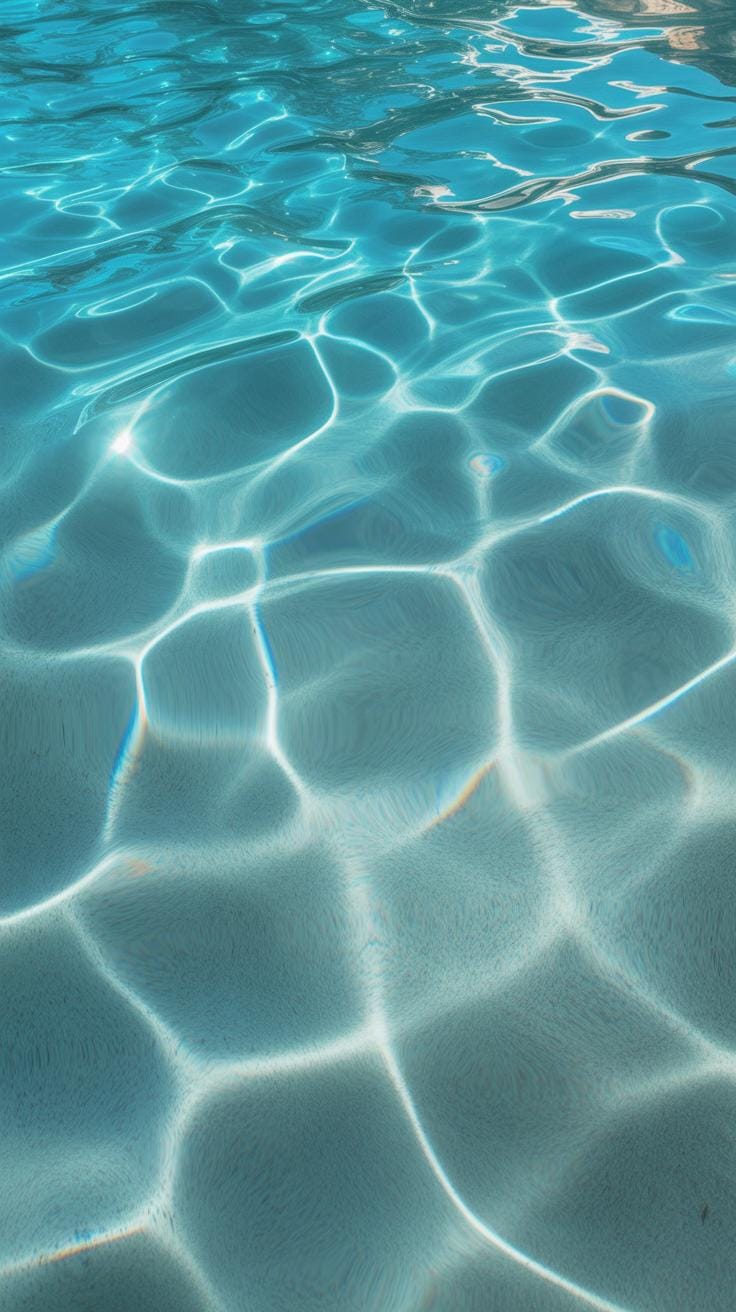
When you’re aiming to create water textures, the challenge is capturing the fluidity and subtle movement of water. Water surfaces aren’t flat; they are constantly shifting with ripples, small waves, or gentle undulations. One method involves layering transparent strokes with varying opacity to emulate reflections and light distortions on the surface. You don’t want everything overly sharp—some edges must blur to mimic water’s natural softness.
Think about how light plays on different water bodies. Calm lakes reflect more clearly, versus choppy seas with complex wave patterns. Using references from photos or real observation can immensely help in understanding these nuances. Incorporate irregularities in the texture to avoid a static look. Sometimes, subtle noise or grain helps break the smoothness, giving a tactile sense.
For ripples, short, curved strokes that radiate from a disturbance can depict expanding circles. Waves need more volume and layering, combining soft highlights and deeper shadows. This approach allows you to suggest depth and motion without over-detailing every drop. Don’t be afraid to experiment with transparency, blending modes, and layering different strokes to capture movement effectively.
Texture Brushes And Effects
Digital art programs offer a variety of brushes and effects suited to creating water textures, though selecting the right ones can feel overwhelming. Texture brushes that mimic organic strokes, like soft round brushes with noise or jitter settings, help simulate natural variances in water surfaces. Some artists like to customize brushes by adding texture maps resembling ripples or foam to build complexity quickly.
Effects like blur, smudge, and layering blending modes such as ‘screen’ or ‘overlay’ can add depth and luminosity to water. You might try experimenting with displacement maps to create subtle distortions that mimic water refraction without reworking the entire painting.
Particle brushes that scatter small droplets or splashes are handy when working on dynamic water effects, but they require restraint to avoid clutter. Incorporating subtle gradients can also suggest light movement across water. I recall spending hours tweaking brush settings before finding a combo that felt right—sometimes it takes trial and error to unlock a style that works for your vision.
Adding Water Details Like Splash And Foam
Small details often make or break the realism in digital water art. Elements like splashes, foam, and bubbles convey interaction and motion, adding life to an otherwise static surface. To create splashes, quick, dispersed brush strokes with sharp edges can capture the chaotic energy of water breaking against an object. White or very light tones contrast well against darker backgrounds, enhancing visibility.

Foam is trickier—it’s about balance. Overdoing foam can look artificial, while subtle application suggests water turbulence naturally. You can achieve this by layering soft brush strokes with transparency, interspersed with sharper highlights where bubbles cluster. Remember, foam tends to gather around edges, rocks, or where waves break, so context guides placement.
Don’t forget to vary the size and density of foam and splashes to avoid uniformity. Adding transparency gradients to these areas creates a sense of volume and integration into the scene. These techniques need patience and refinement, but over time they contribute significantly to realism in your water art.
Lighting To Enhance Water Realism
Lighting shapes how water looks more than many might realize. It’s not just about brightness or darkness; it’s about how light dances and interacts with the surface and depth. To simulate this in digital art, you need to think about the light’s angle, intensity, and color temperature. These factors really affect water’s transparency, glossiness, and movement.
Think about a midday sun making water sparkle aggressively, or a soft, diffused light under an overcast sky, muting all highlights. To replicate this, layer different light effects rather than relying on a single light source. Use gradients and subtle blurs to mimic how light spreads across and inside the water. Don’t be afraid to play with slight imperfections in the glow; real water rarely reflects like a mirror all over.
Have you noticed how sometimes light seems to bend oddly when it hits water? Replicating that takes some trial and error with light paths and rays in your software. Sometimes pushing reflections beyond realism can add a surreal charm, but it’s tricky to keep it believable.
Highlights And Shadows On Water
Placing highlights and shadows correctly builds the sense of water’s three-dimensionality. Highlights often cluster where water ripples catch the light most intensely—usually edges or peaks of waves. Shadows, on the other hand, fall into the troughs or behind curves, anchoring the shape visually.
It’s tempting to distribute highlights uniformly, but that’s a common mistake. Nature doesn’t cast light evenly, and nor should your art. Shadows can be soft or sharp, depending on light’s strength and direction. Consider how transparent or opaque the water is, too; softer shadows can seep through shallower water, hinting at varying depths.
Try to observe real moving water or videos. Where highlights flicker and shadows shift—it’s almost like a living texture. Capturing that, even just a hint of movement in your static image, can elevate the realism.
Reflection And Refraction Effects
Reflections and refractions are what give water its captivating, complex look. Reflections are often partial, sometimes distorted by water movement. Digital artists can simulate this using layered textures and varying opacity masks to avoid perfect mirror effects. Real water often reflects the sky, foliage, or surrounding environment, so don’t forget contextual surroundings when painting or editing.
Refraction bends light through water, changing how submerged objects appear. Recreating this digitally involves manipulating light paths or using distortion filters. These distortions create that familiar wavy, bending effect you see through water. The trick is subtlety; exaggerating refraction too much can make your water seem surreal in a way that distracts instead of enhances.
Reflections and refractions can coexist and interact unpredictably—sometimes reflections appear smeared, or refractions are partly obscured. Trying to capture this complexity, even roughly, adds depth and interest beyond flat water surfaces.
Animating Water Flow Steps
Animating flowing water digitally can feel tricky. You start by setting up key frames that mark the major points of motion—think of them like the skeleton for your water’s movement. These key frames show the position and shape of the water at important moments. Between these, you create motion paths that define how the water shifts and flows smoothly.
Don’t try to capture every ripple at once. Instead, focus on larger waves or currents first, then add smaller details. The timing between key frames matters a lot—it can make the water feel slow and heavy or quick and lively.
Basic Animation Workflow For Water
When you dive into animating water in digital art software, a straightforward workflow helps keep things clear:
- Start with rough blocking of water shapes and movement using simple forms.
- Add key frames to lock down the main flow direction and rhythm.
- Refine motion paths to smooth transitions and natural shifts.
- Introduce secondary details like splashes or foam after the main flow is defined.
- Review and tweak timing, testing different speeds until it feels right.
Following these steps makes the process manageable and ensures the fluidity looks intentional, not chaotic.
Using Animation Loops For Flowing Effect
Loops can be a great shortcut to continuous water movement. Instead of animating every drop from start to finish, you create a cycle that repeats without noticeable jumps. It takes some patience to find the right start and end frames so the loop feels seamless.
Once you have a loop, you can reuse it across different parts of your artwork. It’s perfect for background rivers or waterfalls where constant movement is needed but detailed animation every frame is impractical. Just be mindful—loops can become predictable if overused, so vary size or speed to keep it fresh.
Common Pitfalls With Water Art
Avoiding Flat Or Unnatural Results
Flat water in digital art often feels like a missed opportunity—it can look dull, missing the complexity of real water’s movement. A lot of times, artists overlook subtle shifts in value and texture that suggest depth.
One trick to add dimension is layering different brush strokes or textures. Try breaking up smooth, uniform areas with small ripples or waves that interact with the light source. You want your water to suggest its ever-changing surface tension.
Also, don’t hesitate to observe real water—whether it’s a puddle, a stream, or even a glass of water on your desk. Notice the way reflections distort and shapes shift. Art can sometimes feel too static if it misses that constant, fluid motion.
Correcting Color And Lighting Errors
Another challenge: color and lighting often trip artists up. Water doesn’t have one fixed color—it picks up hues from the environment, the sky, and objects nearby. A common mistake is painting water too uniformly blue or clear.
Try warming or cooling your water tones by eyeing nearby colors and light sources. Shadows aren’t just darker blues but can have hints of green, purple, or even reddish hues depending on the scene. Don’t shy away from experimenting with subtle color shifts.
Lighting is tricky, too. Water behaves differently under direct sunlight versus ambient or diffused light. Reflections, highlights, and transparency must take these conditions into account, otherwise the piece can feel off. Play around with light angles and think about how light refracts through moving water to bring vitality to your work.
Showcasing Water Reference Examples
Example Of River Flow Digital Painting
Imagine a digital painting capturing a river winding through a rocky landscape. The artist used multiple water flow references to shape the river’s curves and speed. These references helped understand how water behaves around obstacles — how it swirls, stretches, and narrows. By studying actual rivers, including how light reflects on moving surfaces and how shadows deepen in eddies, the artist gave the river genuine movement and life.
What stood out in this artwork was the subtle layering of flow patterns. It wasn’t just one generic stream but a composition reflecting varied water speeds and textures. Without reference, such details often disappear, leading to static or oddly shaped water forms. The references made the flow believable and gave depth, inviting viewers to almost hear the river’s quiet rush.
Example Of Ocean Waves Animation
Consider an animation focusing on ocean waves crashing against a shoreline. The animator relied heavily on detailed video references to capture the undulating rhythm and breaking wave crests. Observing real waves demonstrated the varied pace — sometimes slow, sometimes sharp and sudden — which influenced the timing of the animation’s frames.
They applied key techniques: layering translucent wave crests, adding foam textures, and simulating water transparency beneath the crest. The references also revealed how light interacts differently at various stages of a wave’s form, affecting color and brightness. By mimicking these subtle shifts, the animation avoided flatness and felt immersive.
Did this reliance on real water references make the animation less expressive? Perhaps. But it traded exaggeration for convincing naturalism, enhancing overall impact while still breathing life into the digital medium.
Checklist For Water Digital Art
Reviewing Water Movement Accuracy
One of the trickiest parts is making sure the water’s movement comes off as natural. It’s easy to get lost in details and miss those subtle flow patterns that give water its life. A quick way to check is to step back and ask yourself if the water looks like it’s really moving—or if it feels frozen or overly stiff. Watch real water videos, or even glance outside for a moment. Does your digital water respond to forces like wind, gravity, and objects around it in a believable way? Look for sharp edges where water should be smooth or vice versa. Sometimes rushing water has chaotic splashes, while still ponds hold calm, reflective surfaces. If your digital art ignores those cues, it may feel off.
Try tracing the directions of waves, ripples, or currents with a finger, and ask whether the flow paths look logical. Do larger movements break into smaller disturbances naturally? This is where it helps to compare your work often, not just at the end. If something feels wrong, it probably is.
Ensuring Color And Texture Consistency
Colors can be deceptive. Water color changes with depth, lighting, and what’s beneath or around it. Check if the hues you used stay consistent with your scene’s light source and environment. Think through whether the reflection matches the setting or if colors suddenly shift without reason. Sometimes we overlook how subtle color shifts tell a story about water’s clarity or the materials it touches.
Textures also deserve close attention. Water surfaces often have a combination of smooth areas, ripples, bubbles, or spray. These textures should blend well across the piece without clashing. Spot-check sections: do nearby areas share similar detail levels and styles? An inconsistent texture might distract or confuse the viewer. You could isolate the water layer and zoom in to spot any abrupt transitions. Doing that might reveal inconsistencies you didn’t see at normal zoom.
Remember, it’s not just about matching some textbook idea of water but making sure your choices feel coherent within your artwork’s universe. If something looks out of place, asking “Why?” can open surprising improvements.
Conclusions
Water reference is vital when creating flowing water in digital art. It allows you to observe real water features like movement, transparency, and color. Incorporating these observations enriches your digital creations with realism and life.
Following structured methods and leveraging digital tools will improve your artwork quality. Remember to consistently study real water and practice digital techniques to refine your skill. A detailed water reference combined with digital skill leads to beautiful, flowing water art.