Introduction
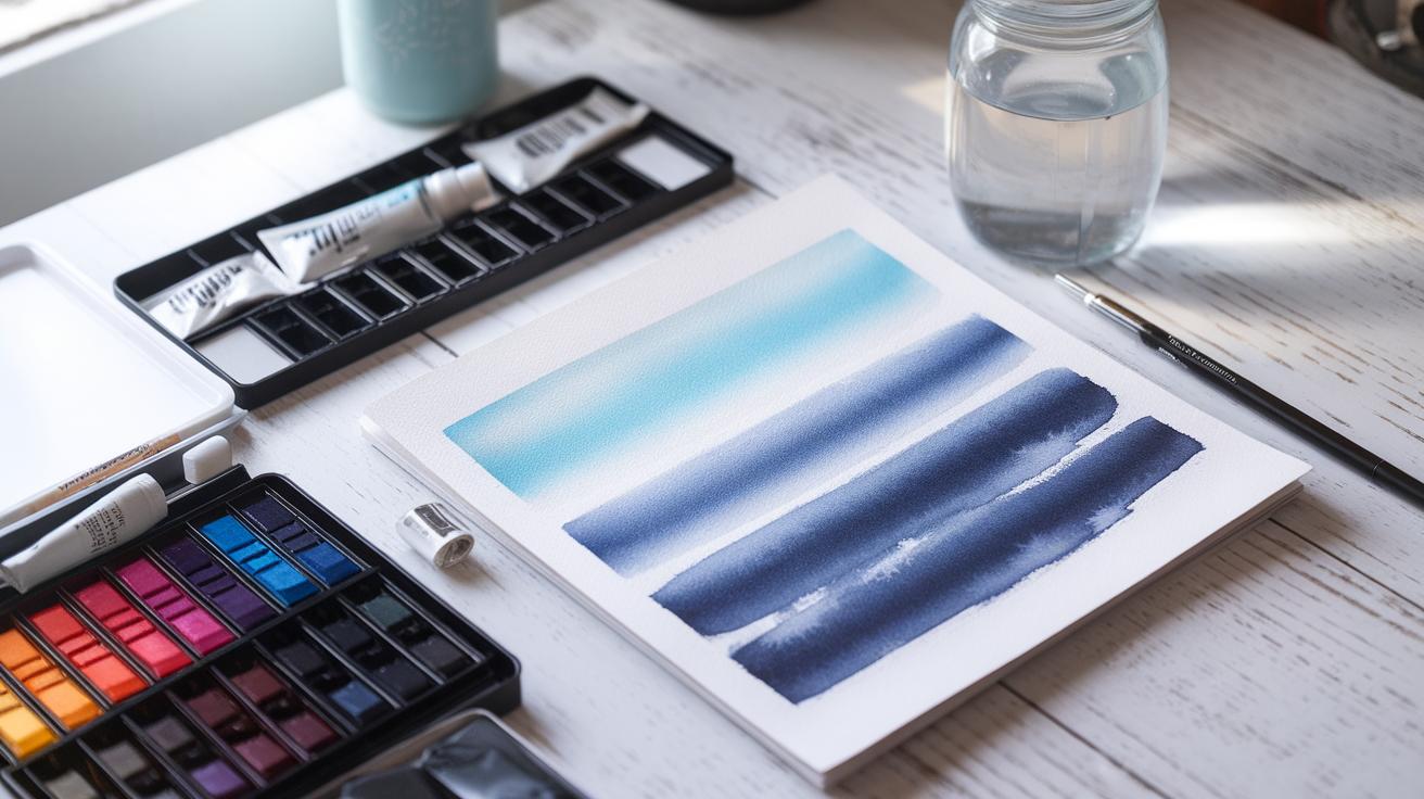
Watercolor painting offers a unique and expressive way to create art using water-based pigments. This medium highlights transparency and allows for subtle variations in color and light. Whether you want to create landscapes, portraits, or abstract pieces, mastering watercolor techniques can improve your art. Watercolor paper and pigment quality play significant roles in achieving professional results.
Understanding how to use watercolors effectively requires learning several key techniques. Each technique has its own effect on the texture, appearance, and mood of your painting. You will learn how to control water and pigment flow to bring your vision to life. This article will guide you step-by-step through the essential watercolor painting techniques to help you build confidence and skill in your practice.
Introduction to Watercolor Materials

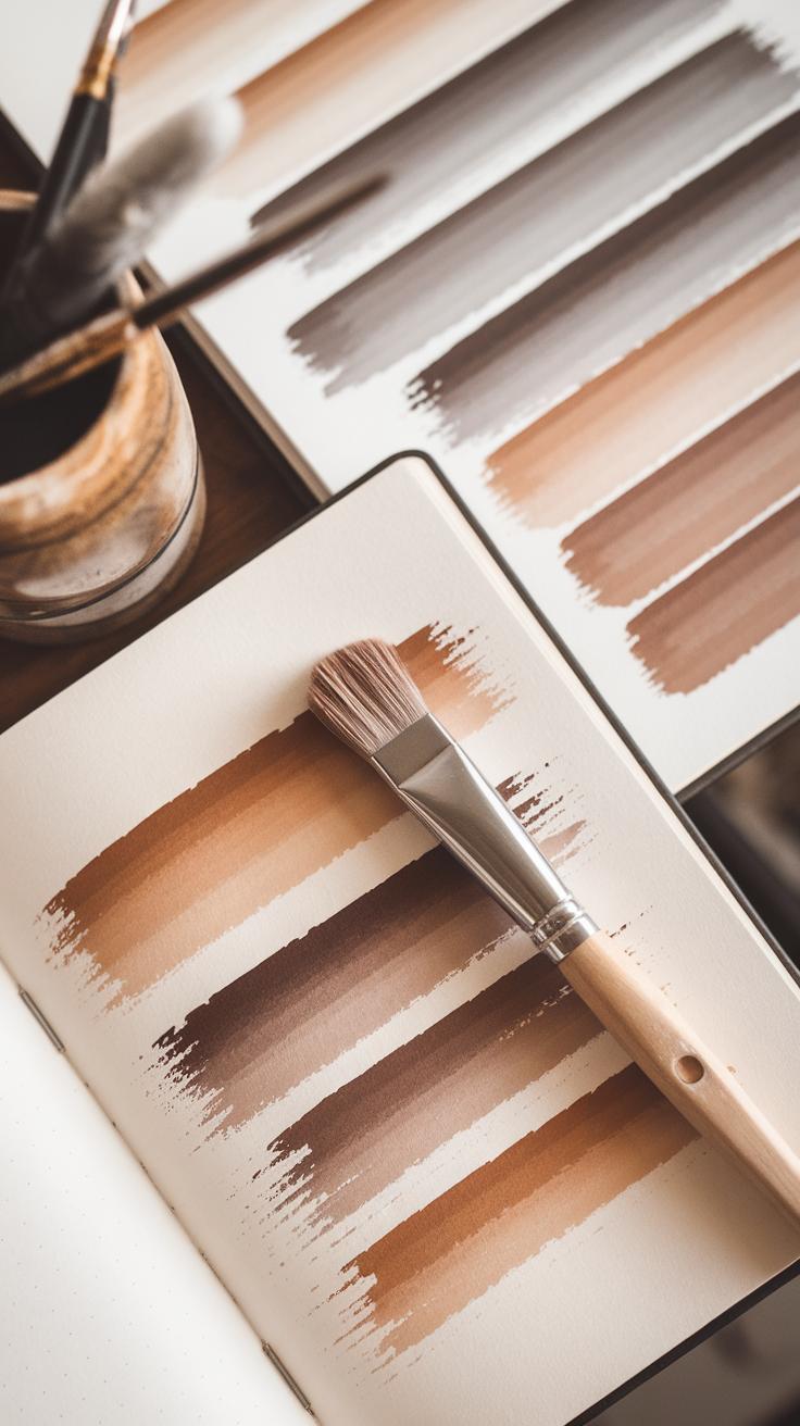
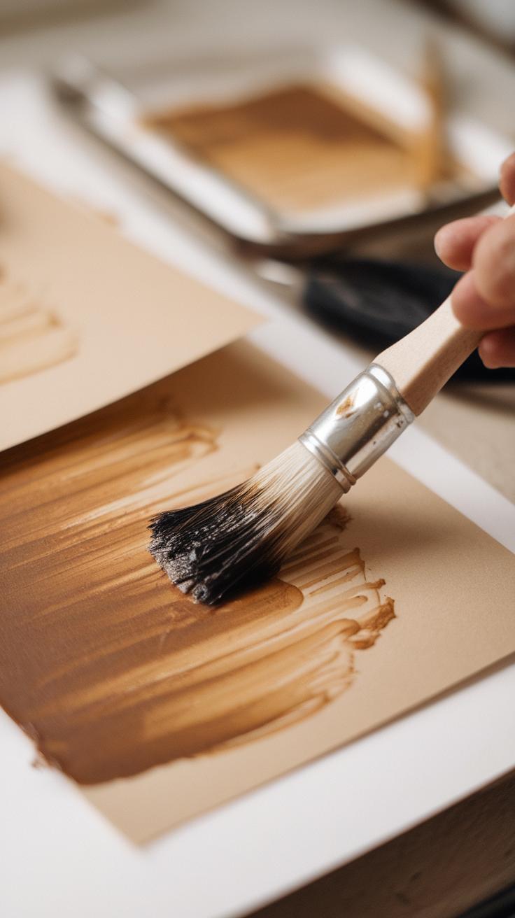
Watercolor painting requires a few key materials: paper, brushes, and paints. Each of these affects how your work will look and feel. Choosing the right paper can change the texture you see and how the paint spreads. Watercolor paper usually comes in different weights and surface types, which affects absorption and drying. If the paper is too smooth, your paint may sit on top, creating uneven patches. Rougher papers absorb more water and pigment, giving bold textures.
Paint quality also matters. Student-grade paints tend to have fillers and less pigment, which can make colors dull. Professional-grade paints have higher pigment concentrations for more vibrant results and better lightfastness. Knowing this helps you decide what fits your budget and goals. Your choice in materials shapes your painting’s outcome. What kind of effect do you want your paint to create?
Watercolor Papers and Their Characteristics
Watercolor paper usually comes in three textures: cold-pressed, hot-pressed, and rough. Cold-pressed paper has a medium texture that absorbs paint evenly and works well for most techniques. Hot-pressed paper is very smooth and shows fine details with little texture, ideal if you want crisp lines or detailed work. Rough paper is heavily textured and soaks up water quickly, creating unique grainy effects.
The texture you choose changes how paint flows and dries. Rough paper catches pigment in its grooves, making colors look more varied. Hot-pressed paper can cause paint to pool or spread slowly because it absorbs less water. Cold-pressed offers a balance and flexibility in how water and pigment act. Which texture sounds right for your style?
Selecting Brushes and Paints
Brush shapes make a big difference in how you apply paint. Round brushes are versatile and work for thin lines or wide strokes. Flat brushes hold more water and cover larger areas smoothly. Detail brushes have small tips for fine lines and small shapes. Synthetic brushes tend to be more affordable and last longer but may not hold as much water as natural hair brushes like sable or squirrel hair, which feel softer and offer better control.
Paints with high pigment concentration give stronger colors and better blending. Professional-grade paints keep their color after drying and resist fading. Student-grade paints cost less but may appear dull and require more layers. If you want bold, lasting colors, investing in better paint pays off. How will your brush and paint choices support the effects you want to create?
Controlling Water and Pigment

The amount of water you mix with your pigment changes how your paint looks on paper. More water makes colors lighter and more transparent. Less water produces stronger, deeper colors. You can control the paint’s flow by adjusting this balance. If your paint feels too runny and hard to control, try using slightly less water. If your paint dries too fast or sits thick on the paper, add a bit more water.
Think about how your brush moves across wet or dry paper. On dry paper, paint stays where you place it and keeps hard edges. On wet paper, colors spread softly and blend smoothly. You can speed up or slow down drying by working indoors or outdoors, or by gently blowing air over your painting.
Try mixing a more diluted wash first to create soft backgrounds. Then, use thicker paint on top for details. How does changing your water-to-pigment ratio affect the mood or depth of your painting? Testing different ratios will help you learn to control your colors confidently. This balance shapes most watercolor effects.
Balancing Water and Pigment
Mixing water with pigment is like a recipe for shade and transparency. Start with a small amount of water and gradually add more until you reach the look you want. Thicker pigment creates bold, dark strokes. Thinner pigment becomes light and see-through. This affects the mood of your painting.
Painting with wet pigment on dry paper gives sharp edges and intense color. Using dry pigment on dry paper creates rough, textured marks. Wet pigment on wet paper softens edges and blends colors into each other. Each effect offers a different way to show your subject. Experiment by painting the same color in these ways to see the changes.
How does your choice of mixing ratio change the story your painting tells? What happens when you add more water halfway through a stroke? Playing with these techniques helps you find the right balance for your style.
Managing Drying Time and Flow
Drying time affects how your paint behaves. Wet-on-wet techniques let colors spread softly as they dry. Wet-on-dry keeps colors crisp and allows for layering. Knowing when your paper is damp or dry helps you plan each stroke.
Watch closely as your work dries. Paint moves faster on wetter paper. You can slow drying by painting in a cool room or using a spray bottle to keep paper moist. Speed up drying with a hairdryer or by working in a warm space. Timing your brushwork is key to controlling flow.
Use quick strokes on very wet paper to create smooth gradients. Wait for sections to dry before adding details to avoid colors bleeding into each other. How might you adjust your painting if your paper dries too fast? Understanding drying time lets you shape how colors blend and layers build.
Basic Brush Strokes and Their Effects
Watercolor painting relies on a variety of brush strokes to create different textures and visual effects. Washes, dry brush, and stippling each offer unique ways to apply paint on paper.
Washes spread paint evenly across an area, producing smooth, transparent layers. Dry brush strokes, on the other hand, leave broken lines and rough textures by using a brush with little water. Stippling involves tapping the brush on the paper to create dots or speckles that suggest texture or detail.
How you hold and move the brush affects each stroke’s outcome. Keeping your wrist loose allows for fluid, controlled strokes. Applying different pressures changes the paint’s density and line thickness. Experiment with varying angles to see how they alter the marks on your paper.
Mastering these basic strokes helps you control the visual story your painting tells. Which texture or effect do you want to prioritize in your next artwork? Your brushwork can bring those choices to life.
Washes and Gradients
Creating smooth washes starts with evenly loading your brush with thin paint. Lay the stroke gently on wet paper to avoid harsh edges. You can build gradients by starting with a deep color and gradually lightening the mix by adding water as you move.
Control brush pressure to vary the paint flow. Pressing softly helps spread color thinly; firmer pressure deposits more pigment. Let your brush glide in long, steady strokes to prevent streaks.
Layering washes while the paper is slightly damp allows colors to blend seamlessly. Dry paper, however, keeps edges sharp and distinct. Which effect suits your composition better? Practice these techniques to sharpen your ability to create depth and smooth transitions.
Dry Brush and Texture Creation
The dry brush technique uses a brush with little water and paint to produce rough, broken lines. This method adds texture and small details that a normal wet brush can’t achieve.
Vary your hand pressure to change effects. Light pressure makes scattered, delicate marks. Stronger pressure presses the paint deeper, creating more defined strokes. Adjust how much paint sits on the brush; less paint results in scratchy lines, while more paint produces bolder textures.
This technique works well for adding detail to tree bark, grass, or weathered surfaces. Are you aiming for a soft texture or sharper contrast? Playing with dry brush strokes helps you refine the tactile feeling your artwork communicates.
Layering and Glazing Techniques
Watercolor allows you to build complex images by applying paint in layers. Layering involves painting one transparent layer over another after the first has dried completely. This process builds depth and rich colors that glow with light, rather than appearing flat. Each layer enhances the previous one, creating a gradual shift in tone and intensity. You can see how shadows deepen or colors brighten just by adding careful layers. Have you noticed how a single stroke looks different when repeated with varying pressure and transparency? That’s layering in action, helping your paintings feel alive and dimensional.
Glazing is a special type of layering used to modify colors without disturbing what’s underneath. You apply a thin, transparent wash of a different color over dried paint. For example, a blue glaze over yellow changes the tone to green, or a faint purple glaze can deepen the shadow in a portrait subtly. It’s important to wait until the previous layer is fully dry before glazing to avoid muddy colors. Glazing lets you fine-tune hues and shadows by adding gentle color shifts, rather than repainting or scrubbing existing areas.
Building Layers for Depth
Start by painting a light wash and letting it dry completely before adding the next one. Drying prevents colors from mixing too much, which can make your colors look muddy. When you add new layers, notice how the color becomes more intense and gains visual weight. For example, layering yellow over a pale orange creates a warm glow, while applying multiple layers of blue creates a deep sky.
Take your time between layers. Rushing can blur edges and reduce the crispness of your work. Watch how each fresh layer adds subtle changes, making your painting appear fuller. Try layering in different shapes or directions to add texture and interest. How many layers do you think your painting needs to come alive?
Using Glazing to Modify Colors
Glazing lets you change the mood of your painting by gently adding translucent color. Use a soft brush and thin paint. Start with a color you want to modify, then glaze a new color on top. For example, a wash of warm red over cool blue can create a purple tone. This technique works well to adjust color temperature or enhance shadows.
Dry your base layer fully before glazing. This keeps colors clear and prevents blending into a muddy mess. If you notice dullness, you may have applied too thick a glaze. Remember, thin is best. Multiple thin glazes control the tonal shifts better than one thick layer. How might glazing help you fix a color that seems off in your painting?
WetonWet Technique

The wet-on-wet technique involves applying watercolor paint onto paper that is already wet or over a layer of wet paint. This method lets colors flow and mix directly on the paper, creating soft edges and natural, smooth blends. You avoid hard lines and let shapes fade gently into each other.
Soft transitions happen because the water spreads the pigment unevenly, which adds a spontaneous feel to your work. If you want gentle skies or smooth backgrounds, this technique works well. However, it can be unpredictable, so it takes practice to manage how the paint spreads.
Try to watch how fast the paper dries as it changes the paint behavior. Different papers and brush sizes also affect the outcome. How can you balance spontaneity with control? Experiment with small amounts of paint at first. Controlling the moisture on the paper and paint helps you guide your work while still enjoying the soft flow of colors.
Creating Soft Transitions
Soft transitions appear when you wet the paper evenly before adding pigment. Use a clean brush or sponge to spread water smoothly over the area you want to paint. The paper should shine but not have puddles. If it is too wet, paint might pool uncontrollably; if too dry, edges become too sharp.
Applying paint on this damp surface lets colors blend naturally. To create gradual fades, add paint at one edge and watch it flow across the wet paper. You can layer colors by waiting for the paper to stay wet but not flooded. Notice how the pigment softly shifts from dark to light as it moves across the moistened area.
When practicing, test different water amounts. What happens if you make the surface wetter or drier? This step is key for smooth blends and transitions in your painting.
Techniques for Control and Experimentation
Managing how paint flows helps you avoid too much unpredictability. Tilt the paper to guide the direction of the paint. This simple move can create interesting shapes and help blend colors evenly.

Vary the water on your brush and paper to control how fast or slowly the paint spreads. More water means softer blends but less control. Less water gives stronger edges but fewer smooth progresses.
Try dropping different colors next to each other on wet paper and watch how they mix. Some colors merge smoothly, while others create sharp contrasts. Experiment with these reactions to learn how colors behave.
How does changing water levels or paper angles influence your results? Test these factors to develop your personal technique in wet-on-wet painting. The balance between control and chance is where creativity grows.
WetonDry Technique

The wet-on-dry technique involves applying watercolor paint onto dry paper or fully dried paint layers. This method gives you strong control over your brushwork. When you place paint on a dry surface, the edges remain crisp and defined. You can create clear shapes, precise lines, and sharp contours that stand out in your painting.
Compared to wet-on-wet, where colors blend softly and edges blur, wet-on-dry keeps your work clean and detailed. If you want a controlled look or specific shapes, this technique works best. It helps you avoid the unpredictability of running colors and offers a way to build structure in your artwork.
Have you ever tried to paint tiny details only to have them bleed? Wet-on-dry solves that problem. It lets you build images step by step, adding sharpness where you need it most.
Adding Details and Highlights
Use the wet-on-dry technique to add sharp lines, patterns, and focal points. When painting tiny petals, leaf veins, or hair strands, this method keeps lines clear and precise. You can highlight parts of your painting without disturbing the colors beneath.
This approach is useful for adding textures like bricks or scales. It also helps when you want to draw attention to an area through clear details. You control your brush, and the paint stays exactly where you put it. This gives your painting depth and interest.
Try painting delicate details after the background dries. Does the contrast between soft and sharp edges improve your artwork’s look?
Layer Control and Correction
Letting each layer dry before adding new paint prevents unwanted color mixing. When you paint wet-on-dry, you keep layers separate and clean. This control lets you correct mistakes without muddying your colors.
If a shape or color does not look right, you can paint over it after it fully dries. The dry layer acts as a barrier, avoiding smudging. This makes it easier to modify your work progressively.
By managing drying times, you decide when to add more layers or changes. Does this control give you confidence when working on complex compositions?
Lifting and Correction Methods
Lifting paint helps you remove unwanted color or soften hard edges after applying wet-on-dry paint. You can blot gently using a damp brush or tissue to pull off excess pigment. Working while the paint is still wet gives you more control and minimizes paper damage.
To lift paint from dried areas, re-wet the spot with clean water and then blot with a tissue or brush. This technique lightens the color without harsh scrubbing. Avoid rubbing harshly since it can damage the paper surface and affect future paint layers.
Correcting mistakes often involves careful scraping, applying clean water, or painting over sections. Scraping works best on sturdy paper with a sharp blade to gently lift dried paint without tearing. Using clean water to re-activate paint lets you adjust edges or soften colors.
Sometimes, painting over errors with a new layer fixes color or shape issues. Make sure earlier layers are dry before painting over to prevent unwanted mixing. What mistakes have you struggled to fix before? Trying these methods can improve your control and confidence in your work.
Lifting Color Using Brushes or Tissues
Lift paint gently by using a damp brush or a clean tissue while the paint remains wet. Dampen your brush with clean water and softly stroke the area to remove unwanted pigment. Tissue works well by blotting gently to absorb color without wiping too hard.
If the paint is dry, carefully wet the area with a brush of clean water first. Let the water sit for a few seconds to loosen the pigment, then blot with tissue or soft brush strokes. This lightens the color but retains the paper’s texture.
Be patient and repeat the process if needed. Avoid scrubbing or over-wetting, which can damage the paper. This method often lifts enough paint to adjust tone or fix small errors without harming your painting’s surface.
Correcting Mistakes Cleanly
To correct mistakes, you have several options depending on the severity and paper quality. Scraping with a sharp blade or palette knife lifts dried paint, but use gentle pressure to avoid tearing. It works best for small, stubborn areas.
Applying clean water to a wrong area reactivates the pigment and lets you lift or soften edges. Afterward, blot with tissue to remove excess color and dry the paper carefully.
Painting over mistakes with a new layer is another solution. Make sure the underlying paint is dry to prevent muddy colors. Choose matching or complementary colors to blend corrections seamlessly into your painting.
How you fix a mistake can change your painting’s look and feel. Practice these methods to find what fits your style and materials best.
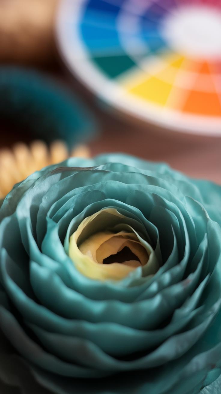
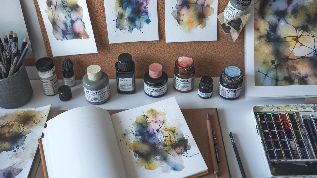
Mixing Colors and Creating Palettes

Watercolor paints differ from other mediums because they are transparent. This transparency allows colors to shine through each other when layered, producing glowing effects. When you mix colors, the light passes through the paint and reflects off the paper, affecting the final color you see.
Understanding how to mix colors starts with learning the basic color wheel. You will combine primary colors—red, blue, and yellow—to create secondary colors like green, orange, and purple. Pay attention to the paint’s transparency as mixing can sometimes dull or muddy colors if not balanced properly.
Creating a balanced palette means starting with a limited selection of colors that can mix into a wide range. Using just primary and secondary colors helps you mix clean and vibrant hues. Experiment with different ratios to see which combinations maintain brightness and which fade toward grays.
Have you noticed how some color pairs lose their glow when mixed? This happens because complementary colors neutralize each other. Planning your palette with this in mind helps keep your colors lively and your paintings pleasing to the eye.
Primary and Secondary Colors
Primary colors red, blue, and yellow cannot be made by mixing other colors. Mixing these primaries in different proportions creates secondary colors: green, orange, and purple. For example, combining blue and yellow gives you green, while red and blue produce purple.
Maintaining vibrancy means avoiding mixing colors directly from opposite sides of the color wheel, like red and green, which can turn muddy. Instead, try layering these colors separately to keep each hue bright.
When mixing, use small amounts to test results. Add water to control pigment strength. Less pigment and more water keep colors light and fresh. Have you tried mixing your own greens or purples? Notice how a little adjustment with water or paint changes the overall tone.
Building Harmonious Palettes
Choosing colors that work well together improves the flow of your painting. Colors close to each other on the color wheel, called analogous colors, naturally blend and create smooth transitions. For example, yellow, yellow-orange, and orange make a warm, connected palette.
Limiting your palette encourages harmony. Select three to five colors that offer a balance of warm and cool tones. This practice avoids overwhelming the painting with too many conflicting colors.
Try choosing one dominant color supported by one or two accent colors. Ask yourself: which colors support my subject? A well-planned palette reduces the chance of harsh contrasts and keeps your work cohesive.
Textural Effects and Special Techniques

Adding texture can bring life to your watercolor paintings. Techniques like using salt, splattering, and masking fluid allow you to create patterns that stand out. These methods help break up large areas of color and add visual interest without changing your color palette.
Salt works best on wet paint. When you sprinkle salt grains over a still-wet wash, the salt absorbs moisture and pigment around it. This creates speckled, organic textures that look like rough surfaces or natural particles. You can experiment by using different salt sizes—table salt creates fine spots, while coarse salt results in larger patterns.
Splattering introduces random dots of paint. Flick your brush or tap it gently to spread small drops across your paper. This technique simulates rain, stars, or rough surfaces, depending on the color and intensity. Try splattering darker paint over light areas or bright colors over dark washes to see how the effect changes.
Masking fluid is a tool to save white space. Apply it to areas you want to keep free of paint. After your painting dries, peel off the masking fluid to reveal sharp white highlights or details. Use it carefully to protect fine lines or complex shapes where you want crisp edges.
Salt and Splattering Effects
Sprinkling salt on wet watercolor creates unpredictable textures as the salt draws pigment away. Wet a paper section, apply your color, then add salt grains right after. The salt changes the paint flow and produces tiny starburst patterns. After the paint and salt dry fully, brush off the salt to reveal rough, grainy spots.
Splattering shifts your work from flat to energetic. Load your brush with paint and tap it sharply using a finger or another brush to flick droplets across the paper. Use different brush sizes and colors to change the look. You can control splatter size by adjusting water amounts. This method adds motion and spontaneity to skies, foliage, or abstract backgrounds.
Masking Fluid for White Space
Masking fluid prevents paint from touching specific paper areas. Start your painting by painting with masking fluid using an old brush or silicone tool on spots you want to stay white—like highlights or fine details.
Once dry, paint freely over the masked parts. The fluid acts as a barrier, so paint won’t go through. When your painting dries, gently rub away the masking fluid to expose clean, untouched paper beneath.
This technique helps keep sharp white edges and highlights, especially in complex designs like flower petals or sunlight reflections. Avoid using new brushes for masking fluid since it can damage brush hairs.
Finalizing and Preserving Watercolor Art
Let your watercolor paintings dry on a flat surface to avoid warping or uneven drying. This prevents puddles and unwanted streaks in your work. If needed, use a fan on low speed to speed up drying, but avoid direct heat that can crack paper. After drying, examine your painting for fragile spots where pigment may lift easily. You can gently fix these areas using a soft sponge or clean brush with minimal water to re-adhere pigments without altering colors.
For fragile edges or details, apply a thin layer of a fixative designed specifically for watercolors. This protects soft pigments and reduces smudging without changing the paint’s appearance. Are you noticing any spots where paint flakes off? Reapply the fixative carefully to prevent future damage.
Proper Drying and Fixing
Drying your watercolor art evenly preserves its texture and ensures your colors stay true. Avoid stacking paintings before full drying to prevent smudges. If you see warping, mount the paper on a damp board, then let it dry flat under weight. Fragile or lifted paint areas often need special care. Using a fixative spray can reinforce those spots and add longevity.
Long-Term Preservation Tips
Framing watercolor art under glass shields it from dust and UV rays that fade colors over time. Use acid-free mats and backing to prevent yellowing or deterioration. Leave a small gap between glass and paper by using a mat or spacers. This stops moisture buildup that can damage paint.
When handling your paintings, always use clean, dry hands or cotton gloves. Store unframed pieces flat between sheets of acid-free paper in a cool, dry place. Avoid exposure to direct sunlight and humidity, which cause fading and mold. Ask yourself, how long do you want your art to last? Taking these preservation steps helps your watercolor paintings stay vibrant for decades.
Conclusions
You now have a clear overview of important watercolor techniques to enhance your painting skills. Practice applying wet and dry methods, control the flow of paint, and combine colors with intention. These approaches will help you produce vibrant and textured works with depth and clarity. Adapting these fundamental techniques allows you to express your creativity while respecting the characteristics of watercolor as a medium.
Continuous practice will build muscle memory and improve your understanding of how watercolors behave on paper. Experiment with layering, blending, and various brush strokes to find your personal style. As you grow more comfortable with these methods, your paintings will reflect both precision and spontaneity. Keep challenging yourself by trying new techniques and capturing different subjects.