Introduction
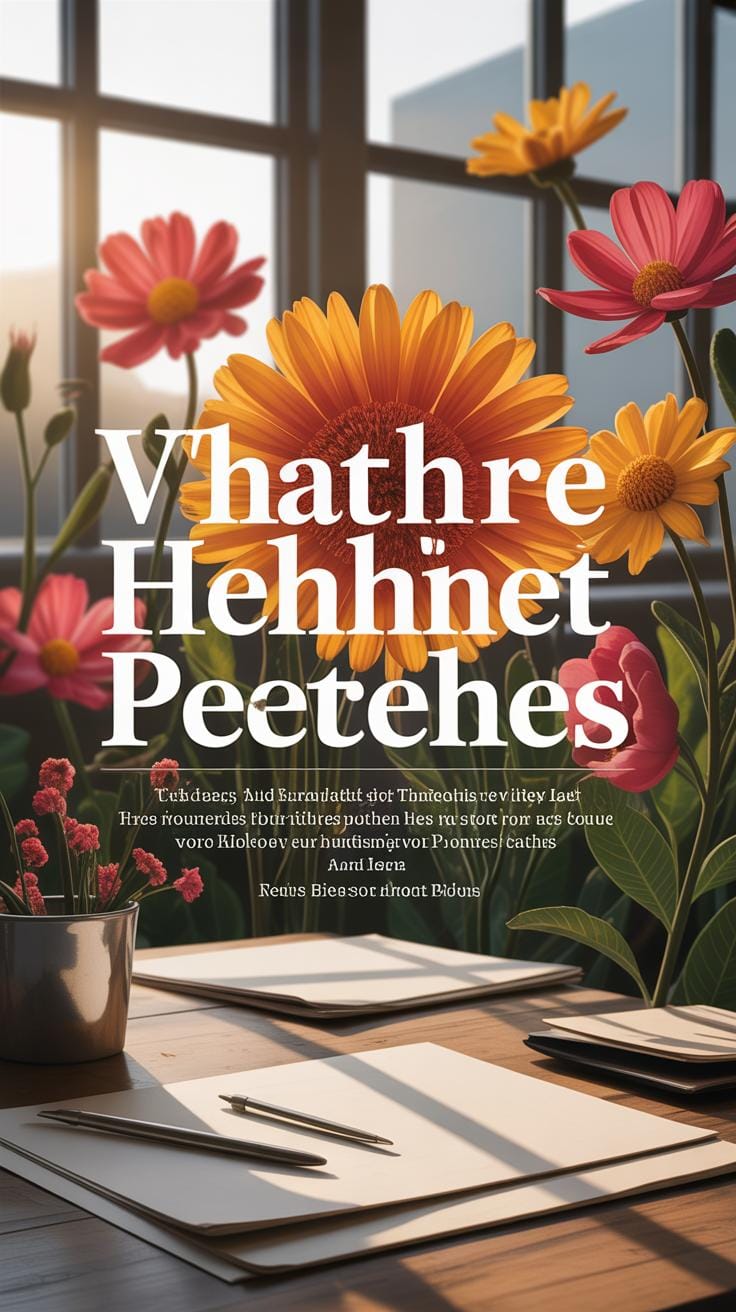
Typography layout is an essential skill for creating digital content that communicates clearly and looks organized. Crafting balanced typography layouts helps guide the reader’s eye, making the text easier to read and more enjoyable to engage with. When typography is balanced, your digital media looks more professional and accessible.
This article explores the foundations of typography layout and how to apply grids to arrange type effectively in digital spaces. We will uncover the principles that govern good typography, how grids work, and practical tips to enhance your design projects. By understanding these concepts, you can improve your digital content and make your message stand out.
The Basics of Typography
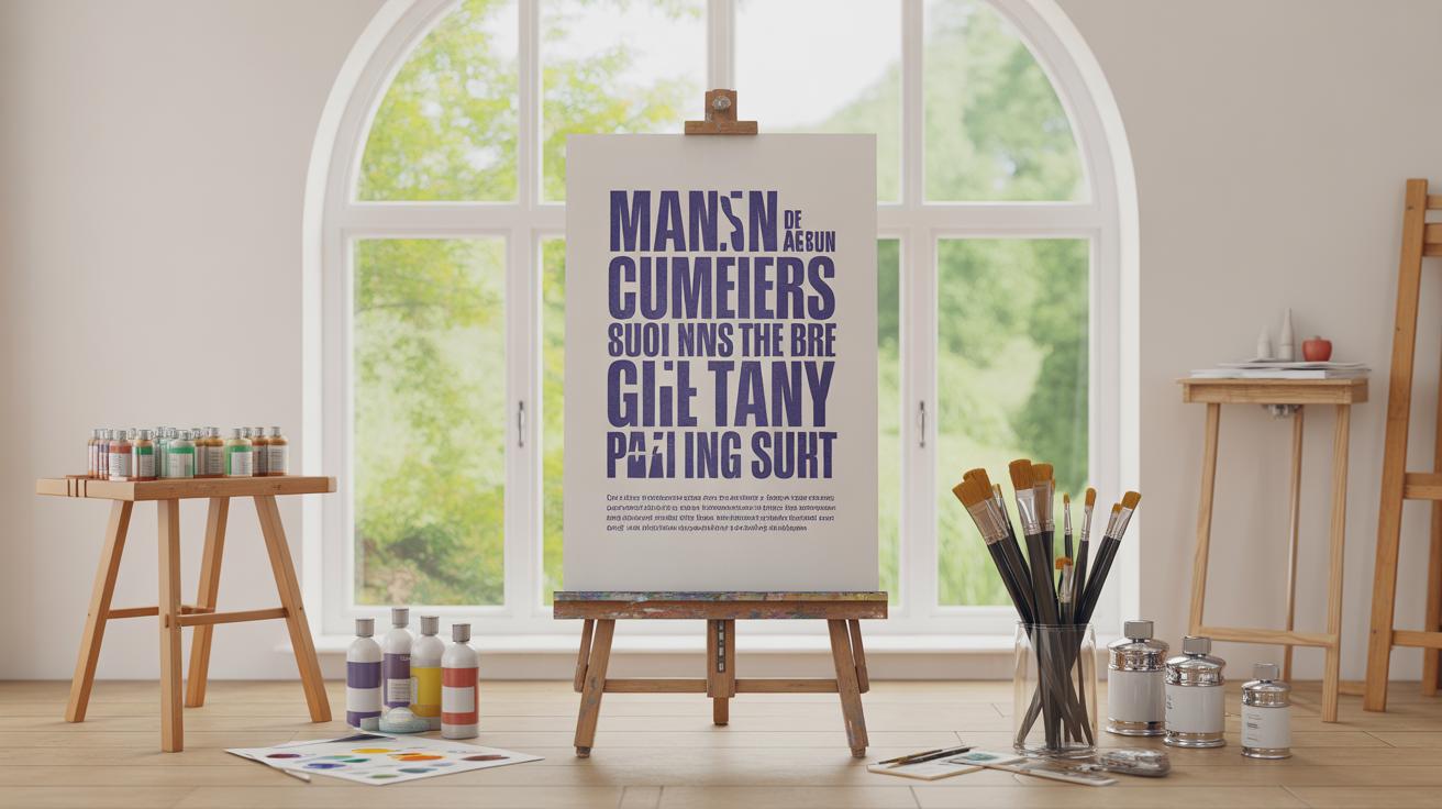
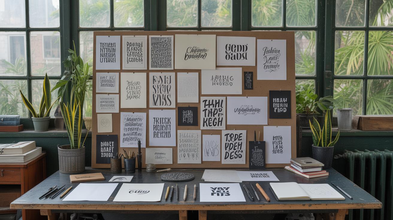
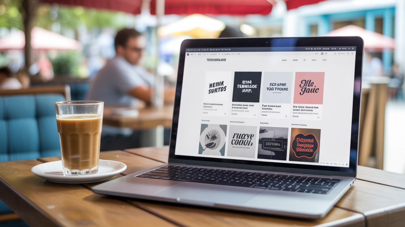
Typography is essentially the art and technique of arranging written language to make it readable and visually engaging. It goes beyond just picking a font; it means carefully choosing how letters, words, and lines come together on a page or screen.
Think of a typeface as the overall design of letters — like Arial or Times New Roman — while a font size controls how big or small those letters appear. Line spacing, sometimes called leading, determines the vertical space between lines, affecting how dense or airy the text feels. Letter spacing, or tracking, adjusts the space between individual letters, which influences how tightly the text is packed.
Good typography doesn’t just look nicer; it improves readability and makes your content easier to follow. Poor typography can confuse or tire readers, which is definitely not what you want, especially on websites or apps where users expect quick and clear communication. I’ve noticed that when I tweak line spacing just a bit, entire paragraphs can suddenly feel less overwhelming—small changes can make a big difference.
In digital media, typography guides readers and sets a tone that supports your message. A bold typeface can grab attention, while something more subtle might encourage calm reading. You want your typography to do the heavy lifting of guiding the eye without shouting or getting in the way.
Understanding Typography Layout
Typography layout is basically how text is arranged within a design, but it’s more than just placing words on a page. It includes everything from the alignment of the text, the spacing between lines and letters, to the way different levels of information are organized. You adjust these elements to create a sense of order and clarity that makes the content easier to read and understand.
Designers work with several components to shape the layout: text alignment (left, right, center, justified), the amount of space between lines (line height), between letters (letter spacing), and the visual hierarchy that guides readers through headings, subheadings, and body text. These parts interact closely — if spacing is too tight, it might clash with alignment choices and disrupt balance.
Creating a harmonious layout means juggling these pieces carefully. I’ve found that sometimes tweaking one detail can unexpectedly affect another. It’s not always a straightforward process, and that’s what makes typography layout a subtle art you learn by doing.
Elements of Typography Layout
Several fundamental parts make up typography layout, each serving a specific role but working together to control how the text appears:
- Margins: The space around the edge of your text block that separates the content from other elements or the screen edge.
- Padding: The space inside the text container, between the text and the box’s border.
- Alignment: How the text lines up horizontally — left, right, center, or justified.
- Column Width: The width of the text block, which influences readability; too wide or too narrow can strain the eye.
- Text Flow: How the text moves within the space—whether it wraps naturally, breaks across multiple columns, or follows a fixed path.
Think of these as parts of a system. If margins are too narrow, text can feel cramped. If the column width is too large, scanning becomes tiring. And padding adjusts how the text breathes inside its container. Designers rarely isolate these elements; they constantly tweak multiple at once to shape the reader’s experience.
Creating Balance with Layout
Balance in typography layout means the visual “weight” of text feels evenly spread across the space. It’s not about perfect symmetry but about making sure no single part overwhelms the rest. When balance is right, readers can move through content easily, scanning key points without drowning in clutter.
For example, uneven margins or inconsistent spacing can throw off a page’s flow, while balanced line spacing and well-chosen column widths invite the eye to linger and absorb. I vaguely recall times when I ignored balance, thinking the content alone was enough—but that often meant readers lost focus fast. Balance supports readability by giving the eye natural pauses and clear directions.
Does your layout encourage easy scanning, or does it cause hesitation? Slight adjustments, like shifting alignment or refining space between paragraphs, can nudge readers along without feeling forced. Getting balance right isn’t just about aesthetics; it shapes how effectively your message is received.
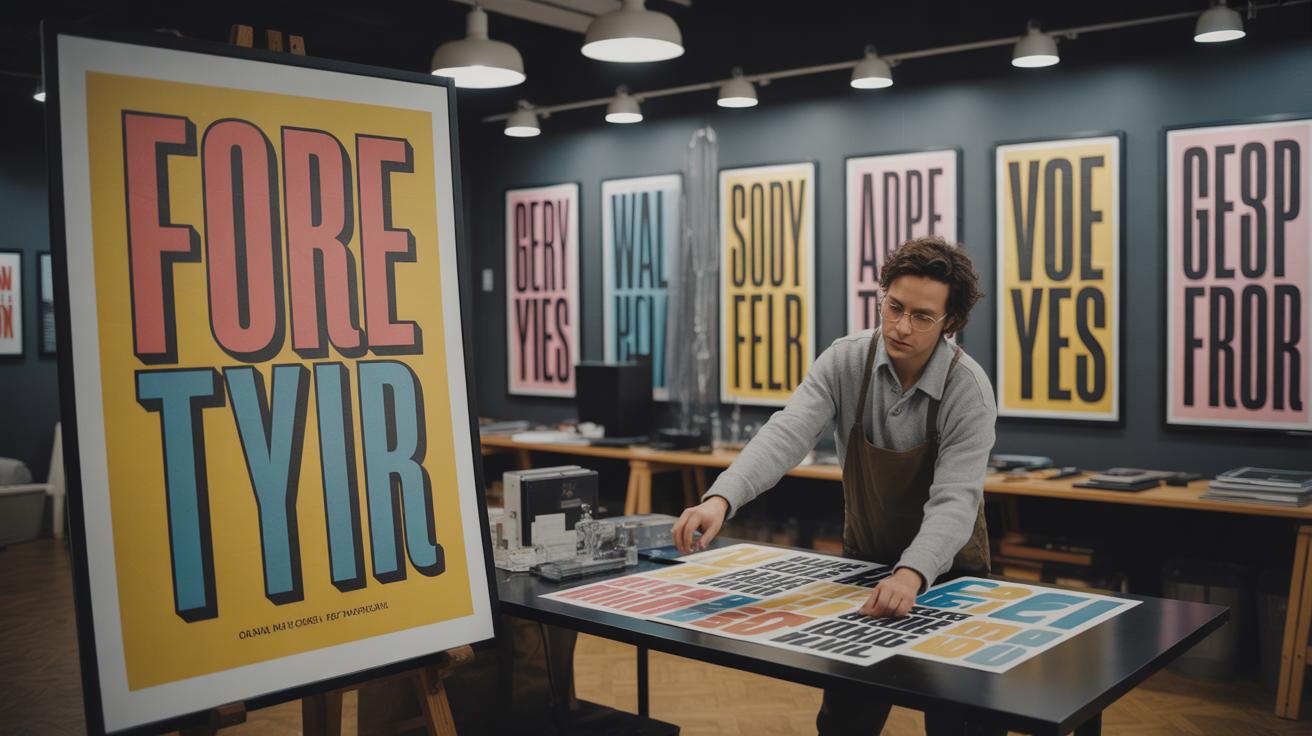
Role of Grids in Typography Layout
What is a Grid in Design
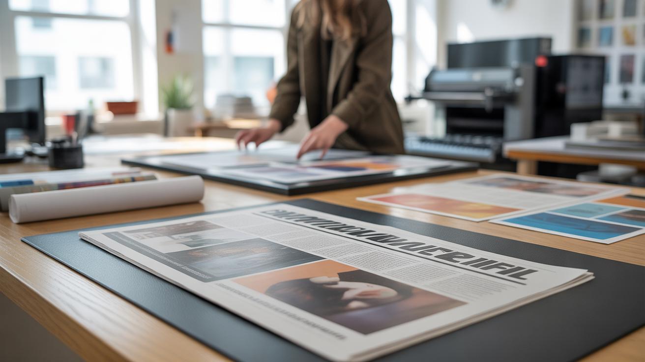
A grid in design is basically a framework made up of intersecting horizontal and vertical lines. These lines serve as guides to arrange text, images, and other elements so everything feels connected and orderly. If you look back, grids have been around in print design for centuries—think newspapers or book pages. They helped printers keep columns and margins consistent. Now, in digital media, grids do the same job but adapt to screens of all sizes.
For example, websites often rely on grid systems to maintain alignment whether you’re on a phone or desktop. The grid’s invisible lines help designers place content where it belongs, without it feeling chaotic or random. It’s like a quiet structure holding everything together, even if you don’t consciously notice it.
Benefits of Using Grids
Using grids makes typography layouts more consistent. They ensure text blocks line up neatly and follow a rhythm that guides the reader’s eye comfortably down the page. Ever noticed the clean columns in a newspaper? That’s the grid at work, giving each article equal space without crowding.
Grids also make adapting designs easier. For instance, responsive web design depends heavily on grids to rearrange content logically across different screen sizes. You don’t have to think twice about whether the text and images will jump around awkwardly—grids help them stay put, or at least behave predictably.
Sometimes, grids might feel a bit rigid or formal, almost too structured, but this actually helps avoid confusion in complex layouts. Without grids, you might struggle with alignment or balancing multiple elements. So, despite occasional tightness, grids provide a kind of freedom by setting the boundaries your content works within.
Types of Grids in Typography
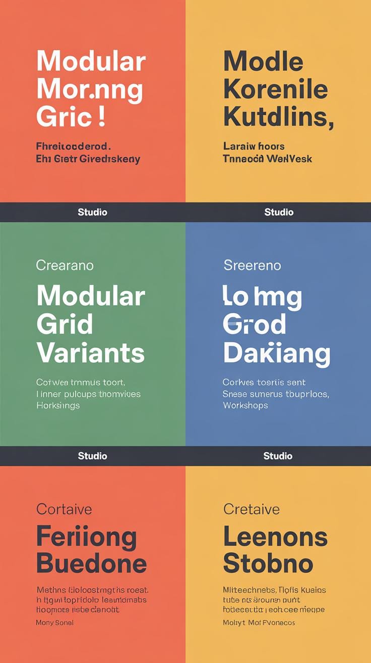
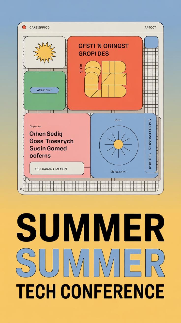
When working with typography layouts, the grid you pick really shapes how your content feels and flows. Column grids split the space into vertical sections—think of newspapers or magazines where text and images align neatly in these columns. They help guide the reader’s eye smoothly down the page without overwhelming them.
Modular grids take this a step further by adding horizontal divisions, breaking the layout into a matrix of blocks. This makes it easier to place different types of content like text, images, or buttons in a balanced manner. You’ll often see modular grids in dashboards or complex web pages where variety meets clarity.
On the other hand, hierarchical grids don’t stick to strict rows and columns. They flex to accommodate varying content sizes, making them useful for intricate or creative layouts like editorial spreads or portfolios. These grids feel less rigid but need a careful sense of order to avoid chaos.
Then there’s the manuscript grid, basically one large block of text over the page area. Think novels or long reads online—it’s simple but powerful for maintaining a focus on content without distractions.
So, you might wonder: which grid fits your project best? Remember, these types aren’t mutually exclusive. Sometimes mixing them—or bending the rules slightly—pays off.
Applying Grids to Digital Typography
The trick to making digital typography neat often lies in how you apply grids. CSS Grid Layout offers a practical way to divide your content into rows and columns—two dimensions, which means you can place items both vertically and horizontally with precision. This makes it easier to organize text blocks, images, and other elements in a way that feels balanced but doesn’t always look rigid.
Here’s a simple example to get you started:
.container {
  display: grid;
  grid-template-columns: 1fr 3fr 1fr;
  gap: 20px;
}
This snippet creates a three-column layout where the middle column is three times wider than the others. You can place text in the center and spacer items on the sides, giving a clear structure. It feels tidy but not too boxed in.
Now, when you think about different screen sizes, grids must be flexible. Mobile devices especially need layouts that shift comfortably without breaking the flow. Relative measurements like percentages or fractional units help. Using grid-template-columns: repeat(auto-fit, minmax(150px, 1fr)), for example, lets the grid shrink or grow with the viewport.
It’s tempting to lock in exact pixel widths, but that often backfires when switching from desktop to mobile. Instead, a responsive grid adapts to the space, maintaining the visual hierarchy you want without clutter or awkward gaps.
Honestly, it took me a while to trust grids to be this flexible. At first, I felt boxed in—too precise for creative layouts. But once you play around with CSS Grid’s two-dimensional nature and relative units, it frees you rather than confines. Have you experimented with grid-template-areas? They can simplify complex layouts more than you expect, by naming grid spaces rather than numbering lines.
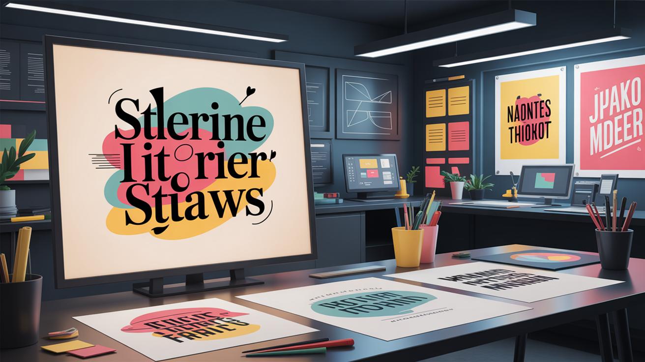
Typography Hierarchy and Its Importance
Typography hierarchy is basically the way text is arranged to show what matters most and what doesn’t. It’s a tool that guides your eyes through content by using variations in size, weight, and color. When done well, the reader naturally knows where to look first, second, and so on. It’s not just about making something bigger or bolder; it’s about signaling importance and creating an intuitive flow.
Using size, heavier fonts, or contrasting colors can make headings stand out. But those choices need to be balanced—too many heavy elements overwhelm, and subtle differences get lost. It’s kind of like a conversation in print or screen, where typography hierarchy tells you what to pay attention to without explicitly saying it.
Creating Clear Hierarchies
To build order, start with defining your headings, subheadings, and body text distinctly. Headings should grab attention quickly. Subheadings act like signposts, breaking content into manageable chunks. Body text needs to be easy on the eyes, providing the main content without distraction.
Here are some tips for making those levels clear:
- Use font size contrasts—you don’t need huge jumps but enough to tell them apart.
- Vary font weight moderately; bold headings and regular body text usually work.
- Play with color, but keep it subtle—too many colors can confuse rather than clarify.
- Use spacing to separate hierarchies visually; white space is underrated here.
- Avoid overusing capitals or all bold—they can lose impact if everywhere.
The goal is flow. Readers shouldn’t stumble visually while scanning or reading. If they do, it usually points toward a weak hierarchy.
Examples of Effective Hierarchy
Look at news websites like BBC or The New York Times. Their headlines are bold and large, pulling the eye immediately. Subheadings break down articles into sections, while body text stays consistent and readable. You don’t have to dig to find key info—it’s right there, framed by typography.
Or consider a product page where product names are prominent, key features in subheadings, and descriptions in smaller text. This hierarchy helps users zero in on what matters quickly. When done poorly, users scroll endlessly, unsure what’s important.
So, when you design your digital content, think beyond pretty fonts. Think about guiding your readers through information with clear, layered typography. It might feel subtle, but trust me—it shapes how people absorb and react to your content.
Common Typography Layout Mistakes
Overcrowding and Poor Spacing
You’ve probably seen pages packed tightly with text, where every inch feels stuffed. This kind of overcrowding kills readability. When there’s too much content all jammed together, your eyes get tired, and your brain struggles to jump from one idea to the next. It’s not just about avoiding a wall of words; you need breathing room. White space isn’t empty—it’s what lets the content stand out and appear approachable.
Breaking text into smaller chunks helps too. Short paragraphs, bullet points, or even just line breaks make scanning easier. Sometimes I just skip over crowded blocks because they look intimidating. You don’t want that for your readers.
To fix this, try adding margins or padding around text areas. Don’t hesitate to leave some space empty. Trust me, it doesn’t mean you have less to say—it just means you’re saying it better.
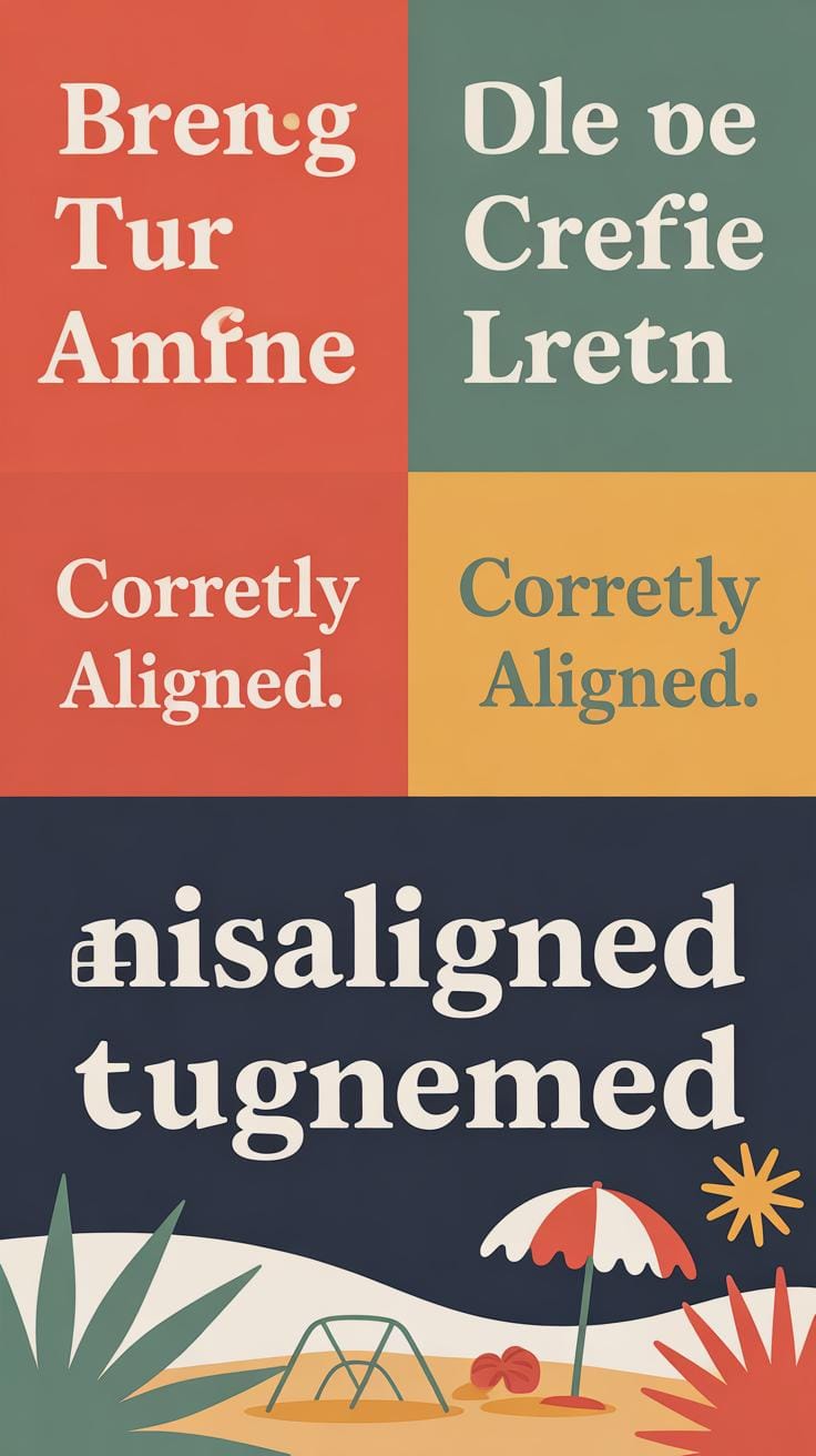
Ignoring Grid Structure
Ignoring grid systems might seem minor, but it creates subtle chaos. Without a grid, elements misalign; texts and images jump around randomly. This breaks the reader’s flow and makes your design feel amateurish. Have you ever tried reading a page where lines don’t line up? It feels unsettling, even if you can’t quite explain why.
Following a grid brings order. It helps your layout stay consistent across pages or screens, making reading smoother. Grids guide your placement decisions without limiting creativity—you still have freedom, just a framework. Aligning text and other elements properly creates a professional, polished look and helps users digest information better. Skipping this step often makes layouts feel off-balance, which few people notice consciously but all sense subconsciously.
Tips for Improving Your Typography Layouts
Choosing the right font requires more than just personal taste. Think about the screen where your content will appear. Some typefaces look clean on desktop but turn cluttered on smaller screens. Sans-serif fonts tend to work better for digital reading, but don’t shy away from mixing styles—just keep it to two or three fonts at most to avoid confusion. Pay close attention to sizes too. Body text should rarely drop below 16px for readability, but headlines can flex, depending on the message.
Using a grid can really help you arrange text in a balanced way—when I started, I ignored grids and ended up with inconsistent spacing that made reading harder. Grids help keep your lines and blocks aligned, offering a natural rhythm to the layout. It’s a bit like giving your typography a framework to breathe within, which I think is underrated.
Testing your design across devices is crucial. What looks fine on a laptop might feel cramped or enormous on a phone or tablet. Ask others for feedback, not just coworkers or designers, but real users too. You might find that what you thought was easy to read actually tires the eyes quickly. Iteration matters—sometimes slight tweaks in letter spacing or line height improve things significantly. Don’t settle for your first instinct; rethink and try again.
Conclusions
Balanced typography layouts are built on solid principles of type arrangement and grid use. You’ve learned how typography affects readability and how using grids can organize and structure content to improve the reader’s experience. Applying these concepts allows you to present your ideas clearly and attractively in digital media.
As you design, remember to keep your typography simple, legible, and well arranged. Use grids as a helpful tool to maintain consistency and harmony in your layout. The effort you put into crafting balanced typography layouts will pay off by capturing your audience’s attention and making your digital media more effective.