Introduction
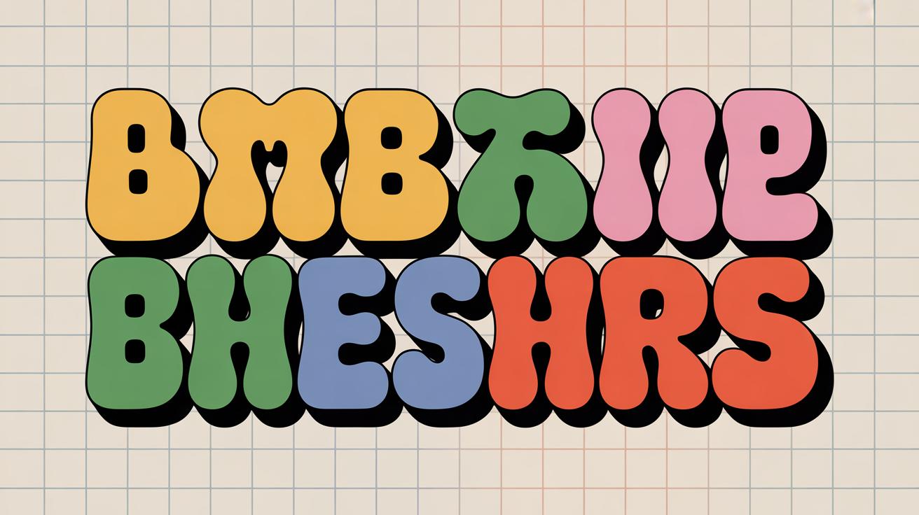
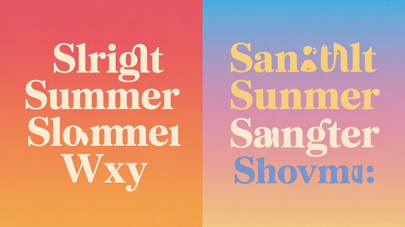
Typography is the art and technique of arranging type to make written language legible and attractive. Finding fresh typography inspiration online is key for designers, artists, and anyone working with text. The web offers many places where you can discover new ideas and styles to improve your work.
This article explores where to find typography inspiration online. You will learn about websites, social media, and other sources that help you see different fonts and layouts. These resources can spark your creativity and help you make better typography choices.
Explore Popular Typography Websites
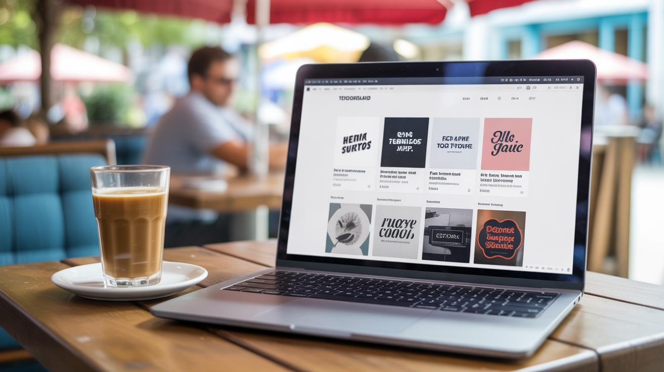
If you want to see what other designers are doing with type, a few websites stand out as must-visits. Sites like Behance and Dribbble are probably the first you’ll hear about. Designers from all over the world upload their projects here, so the range of typography styles can be pretty broad—everything from sleek minimalism to wild experimental lettering. But sometimes it’s a bit overwhelming because, well, there’s so much stuff. Still, it’s a good place to peek into fresh ideas and trends.

Then there are specialized platforms focusing on type. Take Typewolf, for example. It’s less about portfolios and more about showcasing actual fonts in real-world use—often across brands you might recognize. That approach can give you some practical inspiration if you find it tricky to imagine how a font might work beyond just the alphabet.
Another interesting spot is Fontsinuse, which collects examples of typography used in media, advertising, and packaging. Here you’ll see how fonts perform in context, and sometimes the curated samples trigger ideas that pure design sites can’t.
Each of these platforms offers its own kind of spark. Maybe you want a quick glance at trends, or maybe you want detailed case studies. Either way, browsing these sites regularly feels a bit like a dialogue with the type community, and that, I think, keeps your eyes open for possibilities you’d otherwise miss.
Font Libraries and Tools
When it comes to font libraries, there are a few places designers routinely check out both to find new fonts and also to see what’s popular. Google Fonts is probably the easiest starting point—it’s free, accessible, and you can even test fonts live on their site. I often find myself exploring unexpected font pairings just by trying out different weights quickly.
Adobe Fonts caters more to those who want something a bit more refined or unique. It’s integrated into their Creative Cloud apps, so it’s pretty seamless if you’re already in that ecosystem.
For paid fonts or rare finds, websites like MyFonts or Fontspring offer immense collections. Browsing their new releases often uncovers typefaces that break the mold or have subtle quirks that could inspire your next design.
Most of these sites let you filter by style, use-case, or foundry, which can nudge your exploration in interesting directions. And sometimes, just downloading a new font and playing with it can reveal insights about spacing, weight, or mood that pure theory won’t.
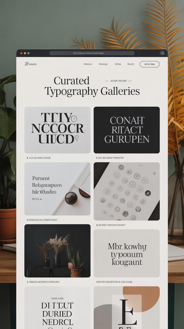
Typography Galleries and Showcases
Galleries dedicated solely to typography showcase curated collections of interesting projects and lettering work. Sites like Typeverything or TDC’s Typeface of the Year highlight creative projects that push boundaries or simply get something right about form and function. These aren’t just pretty pictures—they’re examples that tell you why certain choices work.
Other sites like The Dieline or BP&O mix typography with packaging and branding case studies, giving you a sense of how type interacts with other design elements. This can be useful when you’re not just thinking about letters but about how type fits into an overall visual story.
Exploring these galleries often feels like stepping into someone’s sketchbook or a design museum. They provide snapshots from diverse styles—calligraphy, geometric type, custom lettering—and sometimes even technical details or designer insights, which can be surprisingly helpful.
Have you ever found yourself stuck, looking at type for hours? Browsing these specialized sites might break that cycle by showing what’s possible—not just what’s popular. Sometimes it’s worth getting lost in a gallery for a bit and letting ideas simmer.
Follow Typography Experts On Social Media
Tracking typography experts on social media is a surprisingly effective way to keep your creative well filled. When you follow designers who live and breathe type, you gain a direct view into their thought processes, experiments, and ongoing projects. It’s not just about seeing polished work but also understanding the small details that often get overlooked.
Social media lets you peek behind the curtain—a sketch here, a revision there. Sometimes you stumble onto type sketches or quick tips that don’t make it to formal portfolios. That rawness makes ideas feel more accessible and adaptable for your own projects. Plus, these experts often spotlight new trends or overlooked styles, opening doors to ideas you might not search for intentionally.
Instagram Accounts Focused on Typography
Instagram is a goldmine for typography visuals and quick tips. Here are a few accounts that regularly share content worth following:
- @type.today – Featuring typefaces from Type.Today foundry, along with type history tidbits and contemporary uses.
- @thedailytype – Curates a variety of type styles, from bold experiments to classics, often accompanied by brief explanations.
- @lettersandfacts – Mixes typography with fun facts and design observations—a nice blend of education and visual appeal.
- @goodtype – Focuses on hand lettering and type design, showcasing both professionals and emerging artists.

Following such accounts offers a steady stream of fresh perspectives. They often inspire me to revisit styles I hadn’t thought about in years. Sometimes the ideas circulate so fast, it feels like you’re catching a glimpse of the future of typography.
Twitter Profiles Sharing Typography Insights
If Instagram feeds your eyes, Twitter engages your mind. Twitter profiles from designers and type foundries regularly share typography news, discuss licensing shifts, or announce font releases. It’s a place where quick conversations happen, sometimes sparking debates on design choices or typographic theory.
Take accounts like @typewolf, which highlights font pairings and trends, or the foundry @HoeflerCo, sharing deep dives into typeface history and usage. Following threads can yield unexpected insights or at least shake up your usual sources of inspiration. Sometimes, you end up reading long discussions that challenge your assumptions—always a good thing.
Keep in mind, not every post will be a “wow” moment but absorbing these steady drops of information builds a richer understanding over time. That slow accumulation is, perhaps, one of the best ways to grow your skills without feeling overwhelmed.
Join Online Typography Communities

Joining online communities focused on typography can be a surprisingly good way to expand your skills. When you’re part of groups where people share work, ask questions, or debate the finer points of letterforms, you get exposed to ideas you might never come across on your own. There’s a kind of collective knowledge in these spaces—it’s not just one expert’s opinion but a whole mix of perspectives that can spark new directions in your work.
Forums and discussion boards specifically dedicated to typography remain relevant. Places like Typophile, TypeDrawers, and the typography section on Reddit often have deep conversations about everything from type anatomy to the quirks of kerning on unusual scripts. You can ask detailed questions about a particular font or get feedback on your own projects. Sometimes the advice is very practical; sometimes it’s a bit too academic, but either way, you’ll learn more just by following the threads.
On social platforms, Facebook groups and Discord servers have grown into vibrant spots for sharing and critique. For example, Facebook’s “Typography & Hand Lettering” group hosts daily posts where members showcase new fonts or calligraphy pieces and welcome honest feedback. Over on Discord, servers like “Type Lovers” offer channels for live chats, font recommendations, and even impromptu design challenges. The real appeal here is the immediacy—you get instant reactions and can bounce ideas off others in real time, which feels quite different from the slower pace of forums.
In short, these communities give you plenty of chances to experiment and get outside your usual bubble. If you ever feel stuck or uninspired, maybe ask yourself: have I reached out to fellow typographers online? You might find a new style to try or a fresh problem that reignites your curiosity.
Use Typography Inspiration Apps
When you want fresh ideas right at your fingertips, typography inspiration apps can be surprisingly helpful. There’s something about scrolling through curated fonts and designs on your phone or desktop that sparks ideas in ways browsing a site sometimes doesn’t.
Some apps focus on simple font browsing, while others go deeper, offering interactive ways to explore typography. For instance, apps like Adobe Fonts let you preview fonts in real-time, changing sizes or phrases, which makes testing styles super straightforward. I find that just playing around in these apps can lead to unexpected pairings or styles I wouldn’t have thought of otherwise.
Apps That Offer Font Pairing Suggestions
Pairing fonts can be tricky. One font might look great alone but clash badly with another. That’s where font pairing apps come into play. They suggest combinations based on style, contrast, and history. Fonts like Google Fonts, when coupled with apps such as Fontjoy or Typ.io, offer recommendations that feel balanced — or at least closer to balanced than what I’d guess on my own.
These apps often let you filter by mood, project type, or weight. If you’re stuck trying to find something readable but elegant, they’ll narrow the options down quickly. Sometimes, you’ll stumble on a pairing you wouldn’t consider — and that’s often where the most interesting designs come from.
Typography Challenge Apps
For those looking to push boundaries, challenge apps set daily or weekly tasks around typography. Apps like 36 Days of Type invite you to design letters under creative prompts, which can be oddly motivating. Working within constraints often sparks creativity, or at least it does for me.
These challenges push you out of your comfort zone, making you experiment with styles or layouts you might avoid otherwise. Even if you don’t finish every challenge, the regular practice helps you spot trends and hone your skills. Plus, sharing your results online can bring feedback that’s more useful than you expect. Ever tried a challenge and found yourself liking a font choice you initially hated? It happens more often than you’d think.
Watch Typography Tutorials And Talks

If you want to see typography in action, online videos can be surprisingly helpful. Watching someone explain type choices or demonstrate lettering techniques often clarifies things much better than static images alone.
On YouTube, several channels focus entirely on typography. For example:
- The Futur — They cover type principles alongside design business advice and often analyze type in real projects.
- Will Paterson — He dives into hand lettering and fonts with easy-to-follow tutorials.
- CharliMarieTV — Offers insights into typography from a designer’s perspective, including usability and style tips.
These channels don’t just show what fonts look like. They dig into why certain choices work, or fail. Sometimes you stumble on little tricks—like pairing unexpected fonts or spacing adjustments—that you probably wouldn’t notice on your own.
Meanwhile, TED Talks, and webcasts by industry experts, show you more than technique. They often explore the cultural, historical, or emotional sides of type. Watching Jessica Hische’s talk about lettering or Ellen Lupton’s webinars, you might start seeing type as more than just shapes on a page. It’s a form of communication that shapes how readers feel and interpret the message.
Sometimes these talks can shift your mindset about typography. Maybe you begin questioning your usual font choices or try to create designs that aren’t just visually pleasing but also meaningful. So, these videos don’t just teach—they inspire you to rethink how type functions in design.
Read Blogs And Articles About Typography
When it comes to deepening your understanding of typography, blogs offer a kind of quiet space where ideas develop slowly—unlike quick videos or flashy tutorials. Reading specialized typography blogs lets you explore the nuances behind type choices and design decisions, often with a level of detail you won’t get elsewhere. Sometimes, you find yourself discovering concepts you weren’t even looking for, which can change how you approach your own work.
Typography Design Blogs
Some blogs stand out because they keep you hooked with fresh content and solid insights. For instance, I think Typewolf is great for seeing current trends and font combinations in the wild. Fonts In Use examines real-world examples, showing how type performs across print, web, and branding. Then there’s Codex, which dives into the history and technical side of type, something that’s surprisingly inspiring once you get past the geeky parts.
Each of these offers something different—whether it’s practical tips, new font discoveries, or a deeper historical perspective. You don’t have to read them all, but mixing these sources can spark ideas in unexpected ways.
Case Studies And Interviews
Case studies and interviews pull back the curtain on designers’ actual processes. You get to see problems they wrestled with and decisions they made, often explaining the “why” behind a layout or type choice. It’s fascinating—and sometimes a bit reassuring—to learn that even experts get stuck and experiment.
Interviews, in particular, offer candid reflections. For example, reading how a designer chose a font to evoke a particular mood or how they balanced readability with creativity can influence your own projects. It’s like having a conversation with someone who’s been there, done that.
So, when you hit a creative block or want to push your skills further, diving into a well-written blog post or a detailed case study might give you exactly the spark needed—sometimes more than just watching a tutorial might.
Attend Virtual Typography Events
Online typography events open up worlds you might never stumble upon on your own. When you join a virtual conference or workshop, you’re not just watching presentations. You get a chance to absorb how professionals think, why they choose certain typefaces, and even the nitty-gritty of type design. It’s like peeking behind the curtain and sometimes, unexpectedly, you might catch a mistake or a moment of doubt from seasoned experts—that’s oddly reassuring.
Workshops often push you to try new things right then and there. They can feel a bit intense, sure, but you come away with specific skills rather than vague inspiration. Plus, there’s usually a chat or Q&A where you can ask questions that nag your mind—for example, why a classic serif might still trump some modern sans in certain layouts.
Typography Webinars
Webinars focused on typography usually zero in on one or two key ideas, like type pairing or layout balance. They’re shorter and tend to be more structured than full conferences, which makes them easier to fit into a busy schedule. During a webinar, you can expect live demos, downloadable resources, and sometimes polls or quizzes to help you grasp concepts.
Finding these webinars isn’t always straightforward, though. Good places to start are design platforms like Adobe Creative Cloud or specialized type foundries. Social media and newsletters can alert you when a new one pops up. Keep an eye on sites like Eventbrite or Meetup where smaller, niche groups post events. It feels a little like hunting at times, but catching that webinar can spark ideas you’d never find in a blog post alone.
Online Typography Conferences
Big online typography conferences attract the real heavyweights in the field. These events gather typographers, graphic designers, and type foundry artists from across the globe, sharing their latest work and insights. A few well-known ones—like TypeCon and ATypI—offer keynote talks, panel discussions, and live critiques that reveal different angles on type design rarely seen elsewhere.
These conferences often push conversations beyond basics, tackling questions about cultural context, legibility in digital spaces, or even the ethics of font licensing. You might find yourself wondering how some designers balance heritage with modern tech—and that tension itself can inspire fresh thinking in your own projects.
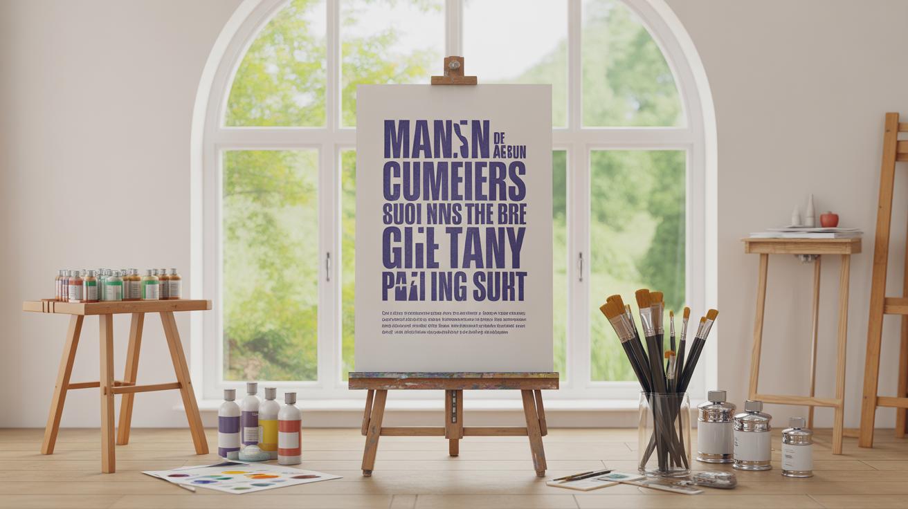
Experiment With Typography Generators
Trying out online typography generators can be a surprisingly good way to spark new ideas. These tools toss your text into different styles and effects, sometimes producing results you might not have thought of on your own. You might start with a simple phrase and suddenly see it transformed into something bold, quirky, or even oddly elegant.
Text effect generators are worth checking out if you want to experiment with visual textures or shadows without needing fancy software. They let you play with things like gradients, outlines, or distortions in real time. I remember once spending hours just tweaking shadow heights and letter spacing on one generator—it felt almost like a fun puzzle rather than work.
Font combination generators can be very practical too. If you’ve ever struggled to pick a good font pair for a project, these tools suggest combinations based on style, mood, or readability. They often include samples so you see how the fonts interact in context—sometimes the suggestions are spot-on, other times less so, but either way, it’s good for breaking out of familiar pairings.
Some popular tools to try include Fontjoy for pairing fonts, Cool Text for quick effects, or even newer AI-based generators that surprise you with random yet usable styles. These resources don’t replace your personal taste, of course, but they do push you to explore options beyond your current toolbox.
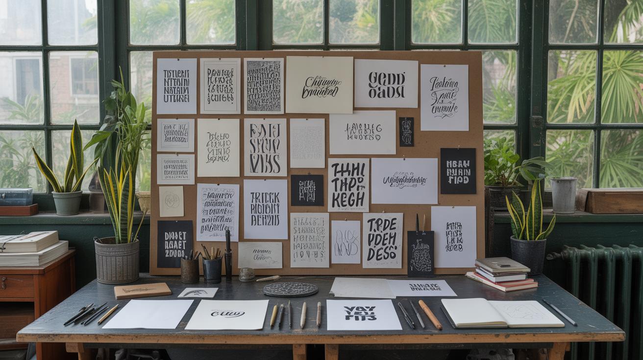
Analyze Typography In Everyday Life
Typography surrounds you all the time, whether you notice it or not. Taking a closer look at the typefaces on street signs, packaging, or even the menu at your favorite café can spark ideas that you might not find online. These real-world examples often mix styles in ways that feel natural, sometimes breaking traditional “rules” but still working. Have you ever paused just to watch how a billboard grabs attention with its font choice and size? It’s a simple, effective study in hierarchy and readability.
Print Media And Signage
Magazines, posters, and signs offer a treasure trove of typography to explore. Flipping through a magazine, you can see how designers balance headlines, subheads, and body text to create flow and emphasis. Posters often use bold, dramatic fonts that demand attention, sometimes pushing contrasts or quirky pairings that are worth testing in your work. Street signs are another good point of reference; their typography needs to be clear and quickly understood, which means studying them can give clues on legibility and spacing. You might notice subtle ways some signs use font weight or letter spacing to improve readability at a glance.
Digital Typography In Apps And Websites
Websites and apps constantly introduce new ways to use type, mixing fonts and layouts as screens get smaller and users scroll faster. Observing how apps handle navigation menus or call-to-action buttons can teach you about prioritizing type visually. Sometimes, you’ll spot trends like variable fonts or playful micro-interactions that add personality without sacrificing clarity. That said, digital typography can also be inconsistent—some sites overdo effects or pick odd combinations—and recognizing those missteps can be just as instructive. Have you checked recently how your favorite app adapts typography for dark mode? It might inspire your own experiments.
Conclusions
Online sources provide many ways to find typography inspiration. Websites with curated font galleries and social media channels with active communities show new and interesting ways to use text. Exploring these resources regularly keeps your ideas fresh.
Using online inspiration helps you learn what works well in typography. It shows you how to arrange letters and words to make them clear and appealing. Keep searching and trying new styles, and your typography will improve with each project.