Introduction
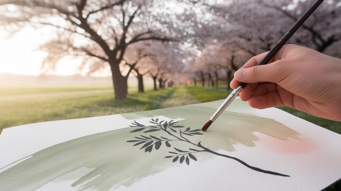
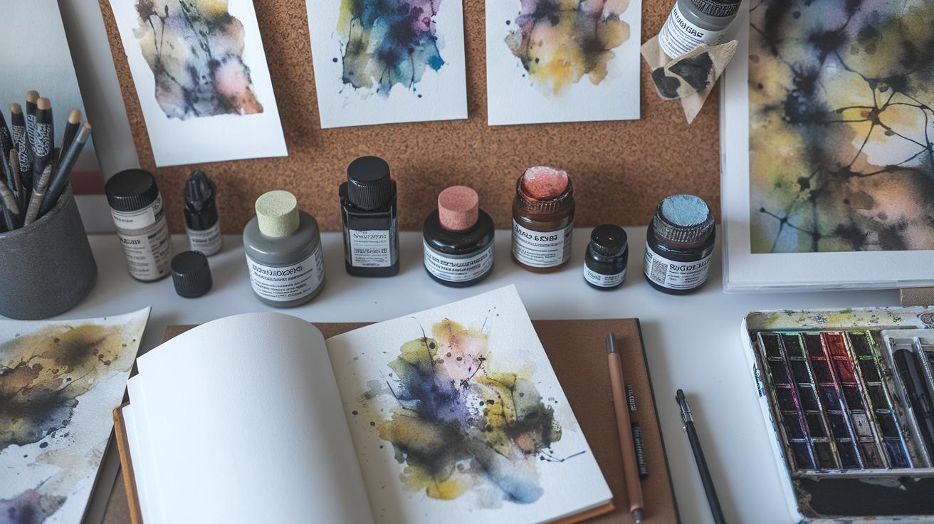
Watercolor painting offers a unique way to capture the beauty of trees. This technique uses pigments suspended in water to produce transparent and delicate artwork. Trees have long been popular subjects due to their natural forms and textures. Learning to paint trees in watercolor brings together an appreciation of nature and artistic skill.
You will find this guide useful in understanding how to apply watercolor methods specifically to tree subjects. It explains the basics of watercolor, explores the features of trees that matter most to artists, and presents step-by-step techniques to help you achieve calm and serene tree paintings. Whether you seek to sketch quickly or create detailed artworks, these tips will improve your results.
Understanding Watercolor Basics for Tree Painting
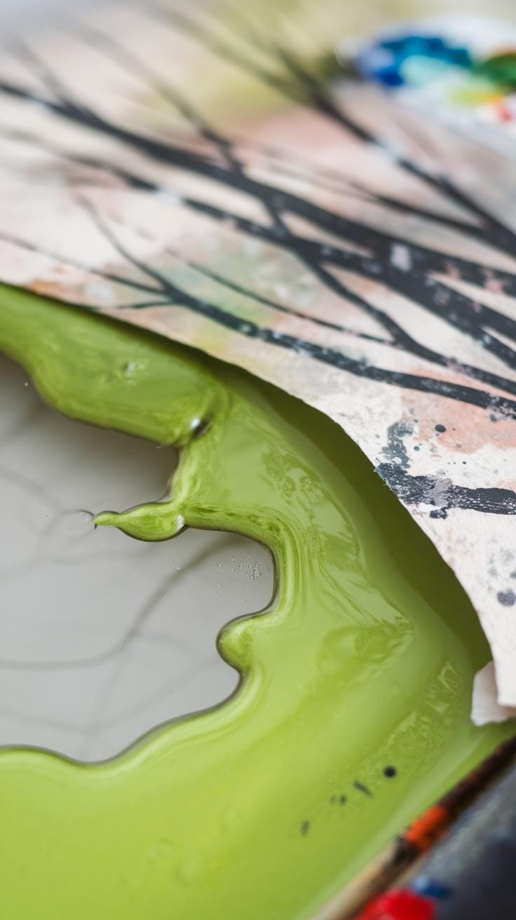
Watercolor works through the mix of pigments and water. When you add water, the paint spreads more freely, creating smooth tones or light washes. This effect suits the soft colors and delicate textures trees often show.
The paper you use affects how the paint behaves. Watercolor paper absorbs water and pigment differently depending on its texture and weight. This shapes the sharpness or softness of your tree’s branches and leaves.
Transparency plays a key role in making trees look lifelike. Thin layers let light shine through, adding depth and richness to your colors. Think about the layers of leaves or bark patterns—using transparent washes can make these stand out naturally.
Water Pigment Interaction
Mixing water with pigment changes the color’s strength. More water means lighter shades, which works well for distant tree foliage. Less water gives stronger, darker colors, useful for tree trunks or shaded areas.
Control the water by adjusting its amount on your brush. To paint rough bark, keep the pigment thick. For light, airy leaves, make your wash thinner and more transparent.
Try testing different water levels on scrap paper before painting. Notice how thin layers let background colors peek through, helping create a realistic feel in your trees.
Choosing Watercolor Paper
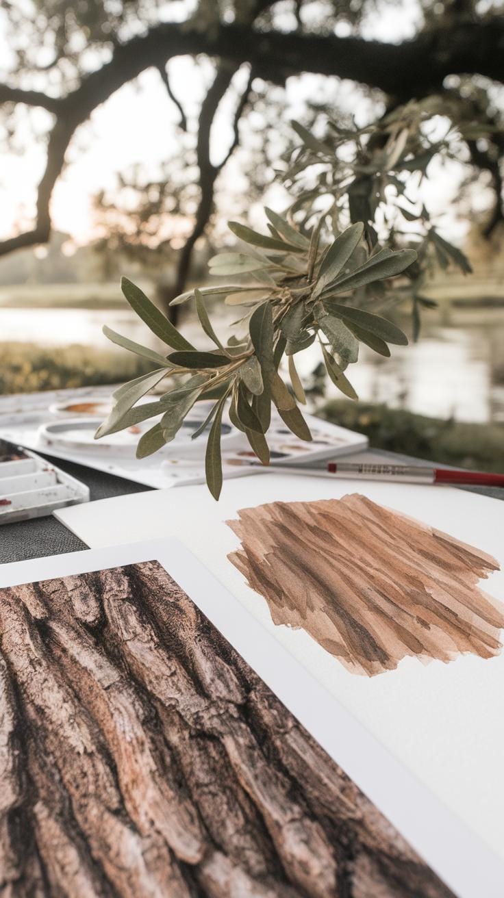
The paper’s surface influences how your brush moves and how paint settles. Cold-pressed watercolor paper has a subtle texture that holds both wide washes and fine details, ideal for capturing the complexity of tree trunks and leafy canopies.

Heavier paper, usually 140 lb (300 gsm) or higher, prevents warping from water. Cotton papers absorb water well without breaking down, which helps maintain clean edges and vivid colors in your tree painting.
You might notice how cheaper paper causes colors to pool unevenly. Invest in quality cotton cold-pressed paper to give your tree artwork a natural look and maintain control over brush strokes.
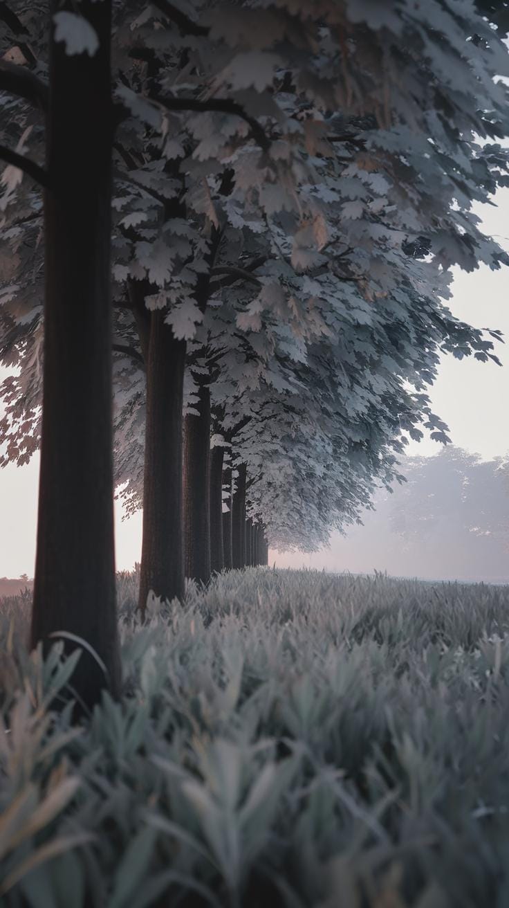
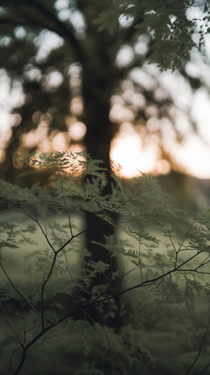
Observing Trees for Realistic Watercolor Art
Before you paint, spend time looking closely at the trees around you. Observe their overall shapes and how the trunks lead into branches. Notice how the leaves cluster together instead of spreading evenly. These details give your painting structure and realism.
Focus on the way branches divide and twist rather than trying to paint every small twig. Are the branches thick near the trunk and thinner at the ends? How do the leaf groups change shape as they catch the wind or light? Taking note of this helps you plan your brushstrokes when you add color.
Also, watch how light falls on the tree. Which parts appear bright and where do shadows collect? These elements show depth and create a natural feel. Ask yourself, how does sunlight change the look of leaves and bark? These observations guide where you layer watercolor washes and when you leave areas lighter or darker.
Identifying Tree Structures
Look at the tree trunk and notice its shape—is it straight, twisted, or wide at the base? This is the spine of your painting, so capturing its form makes your tree convincing.
Observe how branches grow from the trunk. Do they angle sharply upward or stretch out sideways? Are they thick or thin? Understanding this helps you sketch the tree’s skeleton with brush strokes that match these directions and thicknesses.
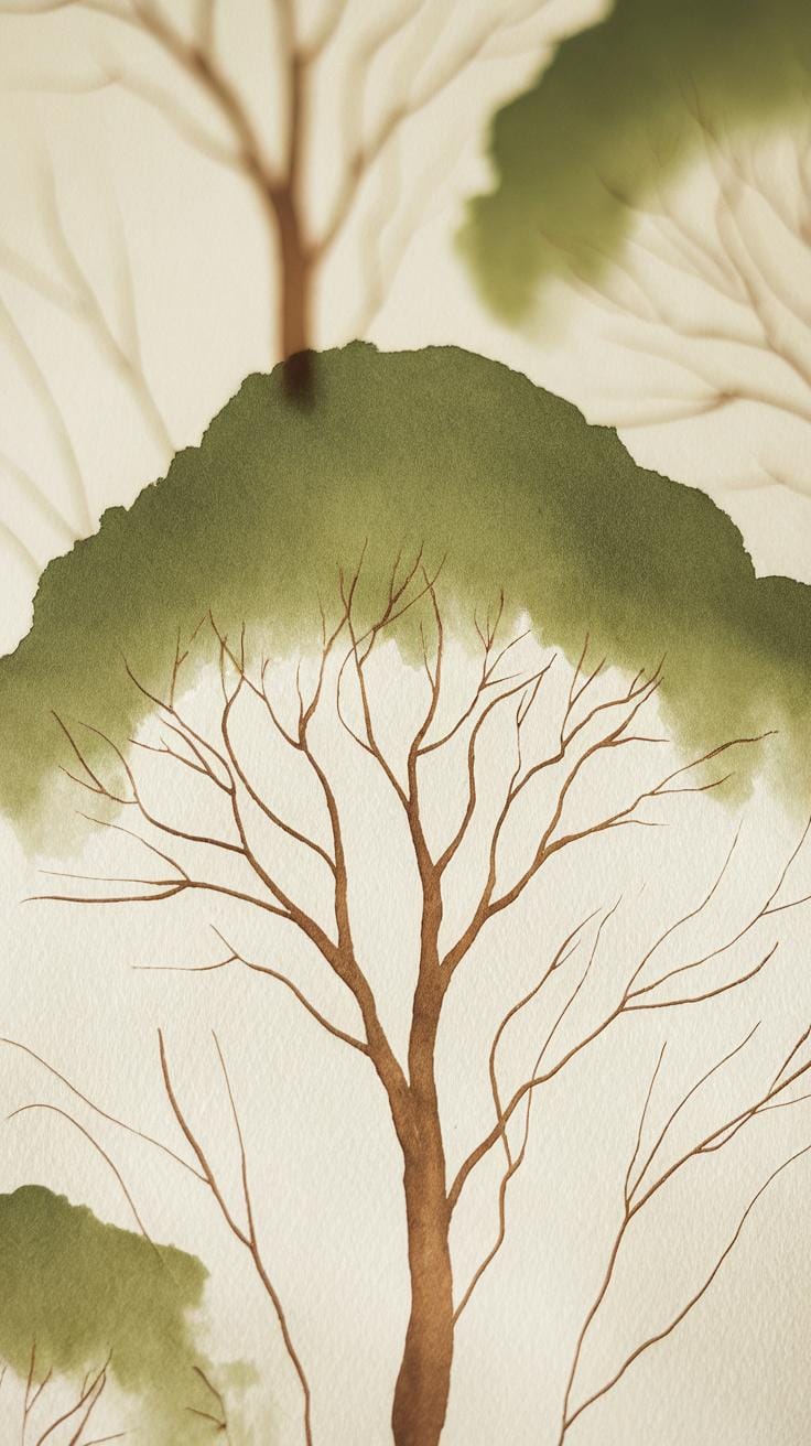
Examine leaf groupings closely. They rarely appear as single leaves in nature. Instead, look for clusters or patterns in how leaves bunch together. When you paint, try to capture these groups rather than detailing every single leaf. This approach makes your tree look natural and avoids clutter.
Light and Shadow in Trees
Spend time observing how sunlight filters through leaves. Notice the bright spots where light shines directly and the darker spots where leaves block the light. This mix creates patterns that add life to your painting.
Watch how shadows fall on branches and the trunk. They often create shapes that follow the tree’s form and help define its volume. Make a mental note of these shadow paths so you can recreate them by layering transparent colors in watercolor.
As you paint, think about how to show the glow of light behind some leaves or how the shaded areas cool down the colors. Using these light and shadow contrasts helps your tree feel three-dimensional. What parts of your tree will you keep bright? Where will you deepen shadows?
Basic Brush Techniques for Painting Tree Forms
When painting tree trunks and branches, selecting the right brush and stroke shapes makes a big difference. You want to capture the rugged look of bark and the delicate structure of branches. For tree trunks, try using a flat or filbert brush. These let you make strong, textured lines that mimic the roughness of bark. Use quick, short strokes that vary in direction to avoid flatness. Dry brushing, where you use less water on your brush, can create scratchy effects perfect for old bark.
For thinner branches, a fine round brush works best because it lets you paint slender lines with control. Switching brush sizes from thick to thin helps show how branches taper naturally. Focus on stroke pressure: pressing harder gives thicker lines, while lighter strokes feel more fragile.
Choosing your tools carefully is just the first step. How will you vary your brush pressure and angle to reflect the tree’s character? Experiment with brushes and strokes to bring out the unique textures you see in your reference or nature walk.
Brush Strokes for Bark Texture
Rough strokes create the uneven surface you see on tree bark. Load your brush lightly with pigment and drag it with a dry brush method to leave gaps, mimicking cracks and flakes. Use a stiff-bristled brush or a fan brush for more texture. Dab some pigment irregularly to add depth. Short, jagged strokes can represent bark peeling or rough patches.
Try building up layers with these dry strokes rather than one solid color. It helps create a three-dimensional look. Why not paint a few trees with different bark types—smooth, cracked, or knotty—using this technique? You’ll notice how texture changes feeling and realism.
Depicting Leaves with Brushwork
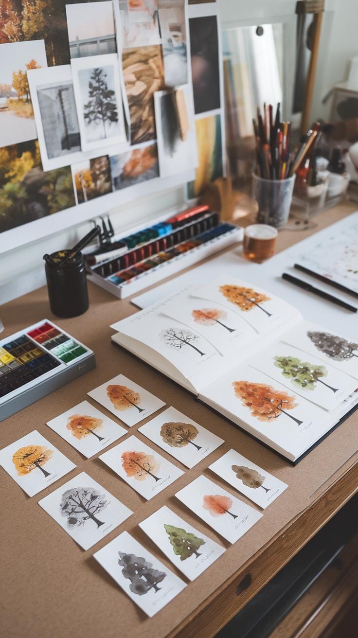
Leaves often appear as clusters rather than individual shapes in a watercolor tree. Stippling and dabbing with a round or mop brush give this effect efficiently. Tap the brush lightly on the paper to form small dots representing leaf bunches. Mix your colors to add variety—greens, yellows, brown shades—just like you see outdoors.
Try overlapping dabs to create depth within the foliage. Avoid painting every leaf; hint at their presence by leaving some areas blank or lighter. Using varied pressure gives denser or airier leaf clusters. Consider how light hits the leaves and let that guide your brushwork. Can you replicate the fuzzy edges of a cluster that’s partially hidden? Practicing these strokes builds confidence in creating lively, natural tree canopies.
Creating Depth in Tree Watercolor Paintings

Building depth in your tree paintings makes the scene feel real and inviting. Layering and glazing are key techniques for this. Layering means applying paint in steps, starting with lighter colors before adding darker shades. This helps create a sense of distance between leaves and branches. You can show some areas catching more light by keeping them lighter, while shadowed parts get darker tones.
Consider how sunlight filters through tree branches. Leaves closer to you appear darker and more detailed. Leaves farther away blend softly into the background. Using contrasting light and dark values makes this effect clearer. Ask yourself where the light hits your tree and where shadows fall. This will guide your layers, pushing some parts forward and others back.
Applying thin washes first lets you adjust colors easily as you build. Avoid heavy paint early on because it can block later details. Keep your strokes loose at first and sharpen edges with darker paint on top. This step-by-step process turns a flat shape into a rich, dimensional tree.
Layering Color for Dimension
Start by painting light washes over your tree shapes. Use diluted paint with plenty of water to create gentle tones. Let these layers dry completely before adding darker colors. You can repeat this to deepen shadows and enrich hues without muddying the colors.
Layering lets you capture the complexity of leaves and bark. For example, a pale green wash might represent sunlit leaves. After it dries, add small dabs of darker green to show shadows within the foliage. Thin, controlled layers help separate different parts of the tree, making your forms pop.

Try experimenting with the order of colors too. Cool colors often recede, so placing darker blues or greens behind warm yellows and oranges can enhance depth. With practice, you’ll learn how to build dimension by layering thoughtfully and patiently.
Using Glazing for Highlights
Glazing means brushing transparent colors over dry layers to brighten or shift tones. It’s useful for highlighting spots where light strikes tree surfaces. Apply a thin glaze of pale yellow or warm white to mimic sunlight filtering through the canopy.
Make sure each glaze is transparent. Thick paint will cover details instead of enhancing them. Use a soft brush and smooth strokes to glaze softly. This lets the underlayers show through, creating subtle glow effects that feel natural.
For example, adding a warm glaze over the rough bark can reveal its texture while brightening edges facing the light. Thinking about how light interacts with your subject will help you use glazing to lift your painting from flat to vivid.
Achieving Serenity in Tree Scenes
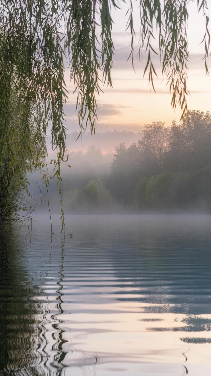
Calm and balanced tree paintings invite viewers to pause and feel at ease. Your choices in color and arrangement shape this sense of tranquility. Start by selecting colors that feel gentle and natural. Soft greens, earthy browns, and muted tones reduce visual noise and help create a restful image.
Consider how these colors interact. Use light layers of green mixed with touches of gray or blue to avoid intense brightness. Browns mixed with a bit of warm ochre offer a stable and peaceful feel. Avoid harsh contrasts or overly bright hues, which can disturb the calm mood you want to build.
Think about where to place your trees on the page. Spacing is crucial. Leave breathing room by including negative space around tree forms. This empty area balances the composition and prevents it from feeling crowded. Imagine a quiet grove where each tree has room to stand alone yet belongs to the group.
Arrange your tree elements so they lead the eye smoothly through the scene. A cluster of three smaller trees can balance a larger single tree across the page. This balance keeps the viewer’s gaze flow steady and comfortable, reinforcing the peaceful spirit of your work.
Color Choices for Calmness
Soft greens work well for leaves in serene tree paintings. Mix green with hints of blue or gray to create muted shades rather than bright, vivid colors. These tones feel cool and restful, as though you are looking through a gentle haze or soft light.
Use browns that lean toward warm or neutral undertones. Adding a little burnt sienna or raw umber helps keep colors grounded without appearing dull. Avoid rich reds or intense yellows, which can break the gentle harmony you want to keep.
Incorporate neutral tones such as soft grays, beige, or pale blues to help blend elements together. Muted backgrounds or sky washes in these colors create a calm atmosphere, letting your tree colors stand out calmly instead of shouting for attention.
Will you try layering subtle greens with muted browns to see how they hold a peaceful tone? Experiment by mixing your palette down instead of adding purer hues. This will help maintain the quiet energy your painting needs.
Compositional Balance
Balance in composition means arranging your tree shapes and empty spaces to feel stable and restful. Start by thinking about the placement of your main tree forms. Avoid clustering everything tightly in one area. Spread out your tree elements so the eye can move freely.
Negative space is your ally in creating calm. Leave some open areas around the trees, like gaps between branches or clear spaces in the foreground or background. These areas give the eye room to breathe, preventing the painting from feeling busy or overwhelming.
Use size and shape variety to add subtle rhythm. A large tree with broad branches can balance smaller, less detailed trees placed opposite it. This type of arrangement creates a quiet tension that holds the composition together without tension or disorder.
Ask yourself how each tree’s position affects your painting’s flow. Does the eye travel easily across the scene? Are there places to rest visually? Finding these answers helps you achieve harmony and serenity in your work.
Using Wet on Wet and Wet on Dry Techniques
Mastering watercolor requires understanding how two main methods affect your tree paintings. Wet on wet happens when you apply paint to moistened paper. This spreads colors softly and creates gentle blends. Wet on dry involves painting on dry paper, giving you sharper, clearer shapes and lines. Each technique shapes your tree scenes differently and can work together to build depth and interest.
Choosing when to wet your paper or keep it dry depends on the effect you want. Soft leaf clusters or mists often benefit from wet on wet, while detailed branches or bark textures need wet on dry. Can you imagine how using both techniques might create a peaceful forest with smooth canopies and defined trunks? Practice switching between these methods to see how they change your tree textures and mood.
Wet on Wet for Soft Edges
Wet on wet starts by brushing clean water onto your paper where you want soft shapes. When you drop paint onto this damp surface, the colors flow and blend naturally. This technique works twice as well for painting leaves that fade into one another or for creating hazy backgrounds behind trees.
Try gently layering greens and yellows with wet on wet. Watch how the tones merge without harsh edges. You can also use this to add atmosphere, like morning mist around trunks and branches. Your trees will look more peaceful, as the edges dissolve softly. When was the last time you noticed how nature blurs colors in early fog? This method helps you paint exactly that feeling.
Wet on Dry for Sharp Details
Wet on dry means applying paint straight onto dry paper. This gives you control to create sharp lines and precise shapes that stand out. It works best for painting thin branches, bark patterns, and leaves with clear contours.
Use a small brush to add bark marks and twigs that look realistic thanks to crisp edges. You can layer darker colors over dry lighter washes to build texture without the colors running together. This technique lets your trees gain definition after using soft washes. Have you tried accentuating your trees by outlining certain branches or carving bark with fine strokes? Wet on dry lets you add those exact details that bring focus and clarity to your serene scenes.
Adding Finishing Touches and Details
Once your main layers dry, focus on adding small details that give your tree painting depth and character. Fine twigs, tiny leaves, and subtle bark marks bring life to flat areas. These extra touches define the structure and invite viewers to explore your work more closely.
Use details to show how light interacts with the tree. Small leaf veins or bark cracks can suggest texture and form. Think about the direction of branches or how leaves catch the wind. These little elements create a believable scene, making your painting look more like a real tree rather than just a shape on paper.
Have you noticed how adding a few lines or dots can transform an image? This stage lets you make your painting unique and personal. Take your time adding these final lines carefully. You will see your work become sharper, clearer, and full of life.
Fine Details with Small Brushes
Small brushes let you paint with precision. Thin liners or tiny rounds work well for twigs and leaf veins. With these brushes, you can create thin, delicate lines without overpowering the rest of the painting.
Try using a size 0 or 1 brush for the finest strokes. Practice controlling the pressure to adjust line thickness. Light, broken strokes mimic real twig edges and leaf veins effectively. If your brush is too dry, flicking the bristles can create interesting fine marks for bark texture.
How often do you pick up a tiny brush for details? Choosing the right size brush gives you more control and adds realism to your tree. Experiment with different brushes to find what works best for your style and the tree you’re painting.
Highlighting Techniques
Highlights give your tree painting brightness and contrast. Using white or lighter colors to catch sunlight makes leaves and bark stand out. This adds a three-dimensional feel and helps parts of the tree pop forward.
Apply highlights on areas where light naturally hits, like the edges of branches or the curve of a leaf. Dry brushing with a nearly dry brush can create soft highlights. You can also use a white gel pen or white gouache for sharper, stronger highlights on smaller areas.
Think about the light source in your scene. Are the highlights warm or cool? Adding highlights in the right spots enhances texture and brings energy to your painting. Where could a small touch of light improve your current work?
Practicing and Developing Your Style
Consistent Practice Benefits
Regular practice sharpens your brush control when painting trees. Each time you paint, you learn how much water to use and how to blend colors naturally. Trying the same tree shapes repeatedly helps you understand leaf placement and branch structure better. Over time, your strokes will become confident and precise.
Mixing colors becomes easier with practice too. You start to see how different greens and browns work together to bring your tree to life. Practicing commonly used tree colors, from deep forest greens to soft autumn oranges, builds your color sense for peaceful scenes.
Try setting aside short, daily painting sessions. Even quick sketches of trees help improve your skill. What small change can you make today to your brush strokes or color mix that might improve your next tree painting?
Exploring Unique Tree Interpretations
Experiment with colors beyond the usual greens and browns. What happens if you paint a tree in shades of blue or violet? These choices can create a mood that feels calm or mysterious. Try blending unexpected colors to design your own versions of trees.
Shapes don’t have to be exact copies of nature. You can play with rounded or angular branches or create abstract leaf clusters with simple washes. These variations help you discover a personal style. When you free yourself from strict realism, what stories do your trees tell?
Practicing different tree forms and color palettes lets you express your artistic voice. Keep notes on which combinations feel most like your own work. How can stepping outside traditional shapes and colors change the way you connect with your art?
Conclusions
You now have an overview of how watercolor painting combines with tree subjects. Trees provide varied shapes and tones that make watercolor both challenging and rewarding. By practicing different brush techniques and layering colors, you gain control over light and mood. Focusing on serene scenes allows you to convey a peaceful atmosphere through your art.
Keep exploring watercolor techniques and observe real trees closely. Test different approaches until you find those that fit your style. Painting trees with watercolor will enhance your connection to nature and your skill as an artist. What tree scenes will you create next using these methods?


