Introduction
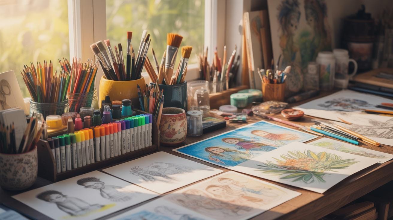
Shadow drawing is a crucial skill for digital art beginners. Learning how to add shadows realistically can make your digital artworks look three-dimensional and lifelike. This tutorial covers the basic techniques for drawing shadows and shading in digital art. It breaks down the process into easy steps to help you improve your digital drawings.
You will learn what tools to use and how to apply shadows on different surfaces. This tutorial will guide you through essential concepts and practical actions for creating depth and volume in your art. By the end, you will be better equipped to shade your digital drawings with confidence.
Basics Of Digital Shadow Drawing

Shadows in digital art are, well, those darker areas where the light doesn’t quite reach because something’s blocking it. They’re more than just dark patches; shadows are what make your flat drawings feel like they have actual weight and presence. If your artwork feels a bit lifeless or flat, it might be because the shadows aren’t properly done or considered.
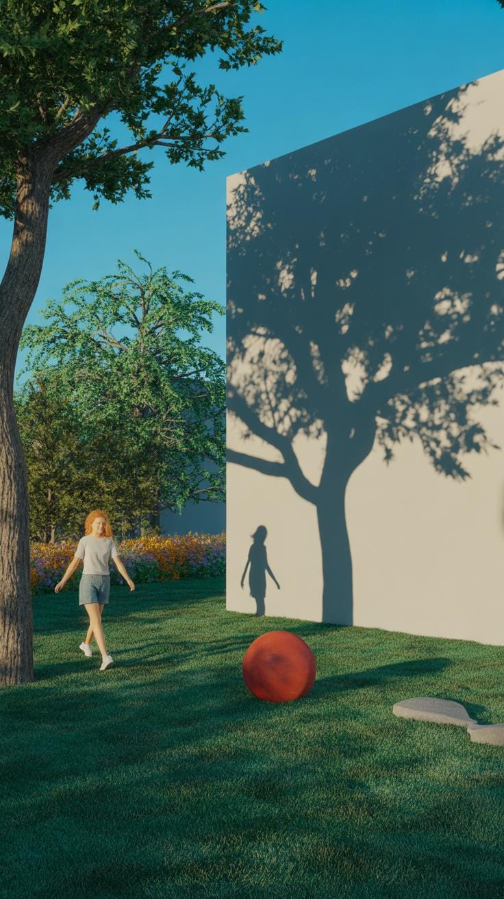
There are a few key shadow types that beginners should get comfortable with. Let’s start with cast shadows. These are the shadows created when an object blocks a light source, projecting a silhouette onto another surface. Think of a tree casting its shadow on the ground. Then, form shadows wrap around the object itself, shaping its curves and edges—these shadows show the form in 3D. Lastly, self-shadows appear on the object, where parts of it block the light from reaching other parts, creating darker areas on the object itself.
Understanding these types can feel tricky at first, but recognizing them in everyday life helps. Notice how a ball on a table casts a shadow on the surface, yet also has darker areas where the light doesn’t hit directly. That’s the interplay of these shadow types shaping volume and depth in your art.
What Are Shadows In Drawing
Shadows are essentially the contrast areas formed when an object blocks light, but in drawing, especially digital, they’re crucial because they add depth to otherwise flat shapes. Without shadows, even a detailed sketch can look two-dimensional. Shadows carve out space and volume in your artwork, showing the viewer how objects sit within a scene and how they’re shaped.
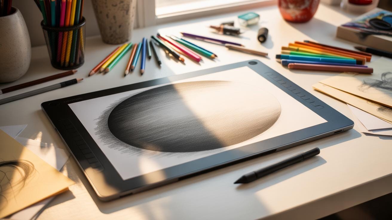
Think of a simple circle drawn on a blank canvas. By adding shadows, you transform that circle into a sphere that looks round and solid. It’s not magic, just light and dark working together, but it’s a foundational trick in art that often gets overlooked by beginners.
So shadows in digital drawing do more than just make things look dark in spots—they help you create form, provide cues about light direction, and lend your characters and objects a believable presence.
Types Of Shadows To Know

When starting out, it’s helpful to keep shadow types distinct. Here’s a quick look:
- Cast Shadows – Shadows thrown by an object onto another surface, like a person’s shadow on the ground. They usually have sharper edges closer to the object but can blur depending on the light source.
- Form Shadows – These shadows live on the object’s surface, showing how light curves around it, like shading on a rounded cheek or the side of a nose.
- Self-shadows – The areas on the object blocked from direct light by itself—like the undersides of eyelids or under the chin. These are often subtle but important for realism.
Digital artists might sometimes focus too much on cast shadows or miss the subtlety of self-shadows, which can make the art feel flat. It helps to study real-life objects or your own face—look closely where shadows appear and how soft or hard they are depending on the light source.
Which shadow do you find most challenging to draw digitally? I often struggle with self-shadows—sometimes it’s hard to know just how dark those areas really should be.
Why Shadows Matter In Digital Art

Shadows play a crucial role in digital art. They are more than just dark spots on a canvas. They provide cues that our brain reads to understand the environment depicted. Without shadows, images often appear flat and unconvincing. Shadows help define the volume and contours of objects, offering a sense of three-dimensionality.

You might have noticed how shadows create contrast that naturally draws the eye. They help to separate objects from their backgrounds by giving hints about their spatial positioning. For instance, the length and softness of a shadow can suggest the time of day or the proximity of an object to a surface.
Moreover, shadows add realism by mimicking how light behaves in the real world. Properly shaded areas can evoke the effect of different light sources, angles, and intensities. When shading aligns with these natural principles, the digital artwork feels believable. It’s a subtle yet vital trick of the trade.
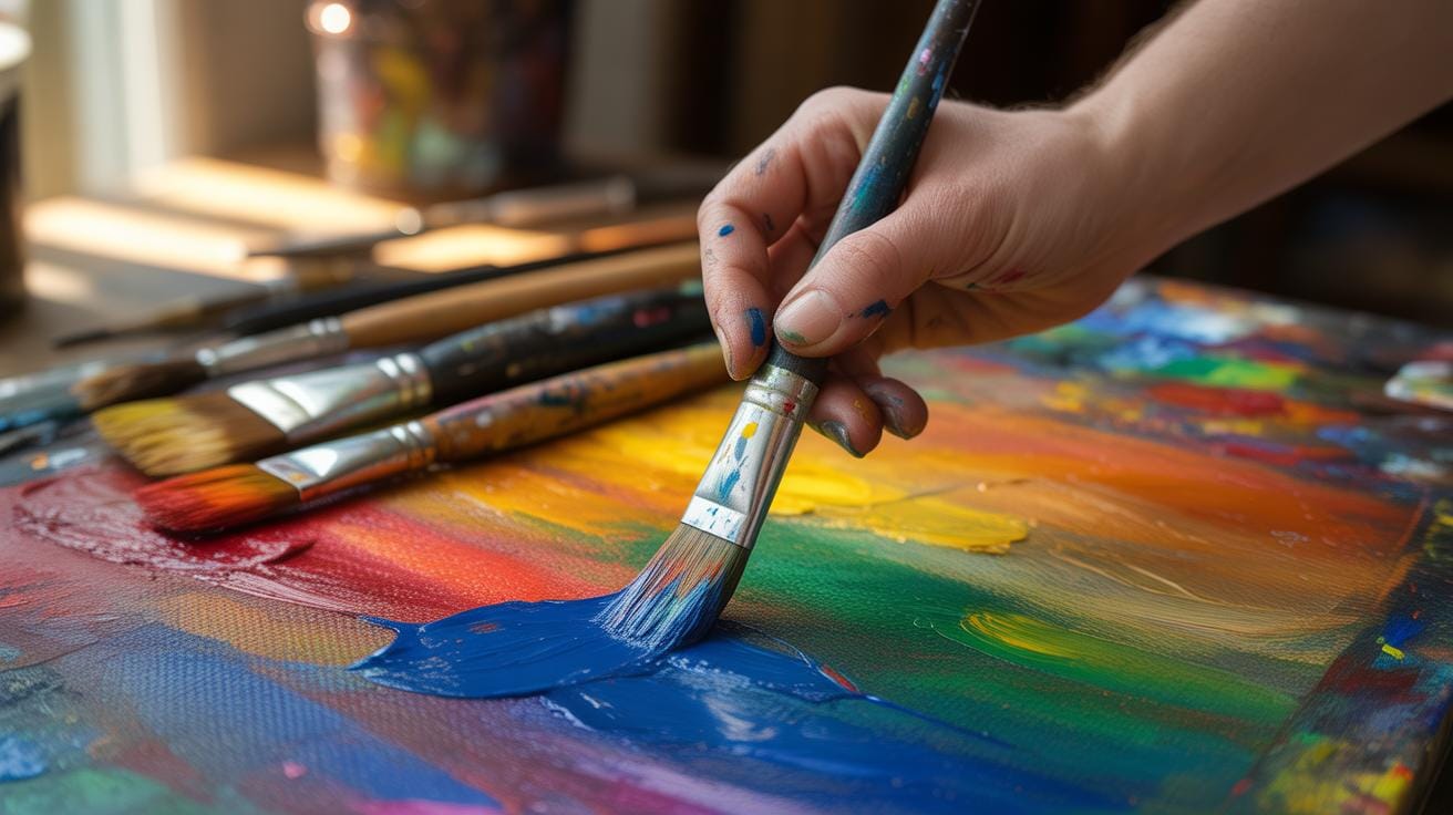
Key Tools For Shading In Digital Art

Brush Options For Shadows
When it comes to shading, the brush you choose can make a real difference. Typically, soft round brushes work well for smooth shadow transitions, giving you that gradual blend. But then, sometimes a textured or speckled brush can add interesting depth and grit to shadows, especially in more detailed pieces. I’ve noticed that adjusting the brush’s hardness and flow can help control how harsh or soft the shadows end up. For example, a lower hardness helps create those gentle fade-outs, whereas a higher hardness gives a crisper edge. Don’t forget experimenting with brush size too — bigger brushes for broad shadow areas, smaller ones for fine shadow details.
Use Layers And Opacity
Shading without layers feels limiting, almost like trying to draw with one color only. Creating separate layers for shadows lets you work freely without messing up your base colors. And here’s a tip: play around with the opacity of these shadow layers. Lowering opacity can give you subtle, see-through shadows that blend naturally with the artwork beneath. Sometimes, I like to build up shadows gradually by layering semi-transparent strokes on multiple layers. You can erase or tweak shadow layers easily without redrawing everything—very handy when you want to adjust shadow intensity or direction. Plus, layer modes like Multiply often deepen shadows effectively, but again, it’s worth testing to see what fits your style best.
Steps To Start Shadow Drawing Effectively
When you’re just beginning with shadows in digital art, starting simple is key. First thing you want to do is pick a light source. It might seem obvious, but many beginners skip this step and end up with shadows going every which way. Decide where the light is coming from—top-left, right, front, or even multiple sources if you’re feeling brave. Keeping this consistent throughout your drawing helps the shadows feel believable.
Once your light source is set, look closely at your subject. Where would the shadows fall if that light actually hit it? Start with simple cast shadows—these are the shadows your object throws onto a surface. For instance, if you draw a cup, the shadow it casts on the table should stretch away from the light source, same direction every time.
- Pick the direction of your light source and stick to it as you work.
- Sketch basic shapes for cast shadows using a softer brush or lower opacity to try them out.
- Double-check that the shadow shapes make sense; they need to stretch in the right direction and not contradict your light source’s position.
At first, your shadows might look too flat or stiff. Don’t worry—that’s normal. Try adjusting the shadow edges; hard edges for sharp, close light and softer edges for diffused light. Play around a bit. You’ll find that just by starting with these simple steps, your sketches already gain depth and dimension. You might even surprise yourself with how much those shadow shapes change your whole composition’s feel.
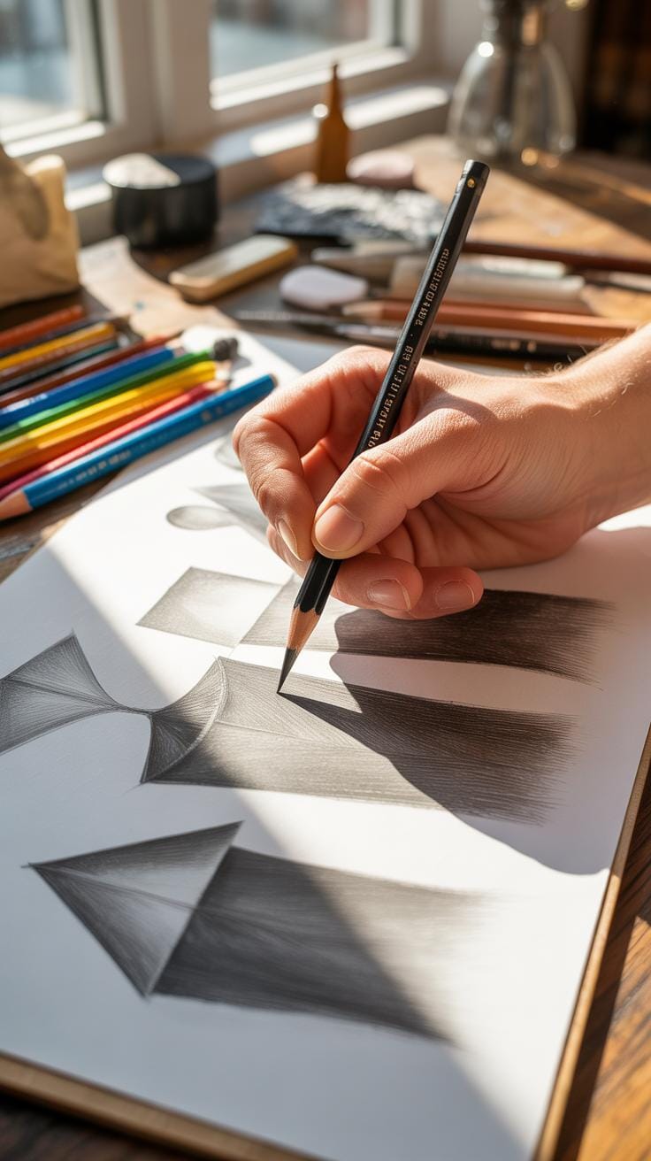
Shading Techniques For Digital Artists


When shading in digital art, the style you pick changes everything. Hatching is a classic method where you use parallel lines to create shading—like those pencil sketches you’ve seen. It’s not just lines but the thickness, spacing, and direction that build volume and depth. You might want to layer these lines at different angles; that’s called cross-hatching, and it packs on the shadow more intensely.
Soft shading, on the other hand, feels much gentler. It mimics smooth transitions between light and dark, often achieved with a brush that fades edges softly. This approach can give your work a more natural, painterly touch.
Gradient blending makes shadows flow seamlessly along surfaces. It’s like pushing colors gently from dark to light without hard stops. This technique works wonders for round or curved objects.
Hard Edge Vs Soft Shadows
Choosing between hard and soft shadow edges depends a lot on the light source and the material. Hard shadows happen when the light is strong and direct—think noon sunlight casting sharp shadows. Soft shadows come from diffused light, like on a cloudy day or from reflections.
Use hard edges for dramatic effects or when the object’s surface is crisp and defined. Soft shadows suit gentle scenes or surfaces that scatter light, like skin or cloth. Sometimes mixing both works best, but it’s tricky—you might end with confusing light sources.
Layer Blending Modes
Blending modes in your digital workspace play a big role in shading. Multiply mode darkens colors by multiplying the base shade with the applied one—great for building up shadows without losing color depth.
Overlay mode is more playful—it combines both Multiply and Screen modes, making shadows richer and highlights subtle. It’s like striking a balance between darkness and light bloom, adding more life to your shadows.
Experiment with these blending modes on separate layers, so you can tweak shading without messing your base colors. You might find some less obvious modes useful too—like Soft Light or Color Burn—but multiply and overlay tend to be go-tos for beginners and pros alike.
Common Mistakes To Avoid In Shading
Shading can be tricky, especially when you’re just starting out. You might find yourself wondering why your shadows look off or why your drawing feels flat despite all your efforts. Let’s talk about some common pitfalls that often trip up beginners and how you might sidestep them.
Ignoring Light Direction
One frequent mistake is, well, not paying enough attention to where your light source is. Shadows that don’t follow a consistent direction confuse the eye. It’s like your drawing can’t decide where the sun is, which makes everything look less believable.
Think of it this way: if light comes from the top right, shadows should fall on the opposite side, usually bottom left. If you let shadows wander in different directions, the image loses depth—your forms seem disconnected. So, always decide on a clear light direction first, and stick with it throughout your composition.
Overusing Dark Shadows
Then there’s the tendency to slam on really dark, almost black shadows everywhere. It might be tempting to push contrast to its limits, but this can backfire by flattening your image rather than giving it volume.
Too much darkness crushes subtlety and detail. Shadows aren’t just vague black blobs; they have gradations and variations influenced by the object’s shape and the light’s nature. Try instead to build your shadows gradually with softer edges and varying tones. This approach keeps your artwork lively and three-dimensional instead of dull and squashed.
So next time you shade, keep light direction clear and don’t fall into the trap of excessive darkness. Your art will breathe more naturally that way, even if it takes a bit more patience.
Tips To Improve Shadow Realism

Getting shadows to look real can be a bit tricky, but a few practical tips can really help you bring digital art to life. One thing I’ve found useful is to carefully observe how shadows behave in the real world. Shadows are not just black or gray shapes; they carry subtle information about light direction, softness, and even texture.
When studying shadows, try to notice how different surfaces affect them. For example, shadows on rough surfaces often look softer or more broken up, while shadows on smooth, reflective surfaces can be sharper and clearer. It’s interesting how the environment and multiple light sources can create layers of shadows that interact and overlap, making the final look more complex than a simple dark patch.
Another tip is to use color within your shadows. Instead of sticking to pure black or dark gray, mix in subtle hues that relate to your light source or environment. Shadows aren’t really just “black holes” — they’re influenced by surrounding colors and reflected light. For instance, shadows under sunlight might have a slight cool blue tint, whereas shadows indoors might pick up warm shades from nearby objects or artificial light. Experimenting with slight color shifts can make your shadows pop with a more natural appearance.
Have you ever tried just adding a touch of color to your shadows and then felt it changed the whole mood of your image? It’s these little adjustments that help push shadow realism from flat and artificial to something that really breathes with your artwork.
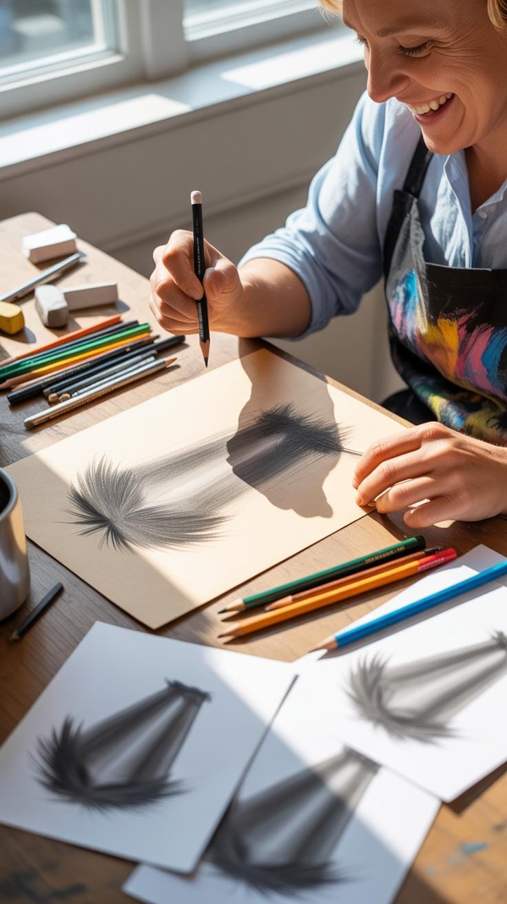
Example Shadow Drawing Projects For Practice

Practicing shadow drawing doesn’t have to be complicated. You might want to start with something very simple—basic shapes like spheres, cubes, or cylinders. These help you focus on how light falls on an object and where the darkest shadows appear.
When shading a sphere, for example, observe the light source carefully. Notice the gradual shift from light to shadow. Practice creating smooth transitions to capture this effect digitally. With cubes, you get clearer areas of light and shadow which can help you understand how edges influence shading.
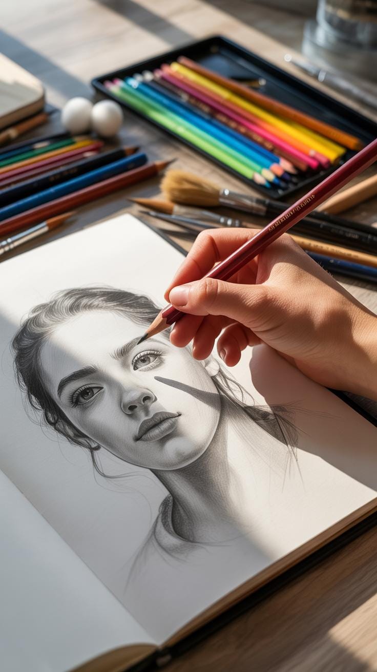
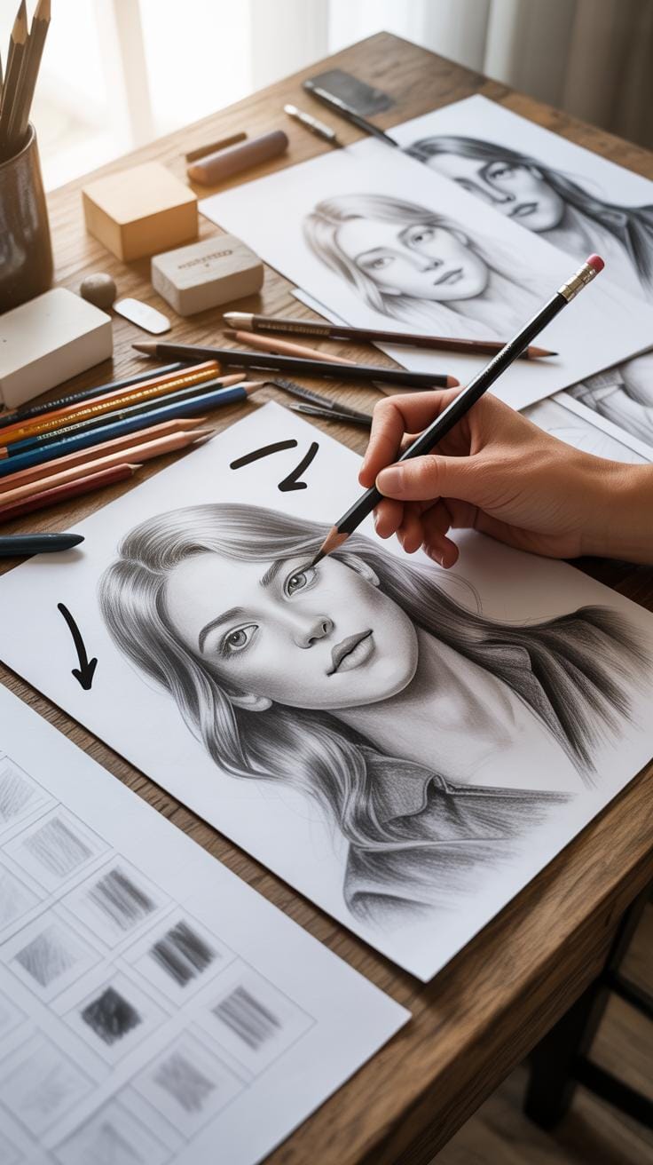
Another step up is working on a shadowed portrait. Here, you pay attention to how light direction affects the face. Shadows aren’t just dark spots; they shape the features, adding depth.
This project encourages you to think about where shadows land—under the nose, around the eyes, and beneath the chin. It also forces you to consider soft versus sharp shadows, depending on the light’s distance and quality.
Taking these projects step by step, you can build confidence in your shading skills. What kind of light source will you choose for your portrait? How harsh or soft will those shadows be? Experimenting with choices like these will make the process more intriguing and informative.
How To Use Shading Layers Efficiently
When shading in digital art, organizing your work through layers can make a significant difference. Trust me, working on a single layer for everything can turn editing shadows into a frustrating task. Using separate layers for different shadow areas lets you tweak each shadow without messing up other parts of your drawing. Plus, it opens up creative ways to add effects selectively.
One trick that helps keep things clear is giving each layer a clear, descriptive name. Something simple like “Shadow – Face” or “Shadow – Clothing” really saves time when you come back after a break or have tons of layers open. Group related layers into folders—this way, you can collapse entire sections when they’re not needed, and it avoids confusion.
Masking shadows with layer masks is a game changer. Instead of erasing or redrawing shadows, layer masks let you control exactly where shadows appear by painting on the mask with black, white, or grey. This means you can adjust shadows smoothly and even change their shapes without permanent edits. Having the flexibility to fine-tune shadows with masks has saved me many times from redoing large parts of a drawing.
- Separate shadows on distinct layers to keep edits simple.
- Name layers logically to find them faster.
- Group similar layers for better workflow management.
- Use layer masks to paint shadows precisely, controlling visibility without damage.
Have you ever tried changing a shadow only to accidentally erase part of your base color? Layer masks prevent those headaches. I think, once you start using this system, it becomes tough to go back to lumping everything on one layer.
Comparing Shading Styles For Different Effects

When you start exploring shading techniques in digital art, you quickly notice variations that drastically change the mood and feel of your piece. Cartoon shading and realistic shading are two ends of a broad spectrum, and knowing when to use which can be a bit tricky.
Cartoon shading often employs flat areas of color to define shadows with sharp edges. It simplifies the forms and focuses on strong contrast, making the artwork pop and feel lively. It’s not about light accuracy but about clarity and visual punch; consider classic comic books or animated characters. This style helps to emphasize shapes and makes characters more readable, especially at smaller sizes.
On the flip side, realistic shading aims to replicate how light behaves in the real world. It often uses gradient blends that smoothly transition from light to shadow, capturing subtle changes in tone and softness of shadows. This is where you pay attention to light sources, reflections, and surface textures. It takes more time but adds depth and a three-dimensional feel.
Another comparison is stylized versus natural shading. Stylized shading reduces complexity by flattening shapes or exaggerating shadow placement, often used for artistic expression or design consistency. Natural shading, instead, is more scientific — you’re trying to mimic real-world lighting scenarios, accounting for variations like ambient light and shadow softness. Both approaches serve different purposes, so the choice depends on your intended effect.
Flat shading, common in cartoons, uses solid color blocks without blending. It’s quick, bold, and graphic. Meanwhile, gradient shading involves soft transitions that simulate depth and volume. This technique can make subjects appear more rounded and realistic but may lack the boldness of flat shading.
Deciding between these approaches isn’t straightforward. Sometimes combining flat and gradient shading can create interesting contrasts or focal points. What’s your style? Perhaps try both in your practice sketches and see which feels right for your art.
Conclusions
Applying shadows and shading in digital art enhances the realism and depth of your creations. The key is to practice techniques consistently and understand how light interacts with objects. Basic tools and methods can produce impressive effects once you master them.
With this tutorial, you now have a framework to guide your shading practice. Keep experimenting with light, shadow, and blending. Over time, your digital drawings will gain more life and dimensionality. Remember, every artist improves with patience and regular effort.