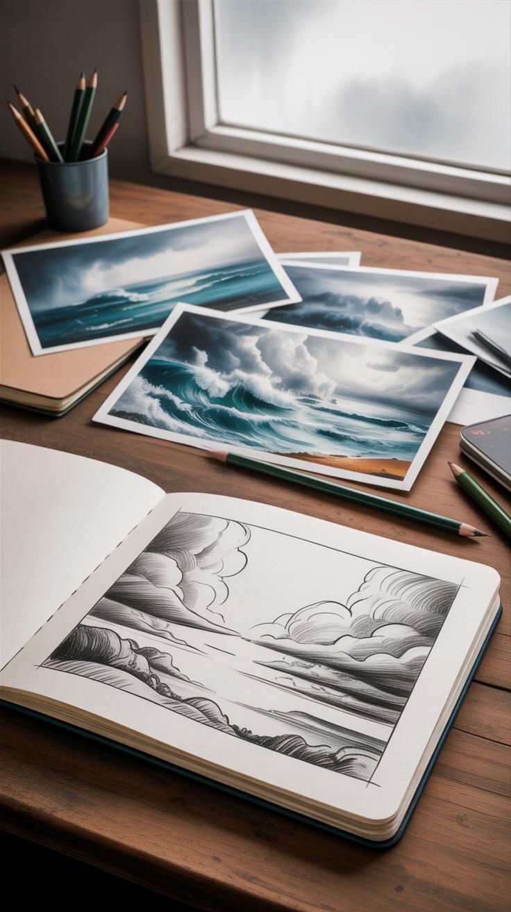
Introduction
Drawing a sea storm can be a thrilling challenge for artists. The movement of water, the shaking air, and the wild energy require skill and the right tools to capture. In this article, we explore how energetic marker strokes combined with detailed pencil work bring the scene of a sea storm to life. You will learn to use these two mediums to show the chaos and beauty of a storm at sea.
We will look at ways to use markers for strong, bold shapes and pencils for delicate textures. As you read through the chapters, you will find step-by-step guidance and tips to help you draw a sea storm that feels alive. Whether you are a beginner or want to improve, this article will guide your artistic journey into capturing nature’s wildest moments.
Understanding Sea Storms And Their Visual Traits
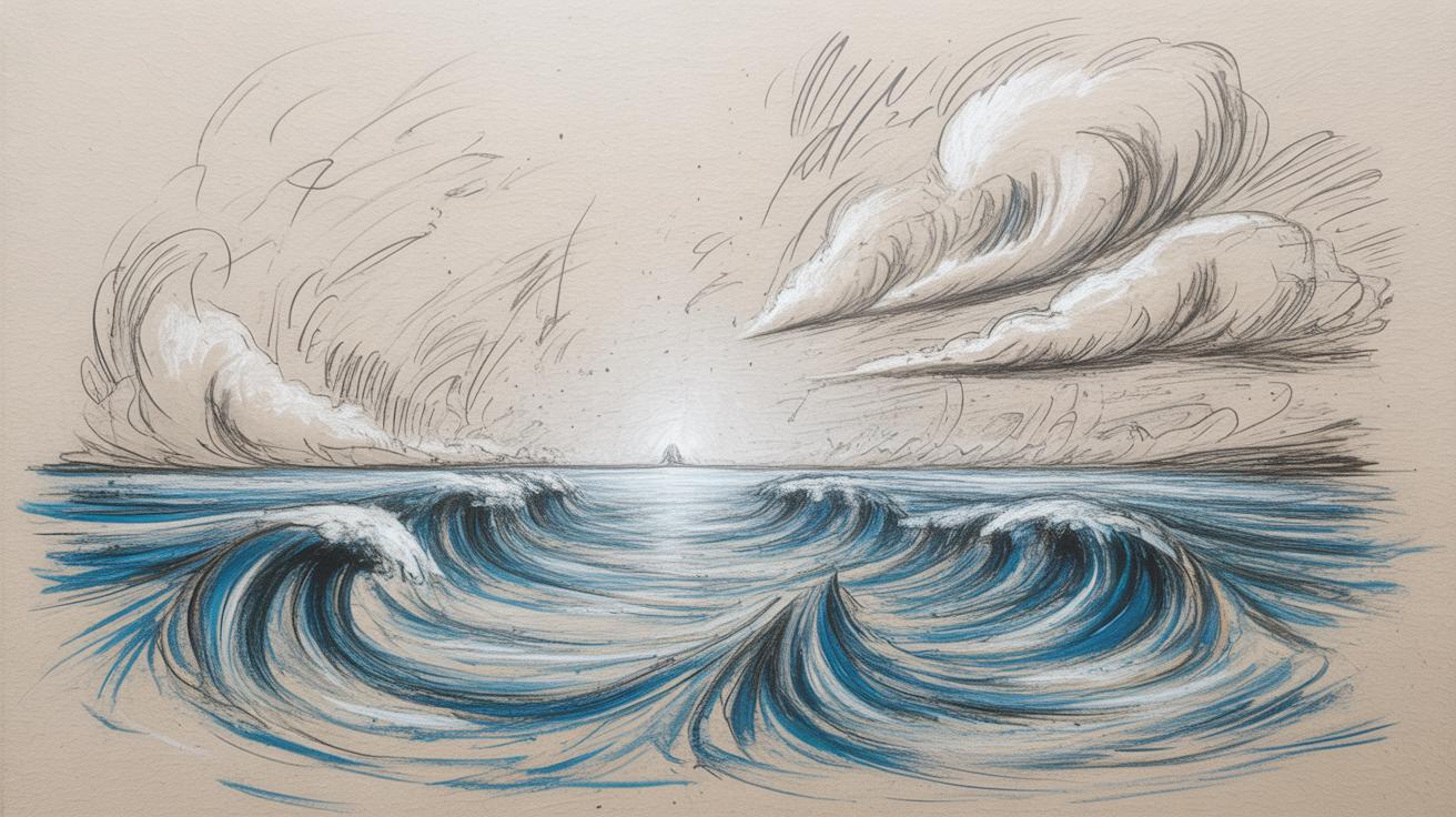
A sea storm is, simply put, a violent weather event occurring over the ocean, marked by strong winds and turbulent water. When you think about it, these storms aren’t just about chaos; they create distinctive looks that artists can really play with. The waves tend to grow tall and jagged, sometimes curling in unpredictable shapes that suggest force, yet show fluidity. The clouds are usually heavy and low, layered in thick masses that swirl or pile up with a kind of restless energy. You might catch glimpses of flashes or breaks in the sky, hinting at lightning far off.
The mood of a sea storm is complex — it’s scary, awe-inspiring, maybe even a bit lonely. Capturing this mood means balancing the raw power of nature with a kind of raw beauty. You want viewers to feel the wind biting their skin or the spray stinging their face, even if they’re standing miles away from the scene. As an artist, focusing on these visual clues—the wild waves, the ominous clouds, and the darkened sky—helps create a believable storm atmosphere without saying a word.
Key Elements Of A Sea Storm
When you set out to draw or paint a sea storm, some details really pull the piece together. Those elements make the scene unmistakable. Here’s what you’ll want to include:
- Rough Waves: Sharp crests, crashing sprays, waves grinding against each other—energy frozen in motion.
- Wind-Blown Spray: Fine mist kicked up by wind, barely visible but adding depth and motion.
- Dark Skies: Heavy clouds packed tightly together, often with varying shades of gray to almost black.
- Lightning: Sudden streaks of light, breaking up the gloom and adding drama.
Sometimes the storm even carries debris or foam tossed wildly, which can show the actual force of nature rather than just an impression. Don’t forget the horizon line—sometimes blurred or tilted—this adds imbalance that hints at the storm’s overpowering presence.
Why Capturing Motion Matters
Movement is what brings a sea storm scene alive. Without motion, the storm just feels static, like a photograph instead of a living event. Think about how the spray arcs off a wave or how clouds race across the sky. If your drawing or painting can suggest this restless energy, it pulls the viewer inside the moment.
For example, sketchy, quick strokes can mimic the gusty winds, while varied pressure with a pencil might capture the foamy froth of waves breaking. Sometimes letting lines blur or overlap just a bit—the way waves blend into one another—creates a sense of continuous flow.
Personally, I’ve found that when an artwork nails that feeling of movement, it becomes more than just a picture. It feels like a living force, unpredictably shifting, and you can almost hear the roar of the sea and wind. Wouldn’t you want your viewer to sense that too?
Selecting The Right Markers For Sea Storm Art
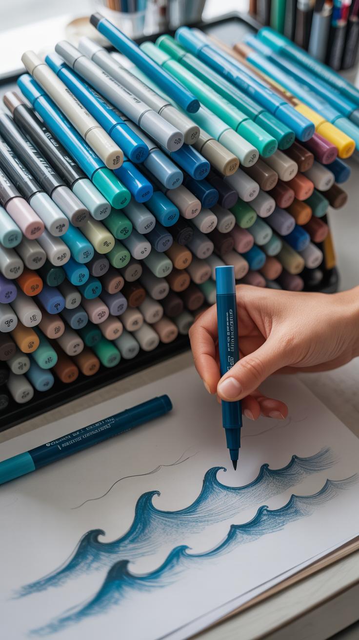
Marker Types And Effects
When picking markers for a sea storm drawing, the kind you choose influences the whole feel of your piece. Alcohol-based markers tend to blend more smoothly, giving soft gradients that work well for skies or misty waves. Their quick-drying nature means you can layer colors without waiting—useful when trying to capture fast-moving clouds or rolling spray.
Water-based markers, on the other hand, feel more unpredictable. They can bleed or feather, especially on textured paper, which sometimes adds a raw, rough edge to the storm’s chaos. That might be exactly what you need for splashing foam or turbulent sea surfaces—but they can also be harder to control in tight areas.
So, if you’re after cleaner lines and controlled blending, alcohol-based markers might be your go-to. But if you want texture and spontaneity, don’t dismiss water-based options. Sometimes mixing both can create effects that neither can alone.
Choosing Colors To Convey Atmosphere
The color palette you select can make or break the mood of your storm scene. Storms rarely shout with bright colors; they whisper with muted tones and sudden flashes. Opt for grays that lean cool, pale blues that seem heavy with rain, and deep charcoals pushing the darkness of clouds.
White highlights can feel stark and frozen—think spray catching the light or lightning slicing through the gloom. Sharp contrasts like these bring a punch to your work, but using too many risks flattening the subtlety of the storm’s depth.
Don’t be shy about experimenting with different blues—sometimes a slightly greenish blue can hint at turbulent water. Or a faint purple might suggest heavy skies just before the worst hits. You’re not just coloring; you’re shaping atmosphere with each marker stroke. Which colors make you feel close to the storm’s pulse? Try to follow that instinct.
Mastering Bold Strokes To Show Storm Energy
When capturing the raw force of a sea storm, your marker strokes need to hit hard—strong, decisive, and packed with intent. Think of the waves and wind as relentless, pushing everything forward. Your lines should reflect that urgency. That said, don’t feel like each stroke must be perfectly clean; rough edges add character and tension, hinting at turmoil just beneath the surface.
For instance, I often start by pressing firmly to lay down thick, heavy marks that suggest the mass of a crashing wave. Then, with a quick flick, I pull out thinner, sharper lines to suggest breaking water or wind tearing through the air. This mix keeps the energy from settling into something too static. If you hold back, the scene might feel calm rather than wild—so push your hand a bit beyond your usual comfort zone.
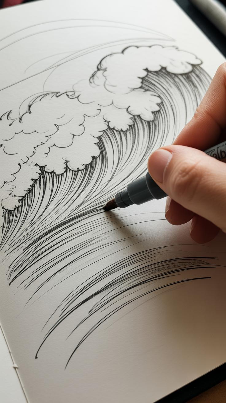
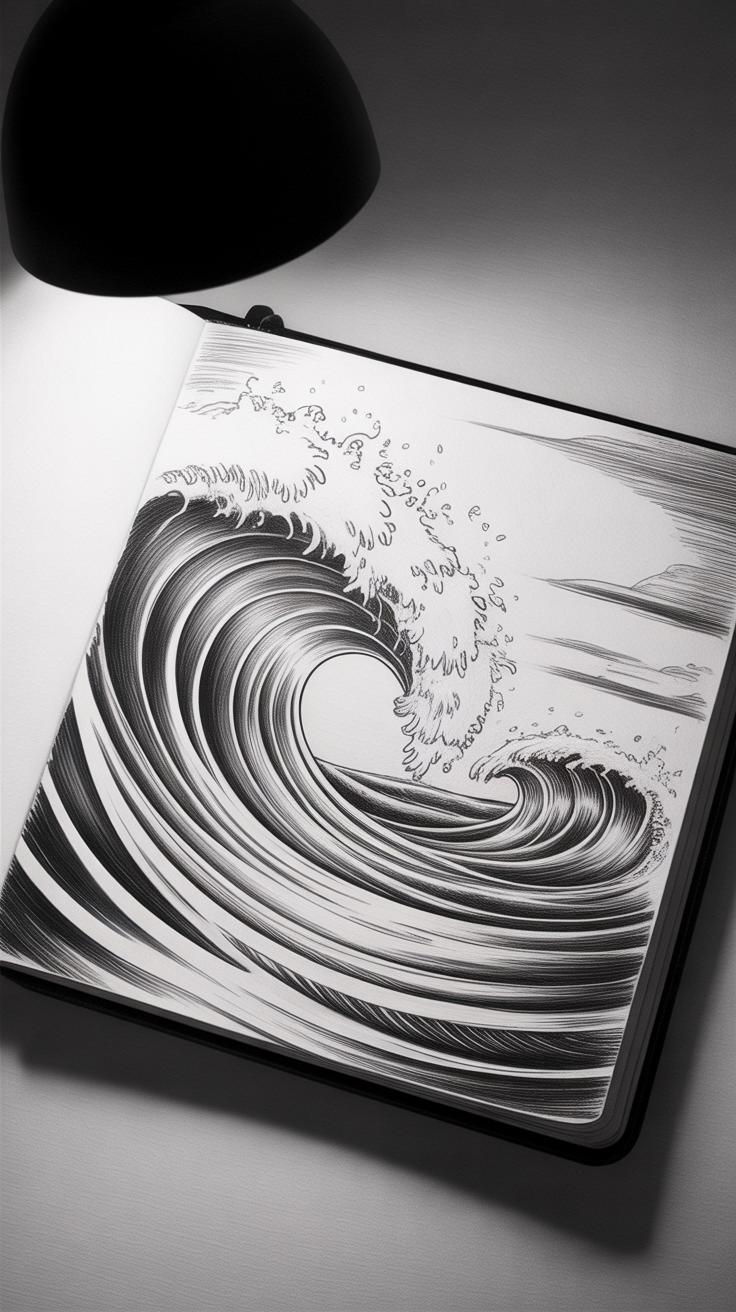
Creating Wave Movement With Line Work

Waves aren’t just lumps of water—they move, curl, and fold back on themselves. Capturing that takes confident, fluid lines. I find it helps to practice short, sweeping strokes that curve lightly but are pulled swiftly. Imagine the edge of a wave lifting foam off the surface. A few quick, irregular lines can suggest foam breaking up with a lively, restless rhythm.
Try layering strokes: light, thin lines overlay heavier ones to create depth. You can even experiment with slight overlaps between strokes, so the sea feels less like a flat shape and more like something rushing toward you. Don’t fret if the foam shapes aren’t perfectly symmetrical or neat. This imperfection brings life to the water.
Expressing Wind And Spray With Marker Marks
Wind in a storm isn’t smooth—it’s brutal, erratic. To translate that with markers, use sharp, irregular marks. I often tap my marker tip lightly or make quick zigzag lines, scattering them across the paper to mimic spray stirred up by gusts. Other times, quick flicks to the side work well, breaking the line tension and hinting at gusts whipping the scene apart.
One thing I sometimes overlook but you might find useful: varying the pressure slightly within these marks. When you push a bit harder in some spots and lift off suddenly in others, it creates a sense of randomness—precisely what wind spray looks like. The key? Keep those strokes spontaneous, almost like you’re letting the storm dictate your hand.
Introduction To Pencil Techniques For Texture

When working on a sea storm, markers give you bold, expressive strokes that capture the raw energy of waves and wind. But pencils can bring in something a bit different—texture. They allow you to create surfaces that feel tactile, making parts of the storm feel almost tangible.
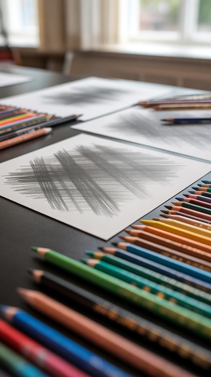
Not all pencils are the same. You’ll find that softer pencils, like 6B or 8B, create dark, rich marks that are perfect for developing shadowy, turbulent cloud masses. Harder pencils, like H or 2H, offer lighter, more controlled lines, useful for finer textures and subtle highlights. This variety lets you build layers—each offering a new dimension of detail.
Pencils don’t just sit on top of marker work; they interact with it. The soft graphite can soften the sometimes flat areas left by markers and introduce a grain that makes the storm’s textures convincing—the roughness of churning water or the gritty spray caught mid-air. You might think markers alone are enough, but pencils bring a delicate balance and contrast that’s hard to achieve otherwise.
Choosing Pencils For Different Textures
Not every pencil serves every part of the storm equally. Clouds, for example, benefit from softer pencils—4B to 8B—because they blend easily and provide the density needed to suggest heavy moisture and turbulence. For those billowing masses, you’ll probably want to push graphite around, smudge a little, and let the darkness build gradually.
Rough water? That’s a different beast. Mid-grade pencils, maybe 2B to 4B, can achieve the gritty, choppy sense of wave crests and foam. With this range, you can play with rough cross-hatching or quick, scratchy lines that markers can’t replicate as easily.

For fine details—the kind that bring a sea storm to life, like sharp spray or distant lightning flashes—firmer pencils such as HB to 2H work best. They keep your lines clean and avoid smudging, helping you add delicate highlights or subtle textures on top of bold marker strokes.
Combining Pencil And Marker
Markers give your storm energy and boldness, but pencils add something like shape and depth. Layering pencil over marker offers subtle mineral textures that break up solid color areas and create volume. When you draw pencil over wet or dry marker ink, it can refresh a flat section, adding interest without heavy reworking.
Here’s the thing—pencils also allow for more controlled variation in tone. Where a marker might saturate too evenly, a well-placed pencil line or shading can suggest wind direction across clouds or wave surfaces. You might find yourself going back again and again, layering graphite until parts of the scene feel alive and tactile, almost vibrating with storm motion.
So, pairing marker and pencil isn’t just a fallback—it’s a way to marry power with nuance. You get the boldness of hard edges and the subtlety of delicate texture in one compelling composition. I’ve noticed that when I use both thoughtfully, the storm stops looking like an illustration and starts feeling like a real moment caught on paper.
Shading And Blending Techniques With Pencil
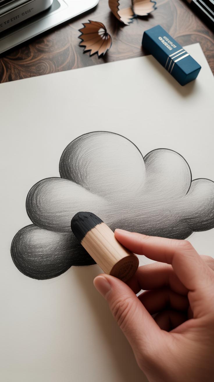
Shading with pencil lets you build depth in both the sky and water, giving shape to the storm’s mood. When creating storm clouds, start with light, even strokes, pressing softly. This gradual buildup—layer on layer—helps to echo the subtle curves and volume in the clouds. It’s tempting to rush here, but slow, careful shading brings out that three-dimensional feel.
Blending is your next step. Use a blending stump or even a fingertip to soften transitions between darkest and lightest areas, but avoid overdoing it. You want to keep a bit of texture, as it mimics the natural roughness of a stormy sky. Smooth transitions suggest rolling, heavy clouds without making them look flat.
For the water, pencils can capture the rough surface by varying stroke direction and pressure. Quick, sharp lines create the choppy, restless motion of waves. Mixing these with small, circular motions can replicate swirling foam or agitation. Experiment to see how different strokes affect the water’s texture—you might be surprised how just a slight change alters the scene’s feeling.
How much detail you include depends on your intent. Sometimes, less is more. Perhaps focusing on a few well-placed shadows and highlights is better than trying to capture every single wave or puff of cloud. What works best for your style? Try different approaches, then decide what captures your idea of a sea storm most effectively.
Building Contrast To Highlight Drama
When capturing a sea storm, contrast between dark and light isn’t just a technique—it’s essential to show its energy and tension. Think about the shapes created by crashing waves and roiling clouds. Without contrast, the scene can feel flat, lacking urgency or drama. But with careful balance, certain areas leap forward, grabbing your attention.
Using Dark Tones To Show Depth
Start with deep, layered strokes using dark pencils or intense marker colors to anchor your shadows. The hollows of waves, the underbellies of clouds, and the churned sea below all benefit from rich, nearly black shades. Don’t be afraid to press harder in some spots or build up multiple layers. You might find repeating these darks in pockets across the drawing helps create a rhythm, a sense of chaos in the storm’s depths. I often find that these shadows can feel a bit unpredictable—sometimes too heavy—and it helps to pause and step back often.
Adding Highlights For Energy
Bright highlights punch through the darkness, adding movement and life. Use white or very pale markers to trace the crests of waves or rim the edges of clouds. Erasing small patches with a sharp pencil eraser can also produce subtle glimmers, like spray or rain catching sparse light. These spots pull the eye exactly where you want and create a flicker of energy, breaking up the intensity of the dark areas. It can feel like a delicate dance—too much light dampens the drama, but too little leaves the scene dull. Watching how these highlights catch your eye while you work may reveal surprises about where the energy really lives in your drawing.
Creating A Composition That Tells A Story
When you set out to draw a sea storm, composition isn’t just a technical step—it’s where the story really begins. The way you arrange waves, boats, and sky decides what the viewer notices first, and how their eye moves through the scene. Sometimes, a slightly awkward placement can add tension, rather than perfect balance, pulling you deeper into the turmoil of the storm.
Think about how you want the viewer to feel. Is the boat struggling against towering waves? Or barely visible, swallowed by the vast sea? Positioning these elements closer together can create a claustrophobic sense of danger, while spacing can suggest isolation. Guiding the eye through sharp contrasts or diagonal lines brings motion to the scene, making it restless and alive.
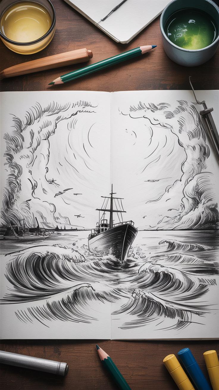
Arranging Waves And Boat Elements
Place the largest waves so they form a rough triangle or diagonal. This avoids a static or too symmetrical layout, which wouldn’t fit a chaotic sea. The boat might tilt on one wave’s crest, off-center, battling forces that seem too big to handle. Avoid putting the boat directly in the middle—too calm, too predictable. Instead, experiment with off-balance positions to create energy.
Also, layering wave shapes—some crashing close, others fading—helps suggest depth. The boat interacts with these layers, sometimes hidden behind a swell, sometimes pushing through spray. This overlap controls focus, making your drawing less flat, more immersive.
Incorporating Sky And Horizon Lines
The horizon anchors the whole scene, but don’t just place it right in the middle. A low horizon makes the stormy sky dominate, emphasizing looming clouds and the wind’s power. A higher horizon lets the sea’s chaos take over, amplifying the danger below. Cloud placement can frame the boat or direct attention toward waves, using darker patches or breaks in the clouds as visual guides.
Clouds might crowd one side, suggesting the storm’s direction, or disperse unevenly to add uncertainty—because storms rarely look neat. Sometimes, the horizon line itself isn’t perfectly straight, maybe wavering subtly to enhance the unsettled feeling. These small choices build mood and bring your drawing closer to what you want to convey about the sea storm’s rawness.
Step By Step Drawing Of A Sea Storm Scene
Sketching The Basic Shapes
Start by lightly sketching the overall forms with a pencil. Focus on the main wave shapes first — think about the big curling masses of water and how they interact. Don’t worry about details yet; just capture the movement and scale. Imagine the waves crashing with force, their crests sharp or foamy, guiding the viewer’s eye across the page.
Next, add the clouds. Make them heavy and rolling, but avoid making them too uniform. Some areas might be darker and denser, others lighter or broken. The shapes don’t have to be perfect; in fact, unevenness adds to the chaotic feeling of a storm.
At this stage, block out any prominent objects, like a distant ship or rocks. Keep these shapes simple but sized correctly to balance the composition. This rough outline sets the foundation.
Layering Marker And Pencil For Details
Once satisfied with the sketch, start applying broad marker strokes over the large areas—wave shadows, sky masses, and dark water zones. Use markers to establish the value contrast early on, giving your drawing weight and depth. Don’t try to fill in everything perfectly; leave room for pencils to add texture.
After the marker layers dry, go back with your pencils to draw in the details. Use varied pressure on the pencil to indicate foam, spray, and water reflections. Layer finer lines over the marker base, teasing out turbulence and motion.
Work in passes: marker first for broad tonal changes, pencils next for subtle gradations and energy in the forms. This layering brings the scene to life, capturing both the force and the fragile texture of the storm. You might find yourself erasing some pencil lines or adding fresh marker touches to tweak values as you refine.
Does the movement feel right? If not quite, sketch lightly over areas that need more tension or softness. This gradual build-up lets you control the storm’s drama without losing spontaneity.
Common Mistakes And How To Avoid Them

Overworking The Drawing
It’s tempting to keep adding detail to a sea storm drawing, especially with markers and pencils where layering seems straightforward. But piling on too many lines or layers can quickly obscure the energy you worked hard to capture. Instead of enhancing the motion, the drawing ends up looking muddled or stiff. I’ve noticed this happens a lot when artists try to fix “mistakes” by adding more marks — the clarity just disappears.
Try stepping back regularly and asking: does this layer improve the sense of chaos or calm? Sometimes less is more. Use bold, deliberate strokes rather than countless small ones. Work in stages, letting some areas breathe without excess texture. If you feel stuck, take a break. When you return, you’ll often spot where the drawing needs space rather than clutter.
Ignoring Lighting And Contrast
Neglecting lighting and contrast is a subtle but serious pitfall when capturing sea storms. Flatness creeps in when your drawing doesn’t separate the darkest darks from the lightest lights. Without this push and pull, the storm lacks depth and drama, and everything feels lifeless. You might find yourself using similar pressures or tones across the page, which can flatten even an otherwise dynamic scene.
Pay attention to where the light hits the waves and clouds, and where shadows fall. Emphasize these differences using pencil pressure or marker opacity. Sometimes, a single dark area next to a bright spot can make the whole scene come alive. Ask yourself if the storm feels heavy or light, and adjust how much contrast you use accordingly. Without it, no matter how many lines you draw, the storm won’t strike you as real or urgent.
Tips For Practicing And Improving Your Sea Storm Drawings
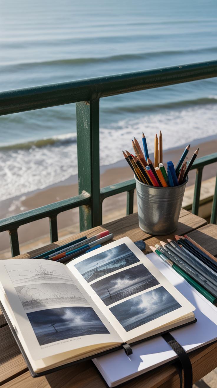
Watching sea storms in person can be tricky, but it’s one of the best ways to get a feel for their unpredictable movement. If you live near the coast, find a safe spot—like a sturdy lookout or a distance where the wind and waves are visible but you aren’t at risk. Notice how the clouds twist and the waves build before breaking. Jot down quick sketches or take photos. Even videos help capture the motion you might miss in still moments.
Once you’re back in your studio, try switching between different pencils and markers. Maybe a soft graphite pencil for shadows, paired with a bold marker for sharp edges—or even using colored pencils over markers to add subtle texture. Don’t hesitate to mix styles. Some experiments won’t work, and that’s okay. It’s part of finding your visual language. You might surprise yourself with a technique you hadn’t thought would fit a storm scene.
Also, challenge yourself to draw storms under different conditions—early evening light, low clouds, distant lightning. Each variation teaches you more about the mood and movement. Ask yourself: what shapes feel true to the chaos of a storm? What happens when you push your lines or soften your strokes? Practicing over time, in this focused yet flexible way, sharpens your ability to capture the raw energy of the sea.
Conclusions
Artistic depiction of a sea storm involves balancing boldness and detail. Markers provide strong lines and broad strokes to create the energy and motion seen in a storm, while pencils allow for soft shading and texture that brings out the depth and nuances of the scene. Combining these tools helps you create a powerful image that feels real and vibrant.
Your art will get better as you practice observing nature and experimenting with marker and pencil techniques. Keep exploring different ways to layer and blend your tools. Capture the sea’s dynamism and let your creativity show through. With patience and imagination, your sea storm artwork will grow more compelling and engaging.


