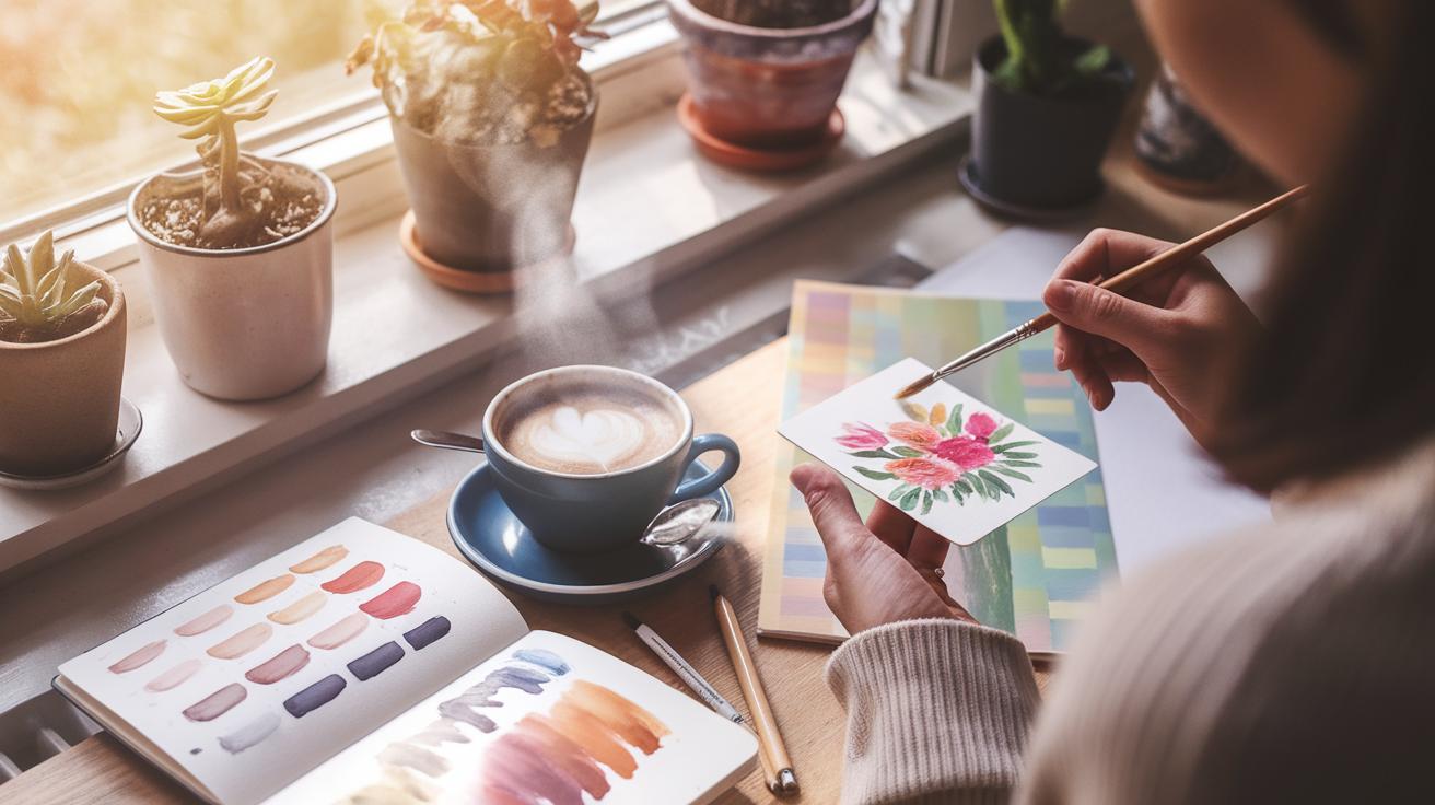
Introduction
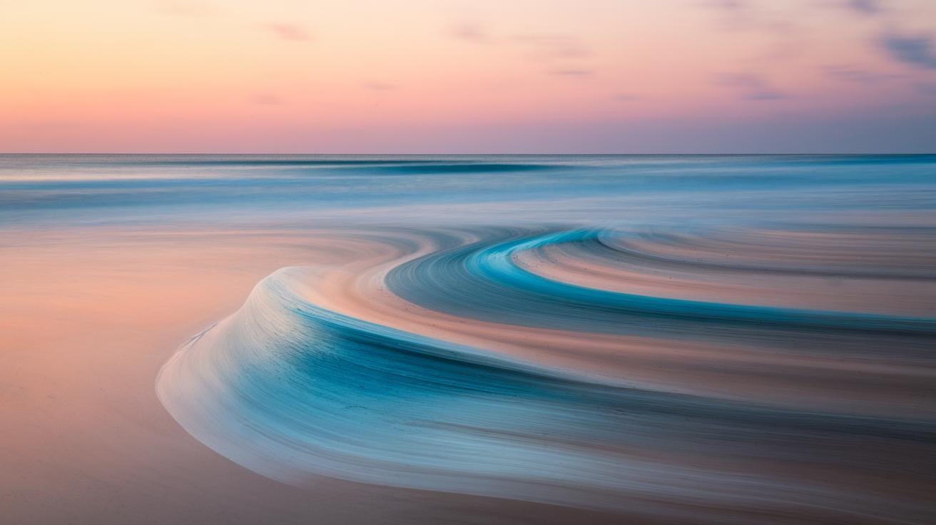
Gouache is a unique painting medium offering a blend of watercolor’s transparency with the opacity of acrylics or oils. This combination makes gouache ideal for artists focusing on detailed yet fluid paintings, such as those depicting the sea. Creating realistic sea paintings requires not only technical skills but also an understanding of the medium’s properties. In this article, you will learn how gouache can be used to produce vivid, dynamic waves with a dreamy effect that captures the ocean’s motion and light plays.
Sea painting often challenges artists due to the complexity of water movement and light reflection. Gouache provides versatility in layering and texturing, allowing you to experiment with techniques that produce both soft gradients and sharp details. We will guide you through practical steps and techniques for using gouache to paint waves and sea scenes that breathe life into your artwork. Whether you’re a beginner or an experienced painter, these insights will improve your ability to depict fluid waves.
Understanding Gouache and Its Benefits for Sea Painting
What is Gouache and How Does It Work
Gouache is a water-based paint made up of pigment, a binder, and fillers. The pigment provides color, while the binder, usually gum arabic, holds the pigment particles together and attaches them to the surface. Fillers like chalk or clay create a matte finish and add opacity.
This mix makes gouache thicker and more opaque than watercolor. When you apply it to paper or canvas, the paint covers well, hiding underlying layers. Because of the fillers, gouache dries to a smooth, velvety texture. You can add water to change its consistency, making it easy to adjust the paint’s flow and texture while working.
Understanding the role of each ingredient helps you control how the paint behaves. For example, more pigment means richer colors, while more filler increases opacity but reduces vibrancy. Knowing this balance lets you adapt your strokes and layers to capture the sea’s movement.
Advantages of Gouache for Painting Fluid Waves
Opacity helps you paint the deep, foamy parts of waves without needing thick paint layers. You can build waves by layering lighter colors over darker ones, recreating the way light hits water. This layering works easily because gouache dries quickly, so you don’t wait long between strokes.
Another strong point is the ability to rework your painting. If your wave’s shape or flow looks off, you can add water to lift some paint or repaint sections without ruining the whole piece. This freedom supports trial and error, useful when capturing waves’ unpredictable motion.
Texture is also easy to control. Using different brushes or mixing in less water creates variations that mimic water’s surface — from glassy calm to rough foam. These qualities let you paint realistic waves with control and flexibility, making gouache ideal for sea scenes.
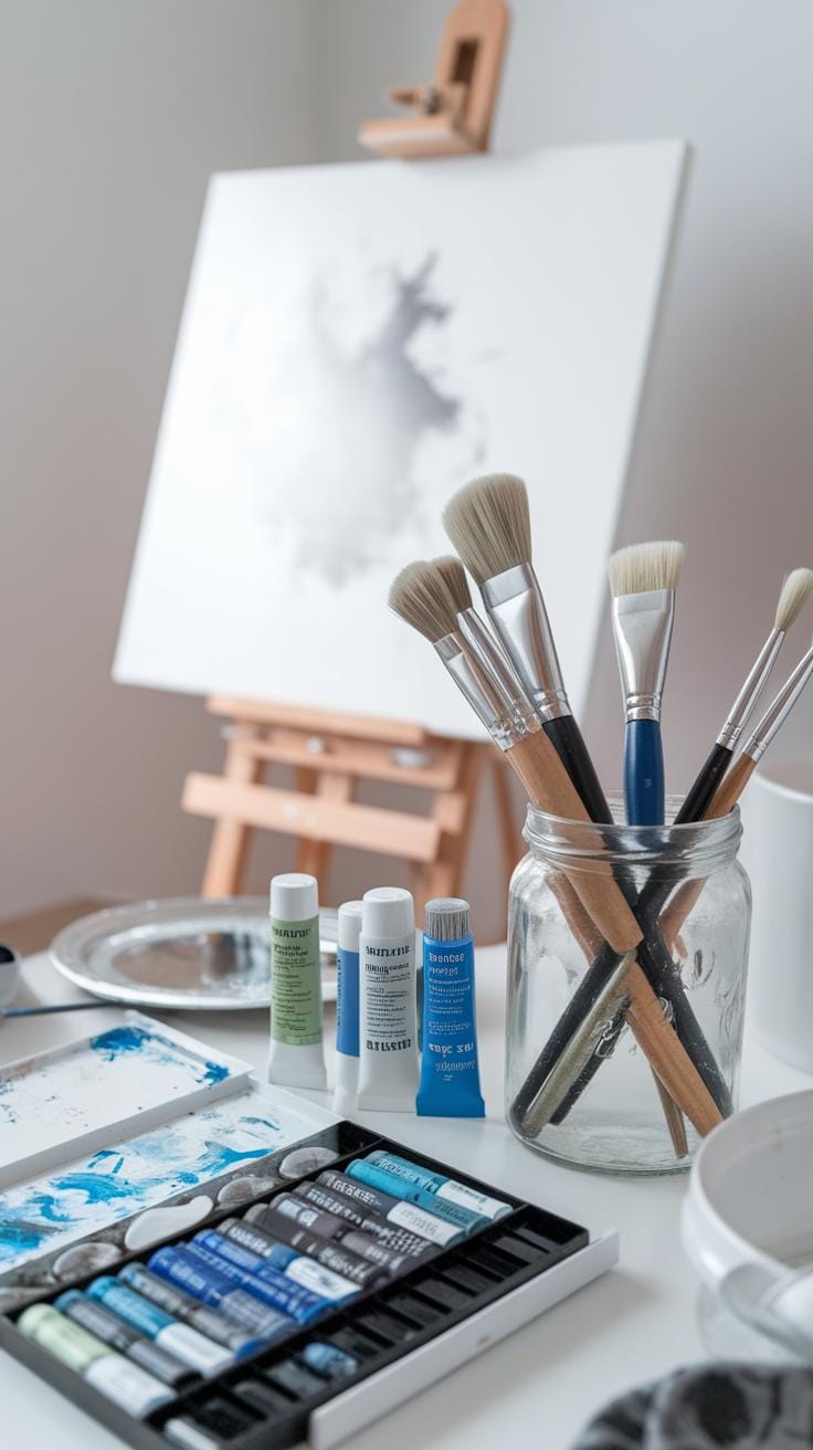
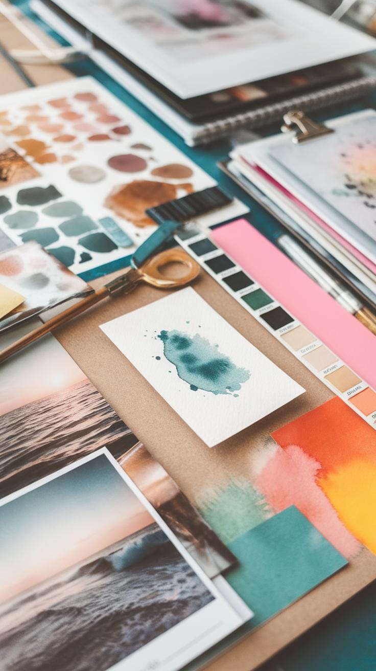
Preparing Your Materials for Gouache Sea Painting
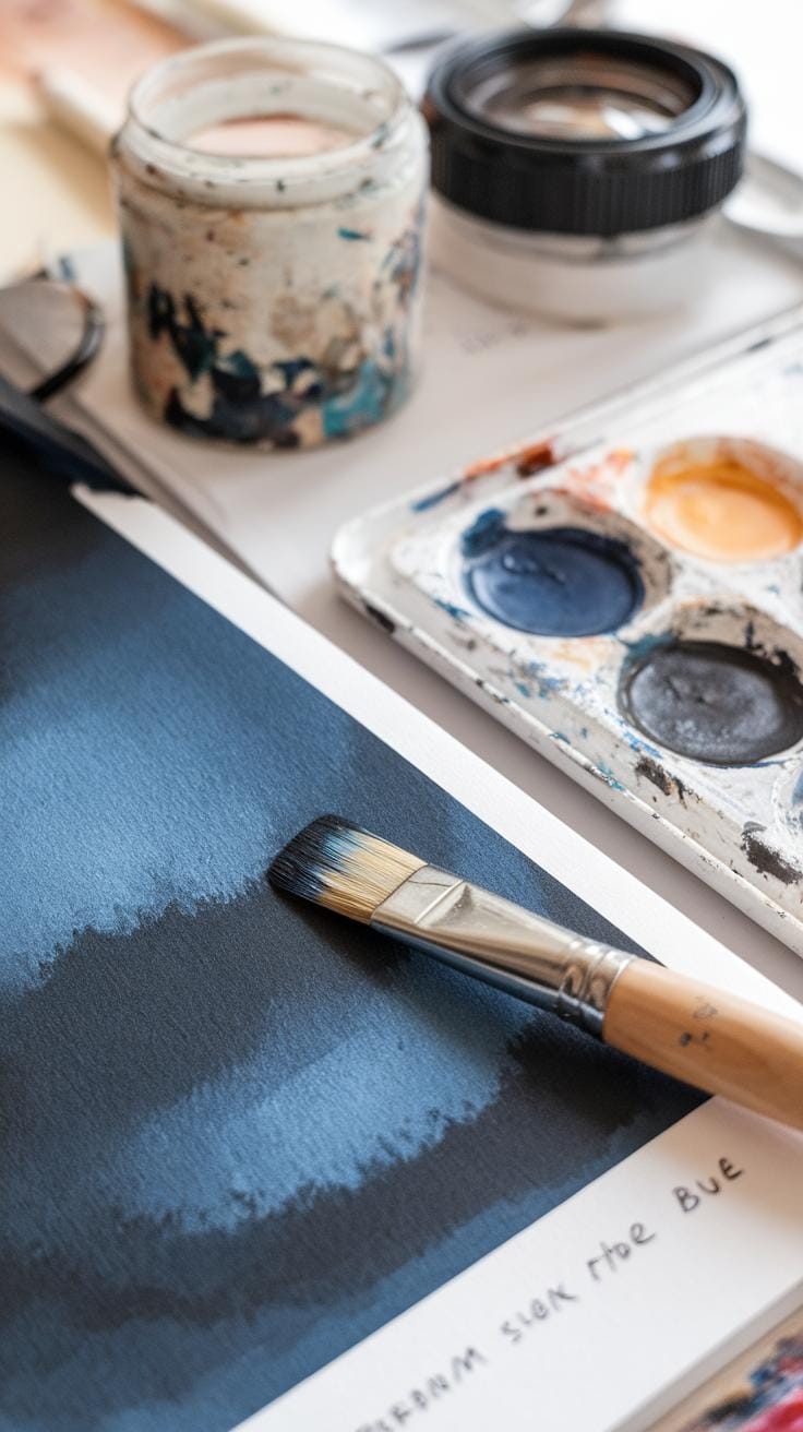
Your choice of materials shapes the outcome of your gouache sea painting. Start by selecting a sturdy surface. Heavyweight watercolor paper around 300gsm works best because it holds layers well without warping. You could also try smooth or cold-pressed paper to find what interacts best with your brushstrokes.
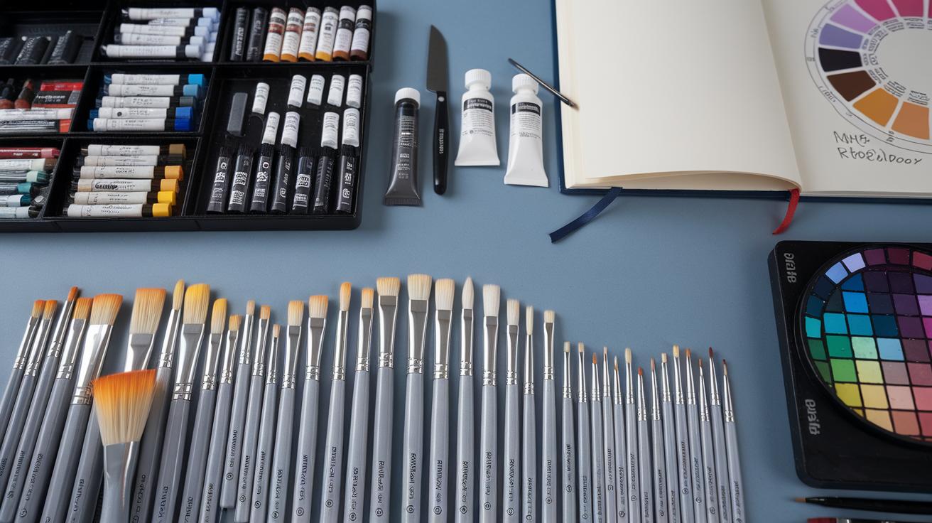
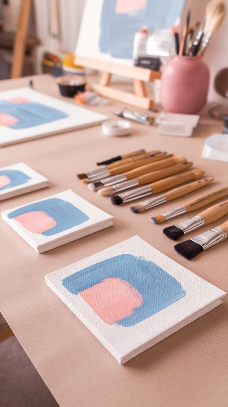
Brushes play a key role in forming fluid wave effects. Round brushes with a fine point allow you to capture delicate crests, while flat brushes help create broad, sweeping strokes for larger wave sections. Include a fan brush to add texture and simulate spray or foam.
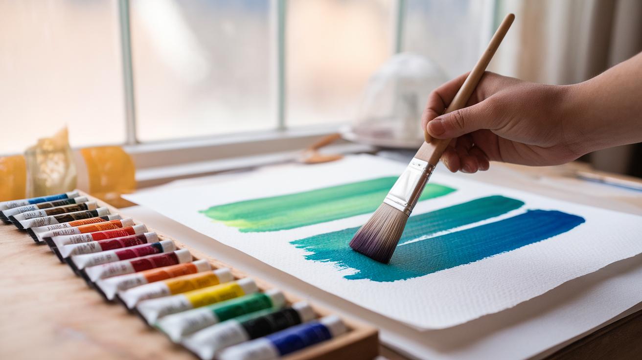
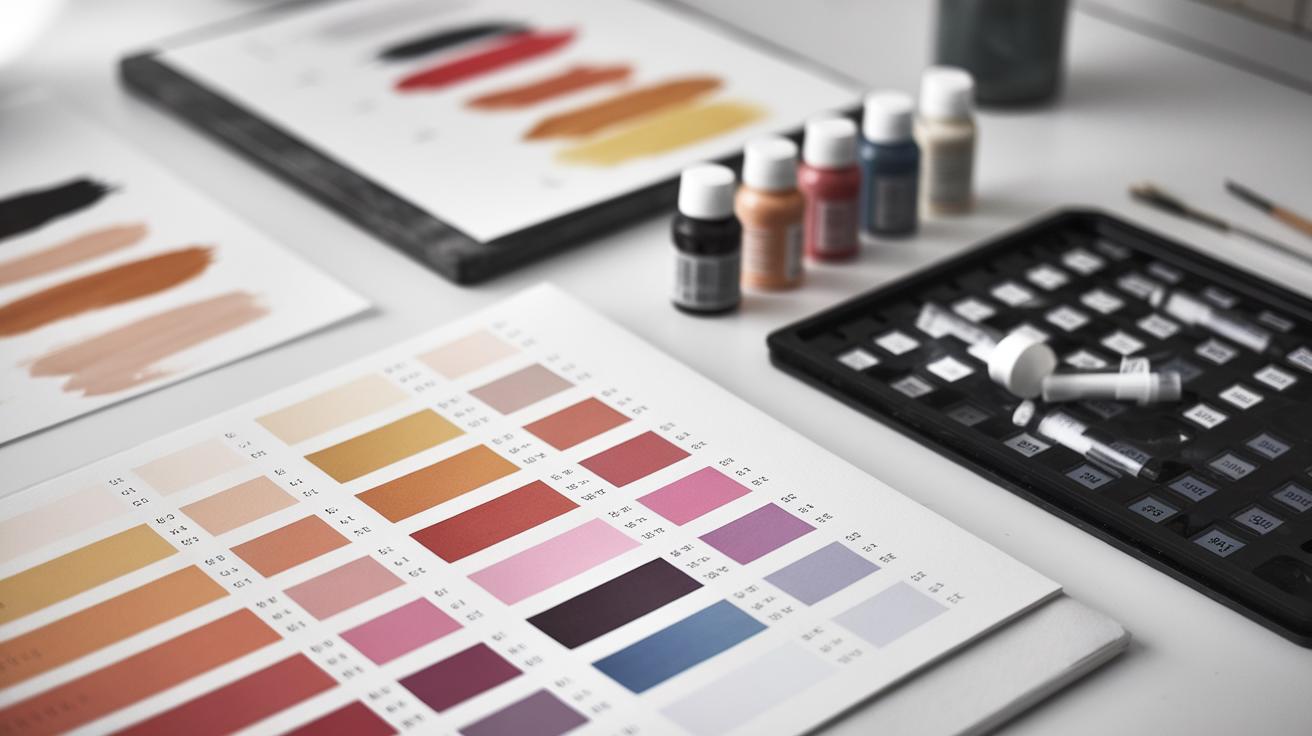
Set up your palette with a wide shallow dish or a plastic palette with many wells. Clean water and paper towels should be nearby for quick adjustments. Arrange your paints in a way that helps you blend without muddiness, focusing on colors that mimic the sea’s varying tones.
Before painting, wet your paper lightly in the areas where you want the waves to flow. This pre-wetting lets the paint move smoothly and blend naturally. Experiment with layering thinned paints to build depth. How will you prepare your space to catch the sea’s movement with gouache?
Choosing the Right Paper and Brushes
Sea paintings demand surfaces that support layering and texture. Cold-pressed watercolor paper offers a slight texture, gripping gouache without losing fluidity. Hot-pressed paper gives a smoother finish but needs careful brush control to avoid streaks. Avoid thin paper that buckles under repeated wet layers.
Brush selection affects wave shapes and textures. Medium-sized round brushes (sizes 6 to 10) help you shape curves and edges of waves with control. A flat brush can lay down wide strokes of water, while small liner brushes tackle highlights and fine details like foam lines.
Using a combination of brushes sharpens your ability to depict the sea’s complexity. Test how each brush moves paint over your chosen paper before starting your main work. Which brush feels right when painting rolling, fluid waves in gouache?
Selecting and Mixing Colors for the Sea
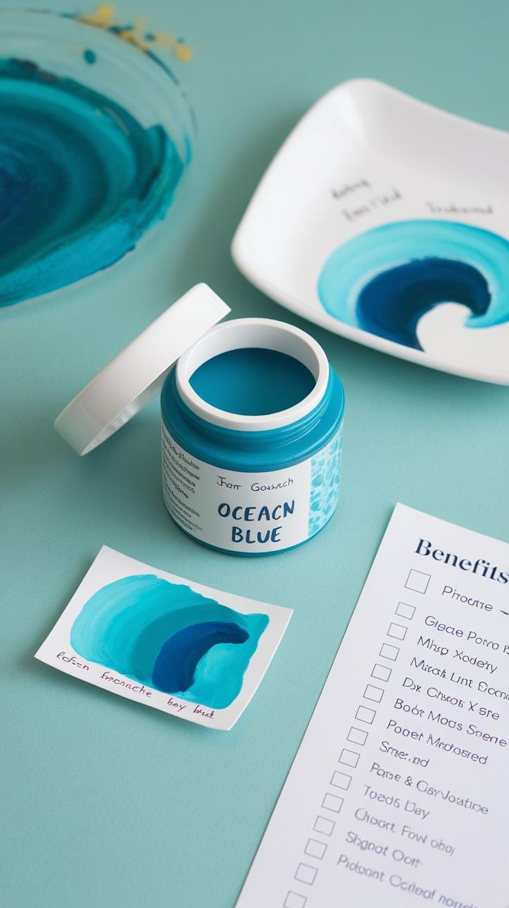
Pick colors that reflect the sea’s range, from deep blues to soft turquoise, greenish hues, and touches of white or beige for foam and light. Classic blues like Ultramarine, Cobalt, and Phthalo blue form a solid base. Mix these with greens like Viridian or Emerald for varying underwater tones.
Create smooth gradients by mixing gouache with a little water. Thin your paint gradually to shift color softly but avoid over-diluting, which reduces opacity. Layering these gradients adds volume and depth to waves, guiding the eye naturally across the surface.
Experiment blending small pools of colors on your palette before applying. Does your mix feel lively enough to imitate water’s movement? Consider warmer or cooler tones to suggest sunlight or shadow. Your color choices will bring your waves to life with energy and fluidity.
Basic Gouache Techniques for Creating Wave Textures
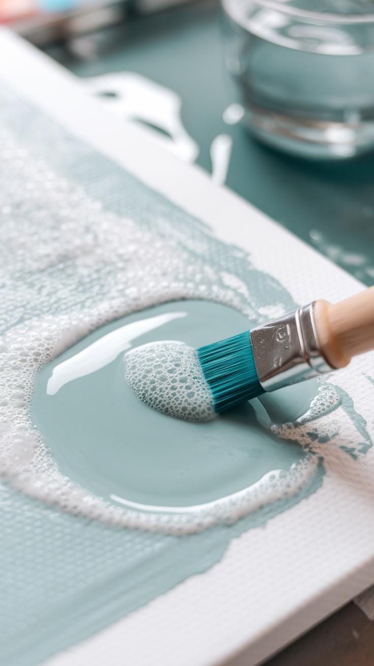
You can create convincing wave textures with simple gouache techniques that focus on brushwork, layering, and paint control. Start by choosing brushes that give you control over detail and texture, like round or fan brushes. Use varied pressure when applying paint to create tension and softness across the water’s surface.
Layering plays a key role in imitating water’s shifting nature. Apply thin, semi-transparent washes for smooth areas, then build up with thicker, opaque paint where waves gather energy. Adjust paint opacity by mixing gouache with a bit of water to mimic how light plays under ripples. Try alternating between wet and dry layers to give your waves texture without losing fluidity.
How does your paint react to each layer? Watch for how different consistencies create different effects, and don’t hesitate to experiment with layering opacity and brush strokes. This gives you control over the sea’s shimmering, changing surface.
Brush Strokes for Wave Movement
Brush stroke choice directly affects how your waves feel alive. Short, curved strokes can imitate the curl of breaking waves. Flicking the brush lightly helps suggest spray and fine splashes on the wave’s crest. Dry brushing adds grainy texture to rough water areas.
Try varying stroke speed and direction as you paint. Quick, confident strokes show energy, while slow, gentle movements suggest calm water. A small round brush allows you to follow the wave’s form precisely, while a fan brush can create soft transitions between water layers. Your hand’s rhythm and pressure will shape the wave’s apparent motion.
Ask yourself where the water pushes forward or pulls back. Adjust strokes to match that flow, making movement believable. This approach helps you capture the constant shift of the sea.
Building Layers for Depth and Fluidity
Layering is essential for realistic sea painting with gouache. Begin with broad, light washes to mark the water’s base color. Once these dry, paint semi-transparent layers over them for midtones. Use thicker, opaque paint on top to define wave peaks and foam. This method builds visual depth and gives waves a feeling of volume.
Wet layers blend smoothly and create soft transitions, mimicking how water merges colors. Dry layers add texture and sharpness, emphasizing motion and wave edges. Switching between wet and dry layers lets you control both fluidity and detail.
Consider how light passes through each layer and reflects off the water. Each new layer should enhance that interaction to keep your waves dynamic. Layering also offers chances to correct mistakes or add highlights without wiping away earlier work.
Advanced Techniques for Enhancing Fluidity and Light in Waves
You can bring your sea paintings to life by focusing on the fluid movement of waves and how light interacts with the water surface. One way to capture fluidity is by using wet-on-wet blending, which lets colors flow into each other naturally. This technique allows you to shape waves as they merge and shift.
Lifting paint offers a way to add dynamic highlights by removing color after applying it. You can pull out paint with a damp brush or sponge, creating bright areas that suggest sunlight hitting the wave crests. Masking helps protect parts of the white paper, keeping sharp bright spots that show reflective light.
Adding both shadows and highlights deepens the form of waves and gives a realistic sense of motion. Ask yourself where the strongest light hits and where shadows fall. Adjusting these contrasts with careful blending and lifting sharpens the sense of depth and fluidity. These methods balance your painting’s tone and make waves feel alive.
Wet-on-Wet Techniques for Smooth Transitions
Wet-on-wet blending means applying wet paint on top of wet paint. This method creates smooth color transitions that resemble the continuous flow of water. When your paper or first paint layer is damp, new colors will gently mix without hard edges.
Try laying down a wash of blue or green and then adding different tones while it’s still wet. Watch how the colors soften and merge. You can tilt your paper or use a clean brush to guide this blending. Avoid pressing too hard to maintain subtle shifts, which mimic wave movements.
This technique works well for backgrounds or large areas. The soft fades between tones keep your waves from looking stiff. You control how much the paints mix by timing your brushwork carefully. What areas in your painting need these soft, flowing transitions?
Using Lifting and Masking to Add Highlights
Lifting paint is about removing some pigment to reveal lighter tones underneath. After applying gouache, you can lift color using a damp brush, tissue, or sponge. This process carves out highlights and gives your waves sparkling spots where light bounces off.
Masking fluid or tape protects parts of your paper before painting. Use it to save white areas on wave crests. When you remove the mask, these untouched spots shine as natural wave reflections. This method saves time and keeps highlights crisp and clean.
Try lifting from areas where light strikes the waves strongest, such as rounded peaks or curling edges. Mask details before painting shadows to keep bright highlights clear. How can you balance lifted highlights with masked whites to maximize the sparkle in your waves?
Capturing Light and Reflection in Sea Paintings
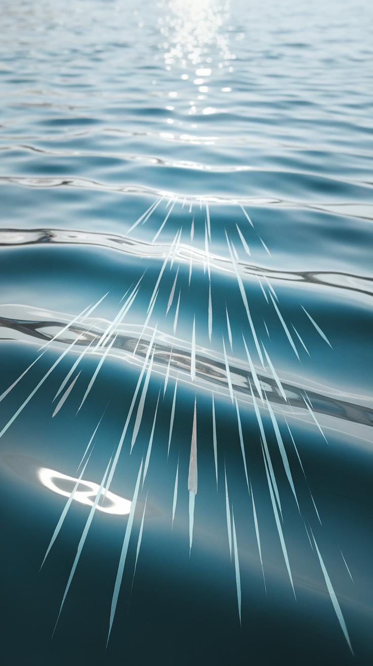
Portraying light and reflection in gouache sea paintings takes careful attention to how light interacts with water. Start by observing real waves and note where sunlight or moonlight hits the surface. You want to capture those highlights and subtle reflections without overworking your paint.
Select your colors based on the time of day and the water’s clarity. Use lighter, warmer colors for areas where light strikes directly. Cooler, muted tones work well for shadows and deeper water. Building layers with semi-transparent washes helps create depth, allowing some underlying colors to glow through.
When painting waves, use varied brush strokes to mimic the water’s texture. Short, quick strokes suggest ripples, while smoother strokes capture calm reflections. Think about where reflections distort as waves move and break. Adjust your brushwork to imitate that shifting light.
Color Choices to Depict Light Reflection
Choosing the right colors defines how believable your reflections will be. For sunlight on water, warm yellows, soft oranges, and pale creams create highlights. Mix these with a touch of white to keep them luminous without washing out.
For moonlight, cooler tones like soft blues, purples, and silvery grays work well. These colors bring a calm, reflective mood to the waves. Balance these highlights with dark blues or deep greens to represent shadowed water.
Try mixing a small amount of complementary colors into your shadows to avoid flatness. For example, add a hint of red in the blue shadows to create vibrancy. Pay attention to how light changes color intensity and shift your palette slightly as you paint. How can subtle color shifts improve your reflections?
Techniques to Create Reflective Surfaces
To simulate shiny, reflective wave surfaces, layer thin gouache glazes. Start with a mid-tone base, then add light strokes of bright color for reflections. Use a smaller brush to apply tiny linear highlights where the light hits the crest of waves.
To create a gloss effect, avoid heavy paint buildup. Instead, apply smooth, flat layers and soften edges by gently blending with a damp brush. Contrast is key: place bright highlights next to darker areas to make reflections pop.
Experiment with lifting paint from dry layers using a clean, damp brush or cloth. This removes paint selectively and adds subtle sparkles or flickers of light. How might you layer these effects to keep your waves looking fluid and alive?
Common Challenges and How to Overcome Them in Gouache Sea Painting
Many artists notice that gouache colors change between wet and dry states. This shift can affect your sea painting’s mood and depth if you don’t plan ahead. You might see that a bright blue looks duller or a soft green becomes more intense once it dries. To handle this, test your colors on a scrap paper before applying them on your final piece. Mix slightly brighter and more saturated colors than what you want, knowing they will dry lighter and matte. Keep notes of your favorite mixes for future reference.
Another challenge is dealing with texture and layering. Overworking your paint can cause cracking or produce rough surfaces, making your waves look unnatural. Avoid piling too many layers without letting each dry fully. Use thinner layers to build subtle gradients, especially for smooth wave crests. If the paint cracks, it might be too thick or drying too fast. Thin your gouache with a bit of water and apply gentle brush strokes. Do you find that your layers feel stiff? Try resting your brush more on the paper rather than scrubbing it harshly.
Managing Color Changes Between Wet and Dry
Gouache appears shinier and more vibrant when wet. As it dries, it loses some saturation and takes on a matte finish. This happens because water evaporates and pigment particles settle. Your sea blues and greens might look brighter during painting but dull once dry. To cope, plan your palette around this shift. Use slightly deeper tones when mixing. Consider layering thin washes to allow more control over how colors settle.
Try adding white only in later layers. Mixing white early can make pigments look pale once dry. Also, avoid using too much water; diluted paint dries lighter and thinner, which can affect your wave textures. Stay patient and allow small test sections to dry before adjusting. What happens if you ignore this step? Your lighter wave highlights may disappear or blend in too much with the background.
Troubleshooting Texture and Layer Issues
Maintaining smooth, fluid wave textures calls for care with gouache layers. Thick paint might crack after drying, especially if you pile it heavily. To prevent this, use moderate amounts of paint and thin your strokes. Keeping your brush clean and damp helps apply even layers. Avoid aggressive scrubbing or reworking an area too soon.
Look for signs of unwanted texture early, such as patchiness or uneven drying. Let each layer dry completely before adding more paint. If you need vibrant wave crests, apply a fresh, thin layer of lighter color rather than thick blobs. When dry patches appear too rough, gently soften them with a damp brush, blending edges without disturbing underlying paint.
You can also experiment with different brushes—flat or round synthetic ones often help create smoother waves. Consider your paper type too; rough paper holds more texture, which may not suit every fluid wave style. What textures do you want to emphasize in your waves? Adjust your layering and brushwork accordingly to match that feel.
StepbyStep Guide to Painting a Dreamy Gouache Sea Scene
Sketching and Laying Down Base Colors
Begin your sea painting with a light pencil sketch on smooth paper. Focus on the overall shape of the waves, marking where they crest and trough. Keep lines loose to capture wave movement, avoiding heavy details at this stage.
Mix a few gouache colors for your base layer. Start with mid-tone blues and greens for the water’s body. Apply these in broad, horizontal strokes to suggest the sea’s depth and flow. Use a flat brush to keep coverage even and smooth.
Add darker shades along the wave bases to create volume. Leave some areas lighter for future highlights. Keep the paint thin in early layers so you can build texture later. This approach prevents the paint from becoming gummy or opaque too soon.
How will you decide where light hits your waves? Observe real waves or photos to spot natural curves and shadows. Your initial base colors set the stage for the entire piece, so avoid rushing this step.
Adding Details and Final Effects
Once the base dries, add wave details with smaller brushes. Use short, curved strokes to mimic foam patterns along the crest and where waves break. Layer different whites mixed with soft blues to create natural variation.
Darken shadows beneath wave peaks to enhance depth. Thin your paint slightly and blend edges for smooth transitions between light and shadow. Add highlights strategically where light reflects most, like the wave tips or water ripples.
Use a dry brush sparingly to add texture to the water surface. This technique helps achieve the fluidity and sparkle of moving waves. Finally, adjust contrasts to ensure the waves stand out and the scene feels cohesive.
Ask yourself if the movement in your painting feels alive. Small, deliberate touches make your waves flow realistically and give the sea its dreamy character. Keep refining until the scene captures the feel of a fluid, shifting ocean.
Inspiration and Ideas for Your Gouache Sea Paintings
Look closely at the sea around you or in your mind. The ocean’s waves offer endless themes—quiet tides, crashing surf, or misty horizons. Think about moments when the water changes, like dawn light catching on small ripples or storm waves tumbling wildly. Each wave tells a different story. Capture the mood that speaks to you.
Push yourself to shift styles or try unusual angles. Paint waves as soft curves or sharp peaks. Place your horizon high for a sweeping view or low to emphasize water details. What happens when you simplify a wave into blocks of color or tiny brush marks? Let curiosity guide your hand. Try using unexpected colors or layering translucent washes for dreamy effects. What new shapes and motions can your imagination create in gouache?
Using Nature and Photography as References
Collect photos of waves, shorelines, and light reflecting on water. This will help you observe how waves fold and break, how foam forms, and how color shifts with depth and distance. Study the texture of wet sand or rocks at the water’s edge—their shapes add realism to your images.
Try photographing waves yourself, capturing moments with different light and weather. A quick sketch from these photos can also strengthen your understanding. Use these materials as guides, not rules. Ask yourself how you can bend or combine what you see to create unique wave forms in your gouache paintings.
Exploring Styles and Compositions
Experiment by mixing styles to find your voice. Abstract paintings strip waves down to patterns and shapes, focusing on movement rather than details. Impressionistic approaches use loose brush strokes and shifting colors to suggest light dancing on water. Realistic works show waves with sharp edges and mimicked light play. What style best matches your mood or message?
Changing composition alters the feeling of your painting. A close-up wave crashing at the canvas edge feels powerful and immediate. A distant horizon with tiny waves suggests calm or vastness. Tilted angles or cropped scenes create energy and tension. Consider where your wave sits on the page and what it reveals or hides. How does it make you or your viewer feel?
Conclusions
Using gouache for sea paintings opens a variety of creative options for capturing the natural beauty of fluid waves. The medium’s opacity and fast drying time allow for layering techniques that provide depth and vibrancy. Mastery of these techniques improves your ability to depict realistic water movement and the interplay of light on waves. You now have practical tools and methods to apply in your next gouache sea painting.
Regular practice will build your confidence in working with this medium. Experiment with different brushes, water ratios, and layering approaches to discover what best conveys the sea’s dynamic energy in your style. Your artistic journey in portraying dreamy, fluid waves using gouache has great potential to grow. Keep focusing on layering, textures, and color blending for stunning sea paintings.