Introduction
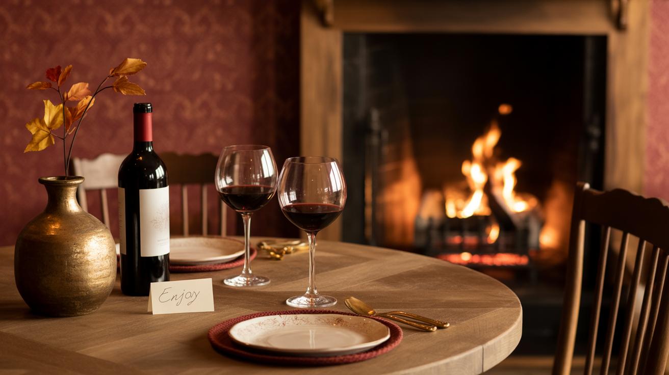
Wallpaper continues to be a favorite in interior design. It covers walls with designs that make rooms look new and interesting. Designers pick styles that fit with the space and the look people want. This article explores popular wallpaper styles designers are using now, showing you how these choices can change your home.
From simple patterns to bold prints, wallpaper helps make a room unique. We will look at different styles and how they are used. With the right wallpaper, your walls can tell a story and bring your space to life.
Designer Popular Wallpaper Styles
The Basics of Wallpaper and Its Uses in Design
Wallpaper is a decorative material applied to walls, often made from paper or vinyl, crafted to add texture, pattern, or color to a room. Its purpose in interior design goes beyond simple decoration—it can define a space’s mood, create focal points, or even visually alter a room’s proportions.
Originally, wallpaper dates back centuries, with early examples appearing in Asia and Europe in the 16th century. Back then, it was a luxury, often hand-painted or block-printed. Today, applying wallpaper is easier with pre-pasted options, and some even peel off for simple changes.
At its core, wallpaper can change how a space feels with minimal effort. Perhaps you want to inject personality or hide imperfections—wallpaper can do both. It’s surprising how a pattern or color on a wall alters everything, even without furniture or other decor. A plain wall suddenly gained interest, right?
Different Wallpaper Types and How They Work
Wallpaper isn’t just one thing—you’ll find varieties suited to different needs and tastes. Some common types include:
- Textured wallpaper: Made from materials like grasscloth or embossed vinyl. These add subtle depth and tactility but can be tricky to clean. Great for cozy spaces or accent walls.
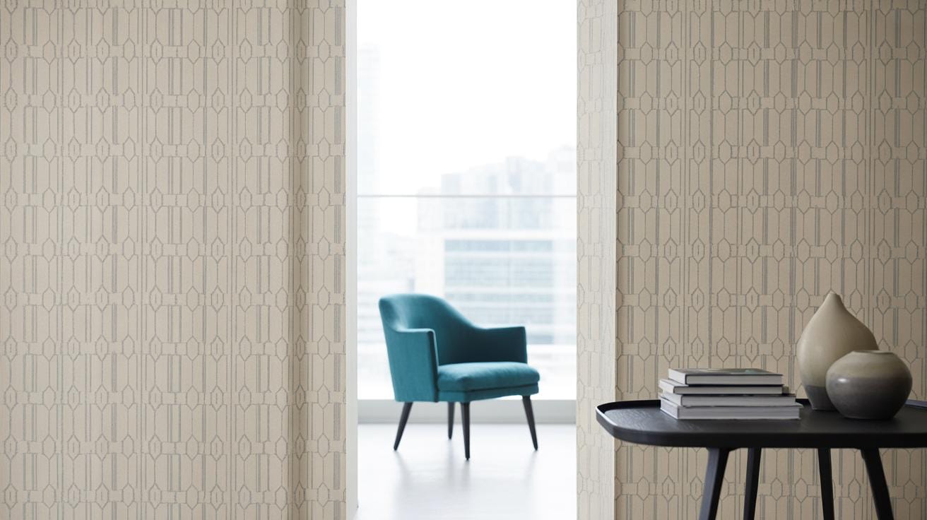
- Patterned wallpaper: Can range from florals to geometrics. Printing methods vary—digital printing offers sharp details, while traditional block printing has charm. Patterns help define style or disguise surface flaws.
- Large prints: These bold, oversized designs can make a dramatic statement. Often printed on smooth vinyl for durability, they work well in modern or minimalist rooms.
Materials matter too—vinyl wallpapers stand up to moisture, so they fit kitchens and bathrooms better. Paper-based ones are more delicate but eco-friendly. You might even find fabric wallpapers, adding softness but requiring more care.
How Wallpaper Fits in Room Design
Wallpaper can pull a room’s entire look together when chosen thoughtfully. Matching wallpaper patterns and colors to a room’s style is a delicate task.
For example, in small spaces, light colors and subtle patterns keep things open, while bold colors and large prints can overwhelm. Conversely, the right wallpaper can make vast rooms feel cozy, filling empty walls with warmth or interest.
Think about the function: a dining room might benefit from elegant patterns, while a kid’s bedroom often welcomes playful or durable vinyl styles. It’s not just about aesthetics—it’s about how people live there.
Seeing wallpaper in action is convincing. A simple, patterned wallpaper transformed a friend’s home office, making it feel less boring, more inspiring. Sometimes, that’s all a room needs to go from bland to engaging.
Classic Patterns Making a Comeback
Traditional wallpaper styles like florals, stripes, and damasks aren’t just sticking around—they’re gaining new life. You might wonder why these old favorites keep showing up in fresh interiors. Part of it is their timeless appeal. These patterns have a way of grounding a space, offering familiarity amid modern trends. Designers and homeowners find comfort in something with history, yet they often reinterpret these classics in surprising ways.
Floral patterns, for instance, come in many forms—from tiny ditsy prints to large, bold blossoms. They brighten rooms and can feel cozy or dramatic depending on color and scale.
Stripes add clean lines and dimension, sometimes elongating walls or breaking up a room’s monotony. Damasks bring texture and elegance, making a subtle statement without overpowering the space.
Examples include a soft floral wallpaper in a sunroom that invites nature indoors, or a bold black-and-white stripe in a hallway that draws the eye forward. A damask print behind vintage velvet furniture can create a quietly sophisticated vibe.
Why do these patterns remain so beloved? Maybe it’s because they balance the new and the familiar, providing a connection to past styles without feeling dated. Or perhaps, they simply have an ease to them that many spirits resonate with, ready to fit into almost any home.
Floral Patterns That Brighten Rooms
Floral wallpapers offer more than just decoration. Their variety is vast—from delicate vines to oversized petals. You can find subtle pastel florals that add softness to bedrooms, or vibrant prints that energize kitchens or living rooms. Their adaptability is impressive.
There’s something about floral patterns that brings life to walls without being overwhelming. They can soften sharp corners and add warmth. Often, they reflect nature’s irregular beauty, making spaces feel inviting and thoughtful.
Rooms with good natural light especially benefit. A floral wallpaper in a breakfast nook, for example, can create a cheerful atmosphere that encourages lingering over coffee. I’ve noticed that florals work well in both traditional and eclectic spaces, which might explain why they keep popping up.
Plus, the emotional pull is strong—florals can evoke calmness, nostalgia, even romance. That emotional connection feels important when choosing a pattern meant to stay for years.
Stripes and Damasks in Modern Interiors
Stripes and damasks have advantages beyond classic beauty. Think about stripes—they introduce rhythm and direction. Vertical stripes can make a low ceiling seem taller. Horizontal ones break up wider walls. Mixing widths and colors changes the mood completely.
Damasks, meanwhile, add texture more than pattern. Their motifs often tell a story tied to tradition, but today’s versions might use metallics or muted palettes that feel fresh rather than formal. Pairing damask wallpaper with modern furniture—like clean-lined sofas or minimalist tables—creates a nice tension between old and new.
Using stripes next to solid-colored furniture can make a room feel organized yet lively. A damask wall behind a sleek leather chair often becomes a cozy but sophisticated corner. These patterns don’t scream for attention, but they do invite a closer look.
Sometimes, designers mix stripes and damasks in the same room—if a bit carefully—to balance textures and prevent clashing. It’s not always perfect, but that’s part of what makes interiors feel human and lived-in.
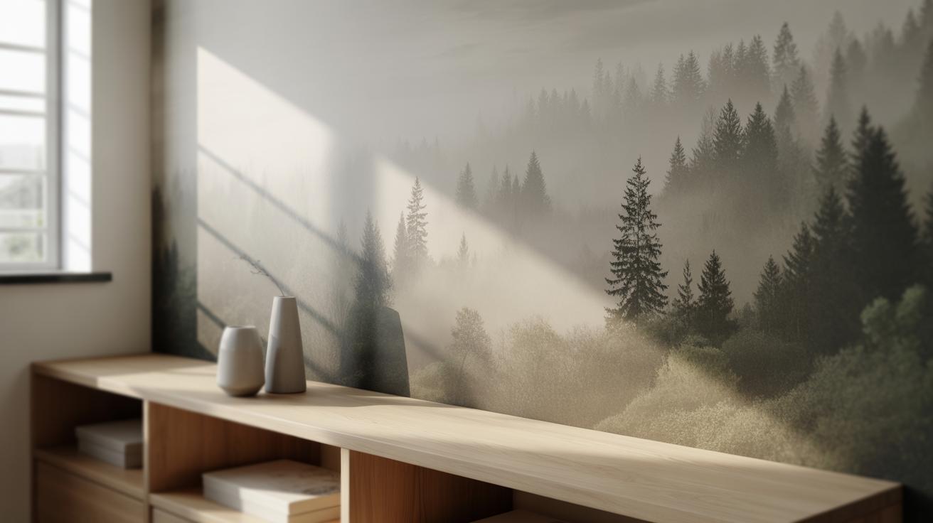
Bold Prints for Statement Walls
Using Large Patterns Wisely
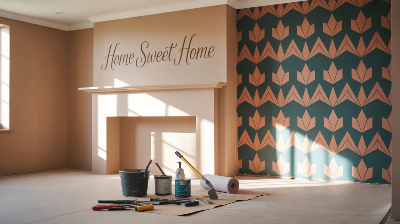
Large-scale prints can transform a room instantly, turning a plain wall into a striking focal point. But that doesn’t mean you should cover every wall with them—it’s easy to overwhelm a space if you’re not careful. Think about where your eyes naturally rest. Usually, one statement wall is enough to create impact without making the room feel cluttered or claustrophobic. For smaller rooms, choose a single wall or even just the upper or lower half for bold prints.
Balance is key. Pair large prints with simple furniture and pared-back accessories. Avoid busy patterns in upholstery or curtains alongside bold wallpaper—they compete for attention and make the space feel chaotic. Sometimes, a bold print near neutral tones calms things down and lets the design breathe. It took me a while to realize that less can look more, especially with big patterns.
Popular Themes in Bold Wallpaper
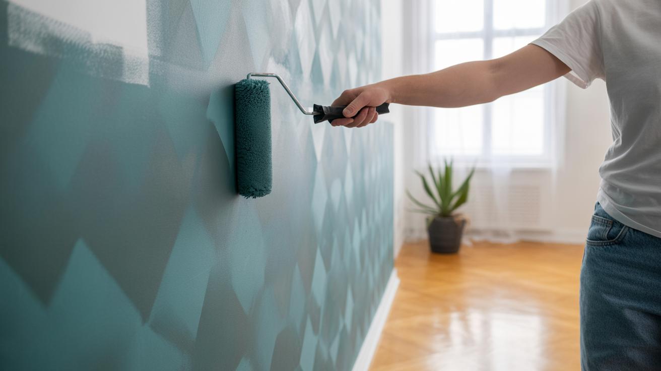
Certain motifs keep popping up on designers’ radars. Tropical themes with oversized leaves and flowers bring a sense of energy and a hint of the outdoors. They often work well in spaces where you want to feel refreshed or even a bit adventurous. Geometric prints, with clean lines and shapes, tend to add structure and a modern vibe; they can make a room feel more organized, though sometimes they risk feeling a bit sterile if not warmed up with texture or color.
Abstract designs are trickier. They can be playful or dramatic, depending on the palette and scale. These often provoke more thought because they don’t spell everything out. I’ve seen spaces where abstract wallpaper shifted the whole mood—from calm and serene to lively and unpredictable. What kind of atmosphere do you want your room to have? Bold prints can help answer that—even if you’re not totally sure yourself yet.
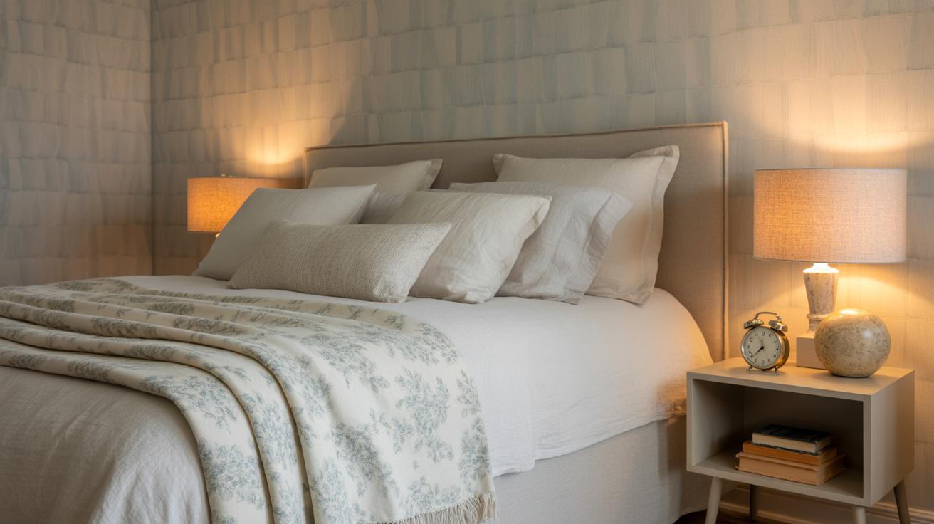
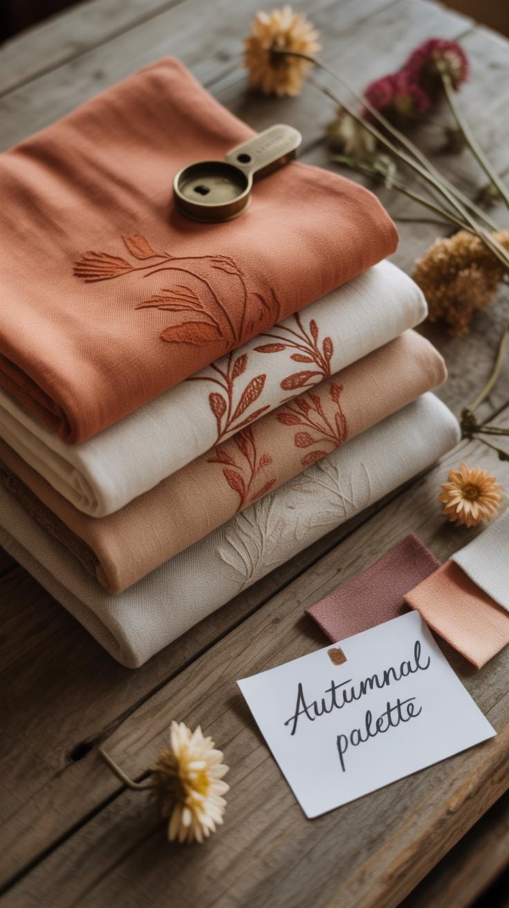
Textured Wallpaper Adds Depth and Interest
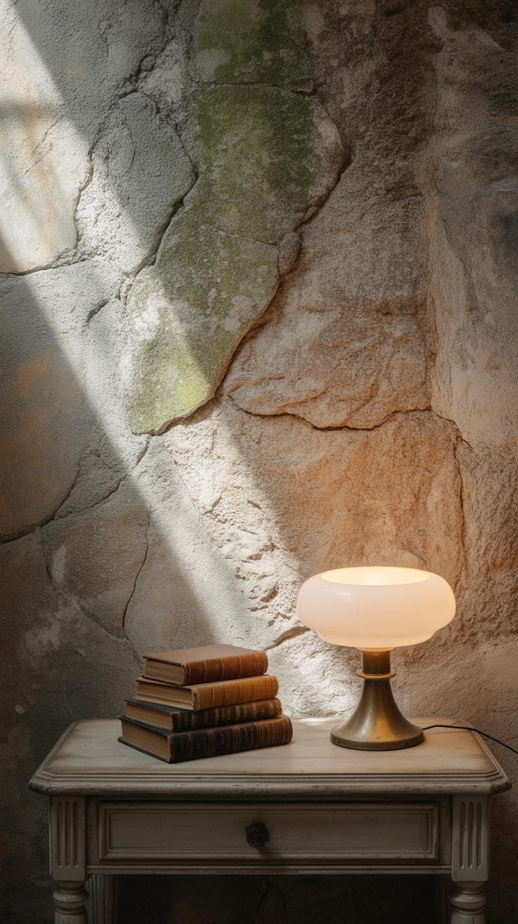
Textured wallpaper brings a subtle complexity to walls that flat prints just can’t match. Think about grasscloth—it’s made from natural fibers woven together, giving walls a tactile dimension. The tiny irregularities catch light differently throughout the day, sometimes casting gentle shadows that shift the room’s mood. Fabric-based wallpapers offer a soft, cozy feel that almost invites you to touch. Embossed patterns push this further, creating raised designs that add sculptural elements to otherwise blank surfaces.
Materials matter a lot here. Grasscloth often uses jute, hemp, or raffia, which means it’s breathable but needs a bit more care to avoid moisture damage. Fabric wallpapers might mix silk or linen, bringing both texture and a hint of luxury. Embossed wallpapers tend to be vinyl or paper-based, making them a bit more durable and easier to clean.
Texture isn’t just about how it feels—It interacts with color and light in ways you might not expect. A neutral-toned textured wall can appear warmer or cooler depending on the lighting. It adds variety without overwhelming, which can be perfect if you want subtle interest rather than a loud pattern. And honestly, adding texture can make any space feel less sterile and more lived-in. Have you noticed how a textured wall often anchors furniture differently compared to a smooth surface? That’s part of its quiet appeal.
Choosing Wallpaper According to Room Function
Picking wallpaper isn’t just about looks. The room’s function should steer your choice more than you might think. Think about a bathroom — moisture is a constant challenge there. Some wallpapers peel quickly when exposed to steam or dampness, so you’ll want something water-resistant, like vinyl or specially coated options that can take the humidity without falling apart.
In contrast, a living room usually faces heavy traffic and occasional spills, so durability is key. Wallpapers with a washable finish or tougher materials can handle wear and tear better. On the other hand, bedrooms call for something softer, maybe even textured, to create a calmer vibe, though those delicate patterns might not hold up as well in busier spaces.
When matching style with room mood, it’s helpful to ask what atmosphere you want. For a bedroom, subtle, muted patterns or soft florals might help you wind down. Meanwhile, dining rooms often benefit from bolder, lively prints — they invite energy and conversation. Although, I once tried a bright geometric wallpaper in a dining room, and it felt a bit too much after a while. Guess some rooms need a lighter touch, even if you like a bold statement.
So, think about durability first, then how the style fits your personal sense of space. It might be tempting to pick the wallpaper you adore without much thought, but considering these factors could save you from quick regrets and lots of redoing later.
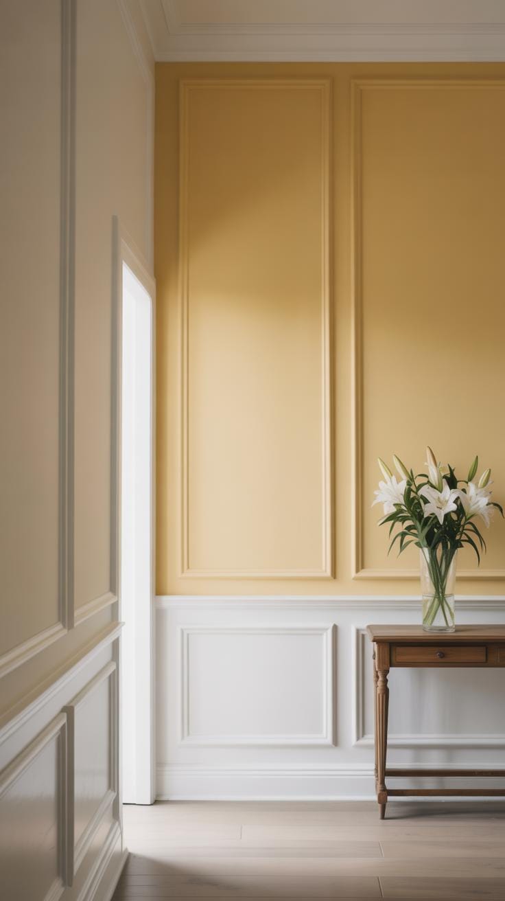
How Color Influences Wallpaper Style Choices
Color plays a bigger role in wallpaper choices than many realize. It sets the mood, shapes how you feel in a room, and can even alter how spacious or cozy a space seems. When picking wallpaper, thinking about color isn’t just about what looks good—it’s about what feels right. Bold reds might energize a kitchen but overwhelm a bedroom. Soft blues can calm a nursery but feel cold in a dark hallway.
Colors affect our emotions in subtle and not-so-subtle ways. Warm hues like yellows and oranges can boost energy and invite conversation. Cool shades, such as greens and blues, often soothe and help people relax. Neutrals tend to ground a space but can sometimes feel bland unless paired thoughtfully. You might want to ask yourself—what feeling do you want every time you see this wall? That question can guide your color choice more than trends do.
Using color wisely can also trick the eye. Light wallpaper colors make rooms appear larger and more open, even if they’re small or low in natural light. Darker colors, while cozier, may shrink a room visually but add drama or depth. Warm colors often make a room seem inviting and intimate, while cool tones push walls back, creating a sense of airiness. I remember once using a soft sage green wallpaper in a small guest room, and it instantly felt less cramped without going too bright. That subtle shift changed everything.
When choosing wallpaper color, consider these tips:
- Match color intensity to the room’s purpose—lively rooms can handle brighter shades.
- Test samples on different walls and times of day; color shifts with light.
- Think about furniture and decor—the wallpaper shouldn’t compete for attention.
- Don’t shy away from unexpected hues; small doses on a feature wall often work well.
- Remember, what feels good to you is key, more than any rule.
Mixing and Matching Wallpaper with Other Wall Treatments
Pairing wallpaper with painted walls is a popular way to add depth without overloading a room. You might try covering one wall in a bold, patterned wallpaper and let the others stay simple with matching paint. Choosing colors from the wallpaper’s palette helps keep things cohesive—for instance, a deep green wallpaper pairs nicely with soft beige or cream paint. Sometimes, matching too exactly can feel a bit forced, so letting a paint color be a shade lighter or darker than the wallpaper can create a subtle contrast that’s easier on the eyes.
Paneling offers another interesting layer. Imagine smooth painted upper walls coupled with textured wainscoting below. Wallpaper fits well above the panels, especially with simpler prints that don’t compete. This mix of smooth and tactile surfaces makes the room feel layered but still balanced. It’s a little like mixing different fabrics in an outfit—you want enough difference to be intriguing, but not so much it clashes.
When it comes to wall art on wallpapered surfaces, the key is balance. Large, bold wallpaper patterns may call for minimal or monochromatic frames to avoid visual chaos. Conversely, subtle wallpaper benefits from art that adds personality and color. Think about spacing, too—giving both wallpaper and art room to breathe prevents overcrowding. Sometimes, I’ve found that leaning art against a wall on a shelf can soften the busy feeling better than hanging it right on patterned wallpaper.
Current Wallpaper Trends Designers Recommend
Eco-Friendly and Sustainable Wallpaper Options
Designers seem pretty focused on sustainability these days, and wallpaper is no exception. You’ll find more wallpapers made from natural fibers like bamboo, cork, or even grasscloth. These materials bring a texture and warmth you won’t get from synthetic options, plus they’re biodegradable, which feels like a win for anyone wondering about environmental impact. Sometimes I wonder if they compromise on durability, but many brands have improved their coatings to last well without harmful chemicals.
There’s also recycled paper wallpaper and water-based inks, which aim to reduce toxins indoors. People are more aware now, not just about looks but about what’s on their walls and how it affects health. Popular choices? Brands like Hygge & West and Flavor Paper offer eco-friendly collections that balance style and conscience. Does the idea of a “green” wall change how you decorate? For some, that’s a big part of the decision.
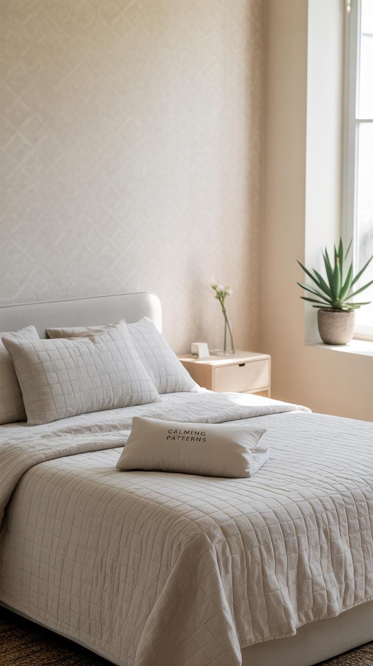
Minimalist and High-Tech Wallpaper Styles
Minimalist patterns—think subtle lines, soft geometrics, or muted textures—have become go-to choices in modern interiors. These wallpapers don’t scream for attention and tend to serve as a quiet backdrop, which I find refreshing in a world that often feels visually noisy. At the same time, digital print technology offers incredible precision and variety. Some designers use this to create high-impact yet sleek looks, where patterns can be custom-made or even photographic.
It’s intriguing how these high-tech styles feel futuristic yet surprisingly simple. They align with clean, contemporary spaces—maybe because they don’t add clutter or overwhelm the room’s vibe. But sometimes, it’s unclear if this is a long-term shift or just a current preference for calm and order in a chaotic time. Either way, as wallpaper becomes more about subtlety and customization, you might find it easier to fit into your home without overpowering other elements.
Conclusions
Wallpaper is more than just decoration. It can change how you feel in a room and how the room looks. Designers choose styles based on space, light, and mood. Popular styles today range from classic patterns to new, creative designs. Each style serves a purpose, whether adding calm, energy, or style to a space.
When you pick wallpaper, think about your room and what style fits best. The right design can make your walls stand out and your home feel special. Popular wallpaper styles offer many options to bring your ideas to life with style and personality.