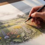
Introduction
Gouache is a special type of paint. It combines qualities of watercolor and acrylic with its opacity and matte finish. Artists use gouache for posters, comics, and illustrations because it covers well and dries quickly. Its unique texture lets you create bold, flat colors and detailed designs. Understanding gouache’s properties helps you control your painting better.
Color mixing with gouache is also essential. Mixing colors correctly can bring your painting to life. Knowing which colors blend well together and how they change when mixed helps you make your art vibrant and expressive. This guide covers everything from basic color theory to practical mixing tips, giving you the tools to improve your gouache paintings.
Understanding Gouache Paint Characteristics
Gouache is a water-based paint made from pigment and a binder mixed with white fillers. This combination gives it a solid, opaque quality. Unlike watercolor, which is transparent and delicate, gouache covers surfaces completely, letting you paint light over dark layers. The finish dries matte, which means it doesn’t reflect light like acrylic or oil paints. You might notice gouache changes slightly in color as it dries, often becoming lighter or duller. This drying behavior affects how you mix and layer your paints. When you work with gouache, you can rework areas by adding water after it dries, unlike many acrylics that dry permanently.
Compared to acrylics, gouache feels softer and is water-reliable. Unlike watercolors, it’s not designed to be transparent or delicate. It lets you create flat, solid shapes easily. These features make gouache a versatile tool for artists aiming for bright, clean color blocks with a smooth finish. How might you use gouache’s opacity to add depth or correct mistakes in your work? Try layering with gouache to see how you can control tonal values without losing vibrancy.
What Makes Gouache Unique
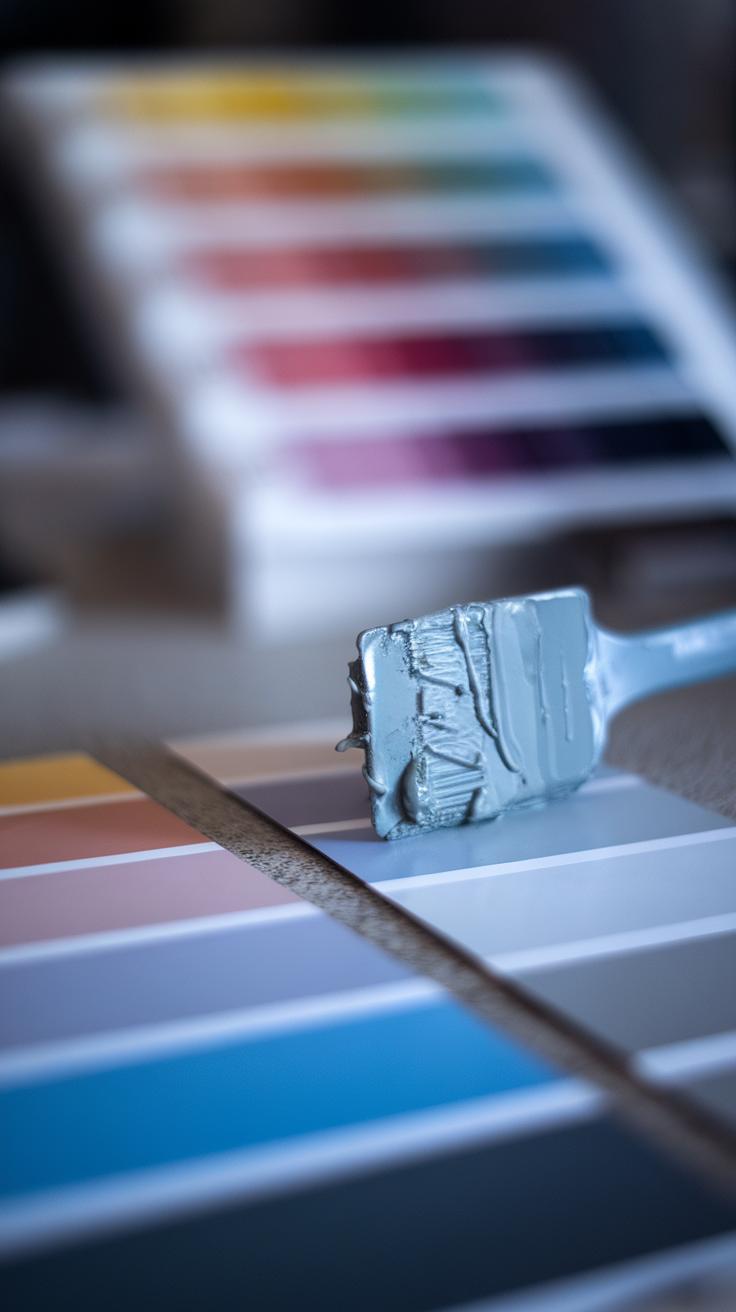
The unique nature of gouache comes from its ingredients. Pigments provide the color, while the binder holds everything together. Gum arabic or dextrin serve as common binders, enhancing the paint’s smoothness and stability. White fillers like chalk give gouache its signature opacity by scattering light inside the paint layer. This is why gouache feels heavier and denser than watercolor, which lacks these fillers.
The white chalk also creates that flat matte finish gouache is known for, reducing shine and glare. For your color mixing, this means you can layer lighter tints on darker backgrounds without losing strength. It’s useful for details or highlights you want to stand out. Have you noticed how mixing gouache with too much water can reduce opacity? Balancing pigment, binder, and filler controls the paint’s behavior.
Brief History of Gouache
Gouache has roots stretching back thousands of years. Ancient Egyptians used similar paint made from natural pigments mixed with gum and chalk for murals and decorative work. Throughout history, artists and craftsmen in various cultures valued gouache for its bold color and flexible application.
In more recent times, gouache became popular with commercial artists. Poster makers, illustrators, and comic artists turned to it for fast drying and vibrant coverage. Some famous painters also used gouache for studies and detailed work. Today, gouache remains a favorite for designers and fine artists who want the ease of watercolor with stronger color presence. Have you tried using gouache for illustration or design projects? Understanding its history shows how this paint adapts across art forms and time.
Basic Color Theory Essentials
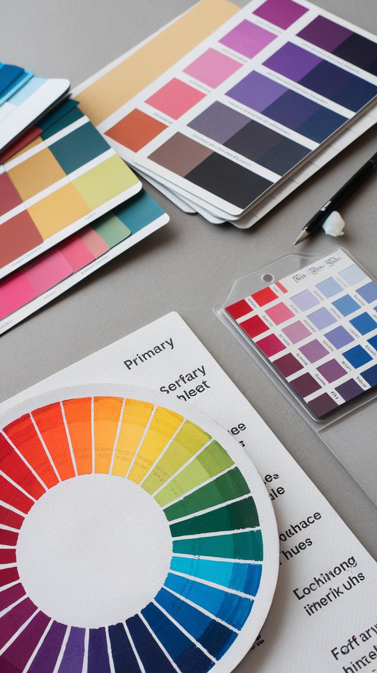
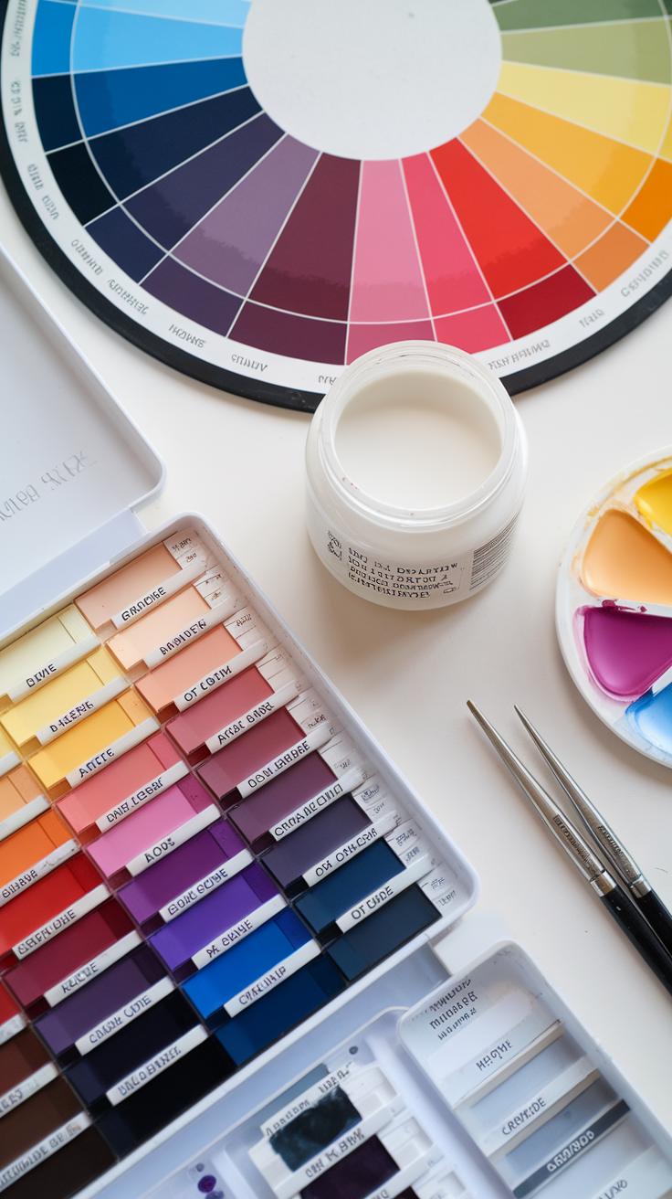
Primary colors form the foundation of your gouache palette. The traditional red, yellow, and blue (RYB) model places these as the starting point. When you mix two primaries, you get secondary colors: orange, green, and purple. For example, mixing red and yellow creates orange. This simple interaction helps you build a wide range of hues from a limited set of paints.
Understanding how these colors relate helps you predict the outcomes of your mixes. Secondary colors sit between primary colors on the color wheel, showing their blended nature. Knowing this guides your choices when blending paints or creating contrasts in your artwork.
Primary and Secondary Colors
Red, yellow, and blue are called primary because you cannot make these colors by mixing others. Mixing primary colors produces secondary colors. Yellow and blue combine to form green, red and blue create purple, and red and yellow yield orange. This system allows you to mix a broad palette with just three basic paint tubes.
Have you noticed how some reds or blues lean warmer or cooler? This affects what secondary colors you get. Experiment with different shades of your primaries to see how your secondary colors shift. This awareness will enhance your control over color mixing in your gouache paintings.
How Colors Mix in Paint
Paint mixing works by subtracting light. Each pigment absorbs some wavelengths and reflects others. When you mix pigments, the resulting color reflects only the wavelengths that both pigments reflect. This subtractive color mixing makes the new color darker or duller than the originals.
Layering gouache affects color too. Applying a thin layer over a dry layer lets some of the underneath color show through, changing the final tone. For instance, a yellow wash over blue can create a softer green effect than mixing yellow and blue straight on the palette.
Ask yourself: How does layering compare to direct mixing in your work? Trying both techniques helps you understand how your gouache reacts and expands your color control for better results.
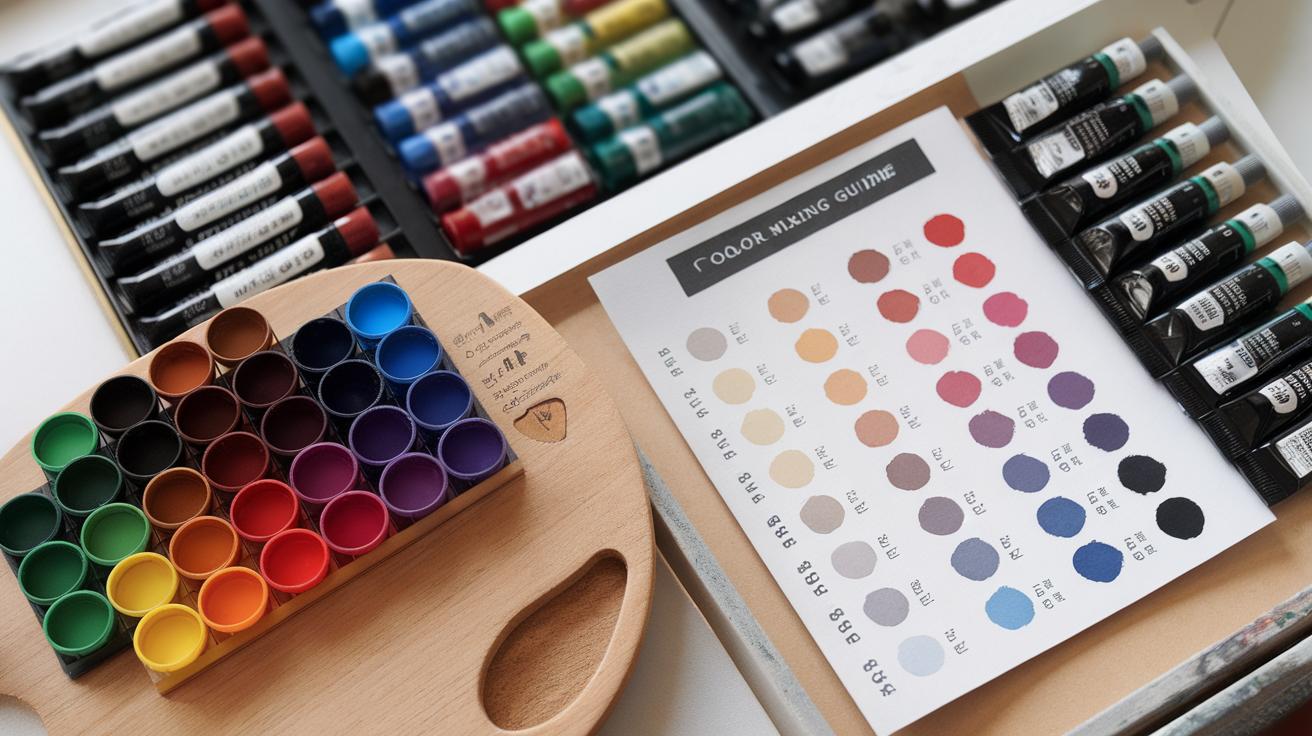
Choosing Your Gouache Colors
Picking the right gouache colors can shape your entire painting experience. Think about how many colors you really need before starting. Single pigment colors offer direct, strong color and make mixing simpler. They give clearer results because their paint behaves consistently. Mixed colors may look convenient, but they can limit your ability to adjust hues later.
Building a palette that fits your style requires balance. Start with basics, then slowly add colors that extend your range. Ask yourself: Which colors do I use most? Where do I want to explore? This approach helps avoid unnecessary duplicates and keeps your palette focused. Focus on pigments that work well together and with your preferred subjects.
Building A Basic Gouache Palette
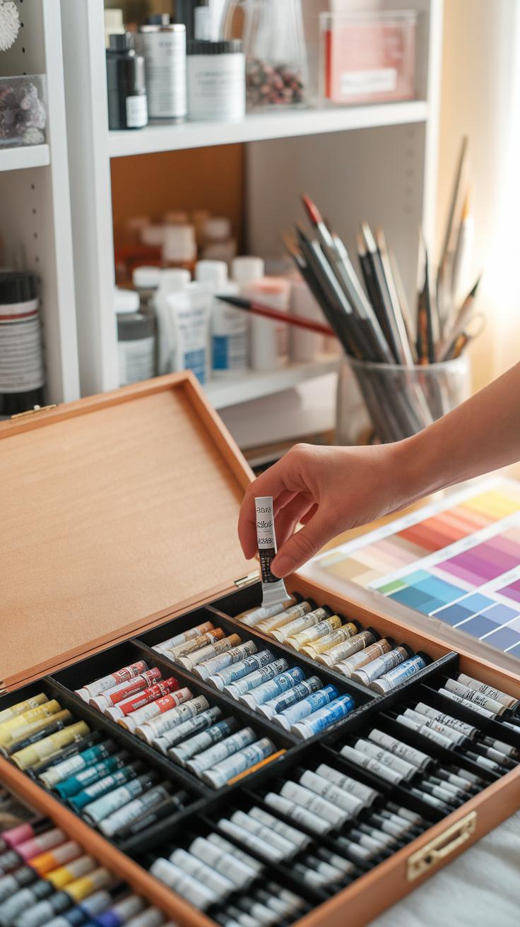
Begin with essential colors: a warm red like Cadmium Red Deep, a cool blue such as French Ultramarine, and a bright yellow like Cadmium Yellow Light. These cover your primary colors and allow most mixes. Include Titanium White to lighten and add opacity, plus a black like Mars Black for shading.
Identify transparency and opacity in your choices. For example, Cadmium colors tend to be opaque, while French Ultramarine stays somewhat transparent. Transparent pigments let underlying layers show through, while opaque paints cover whatever’s beneath. Understanding this helps you plan glazing or layering effects that add depth.
Expanding Color Options
After mastering basics, consider specialty colors like Quinacridone Magenta and Phthalocyanine Blue. Quinacridone Magenta produces rich, intense pinks and purples impossible to get with simple red mixes. Phthalocyanine Blue offers vibrant, saturated blues that stand out in mixes and direct strokes.
Specialty pigments open new mixing paths and boost vibrancy. They can shift your palette from dull to vivid with fewer tubes. Try adding a warm green like Cadmium Green or a deep earth tone like Burnt Sienna to increase your option range. Always test mixes to see how these colors combine under your brush.
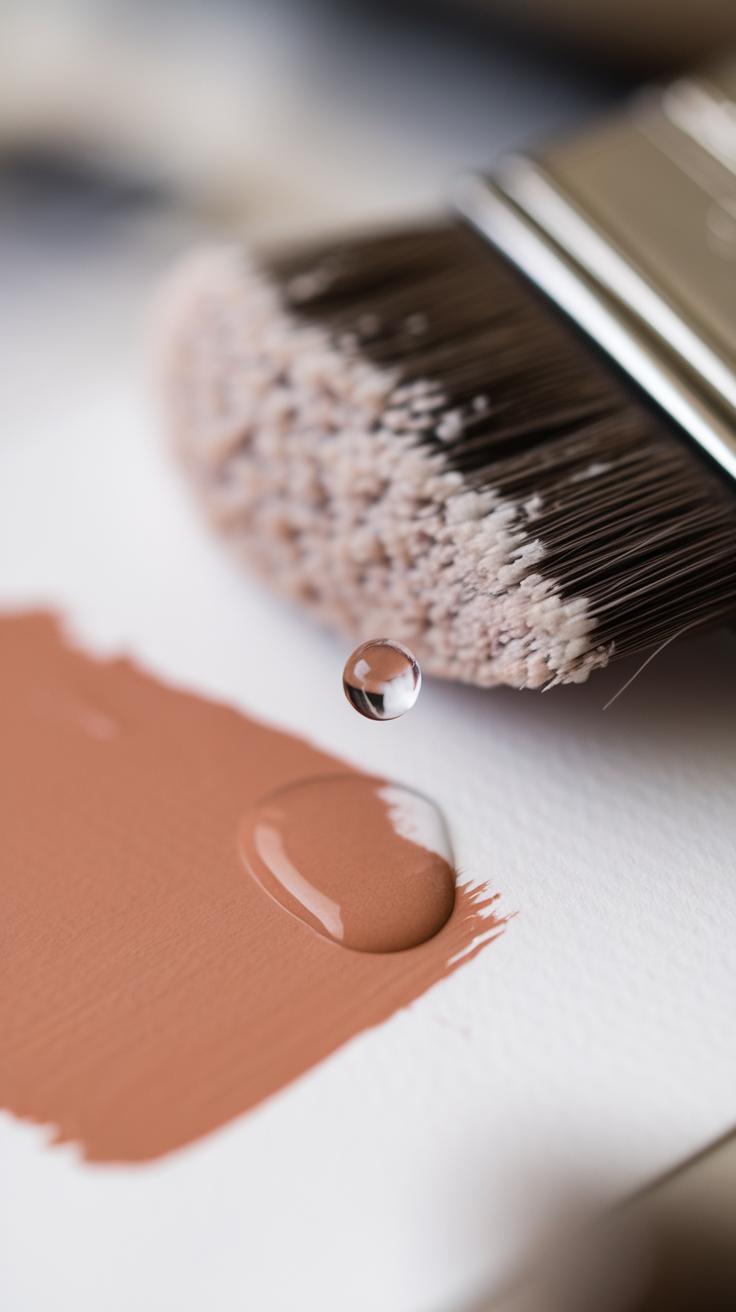
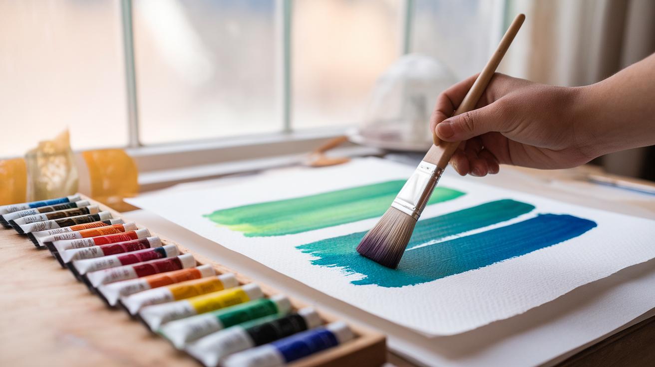
Mixing Gouache Colors Effectively
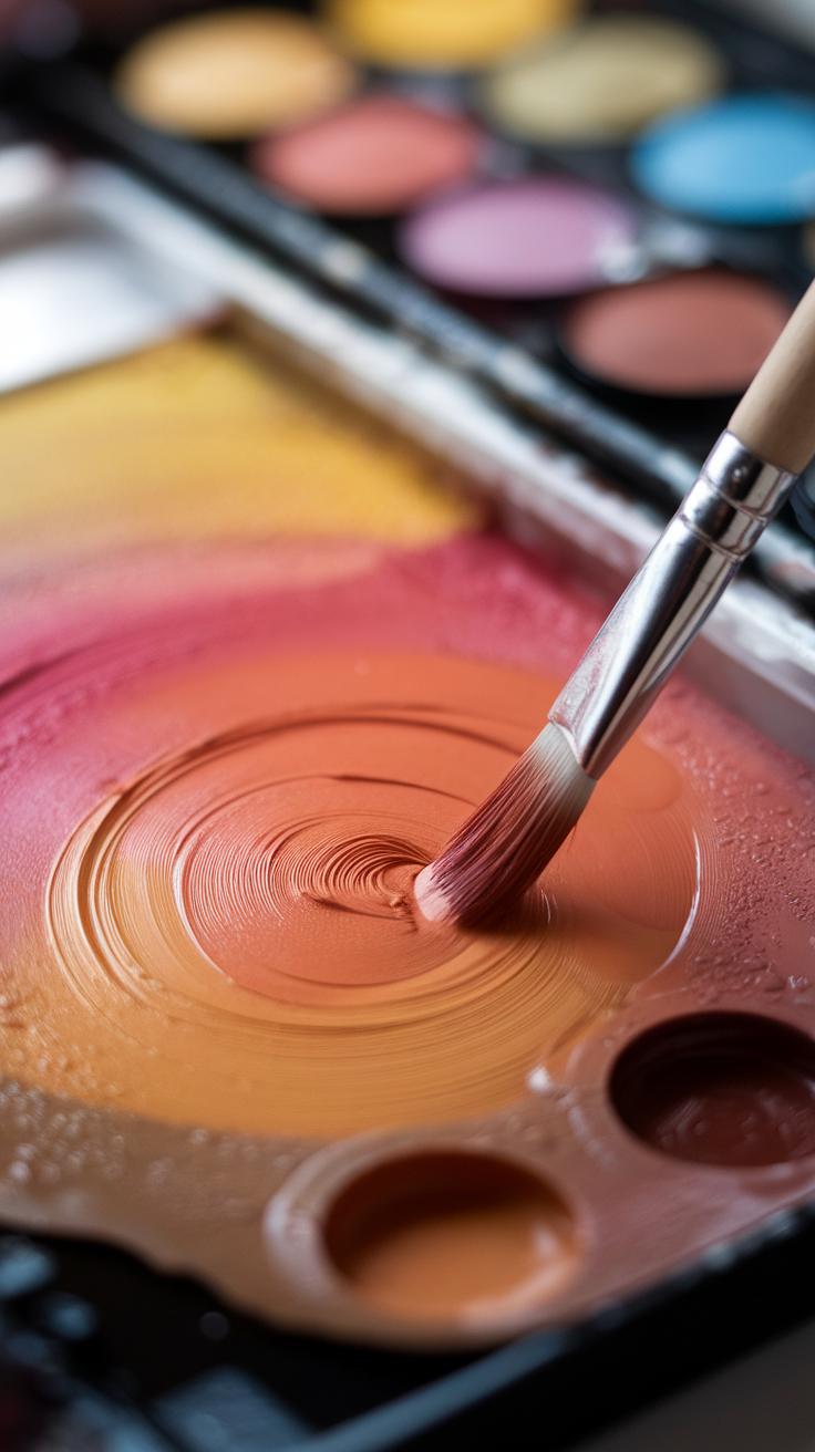
Mixing gouache colors requires attention to how pigments and binders interact. Your mix will change as it dries because gouache contains more binder than watercolor. This means colors often dry lighter and less glossy than when wet. Understanding pigment-to-binder ratios helps you predict these shifts. Thicker mixes hold stronger color but dry with a flatter finish. Thin mixes can appear more transparent and may lighten more on drying.
Try blending colors in small amounts first to see how they behave. Mixing too many pigments can result in dull, muddy colors. Keep your palette simple and test colors on scrap paper before applying them to your artwork. This approach saves time and helps you control final hues accurately.
Think about how a color looks both wet and dry. Do you want a smooth, even tone? Or are you aiming for subtle textural effects? Your mixing method influences how your colors come together and how your painting feels in the end.
Mixing On The Palette
Achieve smooth color transitions by blending pigments gradually on your palette. Start by mixing the dominant color, then slowly add small amounts of secondary pigments to shift the hue. Stir thoroughly to avoid streaks or uneven patches. If you add too many pigments, test your color on paper to check for muddy results before painting.
Swirl different ratios of paint to water to find your ideal opacity and brightness. You can create soft gradients by diluting your mix gradually. Always clean your brush between colors to keep mixes pure. This prevents unwanted color contamination and helps maintain clean, vibrant tones.
Try mixing a familiar color, like a green, from its base pigments on your palette. Watch how small changes in ratios affect the tone. What happens if you add more blue or yellow? Testing like this improves your confidence and control over your mixtures.
Mixing On The Painting Surface
Mixing directly on your painting surface offers different effects depending on your technique. Wet-on-wet mixing involves applying wet gouache over wet paint. The pigments flow and blend naturally, creating smooth, spontaneous transitions. This works well for skies, soft backgrounds, or subtle color glazes.
Layering means applying dried paint and then adding more gouache on top. You can build depth by overlapping colors, allowing the lower layers to show through or influence the top layers visually. Layering adds texture and complexity without muddying colors.
Experiment with both methods to see which suits your style. Have you tried blending colors on paper rather than your palette? How does this affect your control over color and texture? Each approach offers unique opportunities for expression when working with gouache.
Color Mixing Challenges with Gouache
Gouache painting often surprises artists with unexpected color shifts as paint dries. You may mix a perfect tone that looks bright wet but changes once it loses moisture. This drying change can lighten or darken hues, making it tough to predict the final color.
Keeping colors consistent between painting sessions can also cause frustration. Matching exact mixes later is tricky without clear records of the pigments and proportions you used. These mismatched sessions may break the flow and affect your artwork’s harmony.
Another common problem is ending up with dull or muddy colors. Mixing too many pigments or layering quickly without letting paint dry can dull your colors. Avoid excessive mixing on the palette by using small amounts and adding color gradually. How often do you find your paint turning flat instead of vibrant?
Why Colors Change When Dry
Gouache contains a high amount of pigment and binder, but as water evaporates, this balance shifts. The paint often appears darker or juicier when wet because water refracts light differently than dried paint. When dry, the surface layer scatters light more, causing some colors to look lighter or more muted.
This shift affects how you plan colors. For example, a saturated blue may dry to a paler tone. It’s easy to overcompensate when applying color wet, only to find the dried shade is off from your intention.
Colors containing white behave differently too. White added to gouache creates opacity but can cause the pigment to look chalky or dull after drying. Watching how your paint changes can help you adjust your mixing or layering early.
Tips to Maintain Color Consistency
Recording your mixed formulas is essential. Note the exact colors, ratios, and water amount you use. This habit makes it easier to match colors on another day.
Use fresh paint whenever possible. Old or dried gouache can lose vibrancy, leading to dull results. Keeping your palette clean and mixing small batches also helps maintain control.
Layering thin washes instead of one thick coat lets you build color depth without risking muddy mixtures. Each layer influences the final tone, so work gradually and adjust as the paint dries.
Have you tried mixing a small swatch and drying it before committing to a full stroke? This test method can save time and prevent surprises. Keeping your process deliberate helps you master consistent color results in gouache.
Creating Custom Shades and Tones
Lightening and Darkening Colors
You control brightness in gouache by mixing white or black paint into your base color. Adding white lightens the hue and increases opacity, creating softer tones. This helps when you want pastel shades or highlights that stand out. Start with small amounts of white; gouache’s opacity means overdoing it can wash out the color quickly.
Darkening colors needs care to keep vibrancy. Black gouache can dull your color fast. Instead of pure black, try mixing a darker pigment close to your base shade to deepen shadows. For example, mixing ultramarine blue with burnt sienna creates rich, natural darks without losing brightness. This tricks the eye and maintains the liveliness in your painting.
What effect do your darks have on the overall mood of your artwork? Try testing different darkening methods on a palette before applying them. This lets you see how brightness changes affect the final piece without risking your work.
Adjusting Hue with Complementary Colors
Complementary colors sit opposite each other on the color wheel. Mixing these together lets you tone down bright colors and achieve natural shades. For instance, adding a bit of green to red lowers its intensity, helping you avoid artificial-looking reds.
Using complements can also change the temperature of your color. Adding a small amount of orange to blue warms it up and reduces harshness. This method creates muted tones that match what you see in nature. It’s especially useful for portraits or landscapes that require subtle shifts.
Try mixing complementary colors in tiny amounts to avoid muddy results. How much do you need to add to get the perfect tone? Experimenting with these mixes will improve your sense of color control and make your gouache work more realistic and balanced.
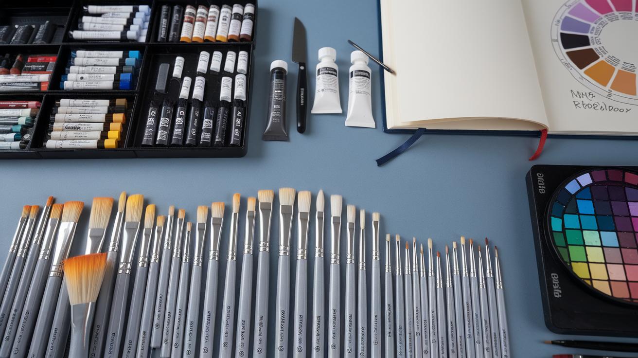
Tools and Surfaces for Gouache Painting
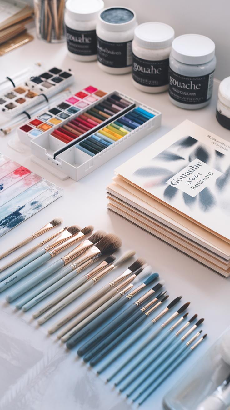
Choosing the right tools can change how your gouache behaves and looks. Brushes come in many shapes and sizes, and selecting the best ones helps you control your paint effectively. Synthetic brushes suit gouache well because they hold paint smoothly and keep their shape. Natural bristles offer different textures but might soak up more water, which can affect your paint’s consistency.
Paper choice influences how your colors shine. Rougher papers catch more paint and create texture, while smooth papers allow for clean lines and washing effects. Heavyweight watercolor papers or mixed media types work well because they handle moisture without buckling. Experimenting with surfaces can reveal new effects and inspire fresh techniques. What surface texture challenges have you faced in your gouache painting sessions?
Best Brushes for Gouache
Synthetic brushes provide firm control and resist damage from gouache’s heavier pigments. They come in flats, rounds, and filberts—each shape fits different uses. Use round brushes for detail work or fine lines. Flats spread paint evenly and are great for covering larger areas. Filberts combine round and flat features, letting you switch between detail and broad strokes quickly.
Size matters too. Small brushes make it easier to paint tiny shapes and precision lines, while larger brushes cover surfaces faster and build texture. If you want smooth blends or sharp edges, try using both types. Which brush shape feels most natural when you paint?
Choosing The Right Paper
Good paper holds your gouache without warping or bleeding. Watercolor paper rated at 140 lb (300 gsm) or more offers enough thickness and texture to absorb paint evenly. Cold-pressed paper has a slight texture, helping your paint cling and layer nicely. Hot-pressed paper gives a smooth finish, ideal for detailed work and layering glazes.
Mixed media papers handle water and gouache well, providing durability and versatility. Using the right surface can make your colors appear clearer or more muted depending on how much paint the paper absorbs. When trying new papers, notice if colors look brighter or duller. How does your preferred paper affect your color mixing results?
Techniques to Enhance Gouache Artwork
Layering and Glazing Techniques
Building layers with gouache adds depth and richness to your paintings. Start with thin, semi-transparent layers and let each one dry before adding the next. This approach controls the paint’s opacity and prevents muddiness.
Glazing involves applying a thin wash of diluted gouache over dried paint. This lets color shine through underneath, enhancing vibrancy without covering details. Try glazing warm hues over cool tones to make colors pop.
Managing how much water you mix with your paint affects the opacity. More water creates smooth, translucent layers, while less water produces solid, matte coverage. Adjust this to build shadows, highlights, or subtle color shifts.
Have you ever noticed how a few well-placed layers can turn a flat shape into something alive? Layering and glazing help you achieve that richness and dimension in your work.
Combining Gouache with Other Media
Mixing gouache with other media introduces exciting textures and effects. Use watercolor beneath gouache for delicate washes that peek through opaque layers. This contrast adds complexity.
Ink pairs well with gouache, especially for fine lines or bold outlines. After your gouache layer dries, apply ink to define details or add patterns. This combo can create sharp, dynamic contrasts.
Pencil or colored pencil works for subtle shading or texture on dry gouache surfaces. Light pencil marks add detail without overpowering the opaque paint.
Have you tried blending gouache with wet media like watercolor or dry tools like pencil? Experiment with these pairings to discover which textures and effects support your artistic style best.
Preserving and Caring for Gouache Paintings
You want your gouache paintings to look fresh for years. Gouache is sensitive to moisture and can crack if not cared for properly. Keep your paintings away from direct sunlight to avoid fading. Light can weaken pigments and change colors over time. Avoid humid spaces like bathrooms or kitchens. Moisture can make gouache soften and even lift off the paper.
Dust can stick to the matte surface easily. To prevent this, handle your artwork with clean hands or wear cotton gloves. Avoid touching the painted areas directly. If dust collects, gently brush it off with a soft, dry brush instead of wiping, which can damage the paint.
Have you noticed how quickly some gouache artworks discolor compared to oils or acrylics? That’s why protecting your paintings should be part of your process. Proper care keeps your colors vivid and your textures intact for your future exhibitions or personal collections.
Drying and Storage Tips
Dry your gouache paintings flat on a clean, dry surface. Vertical drying may cause the paint to crack or drip, changing the effect you wanted. Let them dry completely before moving or storing. Gouache dries fast but the paper underneath needs time to settle.
Store your paintings in a cool, dry place away from extreme temperatures. Place them between acid-free sheets or glassine paper to stop dust and dirt. Avoid stacking unless you use thick boards between each piece. Too much pressure can flatten the paint layers and cause cracking.
Have you ever returned to a stored painting to find its edges warped? Flat drying and careful storage help prevent that. Keep your painting safe so it holds up for your next creative step or display.
Framing and Display
Choose a frame that includes a glass cover to protect gouache paintings from dust, moisture, and environmental pollutants. Use UV-protective glass or acrylic to reduce fading caused by light. Ensure the frame has a mat to create space between the painting and glass. This prevents the paint from sticking to the glass.
Secure the painting with acid-free backing materials. Avoid adhesives directly on the artwork. Mount your painting firmly but gently so it doesn’t shift or crease over time. Check frames regularly for any signs of moisture or damage that could harm your artwork.
Consider how you display your piece. Does it get strong sunlight all day? If so, try rotating locations or limiting exposure hours. Protecting your gouache painting during display and storage maximizes its lifespan and preserves your hard work.
Practical Exercises to Improve Your Gouache Skills
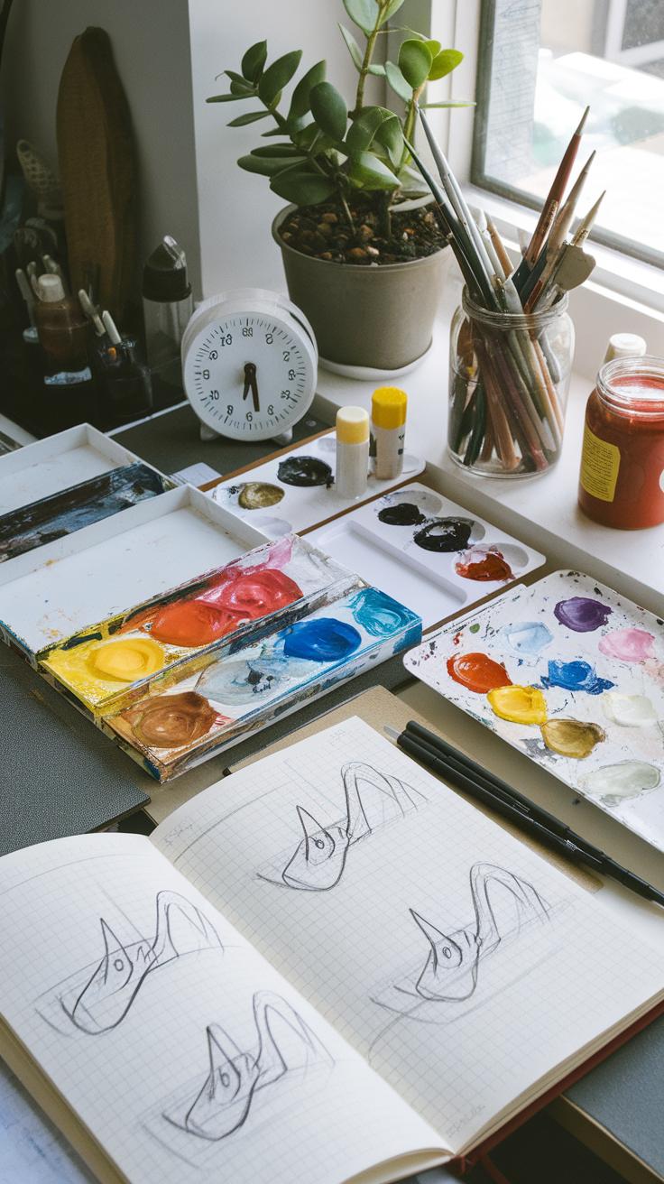
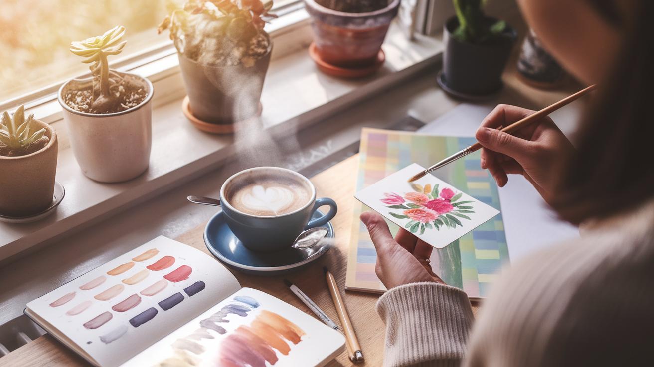
Practice builds skill with gouache paint, especially when focusing on color mixing and technique. Start with simple drills that challenge you to mix a target color using only a few paints. For example, try to create five shades of green using just blue and yellow, adjusting the ratio to see how the hue changes.
Create small swatches of mixed colors, label them, and compare them to reference photos from nature or everyday objects. Matching the exact tone of a leaf, sky, or fruit can sharpen your eye and hand coordination.
Set aside 15 minutes daily for quick painting challenges. Paint a simple shape or object with an unusual color palette or limited tools. Your aim should be to use different brush strokes, vary paint thickness, and explore opacity. These quick exercises train control and help you learn how to layer effectively.
Which color range feels most difficult for you to mix? Focus your daily drills there and watch your confidence grow with each attempt.
Daily Color Mixing Drills
Create small palettes to practice specific color ranges, such as warm reds or cool blues. Mix tints, shades, and tones by adding white, black, or complementary colors. This helps you understand how to shift colors subtly and achieve natural variation.
Use photographs of outdoor scenes or objects as a color guide. Try to match key colors from a photo such as sky blue, sunset orange, or leaf green directly on your palette before applying paint.
Challenge yourself to mix exact matches without preset colors. For instance, only use primary colors to recreate a pumpkin’s orange or a cloud’s gray. This sharpens your eye for value and temperature.
Keep track of your mixtures and results in a color journal. Which combinations reproduce colors most accurately? This information acts as a quick reference for your future paintings.
Creative Gouache Projects
Choose simple subjects for your paintings, like a single fruit, a textured rock, or a small patch of grass. Focus on capturing details with varied brush strokes and layering techniques rather than complex composition.
Try painting small landscape thumbnails where you experiment with soft gradients for skies and detailed strokes for foliage. Notice how layering light colors over dark creates texture and depth in gouache.
Texture studies also sharpen your skills. Paint rough tree bark, smooth glass, or fuzzy fabric using dry brush, stippling, and glazing methods to replicate their look.
Ask yourself, what technique will help me portray this surface most realistically? Practice these on small canvases or paper scraps to build confidence before tackling larger pieces.
Conclusions
Gouache offers versatility through its opaque and fast-drying nature. Learning its features and how to mix colors correctly unlocks many creative possibilities. With practice in mixing pigments and handling gouache, you can create various effects and styles. Your artworks will gain depth and richness with better color control.
Applying gouache techniques and color mixing knowledge improves your painting skill step by step. Keep experimenting with different blends and brushwork to find your style. Use the insights shared here to refine your approach, helping you produce more confident and beautiful paintings.