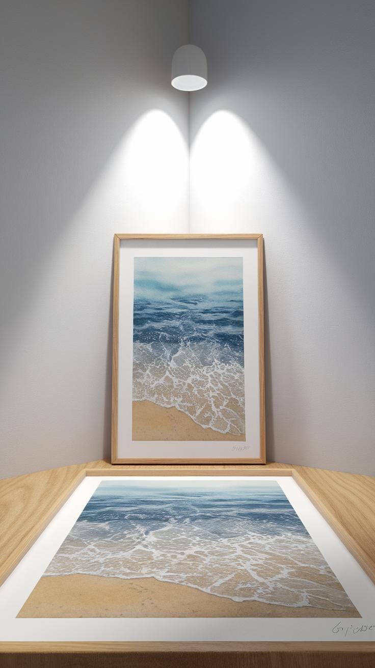
Introduction
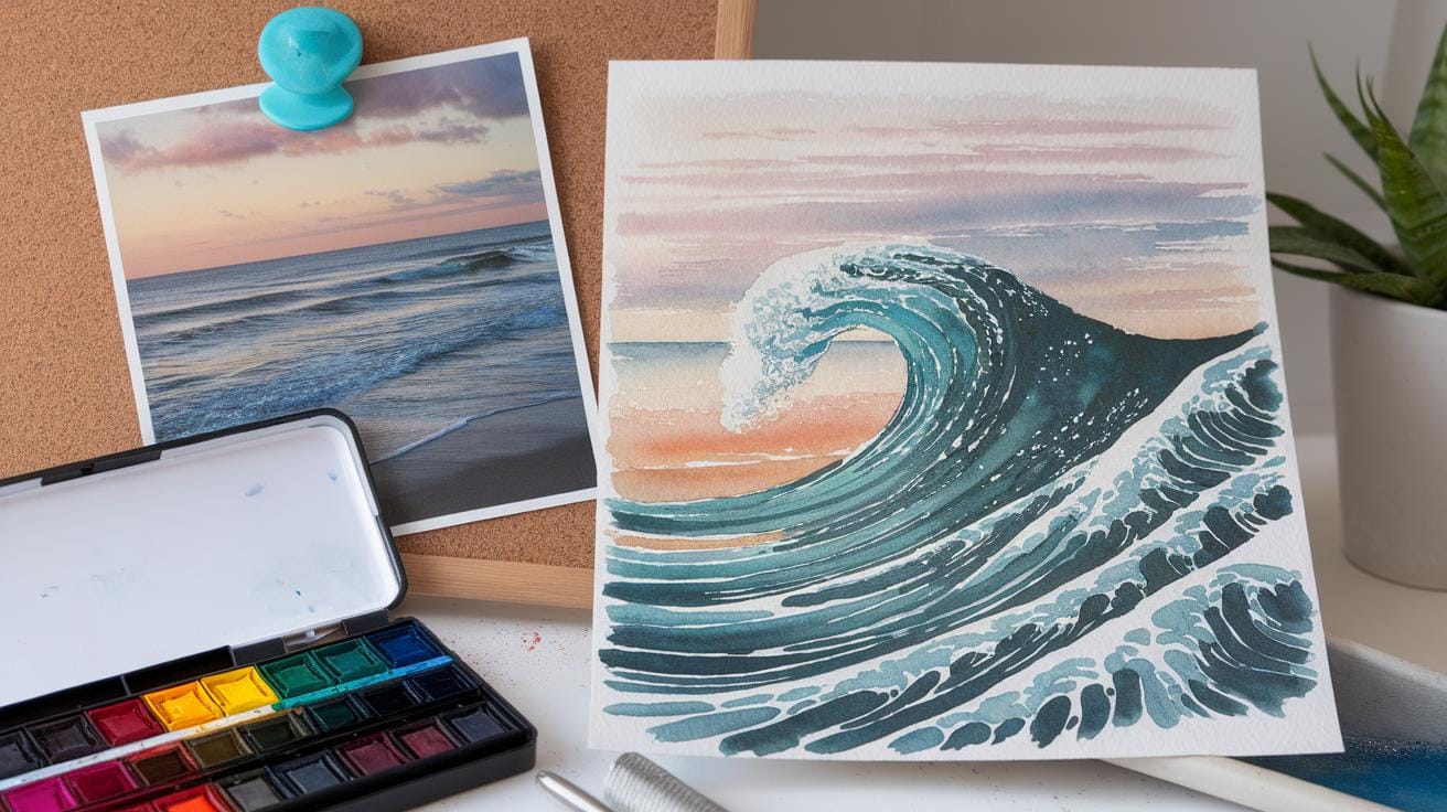
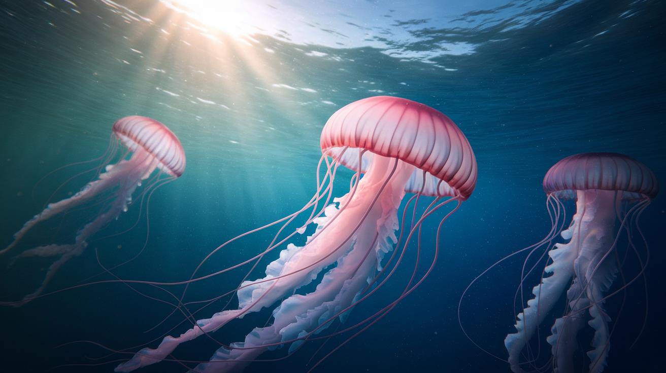
Watercolor painting is a versatile art form that allows you to create beautiful, transparent images using pigments mixed with water. One of the most popular subjects for watercolor artists is the ocean. Painting the ocean offers a chance to capture dynamic water movements, reflections of light, and the wide variety of blues and greens found in nature. This guide will help you understand essential watercolor techniques and approaches needed to paint majestic ocean scenes effectively.
If you have ever wanted to create your own ocean watercolor paintings, this guide covers practical tools and methods. You will learn about the materials to use, how to plan your composition, techniques for painting water, waves, and skies, and advice on adding depth and mood to your work. Each chapter breaks down these concepts into clear, actionable steps that improve your painting skills and inspire your creativity.
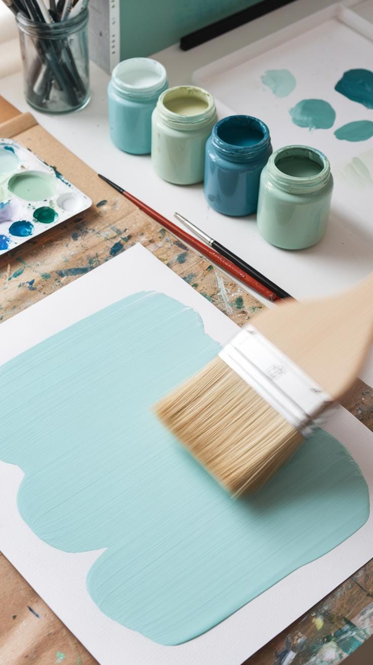
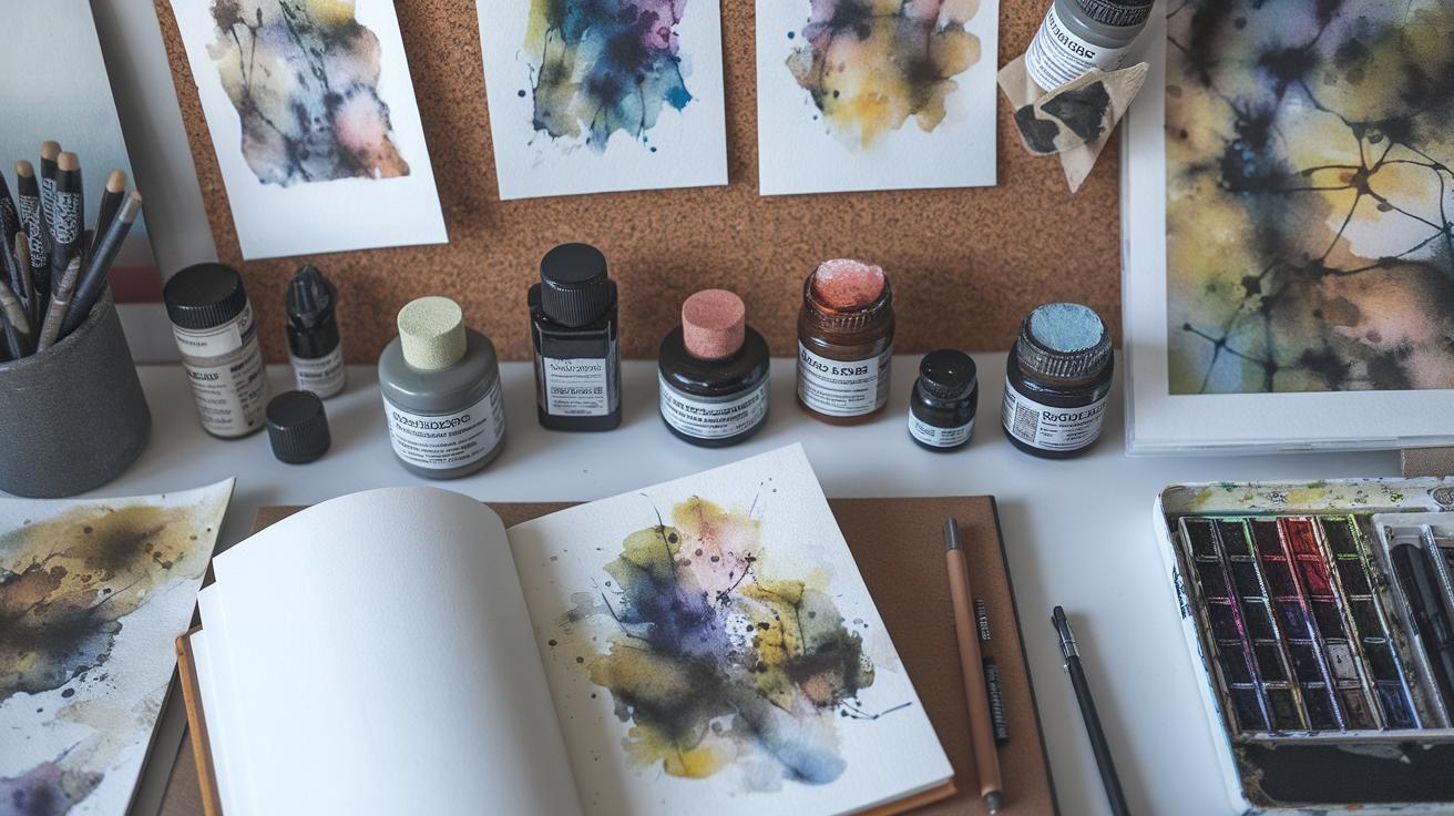
Understanding Watercolor Materials
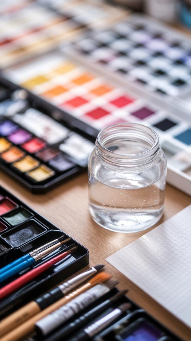
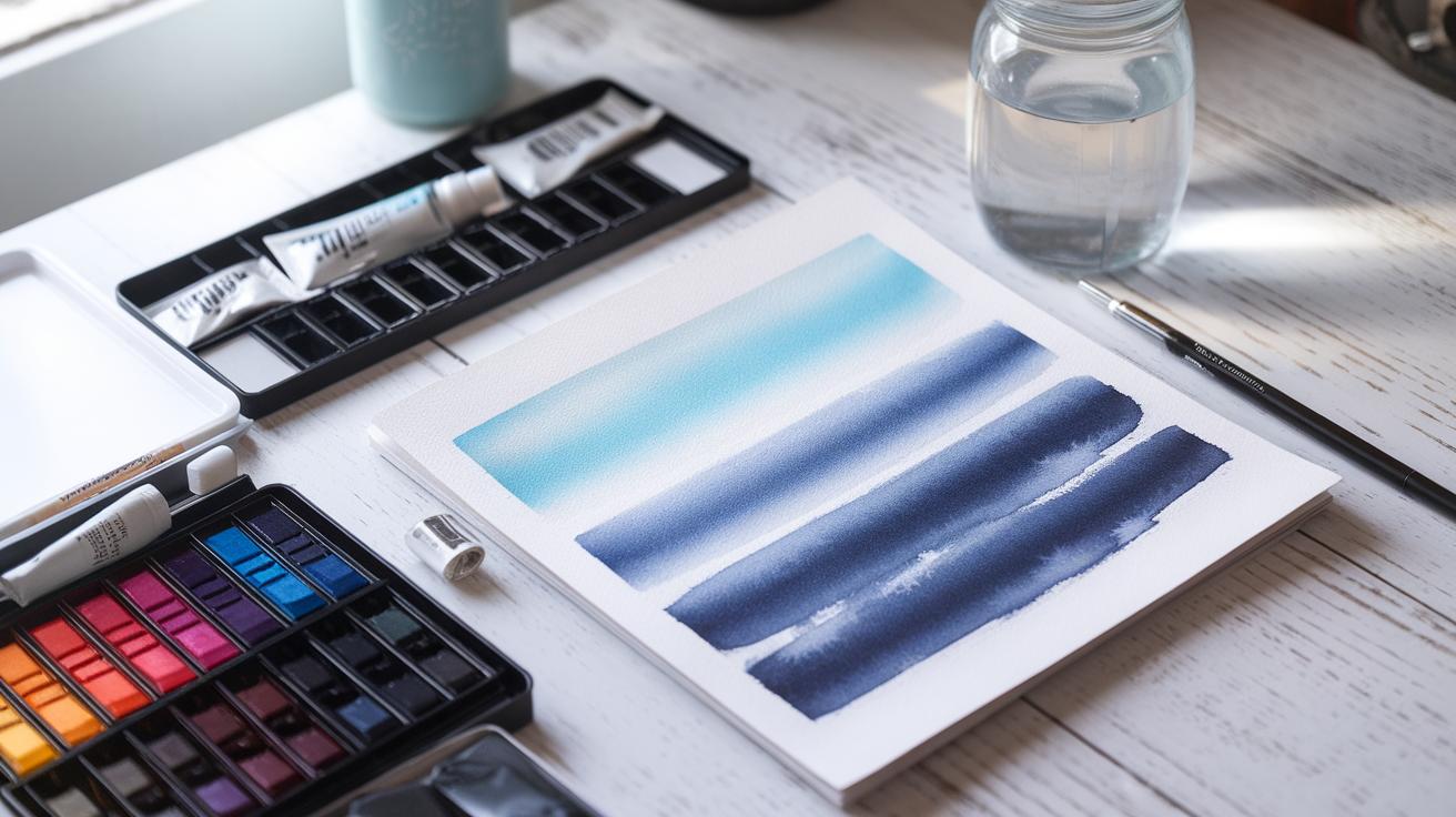
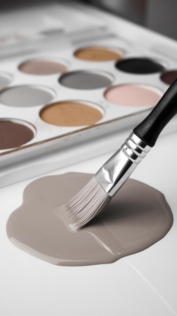
Choosing the right materials shapes how your ocean paintings come to life. Watercolor paper affects how paint spreads and dries. Look for heavyweight paper, at least 140 lb, to avoid warping with water. Cold-pressed paper has a textured surface that helps create ocean waves and foam by capturing brush strokes. The slight roughness holds pigments well, perfect for beaches and rocky shorelines. Hot-pressed paper is smoother and better for fine details, like distant waves or reflections.
Brush selection matters when rendering ocean scenes. Round brushes with firm tips provide control for detailed water curves, while flat brushes cover large areas such as sky or sea with broad strokes. Fan brushes work well to mimic the movement of spray or foamy sea. Sizes between 6 and 12 offer balance between precision and coverage. Synthetic brushes can hold water longer and keep sharper edges, aiding layered glazes to build depth.
Choosing the Right Paper and Brushes
Cold-pressed paper helps capture ocean textures because its grain catches paint unevenly, making waves look natural. Hot-pressed paper, being smooth, lets you push colors side by side for reflections but may lose the spontaneous flow needed for water movement. What kind of texture fits your vision? Experiment with both types.
Round brushes excel at drawing curling waves with their pointed tips. Large flat brushes lay down smooth washes for sky and deep water. Fan brushes create the illusion of spray and foam with quick, light strokes. Using different brushes empowers you to mimic the ocean’s variety — from calm surfaces to crashing waves. Try combining shapes and sizes to capture the ocean’s rhythm effectively.
Selecting Watercolors for Ocean Colors
Pigment concentration controls the vibrancy of your ocean hues. Strong pigments display rich, transparent blues and greens, ideal for simulating clear water. Weak pigments may appear dull or muddy when layered. You want paints with high staining power to keep colors clear through multiple washes.
Essential blues include Ultramarine and Phthalo Blue. Ultramarine has a warmer tone fitting sunsets over water, while Phthalo Blue is intense and cool like deep ocean depths. For greens, try mixing Phthalo Green with a touch of Cadmium Yellow for bright seaweed or shallow water colors. Adding Payne’s Gray or Indanthrone Blue can help depict shadow areas on waves. Do you consider pigment strength when choosing colors? Mastering this lets you paint oceans with believable depth and life.
Planning Your Ocean Painting
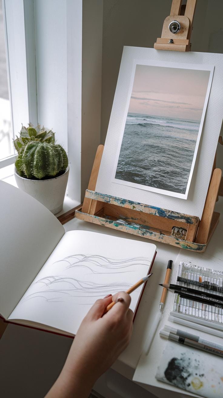
Before you start applying paint, take time to plan your ocean scene carefully. Think about the angle you want to show. Will your view focus on crashing waves, a distant horizon, or a calm bay? Deciding on perspective first helps shape your composition.
Consider the mood you want to express. Is the ocean bright and sunny, stormy and dark, or peaceful and soft? Light affects the ocean’s colors and reflections. Pinpointing how light hits the water will guide your color choices and brushwork.
Preparing a clear layout before you paint saves time and helps avoid confusion. It allows you to think through the major shapes and connections. When you sketch outlines, you start building a roadmap for painting the water’s flow and textures.
Composing Your Scene
Start by choosing a strong focal point that draws the eye. Focus on a wave crest, a rocky coastline, or the meeting line of sea and sky. These spots give your painting interest and structure.
Think about how to arrange the elements to lead the viewer through the scene naturally. You might place a large wave in the foreground and a distant boat near the horizon to add depth. Including coastal details like sand or seaweed can add character.
Ask yourself what catches your attention when you look at the ocean. Use that to guide your framing. Avoid cluttering the scene with too many objects. Keep your focus clear and impactful.
Sketching and Layout
Use light pencil strokes to map out major shapes before applying any paint. Sketch the horizon as a straight line or curve and outline wave shapes with simple curves. Capture how the water flows and where it breaks.
Try breaking down complex waves into basic shapes like triangles or arcs. This helps keep control over your composition as you paint. Mark the areas where you want foam, shadows, or reflections.
Regularly step back to view your sketch with fresh eyes. Check if the balance between sky, ocean, and land feels right. Your sketch acts as a guide to keep your brushwork focused, so don’t rush this step.
Applying Base Washes
Applying base washes sets the stage for your ocean watercolor painting. These washes create the first layers of color and establish the mood you want to capture. Begin by mixing watery pigments with plenty of clean water to keep the colors light and transparent. Use a large flat brush to spread the pigment evenly across your paper.
Focus on smooth transitions between colors, especially where sky meets water. Blending these areas gently will reflect natural gradients and help your painting feel cohesive. Practice controlling the amount of water on your brush to avoid unwanted streaks or hard edges.
Proper base washes make later layers easier to apply and improve your painting’s depth. Think of this as building a foundation: the smoother the start, the more realistic the final ocean will appear. How can you adjust your pigment-to-water ratio to get softer blends in your washes?
Creating a Sky Base
Painting a sky base involves creating a gradient wash that fades smoothly from one color to another. Decide on the time of day and weather before mixing your pigments. For example, early morning skies might blend soft pinks and blues, while a stormy sky could use greys and deep blues.
Start with clean water on your paper, then load your brush with diluted color at the top. Apply it in horizontal strokes, working quickly before the paint dries. Gradually add more water or change pigment mixes as you move downward to create a natural color fade.
Practice lifting pigment with a clean, damp brush if any edges become too harsh. This technique helps simulate the softness of clouds or the sky’s haze. Have you tried layering different washes to bring more complexity to your sky?
Laying the Water Foundation
Begin your ocean base with a light wash that covers the water area evenly. Use a mixture slightly darker than your sky to define the ocean but keep it translucent. Leaving spots blank or lightly painted will reserve space for reflections and highlights later.

Apply your wash with horizontal strokes, mimicking the ocean’s flat surface. Early layers should be gentle and pale to allow you to add depth in following steps. Avoid adding heavy pigment here since you will build up color and texture using other techniques later.
Think about how light interacts with the water. What areas should stay lighter to show shimmer or reflections? By planning your base wash carefully, you create room for these details without overworking the paper. How will you balance pigment density to keep this base layer delicate?
Capturing Waves and Water Movement
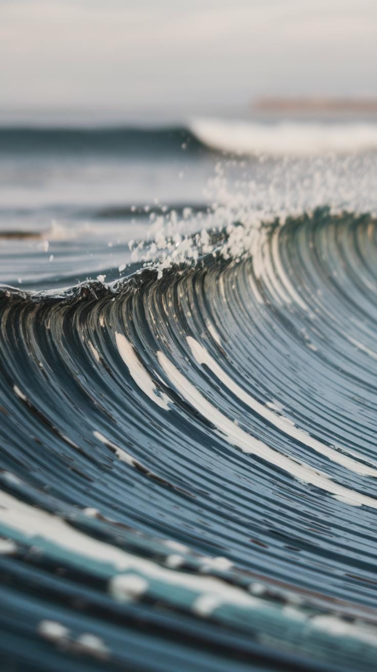
To capture the movement of waves and water in your paintings, focus on how water layers over itself and shifts with the wind. Your control over paint flow helps create natural water dynamics. Use wet-on-wet techniques to suggest smooth curves and blending of colors in wave bodies. Then, add sharper edges with wet-on-dry strokes to form wave crests and curls.
Think about the direction of wave movement. Short, curved strokes mimic the rolling motion of waves. Let paint flow freely in some areas to simulate foam and spray, but maintain control to avoid muddy colors. Layering different pigment intensities helps suggest depth and volume. This balance creates realistic wave shapes that feel alive on paper.
Layering for Depth
Build your waves by layering gradually. Start with light washes to outline the base shape of the wave. Each layer adds volume and darkens shadows. These layers give your ocean body more weight and realism. Between layers, let the paper dry completely to keep colors distinct.
Focus dark pigment on the wave troughs and lighter on the peaks. This contrast creates a sense of depth and light reflection. You can also use transparent layers to show how water changes color where it’s thinner or thicker. This step-by-step build-up makes waves appear three-dimensional and moving.
Using Brush Strokes for Texture
Brush strokes create the feel of water texture on your waves. Dry brushing works well to show rough foam on wave crests. Drag a dry brush with little paint across the paper to reveal texture underneath and suggest splashing water. This works best on textured paper with some grit.
Use lifting to remove pigment in small areas after the paint dries. This mimics highlights and moving water reflections. You can lift paint with a damp brush or tissue to add bubbles or shine within the wave. Try mixing short, flicking strokes with longer ones to present the chaotic motion of waves as they curl and break.
Adding Light and Reflections
Reflections on the ocean surface add depth and life to your painting. The water mirrors the sky’s colors, the sun’s position, and nearby objects. Watch carefully to see how these reflections shift and change with the waves.
Begin by lightly sketching the shapes or colors you notice reflected in the water. Use soft, horizontal brush strokes to suggest the fluid motion of the ocean. Keep your paint diluted for smooth blending.
To capture shimmering light effects, try layering thin washes. Let each layer dry before adding the next. This technique builds a sense of glowing reflections. Using wet-on-wet methods can softly merge colors, mimicking the ocean’s subtle shifts.
Keep an eye on how the sun brightens the water in certain areas. You can hold back pigment or gently lift wet paint with a clean, damp brush to create sparkling highlights. Have you noticed how light catches the waves and makes the water sparkle? Paint those moments carefully to bring your ocean to life.
Paint Reflections with Care
Reflections change based on the sky, the sun, and nearby objects. Your job is to observe how these colors and shapes appear on the water’s surface. Don’t paint the reflected object exactly as you see it. Instead, note how the water distorts and blurs the shapes.
Look for horizontal streaks where the reflection stretches across the water. Use gentle, side-to-side brush strokes to mimic this movement. If trees or boats are nearby, their reflections might appear thinner or broken depending on the waves.
Match the reflection colors but make them softer and less saturated than their real forms. This contrast helps the reflection appear realistic. Do you see the sky’s blue blending with hints of orange or pink near the horizon? Transfer those subtle changes to your painting.
Highlighting Waves and Ripples
To show shimmering waves and ripples, preserving white space acts as natural highlights. Leave parts of your paper clean or very lightly painted to allow light to shine through.
Lifting paint helps create these effects too. When your paint is still wet or damp, use a clean, moist brush or a paper towel to lift some pigment from the wave crests. This method imitates the glint of sunlight catching the tops of waves.
Adding lighter pigments, such as pale blues or cool grays, on top of darker layers enhances the sense of dimension. Apply these lighter tones carefully on the edges of ripples and waves.
Have you tried combining these techniques? They work best when layered thoughtfully to suggest motion and sparkle without losing the water’s fluid feel. Practice on small sketches to find the balance that fits your style.
Painting Clouds and Atmospheric Effects
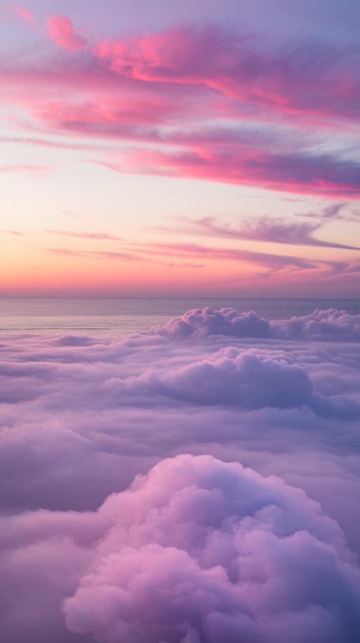
Clouds shape the mood of your ocean scenes and add depth to the sky. To paint clouds that look soft and natural, start with wet-on-wet techniques. Wet your paper in the cloud area, then drop in diluted pigment while the surface is still damp. The paint will spread and blend smoothly, creating soft edges without sharp lines.
Control the flow by adjusting how much water you use. More water makes lighter, fluffier clouds; less water gives stronger shapes. Practice with different pigment densities to find the balance that fits your vision. Think about how the clouds relate to the ocean below. Are they wispy or heavy? Translucent or thick? This will guide how you soften edges and create volume.
Adding darker tones helps develop the rainier or shadowed parts within clouds. Use a small brush to drop deep blues, purples, or grays where shadows would naturally fall. Lightly lift color with a damp brush in areas that catch sunlight to highlight brightness. This contrast brings dimensionality and realism. Ask yourself where the sun hits and where shade forms in your scene. Positioning the light and dark areas thoughtfully makes your clouds feel three-dimensional and alive.
Softening Cloud Edges
Use wet-on-wet to diffuse the edges of clouds and avoid harsh outlines. First, wet the cloud area with clean water. While the paper stays damp, touch the brush loaded with color to the edge of the wet area. The pigment will naturally bleed outward, blending the edge softly into the sky’s background.
If the edges need to be more defined in some areas, switch to wet-on-dry—paint on dry paper. This contrast between soft and sharper edges adds interest. You can also gently blot some pigment with a tissue while still wet to lighten or soften parts further. This technique mimics the way clouds blend with air, making your scene feel more believable.
Adding Dimension and Light
After the base layer dries, add shadows by mixing a darker tone with your original cloud color. Apply this selectively under cloud bases or inside folds where shadows fall. Use a fine brush to keep shadows controlled and avoid blending them with other cloud areas.
For highlights, lift color with a damp clean brush or use a tiny bit of white gouache or watercolor paint to dot illuminated spots. Make sure highlights sit opposite shadowed areas to create volume. Concentrating light and dark parts helps you build clouds that feel solid, yet airy.
Consider how changing weather or time of day affects lighting. Early morning clouds will have different light angles than storm clouds over the ocean. Adjust your tones and contrast accordingly to capture the moment accurately in your painting.
Creating Coastal and Marine Details
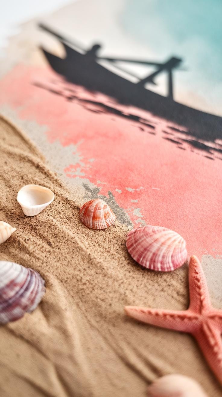
Painting coastal and marine elements brings your ocean scenes to life. Focus on small features like rocks, sand, seaweed, and boats to add interest. These details create a sense of place and invite viewers into your painting.
Rocks and sand require texture work to look realistic. You can use dry brush techniques and layering to mimic the rough, grainy surfaces found along shorelines. Pay attention to how light hits these objects to add depth.
Marine items like shells, driftwood, or fishing boats give your scene personality. Start with simple shapes and build detail step-by-step. Watch how colors interact and how shadows anchor objects in space.
Ask yourself, which coastal elements matter most in your composition? How can you balance texture and detail without overwhelming the scene? These choices will guide your painting process as you capture the ocean’s mood.
Texturing Rocks and Shore
Dry brushing produces grainy, rough textures perfect for rocks and sandy beaches. Use a nearly dry brush with minimal paint and drag it gently over your paper. This leaves sketchy, uneven marks that simulate stone surfaces.
Layering enhances texture by adding complexity. Start with a light wash for the base color. Let it dry completely. Apply darker tones with a drier brush to suggest cracks, crevices, or sand grains.
You can also lift paint with a damp brush or tissue to create highlights. Try this on rock edges to show where light touches. Small, jagged strokes work well to capture the irregularity of natural surfaces.
Adding Marine Life or Objects
Simplify boats, shells, or seaweed into basic shapes before refining details. For example, paint a boat’s hull as a simple curved shape first. Add sails or lines only after the base dries.
Seaweed can be created with quick, loose brushstrokes in greens and browns. Let the paint bleed slightly for a natural, flowing effect. Shells benefit from gentle gradients to show their curved surfaces.
Think about placement. Small objects near the shore usually show some shadow or reflection. Adding these supports realism and ties elements into the scene. Can you suggest a favorite marine detail to include in your next ocean watercolor?
Controlling Water and Paint Flow
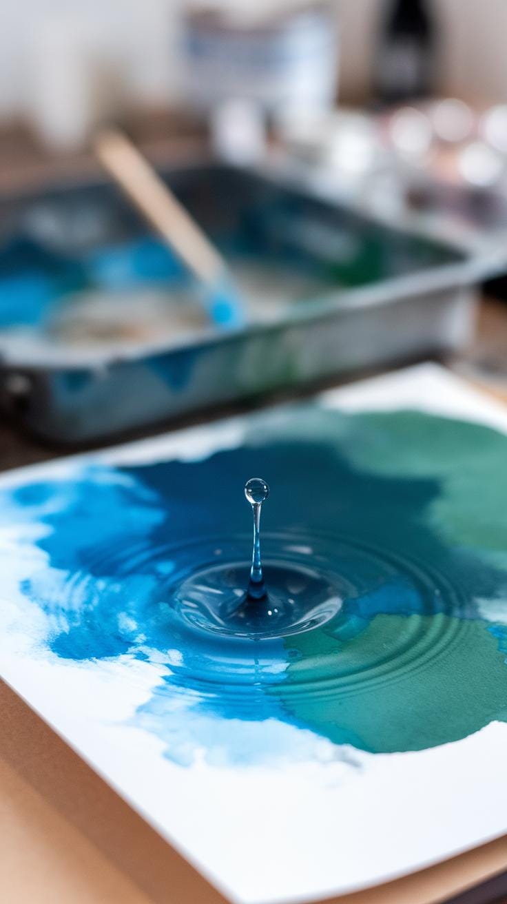
You need control over water and pigment to shape your ocean watercolor successfully. Managing flow means avoiding unintended mixing while still allowing soft blends that reflect the ocean’s movement. When water saturates the paper, pigments spread quickly. This can result in muddy colors if you’re not careful. To stop this, use less water on your brush or blot excess moisture on a paper towel before applying paint.
Timing is key when working with drying stages. Paint applied on wet paper blends smoothly, creating soft edges. Paint on damp or nearly dry paper lets you define details with sharper lines. Ask yourself, how much blending suits the wave or splash you want? Practice timing by watching how paint behaves as your paper shifts from wet to dry. Your ability to control this will bring out the complexity of ocean water in your paintings.
Managing Wetness Levels
Understanding wetness lets you decide how your colors mix and spread. Wet-on-wet means painting on wet paper. Colors merge naturally, giving you soft gradients perfect for water and sky. Wet-on-dry means painting on dry paper. This gives you more control and cleaner edges, ideal for crisp wave crests or boat outlines.
Try mixing these techniques. Start a wash wet-on-wet for a smooth background, then add wet-on-dry details once it dries. Notice how the paint reacts differently. How does the change in wetness affect the richness and texture of your ocean scene? By mastering wetness, you can control how much blending or separation your colors get.
Timing Your Layers
When adding layers, the drying state of your paper affects your painting’s clarity. Adding paint on fully dry layers keeps colors separate and details sharp. Partial drying allows softened edges and subtle color shifts driven by residual moisture.
Wait for your layers to dry depending on the effect you want. For ocean shadows or reflections, wait until the initial layer is just tacky, then add another color to create soft transitions. When painting distinct objects like rocks or boats, wait until the first layer is completely dry to avoid unwanted mixing.
Have you noticed how rushing can ruin an otherwise clear scene? Timing your layers improves the overall depth and realism of your ocean paintings. Experiment with different drying times to find what results you prefer for each part of your artwork.
Fixing Mistakes and Adjusting Colors
When you spot a mistake in your ocean watercolor painting, don’t panic. You can often fix errors by lifting paint carefully. Use a clean, damp brush or a soft sponge to blot the pigment while it is still wet or slightly damp. Work gently in small areas to avoid damaging the paper. If the paint has dried, re-wet the area lightly, then lift the color by dabbing with a moist brush or sponge. This technique helps you remove unwanted marks or soften edges without leaving harsh lines.
Sometimes your colors may feel too bright or too dull for your ocean scene. Adjust these tones by applying thin layers of glaze. Glazing means adding a transparent wash of color over a dry area to alter its appearance. For example, apply a light blue glaze to mute an area that feels too warm or use a contrasting orange tint to deepen shadows. This method lets you control the mood and depth of the waves, sky, or distant water effectively.
Lifting Paint Effectively
Lift pigment carefully by using a damp brush to rub or blot the paint. Start with clean water and a soft brush to avoid roughing the paper’s surface. You can also try a natural sponge pressed lightly onto the wet or damp paint. This action removes excess pigment or softens harsh lines. If the paint is dry, moisten the area slightly before lifting to prevent paper damage. Practice this on a scrap paper to see how your materials respond before working on your main painting.
Use a tissue or paper towel to absorb lifted paint gently. Avoid scrubbing hard. Ask yourself where subtle light areas can help your ocean scene breathe. Using lifting not only fixes mistakes but adds highlights and texture to waves or foam.
Enhancing or Muting Colors
Glazing allows you to alter colors without repainting. To mute a bright blue ocean, add a thin wash of neutral gray or a complementary color like warm orange. Apply these layers slowly and allow each to dry. To boost dull areas, use brighter, transparent colors in light layers to revive intensity. Contrast is also crucial. Applying dark tones nearby can make a color pop and give your ocean depth.
Try layering cool blues over sandy yellows to deepen the color of shallow water. Ask yourself if the colors reflect the ocean mood you want to show: calm, stormy, or sparkling. Adjust carefully, remembering thin glazes build richness without hiding previous work. Practice balance between enhancing and preserving your original colors for vibrant, realistic ocean watercolor paintings.
Final Touches and Presentation
After you have adjusted colors and fixed mistakes, it’s time to focus on the final details that bring your ocean painting to life. Look carefully across your work for areas that may benefit from small additions. Adding subtle features like thin lines or gentle dots can mimic waves, foam, or the texture of sand. You might use a fine brush to suggest sea spray or ripples on the water’s surface. These small touches add depth and realism without overwhelming the composition.
Once these last details feel right, sign your painting in a discreet spot. A signature not only personalizes your work but can also add balance to the piece. Take a moment to step back and reflect on your painting. Ask yourself what you did well and where you might improve next time. How did these small refinements change the feeling of your ocean scene?
Adding Last Details
Using fine brushes or even a toothpick, you can add thin white or dark lines to suggest waves or reflections. Texture dots made with a lightly loaded brush can suggest foam or bubbles. Don’t overdo these touches—subtlety keeps your painting natural.
Try splattering tiny drops of paint by flicking the brush gently to create water spray or sea mist. This technique adds movement. If you want to highlight specific areas, adding a touch of darker blue or green in shadows can enhance contrast and make elements stand out.
Preparing for Display
Wait for your painting to dry completely before handling it. Watercolors can wrinkle, so pressing your work under a clean, heavy book can help flatten the paper. Use acid-free materials when mounting or framing to avoid damage over time.
Choose a frame that suits your painting’s style and protects the surface with glass or acrylic. Consider using a mat board around your painting; it keeps the artwork away from the glass and enhances presentation. Display your finished work in a place where light won’t cause fading, such as away from direct sunlight.
How will you showcase your painting? Will you gift it or start a collection? Thinking about this helps you value the effort you put into capturing the ocean’s beauty.
Conclusions
Painting an ocean scene with watercolor requires practice and a clear understanding of how to handle this medium. You now know the importance of choosing quality materials, planning your artwork, and using techniques that highlight the unique qualities of water and light. By applying washes, layering pigments, and creating texture, your paintings will reflect the natural beauty of the ocean and its surroundings.
Remember that every artist develops their own style by experimenting and observing real-life ocean conditions. Keep challenging yourself to capture different moods, movements, and colors. With continued effort and attention to detail, your ocean watercolor paintings will grow more striking and personally rewarding. Use this guide as a reference to support your artistic journey in portraying the majestic ocean.