
What Is Marker Art Rendering?
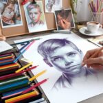
Marker art rendering is the technique of using markers — alcohol-based, acrylic, or water-based — to turn a sketch into a finished illustration with smooth colour transitions, shading, and visible texture. Industrial designers have relied on it for decades to quickly visualise concepts, and illustrators and hobbyists use the same approach to render anything from a still life to a full character design. Done well, marker rendering takes a flat line drawing and gives it weight, light, and depth.
Choosing the Right Markers for the Job
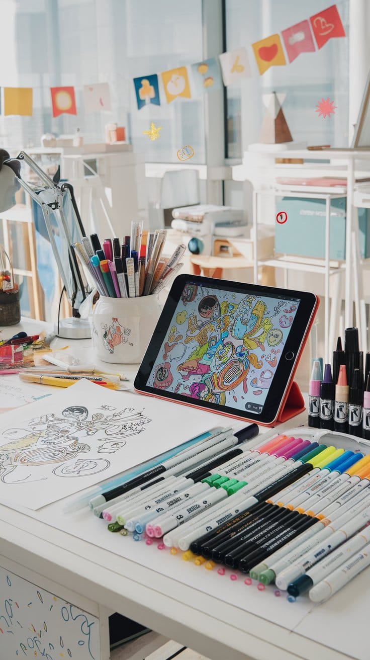
Not all markers behave the same way, so picking the right type matters as much as technique. Alcohol markers, such as Copic and Prismacolor, blend smoothly into each other and are the standard choice for layered shading on paper. Acrylic paint markers sit on top of the surface rather than soaking in, which makes them better suited to wood, canvas, or mixed-media pieces where you want opaque, vivid colour. Water-based markers fall in between — easier to control for beginners, though they blend less seamlessly than alcohol-based ink.
Alcohol Markers vs. Acrylic Markers
Alcohol markers are the better tool when the goal is smooth gradients and fine detail — the ink stays workable long enough to blend one stroke into the next. Acrylic markers are the better tool when you want bold, flat colour that won’t sink into a porous surface, or when you’re rendering on something other than paper. Many artists keep both on hand and switch depending on the surface and the amount of blending the piece calls for.
Core Techniques: Blending, Shading, and Layering
Good marker rendering comes down to three repeatable skills: blending, shading, and layering. Each builds on the last, and together they’re what separates a flat sketch from a rendering that reads as three-dimensional.


Blending for Smooth Gradients
Blending is built by working light to dark, letting each layer of ink dry slightly before adding the next. A colourless blender pen smooths harsh transitions between strokes, and working in small, overlapping circles avoids the streaky lines that show up when ink is applied in one flat pass.
Shading, Layering, and Perspective
Shading establishes where the light source sits and how it falls across a form. Layering darker tones into the same area builds shadow gradually rather than all at once, which keeps a rendering from looking muddy. Keeping perspective consistent — vanishing points, horizon line, the angle of every surface — is what makes the shading believable once it’s applied.
Mixing Markers with Other Media
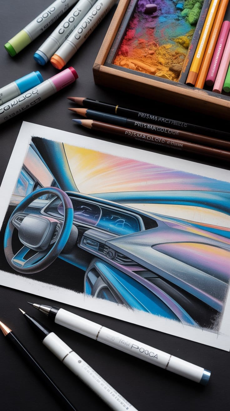
Markers rarely work alone in a finished piece. Soft pastels laid down first establish a base tone or atmosphere before any ink touches the page, since their dry, powdery texture gives marker strokes something to sit against. Once the marker layer is dry, coloured pencils add fine detail — wood grain, fabric texture, burnished edges — that markers alone can’t replicate. White gel pens or opaque fine-tip markers finish the piece with sharp highlights on metal, glass, or any surface that needs a hard reflection.
Taking Marker Renderings Digital
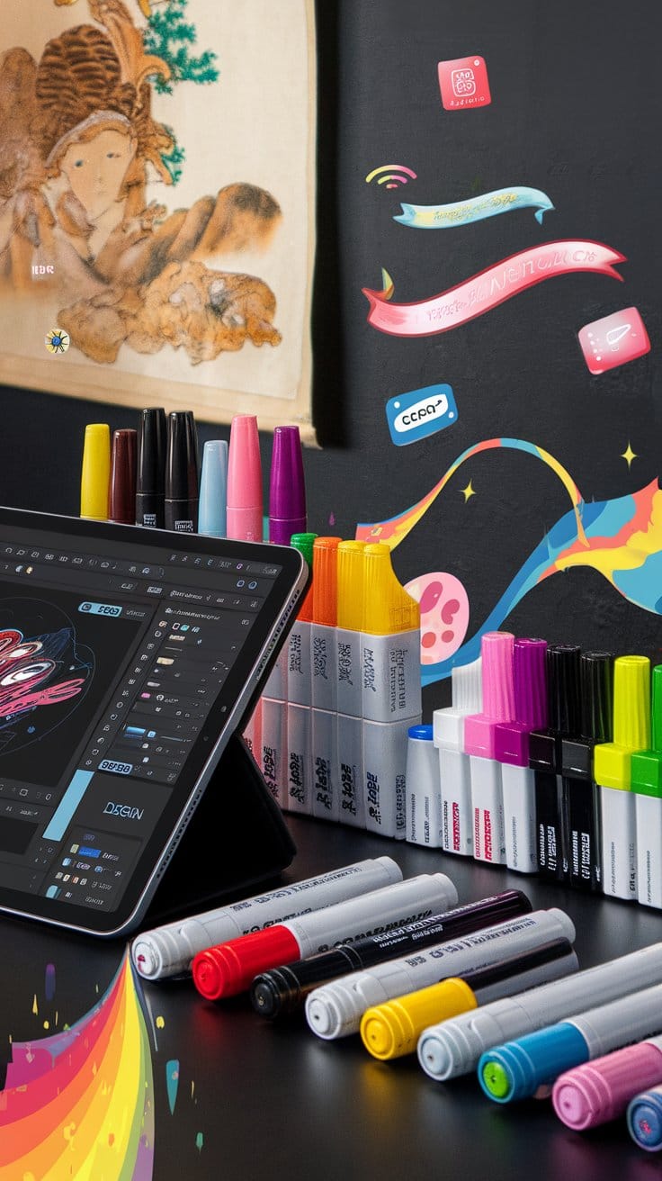
Most of these techniques translate directly to digital tools. Procreate and similar apps offer marker and alcohol-ink brush sets built to mimic the blending and texture of physical markers, making it possible to render a concept digitally and still keep that hand-drawn feel. A common workflow is sketching and laying down base tones traditionally, then scanning the piece and finishing shading, highlights, or colour corrections digitally — combining the speed of hand rendering with the flexibility of digital editing.

FAQ
What is marker rendering?
Marker rendering is the process of using markers to add colour, shading, and texture to a drawing so it reads as a finished, dimensional illustration rather than a flat sketch.
How do I make a drawing look 3D with markers and shading?
Establish a single light source, then layer shadow gradually — darkest where the form turns away from the light, lightest where it faces it — while keeping every surface’s perspective consistent.
What types of markers are best for rendering different textures or materials?
Alcohol markers like Copic suit smooth gradients on paper; acrylic paint markers hold up better on wood, canvas, or glossy surfaces where you want opaque, flat colour.
How do I render specific objects like vehicles or architectural elements?
Block in base colour and shadow shape first, then build form with layered shading that follows the object’s actual surfaces — flat panels stay flat, curves get a soft gradient.
What’s the process for rendering from a reference photo?
Sketch the outline first, identify the photo’s light source, then render shadow and highlight areas in the same order you’d shade a live subject — base tone, mid-shadow, then final highlights.
Are there digital marker brushes for apps like Procreate?
Yes — most digital art apps include alcohol-marker-style brush packs designed to replicate the blending and texture of physical markers for artists who render digitally.