Introduction
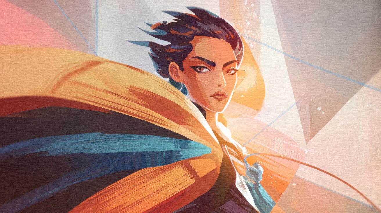
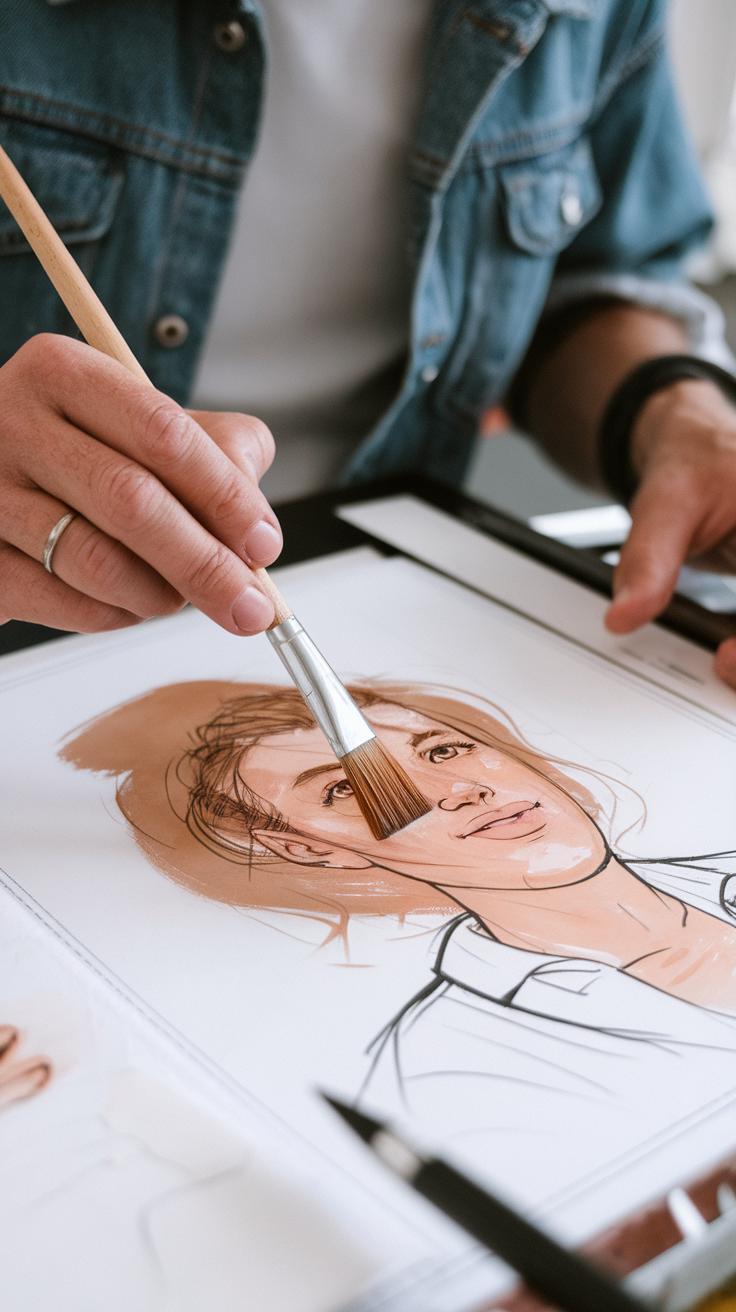
Gouache is a unique water-based paint that stands out because of its opaque and vibrant qualities. Artists often choose gouache to create bold and expressive illustrations, especially in character design projects. Its mix of water, pigment, and a binder allows for rich colors and solid coverage, making it an excellent medium for artists who want their characters to capture attention immediately. Gouache’s distinct ability to balance opacity and water-based techniques gives you versatility in your artwork, whether you are creating detailed illustrations or quick sketches. This guide introduces key concepts and methods to help you use gouache effectively in your character design work.
Exploring the benefits and techniques of gouache can open new doors for your creative projects. You will learn how to combine gouache with other mediums, manage its drying characteristics, and apply it in ways that bring life and depth to your characters. This article will cover practical tips on brushwork, color mixing, layering, and texturing, helping you gain control over this expressive and rewarding medium. Understanding gouache’s history and unique properties enhances your ability to use it thoughtfully and effectively in character art.
Understanding Gouache and Its Unique Properties
Gouache is a water-based paint made from pigment, water, and a binding agent like gum arabic. Unlike watercolor, gouache contains more pigment and less water, making it thicker and more opaque. Its opacity means you can layer colors without the lower layers showing through. This allows you to correct mistakes easily and build solid shapes, which suits character design well.
The paint dries quickly to a matte finish. Drying causes colors to appear slightly duller than when wet. Knowing this helps you anticipate the final look of your artwork. Gouache also reflects light softly, avoiding shine and keeping focus on your character’s form and color contrast.
These traits make gouache excellent for creating characters with clear shapes and bold color choices. You can work in layers and adjust details as you go. How might this flexibility influence the way you create facial expressions or clothing textures?
What Makes Gouache Different from Other Paints
Gouache stands apart from watercolor and acrylic paints mainly because of its pigment concentration and opacity. Watercolors have less pigment, so they are transparent and rely on paper whiteness to shine. Acrylics have strong pigments but dry to a plastic-like, glossy surface.
Gouache sits between these two. It offers rich, flat colors with a velvety matte finish. Its texture allows you to create sharp edges or smooth blends by adding water or applying thick strokes. These qualities make gouache very forgiving for detailed character work.
When designing faces or clothing folds, the full coverage lets you paint over errors or add highlights without muddying the image. Have you noticed how this helps in building layers of emotion and personality within a character?
How Gouache’s Optical Qualities Aid Character Illustrations
Gouache’s opacity helps characters ‘pop’ off the page. It lets you use bright and bold colors that stay vivid after drying. Keep in mind that colors dry slightly darker and less shiny. Work with this shift in mind to avoid surprises in your final artwork.
When layering gouache, let each layer dry fully to prevent unintended mixing or dulling. This helps you keep clean edges and clear shapes that define your characters. Sometimes, adjusting your palette to slightly lighter tones can compensate for the darkening effect.
These optical qualities guide you in building expressive features. How can you use three-dimensional shading or glazes with gouache to bring out a character’s mood effectively? Understanding these traits lets you control the impact your character makes visually.
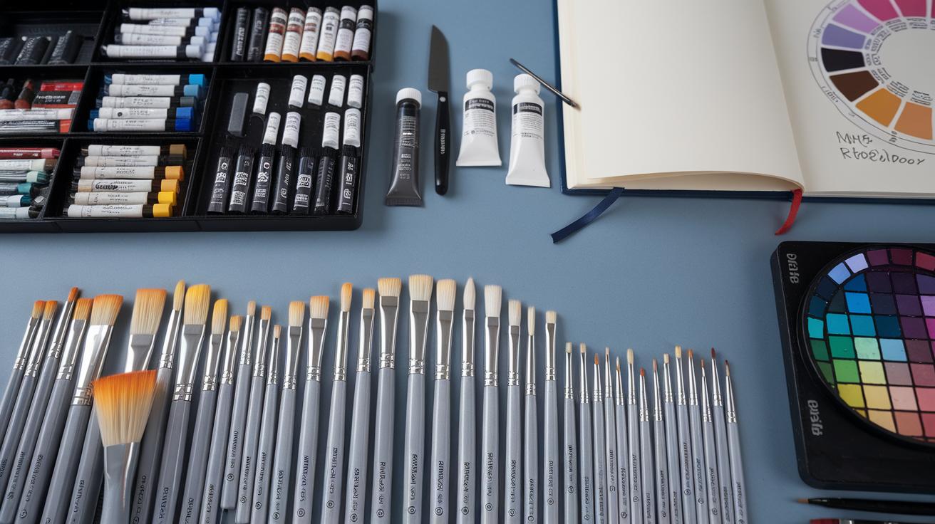
Selecting the Right Materials for Gouache Illustration
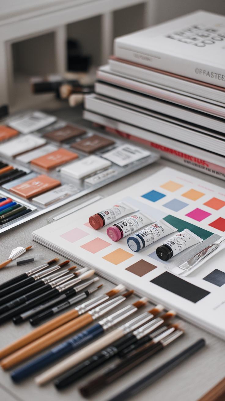
Choosing Gouache Paints and Tools
When choosing gouache paints, focus on pigment quality and opacity. Look for brands known for smooth consistency and rich colors, like Winsor & Newton or Holbein. Check if the paint reactivates with water after drying; some formulas do this better, helping with corrections and layering.
Brush choice matters a lot for character detail and broad shapes. Round brushes with fine points work well for facial features and small details. Flat brushes are great for filling larger areas evenly and creating bold backgrounds. Synthetic brushes often hold their shape and last longer, but natural hair brushes offer softness that can add texture.
Consider the size of brushes you need. You may want a small size 2 or 4 for fine lines and a larger 10 or 12 for washes. Choosing the right mix lets you switch easily between tight details and loose strokes in your character art.
Best Surfaces for Gouache Character Art
Paper affects how gouache behaves and appears. Hot-pressed watercolor paper has a smooth surface that lets paint glide effortlessly. It’s ideal if you want sharp lines and detailed work for expressive characters. Cold-pressed paper has a toothier texture that adds character to brushstrokes and holds more layers without peeling.
Illustration boards provide a sturdy surface that resists warping. You can apply thick layers or heavy reworking without worrying about buckling. Some boards have a smooth clay-coated surface that lets colors stay vibrant and sharp.
Think about texture and absorbency when selecting paper. How does the surface feel as your brush moves? Does it hold paint without bleeding? These factors shape your ability to build volume and mood in character designs using gouache.
Basic Techniques to Get Started With Gouache
How to Create Smooth Washes and Layers
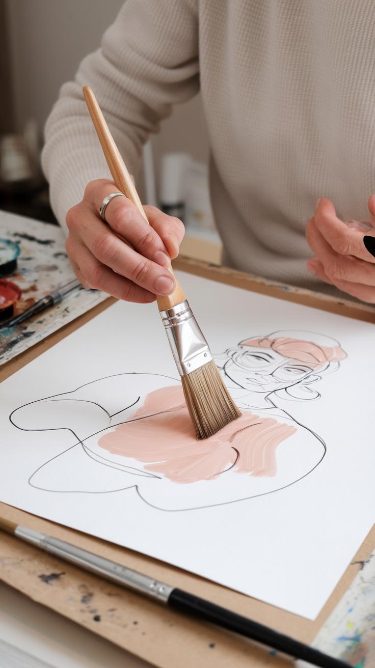
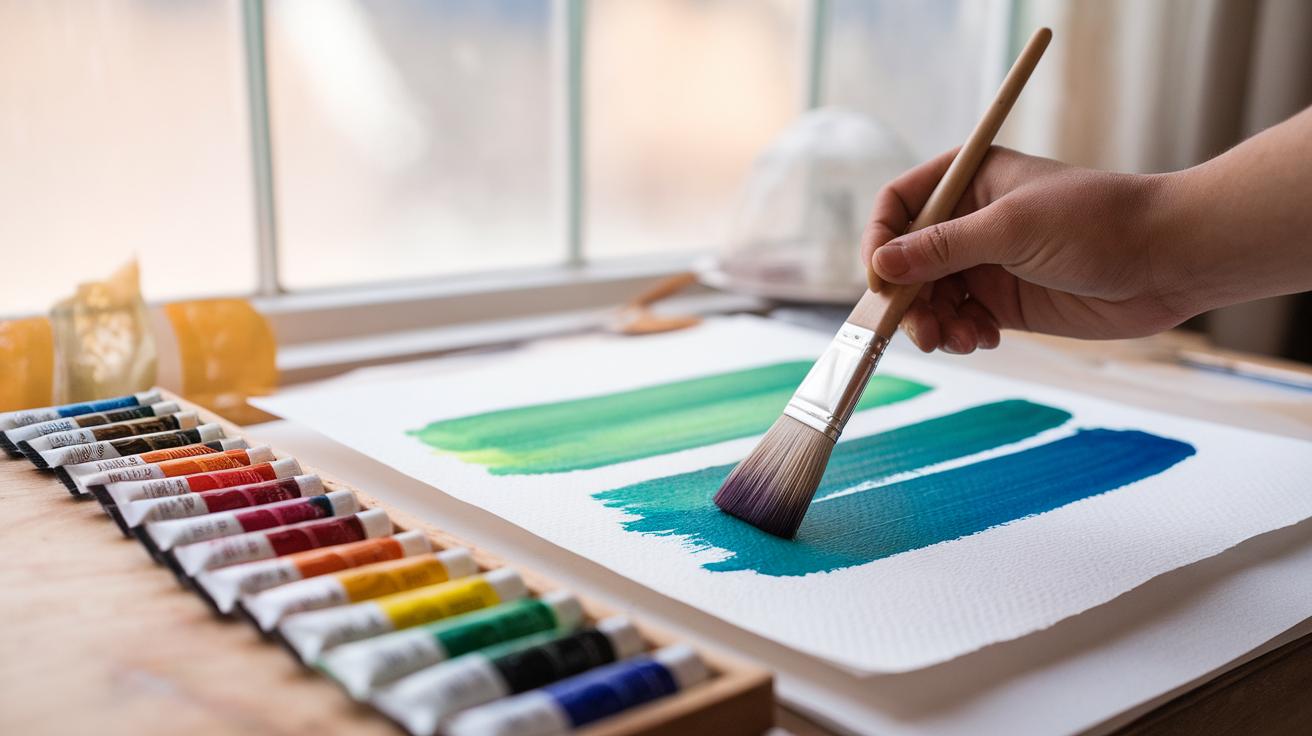
You begin by thinning gouache with water to get smooth washes. Mix enough water so the paint becomes translucent but still keeps some color strength. Use a large, flat brush to apply the wash evenly over your paper. Apply the wash in one direction to avoid streaks.
Let the wash dry completely before adding another layer. Gouache dries quickly, so wait a few minutes to test if it’s dry by lightly touching the surface with a finger or brush. When you add layers, use slightly thicker paint with less water to keep the new layer from lifting the previous one.
Try practicing with a simple character shape using washes. See how layering colors builds depth, like applying a light blue base and then adding shadows with darker blue. This method helps you keep control and avoid muddy colors.
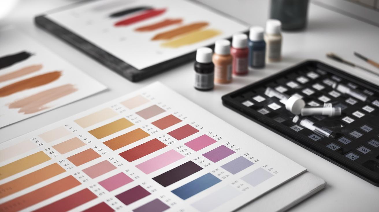
Mixing Vibrant Colors for Characters
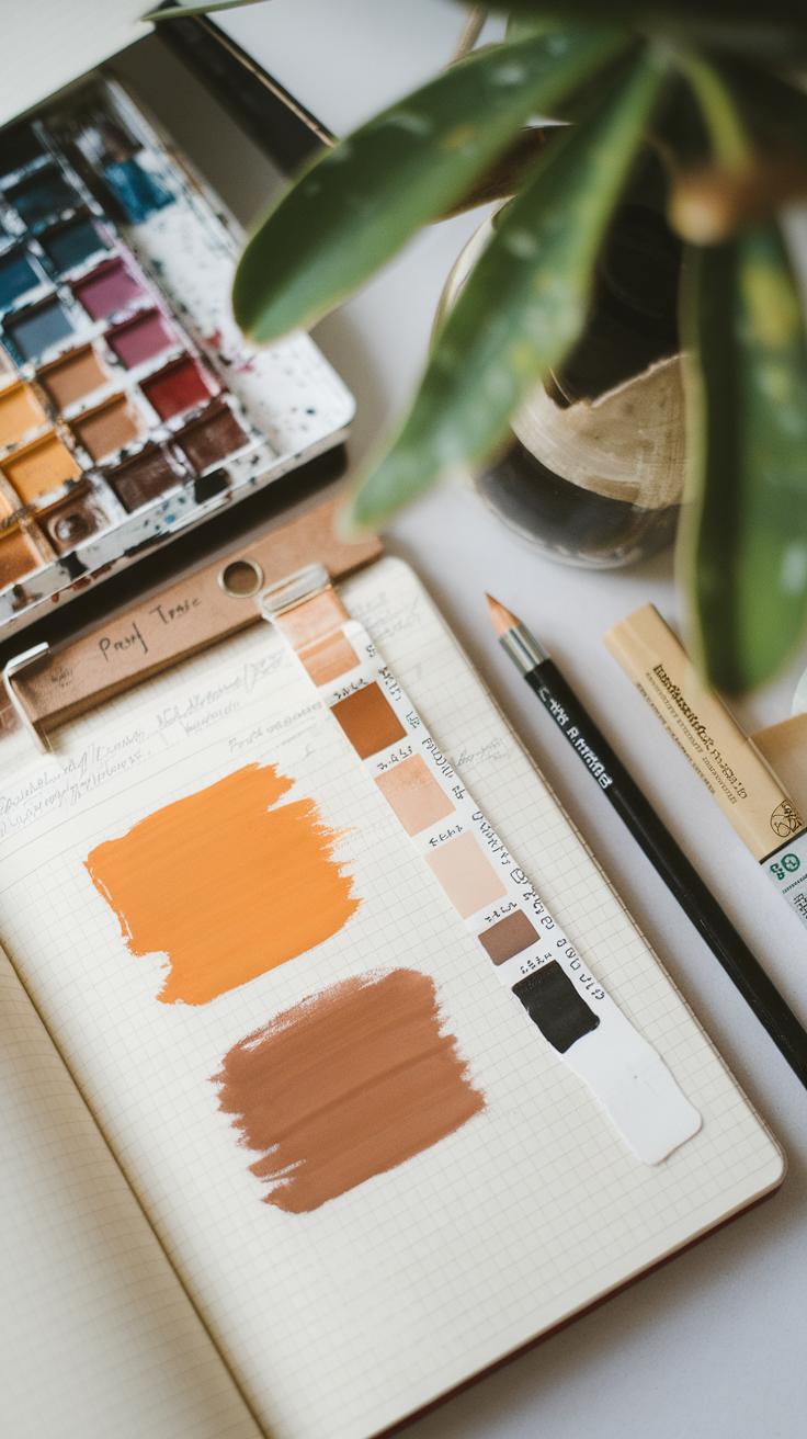
Mix your gouache colors on a palette, not directly on paper. This gives you full control over the final hue. Remember that gouache dries darker than it looks wet, so test your mix by letting a small swatch dry. Adjust by adding white or color until you get the shade you want.
Use pure, bright pigments for base colors and slowly add complementary colors to tone shadows and highlights. For example, mix a little red into your green to make it less flat. You can create richer character colors by layering these mixes over your washes.
Ask yourself how your color choices reflect your character’s mood or story. Does the color feel alive or dull? Mixing colors thoughtfully will give your characters energy and presence. Experiment regularly to discover unique combinations that fit your design goals.
Capturing Expression and Personality with Color and Brushwork
You can use brushwork and color choices to show who your character is and how they feel. Brushstrokes vary in size, shape, and speed, and each tells a different story about your character’s emotions. Soft, smooth strokes suggest calmness or kindness, while sharp, quick strokes hint at anger or energy. When you paint, think about your character’s mood and let your hand move to capture it.
Choose colors that deepen the sense of feeling in your illustration. Warm colors like reds and oranges often show passion or excitement. Cooler tones such as blues and greens can suggest sadness or calm. Mixing colors in thoughtful ways can create tension or harmony in your character’s personality. Ask yourself, what emotion does my character carry right now? Use brushwork and color together to make that feeling clear and strong.
Using Brush Strokes to Add Emotion
Brush strokes give life to emotion in your character. Thick, heavy strokes can introduce strength or stubbornness. Thin, light lines convey fragility or nervousness. Rushed, broken marks express anxiety or confusion. Slow, even brush movements bring peace or thoughtfulness. Practice these styles on small sketches to see how each changes the mood of your character.
Try switching between rough and smooth strokes within the same piece. This contrast reveals conflict or complexity in personality. For example, a confident character might have steady, bold strokes on their face but softer, lighter strokes on their clothing to show vulnerability. Watch how your hand naturally shifts when you feel different emotions—incorporate that into your strokes.
Selecting Colors to Reflect Character Mood
Color communicates mood before words or poses do. Bright, saturated colors like yellow and red often show joy or anger, while muted shades can imply sadness or mystery. Use warm colors to make your character feel energetic or angry. Use cool colors for calm characters or to hint at sadness. Think about the story behind the character and use color as a visual hint.
Experiment by layering colors to show changes in emotion. A character might appear mostly in calm blues but have small bursts of red to reveal hidden anger. Also, consider cultural meanings of colors. Red might mean danger or love depending on the story. When selecting colors, ask yourself what you want your audience to feel when they first see your character. Let color guide their emotions immediately.
Managing Gouaches Drying and Color Shifts
Gouache behaves differently as it dries, which challenges many artists working on character design projects. One striking effect is the shift in color tone between wet and dry states. Wet gouache often looks darker and more vibrant, while dry layers can appear lighter or sometimes duller. Recognizing this change helps you avoid surprises when your piece dries.
Planning your sessions is critical for consistent color results. When working across multiple sittings, you must keep track of your original paint mixes. Saving small samples or mixing extra paint ensures you can match colors later. You might also want to test paint on scrap paper to see how it settles when dry before applying it to your artwork.
Color shifts can impact a character’s mood and expression if not controlled. Ask yourself, how will this tone work once dry? Will the personality you captured with your brushwork in saturated paint stay true after drying? Awareness here strengthens your control over the final outcome.
Understanding Color Changes When Gouache Dries
The difference between wet and dry gouache comes from how the paint’s pigment and binder settle as moisture evaporates. Water in wet paint reflects light differently, making colors pop. When dry, the binder refracts light, sometimes scattering it and changing how you perceive the hue.
For example, a deep blue may look almost navy when wet but shift to sky blue once dry. Or a vivid red may lose some intensity. This happens because gouache contains chalk and other fillers that alter opacity and brightness when dry. Knowing this helps you choose tones that will look right at the end, not just while painting.
Experiment with your palette. Try mixing colors and paint a small swatch to observe its dry state. Does the color lighten or darken? These tests can reveal how much adjustment your palette needs, preparing you to make precise color decisions on your character.
Tips for Maintaining Color Consistency
One strategy to reduce surprises is layering thin washes instead of thick paint. Thin layers dry faster and more uniformly, helping colors stay closer to their wet appearance. Build color gradually to keep shades even and predictable in your character designs.
Use a limited palette during a project and mix large batches of your key colors. Document proportions or save leftover paint in airtight containers. This habit helps you replicate exact shades during future sessions and maintain harmony across your illustration.
Another method is to paint in a controlled environment with stable humidity and temperature. Changes in these conditions affect drying time and color shift. Consistency in your workspace can improve repeatability.
Have you noticed variations in your gouache work after days or weeks? Keeping a color journal or photo reference of your freshly painted layers can help you compare and adjust as you progress. These small steps make a big difference in achieving cohesive and expressive character art using gouache.
Advanced Gouache Techniques for Textures and Details
Creating texture with gouache can add depth to your character designs. Dry brushing is effective. Use a brush with very little paint and drag it lightly over the paper’s surface. This leaves streaky, rough marks that suggest fabric, hair, or skin texture. Try this on a test sheet before applying it to your piece.
Stippling involves tapping the tip of your brush repeatedly for tiny dots. This technique works well for rough surfaces like freckles, stubble, or worn leather. Combine stippling with varied brush sizes to create interesting texture contrasts on your character’s clothing or skin.
Scraping uses a palette knife or toothpick to scratch into still-wet gouache. It reveals underlying layers or paper texture. This can suggest cracks, wrinkles, or scratches. Experiment with different tools to see what patterns appear. Do you notice how this adds character and life to your designs?
Creating Textural Effects with Gouache
Dry brushing helps you create a worn, textured look quickly. Use an old, stiff brush for the best effect. Lightly drag paint on dry paper. Avoid heavy pressure to keep marks subtle. Try dry brushing over a base layer for fabric folds or hair strands.
Stippling suits small textures like freckles or dust. Dip a fine, round brush in paint, then tap gently where you want dots. Build layers carefully to control density. This method can bring realism to eyes, beards, or rough skin areas.
Scraping allows you to add fine cracks or hairline details. Wait until the paint is not too wet but still soft, then gently scratch with a fine tool. The contrast between scraped and painted areas enhances dimension. What textures in your character have you yet to explore?
Adding Fine Details and Highlights
Fine lines in gouache require a steady hand and thin brushes. Use a detail brush or a fine liner brush. You can layer these lines over dried gouache to refine expressions, eyelashes, or hair strands. Thin layers help avoid lumps and keep lines clean.
Highlights attract attention to certain facial features. Apply small amounts of pure, opaque white paint to areas like the eyes, nose tip, or lips. Don’t overdo it. A precise highlight can make your character’s gaze more vivid and lifelike.
Layering fine lines and highlights builds texture and dimension. Let each layer dry before adding the next to maintain clarity. Test small areas before final application. Are your highlights guiding the viewer’s eye where you want it?
Combining Gouache with Other Mediums
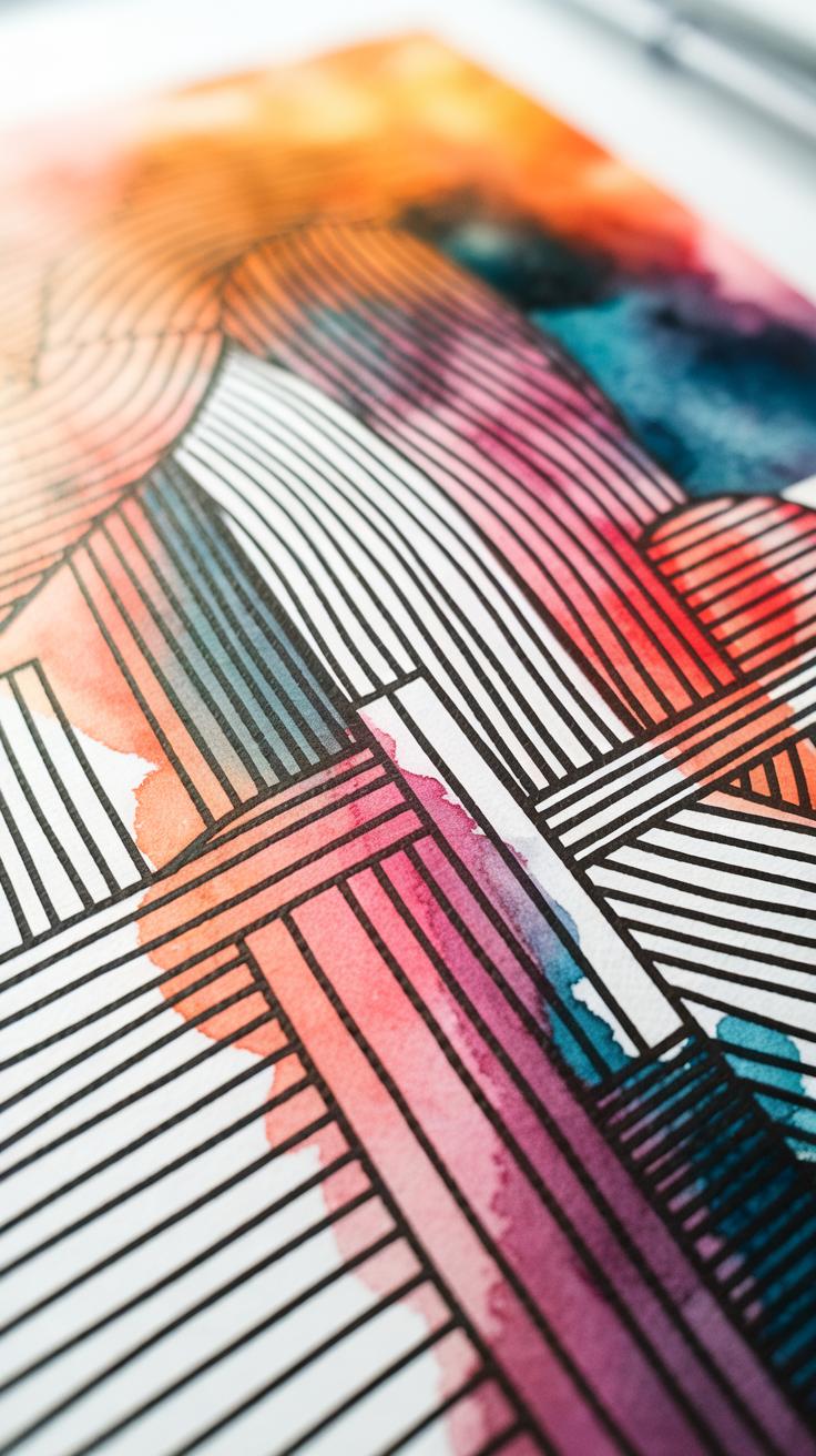
Using gouache together with other art materials can boost your character designs. Mixing gouache with ink, colored pencils, or watercolor adds new layers of expression. This combination lets you highlight different parts of your artwork and create contrast more easily.
When working with ink and gouache, you get sharp outlines that make your characters stand out. Colored pencils over dried gouache add a tactile quality and extra texture. Watercolor works well to bring softness or create translucent effects near opaque gouache layers.
Think about where your character needs focus. Can vibrant gouache create bold shapes while ink delivers precise lines? Could colored pencils add subtle shading or texture on top? Experimenting with these pairings helps you find a style that feels fresh and impactful for your characters.
How to Mix Gouache and Ink for Sharp Lines
Ink gives you clean, crisp lines that gouache alone can’t always produce. Start by letting your gouache layers dry completely to avoid smudging. Use waterproof or India ink for best results. Dip a fine brush or a nib pen into the ink for detailed outlines.
Draw your character’s key shapes and features with ink over the dried gouache. This technique sharpens edges and highlights facial expressions or costume details. If you want a looser effect, try thin ink washes before or after gouache layers. These layers add contrast and depth, making character features pop.
Ask yourself: where do I want the viewer to focus? Use ink in those areas to guide their eyes. Combining ink and gouache this way creates dynamic, expressive characters with clear definition.
Using Colored Pencils Over Gouache
Colored pencils offer a subtle way to build texture on top of dried gouache. Once the gouache is fully dry, lightly sketch or shade over it using sharp pencils. This adds depth without flattening the painted surface.
You can use pencils to create hair strands, fabric wrinkles, or freckles that look more natural than paint alone. Layering colored pencils over flat gouache adds visual interest and allows fine details that gouache brushes can’t achieve.
Applying varying pressure with the pencils controls the intensity of color and texture. Try blending pencil marks with a colorless blender or by layering softly. This technique introduces tactile qualities that improve expressiveness in your characters.
Consider where texture will enhance the story of your design. Could tiny pencil details on a costume or skin bring your character more life? This simple combination of gouache and colored pencil expands your toolset dramatically.
Common Mistakes and How to Avoid Them
Working with gouache offers great control but also presents unique challenges in character design. A frequent mistake is overworking the paint. When you keep blending or layering too much, colors lose their brightness and appear dull. To maintain vibrant hues, apply layers lightly and let each dry fully before adding the next. Stop blending as soon as the tones flow naturally. Have you noticed how a single fresh stroke can revive a painting’s energy? Keep your brushstrokes confident and avoid pushing the paint around excessively.
Another issue comes from applying paint too thickly or adding new layers before earlier ones have dried. This causes the paint to crack and flake over time, damaging your illustration. Use thin, even layers and allow adequate drying time between them. Avoid building heavy paint textures unless you’re aiming for a specific effect and prepared for potential cracking. How often do you check the surface dryness before moving forward? Adjusting your pace can preserve the paint’s stability for a long-lasting final piece.
Avoiding Overworking and Muddy Colors
Overblending gouache causes colors to lose their intensity quickly. When you go over an area too many times, the pigments mix into a dull, muddy shade. To combat this, limit your brush passes and add separate glazes only after the paint dries. Work from light to dark, letting each washed layer set before deepening shadows. This method keeps the colors clean and luminous.
It helps to plan your palette with clear, distinct shades. Mix smaller amounts often to keep your colors fresh. Using clean water and brushes avoids contaminating hues. Asking yourself if a tone feels vibrant enough after one layer encourages restraint. Maintaining that bright pop supports your character’s expressive impact.
Preventing Cracking and Paint Flaking
Thick gouache layers crack as they dry because the paint shrinks unevenly. The best way to prevent this is to apply thin coats. Thin layers dry faster and bond better to the paper. They stay flexible, which reduces flaking risks.
Waiting between layers is critical. Rushing to paint on wet or tacky surfaces traps moisture and creates weak points. You can use a hairdryer set to low to speed drying but keep it gentle. Avoid adding multiple heavy highlights or details all at once.
Choosing the right paper also plays a role. Heavyweight, smooth paper provides a stable base that handles gouache better. Have you tested different supports? Finding one that matches your style reduces cracking problems and helps your artwork last longer.
Building Your Portfolio with Expressive Gouache Characters
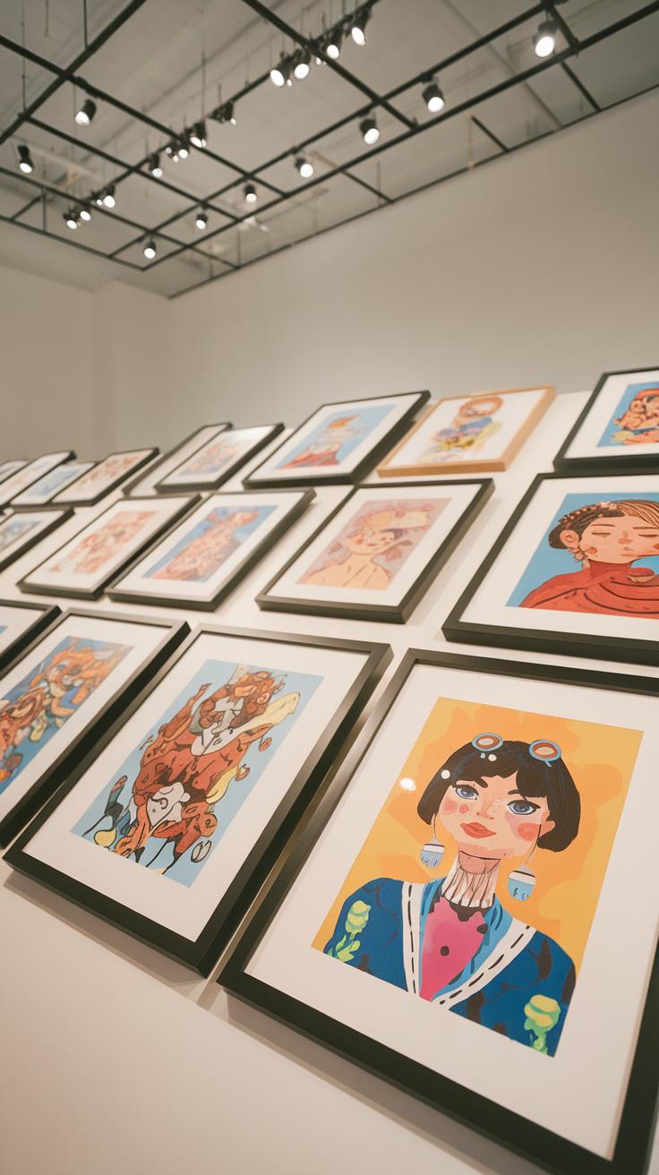
Your portfolio should tell a story about your skills and style. When working with gouache character illustrations, focus on pieces that show different moods, emotions, and actions. This variety helps demonstrate your ability to create expressive, life-like characters. Think about settings and scenarios that give your characters context. How do they react to situations? What can viewers learn about the character without extra words?
Create a balance between playful, serious, and dynamic expressions. Show how gouache’s texture and color can bring depth to your designs. Ask yourself: Does this piece add something new to my portfolio? Would a client understand my character’s personality just by looking?
Organize your work so each illustration flows into the next. Group projects by theme, style, or story arc if possible. This approach shows planning and cohesion, key traits for strong portfolios. The aim is to prove that you can consistently use gouache to build characters who captivate and communicate.
Selecting Your Best Gouache Works
Choose pieces that highlight both your technical skills and your ability to express emotion. Pick illustrations where gouache’s layering, blending, and opacity show clear mastery. Select characters with distinct poses and facial expressions. Avoid similar-looking images that don’t add new information about your abilities.
Look for illustrations where small details, like brush strokes or color transitions, stand out. These features show your control over the medium. Include work that challenges you and displays growth. Which pieces do you feel proud of? Which ones received positive feedback?
Be honest about weaker pieces. Each image should support your story and capabilities. Your selection should demonstrate range: from quick sketches using gouache’s fast drying traits to more detailed, finished artworks. This variety reflects how you understand and use gouache differently for character design.
Showcasing Your Character Design Style
Your portfolio should emphasize what makes your character designs unique. Arrange images to highlight your personal approach to shapes, colors, and expressions in gouache. Create sections that allow viewers to see your style evolve or adapt to different themes.
Consider opening with a strong, memorable piece that captures your signature look. Follow with diverse examples that keep the viewer engaged. Think about how gouache’s texture and layering can become part of your style’s identity.
Ask: What do I want people to remember about my characters? Use consistent visual elements, such as color palettes or brush techniques, to create a recognizable style. This consistency helps build your brand and makes your portfolio stand out in character design projects using gouache.
Conclusions
Gouache offers a distinctive approach to character design that can enhance your artistic expression. Its opaque nature and ease of use allow you to create clean, vivid images with a strong presence. By learning to work with gouache’s characteristics, such as its drying shifts and layering options, you can develop techniques that express your characters’ personality and mood effectively. The versatility of gouache supports experimentation, encouraging you to refine your style and techniques for better results in your projects.
The practical insights shared help you approach gouache with confidence, from materials selection to advanced applications. Your control over brushwork, color, and texture will grow with practice, leading to successful, visually engaging character illustrations. Using gouache in your design work can improve your outcomes and provide an enjoyable and flexible creative process. Experiment, refine, and embrace the unique qualities gouache brings to your character design projects for outstanding results.


