Introduction
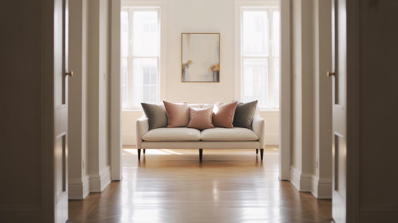
Your living room is the heart of your home, where you relax, gather, and express your style. Creating a gallery wall in your living room offers a perfect way to add personality and charm to this space. Living Room Gallery Wall Ideas That Maximize Impact guide you through selecting designs that fit your taste and living room layout.
This article explores how to pick the right pieces, arrange them for maximum effect, and maintain a harmonious look. You will find tips on framing, themes, and placement that help your gallery wall stand out and become a focal point in your living room.
Understanding Your Living Room Space
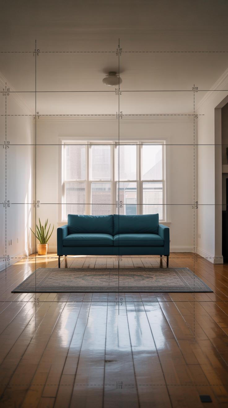
Before you start hanging frames, take a moment to really look at your living room. The size of your space and the available wall area will shape what kind of gallery wall makes sense. A small room with limited wall space might call for fewer, larger pieces or a tight, intentional grouping. In contrast, a bigger wall can hold more art—maybe a sprawling arrangement that feels like its own feature.
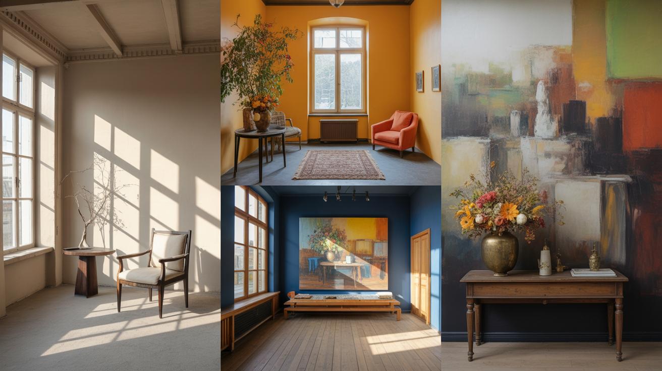
Lighting changes everything, too. Natural light can highlight certain colors or details that artificial lighting doesn’t catch. Is your wall bathed in sunlight in the afternoon, or does it sit in shadow most of the day? That can help decide whether to pick vivid artwork or subtle monochrome prints. You could even experiment with art that responds well to changing light.
Measuring Your Wall and Room
Grab a tape measure and note both the height and width of the wall you’ve chosen. Measure more than once, just to be sure—it’s easy to misread or rush through it. Don’t forget to account for furniture beneath the wall; if a sofa or shelf takes up part of the lower space, your gallery can’t start too low.
Knowing these dimensions allows you to plan how many pieces will fit without crowding. Smaller prints might overwhelm a large blank wall, while giant canvases can dominate a cozy nook. I once misjudged a wall’s width and ended up with too many small pictures—it looked cluttered, so I had to rethink the layout completely.
Analyzing Existing Room Style
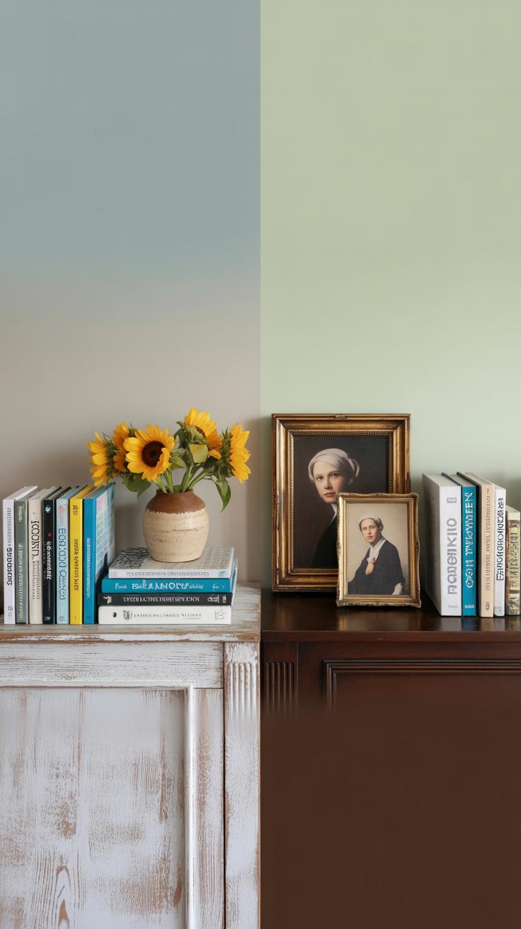
Look around at the colors and styles in your living room. Are you working with modern furniture or something more traditional? The gallery wall should feel like part of the overall look, not stuck on. Observe tones in your upholstery, rugs, and accessories. If your palette is mostly cool or neutral, bright, warm-toned art might feel out of place—or it could become a bold focal point.
Lighting also plays a role here. Soft, warm lights might favor art with muted hues, while bright LEDs can handle busier, more colorful pieces. When I redecorated my living room, I found that matching frame styles to existing wood tones made the gallery feel less “added on” and more like it belonged.
Selecting a Theme for Your Gallery Wall
Choosing a theme for your living room gallery wall can feel a bit like setting the tone for the whole space. Picking the right one pulls everything together and makes the wall worth looking at—not just a random cluster of frames. You might lean toward family photos, travel snapshots, abstract art, or maybe a mix of different types of media. The key idea is unity; a theme ties the pieces together and sparks interest beyond the individual artworks.
Personal and Family Themes
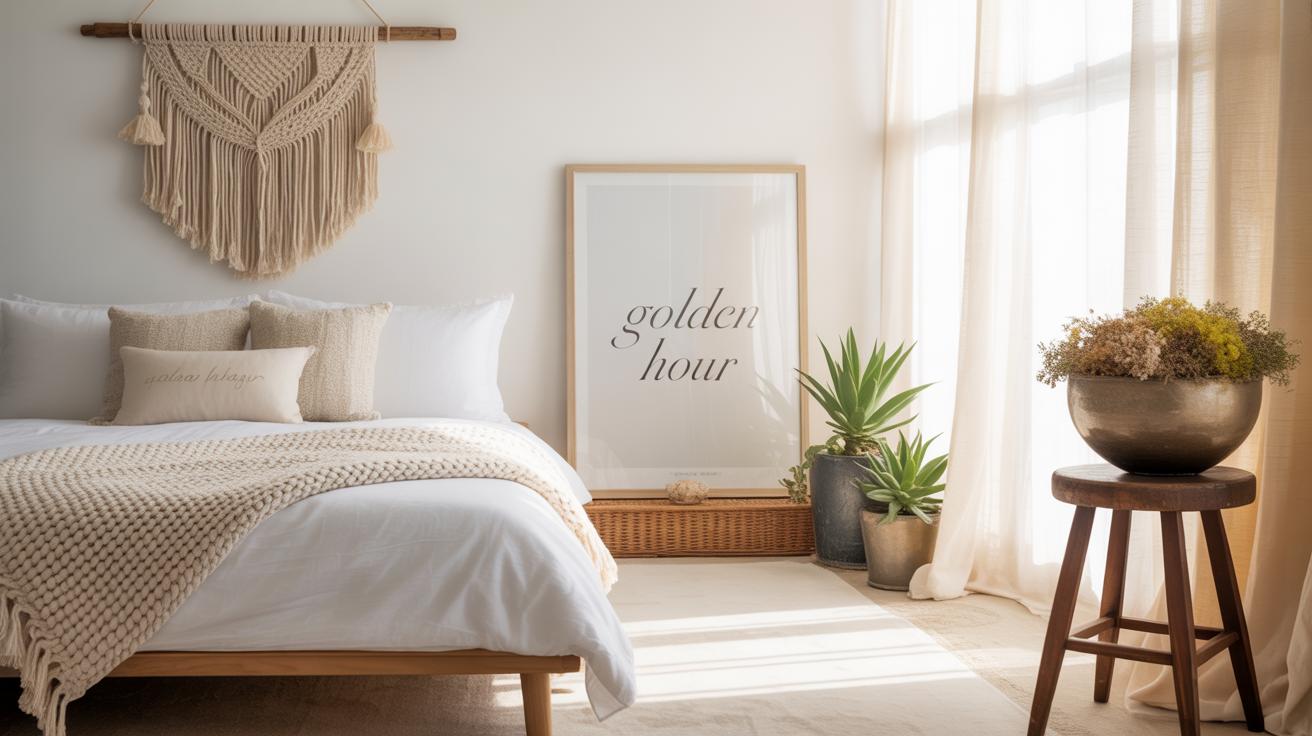
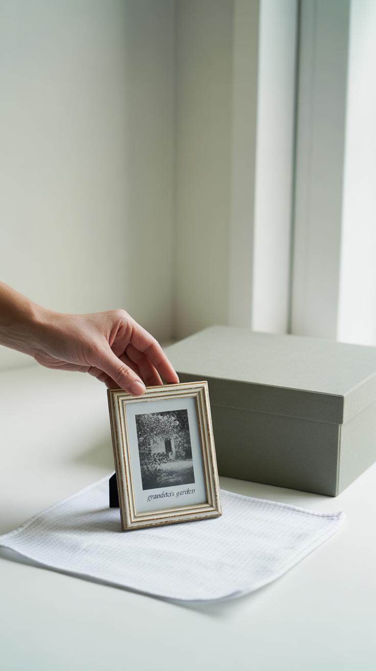
Using personal photos and memorabilia on your gallery wall adds a warmth that’s hard to replicate. Every picture tells a story—your story—which naturally invites guests to connect with the space. You might include photos from celebrations, candid moments, or even keepsakes like postcards or small mementos—in the frame or nearby. This kind of wall can feel deeply meaningful and comforting, not just decorative. But there’s a delicate balance; too many photos can overwhelm or confuse, so choosing a few meaningful ones with some breathing room helps.
Art and Color-Based Themes
Another popular route is to select art by color or style. Say you want a modern look—then clean lines and minimalist prints might fit best. Or perhaps vintage pieces with muted tones speak to you. Matching colors across your collection, whether it’s blues or earth tones, can pull diverse artworks into a cohesive whole. One trick is to pick a dominant color and let accents appear in smaller doses. This way, even varied pieces feel like part of the same conversation on your wall. You might not have to commit to one strict style either; sometimes mixing modern and classic can surprisingly work when the color palette stays consistent.
Choosing the Right Art and Materials
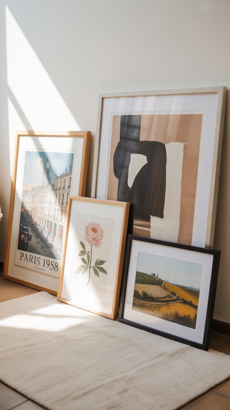
Picking the art for your living room gallery wall is more than just a matter of taste—it shapes the whole vibe. You could go for original paintings that have texture and depth. They bring this unique presence that prints sometimes lack, although originals might be pricier and more delicate.
Prints offer variety and flexibility. You can find reproductions of famous artworks or custom designs that fit your theme. Photographs, on the other hand, hold a personal touch—like snapshots from trips or family gatherings—which can add warmth and narrative. Posters are another option, often bold and graphic, sometimes a bit casual but they can make a striking statement if framed well.
Types of Art to Display
Original artworks, whether paintings or hand-drawn pieces, stand out because of their texture and often subtle imperfections. They can anchor the gallery wall but might feel heavy if overused. Prints are easier to acquire and swap out, which is handy if you like changing your style every so often.
Photographs tend to tell stories, and when grouped thoughtfully, they can create emotional connections. That said, mixing too many mediums might confuse the look unless you’re careful about overall cohesion.
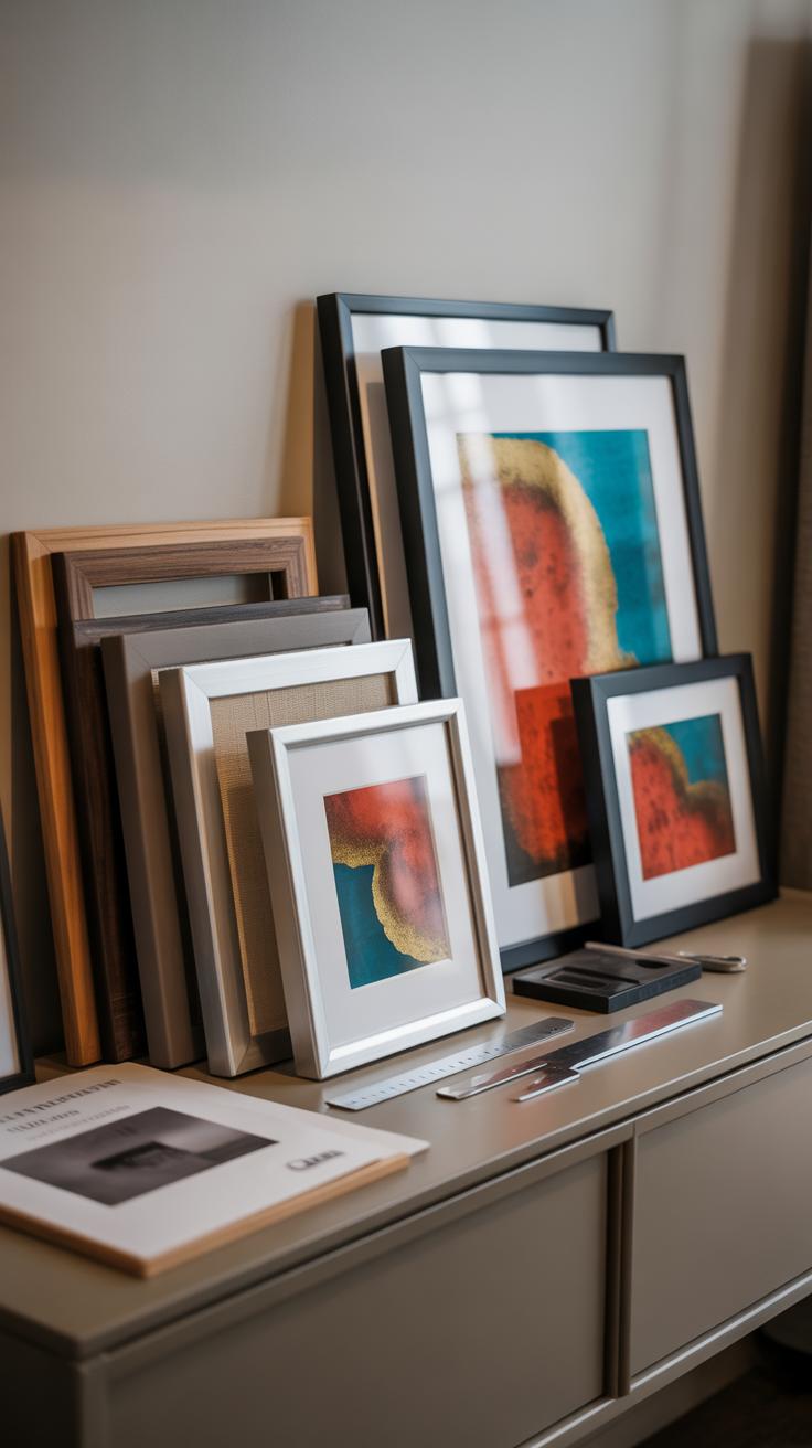
Frame Styles for a Polished Look
Frames do more than just hold art in place—they highlight and elevate it. Choosing frame materials like wood, metal, or acrylic can subtly shift the mood. Wood frames add warmth and classic appeal, whereas metal frames feel modern and sleek.
Color choices matter too. Black or white frames offer neutrality, making the art pop without distraction. Natural wood tones can tie into other furniture or flooring, creating harmony. Don’t shy away from mixing frame sizes, but keep the scale relative to the artwork and the wall space. Larger frames can command attention, but smaller ones can create rhythm and flow.
Glazing options influence durability and appearance as well. Glass is traditional but can glare; acrylic is lighter but scratches more easily. Choosing the right balance depends on your lifestyle and space lighting.
Ultimately, there isn’t a one-size-fits-all answer here. Your choices should reflect not only what you like but how the pieces interact with your living room’s mood and function. Have you thought about how often you might want to rotate or update the pieces? That could steer you toward simpler frames or easier-to-change prints.
Planning Your Gallery Wall Layout
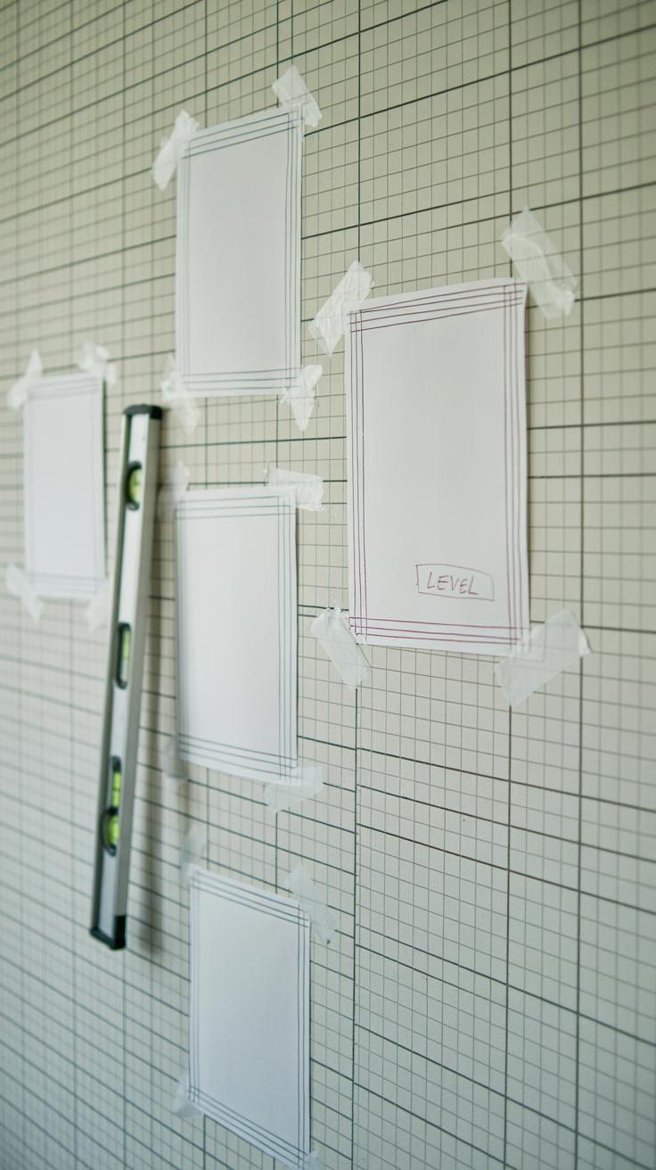
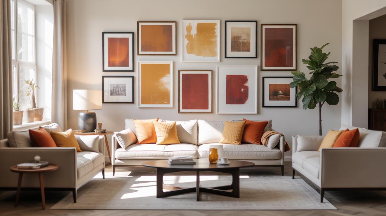
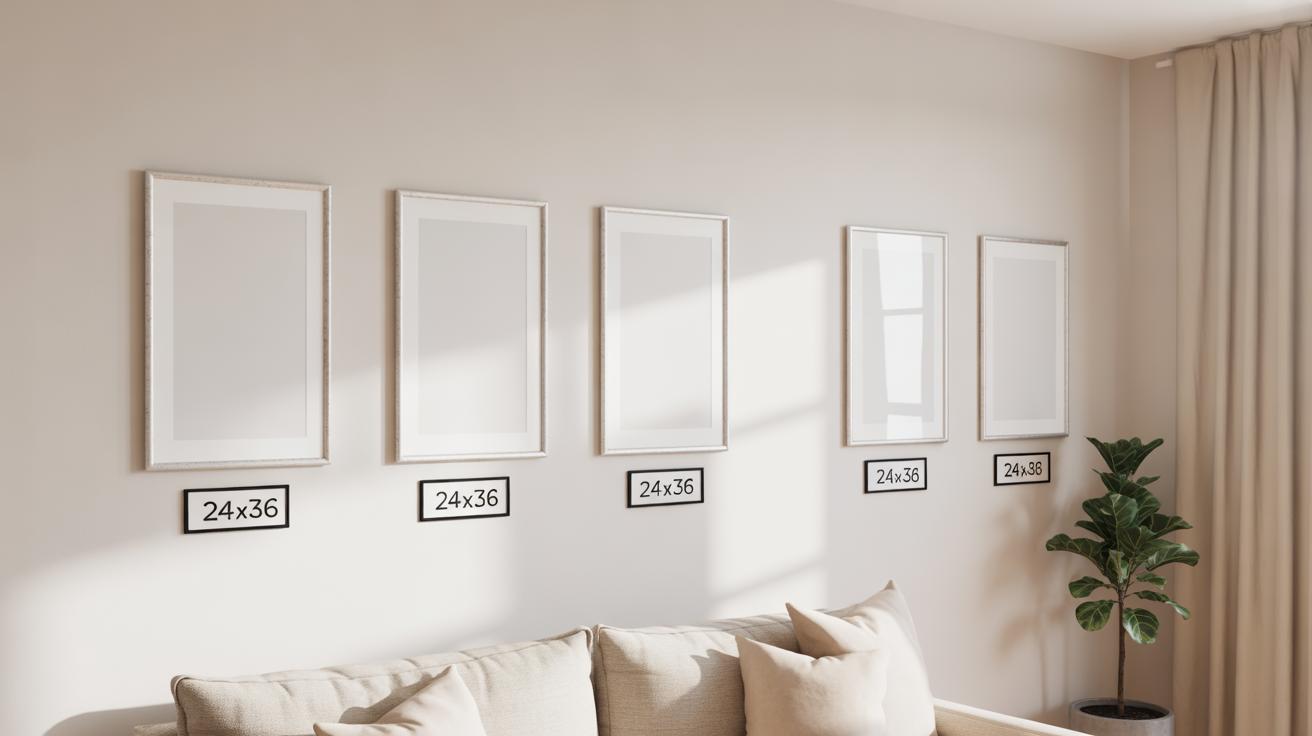
Arranging your gallery wall is like setting a stage for your art. You might lean toward symmetry for a neat look or go bold with a more eclectic mix—both have their perks. Symmetrical and grid layouts bring order. They help everything feel balanced and intentional. To pull these off, measure carefully. Keep spacing consistent, say around two to three inches between frames. Use a level and maybe some painter’s tape to mark spots before hammering nails. It’s a bit tedious, but the result is satisfying: a sharp, clean wall that feels organized without being stiff.
On the other side, salon or mix-and-match layouts let your personality shine through. Here, frame sizes, shapes, and styles play off each other. Don’t worry too much about perfect spacing; let some pieces almost touch, others drift apart. It creates energy, keeps the eye moving. Try using a large piece as an anchor, then work smaller frames around it. This can feel a little risky—what if it looks chaotic?—but with a bit of trial, the balance emerges naturally.
Some practical tips worth trying:
- Lay your frames on the floor first, experimenting with arrangements before putting holes in the walls.
- Consider the wall’s size and shape—too cramped or too sparse can throw the whole look off.
- Think about the furniture below or around the wall to avoid a floating gallery that feels disconnected.
- Mix light and dark frames but keep an eye on how they relate to the art inside.
What do you want the wall to say? A formal tone or something more relaxed and personal? Each approach demands its own rhythm. And sometimes, blending the two styles with a subtle edge can produce a surprisingly fresh effect. Don’t hesitate to adjust once it’s up—art placements aren’t set in stone, even if they might feel like it.
Installing Your Gallery Wall
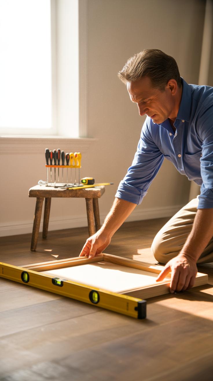
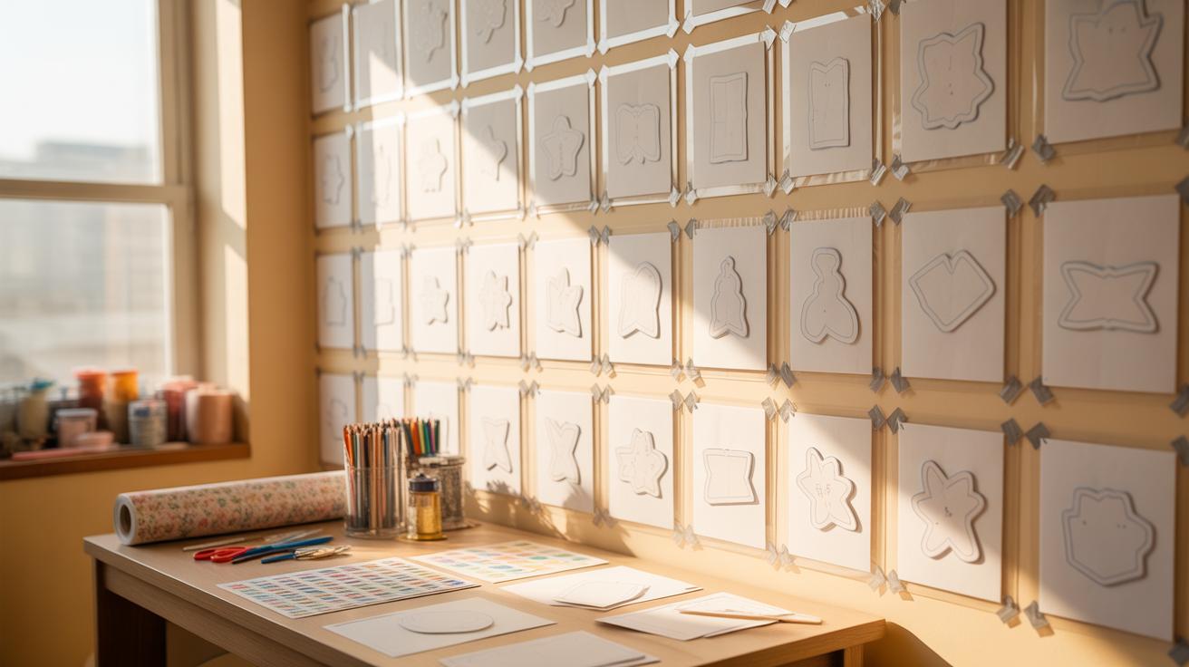
Getting your gallery wall hung can feel a bit tricky, but with the right approach, it doesn’t have to be stressful. First off, gather your essentials: a measuring tape, a level (the kind with a bubble), nails or hooks suited for your wall type, and some paper templates if you want to pre-visualize placement. You might also want a pencil and a hammer handy—sometimes a screwdriver, depending on your hardware.
Start by marking where each frame will go. If you’ve planned your layout beforehand, this part should be easier. Use your measuring tape to check distances between marks. Spacing matters; too close, and the wall feels cluttered, too far apart, and the impact lessens. A good rule is 2 to 4 inches between frames, but trust your eye—it’s not set in stone.
When you hammer in nails or hooks, test the level for each frame as you hang it. A small tilt can throw the whole arrangement off. You’ll likely need to step back and adjust a few times. Don’t hesitate to shift pieces slightly until the balance feels right. Sometimes, what works on paper looks different once it’s up.
Take your time. Aligning frames carefully can take a while, but seeing everything come together makes it worth the effort. Oh, and try not to scratch the wall too much—those little imperfections add character, though your walls might not appreciate it as much as you do.
Adding Lighting to Enhance Your Gallery Wall
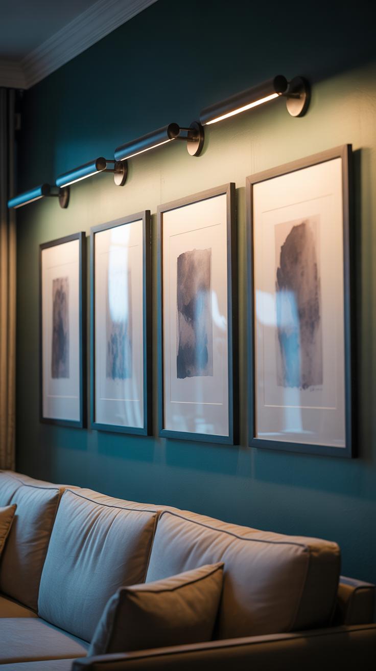
Lighting can really change how your gallery wall looks and feels. It’s not just about making the art visible but about bringing out details and colors you might miss otherwise. I’ve noticed that when a wall is well-lit, it becomes the room’s focal point without overpowering the rest of the space. Picture lights, spotlights, and natural light each bring something different to the table.
Picture lights, those small lamps mounted above a frame, add a classic touch. They work best for highlighting single pieces rather than large collections. Spotlights, especially adjustable ones, can focus on multiple frames, shifting attention as you like. It’s a bit like directing a play, except with frames, which is kind of fun.
Natural light has its quirks. It can reveal texture beautifully but shifts throughout the day, sometimes causing glare or fading colors over time. Balancing natural and artificial light is tricky, though I find experimenting with blinds or curtains alongside fixed lights helps keep the look consistent without feeling unnatural.
Types of Lighting for Art Display
There are a few lighting options to consider, each with trade-offs:
- Incandescent bulbs: Warm glow but generate heat and can damage delicate art over time.
- Halogen lights: Bright and crisp but also produce heat, needing careful placement.
- LED lights: Low heat, energy-efficient, and often adjustable in brightness and direction, making them popular—though sometimes the light can feel a bit harsh or clinical.
- Fluorescent bulbs: Less common for art since they can flicker and distort colors.
LEDs seem to strike the best balance for most people, especially where you want flexibility in intensity and beam angle. If you’re unsure, trying a few different bulbs in your frames before finalizing is probably wise.
Positioning Lights for Best Effect
Where you put the lights matters almost as much as what lights you pick. The goal is to minimize glare and shadows while making each piece look its best. Here are a few pointers that might save you some trial and error:
- Place lights at a 30-degree angle from the artwork. This reduces glare but keeps the piece well illuminated.
- If using multiple spotlights, stagger them to avoid harsh shadows crossing different frames.
- For picture lights, make sure the shade doesn’t cast a dark line on the top edge of the frame.
- Consider light diffusion if direct beams are too harsh—frosted covers or lampshades help soften shadows.
One surprise for me was how small adjustments, even a few inches, in light position completely changed the mood. If it looks a bit off at first, keep tweaking. Sometimes what seems like glare to you might not bother someone else, but trust your eyes—they’ll help you get that perfect look.
Incorporating Gallery Walls Into Various Living Room Styles
Gallery Walls in Modern and Minimalist Rooms
In modern and minimalist living rooms, the gallery wall should echo the clean, uncluttered vibe. Think simple lines, restrained color palettes, and art that doesn’t overwhelm the space. Black and white photography or line drawings work well here—they offer subtle interest without shouting for attention.
Frames? Go for thin, streamlined options in black, white, or natural wood tones. Avoid ornate or bulky frames; they feel out of place. Consider spacing the pieces evenly with generous white space around each, or try an asymmetrical layout for a bit of unexpected movement.
Minimalist art often features abstract or geometric shapes. But if you dip into color, stick to muted tones or single bold accents. You want the wall to enhance the calm atmosphere, not fight it. I once arranged a set of monochrome sketches on pale gray walls—it was quiet but held your gaze after a moment.
Gallery Walls with Rustic and Traditional Decor
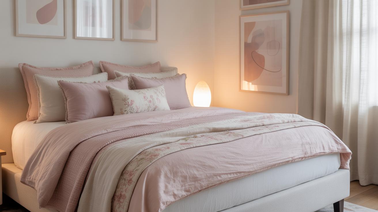
Rustic and traditional rooms invite warmth and character, so your gallery wall should reflect that. Deep, rich colors—think warm browns, golds, and faded reds—create a cozy feel. Vintage or antique prints and family photos in distressed or classic frames connect the wall with the room’s story.
Choose frames with carved wood, gilt edging, or mellow patinas. Mixing in a few aged mirrors or botanical prints can add texture and depth. Don’t shy away from layering frames close together; a slightly cluttered look works better here.
Some of my favorite rustic gallery walls include old maps and sepia portraits, all arranged with a casual but intentional touch. It’s less about perfect balance and more about creating a lived-in sense of comfort. Have you noticed how these walls almost invite you to lean in and explore each piece?
Maintaining and Updating Your Gallery Wall
Cleaning and Care for Frames and Art
Keeping your gallery wall looking good over time means a little upkeep, but nothing too complicated. Dust settles quickly, especially on wooden or metallic frames, so regular wiping with a soft, dry cloth does the trick. Avoid harsh cleaners—they can damage both the frame finish and the artwork inside. For glass surfaces, a gentle glass cleaner sprayed on a cloth (not directly on the glass) removes smudges without risking moisture damage.
Artwork itself is delicate. If you have prints or photos, open frames occasionally to make sure no dust has sneaked inside. For canvases, a dry brush or microfiber cloth can lightly clear dust, but don’t use water or sprays. It’s easy to forget this step, but neglect can cause fading or discoloration, especially in rooms with sunlight.
Refreshing Your Gallery Wall Periodically
Your gallery wall shouldn’t feel permanent in the sense that it can’t change. Swapping in a new piece or rotating artwork keeps the wall personal and interesting. Sometimes I’ve rearranged my own gallery just to fit a new mood or season—something as simple as moving a bold print from the top to the bottom shifts the whole vibe.
Try these ideas:
– Move a few frames to another room and bring back older art you’d tucked away.
– Mix in unexpected items, like mirrors or even small shelves.
– Experiment with layouts. Don’t be afraid to draw a rough diagram and see what happens if you stagger sizes differently or create more space between pieces.
The point is to keep your space feeling alive, not stuck in time. Maybe you won’t want to change it every month, but a little refresh every now and then can make you look at your living room differently—which, in my opinion, is one of the best parts of having a gallery wall at all.
Conclusions
A well-crafted gallery wall enhances your living room’s character and makes it more inviting. By carefully choosing your art, frames, and layout, you create a balanced, personal display. This customization reflects your personality and interests while making efficient use of your wall space.
Remember to consider lighting and wall colors to support your art collection. Keep experimenting with layout and new pieces to refresh your living room gallery wall over time. This way, your space continues to feel dynamic and welcoming.