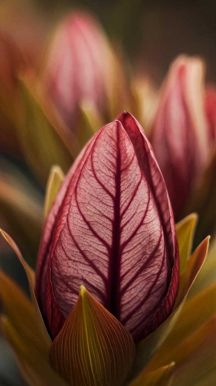
Introduction
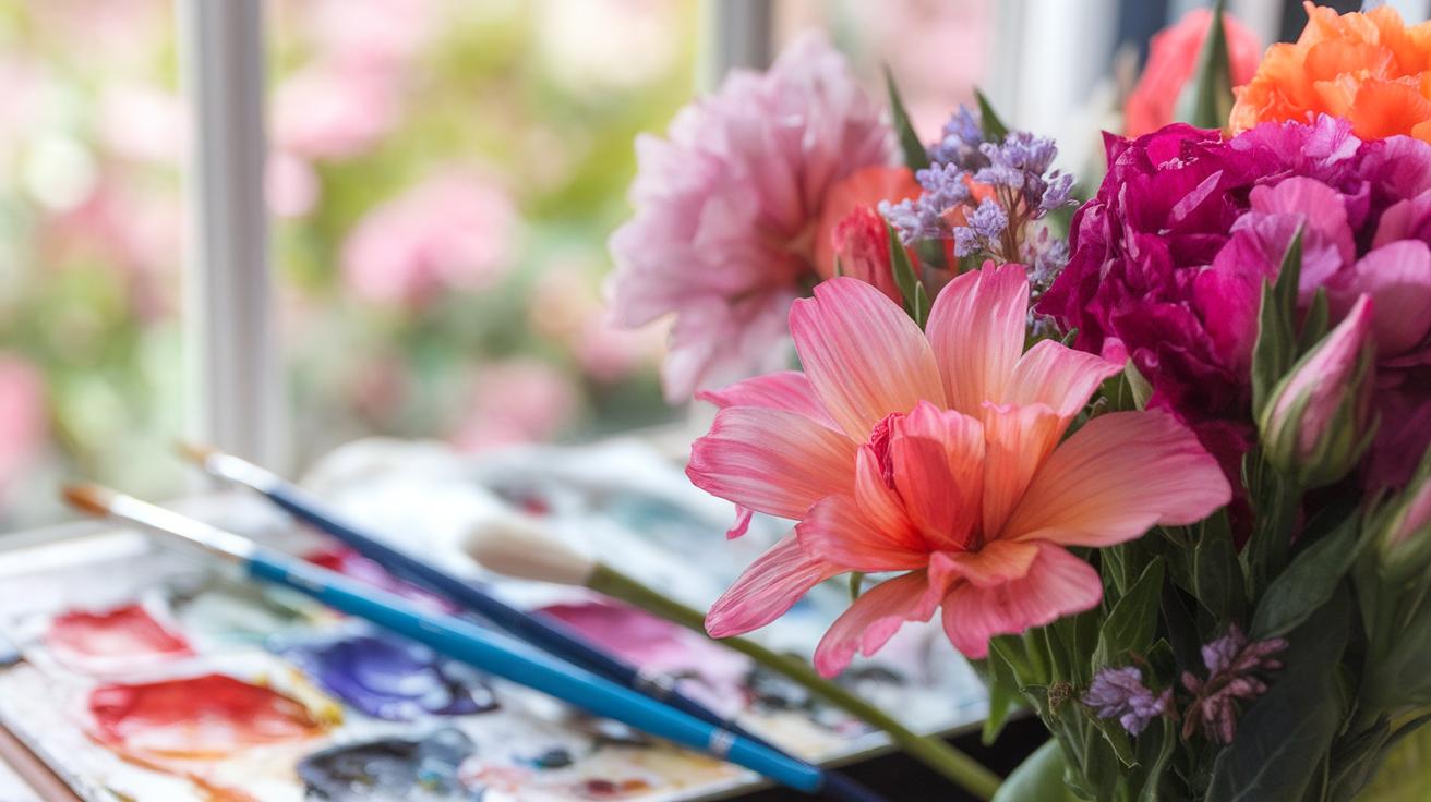
Watercolor painting offers a fresh and lively way to capture the beauty of flowers. This art form uses pigments suspended in water to create vibrant and transparent effects. By focusing on flowers, you can explore a wide range of shapes and colors while practicing watercolor techniques. Flowers are a popular subject because they allow you to experiment with blending, layering, and brush control. Your paintings can range from detailed botanical studies to loose and expressive interpretations.
Understanding the basics of watercolor is essential before you start your flower paintings. You will learn about materials like watercolor paper, brushes, and pigments. The tutorial will walk you through step-by-step processes to create radiant flower paintings. Whether you are a beginner or want to improve your skills, this guide will help you achieve bright, fresh, and beautiful floral artwork that you can be proud of.
Getting Started With Watercolor Materials
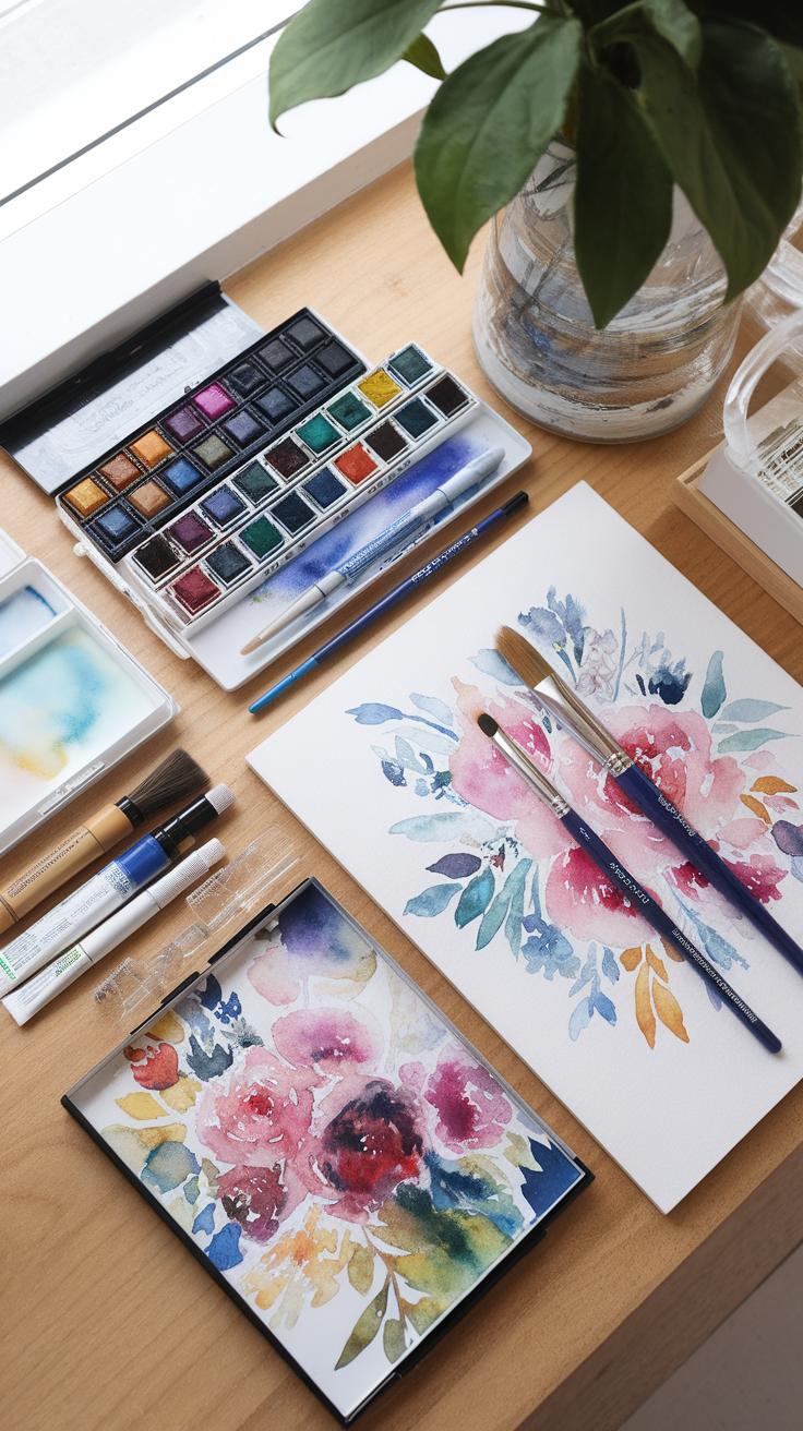
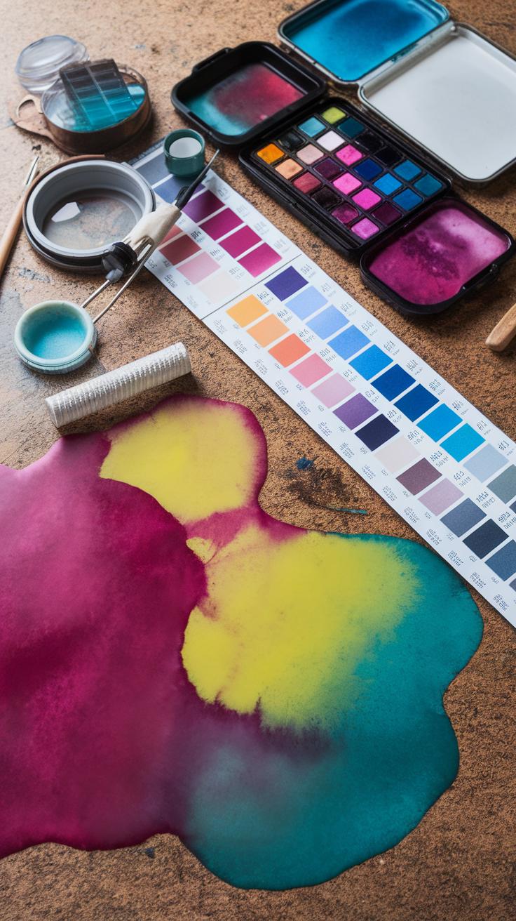
Choosing the right materials makes a big difference in your flower watercolor paintings. The first key item is watercolor paper. Good paper absorbs paint evenly and holds up to multiple washes. Look for papers with a cotton content of at least 25% for durability and better texture.
Next, pick brushes suited for floral details. Round brushes work well for petals and fine lines, while flat brushes help with broader strokes and leaves. Sizes between 4 and 8 are generally versatile for flower painting.
Your pigments affect how vibrant your flowers appear. High-quality pigments give richer colors and improved transparency. Consider investing in artist-grade paints for clearer, longer-lasting results. Can you see how each choice, from paper to pigment, shapes your artwork’s final look?
Choosing The Right Watercolor Paper
Watercolor paper comes in several types, mainly cold-pressed and hot-pressed. Cold-pressed has a textured surface ideal for capturing the delicate details of flowers. Hot-pressed paper is smooth and better when you want fine lines and a polished finish.
Paper weight is another factor. A 140 lb (300 gsm) paper holds moisture without warping. Paper with higher cotton content lasts longer and accepts paint better, which is helpful when layering colors in petals and leaves.
Think about the effect you want. Do you prefer texture that adds depth or a smooth surface for clean edges in your flower paintings? Your choice of paper can enhance or limit your creative style.
Selecting Brushes And Pigments For Flowers
Brush type matters when painting flowers. Round brushes have pointed tips good for curved petals and fine details. Flat brushes cover large areas and create sharp edges for leaves and backgrounds. Smaller sizes like 2 or 4 work well for flower centers and veins.
Pigment quality influences how your colors shine. Transparent watercolors let light pass through, adding glow to petals. Opaque paints provide solid coverage and can be used for highlights or bold accents.

Try different brands and observe how pigments behave on your paper. Ask yourself which colors blend smoothly and which retain their brightness after drying. Your brush and pigment choices directly affect your ability to capture a flower’s natural beauty.
Understanding Watercolor Techniques For Flowers
Painting flowers with watercolor requires specific techniques to capture their delicate forms and vibrant colors. The wet-on-wet method softens edges by applying wet paint onto already wet paper. This works well for gentle petal transitions. Wet-on-dry applies paint on dry paper to keep edges sharp and add fine details.
Layering involves applying multiple thin washes, building up colors slowly. This creates depth without dulling the paper’s brightness. Glazing is a form of layering where transparent colors adjust tone and add richness. Lifting removes paint using a damp brush or tissue, ideal for highlights or correcting mistakes.
Each technique helps show petals and leaves realistically. Choose the right one based on the effect you want. How will you mix soft edges with sharp details in your flower art? Combining these methods keeps your painting lively and true to nature’s shapes.
Mastering Wet-on-Wet For Soft Effects
To achieve soft blends on flower petals, apply wet paint on wet paper. This method causes colors to gently flow into one another. Control the water amount on your brush and paper to prevent colors from mixing too much and turning muddy. Use lightly damp paper rather than drenched for better control.
Start by wetting the area of the petal, then drop color in specific spots. Watch how the pigment spreads naturally. You can tilt the paper to guide the flow. Wait for the paint to dry before adding details with sharper edges. Have you tried letting colors blend on their own? It creates smooth color shifts impossible with dry brushwork.
Using Layers For Depth And Texture
Building color intensity for petals and leaves comes from layering thin washes. Each layer should dry fully before adding the next. This keeps colors transparent while adding shadows and highlights. Aim for four or five layers to increase depth slowly.
Use slightly darker tones with each new layer to suggest 3D shapes. Avoid heavy paint that blocks light; keep your brush strokes light and even. Layering also lets you add fine veins or texture without losing brightness. What details will your next layer reveal? Adding layers teaches patience and improves your flower’s realism.
Sketching Flowers Before Painting
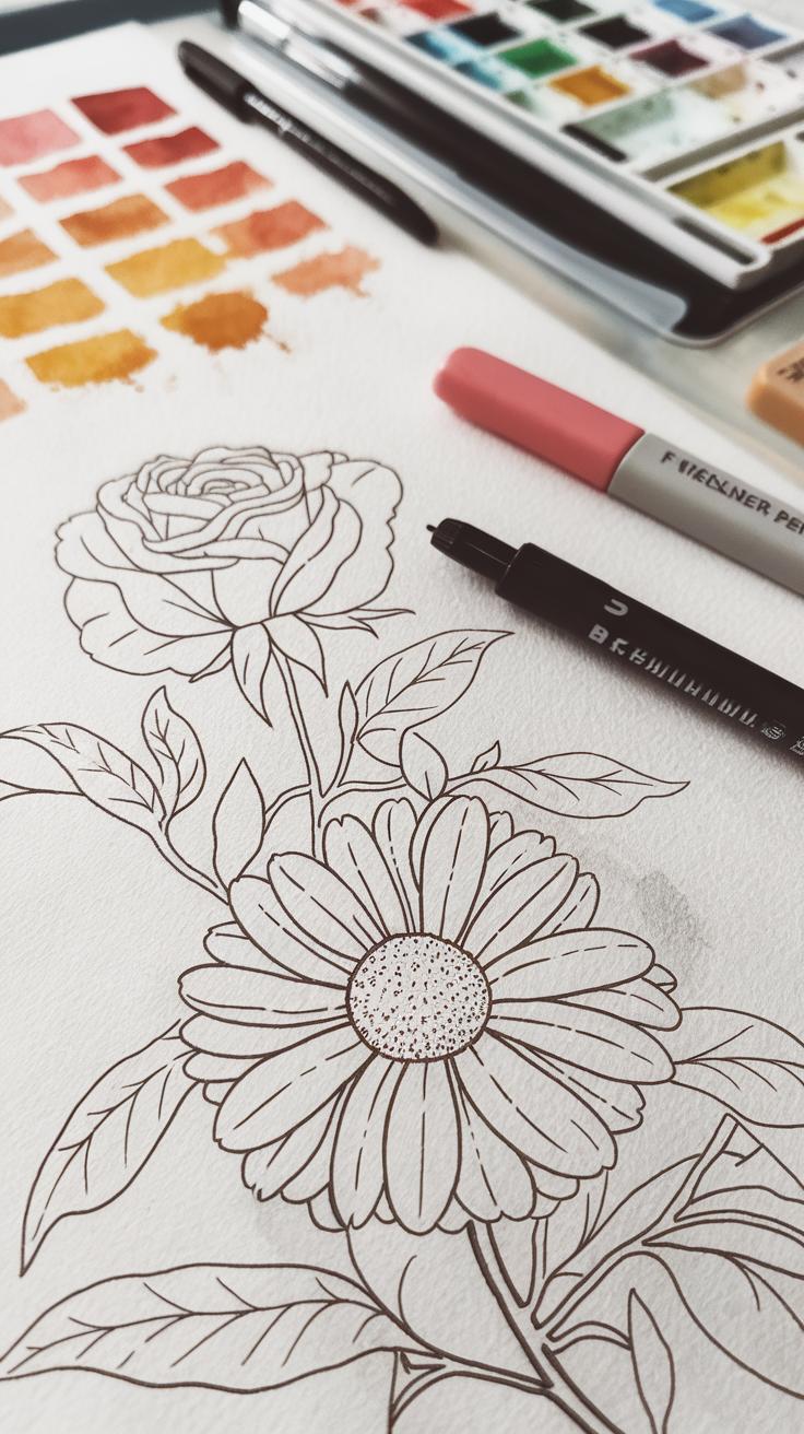
Creating a simple pencil sketch before applying watercolor paint helps you plan your artwork clearly. It gives you a chance to capture the flower’s shape and structure without rushing. Sketching first lets you arrange where each petal and leaf will go, shaping the composition before color touches the paper.
Using light pencil lines means your sketch won’t show through once paint layers build up. You can easily erase or adjust parts without damaging the paper. This approach also helps you avoid heavy corrections in paint, which might make colors muddy or uneven.
Think about how the flower grows and spreads. Is the bloom facing forward or slightly tilted? Are petals overlapping? These observations help you draw a base that guides your brushwork. Can you spot the major forms and flows of the flower with just a few gentle pencil strokes?
Drawing Basic Flower Shapes
Begin by breaking the flower down into basic shapes like circles, ovals, and lines. Focus on how petals cluster around the center. For example, an open rose might start as a circle for the bulb and curved ovals for petals.
Look closely at the edges. Are petals round or pointed? Use simple shapes to map these areas. This method reduces complexity and helps your sketch stay clean.
Try sketching a flower in front of you or from a photo. Can you identify and draw these simple parts first before adding details? This step saves time and makes your final painting easier to manage.
Keeping Your Sketch Light And Minimal
Use a hard pencil, such as 2H or HB, to keep your lines light. Press gently to avoid deep marks that show through paint layers. Heavy lines can distract and stiffen your painting by interrupting watercolors’ transparency.
Focus on outlining just what you need. Skip extra details like tiny veins or shading in your sketch. You can add texture later with paint strokes.
Check your sketch by holding it up to the light or tilting your paper. Are your lines subtle enough not to overpower your color work? If not, erase and lighten them before moving forward.
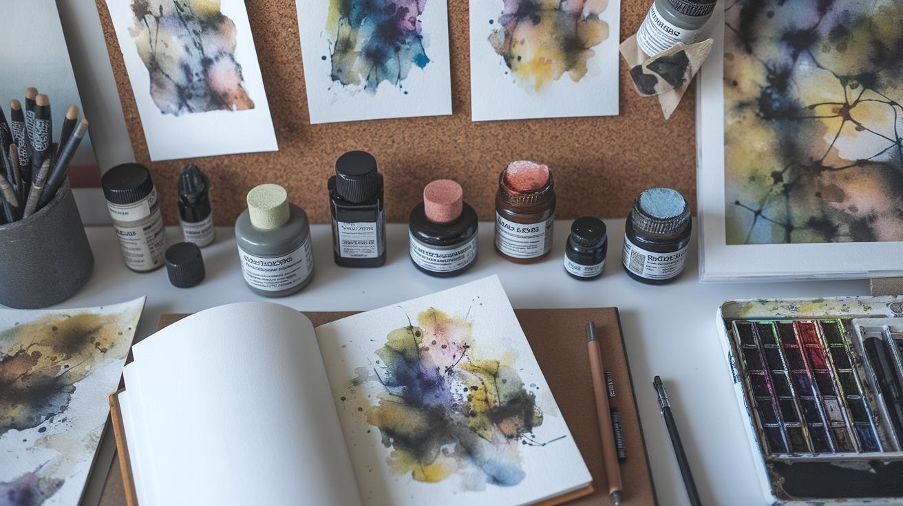
Color Mixing Techniques For Vibrant Flowers
You can create flower colors that really pop by mastering watercolor mixing. Start with the basics of the color wheel. Primary colors are red, blue, and yellow. Mixing two primaries creates secondary colors like green, orange, and purple. Then, mix a primary and a secondary to get tertiary colors, such as red-orange or blue-green. These make your flower shades more natural and varied.
Look at flower petals closely. They often have subtle color shifts. Mix closely related colors to capture that. Try mixing red with a touch of orange for warm rose petals or add blue hints for cooler violets. Ask yourself what mood each flower’s color should show—warm or cool?
Complementary colors on the wheel, such as red and green, help you tone down or darken a color without making it gray. Adding a small amount of green to a red petal can create shadows or depth. Practice mixing these carefully to avoid dull results. How does experimenting with these mixtures change how your flowers look?
Using The Color Wheel For Flower Palettes
The color wheel is your guide to picking colors that work well together in your floral paintings. Colors next to each other, called analogous colors, create soft and harmonious palettes. For example, yellow, yellow-green, and green together bring a fresh, natural feel to leaves and petals.
Contrasting colors, like red and green or blue and orange, make parts of the flowers stand out. If you want a bright center or a focal point, choose complementary colors. They balance each other and add energy to your painting.
Use the wheel to limit your palette. Too many colors can confuse your painting. Choosing three to five colors based on the wheel keeps your flowers lively but unified. How can you design your next palette by using this approach?
Mixing Clean And Bright Colors
Dirty or muddy colors often result from mixing too many pigments or using them in the wrong order. To get clean and bright flower colors, start by mixing small amounts of paint on your palette. Use a wet brush and add water little by little to keep paint transparent.
Keep your colors separate on the palette as much as possible. If you mix red and green in too equal amounts, the color turns gray or brown. Instead, add one color gradually to the other and watch for the shade turning dull. Stop when the color still looks fresh.
Use pure colors for mixing new shades. For example, to create a bright orange petal, mix cadmium red with cadmium yellow instead of red with green, which dulls it. Clean your brush well between colors to avoid unwanted mixing on paper.
Ask yourself: How does changing the amount of water or pigment affect the brightness of my colors? Testing this can help you achieve crisp flower shades every time.
Painting Petals And Leaves With Realism
Painting flower petals and leaves with a lifelike feel requires attention to brush strokes, edges, and color transitions. Start by observing the shapes closely. Notice how petals have subtle bends and leaves show delicate textures. Using a soft, pointed brush helps control fine details.
Edges should vary; some are sharp and crisp, while others blend softly into the background. Practice controlling your brush pressure to create these effects. Gentle, flowing strokes can mimic smooth petal curves, while light dabs and flicks suggest tiny veins or rough leaf surfaces.
Smooth color transitions add depth. Avoid harsh lines where two colors meet. Instead, layer thin washes and let them dry gradually. This builds subtle shifts in color, capturing shadows and highlights naturally. Ask yourself which parts catch light and which sit in shadow. Detail that contrast will make your painting more realistic.
Capturing Petal Curves And Shapes
Focus on the natural bends each petal makes. Use your brush like a pencil, changing direction with the curve. Apply more pressure when painting wider areas, then lift it to create tapering tips. This controls thickness and mimics the petal’s shape.
Think about how petals overlap or fold. Paint the front petal first with clear strokes, then add shadows or faint lines where petals tuck behind each other. This layering brings dimension. Try tilting your brush slightly to follow the petal’s flow. How does the shape change from base to tip? Adjust your strokes to match those shifts.
Rendering Leaf Veins And Shadows
Leaves have a network of veins that add texture and structure. Paint the main vein first with a thin, straight line down the center. Then, use a fine brush to add smaller veins branching out. Keep these lines subtle, not too dark or thick.
Shadows under and around veins create volume. Apply a light wash of a darker green or brown around veins to suggest depth. Use a damp brush to soften edges and blend shadows smoothly. Concentrate shadows where veins curve or fold.
Practice layering veins and shadows to build a natural look. Does adding shadows change how you see the leaf’s shape? Experiment with light and dark to find the right balance. This will make your leaves look alive and textured, not flat.
Adding Highlights And Shadows To Flowers

Creating a three-dimensional look in flower watercolor paintings depends largely on how you add highlights and shadows. Shadows give depth, while highlights bring parts of the flower forward. Before starting, you must decide where the light source is. This affects where shadows fall and where you keep the paper bright or add white paint.
Planning your light source helps you maintain consistency across the entire painting. Imagine if light comes from the top left; then the petals on that side appear brighter. The petals opposite will have deeper shadows. Deciding this early makes your flower appear more real and radiant.
Use lifting to create highlights by gently removing paint with a clean, damp brush or a tissue. This way, you can bring back the brightness without covering the color completely. If you add white paint, use it very sparingly to avoid making the flower look flat or chalky. White gouache or opaque watercolor works best when applied with a light touch on small areas like the petal tips or where water droplets might catch light.
Try lifting paint while the paper is still wet to soften the highlight edges. For sharper highlights, wait until the paint dries first before lifting or adding white paint. This control helps your flower look fresh and radiant. Think about where the light hits your flower and how shadows create contrast. Does your flower glow or fall flat? Adjusting your highlights and shadows can make a big difference in your next painting.
Planning Your Light Source
Before you start painting, decide where the light comes from. This choice affects every shadow and highlight in your flower. Without a clear light source, the flower will look flat and confusing. When you pick a direction—top, side, or even backlighting—you can build shadows and highlights carefully.
Observe real flowers under light and notice where the brightest parts are. These parts should stay nearly white or very light in your painting. Shadows will appear on the petals facing away from the light. You do not need to paint every shadow dark; softer shadows suggest gentle light, and harder edges can show stronger light.
Keep your light source steady through the whole painting. It helps the flower feel solid and real. Imagine the petals catching light on one side and curving into shadow on the other. Plan your shadows and highlights with this in mind. How does your chosen light source shape the mood of your flower?
Techniques For Lifting And Adding Highlights
Lift paint by gently dabbing a damp brush on areas that should be lighter. You can also use a clean tissue or paper towel to absorb color from wet paint. This technique works well for soft highlights and subtle reflections on petals. Lifting helps you control tone without adding more paint.
If the paint dries and highlights are too dark, use a small round brush and white gouache or watercolor to add light spots. Use a thin layer and let the color show through to keep some transparency. Avoid heavy white because it can block your delicate colors and change the flower’s natural look.
Remember to practice lifting on a scrap piece before working on your final painting. This builds confidence and shows how much pressure to apply. Use lifting and white paint to emphasize the petal’s curve, water drops, or edges that catch light. Does the highlight you add make the flower look rounded or flat? Adjust carefully to keep the flower bright and lively.
Creating Radiant Backgrounds For Flower Paintings
Backgrounds play a major role in making your flowers stand out. A well-planned background focuses attention on the flower without fighting for it. Soft washes create gentle, smooth areas that keep your flower as the focal point.
Applying a subtle gradient adds depth and guides the eye toward your floral subject. You can use light color shifts from one corner to another, moving from cool to warm tones or light to dark values, depending on your flower’s colors.
Complementary colors increase visual impact. For example, bright yellow flowers look vivid against purples or blues. Think about what colors will bring out your flower’s best features. Avoid busy or harsh backgrounds that pull attention away.
Ask yourself: What mood do I want to set around my flower? A calm, soft background invites quiet appreciation, while a lively, contrasting one energizes the whole painting.
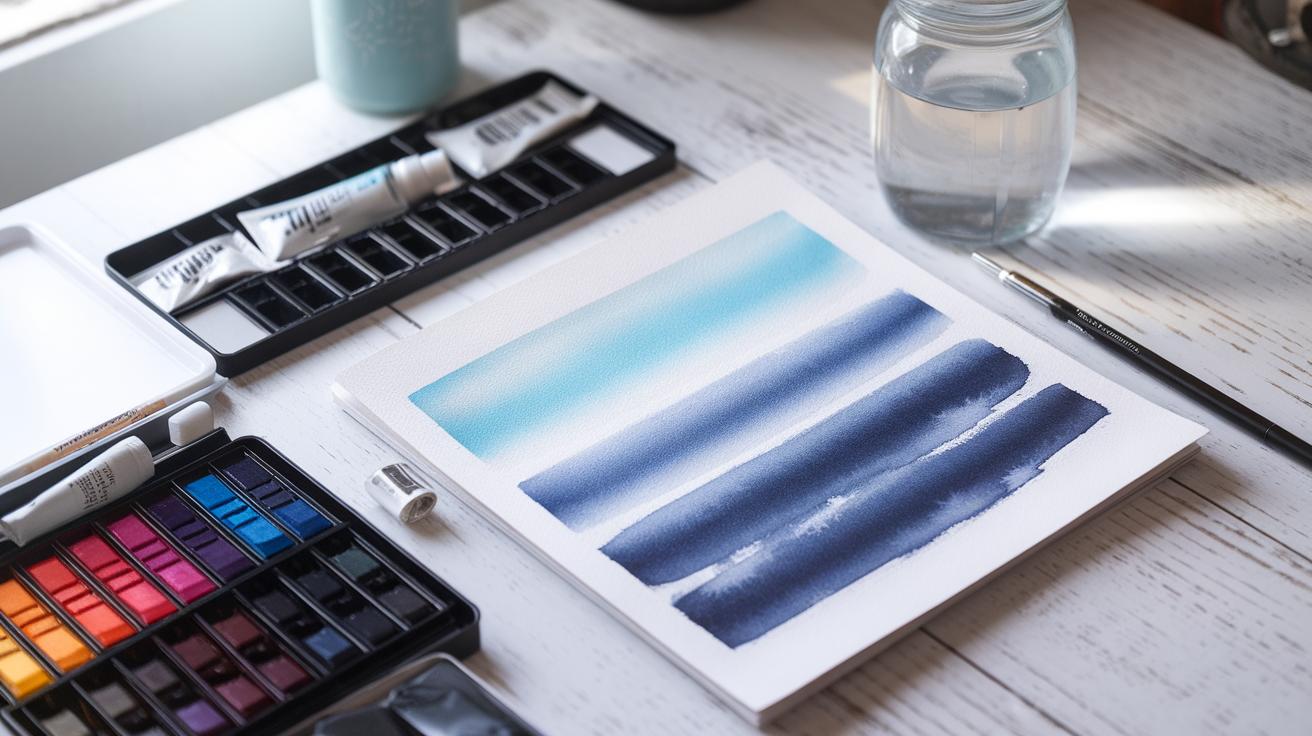
Soft Wash Backgrounds Using Wet-on-Wet
Start with damp paper for soft washes. Wet your paper evenly with clean water using a big brush. Then drop watercolor paint onto the wet surface. The paint spreads and blends naturally without hard edges.
This technique produces smooth gradients and soft textures that won’t compete with detailed flowers. Colors blur slightly, creating a gentle atmosphere behind your blooms.
Keep your brush loaded but not dripping to control flow. Move quickly, as the paper needs to stay wet to maintain the effect. If the surface dries, new paint will create harsh lines.
Try mixing your background colors on the paper instead of the palette for more organic blends. You’ll notice how flowers pop out against the blurred, soft background.
Color Choices That Enhance Flowers
Your background color changes how viewers see the flower. Use colors opposite on the color wheel for strong contrast. For instance, red flowers often stand out best with green backgrounds.
Less saturated backgrounds help bright flowers take center stage. Muddy or dull colors tend to pull away from the vibrancy of your petals, so use them carefully.
Look at your flower’s colors and pick background tones that lift or deepen those shades. For cool blue flowers, warm backgrounds can add warmth and balance. For warm yellow or orange flowers, cool backgrounds highlight their brightness.
Try layering colors to build interesting backgrounds that serve the flower’s energy. How does the flower change when you adjust the background hue? Experiment and pay attention to how your choices affect the overall painting.
Tips For Fixing Mistakes And Improving Paintings

Using Lifting Techniques To Correct Errors
You can correct many mistakes in flower watercolor paintings by lifting pigment carefully. When paint looks too dark or spills outside the petal edges, dampen a clean brush with water and gently blot the area. Use a light touch to avoid damaging the paper. A damp paper towel can also lift faded pigment by pressing lightly—this works best on still-wet paint or just after it dries.
Try lifting in small sections to control how much color you remove. If the pigment has dried thoroughly, rewet the spot before blotting. Practice on scraps to master pressure and timing. Have you noticed uneven patches? Lifting can balance them and restore brightness without starting over.
Adjusting Colors And Shapes After Drying
After your painting dries, you have more control to fix colors and shapes. Adding thin glazes of paint can deepen shadows or brighten dull spots. Work layer by layer, waiting between applications to prevent muddiness.
If a petal looks too small or oddly shaped, paint around it carefully to reshape edges or add highlights for definition. Sometimes a small touch of contrasting color revives flat areas and lifts the whole flower’s appearance.
Do your colors feel off? Try glazing a transparent wash of a cooler or warmer hue over the area to shift tone softly. Keep your brush strokes deliberate and patient as you refine details. How could subtle changes improve your painting’s balance?
Step By Step Radiant Flower Watercolor Tutorial
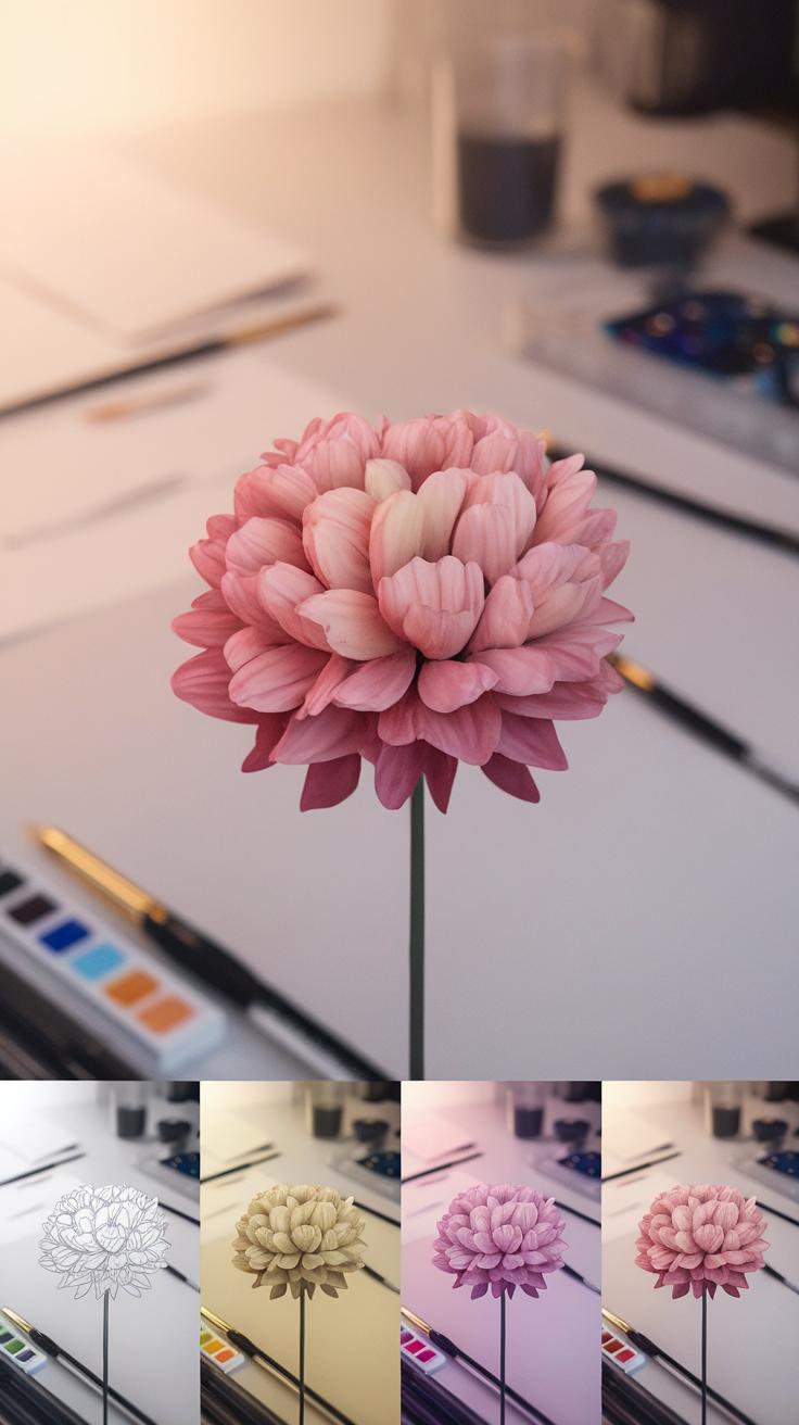
Sketching And Applying The First Washes
Begin by lightly sketching your flower on watercolor paper. Use a soft pencil so your lines don’t press too hard and can blend with paint later. Focus on basic shapes like circles and ovals for petals and leaves, keeping the sketch simple and loose.
Next, prepare your paints. Mix soft colors with plenty of water. Apply the first washes using a wet-on-wet technique, where the paper is moist before adding pigment. This helps colors blend smoothly and creates delicate gradients on petals and leaves.
Start with lighter tones on the petals. Let the paint flow naturally and avoid overworking the area. For leaves, use cool greens but keep the edges soft. Think about light sources and leave some areas less painted to show where light hits the flower.
Are you paying attention to your brush pressure? Gentle strokes create soft edges that give flowers an airy look. This initial layer sets the stage for depth, so keep your color light and transparent.
Building Layers And Adding Details
Once your first washes have dried, apply more layers to build depth and volume. Use a smaller brush to paint more intense pigments on shaded areas of petals and leaves. This adds contrast and helps each petal stand out.
Introduce fine brush strokes to mimic petal veins and textures. Use slightly darker shades than your base color, but avoid overpowering the soft background. This adds a natural complexity to your flower painting.
For highlights, leave some spots untouched or gently lift color with a damp brush. These bright spots make your flower look more three-dimensional.
Look closely at real flowers or reference photos. Can you spot tiny color variations and irregular shapes? Try to capture those by varying your brushwork and color layers.
Adding details last lets you control the painting’s focus. It also allows you to decide which petals should pop forward and which should recede. This process helps you create a radiant, lively flower that feels real.
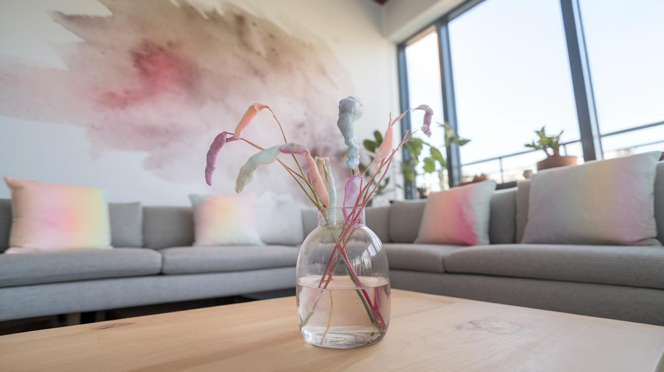
Displaying And Preserving Your Flower Watercolor Art
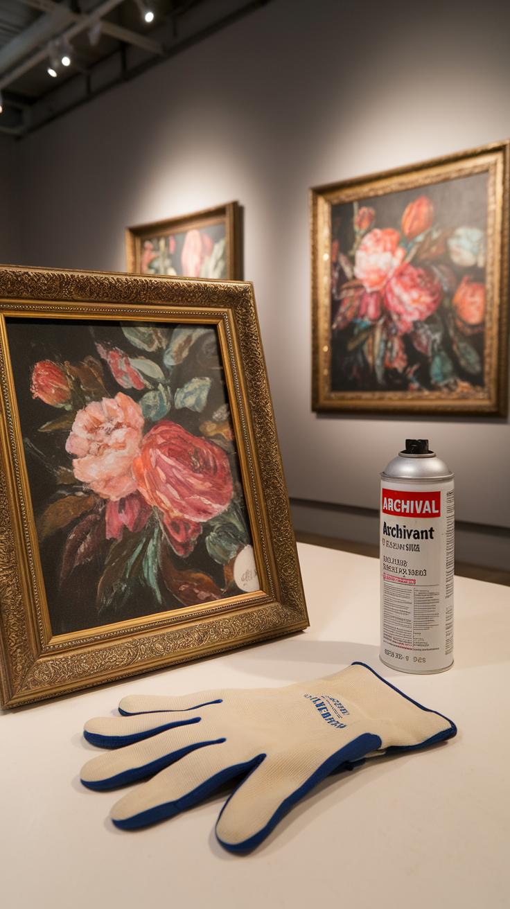
Displaying your flower watercolor paintings with care helps keep their colors bright longer. Choosing the right frame protects your work from dust and physical damage. Think about where you want to hang your painting—avoid direct sunlight, which can fade colors over time. A well-placed painting not only looks good but lasts longer.
Matting creates a space between the glass and your artwork. This prevents the paint from sticking to the glass and becoming damaged. Acid-free mats also stop yellowing, which can ruin your painting over time. When you display your art, make sure the frame holds the mat securely but gently.
Sometimes, you may want to rotate your art to protect it from environmental damage. Consider changing displayed paintings regularly to keep your collection fresh and safe. How often do you check the condition of your paintings? Maintaining your flower watercolors means they can brighten your walls for years to come.
Choosing Frames And Mats For Watercolors
Frames with UV protective glass block harmful light that fades watercolor paints. This type of glass helps keep your flower art vibrant. When shopping, ask if the glass blocks at least 70% of UV rays. Using cheap glass will not stop fading or damage.
Acid-free mats prevent your paper from yellowing and becoming brittle with age. Avoid mats made from regular cardboard or paper. These materials contain acids that eat into your artwork. Acid-free mats create a safe environment for your pieces, preserving their quality.
When selecting mats, choose colors that enhance your flower painting without overwhelming it. Neutral tones often work best. Thin mats create a modern look, while wider mats give more room around your art. What framing style matches your flowers and your space?
Proper Storage To Avoid Damage
Store your flower watercolor paintings flat to keep them from bending or warping. Roll or fold paintings can crack or crease the paper. Acid-free folders or portfolios provide protection from dust and light during storage.
Use sheets of acid-free tissue paper between paintings if you keep multiple artworks together. This prevents colors from transferring or sticking to each other. Store your portfolios in a cool, dry place to avoid mold or mildew.
Check stored paintings every few months. Are they still flat and vibrant? If you notice damage or fading, take action to improve storage conditions. Proper storage helps your artwork look fresh when you want to display it again.
Conclusions
Flower watercolor painting opens a path to creative expression and technical growth. You will gain better control over washes and color intensity as you practice. Flowers encourage you to observe nature closely and translate its details into paint. Your work will develop a sparkling translucency unique to watercolor art. Focus on experimenting with water and pigment to capture the softness and vibrancy of petals and leaves.
By following the tutorial steps and chapter topics, you will build confidence and skill. Each painting session enhances your eye for color, light, and form. The radiant flower paintings you create can brighten any space and bring joy to both you and others. Keep pushing your watercolor abilities and allow floral subjects to inspire ongoing creativity and growth.