Introduction
Fall is a season rich in colors and mood, inspiring artists to capture its beauty on canvas. Watercolor painting offers a unique medium to express the warm hues and subtle shifts in light that characterize autumn. You can use this versatile technique to create stunning representations of fall landscapes, foliage, and scenes that evoke the season’s calm yet vibrant spirit. This article guides you through understanding fall watercolor art and provides a tutorial for creating your own warm fall watercolor paintings.
Watercolor painting uses pigments suspended in water, allowing artists to achieve transparency, layering, and delicate gradations of color. Autumn, also known as fall in the US and Canada, marks the transition from summer to winter and showcases nature’s changing colors. These seasonal changes provide a perfect subject for watercolor art. Your journey will explore materials, color palettes, techniques, and step-by-step guidance to help you create artwork that captures the essence of fall.
Understanding Watercolor Painting
Watercolor is a unique painting medium where pigments are suspended in a water-based solution. When you add water, the color flows easily and spreads over the paper, creating soft edges and delicate effects. The more water you use, the lighter and more transparent the color becomes.
One special quality of watercolor is its transparency. Unlike acrylic or oil paints, watercolor lets light pass through the pigment and reflect off the paper underneath. This creates a glowing effect that many artists find appealing.
You can build depth by layering transparent washes on top of each other. Each layer adds richness without hiding the ones beneath. Texture also plays an important role. Wet-on-wet techniques blend colors smoothly, while dry brush strokes add grainy, rough surfaces.
Have you ever noticed how watercolor can achieve both softness and detail? Experimenting with water control and brush handling helps you find your own style. What parts of autumn would you capture using these effects?
History and Characteristics of Watercolor
Watercolor painting dates back thousands of years. Ancient Egyptians used water-based paints on papyrus to create colorful images. In East Asia, brush painting with ink and pigments developed into a refined art form tied to philosophy and nature.
European artists later adopted watercolor for sketching and landscape painting. The Renaissance saw an increase in detailed botanical studies using transparent washes. Later, British artists in the 18th century popularized watercolor for capturing outdoor scenes.
This medium’s character grew from its portability and quick drying time. Watercolor allowed artists to work directly with nature and light. Beyond its global history, can you imagine what events shaped your favorite autumn art pieces?
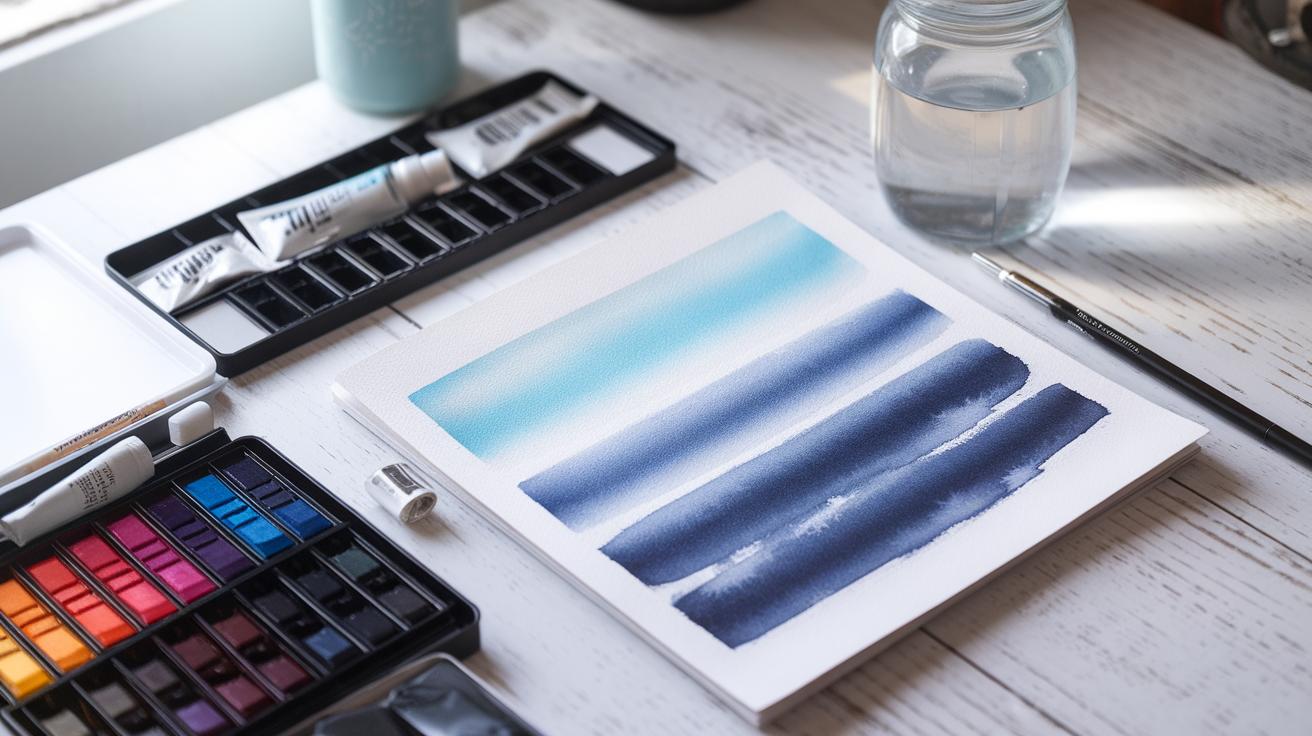
Watercolor Materials and Paper

Your choice of materials strongly influences your painting’s outcome. Watercolor paints come in pans, tubes, or liquid form, each offering different convenience and intensity. Pigments vary too; some are brighter or more permanent than others.
Brushes made of synthetic or natural hair affect how paint deposits on paper. Round brushes hold water well for smooth washes, while flat brushes cover larger areas efficiently. Using the correct brush size helps you paint leaves or branches precisely.
Choosing the right paper is essential. Watercolor paper is usually made of cotton and comes in various weights and textures. Heavier paper prevents warping when wet. Rough or cold-pressed paper shows more texture, while hot-pressed paper gives smooth finishes.
Try experimenting with different tools. How might changing your paper texture or brush type affect the way you capture autumn’s warmth?
Exploring the Fall Season as an Artistic Subject
Characteristics of Fall’s Visual Appeal
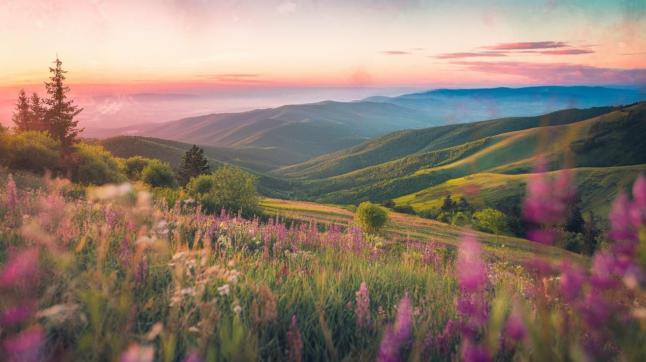
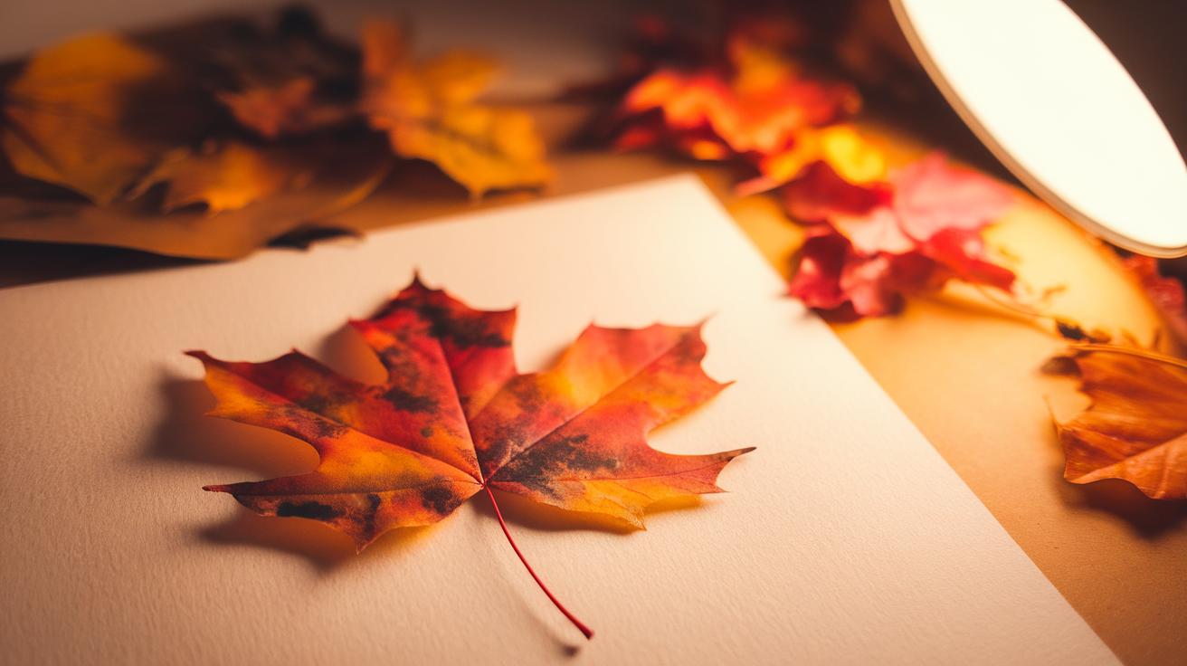
The fall season offers a unique mix of colors and light that draws many painters to capture its beauty. Leaves turn from green to deep reds, bright oranges, and golden yellows, creating striking contrasts in natural scenes. The sunlight during fall often feels softer and warmer due to the sun’s lower position in the sky. The changing angle of light casts longer shadows and highlights textures in landscapes, adding depth for artists to explore.
Cooler air and shorter days shift the atmosphere, bringing a quiet calm to outdoor spaces. This change can influence how colors appear, often making them appear richer and more vibrant. If you observe closely, the misty mornings and crisp evenings offer chances to paint soft edges and subtle blends. These features give fall paintings a tranquil and cozy feeling.
Why Fall Inspires Artists
Artists find fall to be full of inspiration because of the strong emotions the season can evoke. The vibrant colors of leaves express energy and change, while the cooling weather and shrinking daylight invite reflection and a sense of calm. Painting fall scenes lets you capture this mix of energy and stillness.
Fall also carries symbols like harvest, change, and preparation for winter. These ideas add meaning to your work beyond just the visuals. When you paint fall landscapes, you can tell stories about time passing and nature’s cycles. Think about how these themes can shape your compositions or choice of subject. How might you show warmth against cooling air in your paintings? What emotions do the shifting colors bring up for you personally? Reflecting on these questions can deepen your connection to your art.
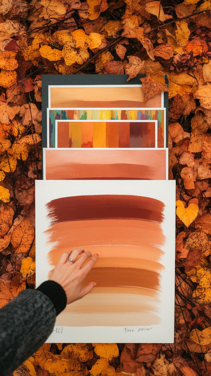
Choosing Warm Colors for Fall Watercolor Paintings

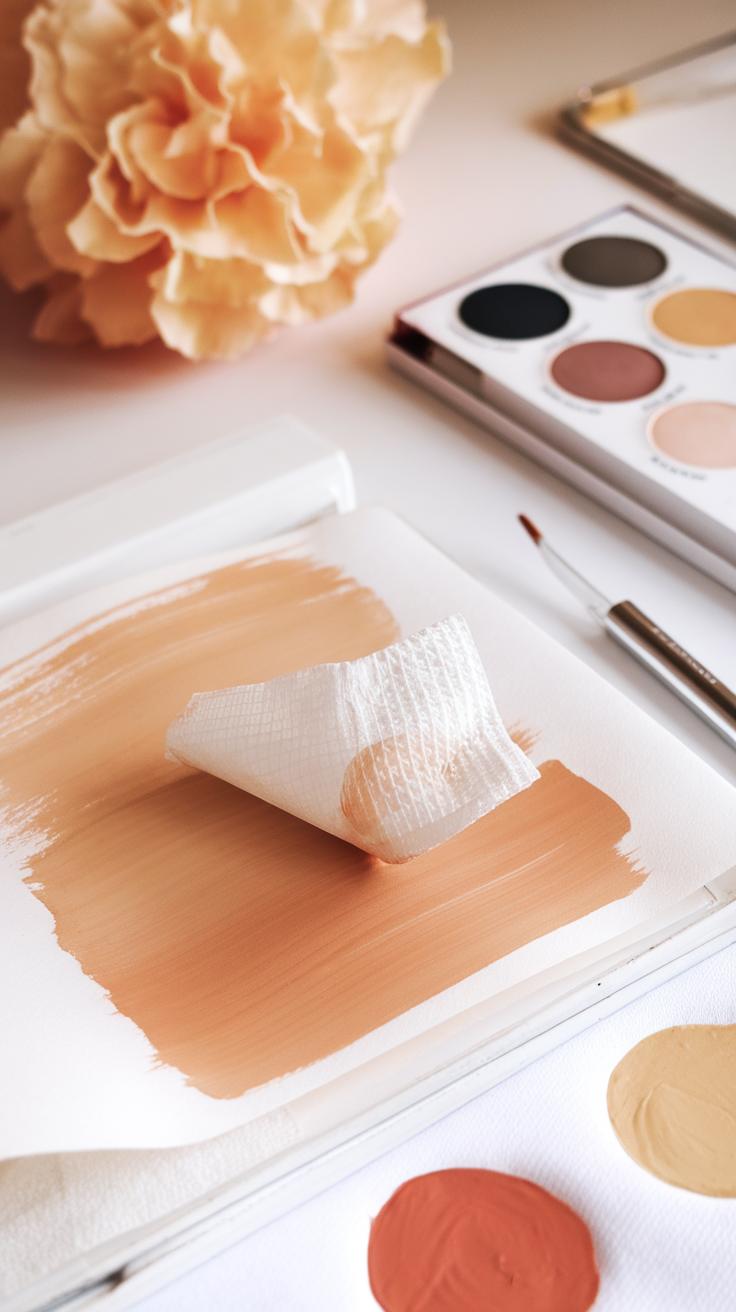
Fall calls for warm and earthy colors to best capture its mood. Begin with reds that lean toward deep and rich shades like crimson or burgundy. These convey the heart of autumn leaves turning. Oranges should feel soft but vibrant, recalling pumpkins and late-season flowers. Yellows need to stay muted, with golden tones resembling dried grasses and fading sunlight. Browns tie the palette together—look for warm siennas or burnt umbers that hint at tree bark and fallen leaves.
Think about which colors dominate your scene. Are you painting a forest floor or a sunlit hillside? Choose your hues to match the temperature and light in your composition. How do the colors you pick affect the feeling? Do they make the painting cozy or lively? Using warm colors in layers helps achieve a glowing effect that feels natural to fall.
Color Theory for Autumn
Color theory helps you balance your palette for harmony. Fall colors often sit next to each other on the color wheel—called analogous colors. For example, reds next to oranges and yellows create smooth flow without harsh contrasts. These tones reflect the gradual color shifts in leaves.
Complementary colors—those opposite each other on the wheel—add contrast and spark interest. Deep greens can make oranges pop, mimicking remaining evergreens against fall foliage. Consider how these relationships influence your painting’s balance. Would your scene benefit from a splash of blue-green for contrast, or stay warm with yellows and reds?
Mixing and Using Pigments
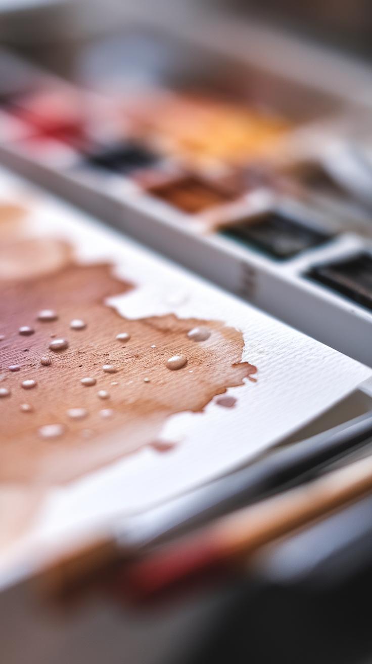
Mixing your pigments ensures your colors feel genuine and vibrant. Start with basic colors like cadmium red, yellow ochre, burnt sienna, and a touch of ultramarine blue to adjust warmth. Combine reds and yellows gradually to find the right orange. Use brown sparingly, mixing reds and blues with yellows yourself rather than reaching straight for pre-made browns. This keeps the color fresh and translucent.
Keep water-to-pigment balance in mind. Too much water dulls the color, too little thickens it. Layer thin washes to maintain brightness and let each dry before adding more depth. Are your mixed colors capturing the glow of sunlight or the muted tone of shade? Practicing mixes on scrap paper helps you master this before applying to your main painting.
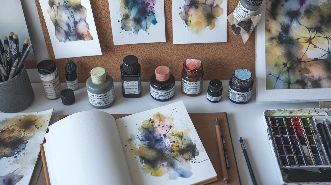
Watercolor Techniques for Capturing Fall Textures
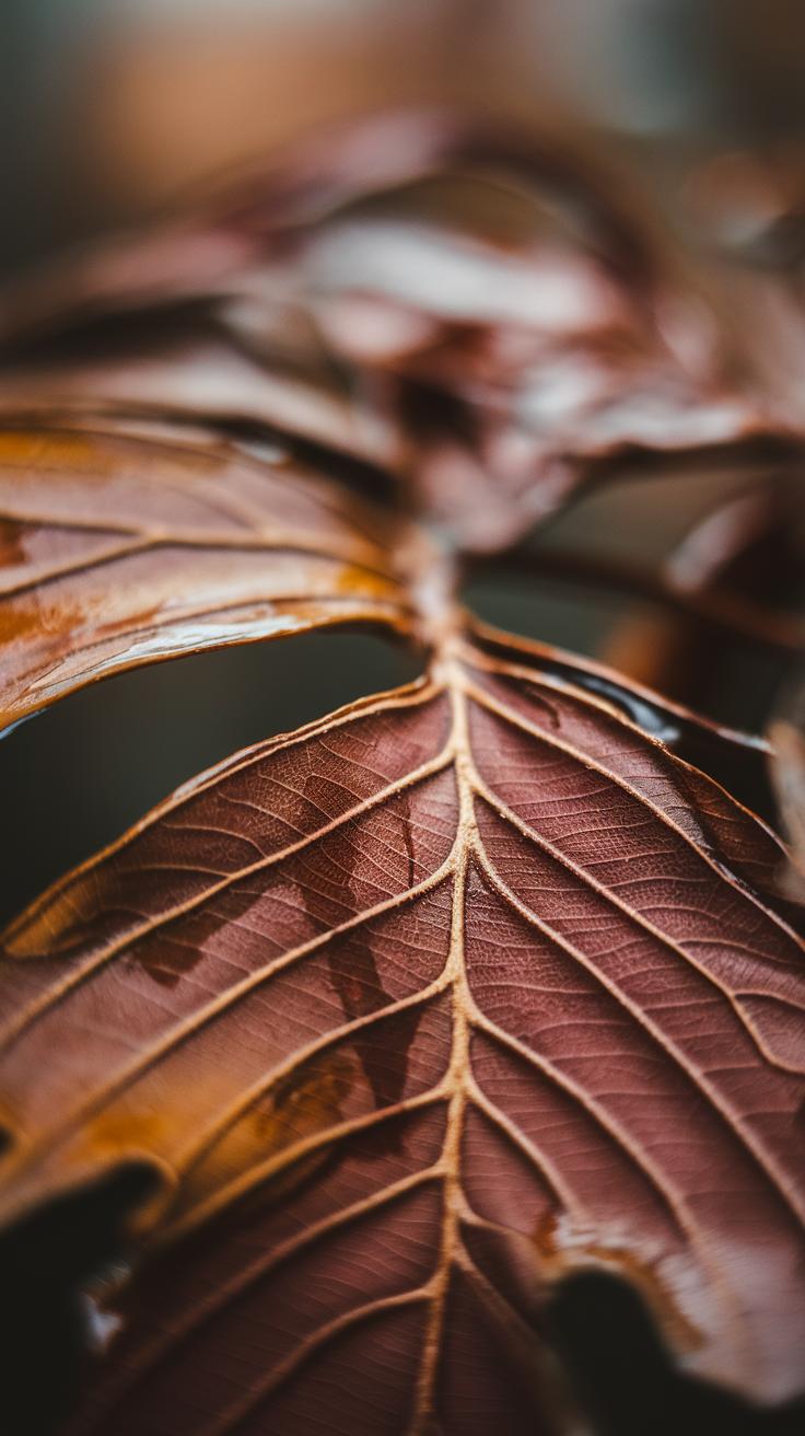
Capturing the unique textures of fall requires focused watercolor techniques. To paint leaf veins, try using a fine liner brush with thinner paint to draw delicate lines after the initial leaf shape dries. This adds realism without heavy detail. For bark, apply dry brush strokes with a stiff brush to create rough, scratchy textures. You can also lift paint with a damp brush or paper towel to highlight patterns in the wood’s surface.
The softness of fog or mist demands a wet-on-wet approach. Apply clean water onto your paper, then drop in diluted paint colors allowing them to blend naturally. This method creates smooth transitions and a blurred effect, perfect for early morning scenes where light diffuses softly. How will you use these techniques to express the tactile qualities of fall in your paintings?
Brush Techniques for Detail
Your brush choice affects the textures you produce. Use small round brushes for detailed veins in leaves and thin twigs. Flat brushes work well for broad strokes like tree trunks or layered foliage. Try stippling with the tip of a round brush to mimic clusters of leaves or rough bark surfaces.
Switch between lifting paint with a damp brush and making sharp, precise strokes depending on the texture you want. Experiment with flicks and dabbing to replicate scattered leaves or moss. Can you feel how adjusting your brush strokes changes the feel of natural elements in your painting?
Layering and Glazing
Layering builds richness in fall colors and textures. Begin with light washes to establish base tones. Once dry, add successive layers with transparent glazes made by mixing small amounts of paint with water. This deepens color without hiding previous layers.
Use glazing to enhance warmth, especially by layering amber, burnt sienna, or deep reds over yellows and oranges. It also helps create shadow and form on leaves and bark. Let each layer dry fully before adding another to keep edges clean. How will layering transform your autumn scenes?
Materials Setup and Preparation

Choosing Your Tools
Start by gathering watercolor paints in fall colors like burnt sienna, yellow ochre, and deep reds. These shades help you capture the warm tones of autumn leaves and trees.
Select a few good-quality brushes. A medium round brush works well for details and washes, while a flat brush covers larger areas. You might also want a fine liner brush for leaf veins and sharp details.
Choose watercolor paper that can handle multiple washes. A 140 lb (300gsm) cold-pressed paper suits most fall watercolor scenes. It offers texture but won’t buckle easily when wet.
Prepare a palette for mixing colors. Keep some water containers handy—one for clean water and another for rinsing brushes. Paper towels or cloths are also important for blotting and controlling moisture.
Don’t forget pencils for sketching and erasers to correct lines before painting. Organize your materials so everything is within easy reach, which saves time and keeps you focused.
Planning Your Artwork
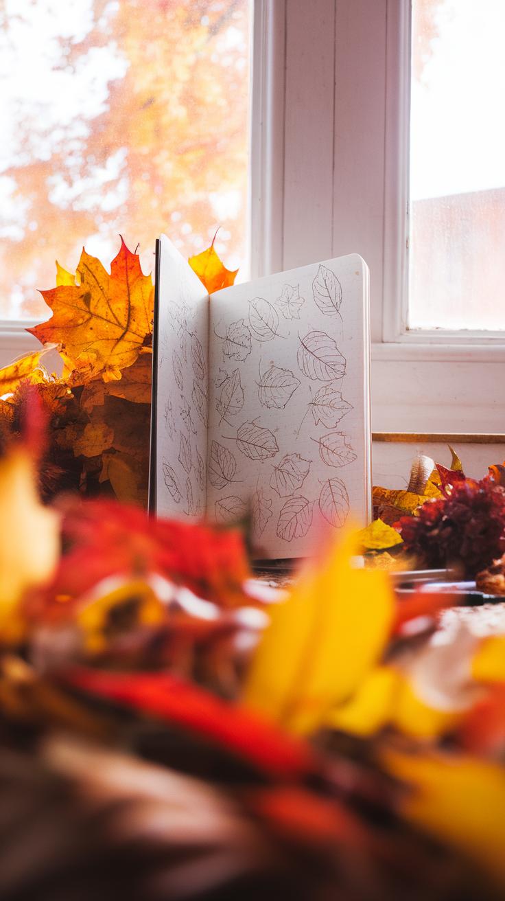
Begin by selecting reference photos of fall scenes. Look for images showing trees with colorful leaves, soft sunlight, or misty mornings. These photos help you study shapes, colors, and light.
Sketch your composition lightly on watercolor paper. Focus on main shapes like tree trunks, leaf clusters, or distant hills. Think about where to place warm colors to draw the viewer’s eye.
Use simple outlines to plan your layers. You want to know which areas will be lighter or darker so you can apply washes smoothly. For example, mark where shadows fall on the leaves or where the fog softens edges.
Ask yourself what mood you want to create with your painting. Planning these details helps you work confidently when you start applying color.
Step by Step Warm Fall Watercolor Tutorial
Sketching and Initial Washes
Start by drawing a simple outline of your fall scene. Focus on the big shapes—trees, leaves, and the ground. Avoid adding too many details. Keep the lines light using a pencil so they won’t show through your paint.
Next, mix your base colors. Choose warm yellows, oranges, and reds to create the feeling of autumn. Apply a light wash to the sky and background areas. Use clean water to spread the pigment thinly. This creates a soft, glowing look that sets the mood.
For the trees and foliage, paint broad patches of color. Don’t worry about defining every leaf yet. Let the colors blend gently on the paper. This helps you establish the overall warmth and tone before adding more details. Have you thought about how your early washes will guide the rest of the painting?
Building Layers and Details
After the first washes dry, add more pigment with deliberate strokes. Use deeper reds and burnt sienna for shadows on leaves and tree trunks. Layering gives your painting depth and warmth. Be careful not to overwork the area; let each layer dry fully.
Focus now on details. Use a smaller brush to add veins and edges to leaves. Dab or flick the brush to suggest texture on bark and scattered leaves on the ground. This adds realism without overwhelming the scene.
Include highlights by lifting paint with a damp brush or applying a lighter color over darker spots. Watch how these small touches bring your autumn scene to life. How can the play of light and shadow improve your composition?
Tips for Troubleshooting Common Watercolor Challenges
Controlling Water and Pigment
Managing water flow in watercolor can be tricky, especially with warm fall colors that shift easily. When your paint spreads too much or creates unwanted blooms, try reducing the water on your brush. Use a smaller brush or blot your paper gently with a tissue to absorb extra moisture. Keep in mind that tilting your paper affects how paint flows; experiment with the angle to control this. Mixing colors in your palette helps control pigment strength before applying it to paper. Test your colors in small patches to avoid muddy areas. Don’t let wet layers overlap too soon, or colors may mix unexpectedly. How do you balance pigment and water so your leaves have sharp edges without losing warmth? Practicing these adjustments helps you stay in control as you paint.
Correcting Mistakes
Mistakes happen, but watercolor offers ways to fix them without starting over. If the color is too dark, try lifting the paint with a damp, clean brush or a soft sponge. Gently blot the area while it’s still wet to lighten it. For dry paint, dampen the spot first to soften it before lifting. You can also add clean water to dilute harsh edges and blend them out. If a color looks off, layering a thin wash of a more suitable tone can adjust the hue. Try scraping edges lightly with a palette knife after drying to create texture or correct shape. What errors have slowed your process? Knowing how to correct colors keeps your painting moving forward and saves your autumn scene from unwanted blends.
Incorporating Personal Style in Fall Watercolor

Your fall watercolor art becomes more meaningful when it reflects your own style. Begin by choosing colors that resonate with you, not just what you see in nature. Don’t hesitate to mix traditional autumn hues with unexpected tones like deep blues or soft pinks. Consider how you arrange elements in your painting. You might focus on close-up leaves or a broad forest scene. Your composition can highlight the mood you want to convey.
Technique also plays a role in expressing your voice. Try loose brushstrokes for a casual feel or sharp lines for precision. Imagine how different brush sizes change your work’s energy. Ask yourself what story you want your painting to tell. How do your choices in color, layout, and brushwork show something unique about your view of fall?
Experimenting with Colors and Techniques
Testing new color mixes helps you find a palette that feels personal. Start with common warm tones like burnt sienna and ochre, then adjust their intensity by adding water or layering pigments. You can also try glazing to build depth or lift paint for highlights to create texture. Combine wet-on-wet and wet-on-dry techniques to see how edges soften or sharpen.
Use different tools like sponges, old brushes, or even toothbrushes to add texture. Try painting on rough or smooth paper to notice changes in how the paint moves. Keep track of your results. What happens when you add unexpected colors like violet or teal to your orange and red mixes? Experimenting this way helps you discover techniques that fit your style.
Finding Inspiration
Look around for ideas that spark your creativity. A walk through the park or forest can reveal shapes, patterns, and colors worth painting. Collect fallen leaves, photographs, or even sketches made on location. Use these materials to keep your thoughts fresh.
Think about autumn themes beyond foliage. Consider seasonal items like pumpkins, cozy scarves, or early sunsets. Ask yourself where you feel most connected to fall. Is it a quiet street or a bustling farmers’ market? These personal experiences make your art more authentic and engaging.
Sharing and Displaying Your Fall Watercolor Artwork
Preparing Artwork for Display
Protecting your watercolor pieces starts with choosing the right materials. Use acid-free mats and backing boards to prevent yellowing over time. A well-chosen frame enhances your painting’s colors and keeps it safe from dust and moisture. Consider frames with UV-protective glass to reduce fading from sunlight exposure.
Mount your artwork carefully. Avoid adhesives directly on the painting; instead, use corner mounts or acid-free tape on the back. This preserves the paper and makes it easier to remove if needed. When displaying in a home or gallery, keep your paintings away from direct sunlight and humid areas to maintain vibrancy and prevent warping.
Building an Audience
Start by sharing clear, well-lit photos of your paintings on platforms like Instagram, Etsy, or art-focused websites. Natural light works best when photographing your work. Crop tightly but avoid cutting off edges, and show some scale by including a common object or your hand in the shot.
Local art fairs, community centers, or coffee shops offer opportunities to display your work and meet potential buyers. Join art groups or workshops to connect with other artists and get feedback. Ask yourself: Who would connect with my art? What story does my collection tell? Engaging your audience with these questions helps build genuine interest and sales.
Conclusions
Creating fall watercolor paintings enhances your ability to observe and render the transition of seasons through color and form. You develop skills in controlling transparency, layering, and blending tones that evoke autumn scenes. The warm color palettes associated with fall—reds, oranges, yellows, and browns—allow you to experiment with hues that communicate mood and atmosphere effectively. Your artwork can reflect the season’s cooler daylight, shorter days, and softer contrasts uniquely characteristic of autumn.
Applying watercolor techniques specifically suited to fall themes empowers you to produce expressive and appealing paintings. Using the tutorial steps, you refine your technique, deepen your appreciation for seasonal changes, and improve your artistic expression. Your finished paintings become a personal record of autumn’s beauty and a way to connect with the season’s essence. Embrace the process and continue exploring the rich world of fall watercolor art.