Introduction
Expressive typography is about making your words not just readable but also visually interesting and full of personality. It allows you to catch the eye of your audience and convey emotions beyond the plain meaning of the words. In this article, you will learn useful techniques for creating eye catching expressive typography that brings your text to life.
These techniques will help you use fonts, sizes, spacing, and colors to create designs that communicate your message clearly and attract attention. Whether you are designing for print or digital use, understanding expressive typography will help you connect better with your audience.
What Is Expressive Typography
Expressive typography goes beyond just arranging letters clearly on a page—it’s about giving text a personality, a mood, or even a subtle emotional layer. Unlike basic typography, which mainly focuses on readability and clarity, expressive typography tries to communicate something deeper through the way words look. It’s not just what the text says, but how it feels.
Think about the last time you saw a poster, a book cover, or even a headline that caught your attention immediately. Chances are, the typography didn’t just deliver information; it told a story or sparked a reaction without even needing extra words.

Why does this matter in design and communication? Because expressive typography shapes how people perceive your message—it can make your words feel urgent, playful, serious, or mysterious. It’s one of the few tools that can hint at emotions before someone even reads a single word.
When you use expressive typography well, you’re guiding your audience’s feelings and expectations. For example:
- A bold, jagged font might create tension or excitement.
- A smooth, flowing script can feel elegant or inviting.
- A distorted or broken typeface might suggest chaos or disruption.
It’s tricky, though. Sometimes, expressive typography can overshadow the message or confuse the reader if overdone. So, its role is not just to look interesting but to connect appropriately with the text’s purpose and the audience’s mindset.
Maybe you’ve noticed how certain brands use typography to feel a specific way—like how some fonts scream formal business while others whisper casual friendliness. This connection between form and feeling is the heart of expressive typography.
Ultimately, it’s about more than just letters on a screen or paper. Expressive typography invites your audience to engage with the message on a sensory level, making the experience memorable and impactful.
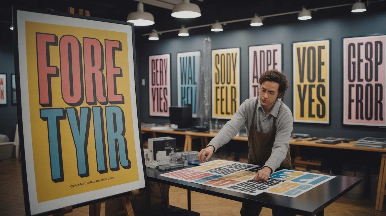
Choosing The Right Fonts
Picking the right fonts is more than just finding something that looks nice. You want a typeface that echoes the mood or message you’re trying to send. For instance, serif fonts often feel more traditional or formal. They bring a sense of history and reliability. Think about old newspapers or legal documents. They’re solid, but sometimes a bit stiff. On the other hand, sans-serif fonts give a more modern, clean vibe. They’re straightforward, easy to read, and can feel more casual or even bold depending on the style.
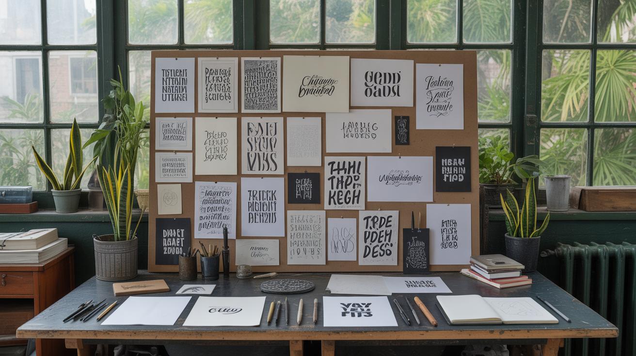
Decorative fonts, meanwhile, are tricky—they can add personality, flair, or even chaos. Use them sparingly and for emphasis because they can be overwhelming if overdone. A script font might suggest elegance or creativity, but it can confuse readers if the style doesn’t match the context. When I was working on a poster recently, I found myself going back and forth between a few decorative options before realizing the message just wasn’t aligned with something too playful.
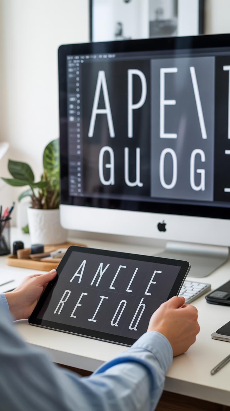
Font Types and Their Impact
Fonts aren’t created equal; their shapes and details carry meaning. Serif fonts, with their small lines or “feet,” tend to feel more grounded. They often work well in print or lengthy text since they guide your eyes across the page—though some argue sans-serifs do this better on screens. Sans-serif fonts lose those little strokes, which makes them cleaner and often appear more neutral or approachable.
Script and decorative fonts bring in emotion but can be risky. They work best in short bursts—titles, logos, or highlights—not whole paragraphs. Display fonts try to catch attention and can be unique or eccentric. The key is matching font style with the message’s personality, even if it feels a bit intuitive or unpredictable.
Pairing Fonts Effectively
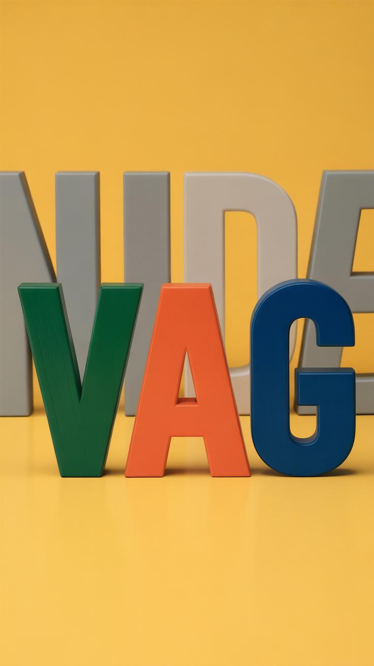
Combining fonts changes everything. Pairing a serif with a sans-serif often feels balanced because they contrast but don’t fight. Still, some pairings can feel off—too similar or too jarring. One trick is to look for differences in weight, style, or mood but still find a subtle harmony.
- Use one font for headings and another for body text to create hierarchy.
- Limit yourself to two or three fonts; more can feel chaotic.
- Try pairing fonts within the same family but different weights or italics to keep things cohesive.
At times, a pairing might feel unexpected but work beautifully. Trust your eye partly, but test and see how the fonts feel together in context. Does the combination support or distract from the message? It’s often a bit of trial-and-error.
Using Size And Scale
Changing font size shapes how people notice and understand your text. Bigger fonts naturally pull the eye, signaling importance without saying a word. When you see a massive headline, you get the message quickly—it’s what matters most. Smaller text fades into the background, working well for details or less urgent information.
Creating contrast through scale makes your typography more expressive. Think about pairing a bold, large title with tiny captions or subheadings. That difference stops readers and guides their attention through the content. It’s not just about making something “big” or “small”—it’s about the relationship between elements and how they talk to each other visually.
Visual hierarchy builds on this idea. Size differences let readers instantly grasp what’s primary versus secondary. For example:
- Large font for headlines sets the main topic.
- Medium fonts show subpoints or categories.
- Small fonts handle supporting information.
This hierarchy prevents confusion. But, if you make everything large, nothing stands out. If everything is small, nobody notices. Balance feels tricky—and maybe a little frustrating—but that’s where experimenting helps.
Playing with scale lets you add personality too. Huge fonts can feel bold, commanding, or playful. Tiny text might imply subtlety, intimacy, or even mystery. In one of my recent projects, I layered a massive, uneven headline with tiny, almost whispering subtext underneath. That contrast gave the whole piece a quirky, alive feeling.
Don’t hesitate to push extremes—really big or very small—to see what emotions or reactions arise. Sometimes, unusual proportions can shake up dull designs and pull people in.
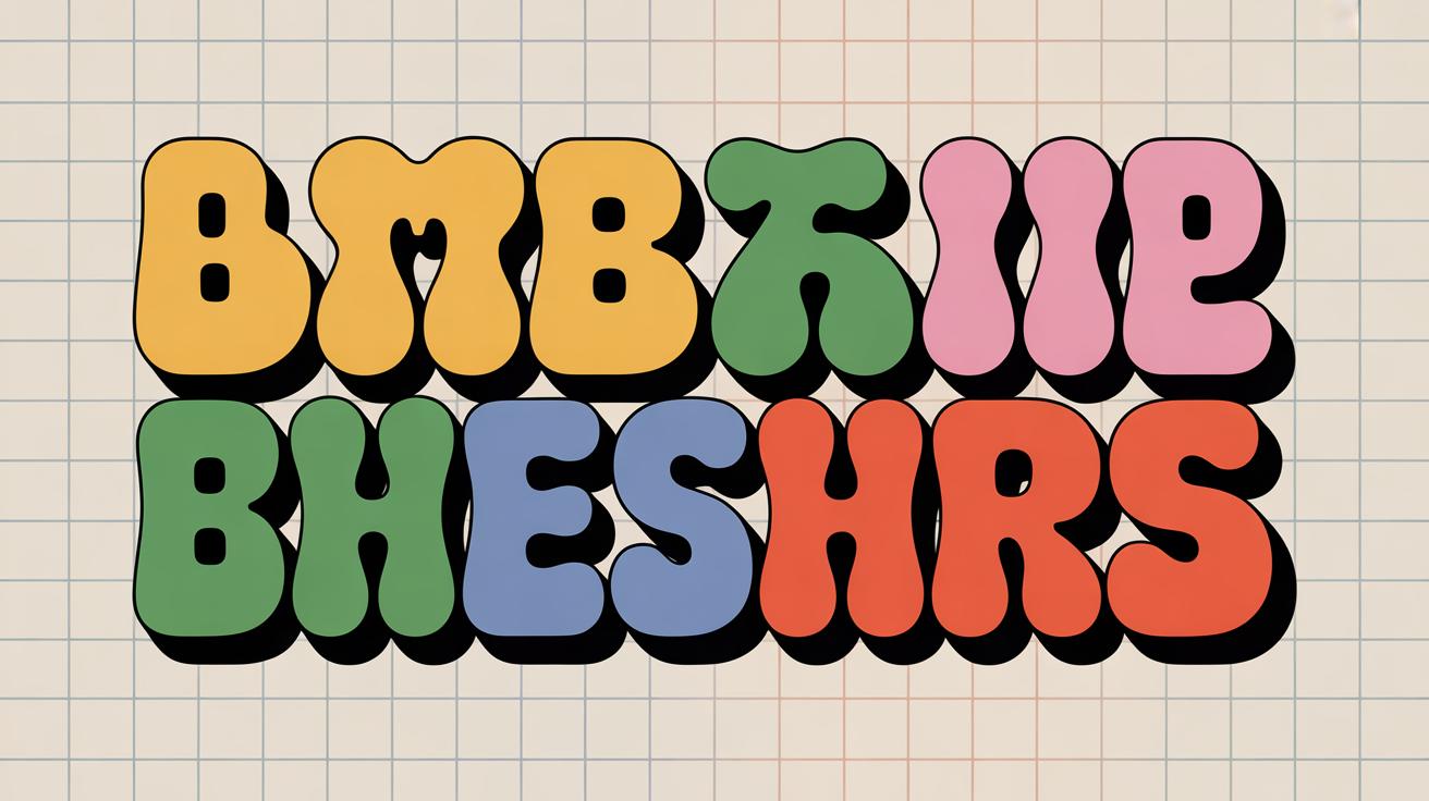
Color And Contrast
Color plays a huge role in making typography feel alive and expressive. It’s not just decoration; it can shape how the message lands with your audience. Think about it — a bright red word might shout urgency, while a calm blue can soothe. But it’s tricky because the wrong tone can confuse or distract. You want colors that back up what you’re saying, not fight it.
Contrast, on the other hand, helps the eyes follow the text. When the contrast between the text and its background is strong, readability improves dramatically. That means pairing light text on a dark background or vice versa. It can also highlight certain parts of the text, creating a hierarchy that guides the reader’s attention naturally. Without enough contrast, typography tends to get lost or feels bland, even if the font itself is interesting.
Applying Colors To Typography
Choosing colors isn’t just about picking favorites or trendy shades. You need to think about what the message calls for and who’s going to see it. Warm colors might evoke energy or excitement, cool colors might be more calming or professional. Sometimes, a color carries cultural or emotional weight that can deepen the meaning. But it’s not always clear-cut – a red might mean danger in one context, passion in another.
Try to match colors with the tone you want to set. At the same time, consider your audience’s preferences and expectations. If your goal is to attract attention but also keep comfort, softer hues paired with strategic pops of bright color can work well. I remember a project where just tweaking the orange saturation shifted the whole feeling from aggressive to inviting. Small changes make a big difference.
Using Contrast For Emphasis
Contrast isn’t just black and white. It’s about playing with light and dark in ways that make important text jump out. A dark navy headline on a pale background can feel grounded but still clear, while white text on a deep purple might feel more mysterious or elegant. Light and dark colors push each other into focus.
If you need to point readers to a specific word or phrase, increasing contrast there can work wonders. Bolder, darker color on a light field creates instant emphasis. But don’t overdo it; too many contrasting spots confuse the eye and weaken the message. Think of it as a spotlight—only shine it where it matters most.
Spacing And Alignment
Letter And Line Spacing
Spacing plays a surprisingly powerful role in how text feels and reads. When letters sit too close, words can blur together, forcing the reader to slow down or guess. Yet, too much space can disrupt the rhythm and make text seem disjointed or sparse. Adjusting letter spacing, or tracking, can help not only clarify the words but also add subtle personality. For example, tightening letters in a headline can create urgency or tension, while looser spacing may feel relaxed or airy.
Line spacing—or leading—works similarly but on a vertical scale. Crowded lines create a wall of text that’s hard to focus on. Wider spacing invites the eye to move smoothly from one line to the next. But here’s the rub: too much space can fragment the reading experience, causing the text to lose its flow or connection. Finding the right balance often requires testing, sometimes tweaking little by little.
Alignment Choices
Alignment dictates the structure of your text block and deeply affects visual harmony. Left alignment is the most common—it mirrors our natural reading pattern and maintains a predictable edge, promoting ease. Yet, it might come across as plain if not paired thoughtfully with other design choices. Center alignment, while common in titles and invitations, can be tricky. It tries to create a symmetrical composition but often leads to uneven line lengths that pull the eye unpredictably.
Right alignment or justified text add more complexity. Right alignment feels less natural in Western typography and can cause awkward gaps that disrupt reading flow. Justified text, stretching from margin to margin, looks tidy but can introduce uneven spacing between words. This might distract readers more than you expect.
In practice, mixing alignments thoughtfully can create tension or balance—experiment with what suits your message. Do you want order or spontaneity? Formality or approachability? Those choices steer how your typography communicates beyond just words.
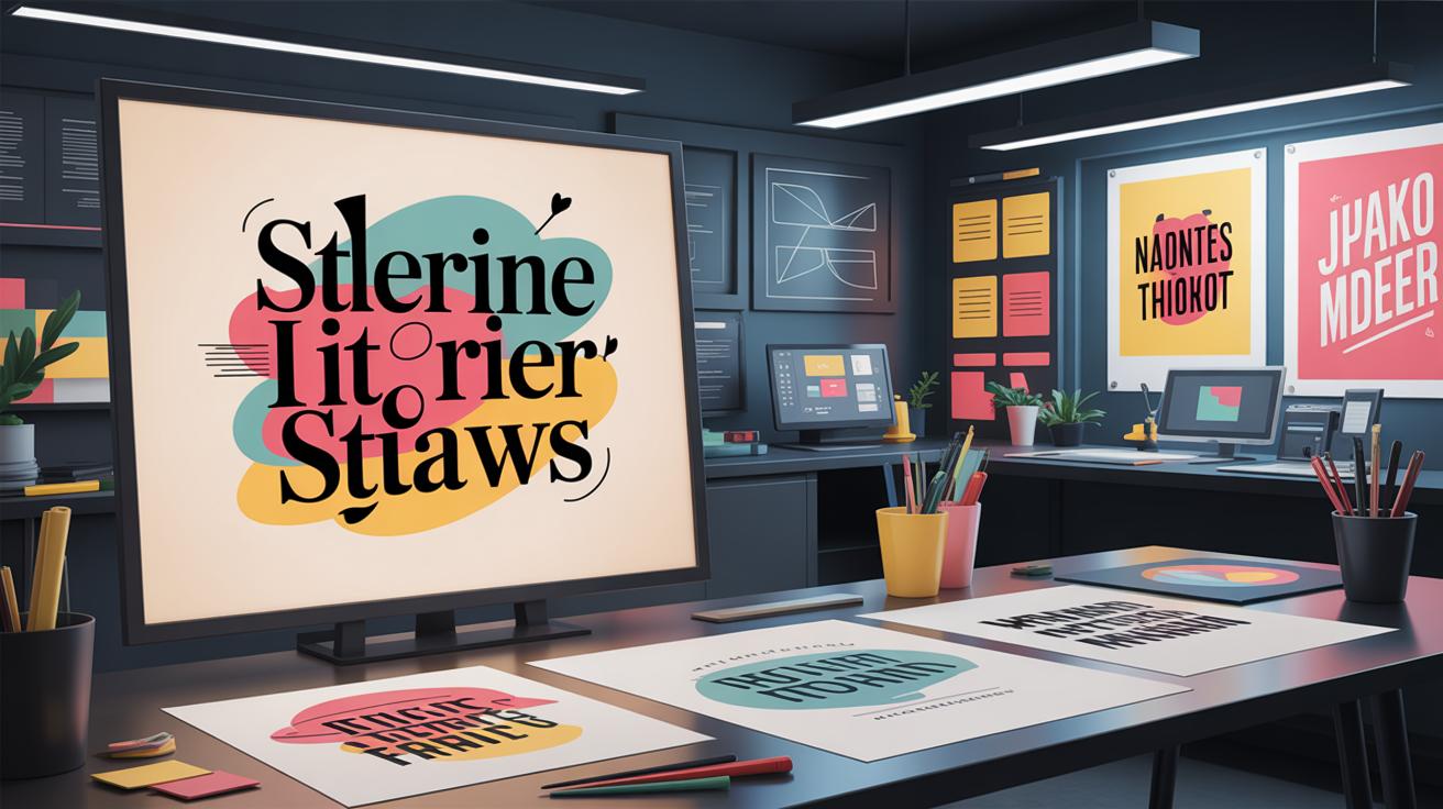
Using Typography As Art
Typography Beyond Words
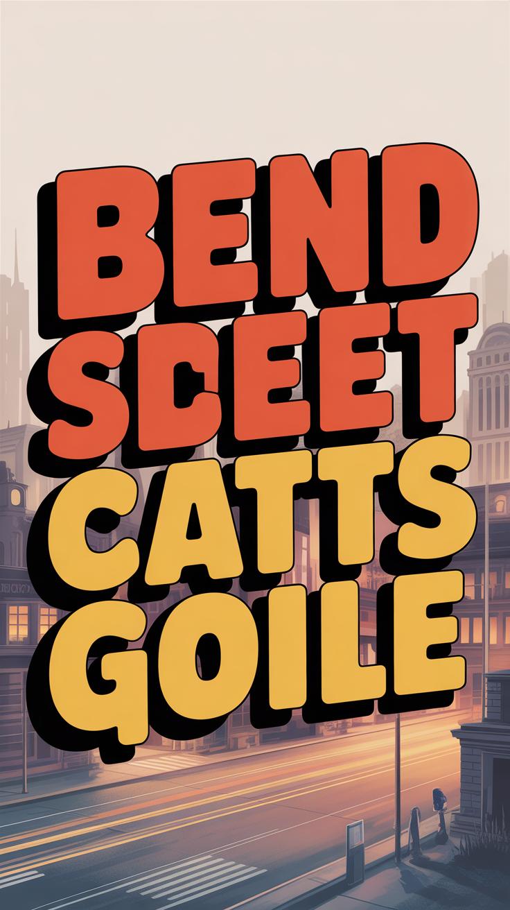
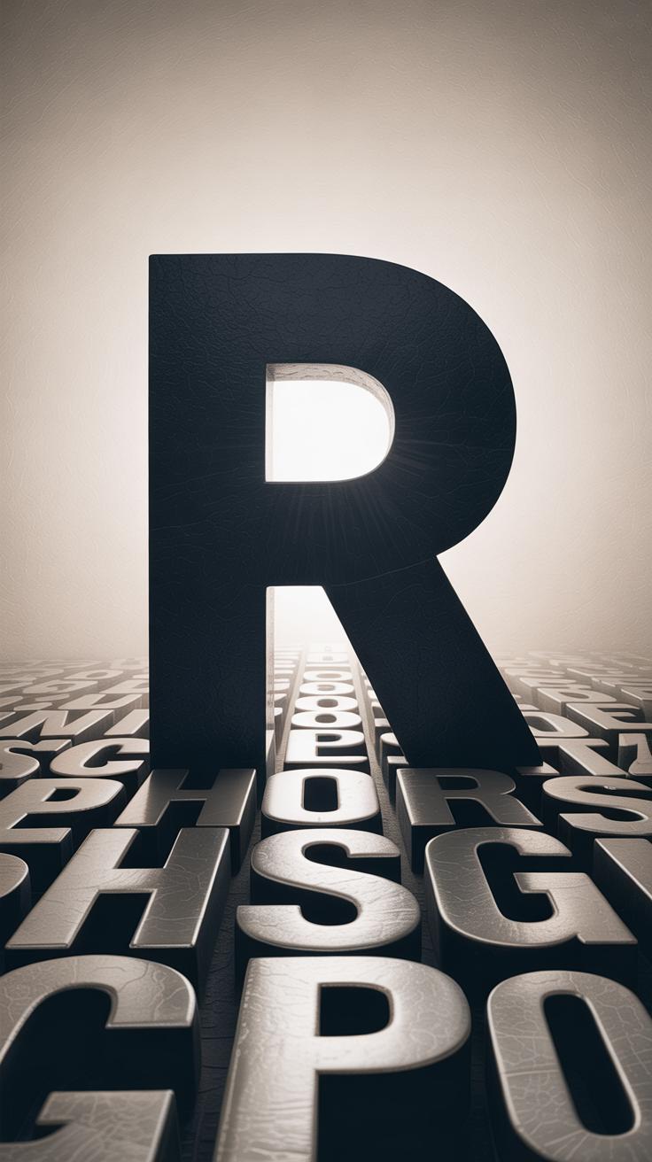
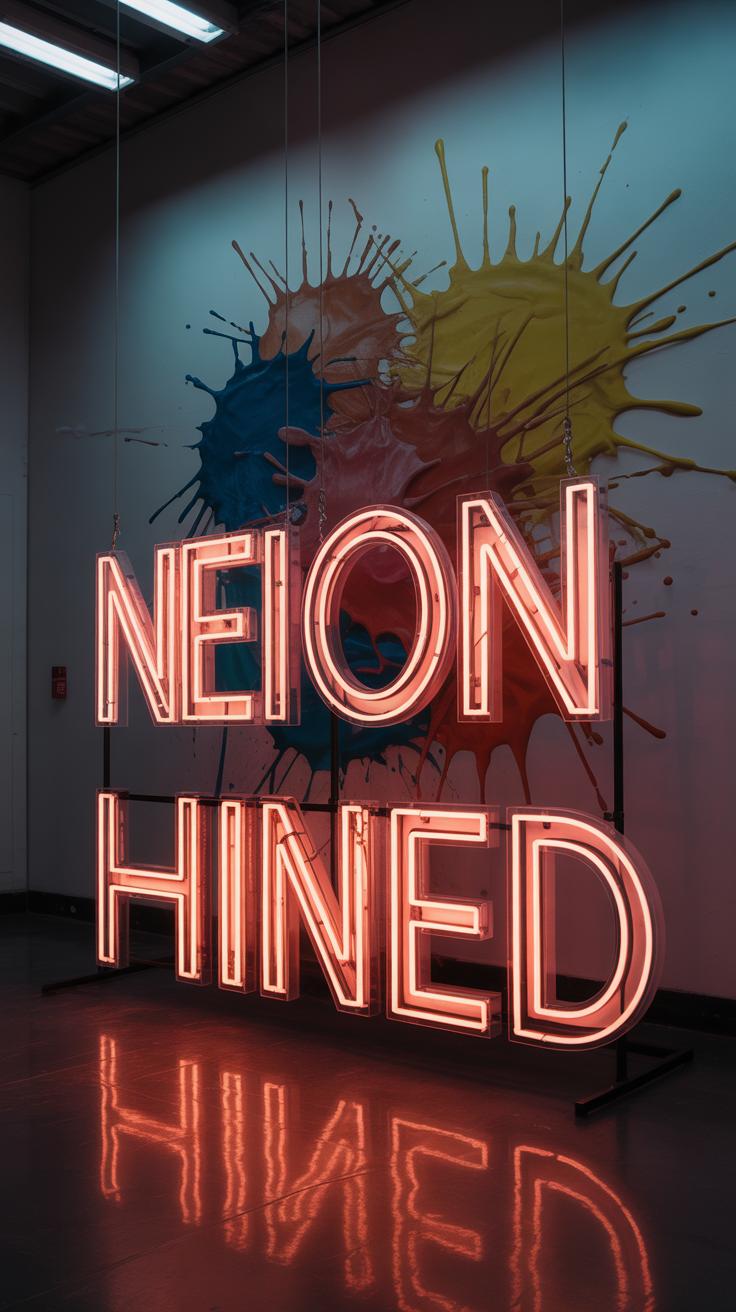
Typography isn’t just about reading; it can act as a visual element that carries meaning beyond the literal. Letters and words can be stretched, twisted, layered, or arranged to form shapes, patterns, and even textures. This moves typography from simple communication to a form of visual art. You might notice posters where the words bend to mimic the movement of water or titles shaped like city skylines. That’s typography stepping into the visual world, morphing the message into something you experience, not just read.
Playing with size and weight also means letters start to behave more like brush strokes than static symbols. Sometimes, individual letters become abstract forms, where legibility takes a backseat. It’s a delicate line—the art risks obscuring meaning, but it gains emotional resonance and visual punch. It makes you pause and look closer, forcing a deeper interaction.
Examples Of Expressive Typography Art
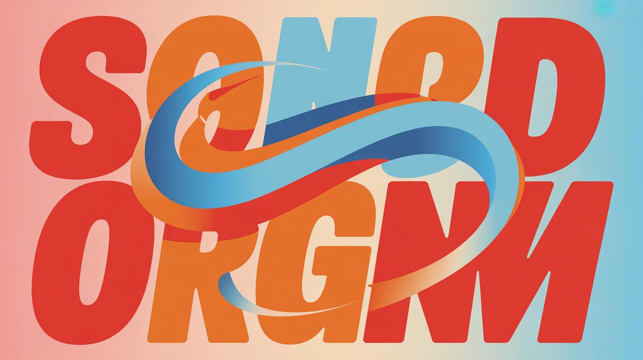
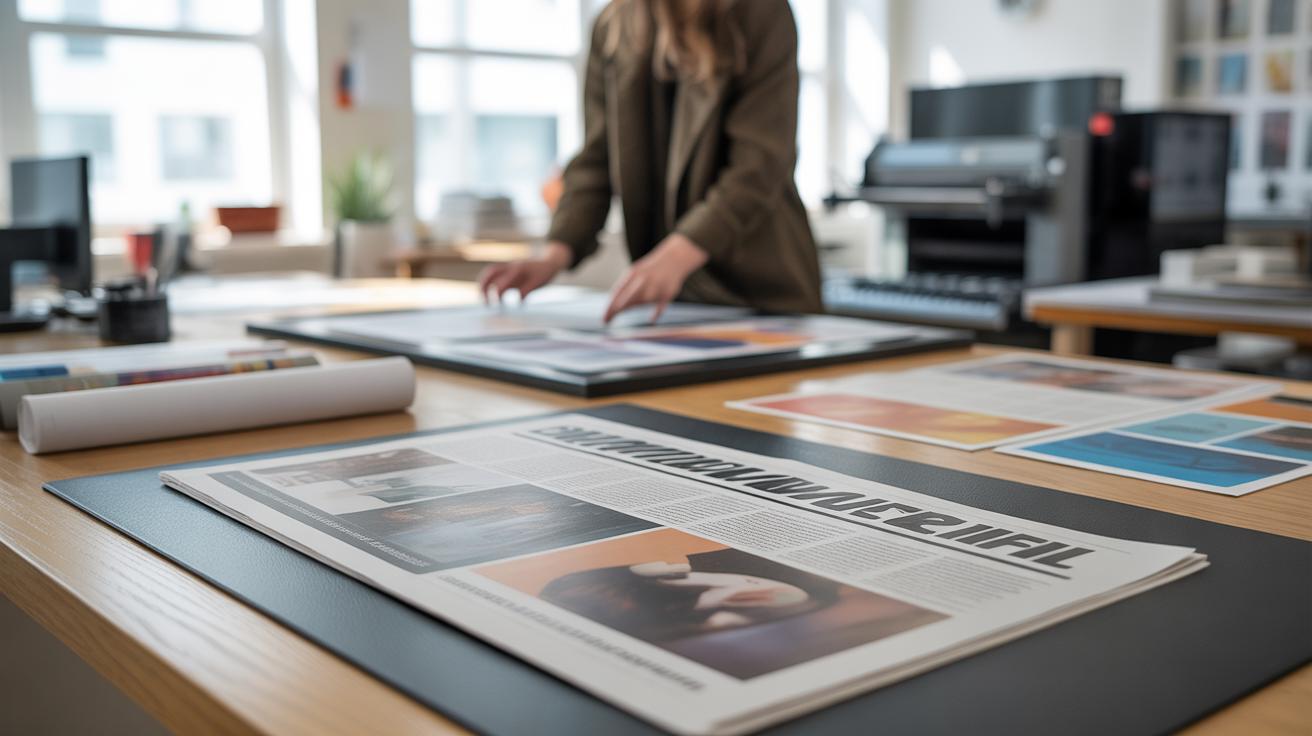
Look at album covers, where typography often dominates the mood of the design. The distorted, dripping fonts from metal bands communicate chaos and energy. Or, consider editorial layouts where headlines form jagged, broken shapes to match the article’s tone. Even brands use expressive typography in logos—for example, the FedEx logo’s hidden arrow or the varying thickness in the Subway logo that suggests movement and freshness.
Street art and murals also showcase letters as visual spectacle. Sometimes, the text dominates the space, but sometimes it melts into the overall composition. You might’ve come across posters where the words spiral out like a whirlpool or typefaces that mimic hand-drawn graffiti, offering a raw, personal feel. These examples prove typography can be the focal point, not just the message carrier.
Testing And Refining Your Work
When you create expressive typography, it’s tempting to assume your design speaks loudly enough on its own. But, guess what? It rarely does—at least not without feedback. Showing your work to different audiences reveals unexpected reactions. A particular font or color might feel bold to you but confusing to others. That’s why testing with real users, fellow designers, or even people outside the creative field can uncover blind spots.
Try gathering feedback through quick surveys or casual conversations. Ask questions like: Does this typeface convey the right emotion? Is the spacing comfortable to read? Does the color grab attention or distract? Simple answers here can guide small tweaks that add up.
When you get the input, don’t hesitate to revisit your choices. Maybe tighten letter spacing if the text feels too loose, or switch colors if the contrast isn’t quite right. Sometimes, subtle shifts in kerning—those tiny spaces between letters—can make the message clearer. It’s rarely about drastic changes; more often, it’s about refining details to connect better.
Testing and refining isn’t one step but a loop. You adjust, you check again. And then, maybe, you adjust once more. It might feel tedious, but it’s also where a design finds its strength, its voice that’s not just seen but felt.
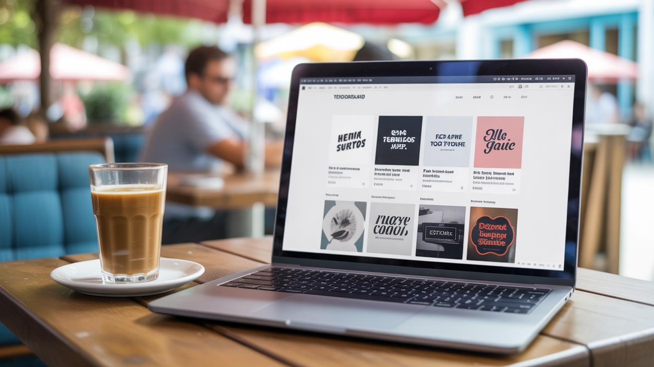
Tools For Creating Expressive Typography
When it comes to crafting expressive typography, having the right tools is key. You might find yourself overwhelmed by the sheer number of options out there, but starting simple is usually best. Most software offers intuitive controls for adjusting font weight, size, and spacing—things that really influence how text comes alive.
Some popular software stands out because of their balance between power and usability:
- Adobe Illustrator: Known for vector designs, it also lets you manipulate text paths and apply effects in ways that can drastically change the mood of your typography.
- Adobe Photoshop: Though mainly for images, it’s very useful for adding texture and effects to type, making letters feel more tactile or dramatic.
- Affinity Designer: A strong alternative to Adobe’s offerings, it offers precise control over typography with a user-friendly interface that beginners often appreciate.
Now, if you’re just starting out or not ready to invest in professional-grade software, some online tools are surprisingly decent:
- Canva: Free and simple, Canva has a range of text effects and font choices. It’s great for experimenting with styles without needing design experience.
- FontStruct: If you want to design your own fonts, FontStruct guides you step-by-step in building letterforms using blocks—fun, if a little quirky.
- Glyphr Studio: A free web-based font editor with enough features for beginners to dive into font creation without much fuss.
You might notice that while some tools focus on finishing touches, others emphasize building type from scratch. Which suits you may depend on whether you want to express yourself through detailed customization or quick visual impact. And that’s okay—it’s rarely a clear choice, more like feeling your way through options. Have you tried any of these? Your favorites might surprise you once you experiment enough.
Conclusions
Expressive typography is a powerful tool you can use to make your designs stand out. By experimenting with different fonts, sizes, and alignments, you can shape how people feel about your message. Remember that clarity and consistency matter as much as style.
Keep practicing the techniques discussed here. Look at examples around you and think about how typography influences the way you read and understand messages. Soon, you will create eye catching expressive typography that truly speaks to your audience.