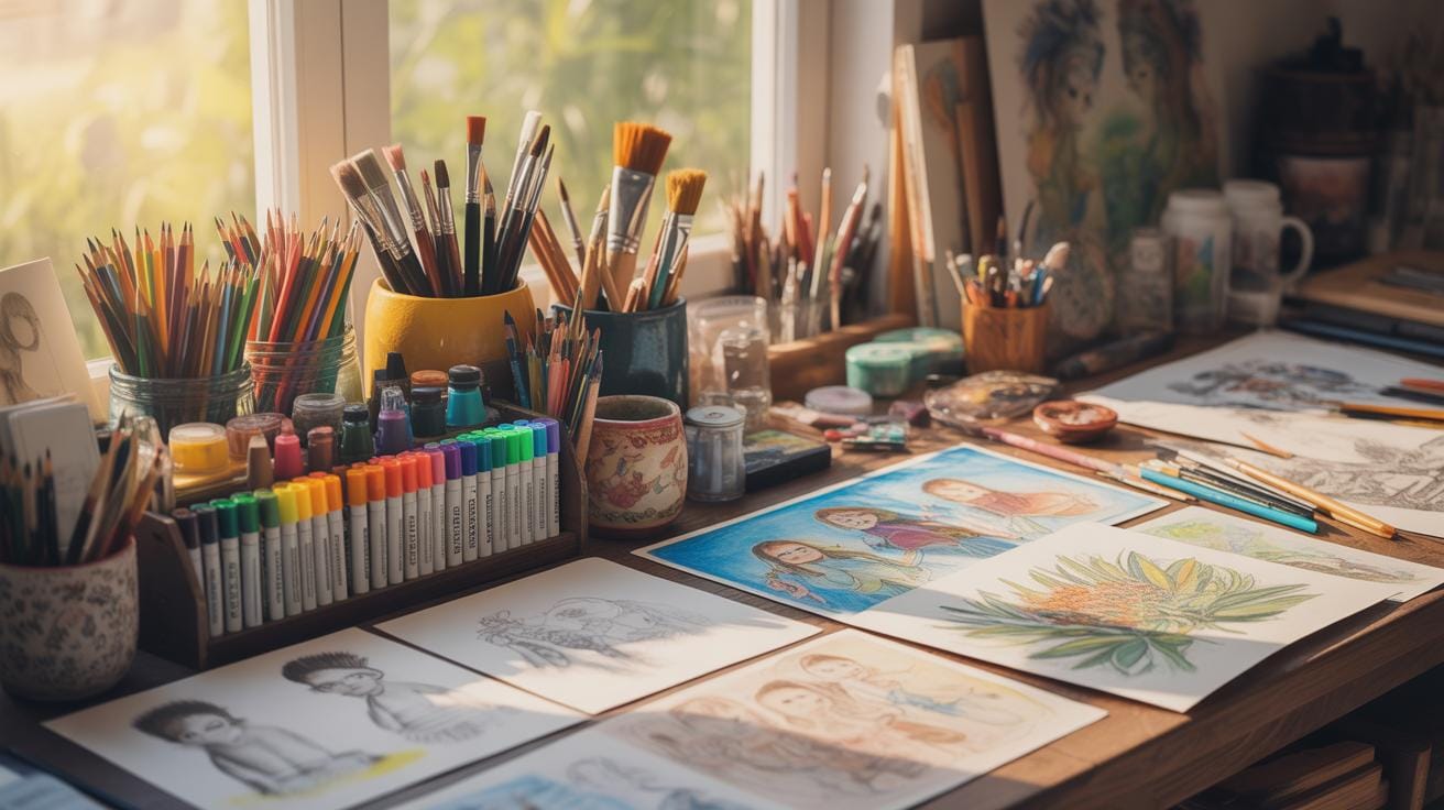
Introduction
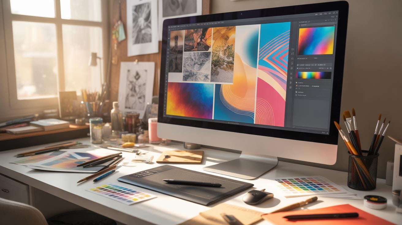
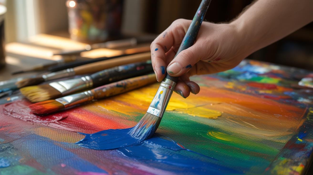
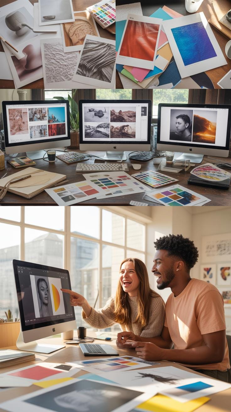
Digital textures are images or patterns applied to surfaces in graphic design to add detail and visual interest. They can simulate real-world surfaces or create unique effects. These textures are essential in texture graphic design and photo overlays, where they enhance the appearance of images for a more detailed and engaging result.
In this article, you will learn about digital textures, how they affect design quality, the different types used, and how to apply them effectively. You will also find examples and processes to help you understand and employ digital textures in your projects.
Digital Texture Overview
Defining Digital Textures
Digital textures refer to 2D images or patterns that are applied to surfaces within digital graphic environments to give visual detail and complexity. Think of them as layers that add a tactile quality to an otherwise flat surface on a screen. These textures can be photographs, hand-drawn images, or digitally created patterns used to simulate materials like wood, fabric, or stone. What’s interesting is how these textures aren’t just about looks; they often contain information about surface properties like roughness or reflectivity, which can affect how light interacts with the design.
Texture Usage in Design
When working with texture graphic design and photo overlays, digital textures play several roles. They can enhance depth, create mood, or add a sense of realism to an image or design piece. For instance, overlaying a subtle grained texture on a photograph might give it a vintage feel, while a rough concrete-like texture could communicate rawness in a poster design. They also help break visual monotony, introduce tactile sensations visually, and emphasize elements you want to stand out.
In photo overlays, digital textures work as creative filters or layers that artists stack to achieve a desired effect—sometimes just a hint of texture can dramatically change how a photo is perceived. Yet, it’s not just about layering textures randomly; the choice and placement are crucial, as textures can shift the viewer’s interpretation or emotional response.
Texture Impact On Design
Digital textures are more than just decorative elements in design; they fundamentally influence how a visual piece feels and communicates. When you look at an image, textures can steer your perception, lending a sense of tactility or mood without physical interaction. This is what makes textures pivotal—they impact the emotional and cognitive experience of the viewer.
You might wonder, why does texture hold such sway over design outcomes? Partly, it’s because textures add layers of complexity to flat visuals. On a basic level, they simulate materials and surfaces, helping your brain interpret what it’s seeing with more nuance. This added detail can shift a design from ordinary to memorable.
Also, textures guide your attention. Rough, smooth, grainy, or glossy surfaces create contrast and hierarchy in a composition. Designers use this to emphasize certain parts or to harmonize the feel of disparate elements. Without texture, designs risk feeling sterile or lifeless—like a sketch without shading.
Think about it: some digital art feels almost photographic because of expertly crafted textures. Others might lean toward a stylized look with selective use of texture to keep a clean impression. The choice and execution of texture affect not only the immediate visual impact but also the perceived professionalism and depth of the work.
So, texture in design is not just an afterthought or embellishment. It’s a tool that shapes your emotional engagement and frames the visual story in subtle yet powerful ways. You might not always notice it outright, but its absence or presence quietly alters everything.
Common Texture Types
When you think about digital textures, three main types come to mind: natural, abstract, and synthetic. Each serves a different purpose and brings a unique feel to your designs or photo overlays.
Natural Textures Examples
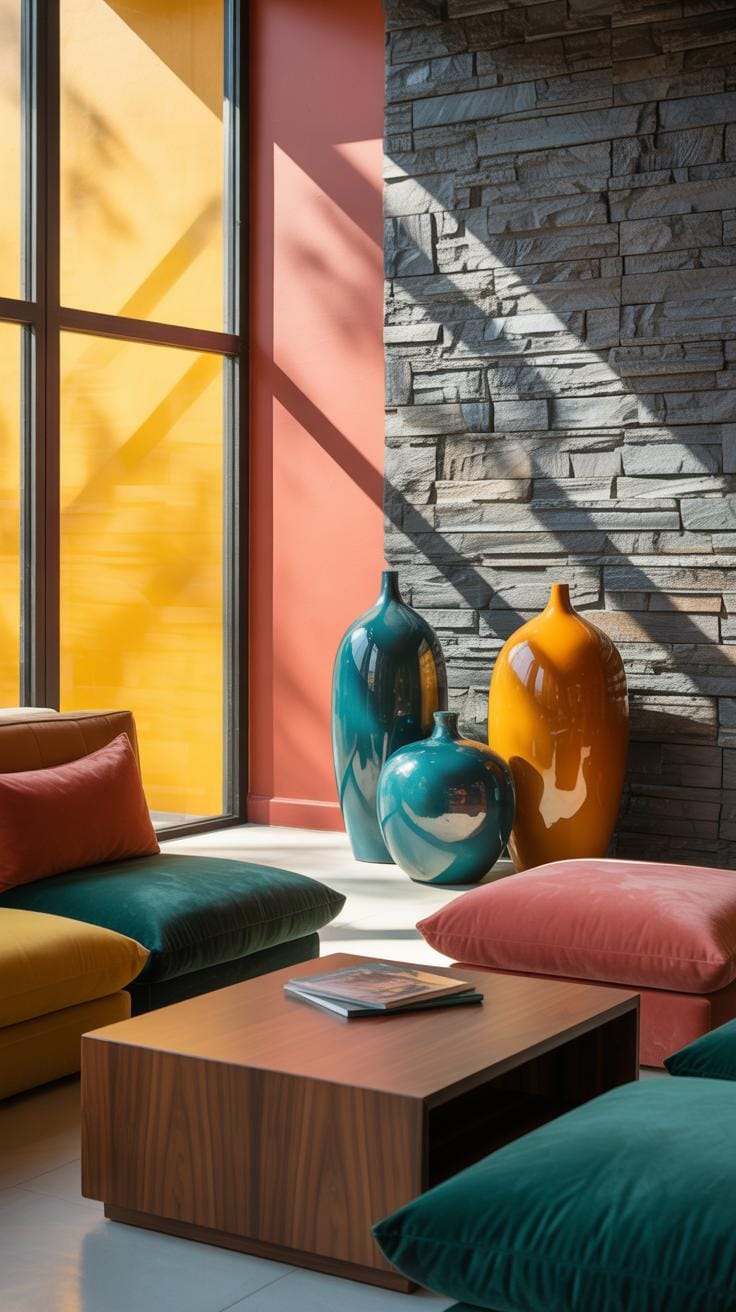
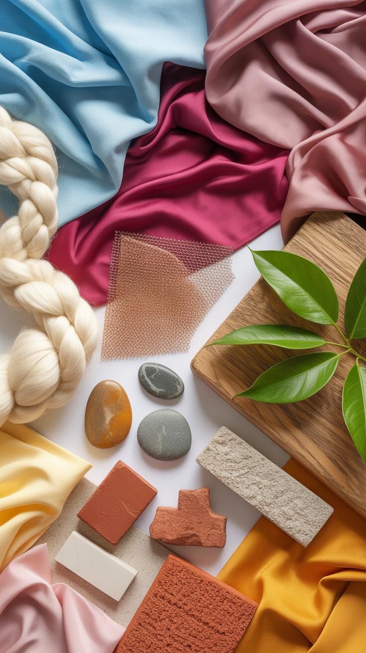
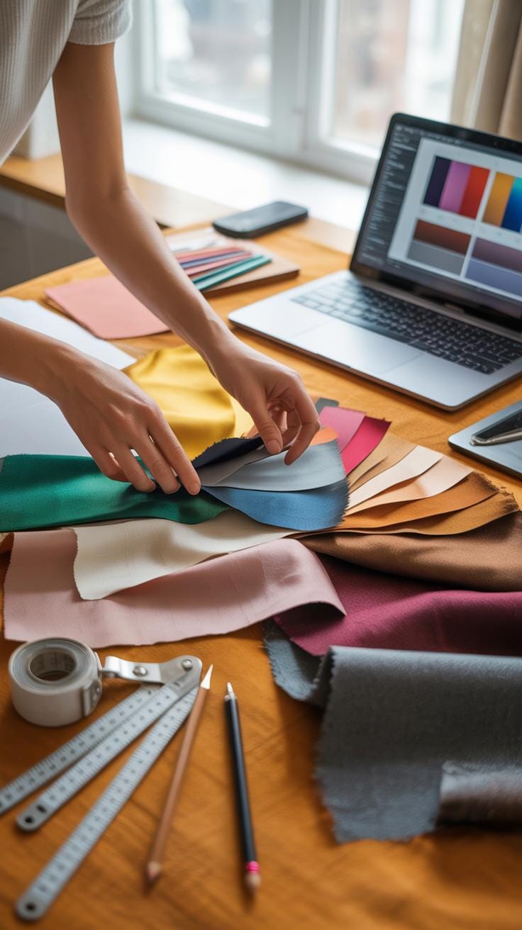
Natural textures replicate real-world materials that you might encounter daily. Wood grain, for instance, offers a warmth and organic touch that can ground a design, giving it familiarity. Fabric textures—like cotton, denim, or silk—add softness or roughness, depending on the weave and material, affecting the mood instantly.
Metal textures introduce a reflective element, adding industrial or futuristic vibes. These natural textures often come from high-quality photographs or scans, and when used digitally, they bring in tangible qualities without the physical object.
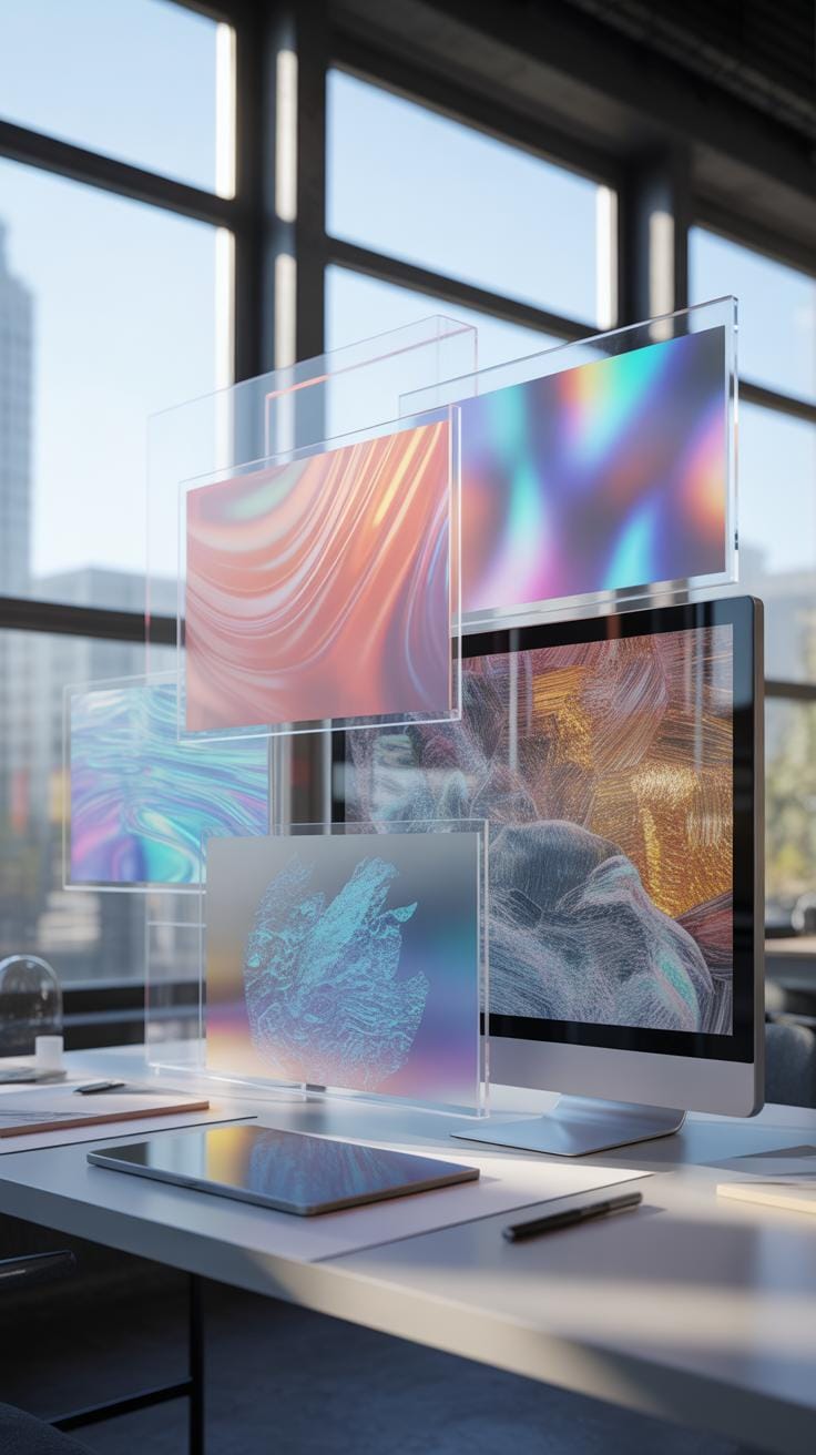
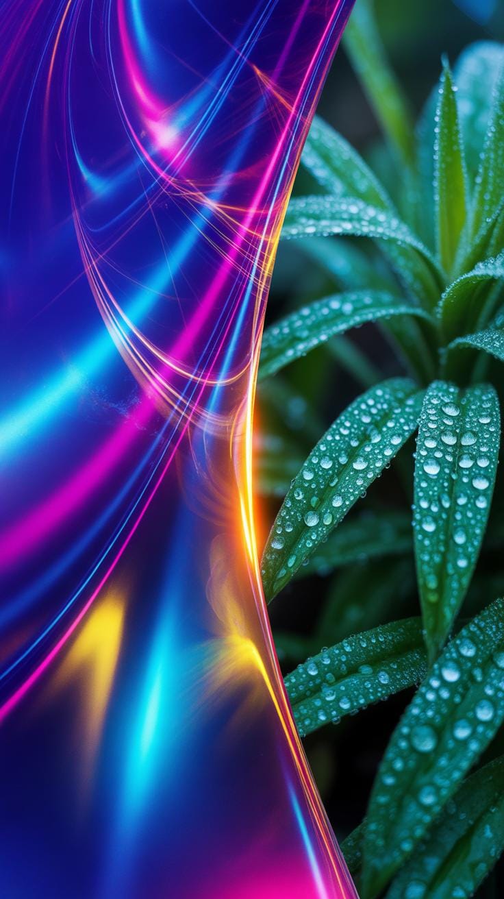
Abstract Texture Forms
Abstract textures, on the other hand, don’t aim to mimic anything from the physical world. Instead, they focus on patterns, shapes, and colors to evoke emotion or create artistic flair. Think splatters, brush strokes, geometric patterns, or fractal shapes. They can be somewhat unpredictable, often used to add motion or depth, or to contrast with more straightforward elements in a design.
Such abstract textures let your creativity roam free. You might find yourself questioning whether the texture is a background element or the main focus—sometimes a good ambiguity is what a design needs.
Applying Textures Step By Step
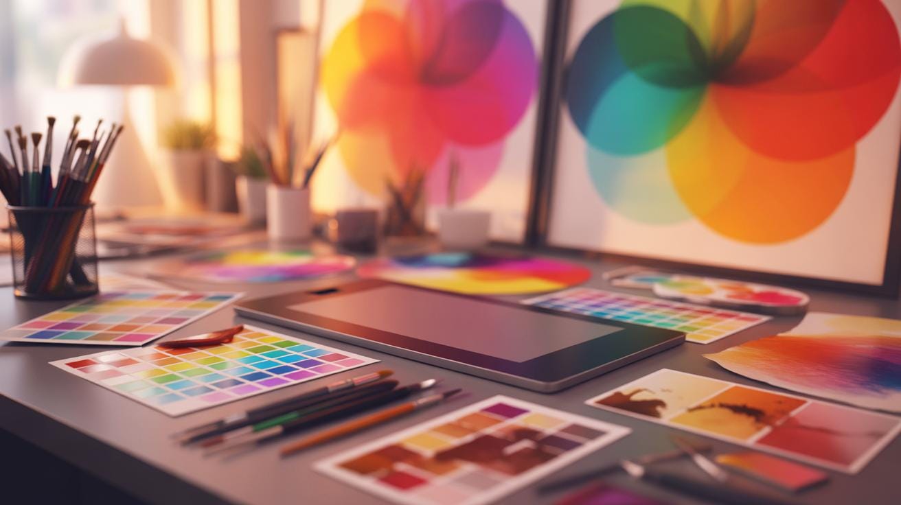
Texture Selection Process
Choosing the right texture feels more like an art than a science. You might start by thinking about the mood or message your project wants to convey. Is it rough and gritty, or smooth and subtle? Sometimes, the best texture is the one you don’t expect to work but surprises you. Look at your base image or graphic—where are its empty spaces or flat areas that could use some visual interest? That’s often a clue to what kind of texture fits best.
Consider the scale of the texture too. Large, bold textures can overwhelm, while tiny, detailed ones might go unnoticed. Don’t forget to test textures on small sections of your design first. You’d be surprised how different a texture feels when scaled or recolored. And, yes, trust your gut a bit—even if scientifically it doesn’t “match” perfectly, the visuals might still click.
Overlay Integration Steps
Applying texture overlays needs some careful balancing. Start by placing the texture layer above your image in your editing software. Blend modes like Overlay or Soft Light often bring out the texture without killing the original details. But you might need to fiddle with these modes for different results. Don’t hesitate to lower the texture’s opacity. A subtle touch sometimes beats a strong one.
Masking is crucial if the texture affects unwanted parts. Use layer masks to erase or reduce texture in areas that should stay clean, like faces or text. Sometimes, duplicating the base layer beneath the texture can help maintain sharpness. Keep zooming in and out to get the feel right. It’s often a process of trial and error—patience here pays off.
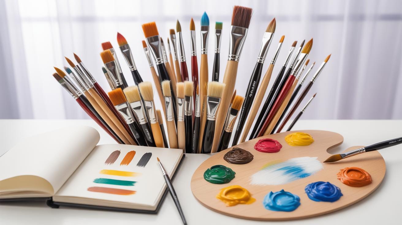
Tools For Texture Use
If you want to work with digital textures, you’ll quickly find that not all software is made the same. Some tools lend themselves better to texture work because they handle layers, blending modes, and brushes with ease. Take Photoshop, for example. It’s practically a go-to for many designers when it comes to applying textures. You get control over opacity, masking, and filters, which can transform a flat image into something that feels tactile.
But Photoshop is just one piece of the puzzle. Other graphic design programs like GIMP and Affinity Photo also support texture work, sometimes with a slightly different approach or toolset. Each one has its quirks, and choosing the right one often depends on what you’re used to or the specific effects you want.
When it comes to crafting textures from scratch, there are apps and plugins that focus solely on this task. Texturer and Filter Forge, for instance, give you procedural options or pre-made textures that you can tweak to fit your project. Some plugins hook directly into Photoshop or other software, offering additional brushes or texture packs designed with photo overlays in mind. You might find it worth experimenting with a few to see which fit your style — or your workflow — better.
You might wonder, though: does having a fancy tool make the texture better? The answer isn’t so straightforward. Sometimes, a simple app with the right effect will do more for your work than a complex program crammed with features you never use. It’s about balance—and maybe a bit of trial and error.
Texture Quality Tips
Maintaining texture quality in your design projects can be tricky. One thing I often remind myself is to regularly check how textures hold up at different sizes. Don’t just zoom in or out once and assume it’s good. Textures can lose detail or become muddy if not handled carefully.
Keeping textures coherent means you should consider their interaction with other visual elements. Look at how harsh or soft a texture feels compared to the rest of your design. If something stands out too much in a jarring way, it can disrupt the whole harmony—something I’ve noticed in my own work, which made me go back and adjust.
It’s also worth experimenting with blending modes and opacity. Sometimes less is more, especially when you want textures to support rather than overwhelm the design. But, admittedly, finding that right balance can take some trial and error.
Texture Resolution Advice
Resolution definitely matters. Using low-resolution textures tends to make your design look unprofessional and blurry when scaled up. But, on the flip side, super high-resolution textures might slow down your workflow or cause file bloat—something you want to avoid, especially with bigger projects.
To optimize texture quality, start with a resolution suited for your project’s final output size. For print, higher DPI textures are better. For screens, you can often get away with less, but still avoid going too low. Downsizing high-res textures non-destructively with smart objects or similar techniques keeps your options open.
One thing I sometimes forget is to consider the texture’s file format. Formats like PNG can keep texture detail sharp without excessive compression artifacts, while JPEG might lose subtle details because of compression. It’s a small detail, but it makes a difference.
Consistent Style Guidance
Keeping textures stylistically consistent throughout a project is easier said than done. You want to avoid mixing textures that look like they’re from completely different worlds—like pairing gritty, rough textures with sleek, smooth ones unless that’s an intentional contrast you’re aiming for.
To keep things aligned, create or choose textures that share similar lighting, grain, or color tone. Sometimes I group textures by their origin—whether scanned, painted, or photographic—to maintain a certain vibe. It also helps to prepare a mood board with your main textures early on.
Remember, consistency doesn’t mean every texture must be identical. Variety within limits can keep the design interesting. The tricky part is knowing where to draw that line, which only comes with experience and experimentation.
Digital Texture Versus Photograph
When comparing digital textures with traditional photographs used as sources of texture, certain distinctions become clear. Digital textures are crafted or generated through software, often offering a controlled and customizable surface quality. Photographs, on the other hand, capture real-world textures with all their natural imperfections and complexities.
Digital textures allow for easy adjustments—you can modify scale, color, transparency, or layering without compromise. Photographic textures sometimes bring unwanted lighting issues or inconsistent resolutions that are tricky to fix. Yet, photos can provide an authentic and unique feel that digital ones might lack, though digital textures can mimic natural appearances quite closely.
In practice, digital textures offer precision and flexibility. Photographic textures might convey more spontaneity but with less control.
Advantages Of Digital Textures
Why would you turn to digital textures rather than photographs? There are several reasons:
- You control resolution and detail without worrying about camera quality.
- Easy tweaking of patterns, colors, and shapes to fit your design exactly.
- Consistency across projects—digital textures won’t shift due to variable lighting or environment.
- Reusable and scalable assets save time when you need texture fast.
- No need for physical access to specific materials or surfaces.
I’ve found that digital textures let me experiment more freely. A photo’s fixed nature can sometimes frustrate when you just want to tweak things a little.
Photographic Texture Limits
Photos aren’t without challenges, though. Common limitations include:
- Uneven lighting creating shadows or highlights that interfere with seamless patterns.
- Camera noise or low resolution limiting quality.
- Uncontrolled elements like dirt, reflections, or other distractions.
- Difficulty isolating just the texture without unwanted objects.
- Legal or copyright restrictions if using photos not taken by you.
Sometimes, I’ve ended up spending more time editing a photo texture than it would take to create one digitally. That’s not always the case, but it’s something to consider when choosing your approach.
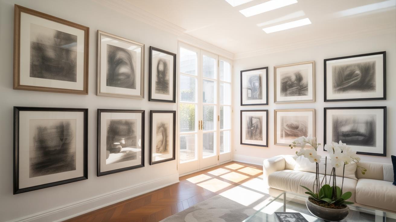
Examples Of Texture Usage
Digital textures bring a noticeable change to graphic design and photo overlays by adding depth and interest. For example, in poster design, using a rough paper texture overlay can make typography pop, lending a tactile feel that plain vector text lacks. It’s something you might not consciously notice until it’s missing. Texture invites us to look closer.
In branding projects, subtle fabric textures applied to logos or backgrounds gently enhance the brand’s personality without overwhelming the design. This often works well for brands focusing on natural or handmade products. Sometimes less is more, right? Texture can be a whisper, not a shout.
Photo overlays also benefit strongly from textures. Combining grainy film textures or light leaks onto portraits can create a vintage or artistic effect that feels organic and spontaneous. Photographers often use these textured overlays to evoke mood and story, rather than a simple polished look. It’s not perfect, but that imperfection is part of the appeal.
Case Studies In Design
Consider magazine covers. They often incorporate textures like foil stamping or embossed effects digitally simulated to stand out on newsstands. Such textures add a sense of luxury and physicality. These textures can replicate expensive traditional print techniques for digital use, which makes design more flexible.
In web design, background textures—like subtle linen or paper—can gently reduce eye strain by breaking the monotony of flat digital surfaces. Though opinions vary on how much texture suits screens, many designers find that carefully chosen textures improve user experience by creating a more inviting interface.
Packaging design, too, extensively benefits from texture application. Textures can simulate the feel of materials such as wood, metal, or stone on product boxes and labels, guiding consumer perception before they even touch the product. However, striking the right balance is tricky since it can easily become overpowering or kitschy.
Photo Overlay Cases
Textures transform photo overlays by adding layers of nuance that simple color filters can’t provide. For instance, applying a cracked paint texture over an urban photograph adds grit and storytelling layers. It’s like a visual patina capturing time and place.
Another case is in wedding photography, where soft fabric-like textures can be overlaid to impart a dreamy, romantic mood. It’s subtle—often barely noticeable—but the final image’s emotional impact is enhanced.
Even in commercial product photography, jewelry shots can be overlaid with delicate pearl or satin textures to emphasize luxury and detail. The texture works more like an invisible hand guiding the viewer’s attention.
Common Mistakes To Avoid

When working with digital textures, some issues tend to crop up quite often, and noticing them early saves a lot of trouble. One frequent slip is overusing textures. It might seem tempting to layer several textures to add complexity, but too many can overwhelm your design, making it look cluttered. The effect strength matters, too; powerful textures can steal focus from the main elements rather than supporting them. You want to enhance, not dominate.
Blend styles carefully. Sometimes, textures just don’t mix well—like pairing a gritty, rough texture with something too sleek or polished. This mismatch creates visual confusion and breaks the design flow, which can alienate viewers instead of drawing them in. Poor blending makes these conflicts obvious; hard edges or abrupt transitions can distract or jar the eye.
Avoid these pitfalls by using fewer textures, dial down their opacity, and choose complementary styles. Experiment with blending modes and test how each texture interacts with the layers below. It might feel like slow work at first, but the impact on your final piece is worth the patience.
Testing And Adjusting Textures
When working with digital textures, testing and tweaking them is essential to get that perfect fit for your design. Don’t settle for the first texture you try; textures can come alive or fall flat depending on how they interact with your base image. It’s a bit like tuning an instrument—sometimes subtle adjustments make all the difference.
You might start by layering a texture over your design and then step back—literally—and see how it feels. Does it add depth? Does it feel forced or out of place? Sometimes what works in one spot might feel awkward in another. Try adjusting the opacity of your texture layer; lowering it can soften harsh edges and create a more natural blend. On the other hand, increasing opacity might emphasize details you want to highlight.
Play with blending modes too. Each mode changes how the texture interacts with the layers beneath it. For example, “Multiply” can add shadows and grit, while “Screen” can lighten and brighten. Scale matters as well; resizing a texture can make it either overwhelm your design or barely register. Don’t hesitate to experiment at different sizes until it feels right—no magic formula here, just trial and error.
Have you noticed how a slight tweak changes everything? That’s where patience pays off. Keep testing until the texture genuinely enhances instead of just being an afterthought.
Conclusions
Digital textures add a critical layer of detail and realism to graphic design and photo overlays. Using the right texture improves the quality and impact of your designs. This article covered what digital textures are, why they matter, how to use them properly, and examples to inspire you.
By applying the practical tips and guidelines shared here, you can create more visually appealing and effective designs. Experiment with different digital textures and techniques to find what works best for your projects.