Introduction
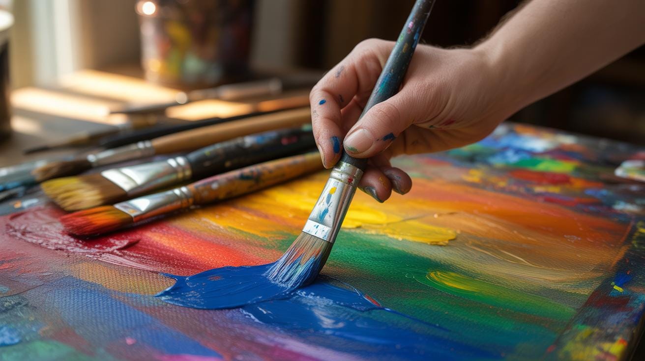
Digital painting merges traditional art techniques with technology, letting you create art directly on digital devices. This article covers essential digital painting tutorials to help beginners build foundational skills in techniques and color theory. You will learn about the necessary tools and how to get started with your first digital artwork.
We will break down key concepts, including brush techniques, layering, and color use, essential for digital art. Whether you want to improve your art skills or start digital painting, these tutorials provide clear, practical advice to make your journey smoother and your art more expressive.
Equipment And Software Setup
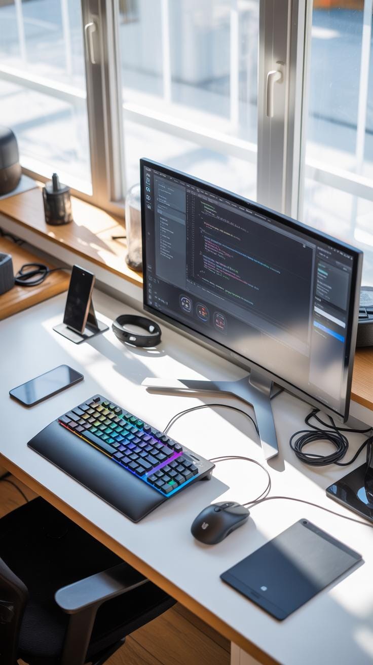
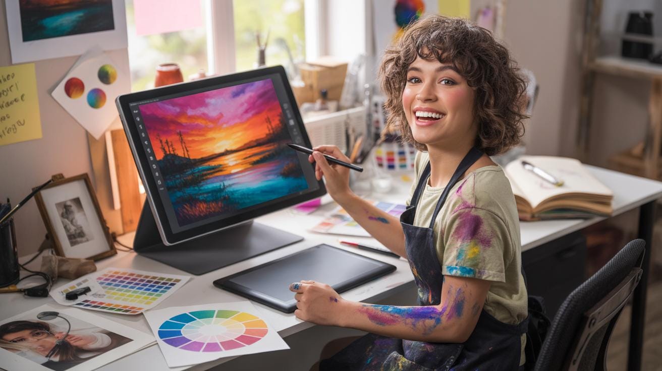
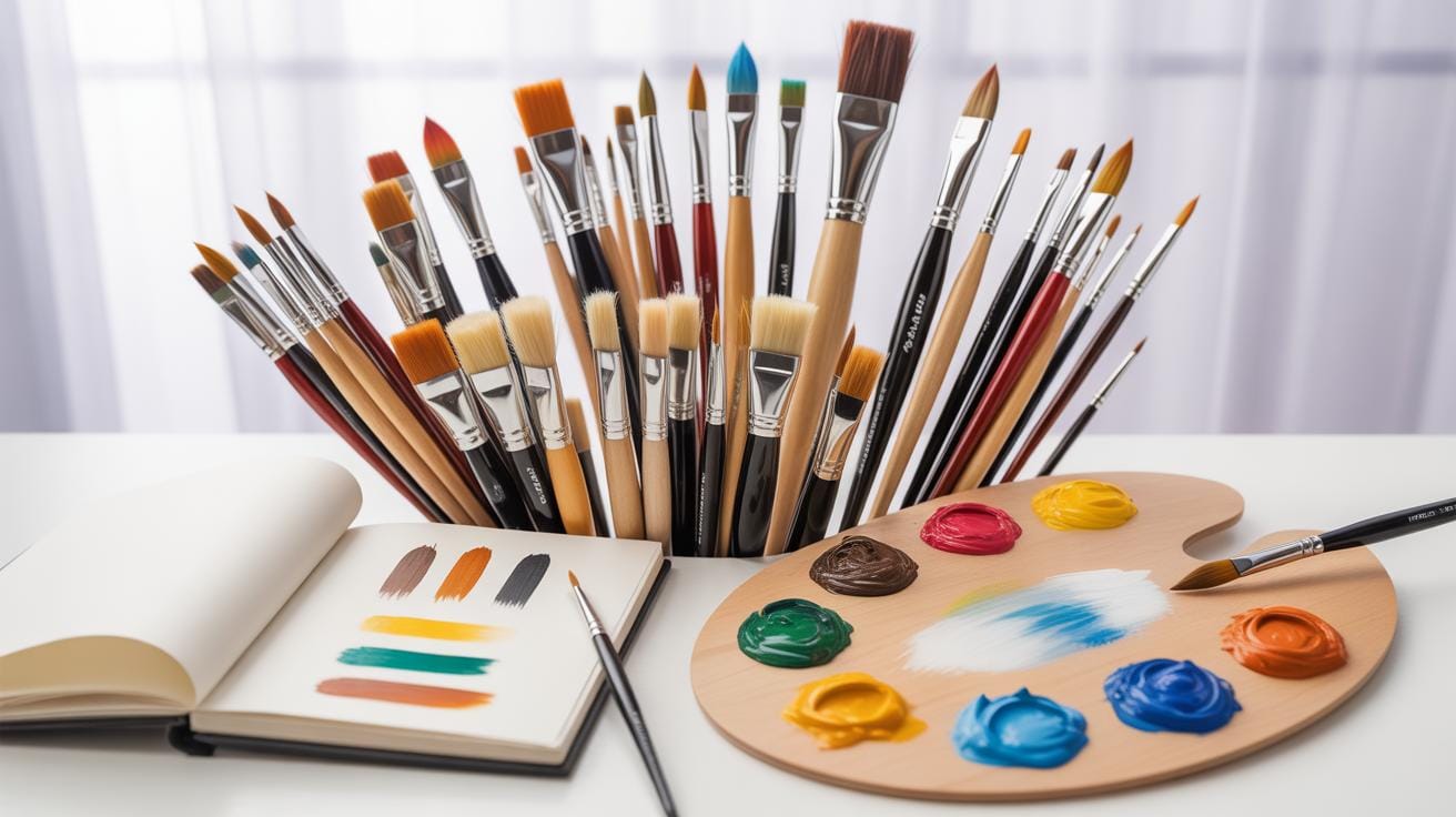
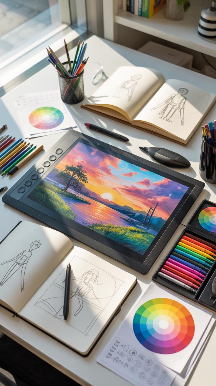
When you start digital painting, you’ll quickly realize you need a few basic tools, but don’t stress—budget-friendly options exist. First off, a graphics tablet is essential. It lets you draw naturally, mimicking pencil on paper, but translated digitally. You don’t necessarily need a pricey, top-tier model. Some tablets cost under $100 and still work well for beginners. A steady computer or laptop that can run your drawing software without lag is necessary though it doesn’t have to be a gaming powerhouse. Something mid-range is fine.
For software, plenty of beginner-friendly programs are out there, often with free versions to test the waters. These let you explore digital brushes, layers, and color tools without overwhelming you. Sometimes, simpler software can be less frustrating as you learn the ropes. Most importantly, start with what feels comfortable, and upgrade your gear as you grow.
Best Tablets For Beginners
Picking the right tablet can feel tricky. Fortunately, some tablets stand out for newbies because they balance price and usability. For instance, Wacom’s Intuos line is popular and generally affordable, with models ranging from around $80 to $200. They’re reliable and have good pressure sensitivity, which matters for brush control. Huion and XP-PEN also offer tablets with similar features, sometimes at a lower cost. Size-wise, a small or medium tablet is manageable for beginners; large tablets are tempting but cost more and can be overwhelming.
Most beginner tablets connect easily via USB and work well with Windows and Mac. One common hiccup for some beginners is getting used to drawing on a tablet while looking at the screen, not the pad. Tablets with screens, like the Wacom One or XP-PEN Artist series, solve this but usually cost more. Think about what feels right for your budget and workflow.
Choosing Your Software
There’s plenty of software to choose from, each with its quirks. Krita is free and powerful, great for experimenting. It covers most digital brushes and layer effects, but it may feel a bit raw or overwhelming. Autodesk SketchBook offers a simpler interface, ideal for those who want a straightforward experience without too many distractions, and it’s free too.
Procreate is incredibly popular but only for iPad users, and there’s a one-time purchase fee. It’s intuitive and responsive but locked to Apple devices. Photoshop is powerful and industry-standard but comes with a subscription model and a steeper learning curve. If you want to dive deep and don’t mind paying, it’s a robust choice.
Ultimately, think about what device you have, how much you want to spend, and how complex the program feels. Trying a couple can help you find your fit. A great tool doesn’t make you an artist overnight, but the right setup can definitely make the process more enjoyable.
Digital Painting Tutorials
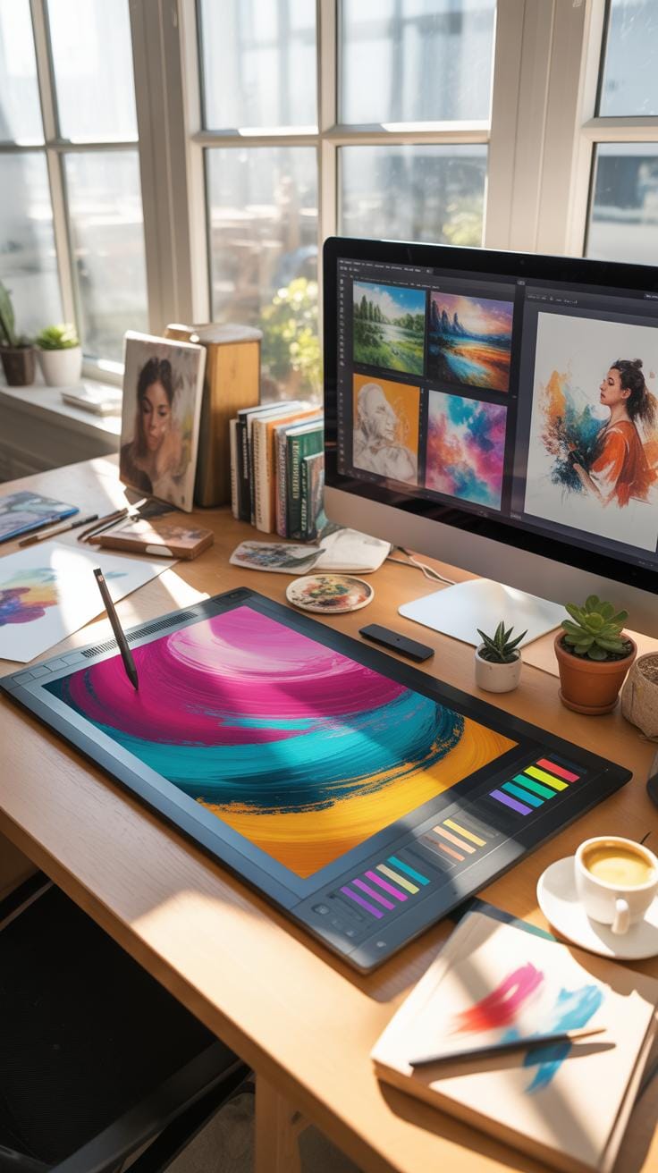
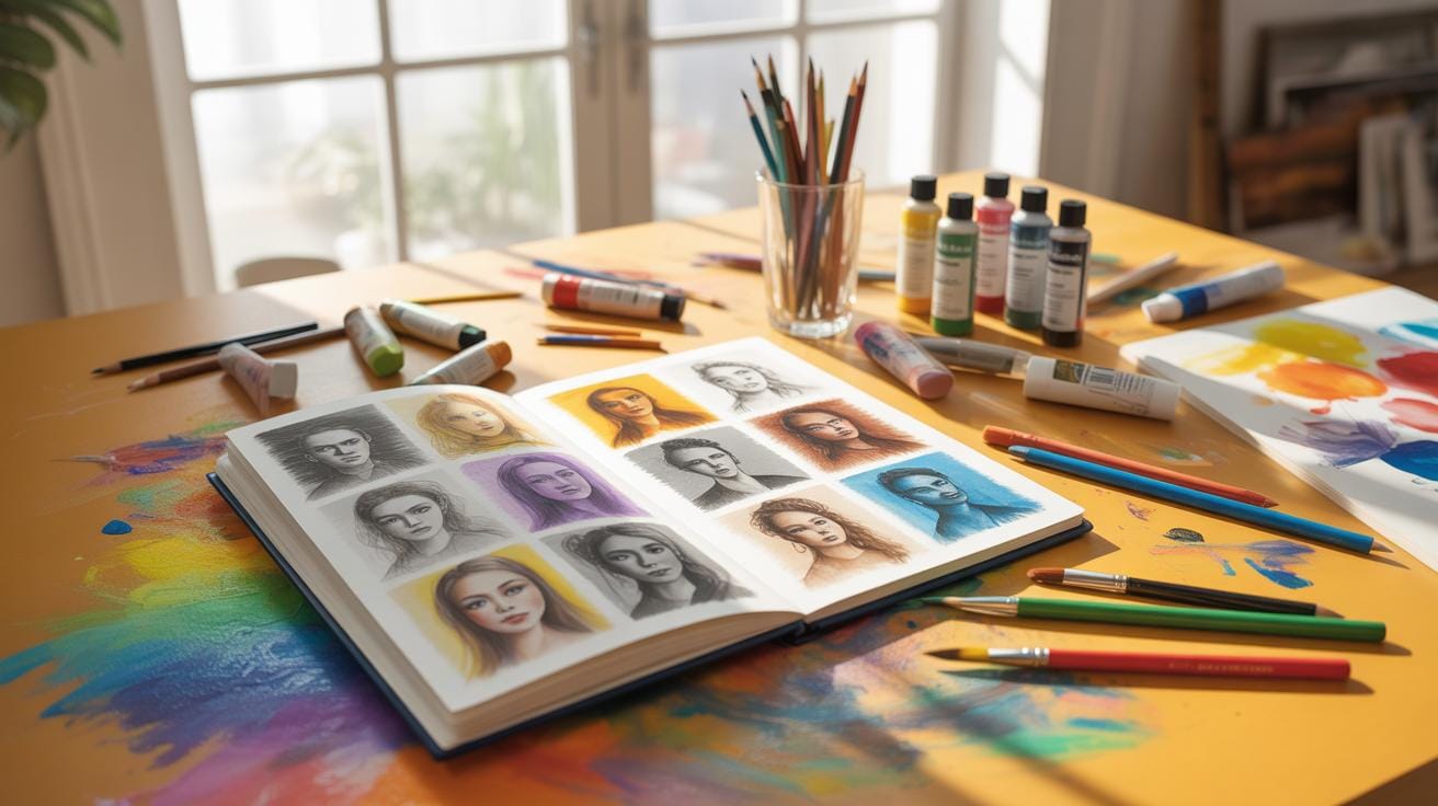
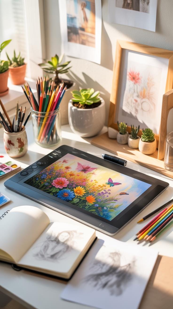
When you dive into digital painting tutorials, it’s not always about mastering every technique at once. Tutorials often start with simple exercises—practicing brush strokes, exploring layering, or trying out sketching methods. These initial steps feel repetitive but are crucial. You might find yourself redoing the same strokes dozens of times, and that’s okay. Each practice nudges your control over the digital brush, even if the progress seems slow.
Brushes come in many forms—round, flat, textured, and more. Each brush responds differently depending on settings like opacity and flow. A soft brush might blend colors smoothly, but that same brush could lose detail at lower opacity levels. Play around with these settings. Sometimes a rigid brush helps with sharp edges, while a textured brush adds grit to your work.
Layer management is another topic tutorials emphasize. It’s easy to overlook its importance until you scramble to fix a tiny detail buried under many other layers. Tutorials teach you to name layers, group them by purpose, and sometimes even lock those you don’t want to accidentally change. You’ll discover tricks, like using clipping masks or adjustment layers, that save time and make corrections less frustrating. Even if it feels tedious at first, good layer habits become a quiet but steady support for your creative flow.
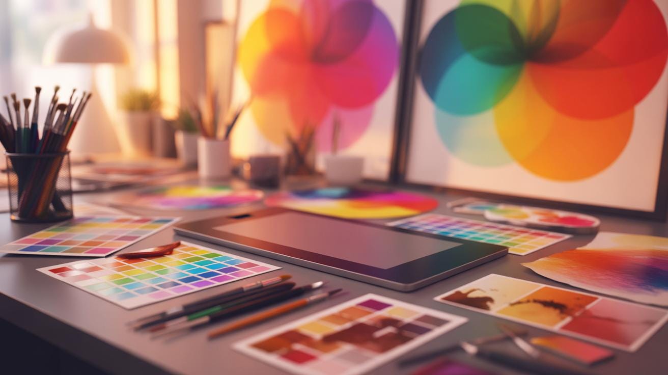
Color Theory Essentials
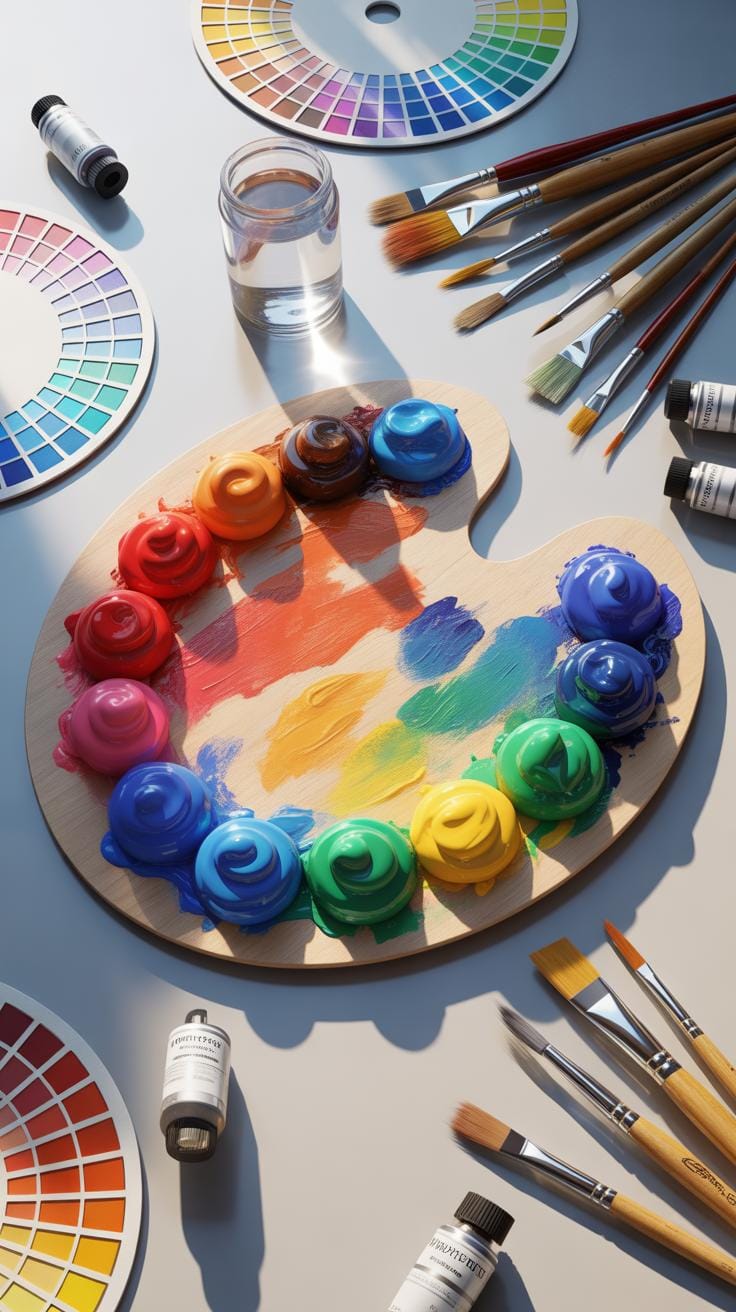
Understanding the color wheel is fundamental in digital painting. It’s a circle where colors transition smoothly from one to the next—reds, oranges, yellows, greens, blues, and purples. You’ve probably seen it before, but it’s more than a pretty chart. Colors opposite each other on this wheel, called complementary colors, create strong contrast, perfect for making elements pop in your artwork.
Harmony in color means balancing these relationships so your piece feels unified rather than chaotic. This can mean using analogous colors—those next to each other on the wheel—for a soothing effect, or a triadic scheme, which uses three evenly spaced hues for energy and balance. But I’ve noticed sometimes stepping outside the “rules” creates unexpected and fresh results. So don’t be afraid to experiment a bit.
Choosing Color Palettes
Picking a palette can feel daunting. One approach is starting with a mood or theme. For calm scenes, cool blues and greens work well. For vibrancy, try warm oranges and reds. You can also base your palette on real-world inspiration, like photos or nature.
- Limit your main colors to three or four to keep things cohesive.
- Use one color dominant, another secondary, and a third as an accent.
- Test your palette by making quick color studies before detailed work.
In digital art, tools like Adobe Color or Coolors can generate palettes for you. But despite the convenience, I find personal tweaks often yield better harmony than automatic picks.
Color Mixing And Blending
Digital painting allows you to mix colors in ways that mimic real paint, although it’s a different process. Instead of physically combining pigments, you often use brushes with opacity and flow settings to blend on the canvas. It takes some practice to get soft, gradual transitions or sharp blends where needed.
Many software programs offer mixer brushes that simulate wet paint blending. Alternatively, layering transparent colors can build up natural shifts in hue and saturation. Some artists use smudge tools cautiously to mix colors without muddying the image.
Remember, the key is subtlety. Over-blending can flatten textures or color vibrancy. I find working in multiple passes—blocking colors first, then refining blends—helps retain life in the painting.
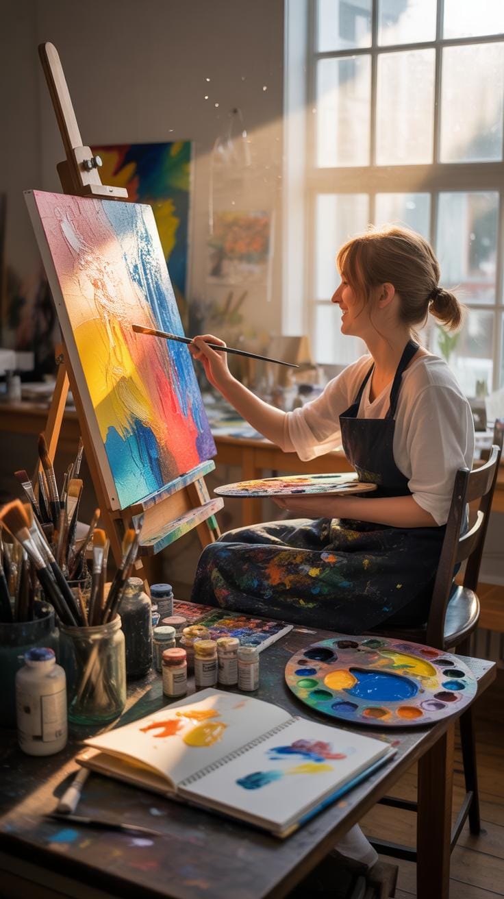
Creating Your First Artwork
Planning Your Composition
When you start your digital painting, think about composition first. It’s the foundation. Roughly sketch your layout to see where the main elements will go. You don’t need perfect lines here—just a guide to keep your visual balance in check. Consider simple rules like the rule of thirds or leading lines, but don’t feel trapped by them. Sometimes breaking rules helps your art stand out. Your plan should also include what you want to focus on and which parts can stay simple. This step might seem slow or tedious, but it saves time later.
Applying Colors And Details
Next, start applying colors to your sketch. It’s often easier to block in broad shapes with flat colors first. Don’t stress about shading yet—just grab the hues that fit your concept. Once those are down, gradually add details, layer by layer. Sometimes, too many details too soon can overwhelm the piece or your patience. Keep stepping back to see the whole picture; details that pop up close might distract when you zoom out. Final touches matter – soft highlights, subtle shadows, and texture can bring your artwork to life. Try to resist perfectionism here; done can be better than perfect.
Common Digital Painting Mistakes
Overusing Effects And Filters
You might think piling on effects and filters will instantly boost your art, but often it just muddies the image. When you lean too heavily on software effects, you risk hiding the core details and brushwork that make your piece unique. It’s tempting, of course, to rely on filters for quick fixes—who doesn’t want instant magic? But that can backfire. Instead, focus on refining your base painting first. Does the lighting work? Are the colors balanced? Use effects sparingly—as a subtle enhancer, not a crutch. If you find yourself applying filter after filter, pause and ask: what am I really trying to achieve here? Sometimes less really is more, and your skills grow faster when you don’t default to shortcuts.
Ignoring Layer Organization
Layers are great, but only if you manage them well. I remember the frustration of opening a file with dozens of layers named “Layer 1,” “Layer 2,” and so on—pleasant chaos, really. Poor layer organization can slow you down, leading to confusion about what goes where. That lost time adds up. Imagine needing to tweak just the shadows but struggling to find the right layer. You can keep it simple: label your layers clearly. Group related layers together. Consider a naming system that makes sense to you. It might feel tedious at first, but it makes your workflow smoother and less stressful. When you come back to your work days later, you’ll thank yourself for this tiny bit of discipline.
Advanced Techniques To Try
Once you get comfortable with the basics of digital painting, it’s natural to look for ways to make your work more interesting. Trying out intermediate methods like adding textures, playing with lighting, or using special brushes can really change the vibe of your artwork. These techniques aren’t just about adding flair—they help create a sense of depth and mood that draws your viewers in.
Adding Textures
Textures are a subtle but powerful tool. Applying them digitally can make a flat image feel tangible. You might start by overlaying texture images on top of your painting, adjusting blend modes like Multiply or Overlay. This adds complexity—think of rough skin, worn wood, or fabric patterns. Try experimenting with opacity; a texture too strong can distract, while one too soft may go unnoticed.
One thing I’ve encountered is the temptation to overuse textures. It’s easy to get carried away, but a little goes a long way. Also, consider texture brushes, which can create detailed surfaces as you paint, giving you more control. It’s not always clear when a texture improves the piece or just adds noise—you have to train your eye.
Using Light And Shadow
Lighting shapes the perception of your digital painting more than you might initially think. Good use of light and shadow brings volume to objects and sets the atmosphere. Start by deciding on your light source’s direction. Shadows should fall consistently, but you can bend reality a bit if it adds drama or interest.
Try layering soft light glows or sharp highlights with a low-opacity brush. It’s easy to make shadows too dark or highlights too harsh, which can flatten your work instead of enhancing it. Play around with color temperature in shadows and highlights—warm light and cool shadows often look natural, yet sometimes cooler light sources require reversing this.
Creating convincing light and shadow is partly technical and partly intuitive. Look closely at photos or real-life scenes, and try to replicate what you see. But don’t hesitate to break the rules here and there; it might give your painting a unique feel you like better.
Digital Painting Tutorials For Digital Art
Comparing Digital And Traditional Painting
When you look closely at digital and traditional painting, you’ll notice clear differences but also surprising similarities. Both require a sense of composition, an understanding of color, and a good eye for detail. But digital painting replaces physical tools like brushes and canvases with screens and styluses. In digital art, mistakes are less permanent—you can undo a stroke in a blink, which is a luxury you never had with traditional painting. However, the tactile feel, the texture of real paint on a canvas, is missing digitally, which some artists find important.
Advantages Of Digital Painting
There are perks specific to digital painting that beginners often appreciate. For one, layers let you work on different parts without messing others up—this can be a game-changer when trying out ideas. Undo and redo features mean you can experiment without fear of ruining your artwork forever. You can blend colors and create effects with digital brushes that mimic oils, watercolors, or pastels but without the mess and dry time. Plus, with digital tools, you can easily save multiple versions and share your work instantly.
Challenges Digital Artists Face
That said, digital painting isn’t without its hurdles. One tricky aspect is the steep learning curve of software and hardware—it’s not just about painting skills but also navigating programs. Some artists struggle with a lack of physical feedback; the screen’s flat surface doesn’t feel the same as paper or canvas, which can throw off control. Another challenge is the sheer overwhelm of options—brush settings, layers, filters—sometimes beginners can get lost trying to figure out where to even start. Also, digital art means you’re dependent on technology, which can glitch or crash unpredictably.
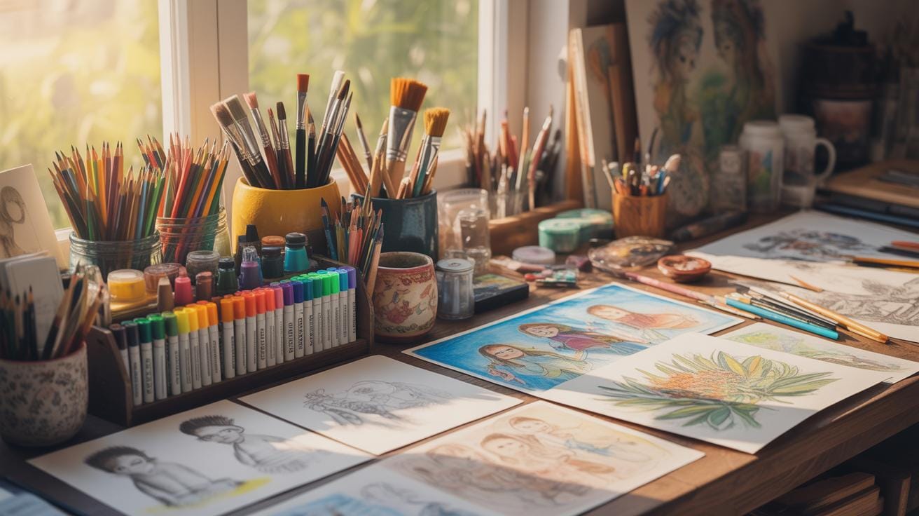
Building A Daily Painting Habit
Developing a steady digital painting routine isn’t always straightforward. It’s less about sudden leaps and more about small, consistent efforts. You might start by dedicating just 15 minutes daily. This feels manageable, and the commitment is less daunting—especially when life gets busy.?
Setting small goals is key. Instead of aiming to finish a masterpiece every day, try focusing on specific skills: practicing shading on a sphere, exploring a limited color palette, or sketching quick poses. These bite-sized tasks keep your motivation alive without overwhelming you.
Tracking progress might sound tedious but can be quite revealing. Save your daily works in a dated folder or use apps designed for organizing artwork. When you look back after a few weeks, you’ll notice subtle improvements that might otherwise slip past unnoticed. Sometimes, it’s surprising how far you’ve come, and other times, it nudges you to switch approaches.
If motivation dips, remind yourself that perfect consistency isn’t the goal—regular engagement is. Even skipping a day or two won’t erase growth if you keep returning. Just keep your process enjoyable enough to want to stick around.
Showcasing And Sharing Your Art
When it comes to presenting your digital paintings, the choices can feel overwhelming. You want to show your work where it can be seen, appreciated, and maybe critiqued. But where exactly? Well, several platforms can help you reach different audiences.
Choosing Platforms To Share
Social media platforms like Instagram and Twitter offer quick and wide exposure. They let you share your progress and finished pieces with a broad community. However, the fast pace means your artwork might get lost among endless posts.
Art-specific communities, such as DeviantArt or ArtStation, cater mainly to artists and art lovers. Here, your work can be discussed in more depth, offering more meaningful feedback. Plus, the environment is often supportive and focused on creative growth.
A personal website or portfolio can also be powerful. It’s your dedicated space to showcase your best work, arranged the way you want. But building and maintaining a site takes effort. Sometimes it feels a bit isolating without the instant interaction of social platforms.
Preparing Art For Display
Properly preparing your files is just as important as picking the right platform. Choosing the right file format depends on where you plan to share:
- JPEG works well for most displays because it balances quality and size.
- PNG is better if your image has transparent areas or needs higher quality.
- TIFF is generally reserved for printing or archiving due to its large size.
Resolution is another key factor. For online use, 72 DPI is common, but you might want to go higher if your platforms support it—sharpness makes a difference. For print, prepare at 300 DPI to ensure clarity.
Presentation matters too. Cropping your image to highlight the focal point helps viewers focus on what matters. Also, adding a subtle border or watermark can protect your work and make it instantly recognizable.
Sharing your digital art is more than just uploading an image. It’s about connecting with others, learning from feedback, and gradually building an audience. Think about what feels right for you and your art journey. What’s the best platform where you feel your style can shine?
Conclusions
The tutorials provided here give you a clear path to begin digital painting effectively. Mastering basic drawing tools, proper setup, and understanding color theory are vital first steps. These skills build your confidence and help your digital artworks stand out.
Keep practicing the techniques, experiment with colors, and use the right tools to enhance your digital painting. With consistent effort, you will see steady improvements and enjoy creating unique digital art pieces.