Introduction
Typography is more than just choosing fonts. It is about arranging letters and symbols to make your message clear and appealing. Creative typography projects help you express ideas in interesting ways that catch the eye and make the words memorable. This article will guide you through inspiring ideas for creative typography projects. Each idea aims to spark your creativity and improve your skills.
You will learn how to use typography tools and principles to make your projects stand out. We will cover topics like font choices, spacing, styles, and practical ways to use typography in your designs. Whether you are a beginner or want fresh ideas, this guide will help you explore new directions in creative typography.
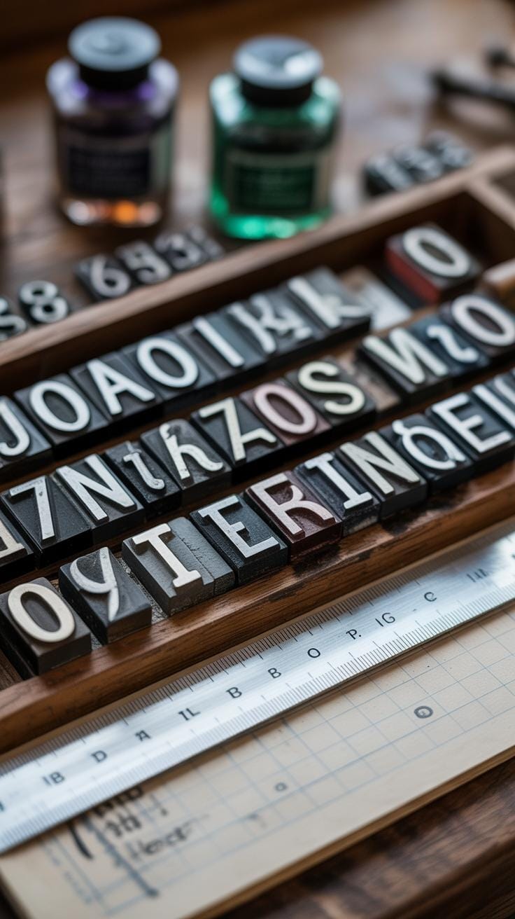
Understanding Typography Basics
What is Typography? Typography is, simply put, the art of arranging letters and words on a page or screen. It’s about making text easier to read and more pleasant to look at. Think of it as organizing words in a way that helps your message come through clearly, without causing strain or confusion. It’s not just about what you say, but how you make people experience what they’re reading.

Key Elements of Typography focus on a few main things:
- Typefaces—these are the styles of letters you use, like Times New Roman or Arial. Each typeface gives a different vibe.
- Font sizes affect how big or small your text appears. Bigger sizes grab attention; smaller sizes deliver subtle details.
- Line length or how wide a block of text is, changes how easy it is to follow along. Too long, and eyes might wander. Too short, and reading feels choppy.
- Spacing happens at two levels: between letters (tracking) and between lines (leading). Adjusting these can make a dense paragraph look inviting or a brief quote feel dramatic.
All these elements work together and influence how you feel about the text. You might not notice it each time, but they set the mood quietly, behind the scenes. Sometimes, playing around with these basics can give your typography that little spark you didn’t expect. Ever thought about why some paragraphs just flow better? That’s probably great line spacing—or maybe just the right font size.
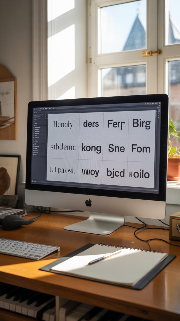
Choosing the Right Typeface
Picking the right typeface can be trickier than it seems. You want your font to fit your project’s goal without overpowering the message or feeling out of place. First off, knowing the basic font types helps. Serif fonts have those little strokes at the ends of letters — think Times New Roman or Georgia. They often feel more formal or traditional, so they work well for printed books, newspapers, or anything wanting to project trust and seriousness.
Sans serif fonts lack those strokes. Fonts like Arial or Helvetica fall here. These feel modern, clean, and straightforward, making them great for screen reading, websites, or anything where clarity is key. But sometimes they can feel a bit too plain if you want warmth or personality.
Script fonts mimic handwriting or calligraphy. They often add flair or elegance, but you should use them sparingly—like for invitations, logos, or small decorative touches. Overusing scripts can hurt readability and distract from your message.
When you’re choosing, ask yourself: what mood do I want to create? What’s this project about? If you’re unsure, try pairing one serif with a sans serif. That contrast can balance tradition and modernity. It’s not a hard rule, but it often works. And remember—sometimes your gut feeling about how a font looks with your text is as valuable as any rule.
Think about where your text will appear and how long people will be reading it. A bold serif might work for a formal poster headline but tire the eyes if used in small body text on screen. A neat sans serif could be perfect for an app but feel cold on a wedding invitation. The context matters.
In the end, font choice can steer the reader’s reaction. It can make your words clearer or create confusion. Spend some time testing different fonts in your design to see which one fits best—sometimes the answer isn’t obvious at first glance.
Experimenting with Letter Spacing
Letter spacing plays a surprisingly big role in how your typography looks and feels. When we talk about letter spacing, we generally mean two things: tracking and kerning. Tracking controls the overall space between letters across a whole word or sentence, while kerning focuses on the space between specific pairs of letters.
Adjusting these spaces changes your text’s readability and style in ways you might not expect. For example, increasing tracking can make a block of text feel airier and more approachable, but if you push it too far, words lose cohesion and get hard to read. On the flip side, tightening kerning between some letter pairs can create a sleek, unified look, but squeeze too much and letters may collide, becoming confusing.
Here are some practical tips you might try:
- Use tighter kerning for logo design or headlines to make words feel compact and crafted.
- Open up tracking on body text when working with small font sizes to boost clarity.
- For special effects, play with uneven spacing—stretch some letters while tightening others to draw attention or add personality.
- Always test your adjustments on different screen sizes or print to catch unintended quirks.
Sometimes, I’ve found that small spacing tweaks completely change the mood of a piece. So, don’t hesitate to experiment a bit—it might feel subtle, but the right letter spacing can transform your project’s entire vibe.
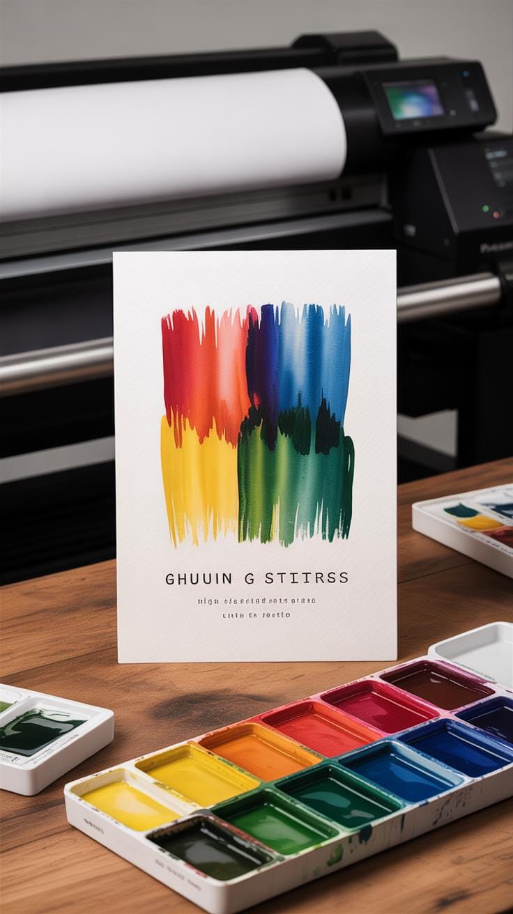
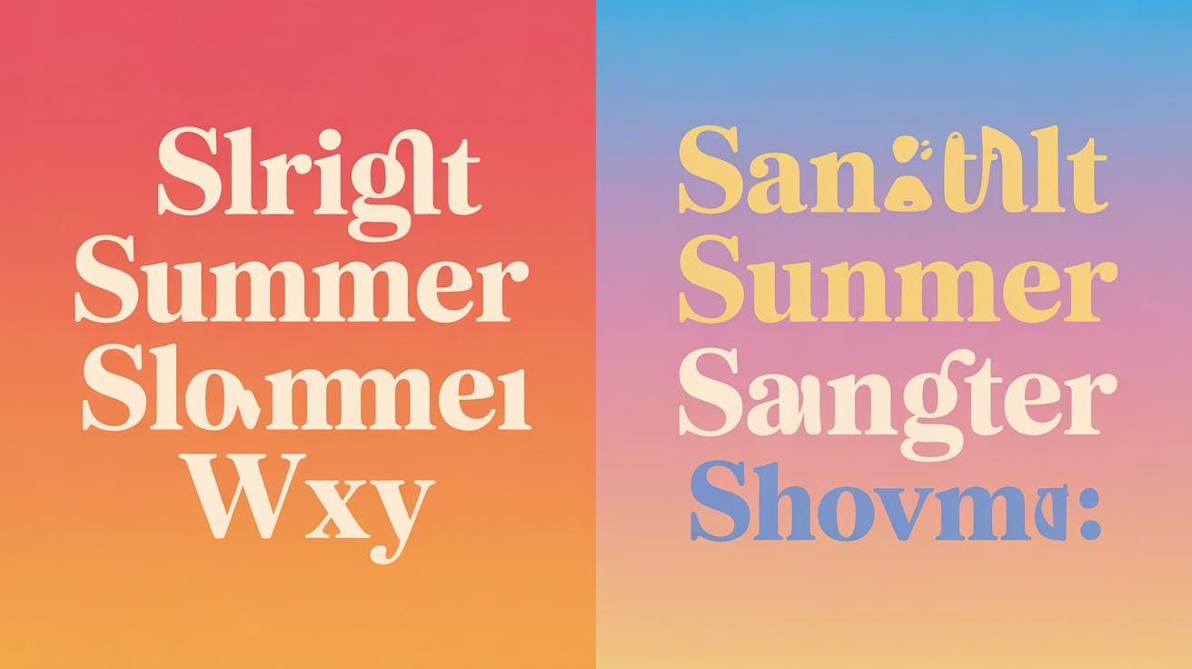
Using Color and Contrast in Typography
Choosing Colors for Text
Color can totally change how your typography feels and, more importantly, how easy it is to read. Picking the right colors isn’t just about looking nice. You want text to stand out without making readers squint or guess words.
For safe color combos, think about high contrast—like dark text on a light background or the reverse. Black on white is classic for a reason. But sometimes, softer options can work, too. Navy blue on pale yellow, for example, gives enough contrast without being harsh.
Some colors just don’t pair well for readability. Red text on a green background might catch attention but often causes strain. I once tried a pastel pink on white design; it was pretty, but I quickly realized I had to tweak it because no one could actually read the content easily. Color blindness also matters—certain reds and greens blur together for many readers.
Creating Contrast to Highlight Text
Contrast is your best tool to guide the eye where you want. When you make headings bolder or use a darker color against a lighter background, you’re drawing attention. But contrast isn’t just about light and dark. It can be subtle too, like using slightly different shades or saturation levels to separate info without shouting.
Don’t forget that too much contrast, like bright colors against dark ones, can feel aggressive or tiring. Sometimes contrast is best used sparingly—to emphasize key points or separate sections. I find that when I overdo contrast, the design feels chaotic rather than helpful.
Ask yourself what deserves to stand out. Is it a call-to-action? A quote? Make those parts jump out by using either a brighter color or just a darker tone combined with a simple background. Organizing information through contrast makes your text easier to scan and understand. So next time you choose colors, think beyond just “pretty” and focus on clarity and purpose.
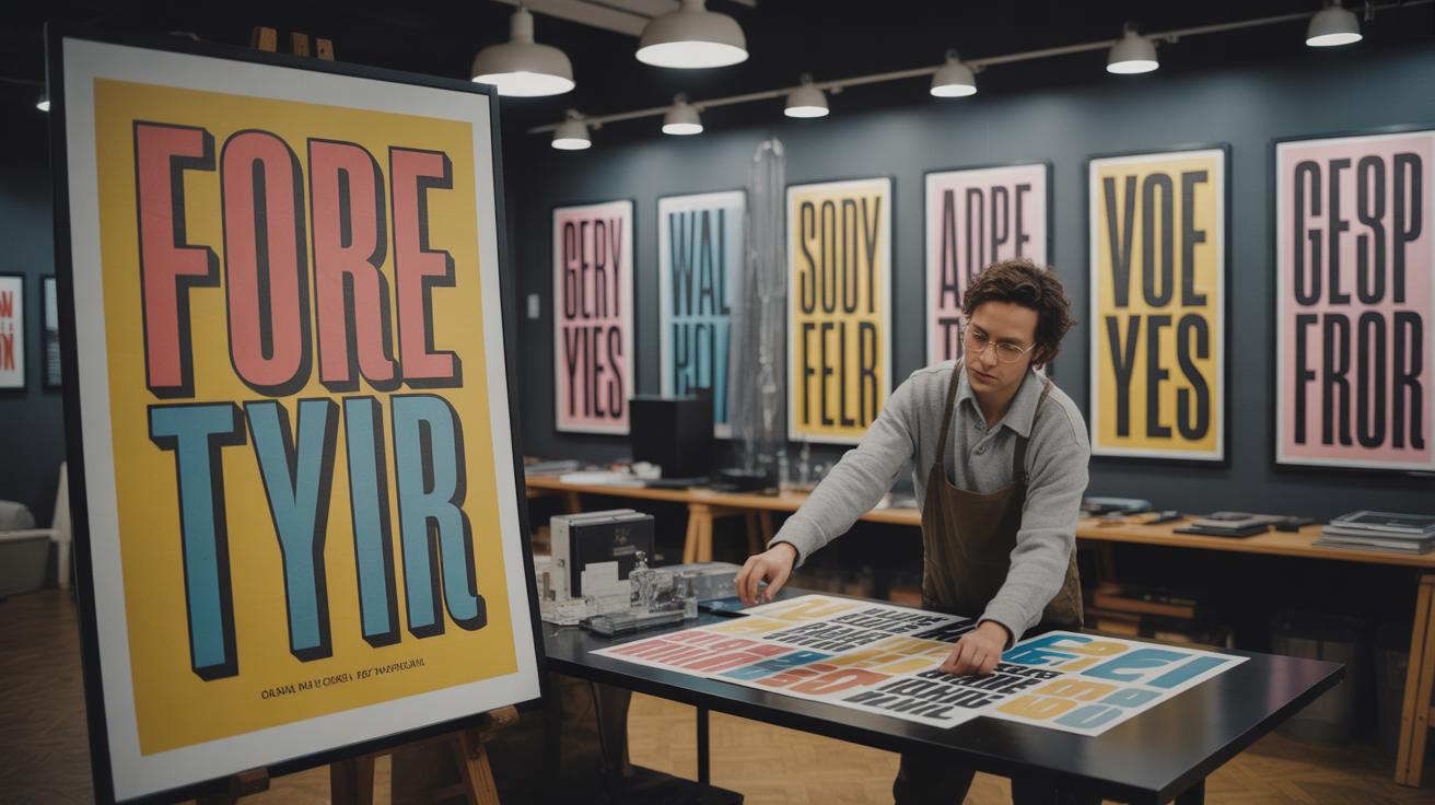
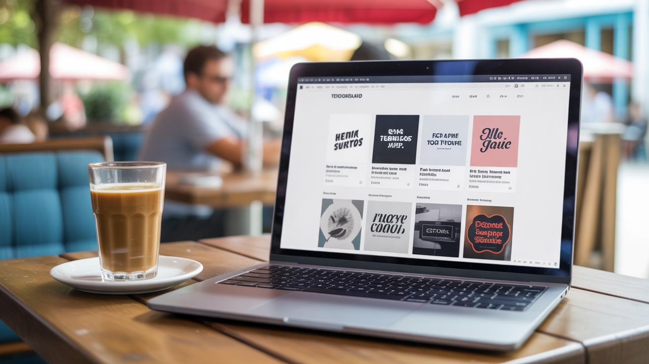
Combining Fonts for Creative Impact
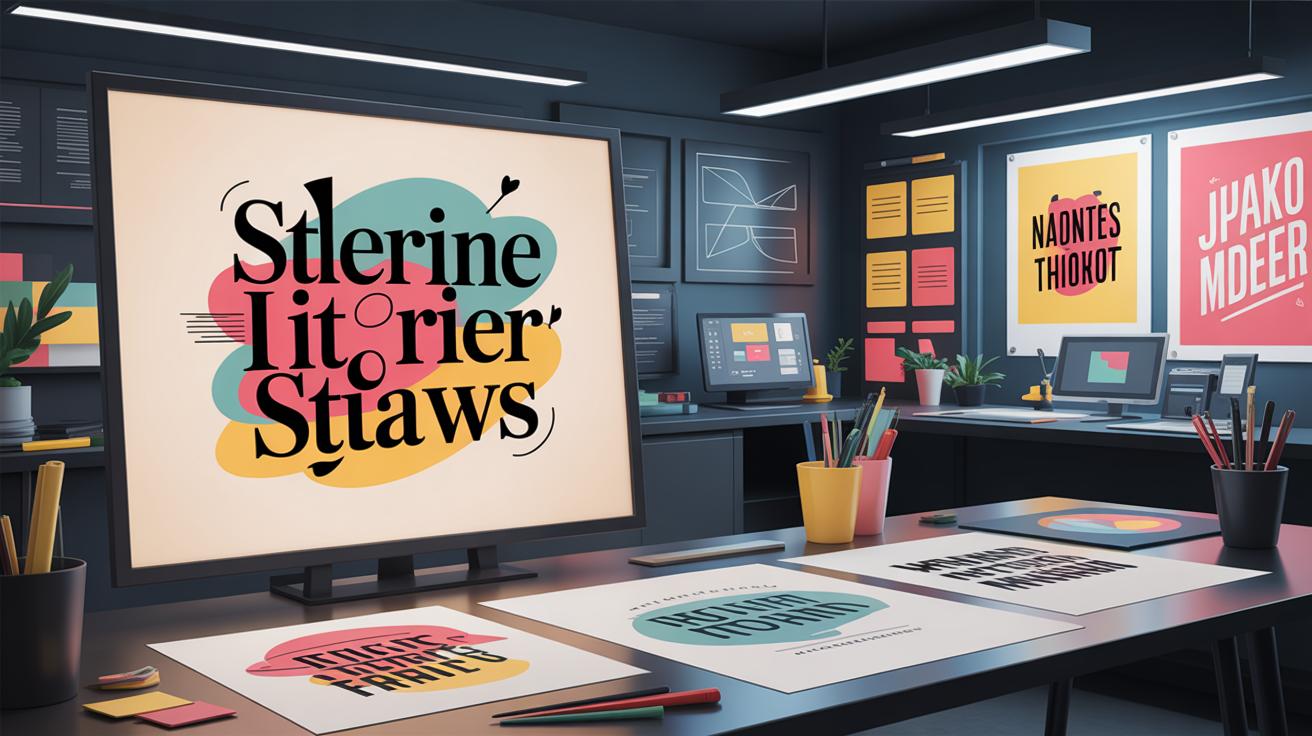
Mixing two or more fonts can really bring depth and style to your typography. When done right, it creates contrast and emphasizes hierarchy, making your design easier to navigate. The trick is to choose fonts that play well together, so they don’t compete or clash.
Why use multiple fonts? Well, combining fonts helps establish a clear visual order. For example, a bold serif for headlines paired with a simple sans-serif for body text guides the reader naturally. It breaks monotony, adds personality, and can even convey subtle moods without extra elements.
Here are some tips to keep font pairing smooth:
- Pick fonts with different but complementary characteristics—like a geometric sans-serif with a humanist serif.
- Limit yourself to two or three fonts. More than that often feels chaotic or forced.
- Look for contrast in weight, style, or size, but avoid fonts that are too similar. They might confuse instead of complement.
- Try pairing a decorative or script font with a clean, neutral one to balance flair and legibility.
- Test your combinations in actual layouts. Sometimes fonts that seem great in theory just don’t work together in practice.
When I first experimented with font pairing, I struggled with how much difference was enough. I found that subtle contrasts often read better than extremes—unless the design calls for something bold. So, mix your fonts thoughtfully. The goal is impact, yes, but also harmony that feels natural.
Creating Text Effects with Typography
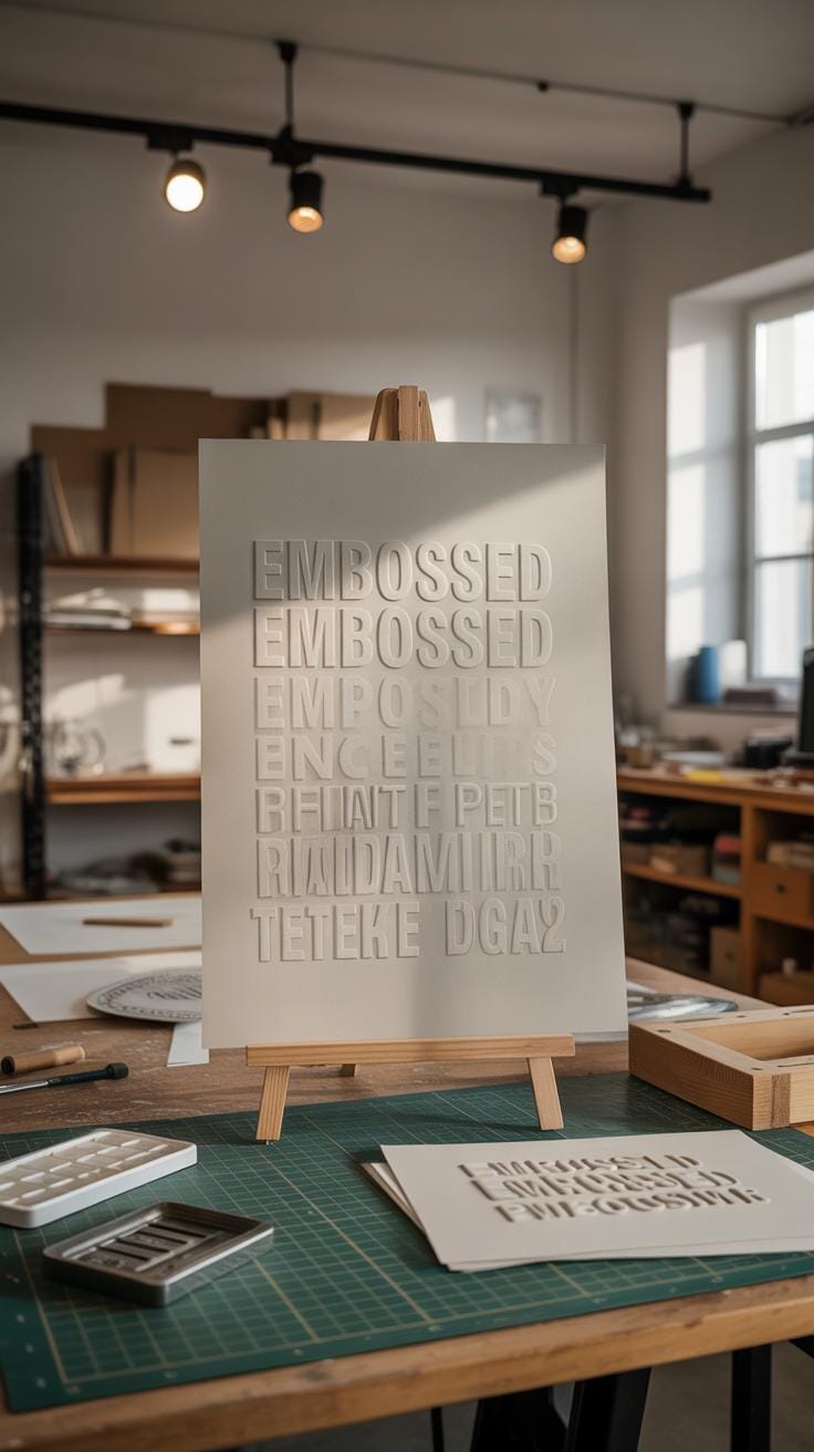
Adding effects to your text can totally change how your typography feels. Shadows, outlines, and textures can give words depth, movement, or even a tactile sensation. These effects make your designs stand out but—and this is key—they shouldn’t overwhelm what you’re trying to say.
Here are a few effects anyone can try:
- Drop Shadow: Duplicate your text, offset the copy slightly, and darken it. This adds depth without much fuss.
- Outline: Adding a thin stroke around letters makes text pop, especially against busy backgrounds.
- Texture: Overlay grain or subtle patterns to give flat letters a more organic or rough feel.
- Gradient Fill: Use a color fade inside your text for an extra layer of interest.
- Blur: A slight blur on shadows or background text adds softness but can easily get messy if overdone.
When using these, think about legibility first. It’s tempting to crank up effects, but too much shadow or heavy outlines might confuse your readers. Try light touches and view your text from a distance. If it’s hard to read or feels cluttered, dial back.
One trick I like: apply an outline and shadow but keep the text color simple and high contrast. It makes the effect noticeable without sacrificing clarity. Sometimes, less really is more—though I guess, that depends on your project and personal taste.
Using Typography in Digital Projects
Typography on Screens
Typography on digital screens has its own set of challenges. Unlike print, where the physical texture and ink play a role, screens rely purely on pixels. That means your font choice affects not just style but readability in very direct ways. Small text can blur, especially on lower-resolution screens. Sometimes a font that looks great on a tablet might be hard to read on a phone.
Web-safe fonts come into play here. They ensure your text appears consistent across different devices and browsers, reducing surprises. But you don’t have to stick to just common ones like Arial or Times New Roman; you can explore Google Fonts or variable fonts that adapt better to screen needs. Still, test what works before finalizing.
Making Typography Work for Different Devices
Responsive typography means your text adjusts fluidly to screen size and orientation. It’s not just about fitting content but preserving legibility. Imagine your headline shrinking to a size that’s too small on a phone or a paragraph expanding awkwardly on a large screen. Neither feels right.
Scaling text with relative units like ems or rems helps keep balance. Some designers also set minimum and maximum font sizes to avoid extremes. Remember, legibility varies based on users’ distance from their screens, lighting, and even software settings. So, think about context as much as design.
You might wonder: can typography alone boost user experience? I’ve found that thoughtful type often guides attention and creates rhythm on pages and apps, making digital content feel more approachable. It’s subtle, but it works.
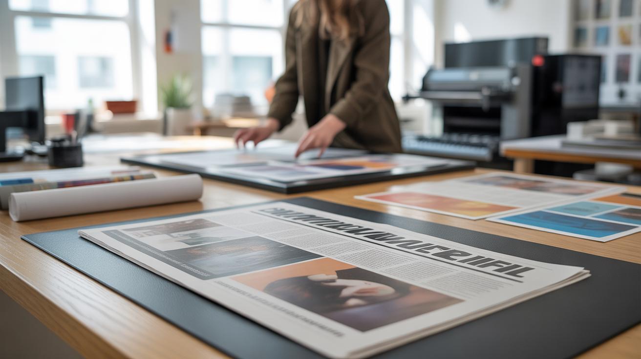
Typography in Print Projects
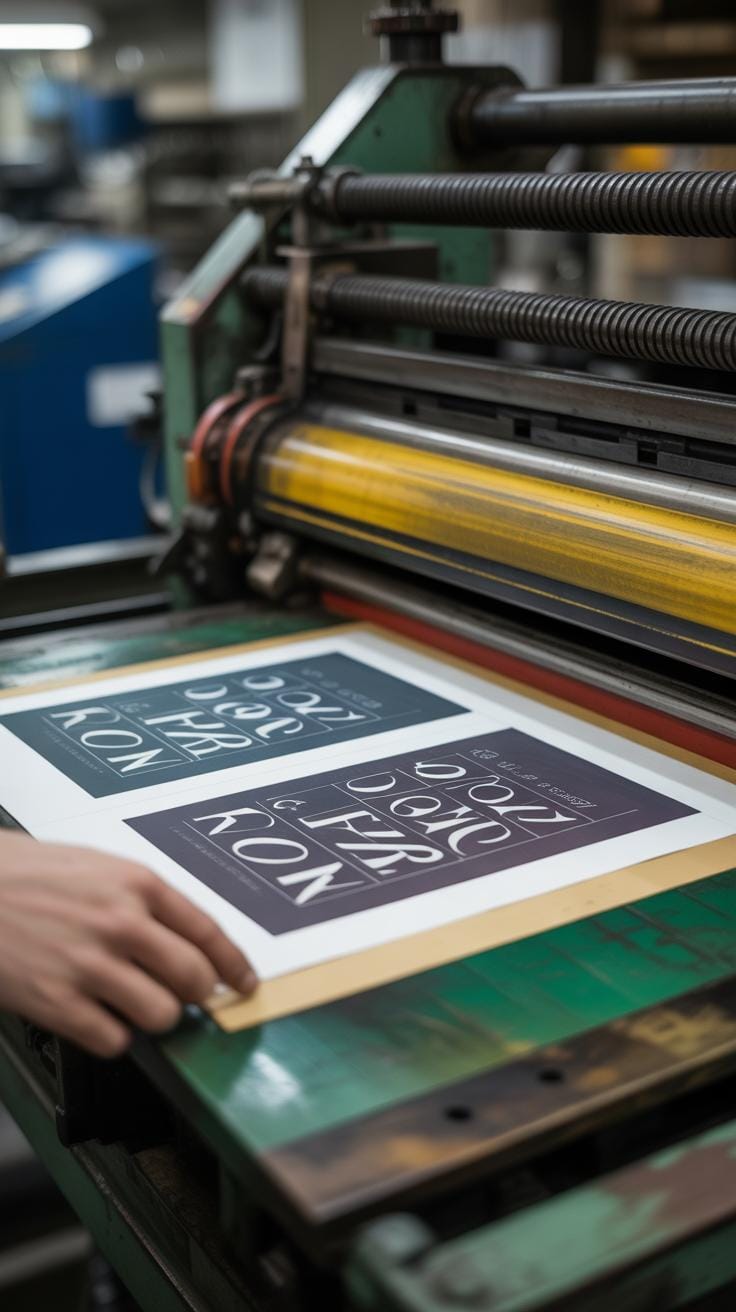
Print projects like posters, flyers, and books give you a tactile canvas to explore typography in ways digital screens don’t quite allow. You can play with textures, paper types, and ink density, and those details can change how your typography looks and feels. For instance, a glossy flyer might make thin, delicate fonts sparkle, while coarse matte paper might call for bolder, chunkier lettering to keep legibility.
When choosing fonts for print, think about how size and spacing will translate physically. Small text on a poster might get lost if the print quality isn’t sharp enough. A common choice is to keep body text between 10–12 points, ensuring it’s easy on the eyes without overwhelming the design. Line spacing should almost feel relaxed, so words don’t seem packed or suffocated.
Print versus digital typography isn’t just about where your work appears. Printed fonts need to consider ink bleed and paper texture, which can slightly blur fine details. Digital fonts don’t suffer from that but require responsiveness—text must adjust to different screen sizes.
Some printing tips worth remembering are:
- Choose fonts with clear letterforms to avoid smudging in print.
- Test printed proofs before final runs; what looks good on screen might not print exactly the same.
- Give generous margins and spacing—cramped type in print can distract or tire readers faster.
- Don’t rely heavily on very light or very thin fonts unless you know the print quality can match the demand.
So, when working on your next print project, think beyond just picking a font. Consider the whole tactile experience—how printed type interacts with the medium itself and your audience’s viewpoint. Sometimes what works beautifully onscreen might simply disappear on paper.
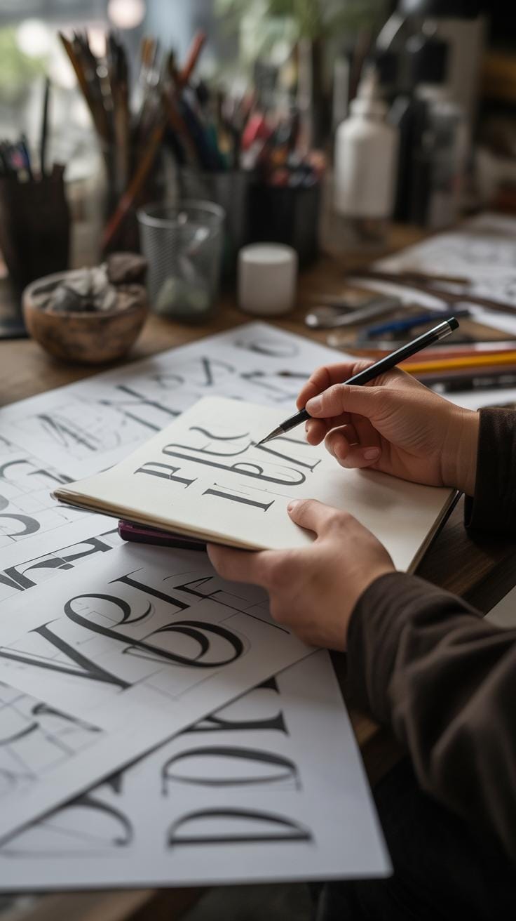
Incorporating Hand Lettering and Calligraphy
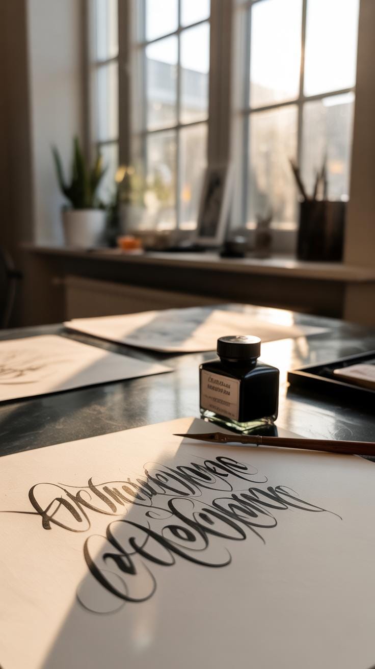
What is Hand Lettering and Calligraphy
Hand lettering and calligraphy are both art forms centered on creating letters, but they’re not quite the same thing. Calligraphy focuses on rhythm and flow, where each stroke carries weight and direction, often using special tools like nib pens or brushes. It’s about form and repetition—writing letters with a set structure that comes alive through practice.
Hand lettering, on the other hand, is more like drawing letters. You shape each character individually, allowing for more freedom in style and decoration. Think of it as crafting each letter with intention instead of repeating a standard pattern. Digital fonts, by contrast, are pre-designed letterforms; they lack this human touch and subtle variation you get when letters come from your own hand, as imperfect and alive as that is.
Mixing Hand Lettering with Typography
Bringing hand lettering or calligraphy into your typography projects can add a personal, organic edge that’s often missing from purely digital fonts. You might try these ideas:
- Create a hand-lettered title or headline and pair it with a clean, simple font for body text. The contrast can make your design stand out without overwhelming the reader.
- Use calligraphy flourishes or small hand-drawn elements around digital text to add nuance and detail.
- Digitize your own hand lettering, then mix it with typefaces on screen. This lets you adjust spacing or color while keeping that one-of-a-kind feel.
I’ve found blending hand and digital styles works best when you don’t overdo it. A little imperfection can invite the eye—but too much can confuse the message. Have you thought about where you want the focus? Start with that, and then figure out how the handcrafted elements can support it.
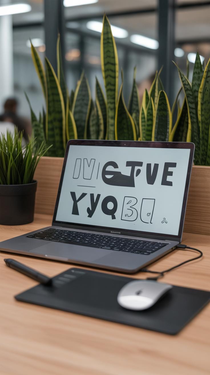
Planning Your Typography Project from Start to Finish
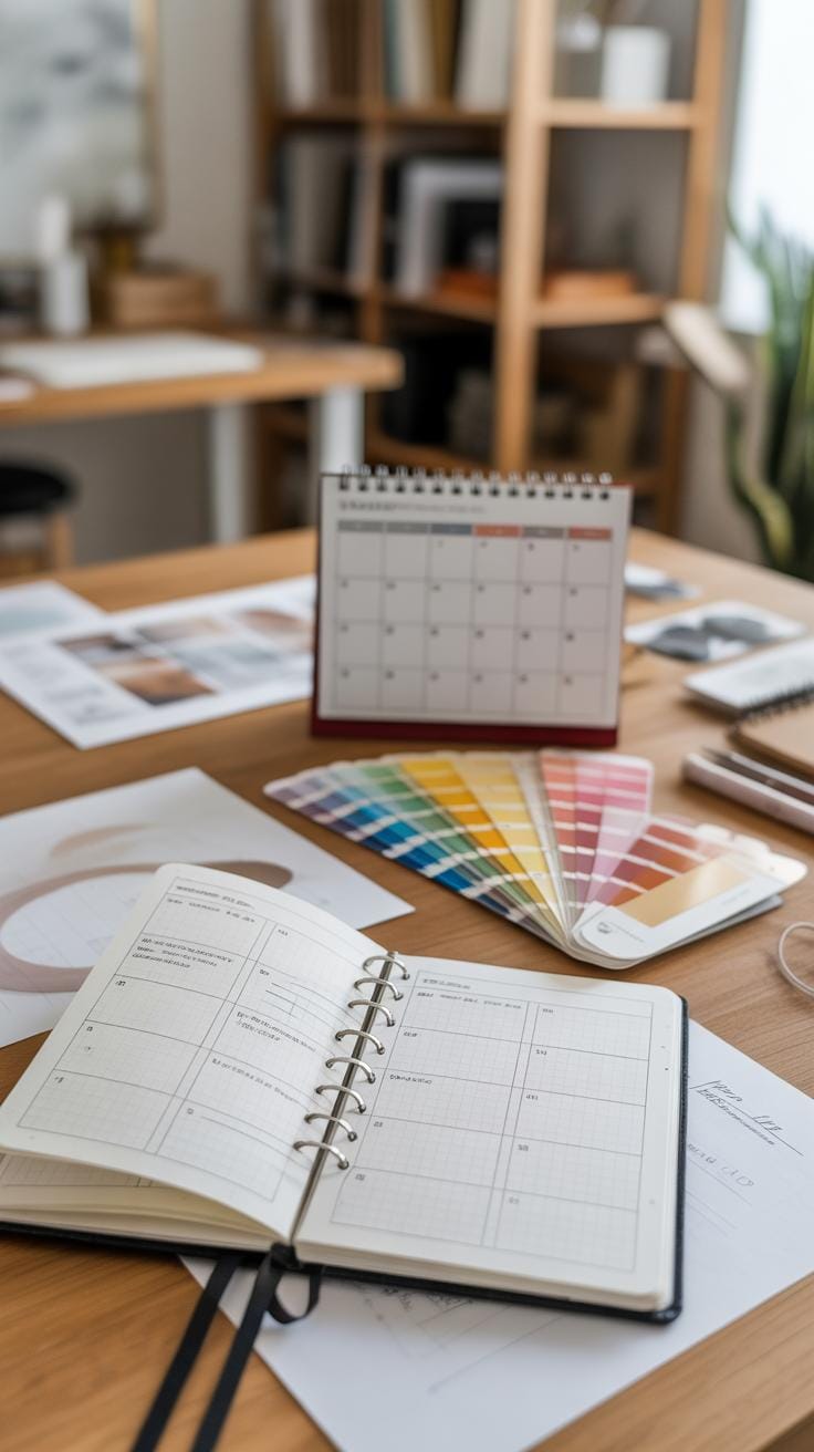
Before you dive into creating your typography, taking time to organize your project can save you headaches later. It often starts with a clear understanding of what you want to achieve. Are you making a poster, a logo, or something decorative? Defining your purpose early helps guide decisions, like which fonts to pick and how detailed your layout should be.
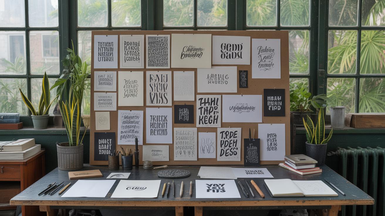
Next, gather your ideas through brainstorming. This isn’t the stage to worry about perfection — jot down any concept that comes to mind. You might sketch rough letterforms or arrange words quickly on paper. This visual thinking often sparks new directions you hadn’t expected.
Here’s a simple way to start:
- Write down the message or purpose of your work.
- Pick a few fonts or lettering styles that might suit your tone.
- Create quick sketches exploring how these fonts interact with your layout.
- Consider the mood or feeling you want your typography to convey.
Once you have your draft, editing becomes crucial. Look closely at spacing between letters and lines — the tiniest adjustment can change how easy it is to read or how the words flow. Sometimes you’ll find a perfectly good font that just needs tweaking to fit your design better.
When you’re ready to finalize, prepare your files depending on the medium. For print, checking resolution and color profiles matters. For digital, make sure your typography scales or adapts across different screens. The finishing touches, though subtle, often separate a rushed design from a carefully crafted piece.
Do you find yourself revisiting your sketches after stepping away for a while? That pause can reveal new flaws or ideas, so consider building in time for reflection. Ultimately, your planning sets the foundation, but your willingness to iterate shapes the final outcome.
Conclusions
Creative typography offers many ways to show your ideas with words. You can choose fonts carefully, play with shapes and spacing, or mix styles to create unique looks. Each project you work on will help you learn more and grow your skills. Using what you have learned here, you can start your own projects and keep improving.
Remember, good typography makes your message easy to read and attractive. Keep experimenting and asking yourself how to make your letters speak louder and clearer. Your creativity in typography will grow with practice and new ideas. Now it’s your turn to bring words to life with exciting typography projects.