
Introduction
Creative book covers hold great power. They do more than protect pages. They invite you in. A good cover sparks your imagination and draws you toward the story or content inside. It is a bridge between the creator’s vision and the reader’s curiosity. This article explores how creative book covers inspire imagination and develop your design skills.
We look at book cover history, design principles, and creativity’s role. Then, we guide you through practical ways to create book covers that communicate well and catch eyes. By understanding these elements, you can learn to design covers that not only look good but also tell stories that capture attention.
History of Book Covers

Book covers began simply as protective layers, meant to shield delicate pages from wear, dirt, and damage. Back in medieval times, covers were handmade, often from wood or heavy leather, sometimes embellished with metal clasps or jewels to guard precious manuscripts. These early covers weren’t designed to catch the eye but to preserve the text within. You might imagine a dusty monastery library where books looked more alike than different.

As printing progressed, so did the materials and techniques. Handmade paper gave way to machine-produced sheets, and bindings shifted from artisan stitches to more uniform methods. Mechanized pressing and gluing techniques enabled covers to be produced faster and cheaper. This shift made books more accessible but also opened possibilities for more creative, varied cover designs.
Over time, the role of the cover grew beyond protection. It became a canvas for storytelling—a way to hint at the world inside. Book covers began to communicate genre, mood, or theme through imagery and typeface. In the modern era, covers are often the first thing a reader notices, influencing buying decisions or sparking curiosity. Think of a striking cover in a bookstore aisle—that’s marketing in action, balancing art and commerce. But sometimes, this intention can conflict: a cover may attract buyers without fully representing the story, leaving you wondering about the balance between honest depiction and eye-catching design.
Principles of Cover Design

When creating a book cover, a few design principles really shape how your work is received. Color is one of the most obvious, but it’s not just about picking what looks nice—you want colors that fit the mood and genre. Think about soft pastels for a gentle story or bold reds for something more intense. Too many colors, though, can confuse the eye; simplicity often helps focus your message.
Typography plays a big role, too. The font you choose should reflect the book’s tone but also stay readable. A serif font, for example, might feel classic or serious, while a sans-serif looks cleaner, maybe more modern. Size matters as well—titles need to stand out, but secondary text, like taglines or author names, shouldn’t compete for attention.

Imagery is tricky. It can be literal or abstract, but it needs to harmonize with the rest of the design. A busy photo might overwhelm, while a minimalist icon might tell the story better. Think of imagery as a first impression—it’ll shape what people expect before they even open the book.
Finally, layout is how you bring everything together. Balance, spacing, and alignment influence how easily someone can take in the cover at a glance. Sometimes off-center titles or unexpected placements can catch attention, but it can backfire if it feels cluttered or awkward. The key might be avoiding a “perfect” rulebook and seeing what feels right for your particular project.
Visual Hierarchy
Visual hierarchy is, well, kind of the backbone of effective cover design. Your eye naturally looks at certain parts first, so deciding what’s most important—the title, the author, or an image—is crucial. Usually, the title gets the spotlight, but not always. Sometimes, a bold image might be what draws readers in before the text does its job.
Size and weight of fonts, contrast between colors, and the position on the cover all direct attention. A bright splash of color on a muted background, for instance, can pull your eye quickly. But don’t assume bigger is always better. Sometimes subtlety leads to curiosity rather than just shouting for attention.
It’s about guiding the viewer—not forcing them—toward what you want them to notice first. This balance can be tricky. Do you want the cover to reveal itself quickly, or slowly, piece by piece? Your choice changes the whole experience.
Typography Choices

Picking the right typography is more than aesthetics—it’s about communication. Fonts carry a personality. A playful, rounded font sets a very different expectation than a sharp, angular one. Choosing the wrong font can mislead readers or make the cover feel disjointed.
The size of the text affects readability. Long titles might need smaller fonts, but don’t shrink them so much that they’re hard to read from a distance. On the other hand, sometimes a very large, dramatic font can dominate the cover and leave no room for other elements. It’s a balancing act.
Spacing, line height, and letter spacing also impact how the text feels. Crowded fonts can create tension, while generous spacing might convey openness. And don’t forget about legibility on different formats—what looks good as a print cover might not work as a thumbnail online.
In my own experience, I’ve found that testing fonts in different lights and sizes helps catch uncomfortable choices before finalizing. Have you tried flipping through your cover at different scales? It’s revealing.
Using Creativity in Design


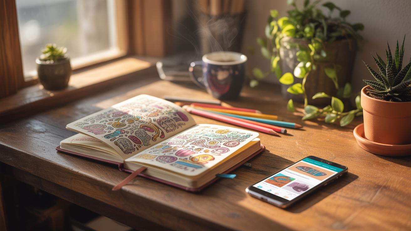
Finding ways to unlock creativity when designing book covers can be tough. Sometimes it feels like ideas just don’t flow. But there are several techniques that might help nudge your thinking in fresh directions.
Start with brainstorming sessions where you let all ideas spill out—good, bad, or weird. Sketch thumbnails fast without judging them. Ask yourself questions like, “What if this cover screamed mystery instead of whispering it?” or “How would the story look if transformed into a symbol rather than an image?” Even something as simple as switching mediums, say from digital to hand-drawn, can spark new concepts.
Breaking conventions can make a cover stand out. Using unexpected color combinations or unusual layouts grabs attention. But it’s a bit of a gamble. Some readers might find these choices intriguing, while others might see them as confusing. Finding the balance between striking and alienating can be tricky, and sometimes the risk pays off—sometimes it doesn’t.
At times, you might wonder if breaking all rules dilutes the message or makes the design lose clarity. It’s an open question. Creativity in book covers is often about pushing boundaries carefully but also listening to what the design truly needs.
Inspiring Imagination


Book covers have this curious power to spark imagination even before you turn the first page. When you glance at a well-designed cover, it might plant a seed of questions or visions in your mind. Sometimes, just a hint of an image or a particular style can set your thoughts racing—what could this story be about? It’s the cover’s ability to open a small door into the world inside the book that really catches attention. You might find yourself lingering on the design longer than expected, caught in the promise of an untold story.
Imagery Impact
Images on a book cover do more than decorate; they build a mood. A shadowy forest can feel mysterious or ominous, while a bright city scene might suggest energy or chaos. The key lies in the subtle cues—colors, composition, and focus—that nudge you toward feeling curiosity or anticipation. Sometimes the image is straightforward, other times vague or abstract, but either way, it should make you pause, ask questions, or wonder what happens next. This visual invitation often decides if you pick the book up or just walk on by.
Symbolism and Themes
Symbols on covers serve as silent messengers, hinting at deeper themes or ideas without spelling everything out. Think of a cracked clock for time slipping away, or a lone bird for freedom and isolation. These elements layer meaning onto the design, enriching your interest. They’re not always obvious; sometimes they’re subtle enough to reveal more with each glance or reread. When these symbols connect with the story’s themes, they create an added bond between reader and book, encouraging you to uncover the significance behind the visual clues. This interplay can be quietly compelling, even if you don’t immediately realize why.
Skill Development in Design

Designing book covers isn’t just about throwing together images and text. It demands a mix of hard technical skills and softer creative abilities that often develop over time and through trial. You might be surprised how much just consistently practicing can boost your skill set.
Technical skills form the foundation. Knowing your way around graphic software like Adobe Photoshop or Illustrator is practically a must. But don’t stop there—understanding color theory can entirely change how your design feels and communicates. Think about contrast, harmony, and emotional impact of colors. Typography also plays a crucial role; choosing and pairing fonts well can either pull a cover together or leave it feeling off. It’s often through repetition and projects that these skills start to feel intuitive.

Creative skills go hand in hand with this. Creativity isn’t just coming up with wild ideas; it’s about shaping concepts that connect with the reader in subtle ways. I’ve noticed that imagination fuels the ability to explore unexpected solutions—not just in visuals but in how the cover tells part of the story. Problem-solving too becomes critical, especially when you’re dealing with client limits or tricky themes. Sometimes it feels like a puzzle that pushes you beyond your comfort zone. Maybe you struggle with generating fresh ideas but rethinking your approach—looking at covers you admire or switching up your process—can help reignite your creative spark.
Both kinds of skills require patience and curiosity. Are you curious enough to keep learning and making mistakes? Because, honestly, that’s a big part of growing as a book cover designer.
Tools and Software

When it comes to creating book covers, the choice of tools can shape not only the design process but the final look quite a bit. Graphic design programs like Adobe Photoshop and Illustrator remain favorites because they offer control over details and let you work with layers, colors, and typography with precision. Photoshop is great for photo editing and texturing, while Illustrator shines when you need sharp vector shapes and scalable logos. If you ask me, jumping into these programs can be overwhelming at first. But once you get a handle on basic tools, your designs start to take shape faster than you’d expect.
On the other hand, more approachable options like Affinity Designer or even CorelDRAW also provide solid features without the heavy price tag or subscription lock-in. They aren’t quite industry standards but often get the job done with fewer distractions.
If you’re just starting out or want something quicker, online platforms such as Canva and Adobe Express offer templates tailored for book covers. These resources limit customization but can be a fast way to produce something decent without investing tons of time. The trick is knowing when to stick to templates and when to push beyond them. Sometimes, you might find the template stifling, yet at other times, it’s precisely the nudge you need to get moving.
One thing to keep in mind: no single tool does everything perfectly. Your project might need a combination—maybe photo edits in Photoshop, then layout tweaks in InDesign, alongside some quick mockups in Canva. Playing around, mixing tools, and learning their quirks often leads to stronger outcomes. What feels right for you will probably evolve as your skills develop and your creative vision sharpens.
Trends in Book Covers

Book cover design trends shift with time, but two styles have really caught the eye recently: minimalist designs and bold typography. These choices might seem almost opposite but share a surprising connection—they both focus on grabbing attention quickly in a busy market.
Minimalist Designs
Minimalism in book covers has grown, maybe because people now scan shelves and digital stores fast, looking for something simple yet striking. Minimalist covers often use limited colors, clean lines, and plenty of white space. This approach avoids clutter and speaks directly, which can feel refreshing amid visual noise. It’s interesting—sometimes less really does capture more.

Why does minimalism appeal so much today? Maybe it taps into a desire for calm and clarity. Or maybe readers think a minimalist cover signals a confident story, not needing flashy distractions. You might notice how a single symbol or a few shapes can intrigue you more than a detailed image. It’s subtle but purposeful.
Bold Typography
Bold typography stands out as a powerful tool, often taking center stage on covers. Designers use creative fonts—thick, unique, or even hand-drawn—to add personality without extra imagery. In some cases, type hits you almost like a visual shout. That immediate impact can make the title memorable, especially when paired with simple backgrounds.
But there’s a risk, too. Overusing bold fonts can overwhelm or confuse readers about the book’s tone. Striking a balance is tricky and depends on the genre and audience. For example, a thriller might benefit from jagged, sharp letters, while a literary novel leans towards elegant, restrained typography.
Have you ever picked up a book simply because the title design caught your eye? That’s the subtle power at play in these trends. Both minimalism and typography speak volumes without saying too much—an approach that really shapes how you and others decide what’s worth reading.
Cultural Influence

Culture shapes more than just the story inside a book. It quietly guides how a cover looks, what colors catch attention, and which symbols resonate. You might think a red cover is bold everywhere, but in some cultures, red suggests celebration, while in others, it hints at warning or danger. Knowing your audience’s cultural background helps you avoid mismatched designs that distract rather than attract.
Take market preferences, for example. Some readers favor minimalistic covers with subtle tones, while others expect bright, detailed imagery rich with symbolism. A fantasy novel with dragons might feature sleek, dark art in one country, but bold, colorful dragons in another, catering to local tastes.
When books get translated, covers often change too. It’s not just about language—the cover must speak to a new culture’s expectations. Publishers might swap designs to appeal more directly to local customs or trends. A thriller’s cover in Europe might lean on suspenseful shadows, whereas in Asia it could emphasize vibrant action scenes.
Understanding cultural influence means asking: Will this cover feel familiar and inviting? Will it honor what readers care about visually? It’s tricky, sometimes puzzling. But ignoring culture risks losing the connection that makes a cover truly work.
Practical Design Steps

Planning and Research
Before you put pen—or rather pixels—to paper, gathering solid information about the book is critical. Start by reading the manuscript or at least a detailed synopsis. What mood does the story set? What themes stand out? Sometimes I’ve found that even a small hint in the author’s notes can spark a fresh direction.
Next, think about the audience. Who are they really? What do they expect, and what might surprise or intrigue them? It’s not always obvious, so try to sketch out personas or profiles. This little exercise often shifts your approach in unexpected ways.
Then come the competitors—other books in the same genre or on similar topics. What covers clutter the shelves or digital marketplaces? Observe what works and what feels tired. But don’t just copy; rather, find gaps or fresh angles where your cover can stand apart.
Execution and Feedback
With your research done, begin sketching ideas. I mean rough, messy sketches. Don’t aim for perfection right away. This phase is about exploration. Sometimes the best cover concept comes from a failed draft that you almost threw away.
Next, develop a few polished drafts. Try different color schemes, typography layouts, or illustration styles. Show these to others—friends, potential readers, or even strangers. Feedback can sift perspectives you hadn’t considered, but be ready for conflicting opinions. It’s normal to feel stuck between contrasting views.
Refine your design based on that feedback, but trust your instincts too. Occasionally, pushing against what people say results in the most interesting outcome. Repeat this cycle until your cover feels right. Sometimes it’s dirt under the fingernails work; other times, a sudden tweak makes everything click. There’s no guaranteed formula—only your judgment and patience.
Conclusions
Creative book covers combine art and communication. They tell a story before you open the book. Throughout this article, you learned how book covers evolved from simple protection to vital marketing tools. You explored design principles and how creativity and imagination play key roles in shaping memorable covers. Developing these skills will improve your ability to create covers that stand out.
Your new knowledge lets you approach book cover design with clear goals. You can plan covers that fit the book’s message and catch your audience’s eye. With imagination and skill, you create art that invites readers in. Use this guide to start designing book covers that inspire and communicate.


