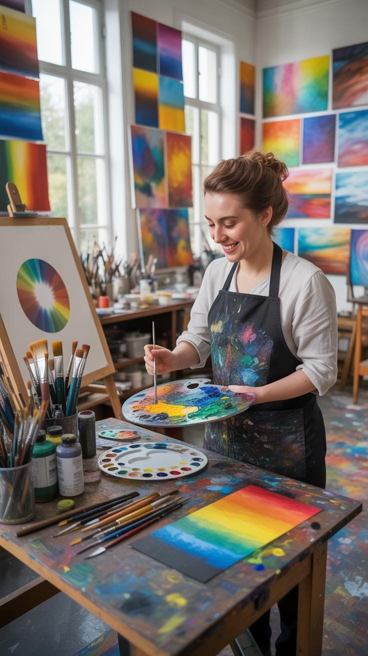
Introduction
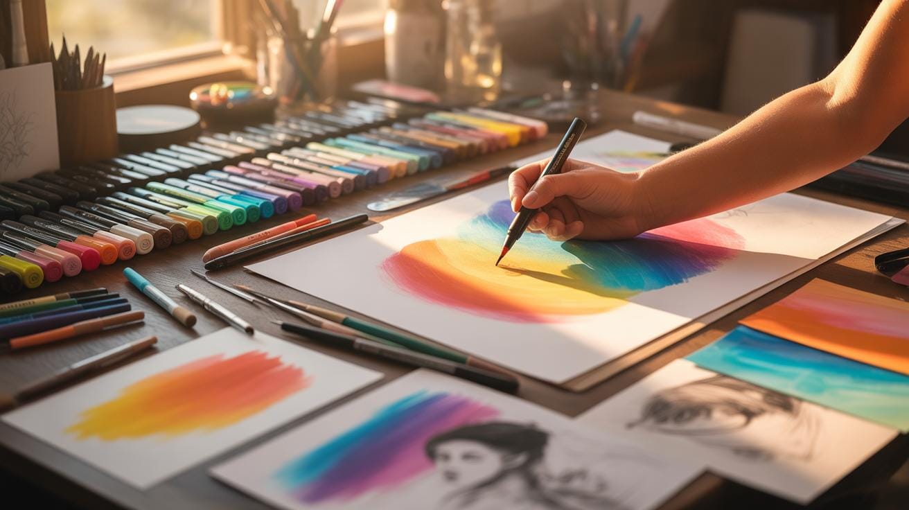
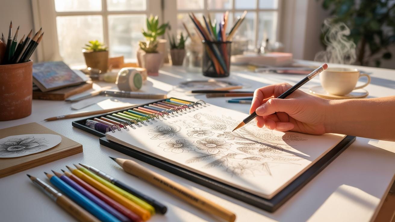
Coloring with alcohol markers offers rich, vibrant hues and smooth blending, popular among artists and hobbyists. Improving your skills with these markers can significantly enhance your artwork. This article provides practical coloring tips to help you get the most out of your alcohol markers.
You will learn essential techniques for blending colors, protecting your tools, and layering for depth. These tips are designed for both beginners and those wanting to refine their craft. Following these practices will help you create clean, professional-looking artwork with your markers.
Choosing The Right Alcohol Markers
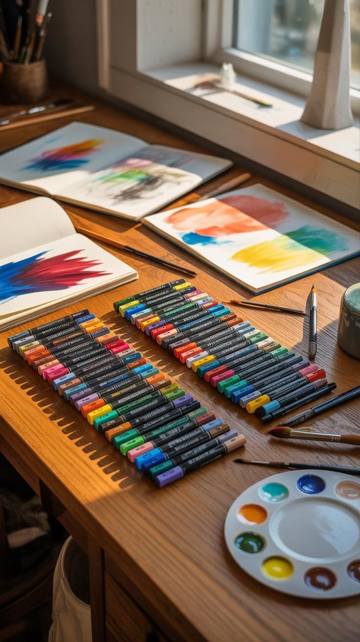
Picking alcohol markers isn’t as straightforward as it might seem. There are a few things you might want to weigh before making your choice — brands, color range, price, and nib types all play significant roles.
Brands can differ a lot. Some makers focus on high-quality ink that blends smoothly without streaks, while others offer more affordable sets that may have a limited color range or less consistent flow. You might find yourself torn between going for a premium brand or sticking with budget-friendly options, especially if you’re just starting out and not sure how quickly you’ll use them.
The color range also matters. If you like having a rich palette, then look for sets with a broad selection of shades and skin tones. You may not need a 100-color set, but having more than just a dozen can make blending and shading easier. Conversely, fewer colors could push you to get creative mixing, which isn’t a bad thing either.
Nib types—fine, broad, brush—affect how precise or broad your strokes are. If you care about detail work, fine nibs are essential, but having broad nibs can speed up covering large areas. Brush nibs add flexibility but can take some practice to control.
Price often nudges decisions too. Higher-end markers tend to last longer and have richer ink, but even cheaper markers can yield decent results if you adjust your technique.
Popular Marker Brands And Features
Brands like Copic, Prismacolor, and Spectrum Noir dominate the market for alcohol markers, each with defining traits that artists swear by.
- Copic is often praised for its vibrant, blendable ink and replaceable nibs. They feel sturdy and come with an airbrush-type broad nib and a brush nib that’s flexible for detailed work.
- Prismacolor markers offer a smooth laydown of ink with a decent color range, though they aren’t as blendable as Copic. If you don’t mind less expensive options but want consistent color, they’re worth considering.
- Spectrum Noir tends to attract hobbyists with affordable starter sets, decent ink flow, and colorful options, though some find their colors less saturated.
Choosing among these brands might come down to what feels right in your hand and your budget. It’s often helpful to test a few markers before committing to a full collection.
How Nib Types Affect Coloring Control
Your preferred nib can make or break your coloring experience. Let’s break down the common types:
- Fine nibs offer precision for small details, making them ideal for line art or intricate patterns. They’re less suited for large areas because you’ll spend more time covering space.
- Broad nibs cover large spaces quickly and provide more even saturation but might be clumsy when you need detail.
- Brush nibs mimic the feel of a paintbrush—flexible and versatile. They allow for both thick and thin strokes but require some practice for steady control and consistent line weight.
Often, the best sets include a mix of nibs, letting you switch depending on what your art piece demands. You might prefer broad tips for backgrounds and fine or brush tips for details. The interplay between nib shapes and sizes often defines the texture and feel of your finished piece.
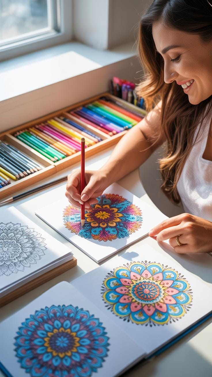
Coloring Tips For Improving Coloring Skills With Alcohol Markers
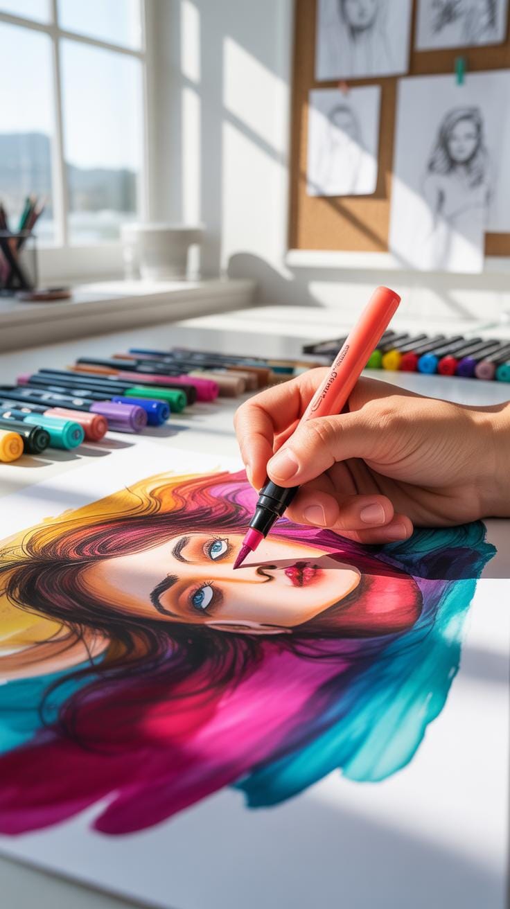
When working with alcohol markers, there are a few subtle things you might want to keep in mind to get the most out of your coloring experience. For one, it’s useful to test your markers on a scrap piece of the paper you’re using. This helps you get a feel for how the ink flows and how the colors layer or blend—because, honestly, every marker and paper combo behaves a little differently.
Don’t rush your strokes. Alcohol markers work best with some patience. Colors may need a moment to “settle” or blend into each other, so layering gently and gradually often yields better results than heavy-handed coloring all at once. You might find you need to go back with a lighter color to soften some edges or smooth out a gradient, which is something I often forget at first.
One handy trick is to use the side of the marker tip instead of the point for broad areas—it offers a more even coverage and saves your nibs from wearing out too fast. For details, switch back to the fine tip, but keep your hand light. Pressing too hard won’t make the colors more intense and can create unwanted texture.
Also, think about marker storage during a session. Keep your caps tightly closed between colors to avoid drying out, but it’s okay to leave them out briefly if you’re switching back and forth quickly. That said, be mindful of your strokes’ direction; following the natural lines or shapes in your drawing can enhance the overall depth and realism.
And, sometimes, less is more. Overworking an area too much might lead to unwanted streaks or bleeding. If you notice bleeding, pause and give the ink a second to dry before adding more layers. It helps keep your coloring neat.
Mastering Blending Techniques
Blending alcohol markers is a bit of an art, and getting it right can seriously up your coloring game. You can try different methods like fades, gradients, and mixing colors to create more depth and interest in your work.
For fades and gradients, layering is key. Start with your lightest shade and gradually add darker tones, overlapping each layer while the ink is still wet to get that smooth transition. It takes a bit of patience to find the right timing — if the first layer dries, the colors won’t blend as well.
Mixing colors can bring unexpected results. Try applying one color and then adding another on top while it’s still wet to see how they merge. Sometimes, some colors blend better than others, so don’t hesitate to experiment to discover what works best for you.
Step By Step Guide To Smooth Fades
Creating smooth fades is about layering and patience. Here’s a simple approach:
- Begin with your lightest color and cover the entire area.
- While it’s still damp, add the next darker color at one edge and feather it inwards.
- Go back over the transition area with the lighter color to soften the border.
- Repeat with darker shades if needed, always working from light to dark.
You might find that sometimes going back with the light color helps blend better than pushing dark tones around too much. Don’t rush—let each layer settle slightly before adding the next.
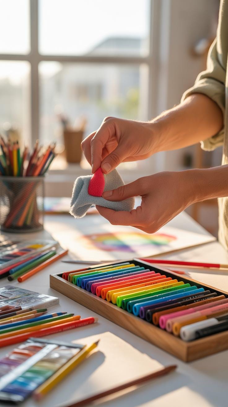
Using A Colorless Blender Marker
The colorless blender isn’t just a tool for erasing or lightening colors, though that’s a common misconception. It’s actually pretty useful for softening edges between colors and mixing shades subtly.
When you run the blender along the edge of two colors, it lifts some pigment and helps the tones flow into each other without harsh lines. Sometimes, I use the blender in small circular motions to mix two colors into a new shade right on the paper.
Be cautious though—not every paper reacts the same way, and overusing the blender might distort the texture. It’s best to test it out before applying it on your main piece.
Caring For Your Markers Daily
When it comes to alcohol markers, daily care can feel like a bit of a chore, but it makes a noticeable difference. One simple habit: always cap your markers tightly after use. It’s easy to overlook, but a loose cap lets the ink dry out faster. Sometimes, I’ve found myself setting caps down casually—only to face a marker that’s lost its smooth flow by the next day. So really, just snapping that cap firmly back on is a small step that pays off.
Cleaning marker tips is another aspect many skip, but it helps keep colors true and nibs responsive. If you notice ink buildup or bleeding, gently wipe the tip with a damp cloth or a paper towel. Rinsing with a little rubbing alcohol can clear stubborn stains, but be gentle—overcleaning might wear down the nib faster. On the upside, this routine helps you spot early signs of damage, so you can adjust before things get worse.
Storing your markers right after use matters just as much. Ideally, keep them in a case designed for markers or a container with enough room so they don’t rub against each other roughly. Crammed spaces can bend nibs or cause caps to loosen. I once stuffed my markers in a tight box, only to find some tips flattened the next time I pulled them out. Simple storage changes help avoid that kind of damage.
Protecting And Storing Marker Tips
Marker nibs are a marker’s most sensitive part and can dry out or get damaged quickly if not treated with care. You might think that just capping markers is enough, but sometimes caps don’t seal perfectly. Giving the nib a quick check before capping can help. If you see ink crust or paper fibers stuck to the tip, gently clean it off. It might seem minor, but that buildup can interfere with smooth coloring later.
Using the right technique to cap markers is key. I found that pressing the cap firmly but not too hard avoids bending or crushing the nib inside. Also, don’t ever leave markers uncapped, not even for a minute. The alcohol-based ink evaporates rapidly. If you happen to forget, soak the nib in marker solution or alcohol briefly to refresh it, but this isn’t a fix you want to rely on all the time.
When it comes to long-term tip care, remove the nib occasionally if your marker allows it. Soaking it carefully in cleaning fluid and allowing it to dry before reinserting can prolong life. Just be cautious with this process—improper handling might cause more harm than good.
Layering Colors For Depth And Texture
When you layer different tones and shades with alcohol markers, you start to add real depth to your coloring. It’s like slowly building the shape and contours instead of applying flat color. The trick is to think of layering as a process of adding dimension rather than just filling space.
Try using lighter shades first. This gives you a base that won’t overwhelm the paper or cause it to buckle. Then, go back and add mid-tones, blending gently into the lighter color. Finally, apply the darkest tones sparingly where shadows or deeper areas occur. These layers together create subtle texture and a sense of volume.
What about the paper? Alcohol markers can saturate it quickly if you’re not careful, so building layers slowly is essential. Use a light touch and allow each layer to dry before applying the next one. It might feel tedious, but it helps avoid blotchiness and preserves the paper’s integrity. You’ll notice that the colors meld more realistically this way.
Using Contrast To Highlight Details
Contrast is what makes your artwork pop. You don’t want everything to look uniform. Adding shadows and highlights guides the viewer’s eye and reveals details that might otherwise be overlooked. For shadows, choose a slightly cooler or muted dark tone than your main color. This helps create the illusion of depth without harsh lines.
Highlights? Leave some spots lighter or even use a white gel pen to add tiny reflections. It’s surprising how small touches can bring life to the piece. One thing I learned is not to overdo it—too much contrast can look artificial. Instead, think of it as a dance between light and dark, softly emphasizing the important parts.
Comparing Alcohol Markers With Other Markers
Alcohol markers differ quite a bit from water-based and oil-based markers in their behavior and usage. In terms of blending, alcohol markers stand out for how smoothly their colors merge. This is because the alcohol solvent keeps the ink wet longer, allowing for subtle gradient effects when colors overlap. Water-based markers, on the other hand, dry faster and can sometimes leave streaks if you try to blend too much. Oil-based markers are typically harder to blend since their inks dry quickly and have thicker consistency.
When considering drying time, alcohol markers dry relatively fast but not instantaneously, striking a balance between water and oil markers. Water-based inks evaporate quickly but can be reactivated with water, whereas oil-based inks tend to set almost immediately and are less forgiving if you want to fix mistakes.
Regarding application, alcohol markers usually work best on smooth, bleed-proof papers. They penetrate paper fibers and give a consistent finish. Water-based markers react with the water content in paper differently and can sometimes warp thin sheets. Oil-based markers can be used on a variety of surfaces, including non-porous ones, but their finish is often less vibrant on paper.
Advantages Of Alcohol Markers
Alcohol markers have some clear benefits that often make them a go-to choice:
- Quick drying time balances productivity and ease of blending.
- Colors blend smoothly, ideal for shading and gradients.
- They produce vibrant, clear hues that stand out on paper.
- Alcohol-based inks are less prone to water damage once dry.
- Markers tend to have dual tips, offering versatility for details and coverage.
From my experience, the vibrancy and blendability of alcohol markers often feel unmatched when creating detailed illustrations or coloring complex designs.
When To Choose Other Marker Types
Despite their strengths, alcohol markers aren’t always the perfect fit. You might prefer water-based markers when working on watercolor paper or when you want the ability to lift or dilute colors with water. They’re also less likely to bleed through thin papers, which can be a concern with alcohol markers.
Oil-based markers shine for projects on unconventional surfaces like wood, metal, or plastic where alcohol or water-based inks might fail to adhere properly. Their fast drying and waterproof nature make them suited for more industrial or craft applications that require permanence.
So, the choice depends on your medium, surface, and the effect you want. Sometimes, mixing marker types or switching depending on your project’s phase can actually bring fresh and interesting results, rather than sticking to just one.
Avoiding Common Coloring Mistakes
When working with alcohol markers, beginners often fall into a few traps that can be avoided with some careful practice. One frequent error is over-saturating the paper with ink, causing unwanted bleed through or patchy areas. It might be tempting to layer until the color looks right but consider patience; giving the paper a moment to absorb can make a world of difference.
Another issue is harsh edges between strokes, which can break the illusion of smooth blends. Instead of pressing hard or turning the marker abruptly, try gentle, consistent strokes and use a lighter hand for layering. It’s easy to feel frustrated when the colors don’t blend perfectly, but touch-ups and layering can help soften those divisions over time.
How To Prevent Paper Bleed Through
Choosing the right paper is crucial in managing ink flow. Many markers can soak through thin paper, ruining your artwork or the next page. Look for marker-specific or bleed-proof paper that is thicker with a smooth surface; it may just solve many problems before you begin.
Controlling ink saturation means avoiding heavy, repetitive strokes on the same spot; instead, spread the ink out and work in layers. If you notice the color pooling or bleeding, try lifting some with a paper towel or use a lighter color over the spot to spread the ink gently.
Fixing Uneven Color Patches
Uneven patches or harsh edges don’t mean you have to start over. Often, going back with a colorless blender or a lighter shade allows you to smooth out rough areas. If a spot looks too dark or blotchy, layering a light color on top can blend the transition.
Take your time with these fixes. Sometimes, blending while the ink is still wet works best; other times, waiting till it dries and then gently layering is the smarter choice. It can feel a bit like trial and error but developing these observations improves your control and technique in the long run.
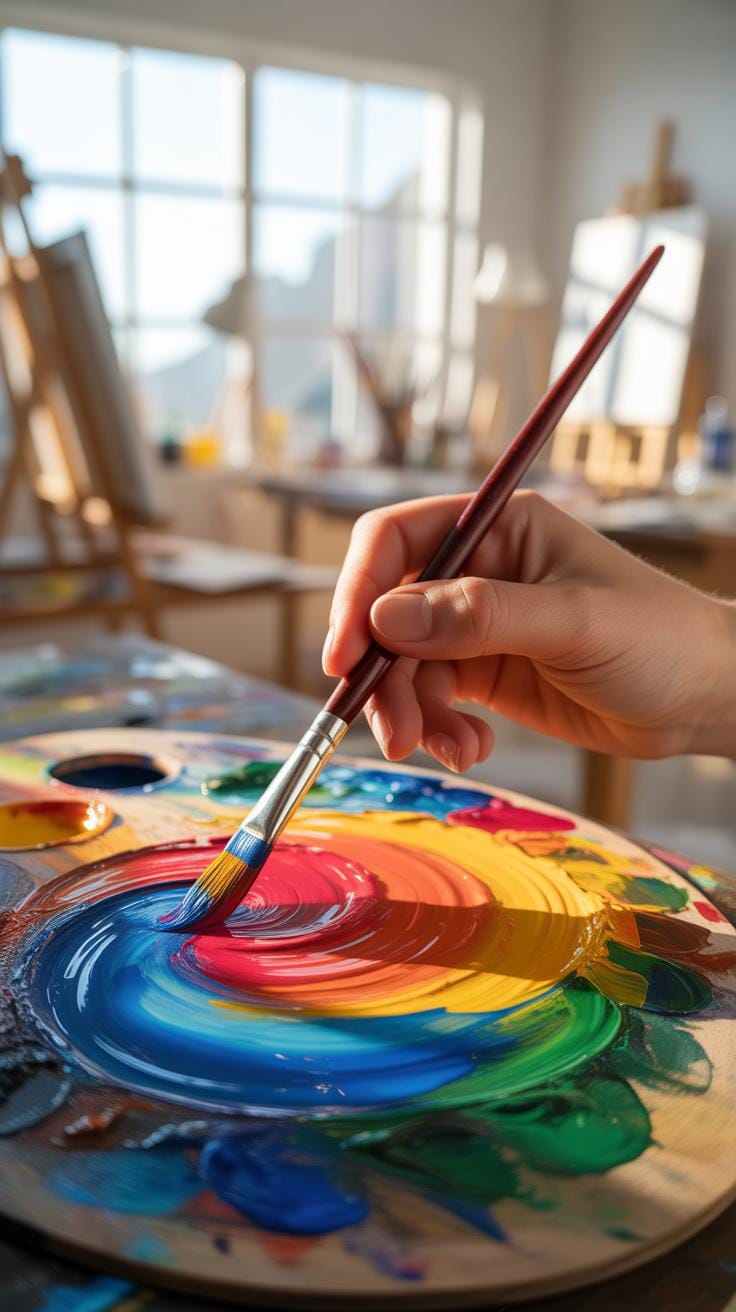
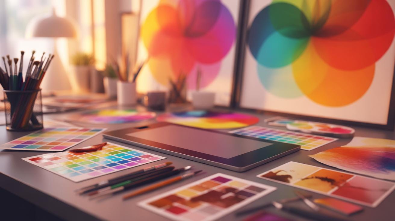
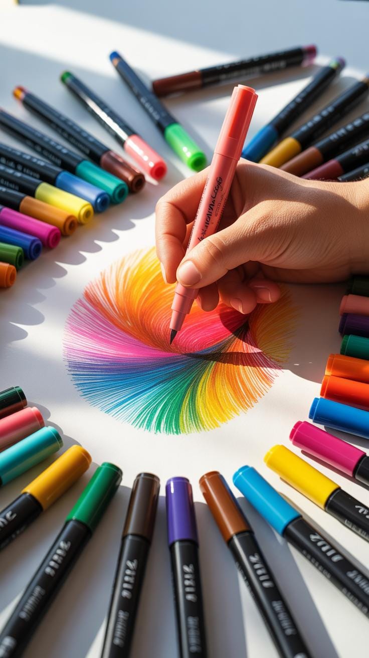
Using Color Theory In Your Work
Color theory is a fascinating mix of art and science that helps you understand how colors interact and influence each other. When you’re choosing and combining alcohol marker colors, it’s useful to know some basic principles. For example, colors opposite each other on the color wheel—complementary colors—create a striking contrast that can make your art pop. Then you have analogous colors, which sit next to each other and offer a more harmonious and blended look. Triadic schemes, involving three colors evenly spaced around the wheel, provide a balanced yet lively palette.
Applying these ideas might sound straightforward, yet it often requires a bit of experimenting. Try pairing colors and then step back to see how they feel. Is the contrast too harsh? Or maybe too dull? Color theory isn’t a strict rulebook but more like guidelines to give your work a sense of unity or tension, depending on what you want.
Thinking about mood is another angle. Warm colors like reds and oranges tend to evoke energy or coziness, while cool blues and greens often feel calming or distant. Combining these intentionally can help you direct the viewer’s emotional response. Sometimes, mixing warm and cool colors in unexpected ways creates a dynamic tension that keeps the eye interested. Don’t hesitate to play with these concepts in your art to find what works best for your style and message.
Using Texture Techniques With Markers
Creating textures with alcohol markers can really bring your art to life. For instance, when you’re aiming for fur, think about short, directional strokes that follow the natural growth of the hair. With wood, using longer, slightly curved strokes in the direction of the grain helps a lot. Metal finishes need sharper, more deliberate strokes to mimic the glint and smooth surface. It isn’t always straightforward, though—sometimes the same stroke can look different depending on pressure and ink flow.
Brush Stroke Techniques For Textures
The way you move your brush or nib changes everything. For fur, try quick, light flicks with the tip of the marker to mimic strands. For wood, a gentle back-and-forth or circular motion works well to suggest knots and grain. Metal calls for firm, clean strokes, sometimes layering short dashes to imitate scratches and reflective surfaces. Switching between nib edges can add variety too—flat edges for broader texture, fine points for detail.
Combining Colors To Enhance Texture
Layering isn’t just about adding depth; it’s about capturing how light plays on different surfaces. With fur, layering varied shades from base to highlights creates that soft, natural look. Wood often benefits from contrasting warm and cool browns to indicate shadows and highlights in the grain. Metals? Think reflective—layer darker shades first, then add touches of whites or very pale hues where light hits strongest. Sometimes blending colors with a colorless blender helps smooth transitions but don’t overdo it—you want some edges crisp to keep the texture believable.
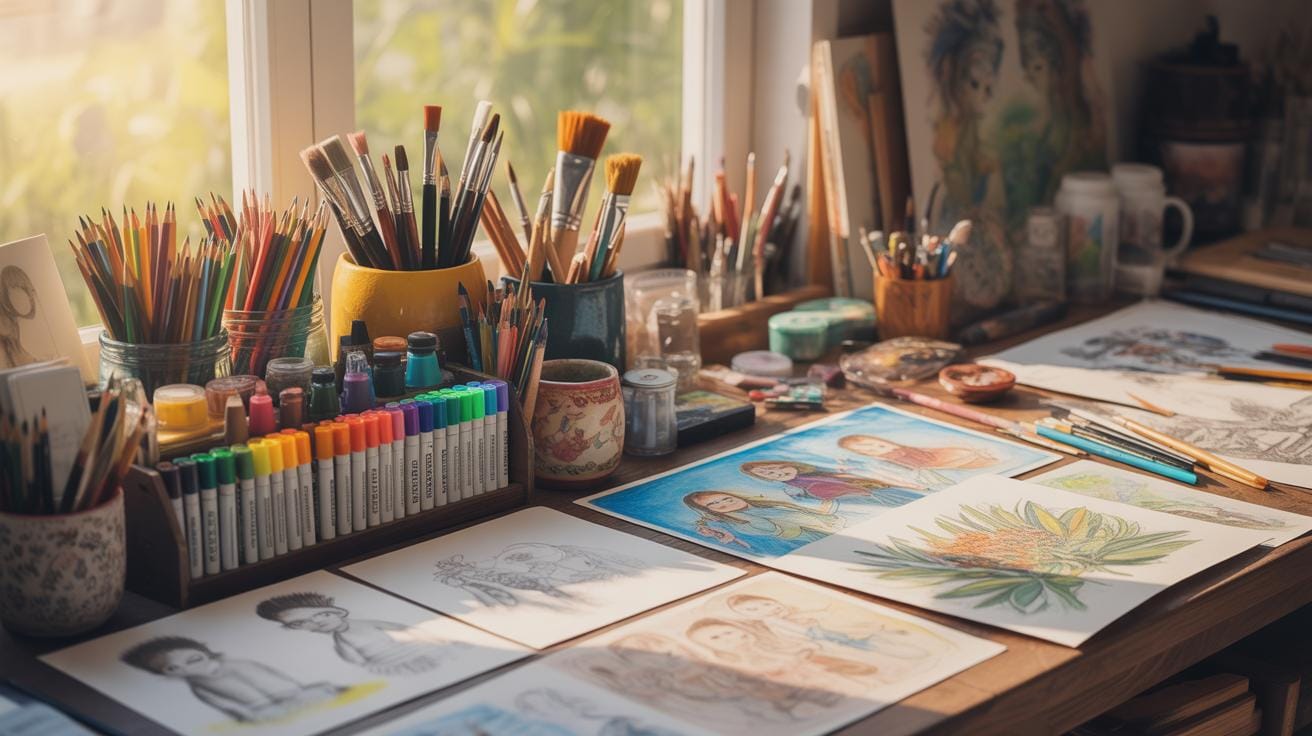
Practice Checklist For Consistent Improvement

Building steady skills with alcohol markers needs more than just random scribbling. Having a checklist helps to keep your practice focused—kind of like a roadmap for your progress. Here’s a simple routine you might try daily or weekly to stay on track:
- Warm up with basic strokes: straight lines, circles, and hatching to loosen your hand.
- Practice color blending with two or three shades each session.
- Work on layering by applying inks repeatedly without over-saturating the paper.
- Try quick sketches to improve speed and confidence.
- Review your previous work briefly; note any trouble spots.
- Experiment with new color combinations or paper types occasionally to expand your range.
Consistency beats occasional marathon sessions. Even 15 minutes can lead to noticeable improvement.
Daily Warm Up Exercises
Before diving into detailed work, spend some time warming up your marker control. I often start with simple exercises like drawing parallel lines, then cross-hatching, and finally filling small shapes with gradients. It sounds dull, but this prepares your wrist and fingers to handle blending and smooth strokes better—so it’s worth the time.
Try blending two colors in a small circle or stripe to feel how the ink behaves. Push yourself gently to control color transitions without harsh edges. Don’t worry if it looks messy; this is just you getting comfortable.
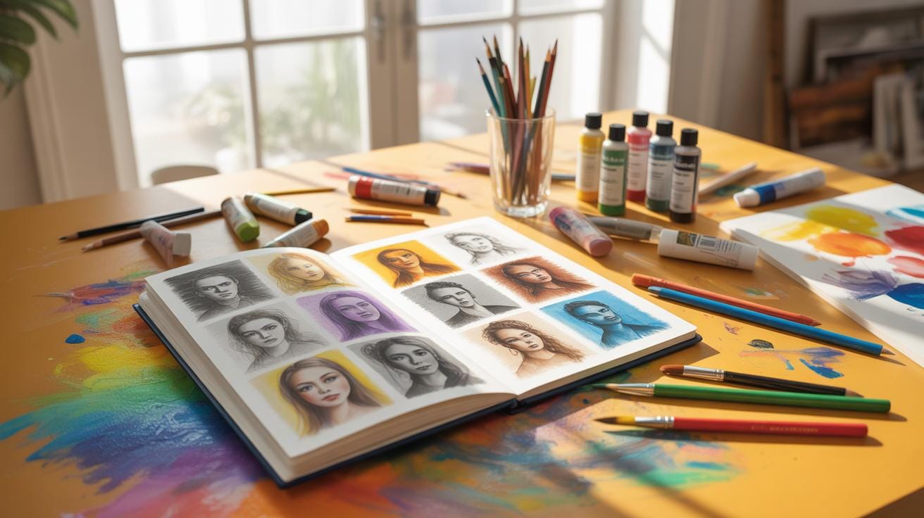
Tracking Progress With Sample Sheets
One effective way to monitor your improvement is by maintaining colored sample sheets. I keep sheets with swatches of all my marker colors, noting how they blend or layer together. Next to each swatch, write quick notes on the type of paper used and any blending tips you discovered.
Update these sheets as you practice new techniques or discover better color combos. Over time, they become personalized reference guides, helping you avoid repeating mistakes and encouraging you to try new methods confidently.
Conclusions
Practicing smooth blending techniques and protecting your marker tips lengthen the life of your tools and improve your results. Layering colors with proper technique adds depth and realism to your work. Each tip helps you use your alcohol markers more efficiently and effectively.
By applying these methods, your coloring skills will grow steadily. Your projects will show more precision and richness. Keep experimenting and caring for your markers to unlock your full potential in art with alcohol markers.