Introduction
Color theory art examples show how different colors can be combined to create strong, appealing designs. This article shares practical tips you can use to choose colors that work well together. Understanding color theory helps you pick the right shades for your art projects.
We will cover what color theory is, why it’s important, how to use color wheels, and examples of how colors affect the mood and style of artwork. By the end, you will know how to apply color combinations effectively in your own creations.
Basics Of Color Theory Art
Color theory is basically a framework that helps artists understand how colors interact. It’s not just guesswork; it’s a kind of system that artists have used for centuries to mix colors properly and make their work more visually interesting.
At its core, color theory starts with three primary colors: red, blue, and yellow. These colors are unique because you can’t create them by mixing other colors. From these primaries come secondary colors—green, orange, and purple—which are formed by mixing two primary colors.
Then there are tertiary colors, which are made by blending a primary color with a neighboring secondary color, such as red-orange or blue-green. This category adds more subtlety and range to any palette.
Ultimately, color theory offers artists a guide for mixing hues and crafting combinations that catch the eye and evoke emotions. It’s both a practical tool and a creative compass for artistic expression.
Primary, Secondary And Tertiary Colors
Understanding these categories is pretty straightforward but essential. Primary colors (red, blue, yellow) are the roots from which all others grow. You can think of them as the building blocks.
Secondary colors (green, orange, purple) are direct mixes of two primaries — for example, blue and yellow make green.
Tertiary colors come next. They aren’t just random mixes but blends of a primary and an adjacent secondary, like red-orange or yellow-green. Tertiary colors fill in the gaps between primary and secondary hues, giving artists more options to create depth and nuance.
How Color Wheels Help Artists
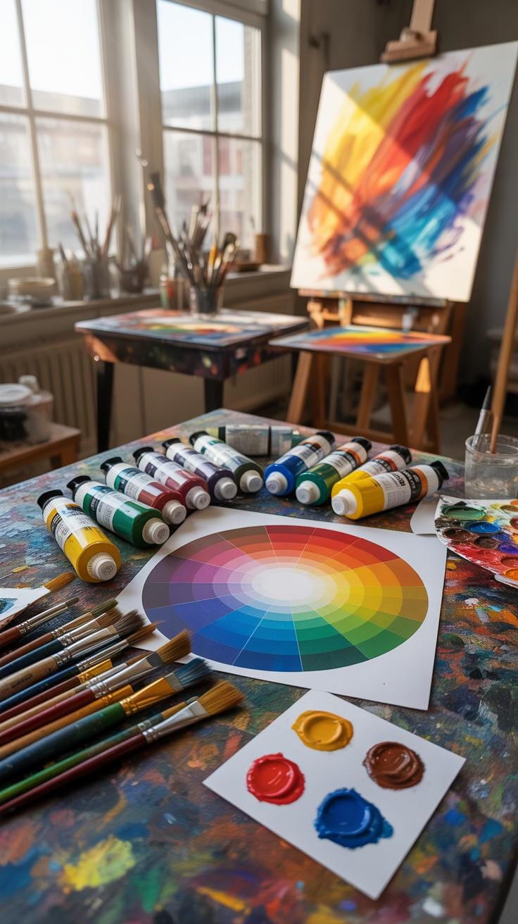
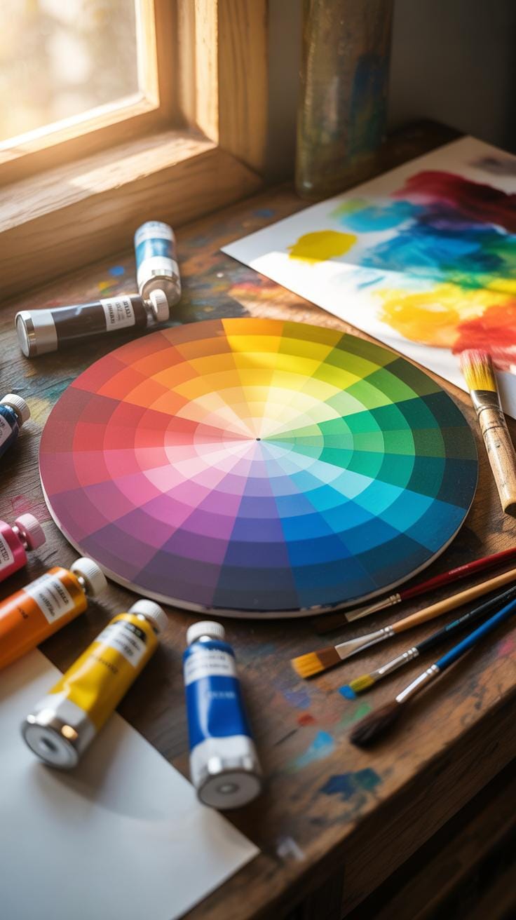
The color wheel is a handy tool that organizes colors in a circle, showing their relationships visually. It’s a way for artists to quickly see how colors relate to each other.
Using the wheel, artists identify several schemes:
- Complementary colors: Opposite colors on the wheel, like blue and orange, create vibrancy when paired.
- Analogous colors: Colors next to each other, such as blue, blue-green, and green, blend smoothly for a harmonious look.
- Triadic colors: Three colors evenly spaced around the wheel, like red, yellow, and blue, offer balanced contrast.
This simple circle shapes an artist’s approach to selecting palettes, mixing colors, and arranging visual compositions that appeal to viewers in often surprising ways. Have you noticed how some color combinations just feel right? The color wheel might be why.
Why Color Combines Matter In Art
When you think about color combinations in art, it’s not just about looking nice, right? These choices shape the mood of the entire piece. A painting stiff with the wrong colors can feel cold or chaotic, while just the right blend can pull your eye exactly where the artist wants. Color harmony isn’t only about balance; it controls how you react emotionally to the work. Sometimes, subtle mismatches create tension that keeps you hooked, while smooth blends ease your mind. I guess it’s like music—some notes clash, some soothe, and that mix alters what you feel. So, color combos act like silent guides through the artwork’s message and feeling.
Effects Of Contrast And Harmony
Contrast and harmony play kind of opposite but equally important roles in art. High contrast grabs your attention, sparks energy, and creates visual excitement—like a red dot on a black background. It can make a scene jump out and keep you alert. On the other hand, harmonious colors work together to create calmness and unity. Think of a sky painted with different blues or a gentle blend of greens. That’s a quiet, restful effect. Sometimes, artists use both together, making parts of the painting pop while the background stays soft. It’s a delicate balancing act between tension and peace.
How Colors Influence Emotion
Colors speak in emotions, though perhaps not in a universal language. Warm colors like reds, oranges, and yellows often bring energy, warmth, or urgency to a piece. They make some artworks feel alive or even aggressive. Conversely, cool colors such as blues and greens tend to calm the senses, making scenes feel peaceful or sometimes detached. But here’s the catch: context matters. A blue under harsh light might feel cold and distant, but under soft light, it suggests serenity. And combinations can mix emotions—warm and cool together can create intriguing tension or harmony depending on their balance. Ever noticed how a sunset can feel hopeful yet melancholic at the same time? That’s colors pulling multiple emotional strings.
How To Use Color Wheels For Art
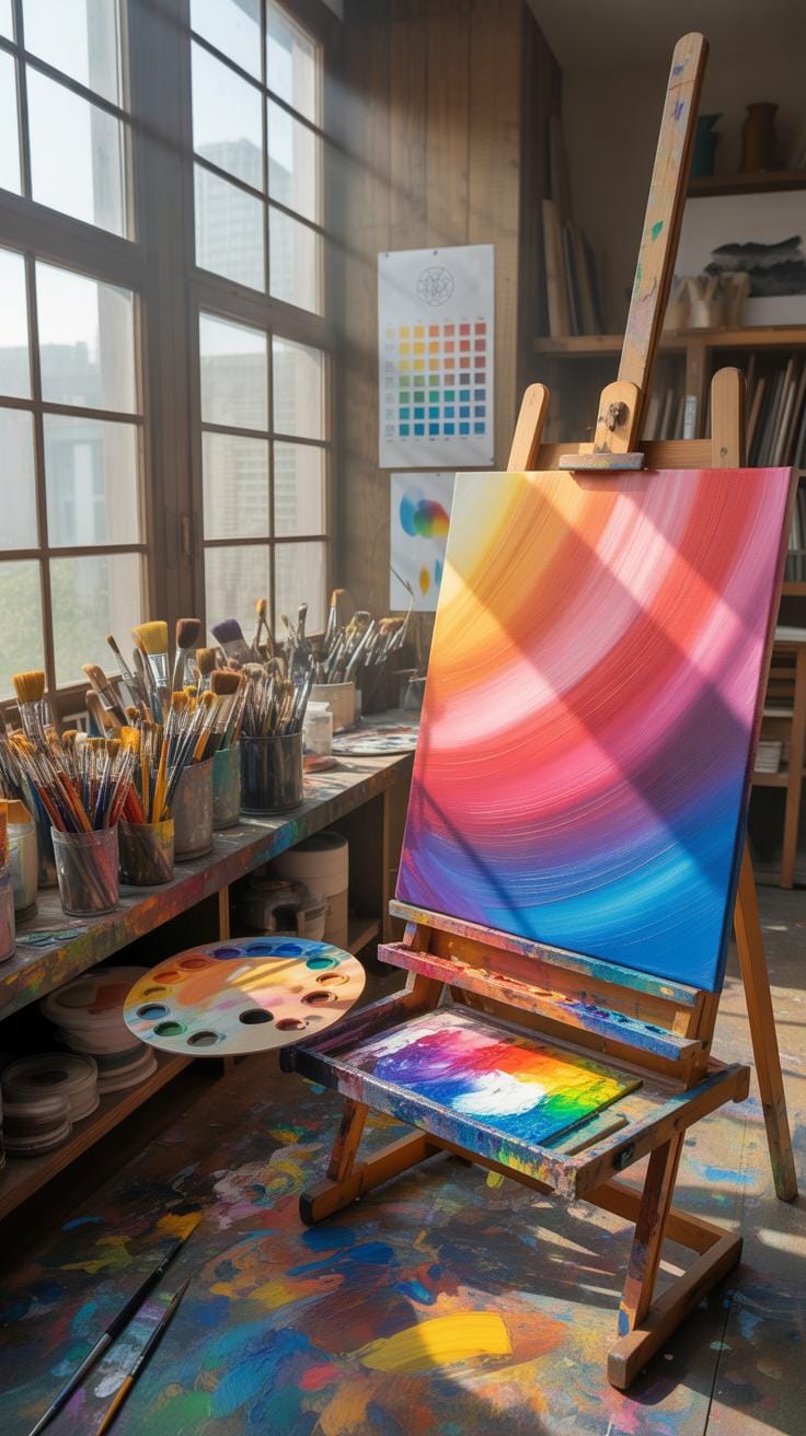
The color wheel is a basic yet powerful tool for choosing colors that work well together in art. If you’re staring at a blank palette wondering where to start, the wheel can guide you step-by-step. First, find the primary colors: red, blue, and yellow. These form the base of the wheel. From there, secondary colors—green, orange, and purple—fill in between the primaries. When you want to pick effective color combinations, start by locating complementary colors: they sit opposite each other on the wheel, like red and green. Using these together creates striking contrast.
Split-complementary schemes soften that contrast. You pick one color, then the two hues adjacent to its complement. For example, instead of red and green, try red with yellow-green and blue-green. Analogous colors, on the other hand, sit side-by-side on the wheel, such as blue, blue-green, and green. These produce harmony without much contrast, great for calm compositions. Finally, triadic schemes involve three colors evenly spaced around the wheel, like red, yellow, and blue. They balance contrast and harmony but can feel busy if not handled carefully.
Step By Step Color Wheel Checklist
When choosing colors from the wheel, try this checklist to achieve a balanced palette:
- Pick your main color as the starting point on the wheel.
- Decide which scheme you want to try: complementary, split-complementary, analogous, or triadic.
- Locate the other colors on the wheel accordingly.
- Adjust each color’s saturation by adding white, black, or gray to vary intensity and mood.
- Modify brightness to ensure no color overwhelms the others; balance light and dark tones.
- Test the colors together, tweaking their proportion to bring balance.
Don’t expect perfect results on the first try. Sometimes, you’ll find a shade just off the wheel that fits better. Experimentation is part of the process.
Comparing Color Schemes For Impact
Different color schemes deliver very different vibes. Complementary pairs, like blue and orange, punch with high contrast and energy. They draw the eye immediately but can tire the viewer if overused. Analogous colors offer subtlety and calmness; think about a sunset’s gradient from orange to red to purple. Triadic schemes create vibrant, dynamic palettes but can feel chaotic if all colors have equal weight.
For example, a painting with complementary colors might feel lively but abrupt, challenging the viewer. Analogous schemes soothe and unify, encouraging longer glances. Meanwhile, triadic choices keep things balanced but invite attention to all parts equally, which can sometimes dilute focus.
So, which scheme fits your art’s message? Sometimes, the ‘best’ choice depends on how you want your audience to react or feel. That’s the tricky, fascinating thing about using the color wheel—it’s both a guideline and a playground.
Examples Of Color Theory In Art
Color theory has played a significant role in some of the most iconic artworks throughout history, often subtly guiding the viewer’s experience without them realizing it. For instance, in Vincent van Gogh’s “Starry Night,” the swirling blues and yellows demonstrate complementary color harmony—a choice that intensifies the emotional energy of the scene.
Picasso’s Blue Period is another fascinating example where a monochromatic palette was used to evoke mood and feeling. Limited color ranges don’t always mean limiting expression; in fact, the singular focus on blues conveys melancholy in a striking way.
You might find it interesting that Impressionists, like Claude Monet, frequently used analogous colors—those close on the color wheel—to create seamless transitions and a sense of natural harmony in their landscapes. Their color layering created depth without heavy outlines.
In terms of styles, Fauvism is worth mentioning for its bold and non-naturalistic use of color. Henri Matisse’s works exhibit a fearless approach to placing vivid colors side by side, sometimes clashing but always energetic. It’s almost like he ignored traditional rules but still got stunning combinations that engage viewers instantaneously.
These examples show how applying color theory can be more intuitive or calculated, depending on the artist’s intent. Some rely on exact complements, others forgo traditional harmony for emotional impact—which, in itself, breaks a kind of rule. Does that mean they’re ignoring color theory, or reinventing it?
Famous Artists Using Color Theory
Many well-known artists have intentionally employed color theory principles to shape their art. Johannes Itten, though lesser known as an artist compared to others, developed influential theories on color contrasts and harmony that shaped movements like Bauhaus.
Paul Cézanne’s deliberate use of warm and cool colors to provide spatial depth is often cited in color studies. By strategically placing oranges against blues, he could create a visual tension that subtly pushes and pulls the viewer’s eye.
Mark Rothko’s color field paintings focus almost exclusively on large blocks of color that evoke meditation and emotion. His understanding of hue juxtaposition and tonal relationships contributes to the immersive quality of his work.
Pierre Bonnard leaned toward complex, layered color palettes that involved experimenting with light and shadow. His works reveal a keen awareness of how colors interact to produce warmth, atmosphere, and movement within a composition.
These named artists didn’t just choose pretty colors; they explored the underlying science and psychology of how colors affect perception and feeling. That blend of art and theory remains complicated—nuanced, I’d say—and it’s why their work continues to be studied both aesthetically and scientifically.
Modern Art Examples For Reference
Looking at modern art, you’ll spot many deliberate color experiments rooted in contemporary color theory. Take Yayoi Kusama’s installations: her use of repetitive patterns paired with vibrant reds and greens creates an overwhelming, almost dizzying experience. It’s color as an immersive environment.
In abstract expressionism, artists like Helen Frankenthaler employed color staining techniques that enabled hues to blend softly on the canvas. Her work is an example of letting color interactions emerge organically rather than control everything strictly.
Diverse color palettes in graphic design and street art also draw heavily on color theory principles. Banksy, for example, often uses limited colors but with high contrast, enabling his socially charged messages to come forward powerfully without distraction.
More recently, digital artists play with RGB and CMYK color models, extending traditional color theory into tech-based realms. They manipulate colors in ways impossible with physical paints – creating moods that resonate visually but also psychologically on new levels.
What stands out across these examples is the breadth of how color theory can be applied—from strict harmony to deliberate tension to complete rule-breaking. Each approach invites the viewer to engage differently, asking us to reconsider how colors influence our perception and emotions in art today.
Common Color Mistakes In Art
Many artists, including myself at times, struggle with color choices that can weaken their work. One typical error is using clashing colors. This happens when colors fight for attention instead of working together, creating discomfort or visual tension in the piece. Poor contrast is another issue — without enough difference between light and dark or between colors, details can be lost, making the artwork look flat or dull. And then there’s the overly saturated palette problem. Flooding your piece with too many intense hues can overwhelm viewers and reduce clarity.
Why are these problems significant? Colors guide emotion and focus in art. When they clash or contrast poorly, the message can become confusing or lose impact. Oversaturation can tire the eyes and flatten the piece’s energy instead of enhancing it. So, taking care with color balance matters more than it might seem at first glance.
How To Avoid Clashing Colors
Colors clash mostly because they are too close in warmth but far apart in tone, or they simply don’t harmonize on the color wheel. If you ever felt your colors don’t belong together, you’re seeing this in action. One practical way to steer clear from this is by choosing colors that are complementary — opposite each other on the color wheel — which balance each other out naturally. Another path is picking analogous colors that sit next to each other on the wheel, offering softer, smoother transitions. Using these methods reduces the risk of discordant colors drawing unwanted attention.
Balancing Saturation And Brightness
Saturation and brightness, if unchecked, can break even a carefully planned color scheme. Overly saturated hues tend to scream for attention, making harmony tough to achieve. Conversely, colors too muted can disappear, robbing energy from your art. Brightness differences help shapes and elements pop but skewing too far, either way, can strain or confuse the viewer’s eyes.
Adjusting these aspects means tuning down saturation where things feel too loud and playing with brightness to create a rhythm in your palette. Sometimes small tweaks, like dulling one color slightly or lightening another, make a huge difference. It’s a bit like finding the right volume for each note in a song — each color needs space to breathe.
Tools To Pick Colors Easily
Choosing colors for your artwork can sometimes feel a bit overwhelming. Thankfully, there are tools that can help simplify the process by using color theory principles. Software and apps are designed to guide you through creating appealing combinations without needing to memorize every rule. For beginners, these tools often have preset harmony options—like complementary, analogous, or triadic palettes—that you can try instantly.
It’s pretty handy to see colors together before committing to them in your work, and many programs provide sliders to adjust hue, saturation, and brightness easily. You might find the ability to save and export palettes especially useful when you want your colors consistent across projects. Yet, keep in mind that tools are guides rather than strict rules; sometimes those ‘wrong’ combinations can surprise you in good ways.
Some popular tools include Adobe Color, Coolors, and Paletton. They all have free versions or trials and offer interactive ways to explore the color wheel and harmonies tailored for art. You might want to experiment with several to find which interface and features resonate with your style.
Digital Color Palettes And Editors
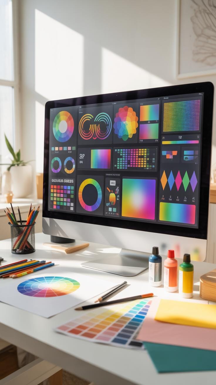
Digital color palette tools are especially convenient because they apply color theory rules automatically. You pick a base color, and the software suggests harmonizing colors based on established theories like complementary or split-complementary schemes. It’s a real time-saver.
Also, these editors usually display exact color codes (RGB, HEX, etc.), which helps maintain color consistency on different screens or in print. For beginners, this means less guesswork and a clearer idea of color relationships.
Many also allow you to tweak suggested palettes, saving custom combinations as you learn which blends work best for you. Some even offer features like previewing palettes on sample images or artwork, which can help you visualize the mood and impact of colors before applying them.
Physical Tools For Color Mixing
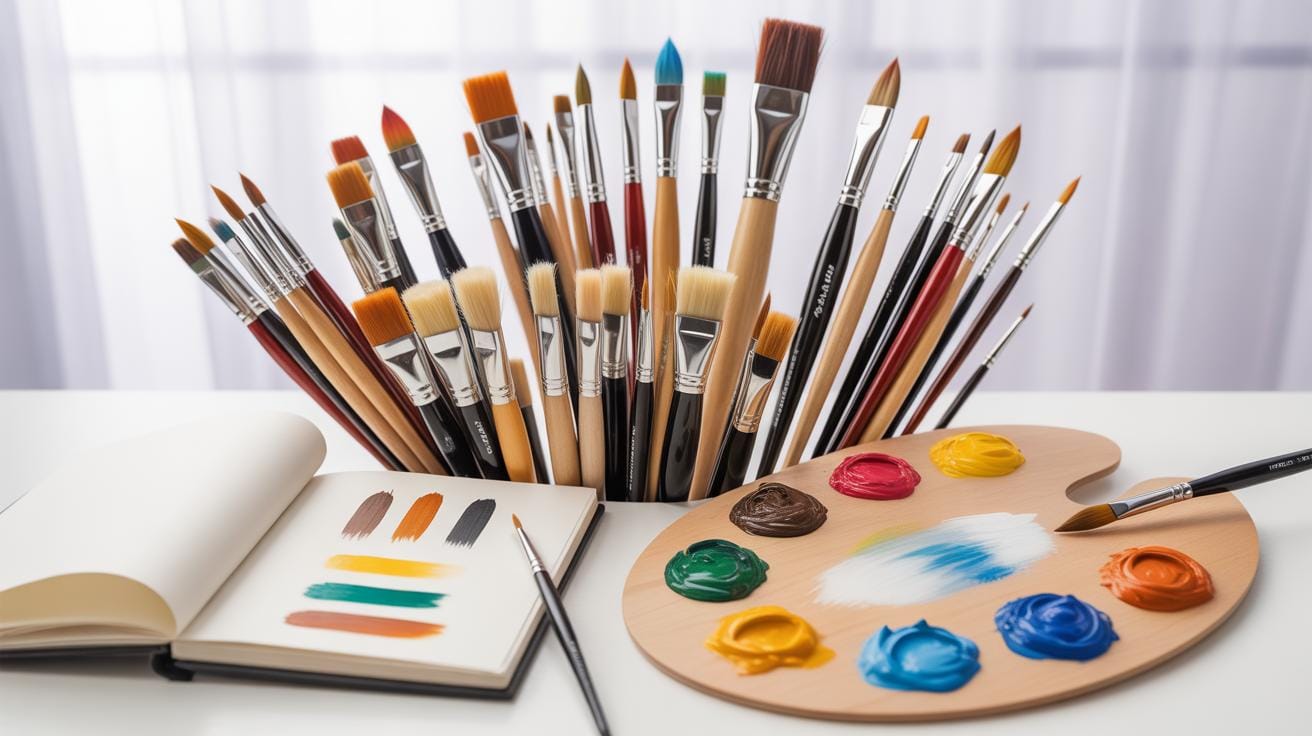
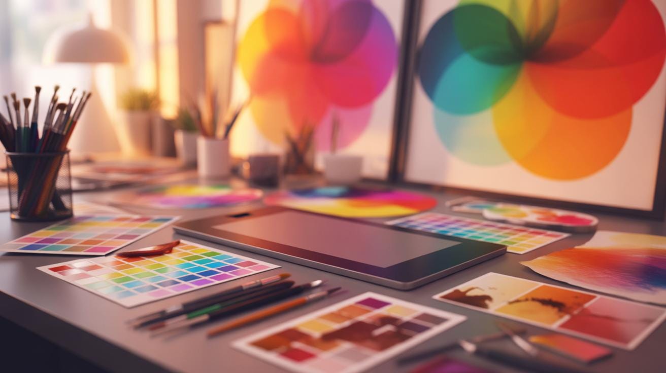
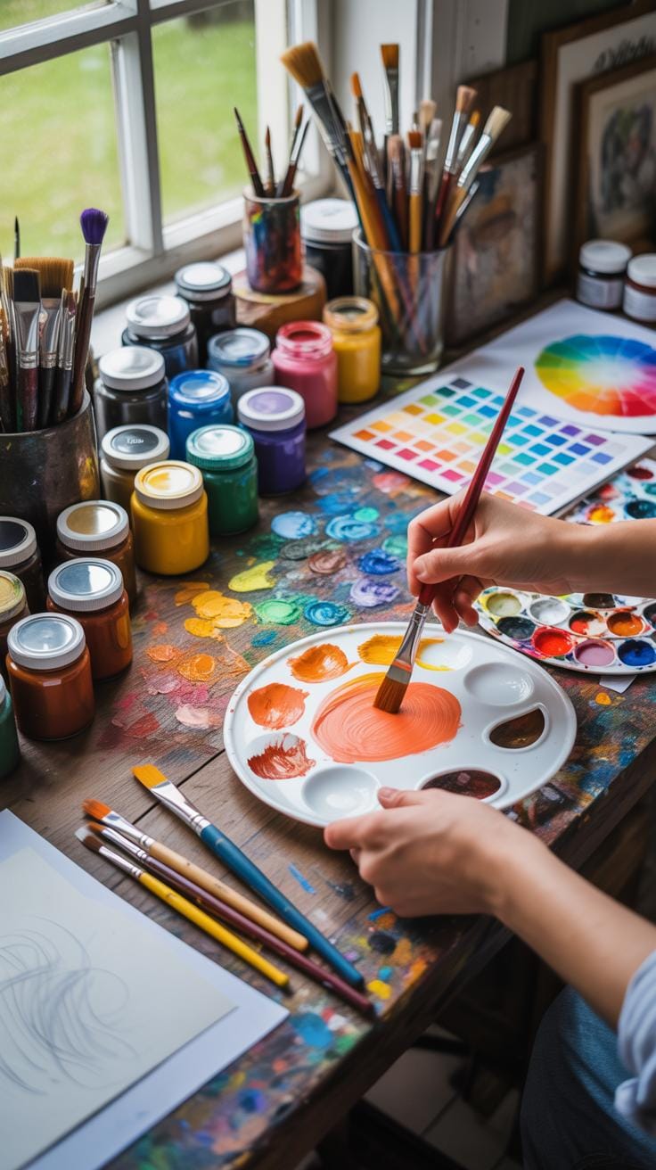
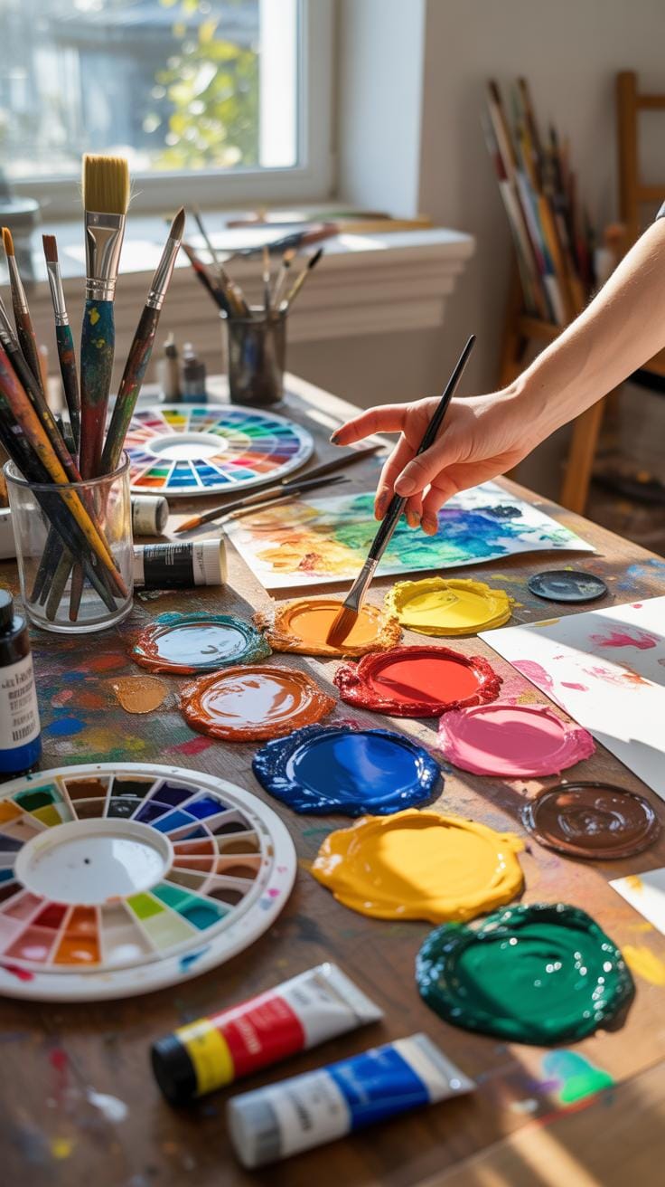
Digital tools are great, but traditional artists often swear by old-school methods like physical color wheels and paint swatches. Having a tangible wheel lets you see and mix colors firsthand, creating a more intuitive understanding of how colors interact.
Paint swatches and mixing guides also offer practical help—especially when you need to blend paint to match a certain shade. It can seem tedious at first, but physically experimenting with combinations deeply sharpens your eye and instincts.
A common tip is to start with primary colors and practice mixing secondary and tertiary hues. This hands-on approach sometimes reveals surprises about pigments and their behavior that digital screens can’t fully capture. So, even if tech tools feel like the only way, don’t dismiss the value of paint and brushes; sometimes you just need to touch the colors to truly get them.
Process For Creating Your Palette
When you start building a color palette, it can feel like wandering through a maze without a map. The first step, I find, is research. Look around—artworks, nature, even everyday objects—to gather colors that grab your attention. Sometimes, a mood or theme you want to express will suggest certain hues.
Next comes selection. Narrow down your choices; too many colors can make the piece chaotic. Focus on a few that work together, but don’t be too rigid—leave room for surprises. If you’re unsure, small swatches help. Try painting or digital mock-ups to see how colors behave side by side. It’s a kind of trial and error, really.
Testing and tweaking is essential. You might think a combo is perfect, then spot something that jars the eye. Getting feedback—whether from friends or your own fresh perspective after a break—can reveal issues you missed. Adjust and refine until your palette feels right. The whole process is often nonlinear; you might jump back to research or selection as ideas evolve.
Choosing Colors To Communicate Mood
Colors speak louder than words sometimes. Before picking hues, ask yourself: what feeling do I want to evoke? Blues might suggest calmness or sadness; reds can signal energy or anger. But context matters—blue in a stormy sky means one thing, blue in a cheerful cartoon another.
Think about cultural and personal associations, too. Your choice isn’t just about aesthetic harmony but the response you want from your audience. It’s tricky because moods mix and colors can seem to shift meaning depending on light or surroundings. Still, aiming for colors that match your intended emotion helps guide your selections.
Testing And Adjusting Combinations
Don’t rush your palette finalization. Put your colors into practice—create test pieces or palettes applied to small studies. This visual experimentation reveals how colors interact in real settings. Sometimes, surprisingly, a color looks wonderful isolated but clashes when combined.
Feedback loops are crucial here. Show your work to others and listen—criticism can sting but is often invaluable. Be open to change. Adjust brightness, saturation, or value to fine-tune the dynamic between colors. This stage can feel frustrating, but that’s part of discovering what really works.
Remember, a palette is living; you might find new colors to add or discard later. Trust your eye and intuition, and don’t be afraid to revisit earlier steps as needed. The perfect palette is rarely found in one attempt—it evolves with your work.
Examples Versus Color Trends
Why Classic Combinations Last
Classic color combinations endure because they tap into our visual instincts and cultural conditioning. These combos often have balance and contrast that work naturally with how we perceive color—think of the classic blue and orange or red and green pairs. They have a harmony rooted in color theory fundamentals, like complementary and analogous colors.
What makes these classics stick around? Well, they are easy on the eyes without causing fatigue. Plus, they typically avoid extreme novelty that might feel dated soon. Often, they provide versatility—they can suit various moods, styles, and purposes. Maybe you’ve noticed how timeless designs, like the artwork of Piet Mondrian with primary colors or the subtle earth tones in classical paintings, still resonate decades later.
Still, the appeal of these combinations is partly cultural and personal, so there’s room for individual preference. Classic combos don’t automatically mean something old-fashioned or boring, either. They sometimes surprise you by fitting perfectly with contemporary aesthetics, even if you didn’t expect it.
When To Follow Color Trends
Color trends are often born from social shifts, technology, and cultural events. Using trendy colors can make your art feel fresh and relevant, especially if you’re targeting a specific audience that values staying current. For example, pastel colors surged in popularity with the rise of digital art communities, and neon colors can evoke a retro yet modern vibe.
But trends can be fleeting, disappearing faster than you might anticipate. That doesn’t mean they lack value—they can add excitement and immediacy to a piece. You might want to lean into trends when creating promotional material, event-specific art, or work aimed at younger, trend-savvy audiences.
Still, picking the right moment is crucial. If your goal is longevity or timelessness, relying heavily on trendiness can backfire. I find that mixing classic combos with a touch of trend can sometimes hit the sweet spot—giving your art a foot in both worlds.
Evaluating Your Color Use
When you step back and look at your artwork, how do you truly judge your color choices? It isn’t always straightforward—some colors might feel right but don’t quite work together. Try asking yourself a few questions to get honest about your color use:
- Does the balance of colors feel stable, or is something overwhelming the composition?
- Is there enough contrast to guide the viewer’s eye without causing discomfort?
- Do the colors evoke the mood or response you intended, or is the impact off?
- Are any hues competing instead of complementing?
- Does the overall combination maintain visual interest over time?
You might discover one shade pulls focus too strongly or that the harmony isn’t quite there. It’s tricky; sometimes what looks great up close might feel off from a distance. Keep asking questions, and be patient.
Questions To Assess Color Impact
Thinking critically about your colors helps refine your work. Here are some key points for self-assessment:
- Does each color serve a purpose in the piece?
- Are complementary colors used to create energy or tension?
- Have you considered warm versus cool tones and how they affect depth?
- Is saturation varied enough to create focus and rest points?
- How do your colors respond under different lighting or settings?
These questions might not come with black-and-white answers. Your instincts will kick in and sometimes contradict your intellect. That’s okay.
Adjustments Based On Feedback
Getting feedback from others can be revealing, though also a bit unsettling. Listen for consistent remarks on your color choices. If multiple people mention something feels too dull or too intense, that’s worth revisiting.
Try to understand the why behind comments. Are viewers confused by your color balance? Do they find the contrast harsh or insufficient? Use their reactions as clues, not rules.
Experiment with small tweaks—shift hues slightly, adjust saturation here, or introduce a neutral tone. Each iteration brings you closer to a more compelling color story. It’s a back-and-forth journey, and, well, you might never feel entirely “done.” But that’s part of the creative process, isn’t it?
Conclusions
Color theory plays a key role in making artwork visually pleasing and effective. Using knowledge of primary, secondary, and tertiary colors along with color wheels can guide your choices. This helps you avoid clashing colors and create balanced schemes.
Simple steps like checking contrast, saturation, and harmony improve your designs. Experiment with color examples from this article and notice how colors influence emotion and style. Your art will become more expressive and engaging.
