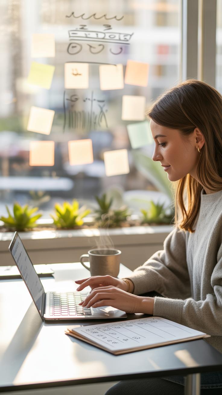
Introduction
Art journal covers are the first thing people see. They show your style and make your journal feel special. Choosing or making your cover is an exciting start to any art journal project. You can use many ideas to make your cover stand out and reflect your creativity.
This article explores many art journal cover ideas. You’ll learn how to pick a style, what materials work best, and ways to make your cover personal. Let’s explore simple and fun ways to create a cover that you will love for your next creative project.
Picking a Cover Style
When it comes to choosing a style for your art journal cover, you might find yourself torn between keeping it simple or making it bold. There’s no one right way, really. Some people like covers that don’t shout for attention but still feel purposeful. Others want a cover that’ll grab you at first glance.
Plain and Simple Covers
Plain covers often feel neat and clean, almost like a quiet invitation. You can use materials like kraft paper or plain cardstock. I sometimes like kraft paper because it has this raw, unpolished vibe that still looks put together. Plus, it gives your journal a grounded, earthy feel—if that makes sense. It’s not flashy, but clean covers sometimes help you focus on the contents rather than distracting from them.
On the downside, a plain cover might seem a bit… well, plain. But isn’t there beauty in that simplicity? To spice it up, you could add a small detail—a hand-drawn symbol or a short quote. Yet, even left completely blank, these covers carry their own quiet strength.
Colorful and Bright Covers
Bright covers, on the other hand, really stand out and can set an energetic tone. Using bold paints, vibrant markers, or colorful paper can instantly make your journal feel alive before you even open it. Sometimes, I feel like a splash of bright colors can make you want to dive into your creativity faster.
But here’s a thought—too much color might overwhelm. It’s like when you walk into a room with too many loud patterns, and you end up feeling a bit off. Still, if you enjoy a lively look, combining different bright hues or even experimenting with gradients can keep things interesting without going overboard.
Whatever style you lean toward, remember it’s about what feels right for you on that day. Your art journal cover can be an extension of your mood or the projects inside. So, why not let your cover style evolve as you do?
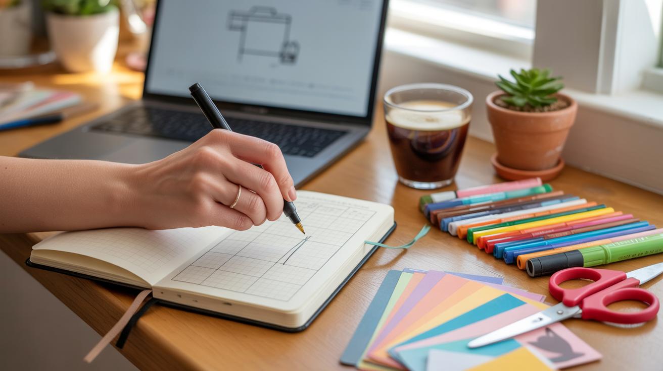
Choosing Cover Materials

When it comes to making or decorating your art journal cover, a few materials keep popping up because they’re easy to find and work with. Cardboard and paper often top the list, mostly because they hold up well and give you a solid base to play with. You can cut, paint, glue, or even collage right on them without much fuss. Their durability means your journal can survive a bit of rough handling, which is always a plus. Plus, cardboard is surprisingly forgiving if you want to punch holes for binding or add extra layers.
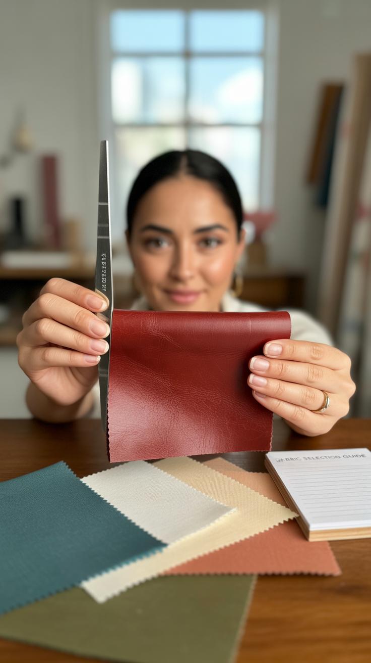
Fabric and textiles bring a different dimension to covers. They add texture that paper just can’t match, and you get to pick from endless colors and patterns. If you like the feel of cloth under your fingers or want something that looks softer and less like a traditional journal, fabric is a nice go-to. Gluing fabric over cardboard is a simple way to combine strength with softness—you just need a sturdy adhesive, like tacky glue or a spray adhesive. Sometimes I stick down scraps of fabric to cover small imperfections or add a layered, casual look that’s oddly satisfying.
Don’t forget about paper itself, too—not just plain sheets, but patterned or textured kinds. Mixing paper and cardboard can be surprisingly effective. Stickers also deserve a mention here since they’re an easy way to personalize covers without much effort. They can work directly on cardboard or fabric, depending on the glue and surface texture. Maybe try layering some stickers on painted cardboard for an interesting look—you might be surprised how different it feels compared to plain paper.
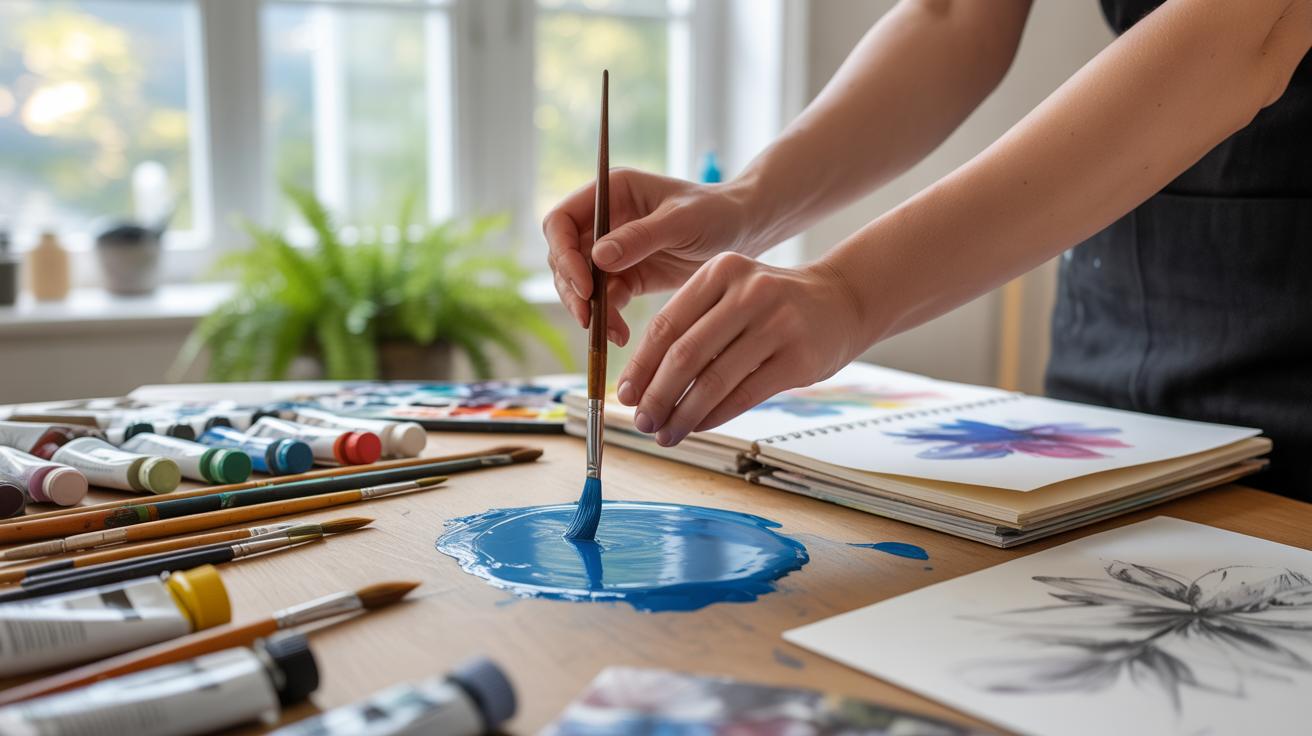
Using Paints and Markers
When it comes to decorating your art journal cover, paints and markers can give you so much room to experiment. You might want to start with acrylic paints if you’re after bold, sharp colors that really stand out. Acrylics tend to dry fast and cover surfaces evenly, so layering is easier—think about painting a dark base, letting it dry, then adding lighter colors on top to create dimension. Sometimes, the texture acrylics leave is almost like a subtle relief, which can enhance the tactile feel of your cover.
Watercolors, on the other hand, offer a softer, more fluid look. They work better if your cover material absorbs moisture well—paper-based covers, for example. The colors blend gently and create natural gradients, which can be lovely, but layering them takes patience. You have to let each layer dry fully, or colors might muddy together, though sometimes that blending is precisely the unpredictable effect you want. I’ve found myself hesitating with watercolors because they can be less forgiving, but the subtle fades are worth the cautious approach.
Permanent markers serve a different purpose but are just as useful. They’re great for adding details after painting or even for starting your design. You can draw lines, write quotes, doodle shapes, or add outlines to painted areas. Sharpies and other fine-tipped markers work well, but remember their ink sits on top of the paint, so smudges are possible if you’re not careful. Sometimes I like to use markers first to sketch an idea, then paint over it, but other times it’s better the other way around.
Some tips to keep in mind:
- Choose paints based on your cover’s material. Acrylics suit most surfaces; watercolors demand more absorbent ones.
- Layer colors thoughtfully. Start light and build up with acrylics; with watercolors, layer transparently and wait between coats.
- Use markers to add fine details or text once paint is dry to avoid smearing.
- Experiment with mixing mediums—painting a wash first, then drawing with marker, can lead to unexpected styles.
Have you tried mixing acrylic with watercolor effects by diluting the acrylic or layering washes? I sometimes find the results don’t quite match my initial vision, but that’s part of the process, isn’t it? Cover decoration with paints and markers rewards a bit of trial and error, so don’t be afraid to test out what feels right for your journal cover.
Adding Collage Elements

Using collage on your art journal cover can open up a world of creative possibilities. Start by gathering images, papers, and textures that speak to you. Cutting them into shapes or interesting fragments adds a tactile quality that paint alone might not offer.
When you cut out pieces, think about layering. Overlapping torn edges with smooth ones, mixing patterns with plain colors, can create depth. Don’t be afraid to experiment with placement before gluing. Sometimes, shifting a piece by just a few millimeters changes the entire feel.
Cutouts from Magazines
Magazines are a treasure trove for cover-making. You can search for words, portraits, patterns, or even random bits of texture. Choosing images that resonate with your project theme or mood can give the cover a strong visual impact. For example, clipping bold typography might work well if you want a graphic look, while nature photos can bring softness or calm.
Try mixing unrelated images—maybe a vintage car next to floral prints—with glue and layering, creating something unexpectedly unique. You don’t have to stick strictly to the obvious; abstract shapes or partial faces can add curiosity or mystery.
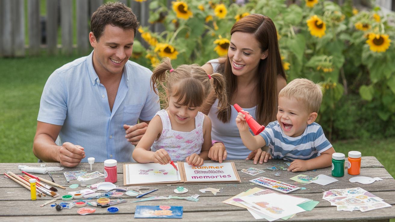
Personal Photos and Memorabilia
Adding personal photos or small keepsakes turns your cover into something really intimate. I recall once including a tiny ticket stub and a photo from a trip on my art journal cover—it instantly made the journal feel more like “mine.” These elements can remind you why you started the project or bring some history along.
Try scanning or photocopying photos if you want to protect the originals. Little items like pressed flowers, stamps, or fabric scraps can also work, but keep in mind how thick your cover will become if you add too much. It’s a fine balance between meaningful and bulky.
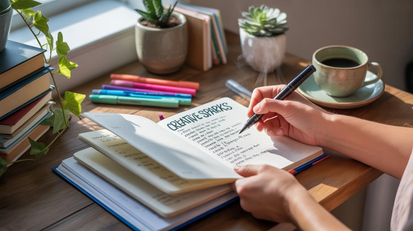
Including Text and Titles

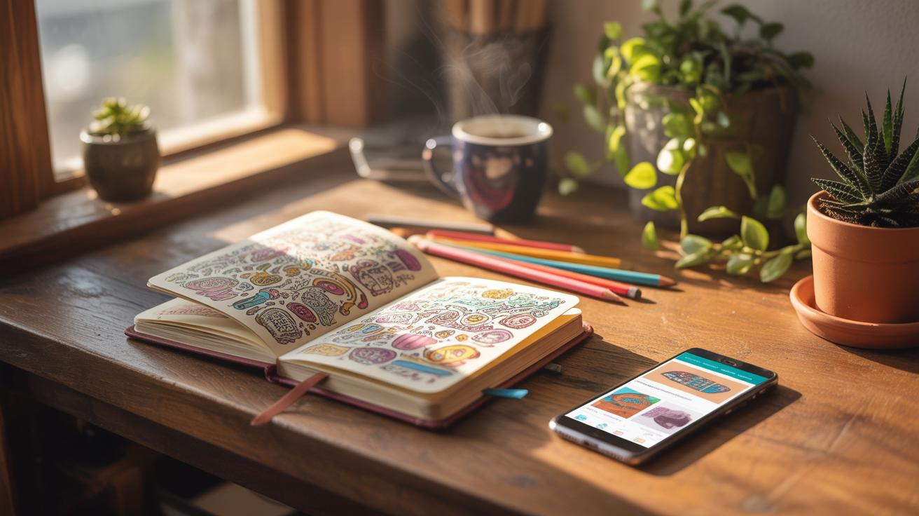
Adding titles or words on your art journal cover can really set the tone for the whole project. Sometimes, just a simple word or phrase captures everything you want from your creative journey. You can approach this in a few ways that suit your style and skill level.
Hand Lettering Tips
Writing titles by hand gives your cover a personal touch, but it doesn’t need to be complicated. Start with pencil sketches—this helps avoid mistakes and gives you a chance to plan spacing. Try using basic block letters or simple cursive if you’re not confident with fancy fonts. I often find that uneven letters add a bit of charm, so don’t worry about perfection.
Using a ruler can help keep lines straight, but sometimes a little wobble makes it look more genuine. Choose pens that won’t smudge and test them on scrap paper first. If you want emphasis, bold part of your letters or add shadows. Experiment with thickness—thicker strokes catch the eye, while thinner lines can be subtle. Hand lettering doesn’t have to be fancy to be effective.
Stickers and Stamps
If neatness is a priority and your handwriting feels shaky, letter stickers or stamps provide a clean solution. Stickers are quick to apply and come in endless styles—from vintage typewriter fonts to playful bubble letters. They let you mix sizes and colors easily, which can create visual interest without fuss.
Stamps offer a similar effect but can give more consistent impressions, especially if you repeat the same title on different projects. When using stamps, make sure your ink pad isn’t too wet or dry, or letters may smudge or appear faint. Press evenly and consider layering ink for boldness.
One tip—lay out stickers or stamps on your cover before fixing them permanently. This way, you can check spacing and alignment, and move things around if needed. It might seem a bit tedious but saves you from frustrated mistakes later.
Protecting Your Cover
Once you’ve carefully designed your art journal cover, you’ll want to keep it looking good for as long as possible. Covers tend to get scuffed or stained pretty quickly, especially if you carry your journal around a lot. So, protecting that original design matters—maybe more than you expect.
Laminating Covers
Laminating your cover can provide strong protection and a smooth, almost shiny finish. This method involves sealing the cover between two sheets of plastic. It guards against dirt, moisture, and scratches, which is useful if your journal ends up in a backpack or on a crowded desk. The flip side? Laminating adds a little bulk and rigidity, so if you prefer a softer, more flexible cover, it might feel too stiff.
I once laminated a cover filled with watercolor details, and the colors stayed bright for months, no fading or smudging. Of course, laminating is permanent. If you want the option to change your design later, then this method may lock you into one look, for better or worse.
Sealants and Tapes
There are other ways to shield your cover, too—like clear tape and spray sealants. Clear tape can be quick and cheap. You can carefully cover fragile parts or the entire surface with wide packing tape or decorative washi tape for a bit of extra flair. It’s not as smooth or neat as lamination but certainly keeps edges from peeling or fading.
Spray sealants are another option, usually acrylic-based. They create a thin, protective layer over your art, guarding against water and smudges without altering the texture much. Just remember sprays can sometimes darken certain inks or paints, so test first on a small piece. I keep a can handy for finishes that don’t hold up well to handling, though it might feel a bit risky if you’re worried about changes to your original surface.
So, when it comes to protecting your cover, think about how you use your journal and what kind of finish you want. Do you want something tough and glossy or subtle and flexible? Each choice has its quirks, and maybe you’ll try a couple before you settle on what works best for you.
Personalizing Your Design

You might find that using your favorite colors on the cover makes it instantly more inviting. When you select hues that you’re naturally drawn to—whether it’s a calming blue, a bold red, or something soft and subtle—the cover begins to feel like an extension of yourself. Colors have this odd way of connecting with memories and moods. Maybe you don’t even notice it, but when you see your preferred shade, a little spark of comfort or joy can show up. And yes, sometimes those favorites shift over time, or even depending on your mood that day.
There’s no need to stick with just one color either. Mixing your favorite shades can create a unique look that’s purely yours. For example, layering a muted green with flashes of gold might feel both grounded and special, if that suits you.
Another way to make your cover personal is by adding symbols or images that hold meaning to you personally. It could be anything—a small drawing of a bird if you find freedom in flight, a mandala if you seek balance, or even a simple anchor to remind you of stability.
Think about what speaks to you quietly or strongly. These symbols don’t have to be obvious or well-known. Maybe it’s a tiny sketch of your favorite leaf, or a mysterious pattern from a fabric that reminds you of a place you love. When you look at the cover, these little marks can tell stories you know without saying a word.
It might even be fun to collect small meaningful images over time and layer them on the cover. Your journal cover can slowly grow with you, reflecting shifts in your journey or interests.
Inspiring Cover Ideas
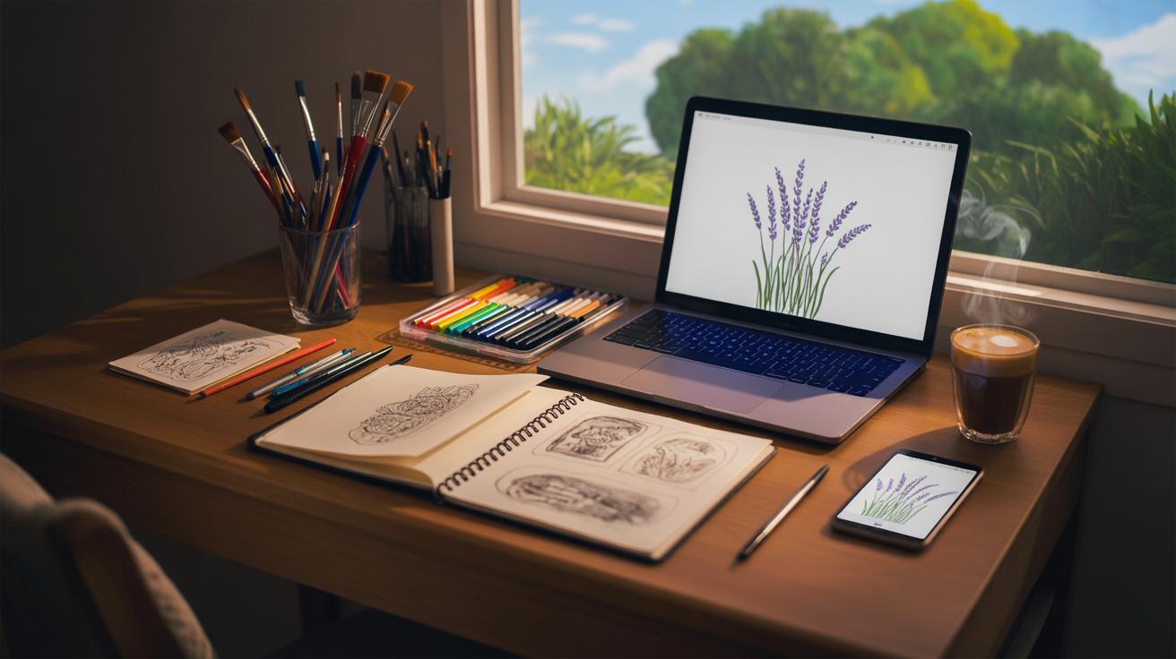
When thinking about your next art journal cover, you might find it refreshing to explore themes that tap into nature or abstract designs. Nature offers endless possibilities, like sketches of leaves pressed against paper or delicate flower illustrations that bring softness to your cover. Sometimes, simply layering different shades of green or brown can evoke a calming forest vibe, even without detailed drawings. You could try combining a few landscape elements—maybe gentle hills or a quiet shoreline—to suggest a mood without overcrowding the space.
On the other hand, patterns and abstract art can give your cover a very different kind of personality. Using simple shapes, such as circles or triangles, arranged in unexpected ways can make the cover feel lively and modern. Lines—wavy, jagged, or intersecting—can add movement or tension, depending on how you place them. One time, I experimented with random brush strokes and ended up with a cover that looked almost like a mood map of my day. That’s something you might consider: letting your abstract art reflect your emotions or thoughts.
You don’t need to overthink or overdecorate; sometimes the simplest patterns repeated with slight variation create the most interesting effect. What if you combined a nature motif with abstract shapes? A leaf outline repeated in different sizes might become a pattern itself. It’s worth trying out ideas you wouldn’t expect to see side by side. Have you noticed how certain covers just draw you in because they feel a bit unpredictable?
Conclusions
Making an art journal cover is a great way to start your art journey. It shows your style and can inspire you every time you open your journal. Simple ideas and materials can make your cover unique and personal. Keep it easy and fun so you want to create more.
Try different styles and materials. Your art journal cover can be a small work of art itself. It helps you show your story and keeps your journal safe. Now you have many ideas to start your next creative project with a cover that feels right for you.


