Introduction
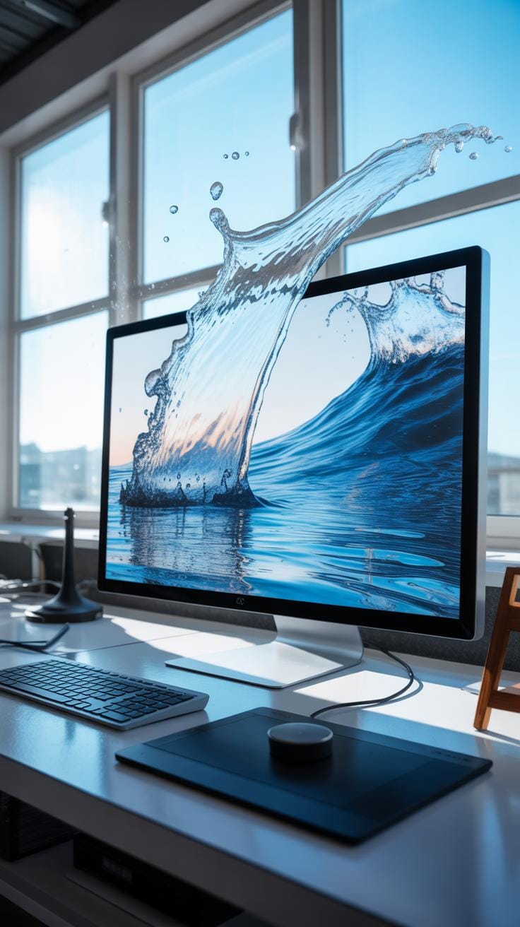
Water effect backgrounds add a unique touch to art and home decor by mimicking the natural movement and aesthetic of water. These effects can transform simple designs into captivating visuals that engage viewers and elevate interior spaces. This article explains practical techniques for creating water effect backgrounds for various artistic and decorative purposes.
You will learn how to apply different methods, from painting to digital design, to replicate water effects. The guide also covers essential materials and steps to produce stunning backgrounds that can enhance your art or room decor with ease and creativity.
Water Effect Uses In Art
Water effect backgrounds often bring a unique visual rhythm to art, blending realism with abstraction in ways that draw the viewer in. Artists turn to these effects because they add depth and subtle complexity. When done well, backgrounds with water effects can evoke feelings ranging from calm and tranquility to mystery or even melancholy. I find it interesting how these visual elements can change the mood of a piece almost immediately.
Using water effects can make a scene feel alive, especially when painters or creators capture the play of light on ripples or droplets. The shimmer and flow simulate movement, which might keep your eye wandering across the canvas longer than it would on a flat color background. This fluidity is why many artists integrate water textures in landscapes, portraits, or abstract art—it acts as a silent collaborator, enhancing the story or emotion behind the work.
But it’s not just about catching eyes; it’s about setting a tone. Water effects can provoke subtle emotional reactions—calmness, nostalgia, even unease. Through reflection or distortion, they create layers of meaning, inviting viewers to pause and imagine beyond what’s immediately visible. It’s almost like the water effect is whispering, urging you to see beyond the surface.
How Water Effects Enhance Visual Appeal
Water effects influence art in several specific ways, enhancing its visual appeal noticeably. You’ll often notice:
- Light reflections: The way water reflects or refracts light adds vibrancy. Small highlights glistening can make the whole piece feel luminous.
- Texture depth: Water backgrounds introduce textures that contrast smooth or matte foregrounds, adding variety that captures interest.
- Movement illusion: Even a static image can appear animated through layered ripples or waves, making the scene feel dynamic.
- Color blending: Water’s transparency can soften edges and colors, resulting in harmonious, blended areas rather than harsh separations.
A painter might use a shimmering pool at a distance or a gentle rain pattern on a windowpane—both instantly changing how you experience the artwork. Sometimes these effects are subtle, almost hidden, and other times they dominate the scene, shaping the entire composition.
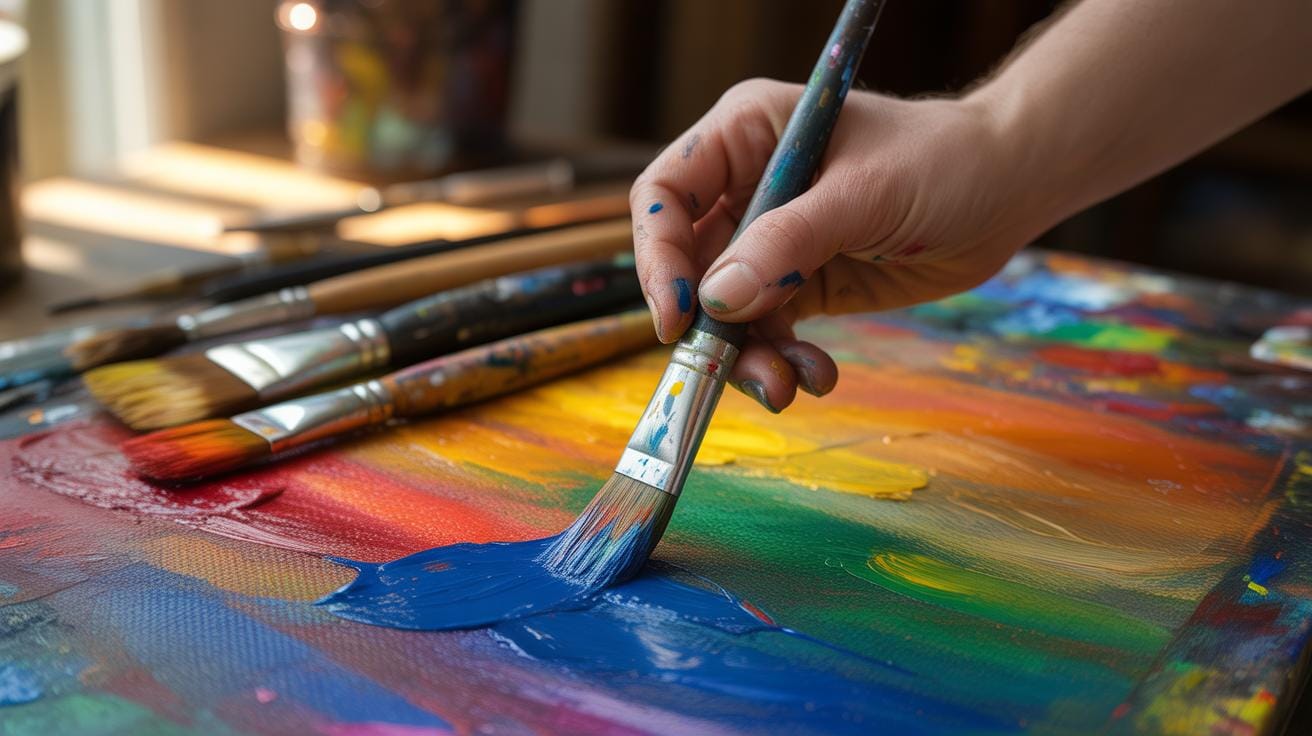
Techniques For Water Effect Background Creation
Artists approach water effect backgrounds in many ways. Some common methods include:
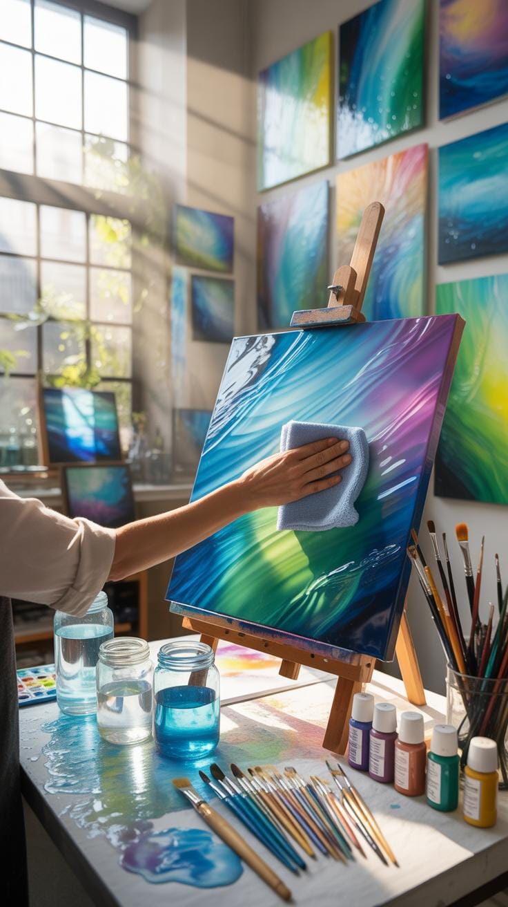
- Painting styles: Watercolor naturally suits water effects because of its fluidity and transparency. Loose brushwork enhances the look of flowing water.
- Layering: Using multiple layers of paint or glazes creates depth. Artists might start with broad washes and gradually add details like reflections or ripples.
- Texturing tools: Sponges or palette knives can add irregularity that mimics water surface tension and undulations, introducing realism or impressionistic flair.
- Digital tools: Digital artists use brushes and layering effects in software to simulate ripples, refractions, or shimmer. This allows more control and experimentation with opacity and blend modes.
Each method has quirks. For instance, watercolors can be unpredictable, so the artist may need to work intuitively, embracing surprises. Digital art offers more undo options but sometimes lacks the organic randomness of traditional media. What’s clear is that whatever the technique, getting the water effect right requires patience and a good understanding of how water interacts with light and form.
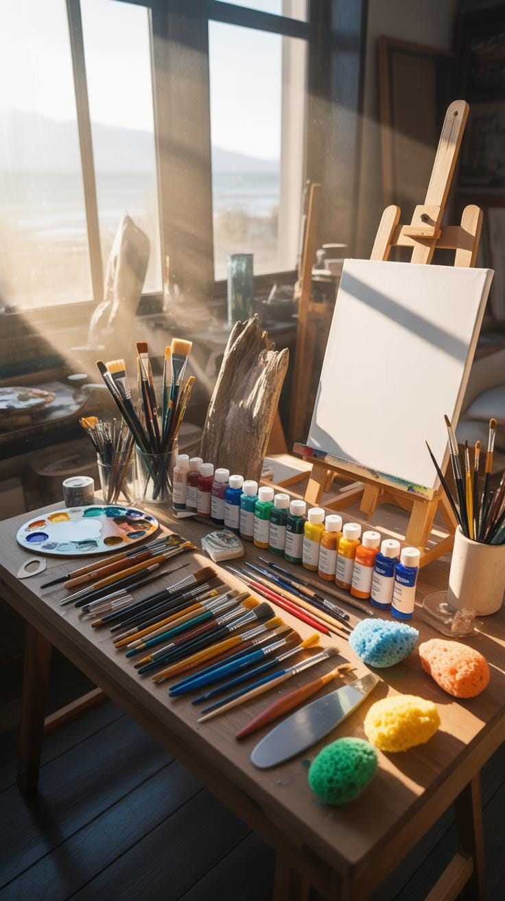
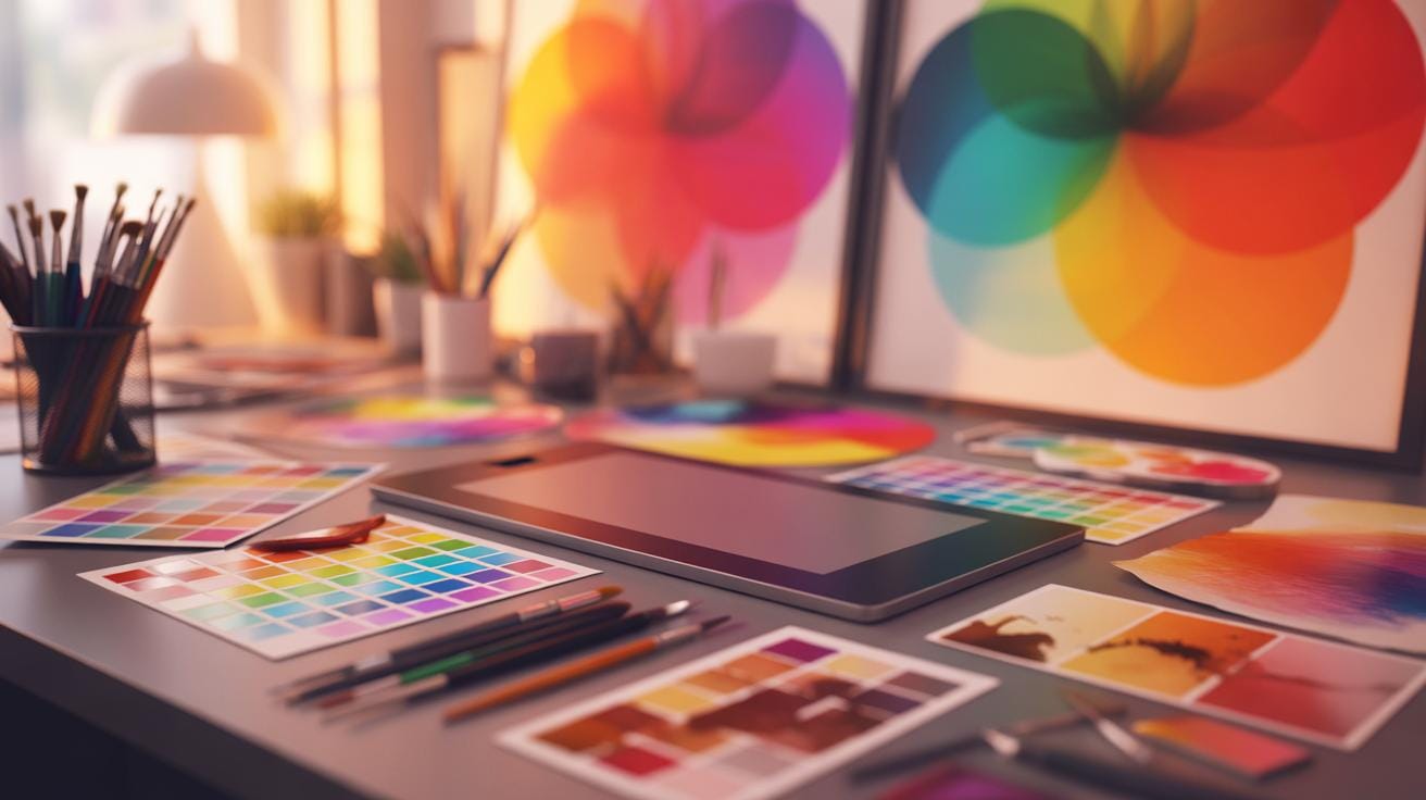
Materials Needed For Water Effects
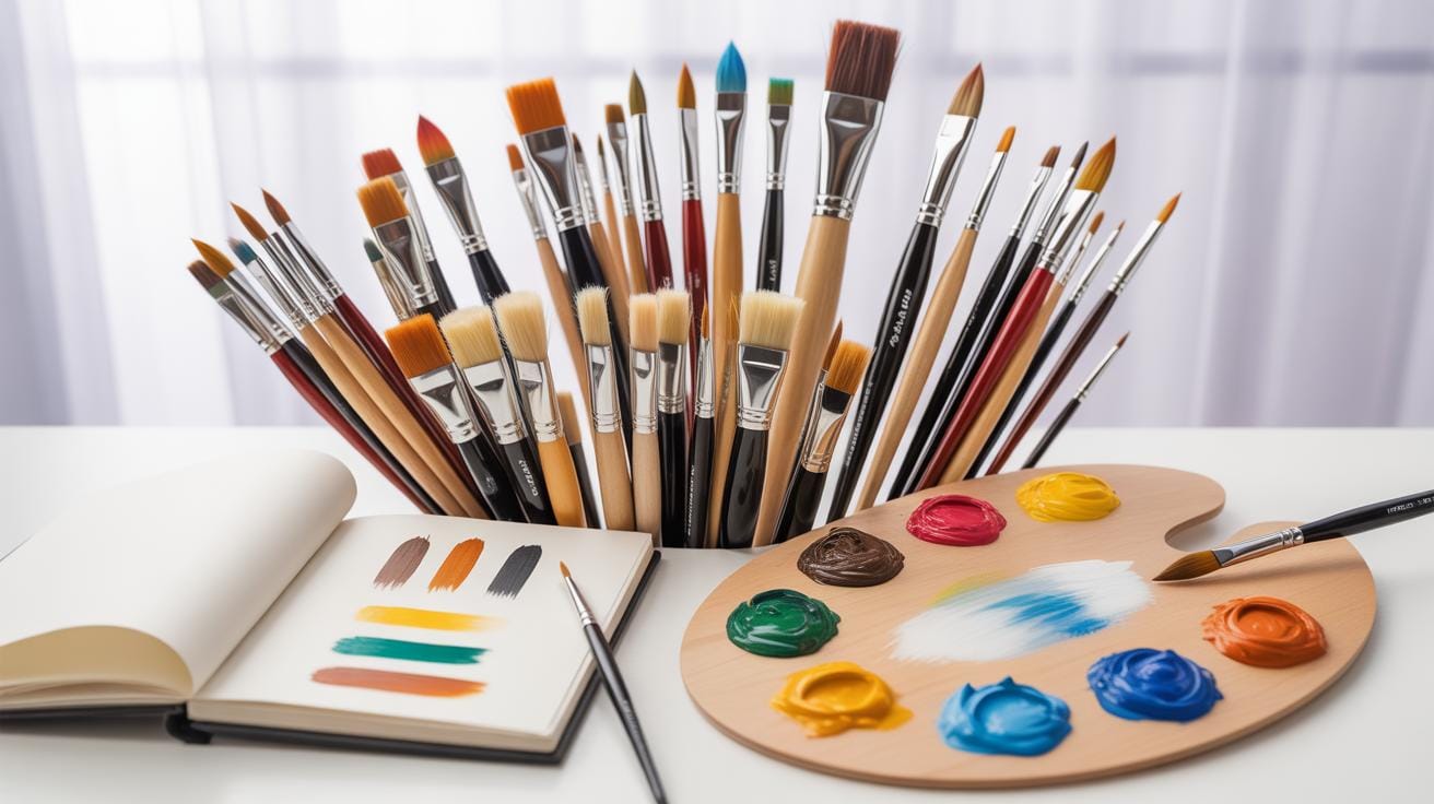
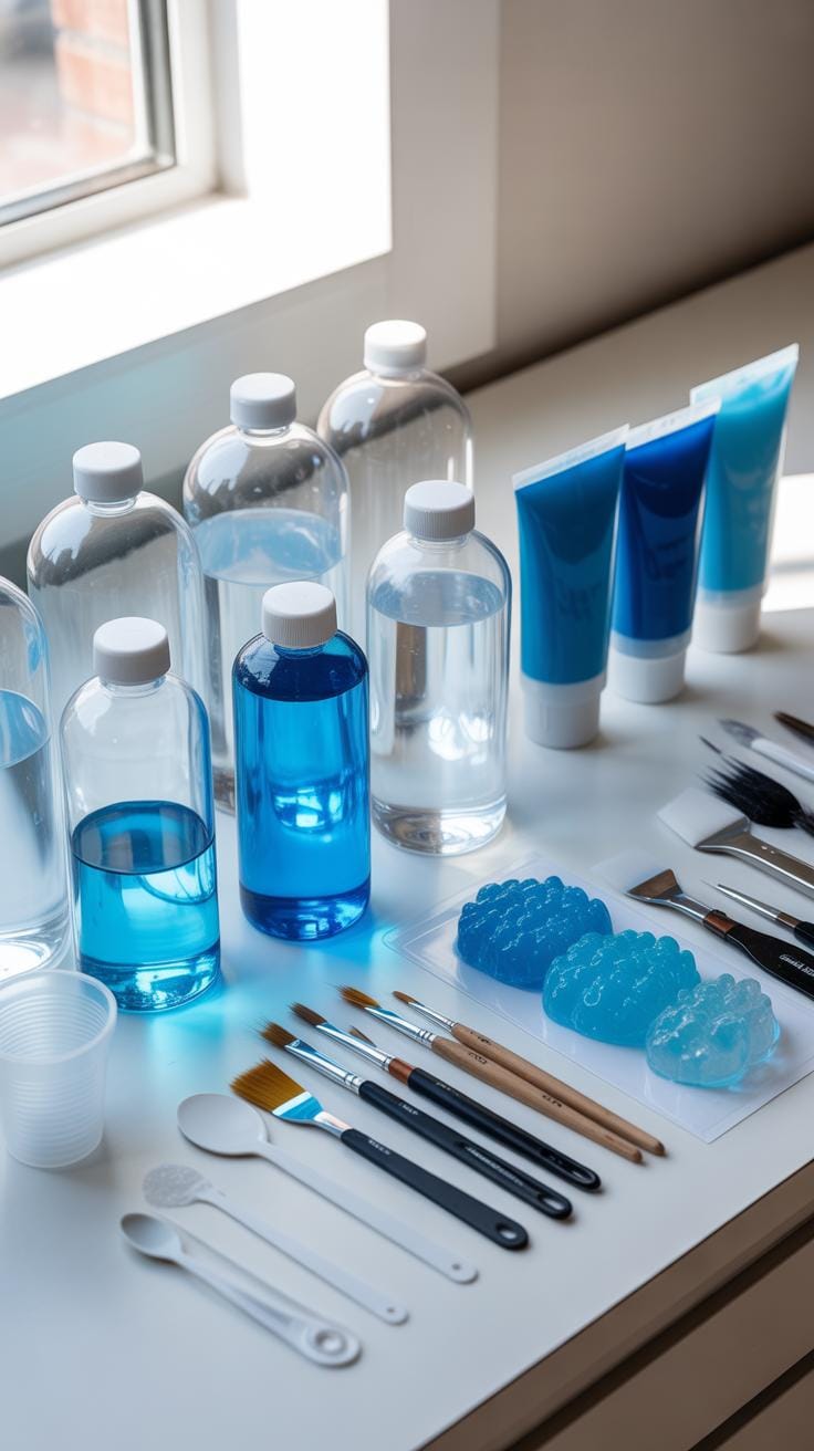
When you’re setting out to create water effect backgrounds, gathering the right materials can shape your results profoundly. The essentials include quality paints known for their transparency and fluidity — acrylics often steal the spotlight here, thanks to their versatility and quick drying time. You’ll also want specialized mediums designed to extend, thicken, or add gloss to your paints, helping mimic the reflective and flowing nature of water.
Don’t overlook additives like water retarders which slow drying times, allowing more manipulation, or gloss gels that amplify shine. Selecting these supplies involves considering your project’s scale and desired realism. Some prefer professional artist-grade pigments for their intensity and longevity, while others may opt for student-grade for experimentation without worry. Each material plays a distinct role, so thinking about their interaction will better inform your choices.
Alongside paints and mediums, keep handy tools like palette knives for texture, spray bottles for subtle misting effects, and sealants to protect your finished work. I found that investing a bit more in mediums made a noticeable difference in the depth of my water scenes. There’s a balance between cost and quality, so don’t hesitate to test a few options to see what feels right for your process.
Types Of Paints And Mediums To Choose
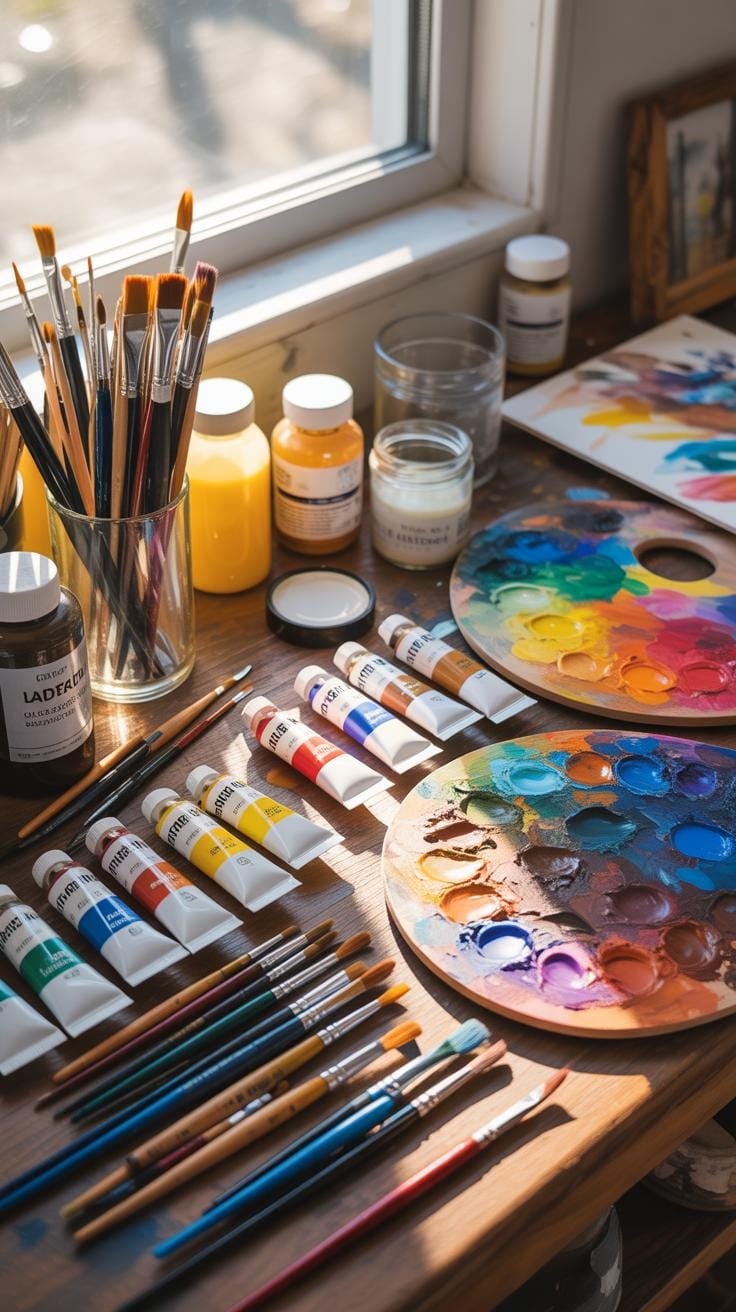
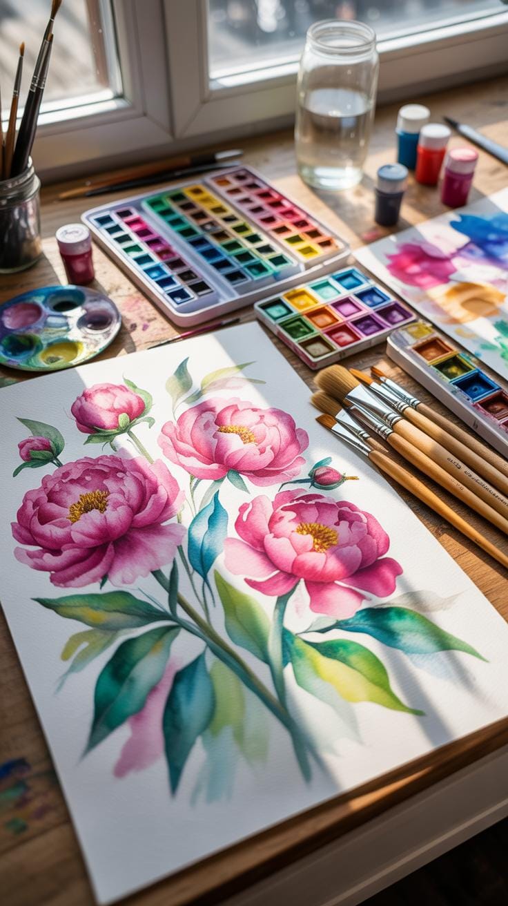
To capture water’s elusive qualities in art, acrylic paints are often the go-to for many creators. Their water solubility when wet and permanent finish make layering and glazes easier to manage compared to oils that take longer to dry. Yet, oil paints can produce richer hues and subtle blends if you’re willing to wait.
Watercolors offer an entirely different approach, with their natural translucence lending a soft, diffused look ideal for flowing water or distant reflections. Some artists combine these with gouache for added opacity where needed.
Mediums are where things get interesting. Gloss mediums and transparent gels boost the illusion of wetness and depth, but care must be taken not to overdo it as heavy applications might appear plastic-like. Flow improvers help paints move smoothly, mimicking water’s fluid motions. For texture, molding pastes or acrylic gels can simulate ripples, waves, or water’s surface tension.
Choose additives based on your painting style — if your technique relies on layering thin washes, water-based mediums paired with slow drying agents offer more control. Conversely, if you prefer impasto or textured effects, thicker gels work best. Experimentation is key because what suits one style or surface might feel awkward for another.
Tools And Surfaces Suitable For Water Effects
Brushes come in various shapes and stiffness levels, all influencing how paint behaves on your canvas or board. Round brushes give you fine details like water droplets or fish scales, while flat or fan brushes can create broader strokes and subtle blends representative of moving water.
Sponge techniques are surprisingly effective for broken textures — sponges dipped lightly in paint and dabbed onto surfaces can suggest shimmering reflections or frothy waves without detailed brushwork.
Surfaces matter too. Traditional stretched canvas provides a textured ground that interacts uniquely with paint layers, perfect if you want visible brush marks adding to the watery feel. Wood panels offer a smooth, rigid base ideal for fine details and layering without warping. Some artists use watercolor paper for its absorbency when working with fluid media. Choosing your surface depends on both your medium and desired finish.
I noticed when switching from canvas to wood, my acrylics behaved differently — colors appeared more vibrant but drying times shortened, demanding quicker work. Trying a small test piece before committing to a big project helps mitigate surprises like this.
Step By Step Water Painting Process
Start With Base Colors And Shapes
Begin by blocking in the broad, simple shapes of your water area. Use a light touch with diluted paint to lay down colors that represent the water body. These base colors don’t need to be perfect; think of them more as a backdrop. Blues, greens, or even browns—depending on your scene—should be gently applied with loose brushstrokes.
Try to capture the general form and flow of the water, without worrying about details yet. This foundation helps set the mood and tone. You might find that starting too dark limits later layers, so it’s good to stay light and translucent here. Remember, water’s appearance changes constantly, so there’s room to experiment without stressing over precision.
Add Layers For Texture And Reflection
Once your base is dry, start building up layers to mimic water’s complexity. Use slightly more saturated tones and varied brush techniques to simulate ripples, waves, and reflections. Think about how light bounces and how objects near the water surface create subtle shifts in color.
Layering is key—apply glazes of transparent colors, maybe some soft dabs or streaks, to suggest movement. But don’t overwork it; sometimes, less is more. Wet-on-wet techniques can help to blend edges and create softness that mimics water’s fluidity. And occasionally lifting paint with a damp brush or cloth adds highlights and breaks monotony.
Each layer adds depth and liveliness. Though it can feel a bit unpredictable, patience pays off. Have you noticed how water art almost looks alive as you add layers? It’s a process that invites you to stay curious and responsive, rather than rigidly controlling every stroke.
Digital Tools For Water Effects
When it comes to creating water effect backgrounds digitally, having the right software can make a big difference. Two of the most popular options you might consider are Adobe Photoshop and Procreate. Photoshop, widely known for its powerful image editing capabilities, lets you work with layers, masks, and custom brushes to build realistic water textures. Its support for alpha compositing and various color models allows you to simulate water reflections and transparency with some patience.
On the other hand, Procreate offers a more tactile experience, especially on tablets. It has a variety of brush brushes styles that can mimic water streaks, ripples, or even the gentle blending of watery colors. I’ve found it quite intuitive for quick sketches but detailed enough for serious artworks.
Popular Software Options To Try
Photoshop shines if you want extensive control over every aspect of your piece. Layering effects and blending modes can create convincing water surfaces—like calm lakes or stormy seas. You’ll find plenty of tutorials online to learn specific brush settings for water effects.
Procreate stands out for its portability and ease of use. It’s perfect if you prefer drawing directly on a screen. Plus, its brush customization is surprisingly versatile for imitating not just water textures but also the play of light on water surfaces.
Basic Techniques Using Digital Brushes
To start, try using a soft round brush with low opacity to build subtle gradients that resemble the depth and clarity of water. Overlaying multiple layers with different brush strokes can enhance this effect. Experiment with brush settings like flow, scatter, and jitter to add randomness like the ripples you see in natural water.
Also, reflections are critical. Using a smudge tool delicately can help you mimic the way light bends and stretches on water. It’s a bit of trial and error, but once you get the hang of how different brushes react, you’ll see a compelling illusion emerge.
Have you noticed how sometimes water isn’t just about smooth surfaces? Try incorporating small wave patterns or drops with sharper brushes to capture movement or rain effect. Digital tools won’t replace real practice in observing water, but with patience, you can create backgrounds that lend your art and decor something quite captivating.
Common Mistakes To Avoid

Overusing Effects Leading To Unnatural Looks
When creating water effect backgrounds, it’s easy to get carried away with detail. You might think more ripples or extra reflections will add realism, but it often has the opposite effect. Too many details, especially if they clash in color or texture, can make the water look artificial—almost like plastic or glass rather than flowing liquid. Sometimes simplicity and subtlety make the scene more believable.
Also, color choice plays a surprisingly big role. Colors that are too bright or overly saturated can kill the illusion of water. Instead, using muted tones or gentle gradients often works better. I’ve seen projects where bright blues overwhelmed everything, making the effect stand out for the wrong reasons.
Ignoring Light And Shadow Dynamics
Ignoring how light and shadow interact with water is a common oversight. Water’s appearance depends largely on how it captures and reflects light. Without shadows or highlights, the effect can feel flat and unconvincing.
Think about how light passes through water and creates areas of brightness and shade. Shadows provide depth, while highlights give the illusion of movement and reflection. Neglecting this can result in a dull, lifeless surface. Reflect on places you’ve seen water look especially real — you’ll notice the delicate balance of light and shadow that’s hard to fake without careful planning.
So, before you finish your water effect background, ask: Are the light and shadows in harmony? Are the colors realistic without being overwhelming? These questions help steer clear of mistakes that degrade the overall effect.
Water Effect Variations Compared Calm Water Waves and Ripples
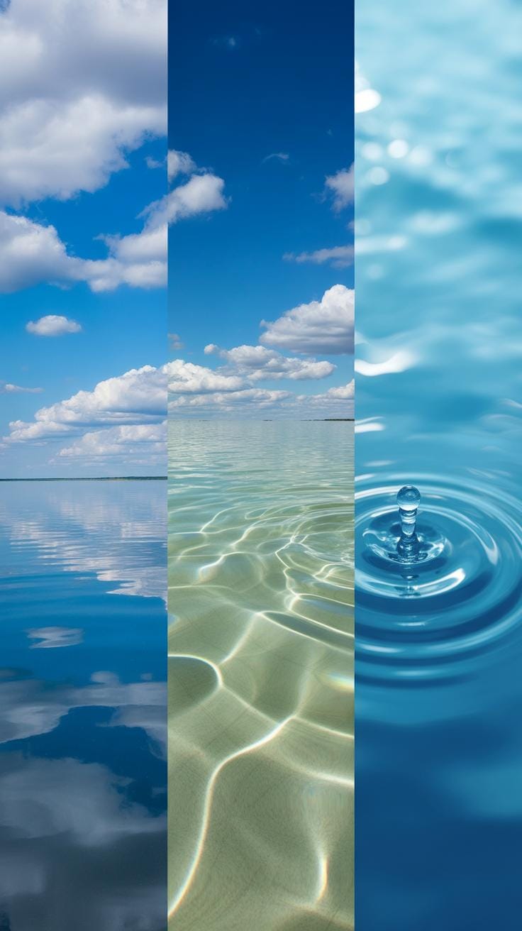
When considering water effects for your art or home decor, the style you choose can shape the entire mood of your piece. Calm water, waves, and ripples each have distinct visual impacts and evoke different feelings.
Calm Water Versus Wave Patterns
Calm water backgrounds often appear smooth and reflective, almost like glass. They suggest stillness, peace, or introspection. I tend to use them when I want a subtle, serene backdrop that won’t distract from the main subject. Wave patterns, on the other hand, are dynamic and full of energy. Their undulating lines and curves create movement and tension. If you’re aiming for drama or a sense of nature’s force, waves work better. The catch is waves can overwhelm if overused, so balance is key.
Ripple Effects And Their Applications
Ripple effects are like the middle ground between calm and wave water. These small, concentric circles spread from a point of impact, carrying a delicate motion. Creating ripple effects involves careful layering of paint or digital tools mimicking this spread. In decor, ripples add a soothing, tactile quality that’s visually interesting without being too bold. Say you have a minimalist design that needs a hint of movement—ripples can do just that. They’re often favored in zen-inspired settings or where subtle texture is desired.
So, whether you go calm, wavy, or ripple, each style gives you a different story to tell. Selecting the right one depends on what mood you want your art or space to convey. Ever found yourself unsure about which water style to pick? Maybe try mixing them up and see how your view shifts.
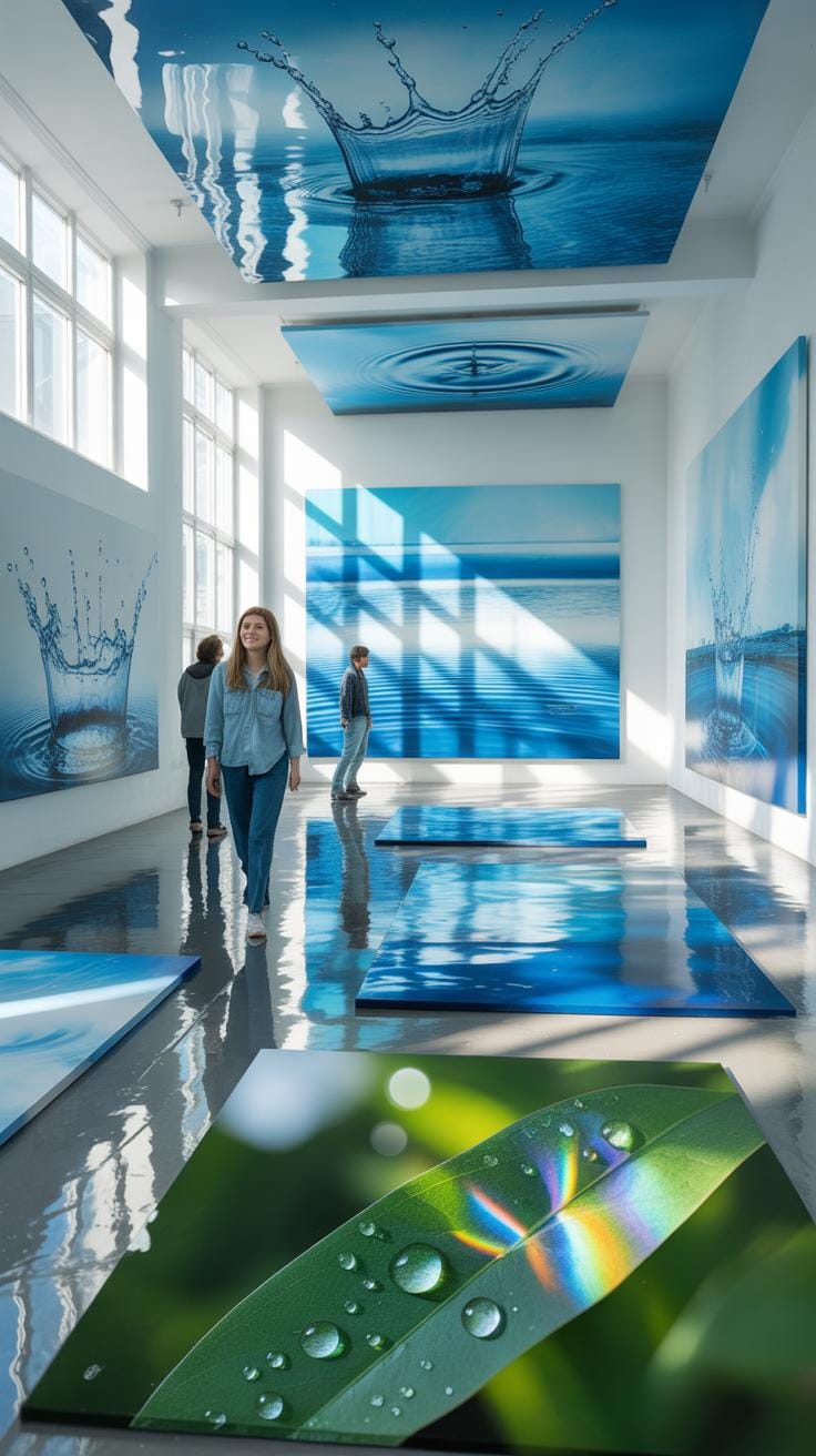
Examples Of Water Effect Artworks
Water effects in art come alive through both subtle and bold expressions. If you consider Claude Monet’s series of Water Lilies, you get a firsthand glimpse of how light and shadow interplay over the surface of a pond. Monet didn’t just paint water; he painted the shimmer, the reflections, and the movement. He layered colors with a soft touch, creating a natural fluidity that’s not simply a flat image but an immersive experience.
In more contemporary art, some artists layer different mediums—resins and acrylics, for example—to simulate the thickness and glossiness of water. One artist I recall used a combination of ink washes and digital print overlays to mimic the rippling effect on lake water, capturing the ephemeral quality of light dancing on liquid surfaces. It’s a delicate balance to strike, as too much detail kills the effect, but too little leaves it feeling empty.
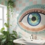
In home decor, water backgrounds often appear as large-scale wallpaper or wall decals. Imagine an entrance hall framed by a mural of a calm sea or a cascading waterfall—it sets a mood almost immediately. Some even embed thin LED strips behind glass panels to replicate the sparkling of sun on water, adding an interactive dimension. While simple paintings or photos can do the job too, it’s the textured or layered designs that make the ambiance memorable and tactile.
Famous Paintings With Water Effects
Monet’s “Impression, Sunrise” is another landmark piece, setting the tone for how water effects became central to Impressionism. The painting captures the hazy morning sun over a harbor, its reflection on water fractured into a mosaic of brush strokes. Monet’s approach was to capture the sensation of water rather than its exact detail, a method that left much open to interpretation, but that’s the charm—the water feels alive.
Turner’s seascapes also deserve mention. His technique involved bold strokes of color and light that evoke the tumult and translucency of stormy waters. Unlike Monet’s calm ponds, Turner’s waters seem wild, almost threatening, yet utterly fascinating. His use of contrast and layering makes you almost hear the waves.
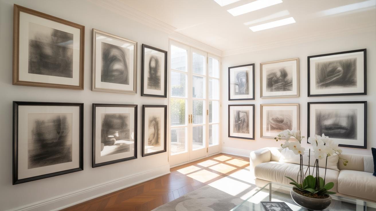
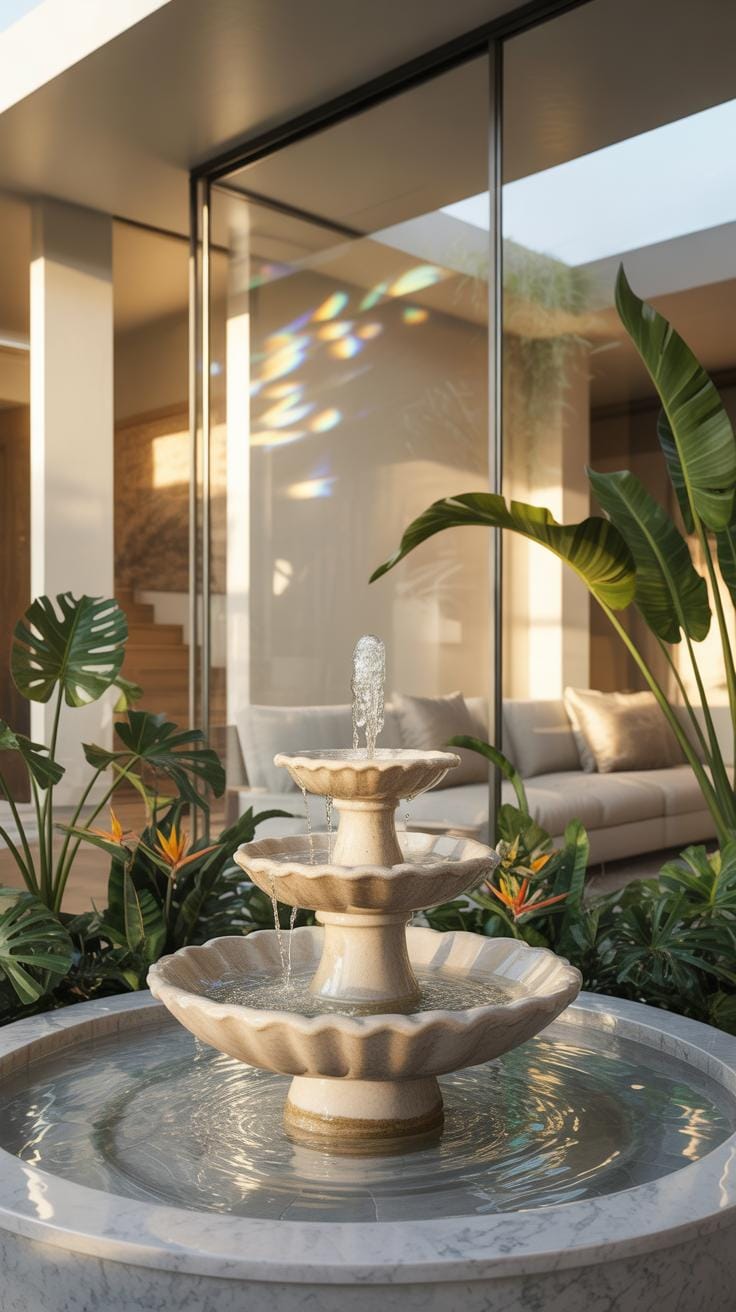
Home Decor Ideas Featuring Water Backgrounds
Water effects work well beyond paintings—transforming walls, furniture, and even lighting into serene, flowing elements. Here are some ideas you might consider:
- Wall murals featuring abstract waterforms or realistic ocean scenes instantly enhance a room’s calmness.
- Furniture with glossy, blue-tinted finishes mimics water surfaces, bringing a subtle aquatic vibe without overwhelming.
- Glass or acrylic panels infused with wave patterns placed behind sofas or beds add depth and texture.
- Water-inspired lighting that plays with reflections and shadows, creating dynamic room moods through subtle waves of light.
Trying such decor can be a bit of a gamble—too literal, and it feels cliché; too subtle, and it’s almost invisible. But when balanced right, water effect backgrounds can make a space feel refreshed and surprising, holding a quiet power that few other design elements offer.
Tips For Maintaining Water Effect Art
Water effect art needs a little special care to keep its unique look fresh and vibrant. I find that even small efforts can make a big difference. For instance, avoid direct sunlight—it’s tempting to hang your piece where it catches all the light, but UV rays can dull those delicate watery hues over time.
Cleaning requires a gentle touch. Use a soft microfiber cloth, slightly damp if needed, and avoid harsh chemicals—these can strip off the subtle layers that give water effect its depth. Dust can accumulate in tiny crevices, so regular light dusting helps prevent buildup.
Storage is equally crucial if you ever need to pack away your art. Store it in a dry, cool space with good air circulation, and avoid humid environments that could cause warping or mold. Wrapping in acid-free paper or using a breathable fabric cover protects the surface without trapping moisture.
Cleaning And Storage Guidelines
It’s easy to forget that water effect backgrounds often have fragile textures that react differently than flat paint surfaces. My preferred method is using a soft brush for dust and a barely damp cloth for smudges, always testing a small spot first.
When storing, try not to stack pieces directly against each other. Use protective layers to avoid scratches or accidental rubbing. Also, avoid plastic bags for storage unless they are specifically designed for art—you want materials that allow the artwork to breathe.
Repair And Touch-Up Advice
If your water effect art gets small chips or fading, don’t panic. Simple fixes like carefully blending colors with watercolors or transparent acrylic paints can help restore the illusion of flowing water. Sometimes just reapplying a thin glaze or varnish revives the brightness.
Of course, if damage is extensive, consulting a professional restorer might be the best choice. But for minor touch-ups, patience and a gentle hand usually suffice. Have you tried mixing your own touch-up solutions? It can be a bit tricky but really rewarding when done right.
Using Water Effects To Enhance Decor
Water effect backgrounds in home decor can add an undeniable sense of calm. Imagine a softly rippling water backdrop behind your sofa or workspace; it invites a certain quietness without overwhelming the senses. This subtle touch can brighten up rather dull rooms by introducing gentle movement, which I find quite soothing. Of course, the trick is not to go overboard—too much can feel chaotic rather than peaceful.
In practical terms, think about using murals or wallpapers that mimic water’s fluidity, or even water-inspired glass panels that reflect light. These evoke natural water patterns and textures, influencing the mood profoundly without needing real water. Placed in bathrooms or meditation corners, they can be especially grounding. And sure, the watery hues often blend well with neutral furniture tones, but contrasting deep blue or teal pieces sometimes work even better.
Overall, the application of water effect designs offers a blend of aesthetics and tranquility. If you’re hesitant, perhaps start small—like a framed water art piece—then see how your space evolves with these tranquil accents.
Creating Focal Points With Water Backgrounds
Designing walls or zones with water effect backgrounds can truly change how a room feels. Picture a feature wall behind a dining table that looks like water glimpsed through the lens of sunlight. It naturally draws eyes and sparks interest without needing complex decor. This kind of focal point anchors the room’s style—or at least it can, if done well.
Choosing an appropriate scale is key. A too-large water effect mural might overwhelm a small room, while too small might not make the intended impact. Try to imagine how passersby or guests will see that wall from various angles and distances. And think about how the water effect interacts with other textures; for example, matte painted walls nearby can emphasize the shimmering quality of water patterns.
In some cases, subtle lighting near the water effect background can peak the visual appeal—say, a soft spotlight making the “water” glisten in the evening. It’s an interesting mix of natural tranquility and intentional design flair.
Mixing Water Effects With Other Elements
Combining water effect backgrounds with plants, furniture, and lighting can create a balanced, inviting decor scheme. Plants introduce organic shapes that complement the flowing lines of water-inspired backgrounds. A tall leafy plant near a watery mural, for instance, can mimic the feeling of reeds by a water’s edge. Furniture choices are equally important—lighter wood tones and soft fabrics usually pair well with the coolness of water themes.
Lighting plays a surprisingly big role. Warm, indirect lighting softens the often cool, blue hues of water backgrounds, preventing the room from feeling too cold or distant. On the other hand, sharper white lighting can emphasize clarity and freshness in a kitchen or workspace.
Sometimes, going for a slightly imperfect mixture—like an eclectic chair next to a calm water wall—adds personality. It stops the decor from looking too staged and more like a living space. The balance is what really matters here, not perfect matching.
Conclusions
Applying water effect background techniques can sharply improve the impact of your artwork and home decorations. Using clear steps and suitable materials allows you to create authentic water-like visuals that complement diverse designs and spaces.
Whether you are a beginner or experienced artist, experimenting with these methods provides new ways to enrich your work. Embracing water effect backgrounds can add depth and freshness to your creative projects, making them more attractive and lively for your audience or guests.