
Common Color Theory Mistakes in Digital Art
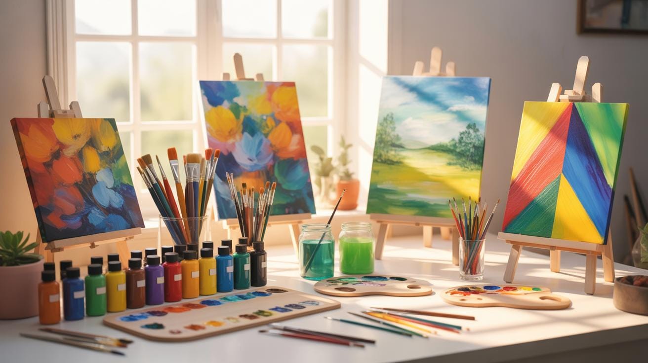
Color studies play a crucial role in digital art. They involve examining how colors work together and the rules of color theory that help artists create visuals that are pleasing and effective. By focusing on color studies, artists can use color to guide the viewer’s attention, create moods, and enhance storytelling.
This article covers key aspects of color studies in digital art and highlights mistakes to avoid when applying color theory. Whether you are a beginner or a seasoned digital artist, understanding these fundamentals will improve your work and save time fixing color issues.
Basics Of Color Studies

Color studies explore how we see and use colors, especially in art. It’s about observing colors closely, testing combinations, and understanding their effects. When you study color, you realize it’s not just about pretty visuals—colors influence emotions and tell a story.
Humans see colors through light wavelengths hitting our eyes. Different light wavelengths correspond to different colors. This light hits special cells in our eyes called cone cells, which help us distinguish colors. Colors aren’t fixed or separate objects; they depend on light, conditions, and our eyes.

There are three basic properties of color: hue, saturation, and brightness. Hue is what we usually call color, like red or blue. Saturation is how intense or dull that color looks. Brightness, also called lightness, is how light or dark the color appears. For instance, a bright red and a dull red can feel very different. Understanding these helps artists create moods or guide the viewer’s eye.
When you start thinking about these basics, you’ll notice how color choices impact your art more than you might have realized. It’s almost like learning a new language—once you know the vocabulary, your whole experience changes.
How Colors Are Perceived By Humans
Our eyes see color through cone cells—three types, each sensitive to different light wavelengths: roughly red, green, and blue. These cells send signals to the brain, which combines them into colors we recognize. The visible spectrum is the range of light humans can see, from violet to red.
Colors that come from a single wavelength of light are called spectral colors, like those in rainbows. But sometimes, different mixes of light can look the same because of something called metamerism. That’s why two objects might look identical in one light but different in another. Our perception isn’t always straightforward.
Properties Of Colors To Know
Here are the key color properties you should keep in mind:
- Hue: The basic color you see—red, blue, green, etc.
- Saturation: How vivid or dull the color feels. Saturation changes can make a color look washed out or very intense.
- Lightness (or brightness): How light or dark the color appears. Adding white makes a color lighter (tint), and adding black makes it darker (shade).

For example, a bright yellow feels cheerful and energetic. Lower its saturation, and it becomes softer, calmer. Make it darker, and it can feel more serious or muted. Little adjustments can shift the mood entirely.
It might sound a bit much at first, but playing with these properties will give you control over how your art communicates. Maybe try adjusting saturation or lightness on a color you like and see what changes. It’s a practical step anyone can do.
Color Studies

Color studies form the backbone of understanding how colors work together—or sometimes don’t—in digital art. When you dive into color studies, you’re essentially examining how colors behave, how they relate, and how the human eye perceives them. But it’s more than just picking pretty hues. It’s about paying close attention to properties like hue, saturation, and brightness, and how these shift your artwork’s mood or message.
One tricky part is that color perception isn’t simply about the pigment on your screen; it’s tied deeply to light itself. You might use certain color schemes because they look good on one device but end up muddy or harsh on another due to different color spaces like RGB or CMYK. Many digital artists underestimate this variance, leading to inconsistency when their art is viewed elsewhere.

Also, you’ll find that colors can be additively mixed (like on your screen) or subtractively mixed (like with paint), and these processes yield different results. So understanding which model you’re working within is crucial. Many beginners skip this step and wonder why their color blending doesn’t match expectations.
Color studies also urge you to consider the effect of cultural context and emotional associations tied to colors, though this can get murky and vary widely. Which is why color harmony—the idea of arranging colors to please the eye—cannot be a rigid rule. It calls for subtle judgement, sometimes a bit of experimentation.
If you want your digital art to maintain a strong visual impact, start by learning the fundamentals of color science, and then observe how these principles play out in your work daily. Maybe keep a notebook of color combinations that succeed or fail in your eyes, and test how they show up on different screens. It’s a process, but one that will grow your skill beyond mere guesswork.
How Color Theory Affects Your Art

When you dig into color theory, you quickly realize it’s more than just picking colors that look nice together. It’s a set of principles that guide how colors interact, mix, and influence emotions in your digital art. For instance, color mixing rules help you understand why adding red and green light results in yellow in digital screens, whereas mixing red and green paint gives a muddy brown. This difference comes from additive versus subtractive color mixing.
Additive mixing deals with light—red, green, and blue (RGB)—which your computer or tablet screen uses. When these colors overlap, they get brighter, ultimately producing white. Subtractive mixing, common with paints or inks, uses cyan, magenta, and yellow, absorbing light and producing darker combinations. So, in digital art, you’re mostly working with light itself, and that changes your approach to color blending.

Complementary colors, positioned opposite each other on the color wheel—like blue and orange or red and green—create striking contrasts. Use them wisely and your artwork gains balance and emphasis, making elements “pop.” Imagine a digital portrait with a warm orange glow behind a subject dressed in cool blue tones—this contrast can really captivate viewers.
Colors also convey feelings. Blues might calm or sadden, while reds energize or alarm. This can be tricky though, since emotional responses depend on culture and context. Still, grasping these basics can shift how you use colors to set moods or focus attention in your digital creations.
Choosing Color Palettes For Digital Design

When you start a digital art project, picking a color palette can feel a bit like guesswork. But there’s a process that makes this more manageable. Begin with a base color—this is your main tone that sets the project’s mood. For instance, a deep blue might feel calm and stable.
Next, add accent colors. These should contrast or complement your base. Think about how a splash of orange works with blue, or maybe a subtle green beside a yellow base. Accent colors draw attention and create points of interest.
Finally, evaluate the overall mood. Does it feel warm, cool, or neutral? Is the harmony right, or does anything clash? Sometimes what’s theoretically harmonious can still feel off in practice. Don’t hesitate to tweak shades or saturation until it feels balanced to you.
Steps To Build A Color Palette

Here’s a simple method to build a palette that works:
- Start with the base color that defines your theme.
- Choose complementary colors—those opposite on the color wheel—like blue and orange.
- Pick analogous colors next, which sit next to your base on the wheel—for blue, think blue-green or blue-purple.
- Add neutral tones such as gray, beige, or off-white to soften and balance.
For example, for a nature-themed palette you might pick a leafy green base, select a rusty red complement, add some yellow-green and teal analogous colors, and finish with creamy beige neutrals.
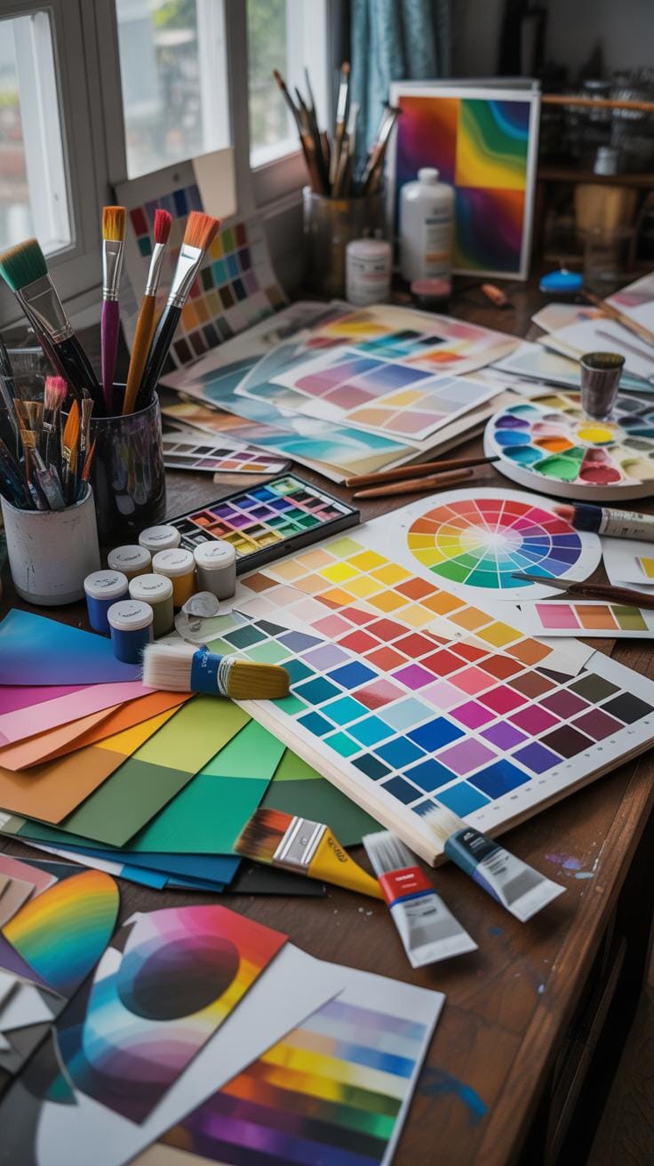
Tools For Palette Creation
There are digital tools that can help—some I find quite handy:
- Coolors: Quickly generate palettes with a shuffle button. Great for inspiration or rapid testing of combos.
- Adobe Color: Offers rules like complementary and triadic. Plus, you can upload images to extract colors.
- Palette Generator: Extracts palettes from photos, handy if you want natural color inspiration.
- Color Hunt: A curated gallery of palettes, perfect if you want proven good combinations instantly.
Using these tools can simplify things a lot, but trust your eyes—sometimes the tool’s pick doesn’t quite match your vision.
Using Color Spaces And Models


Color spaces are frameworks that organize colors, making it easier for artists to understand and reproduce them across different devices. You’ve probably heard terms like RGB, CMYK, and HSL tossed around in digital art discussions—but what do these really mean? And when should you care about them?
Each color space or model serves a distinct purpose:
- RGB is built for screens—your computer monitors, tablet displays, and smartphones all use it. It mixes red, green, and blue light to create colors.
- CMYK is tailored for printing. It uses cyan, magenta, yellow, and key (black) inks to replicate colors on paper.
- HSL and HSV describe colors based on hue, saturation, and lightness/value, which can feel more intuitive when adjusting tones and brightness.
Knowing when to use each can affect how your artwork looks and translates in different formats. For example, RGB covers a broader range of bright colors but doesn’t always convert perfectly to CMYK, which might limit or dull some colors. This matters a lot if you plan to print your digital work, as you might need to tweak colors to ensure they look right on paper versus on the screen.
If you think about it, color spaces are kind of like the different languages colors speak to various devices. This explains why the same shade you see glowing on your monitor can suddenly look off when printed. So, even if it feels a bit technical—understanding these spaces can actually save you from those frustrating surprises.
Using HSL and HSV, meanwhile, often makes it simpler to tweak your colors directly. They break down color into hue (the actual color), saturation (the intensity), and lightness or value (basically brightness). This division can be easier to grasp than juggling RGB values when you want to brighten or mute a color fast.

In practice, digital art software usually lets you toggle between these models, but being mindful of what each entails can guide your choices better. So, before you dive into your next project, ask yourself: is this art mainly for screen viewing or print? And how might adjusting saturation or brightness in HSL help get the mood just right?
Mistakes To Avoid In Color Theory

Wrong Color Combinations To Avoid
One common slip in digital art is piling on too many bright colors. It might seem like a fun explosion, but it often ends up overwhelming the viewer. Colors clash, and the overall harmony suffers. Another frequent error is ignoring how hues interact. For example, placing red next to green without intention can trigger a visual discomfort rather than interest.
Choosing balanced sets often means stepping back and limiting your palette. Try picking two main colors and a few subdued accents. Don’t be afraid to use muted versions to create breathing space. Also, consider color relationships—complementary, analogous, or triadic schemes can guide you toward more pleasant combinations without much guesswork.
Ignoring Lighting And Context
Lighting completely changes how you see colors. Imagine a bright daylight scene versus a dim room with warm light; the same color will feel different, sometimes drastically so. Neglecting this can lead to shading that looks off, or moods that don’t quite land right. It’s not just about brightness but direction and quality of light too.
Think about the environment you want to suggest. Is the light harsh, soft, natural, artificial? That context shapes every color choice. If you overlook it, your artwork might feel flat or disconnected. To fix this, try referencing real-world lighting setups or using lighting studies. Even simple shadow tests before committing to full color can help avoid mismatches.
Practical Color Study Exercises

One way to sharpen your color skills is by practicing with digital mixing tools. Try blending different colors and watch how the hue and saturation shift. For instance, start combining two primary colors in varying proportions. Notice how subtle changes create new shades. Experiment freely, sometimes mixing unexpected pairs. Don’t stress about “correct” results; it’s about observing outcomes and understanding relationships.
Next, give yourself a challenge with limited palette sketching. Pick just 3 to 5 colors and create a simple scene or quick sketch. It forces you to think carefully about color harmony and contrast within restrictions. You’ll likely realize that fewer colors can still express depth and mood effectively. It’s a practical way to train your eye to balance hues and values without overwhelming options.
Lastly, test contrast by creating compositions focusing on light and dark differences, or complementary colors. See how contrast affects readability and emphasis. These exercises might feel basic, but they build a strong foundation. They let you focus on specific color properties one step at a time, making you more confident in your choices.
Examples Of Effective Color Use
Looking closely at digital artworks where color theory comes alive reveals some pretty clear lessons. Take a piece where the artist uses a limited palette but plays with saturation to give depth—it’s not just about bold colors but how much those colors breathe. One example is a digital portrait where warm earth tones set a grounded, intimate feeling, while a cool blue background adds contrast without overpowering. The lesson? Balance is subtle and nuanced; it’s not just what colors you choose but how you manage their intensity and relationships.
In another striking example, complementary colors are used to create vibrant energy. Imagine an urban nightscape with glowing neon signs—electric pinks against deep teal shadows. This contrast makes the colors pop and guides your eye through the composition. It shows how complementary contrasts can draw focus effectively, but careful restraint is necessary to avoid visual fatigue.
Case Study Of A Balanced Palette
Consider a digital landscape where the artist has carefully balanced their palette. The dominant blues and greens evoke tranquility, but small dashes of orange and red punctuate the scene, adding points of interest. These complementary colors don’t overwhelm; instead, they harmonize thanks to careful saturation control. The artist’s timing of value shifts—the light and dark interplay—further enhances depth. It’s not a haphazard splash of hues but a deliberate dance, where each color’s role is clear yet subtle.
Example Of Color For Mood Setting
Color’s power to set mood is often overlooked until you notice its effect. Picture a digital piece using cool tones—blues, teals, muted purples—to convey calm, introspection, or even melancholy. In contrast, another artwork might be bathed in warm yellows, oranges, and reds to pump up energy or excitement. The choices feel intuitive even if you don’t consciously note them. This isn’t scientific precision; it’s almost instinctive, like colors tuning emotions quietly. These examples remind us that picking colors is not just about aesthetics but about tapping into emotional currents in viewers.
Conclusions
Color studies help you use color more intentionally in your digital art. Knowing the basics of color theory allows you to create better compositions and visuals that communicate clearly. Avoiding common mistakes will enhance your efficiency and creativity.
Take time to practice color mixing, contrast, and harmony. The right use of color can transform your art and make your message stronger. Keep learning and experimenting with colors to find what works best for your style and goals.