Introduction
Typography drawing is the skill of arranging letters and symbols clearly and attractively. This guide will show you how to learn and improve your typography drawing skills. You will explore the history, tools, and basic methods needed to create your own typography designs.
In the following chapters, you will find practical steps to understand the shapes of letters, how to draw them, and how to make your designs look good and readable. You will also learn how to use modern tools and tips from experts to master this art form.
What is Typography Drawing
Typography drawing is about creating letters and symbols by hand, arranging them in a way that makes text not only readable but also visually pleasing. It’s more than just writing words; it’s crafting each character thoughtfully, considering shape, spacing, and proportion. You might think it’s simple, just drawing letters—yet it involves decisions about balance and clarity that influence how people understand the message.
In design and communication, typography drawing plays a subtle but powerful role. It can catch your eye or slow you down to absorb details. For example, a well-drawn font in a poster guides your focus, while messy or awkward typography can confuse or distract. It’s about making words work as visual elements, not just carriers of information.
The Meaning of Typography
Origins of typography trace back to the early days of printing and even before, to handwritten scripts. The term itself comes from the Greek words for “type” and “writing.” At its core, typography is the art and technique of arranging type to make written language legible and attractive. Without it, texts would be challenging to read and far less engaging.

Historically, typography shaped how information spread. Think about how the invention of movable type changed communication forever. Before that, scribes labored over manuscripts, but typography introduced reproducibility and consistency. This was crucial not only for books but also for signage, advertising, and later, digital screens.
Why Typography Drawing Matters
At first glance, learning typography drawing might seem specialized, but its applications reach far beyond. If you’re into graphic design, for example, understanding how letters form and interact can elevate your work dramatically. It helps you create logos, posters, or websites that communicate clearly and with style.
Publishing also benefits—you can better appreciate how typographers choose font styles, weights, and spacing to improve the reading experience. And if you lean toward art, typography drawing offers a way to blend text with imagery, making your pieces more expressive. Sometimes, it surprises me how much a carefully drawn letter can add personality or mood to a project.
Thinking about it, can you imagine how many fields rely on the balance between form and function embedded in typography? That’s the value of mastering this craft. It’s not just about aesthetics but practical communication too.
History of Typography Drawing
Early Typography Origins
Typography’s roots reach far back, even before the invention of printing presses. Early printing wasn’t about ink on paper like we imagine, but more about impressions and symbols carved into seals or stamps. These were pressed onto clay or parchment to replicate patterns or messages. It’s fascinating to think how this tactile form shared the basic goal of repetition, much like typography today.
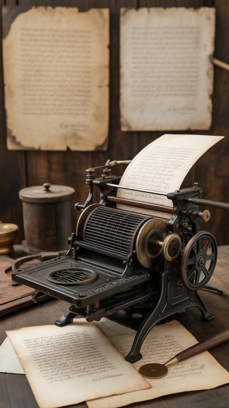
Later, in the 11th century, movable type appeared in East Asia, with metal or ceramic characters arranged to form words. This method allowed quicker re-use of printed characters, unlike carving entire pages each time. Johannes Gutenberg’s 15th-century printing press in Europe brought movable metal type into widespread use, revolutionizing how text was reproduced. But, you know, it wasn’t just about speed—it also demanded a keen sense of letter shapes and spacing, early forms of what we now call typography drawing.
Modern Typography Development
The move from manual to digital typography reshaped everything, but the transition wasn’t overnight or simple. Before computers, typography drawing involved sketching letters by hand, carving metal type, or setting lead pieces. Designers needed steady hands and sharp eyes. With the arrival of digital tools like Adobe Illustrator and font editors, the process became more flexible, precise, and accessible. Yet, some of that old craft still lingers—drawing letters by hand teaches you subtle details that software can’t replicate fully.
Now, you can create or modify typefaces on your screen with great speed. But the question remains: does this technology make us less attentive to the letterforms themselves? When you’re drawing typography by hand, every stroke matters in a way that digital tools sometimes mask. Still, both methods shape how typography drawing grows and changes today. It’s a curious mix of tradition and technology that you’re part of whenever you pick up a pencil or open that design software.
Basic Tools for Typography Drawing
Traditional Drawing Tools
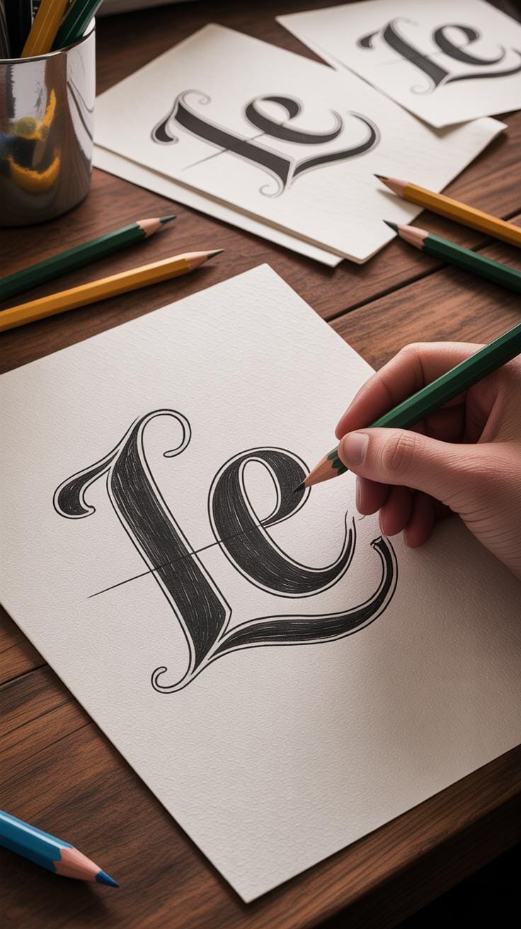
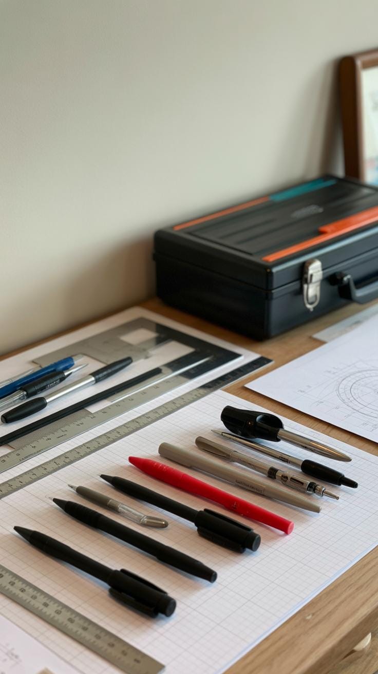
When you start with typography drawing by hand, some basic tools can make a big difference. Pencils are usually the go-to—great for sketching ideas roughly, adjusting shapes, and erasing mistakes without fuss. I often find that a softer pencil, like a 2B or 4B, gives you more control over thickness variation. Pens come next. Fine liners or technical pens help to sharpen the outlines once your sketch is ready. Some prefer brush pens to play with line weight, but that depends on the style you’re after.
Rulers and grids play a key role too. They keep your letterforms consistent, especially when drawing capitals or geometric shapes. Grids might feel dull, but they’re like a safety net—it’s easier to see where your letters stand in relation to one another. I remember struggling without one at first, always wondering if my baseline was straight. Having a good layout saved me from endless corrections.
Digital Tools for Typography
On the digital side, there’s a variety of software tailored to typography drawing. Adobe Illustrator remains a popular choice, especially if you want precision. It lets you draw vector-based letters that you can scale without losing quality. But, well, it can feel overwhelming if you’re new. For something lighter, apps like Procreate on iPad offer a more natural drawing experience with a stylus, blending the feel of hand-drawing with digital convenience.
Tablet devices, especially those with pressure sensitivity, change how lines respond to your hand movements. That variation in stroke width is often trickier with a mouse. Still, the choice between mouse, stylus, or even finger drawing is personal. And there’s free software too, like Inkscape or Krita, that can help you begin without any investment, though their interfaces might require some patience. Finding what fits your style and budget is part of the process.
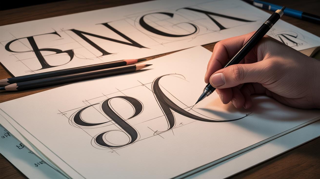
Understanding Letter Anatomy
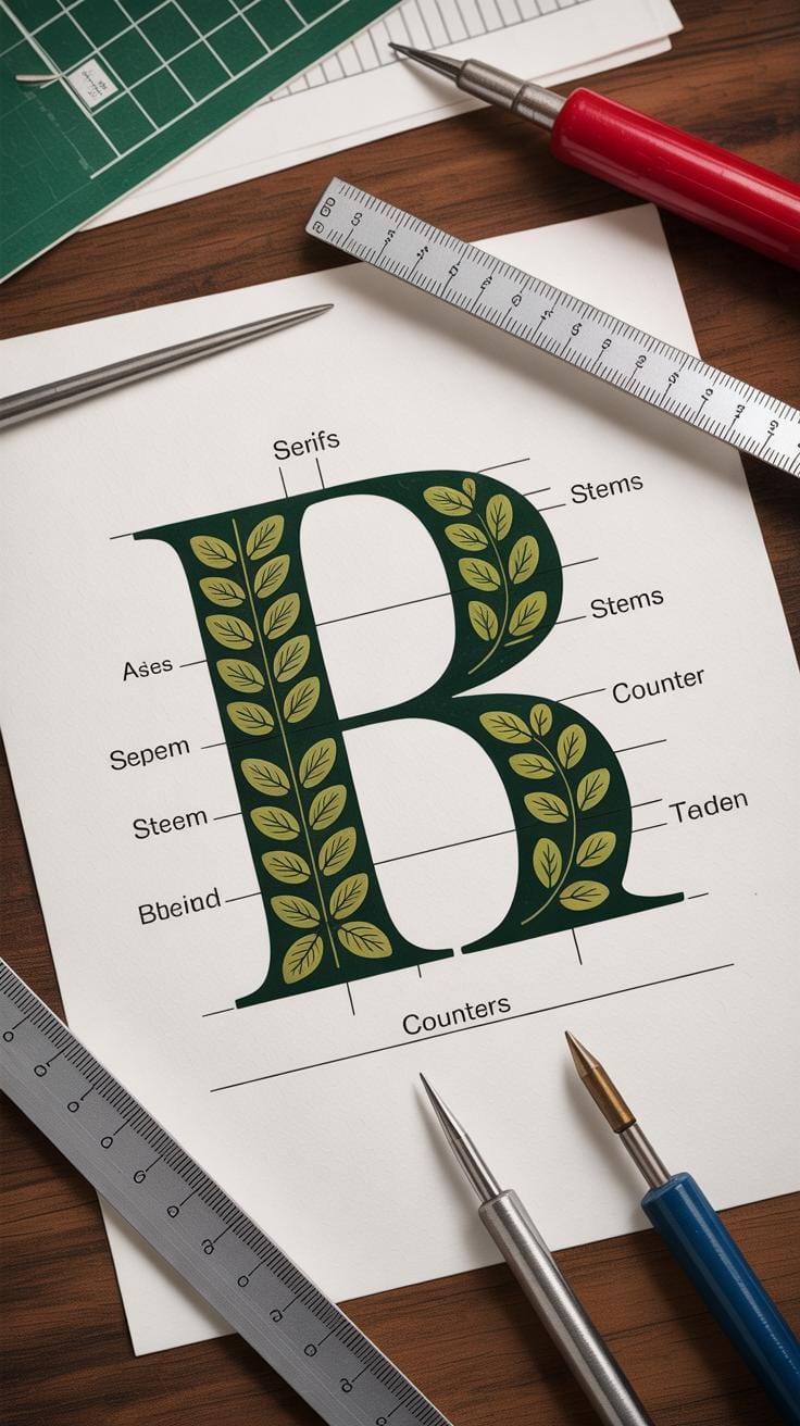
When you start drawing letters, it helps—well, maybe even feels necessary—to know the parts that make up each letter. These aren’t just names to memorize; they actually shape how a letter looks and how you should draw it. Take the stem, for example—this is the main vertical or diagonal stroke of a letter, like the backbone. Then there are serifs, those tiny strokes or feet at the ends of some letters. They aren’t decoration only; serifs can affect the letter’s personality and how readable it feels. Counters—the empty spaces inside letters like ‘o,’ ‘p,’ or ‘e’—also shape letters in subtle ways. They control how open or closed a letter appears, which can change how you sketch its form.
Key Letter Parts
Here are a few essentials to keep in mind when you’re drawing letters:
- Stems: The main supporting strokes. Tall, thick, thin—they guide the letter’s structure.
- Serifs: Little extensions at stroke ends found mostly in serif fonts. Their shape influences weight and flow.
- Bars and Crossbars: Horizontal strokes like in ‘A’ or ‘H.’ They balance vertical elements.
- Counters: The empty or white space enclosed or partially enclosed within letters, critical to form.
- Terminals: The end of a stroke that doesn’t have a serif. Knowing how these taper or finish matters when drawing letters with personality.
Understanding these parts changes the way you approach each letter. A ‘T’ with a broad serif will take more space, so you’ll draw differently than a sans serif ‘T’. These little details can make or break your design, and not just aesthetically—they affect clarity and style. You might not notice all these details at first, but soon your eye will begin catching them everywhere.
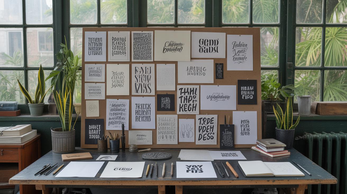
Observing Letters Around You
You don’t need fancy books or software to learn this stuff. Look at street signs, book covers, packaging—really look. How thick are the stems? Are the serifs sharp or rounded? Notice the counters too; sometimes a tiny tweak there changes everything. Try sketching letters you see, breaking them down into these parts. This hands-on practice helps you understand what works and what doesn’t. It’s a bit like detective work, piecing apart things you didn’t think twice about before.
Does this change how you see words on a signboard or a logo now? Keep questioning—why is that ‘e’ shaped like it is? What does that small serif add? Over time, you might find yourself drawing with more confidence because you’re not just copying shapes but understanding their intent.
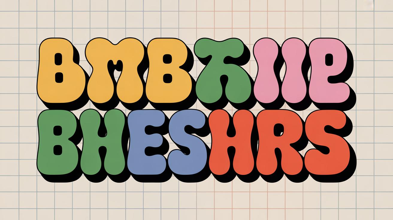
Basic Letter Shapes and Styles
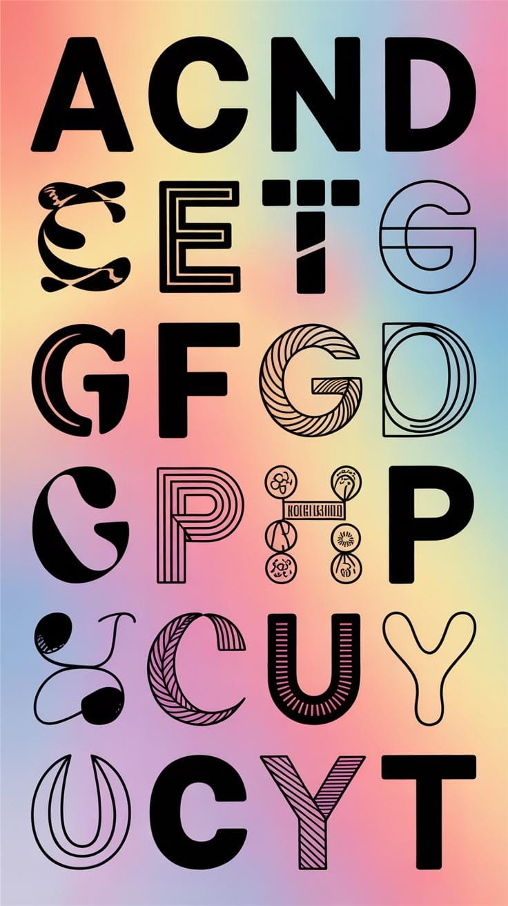
When you start drawing letters, the first thing to notice is that not all letters look the same—they follow certain shapes and styles. The three main ones you’ll often see are serif, sans serif, and script. Each has its own personality, and knowing these can guide how you approach your drawing.
Serif letters have these small lines or strokes attached to the ends of their main strokes. Think of classic book fonts or newspaper headlines that feel a bit formal or traditional. Drawing serifs can be tricky at first because those tiny strokes need balance—they should complement, not clutter, the letter.
Sans serif letters drop those extra bits and keep things clean. They look simpler, more modern. Drawing them feels straightforward—focus on clean, even strokes and you’re mostly good. They often use consistent thickness in their lines, but variations exist.
Script styles mimic handwriting. They flow, connect, and sometimes loop back on themselves. You might hesitate here, trying to keep the fluidity while sticking to legibility. Drawing script letters means paying close attention to stroke weight and rhythm; it’s not just about shape, but also about movement.
Start practicing with simple forms:
- Draw uppercase A, E, and T in serif style, noticing the small feet and edges.
- Copy the same letters sans serif, focusing on strong, clean lines without extra marks.
- Try a script version—maybe a cursive lowercase a or e—observing how the strokes connect and flow.
Remember, each style has rules but also room for your interpretation. Don’t hesitate to experiment and let your hand feel the differences. What happens if you exaggerate a serif’s tail? Or smooth out a script’s curve? There’s no perfect answer, just the way you see and understand letters in motion.
Spacings and Arrangement
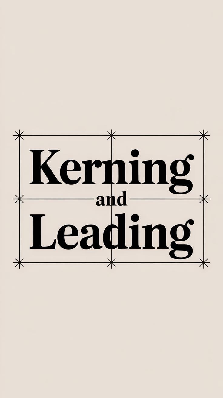
Spacing between letters and words plays a key role in how your typography drawing feels and reads. Too tight, and it becomes cramped, confusing the eye. Too loose, and the text looks disjointed, losing flow. When you’re arranging letters, consistent spacing feels… well, natural, but getting there isn’t always straightforward.
Kerning refers to adjusting the space between individual letter pairs. You might notice that letters like “A” and “V” need less space between them than “A” and “T.” Kerning helps avoid awkward gaps or collisions. Tracking, on the other hand, adjusts spacing uniformly across a range of letters. Think of it as tweaking the overall density of text.
To arrange letters evenly:
– Compare and tweak the spaces visually, letter by letter if needed.
– Use guides or measuring tools—you can sketch light lines to keep letters aligned horizontally and spaced uniformly.
– Step back to see if the text block feels balanced—you might find some areas need subtle spacing changes.
Positioning your letters and words isn’t just about neatness. Aligning text blocks properly improves clarity and guides the reader’s eye. Left alignment is common and easier to maintain consistently. Center alignment can work but is trickier—words may look unevenly spaced when lines vary in length.
During my early attempts, I often rushed the spacing, thinking it was secondary to the letter shapes. But spacing can totally make or break legibility. Are you noticing any awkward gaps already? Maybe try tweaking spaces in a sketch and observe how your eyes respond.
Practicing Typography Drawing
Getting better at typography drawing takes more than just knowing the rules—it demands real, hands-on practice. But where do you start? Start small. Pick a single letter and draw it over and over, focusing on shape and balance. Don’t rush. You might find that some letters feel awkward, or your lines don’t quite match your vision. That’s normal. The key is to practice daily, even if it’s just for ten minutes.

Try these simple exercises to build your confidence and precision:
- Trace letters from fonts you like, then redraw them freehand to compare.
- Write out the alphabet focusing on consistency in stroke width and height.
- Draw letter pairs to practice how they interact side by side.
Once you feel more comfortable, introduce some variation. Experiment with mixing thick and thin strokes, or play with letter shapes slightly to develop your style. Arrange letters in different patterns or curves. Notice how different setups change the feel. You might find a combination that feels right or sparks an idea.
Don’t hesitate to challenge yourself creatively. Sketch words in unexpected layouts or combine styles that seem unrelated. You won’t always get it right, but those attempts show where you can grow. What style do you naturally lean toward? What feels forced? Keeping track of these answers will shape your practice going forward.
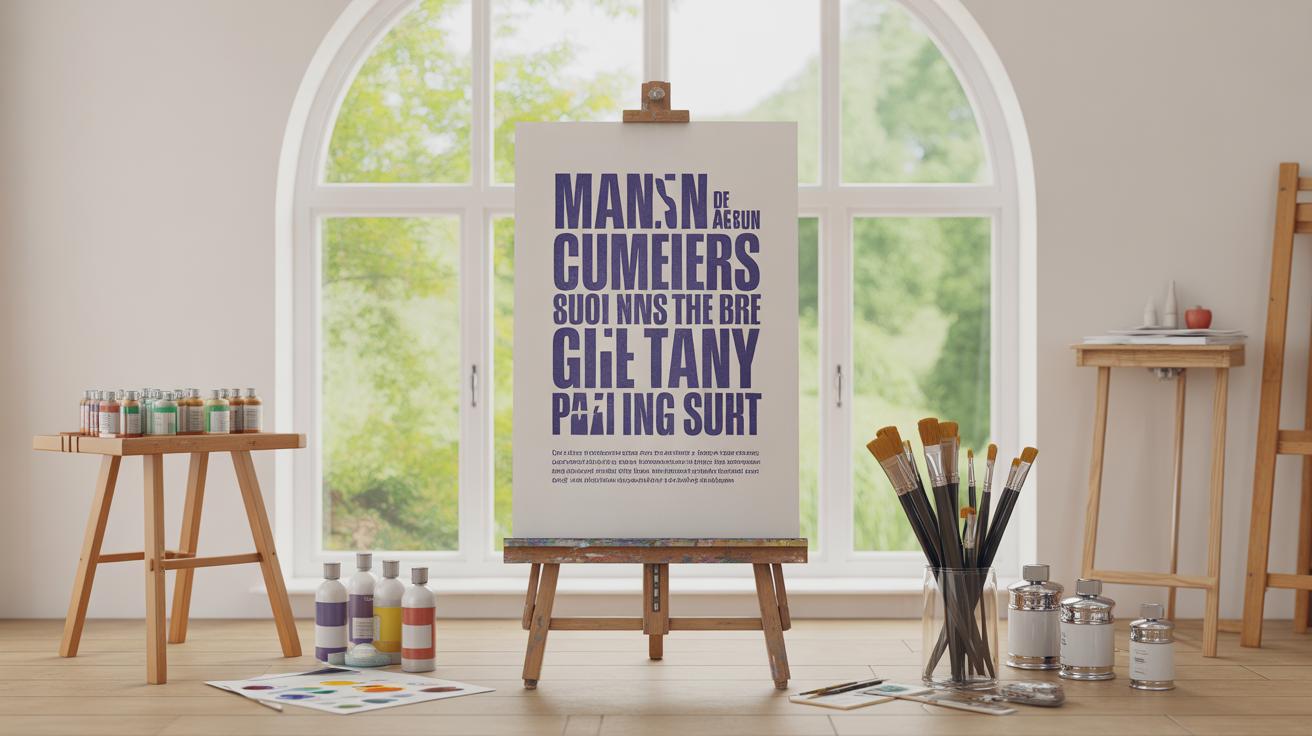
Using Color and Decoration
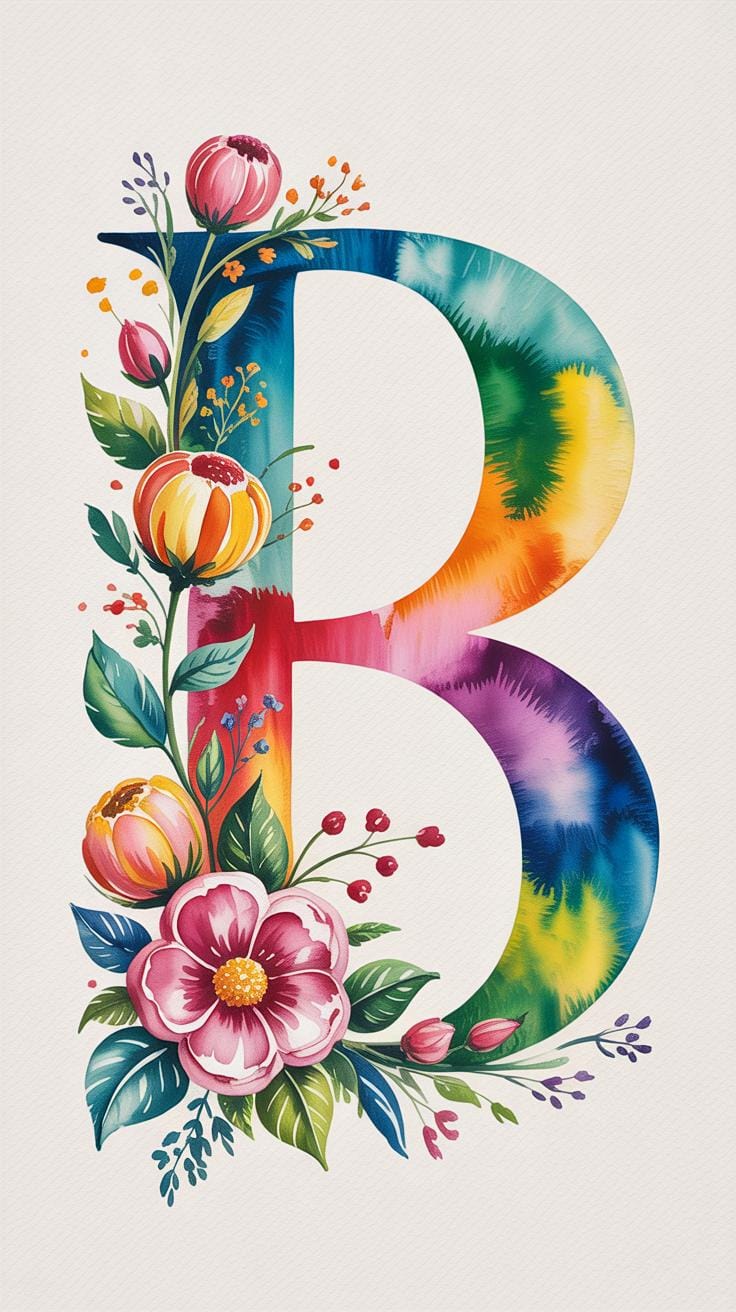
Color can change everything in a typography drawing, but choosing the right hues isn’t always straightforward. You might think bright colors automatically make your letters pop, but sometimes subtle shades work better, especially if you want to keep things readable. Think about what mood or message you want to convey—calm blues, energetic reds, or something more neutral? Your choices can either support or distract from your letterforms.
When applying color, it helps to limit your palette. Too many colors can make a piece feel chaotic. Try using one or two main colors with a neutral background. You can also experiment with gradients or slight tonal shifts within each letter, which adds depth without going overboard. Remember, color isn’t just decoration. It guides the viewer’s eye and sets the tone.
Decorations like shadows or highlights are handy tools. Drop shadows, for example, create a sense of dimension. But you should use them sparingly—too much shadowing can clutter the drawing or reduce legibility. Highlights can make letters appear shiny or glossy, but placing them wrong might confuse rather than clarify. Sometimes a simple line or dot pattern around a letter adds just enough flair while keeping the message clear.
Some decoration techniques include:
- Adding a soft shadow behind letters to suggest depth
- Using subtle highlights on edges to mimic light reflection
- Applying fine lines or dots around letters to add texture
- Outlining important words with a contrasting color for emphasis
It’s a bit of a balancing act. Decorations should enhance, not overpower. Tried a decoration that looked cool but made reading harder? You’re not alone. This is the part where personal taste and trial come into play. So, when you add color or decoration, always ask yourself if it helps communicate your message better. If not, simplify or rethink your approach. Colors and decorations are tools to serve your typography, not the other way around.
Digital Techniques for Typography Drawing
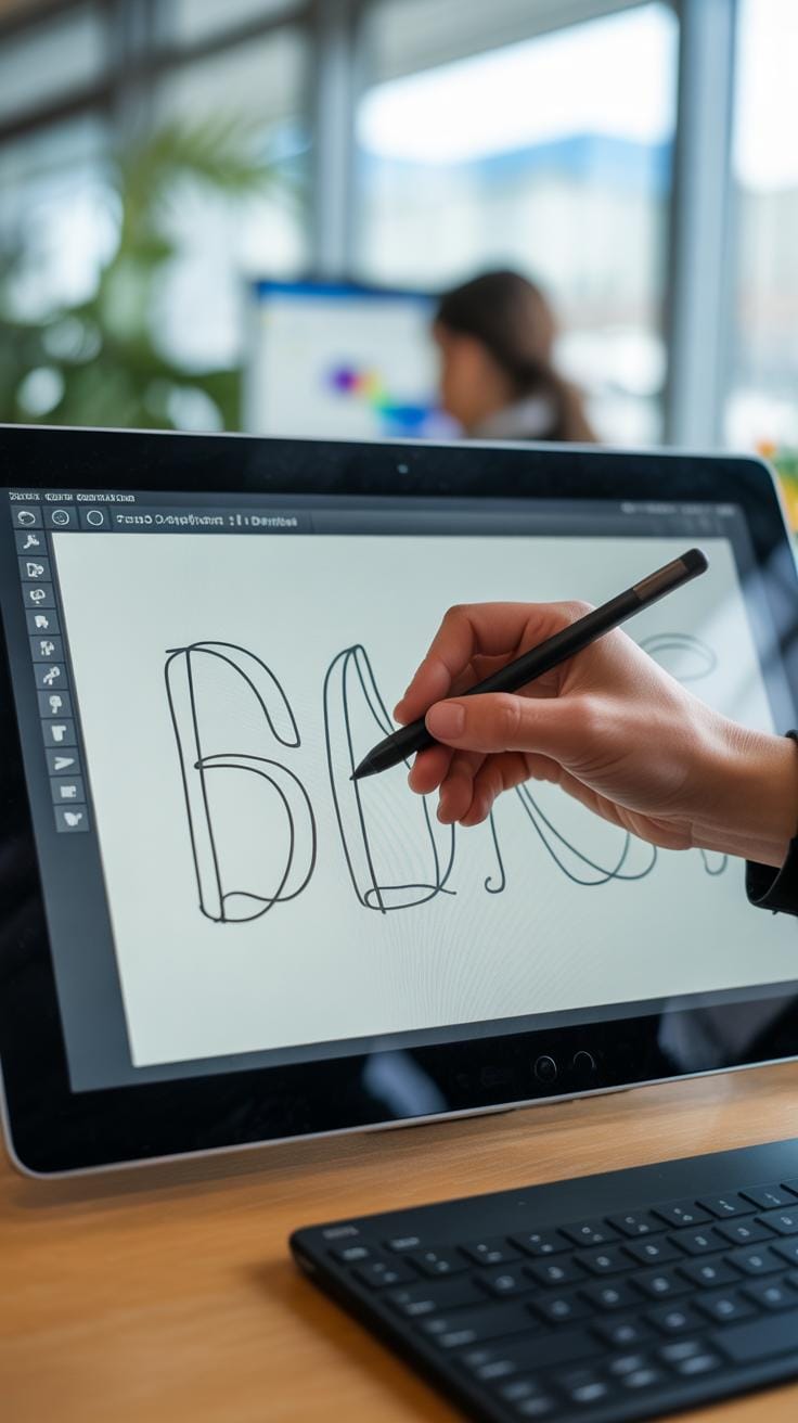
Using digital tools for typography drawing opens up a whole new level of control and flexibility. At first glance, it might feel overwhelming—there are so many options out there—but once you get used to a few basics, it’s easier to shape your letters the way you want.
Common software like Adobe Illustrator or Procreate offer vector and raster options that suit different needs. For example, vector tools let you tweak curves without losing quality, which is great for precise letterforms. On the other hand, raster programs let you add subtle textures or brush effects that feel more organic. You might find yourself switching between them depending on whether you want clean lines or a hand-drawn feel.
When it comes to editing your typography, layers become your best friend. You can isolate individual letters or details, move them around, and experiment freely without losing the original sketch. Tools like the pen and anchor point editors allow you to modify shapes with pixel-perfect accuracy. Sometimes I get stuck trying to smooth out a curve, and the undo button feels like a lifesaver.
Zooming in is another simple trick I can’t live without. It lets you spot tiny imperfections that often get ignored at first glance. Plus, digital brushes can simulate traditional drawing tools, so you can practice your strokes without constantly changing pens or erasing mistakes.
Have you tried using grid overlays or guides in your designs? They help keep proportions consistent, especially when working with complex lettering styles. While you might feel tempted to skip them for a more freeform look, these guides often make the difference between a messy sketch and something that feels polished—even if just slightly.
In the end, digital drawing isn’t just about convenience. It allows you to push your typography work in directions that manual drawing might slow down. Still, I wonder if sometimes it takes away a bit of the rawness that comes from creating by hand—something worth thinking about as you progress.
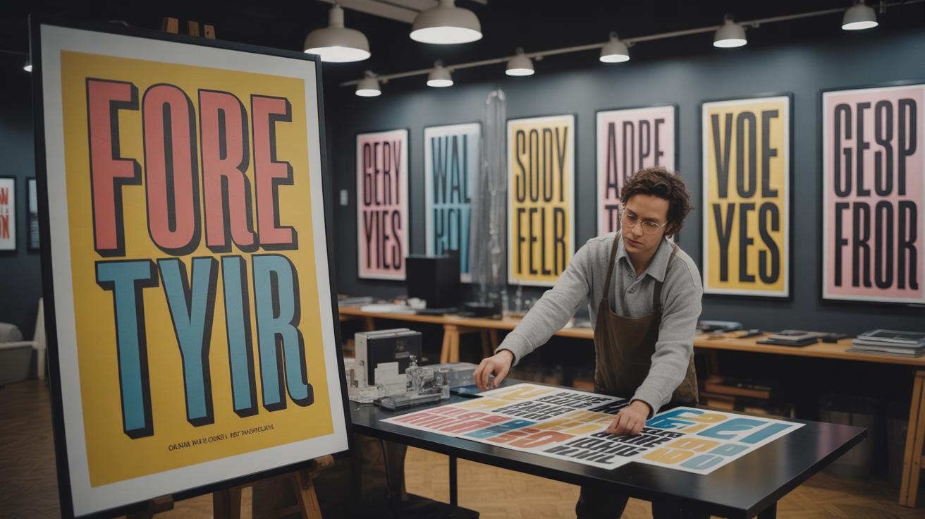
Applying Typography Drawing in Projects
You’ve practiced your typography drawing skills, explored digital tools, and refined your craft—so where do you go from here? Putting your skills to work in real projects can feel a bit daunting at first, but it’s also where your efforts really take shape.
When creating posters, typography drawing lets you set the mood instantly. You might want bold, chunky letters to grab attention, or something more delicate for a softer vibe. Think about the message you want to send and how your lettering style echoes that feeling. For logos, hand-drawn typography adds an unmistakable personality—something unique that often can’t be achieved with standard fonts. Does the brand feel playful, serious, or vintage? Your lettering can reflect that.
In web design, it’s tempting to stick to safe, web-friendly fonts. But imagine sparking a bit of character with custom typography that complements the site’s tone. The challenge is balancing style with readability and technical limits. It might take some trial and error, but that balance is worth hunting down.
Designing with Typography
Choosing the right typography drawing for a project is less about rules and more about feeling. Ask yourself:
- What emotion should the design evoke?
- How will the lettering work with other visual elements?
- Is the typography the main focus or supporting detail?
For example, a vintage-themed poster might call for hand-lettering that looks slightly imperfect, conveying that nostalgic charm. A tech startup’s brand, in contrast, may need clean, sharp lines that hint at precision and modernity. Don’t force every style on every project—some things just don’t fit. Yet, sometimes breaking “the rules” leads to fresh ideas. So, trust your instincts, but also test your choices in context.
Showcasing Your Work
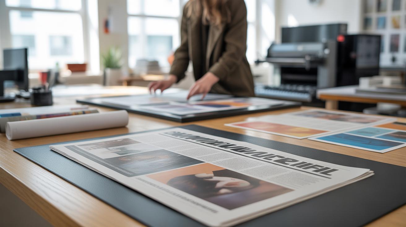
Sharing your typography drawings feels rewarding but can be tricky. The way you present your work shapes how others see it. Displaying your lettering mocked up on products—like t-shirts or book covers—helps clients or viewers imagine the potential. Digital portfolios are great, but don’t shy away from printed samples; sometimes a tactile experience sells your skills better.
Feedback matters. Showing your work to peers or mentors often reveals perspectives you might miss alone. Still, not every comment will land right. Be open but discerning when adapting suggestions.
Where to share? Platforms dedicated to design communities encourage meaningful exchanges. Yet, personal websites let you control the narrative fully. Experiment with different methods and see what feels authentic to you.
Conclusions
What you have learned in this guide will help you practice and improve your typography drawing skills step by step. Remember, like any skill, it takes time and effort to get better. Keep practicing drawing letters and trying different styles.
Use the techniques from this guide to make your typography clear and attractive. Keep learning and experimenting. Your designs will become stronger and more interesting as you gain experience. Typography drawing is a useful skill that can help you in many creative projects.