Introduction
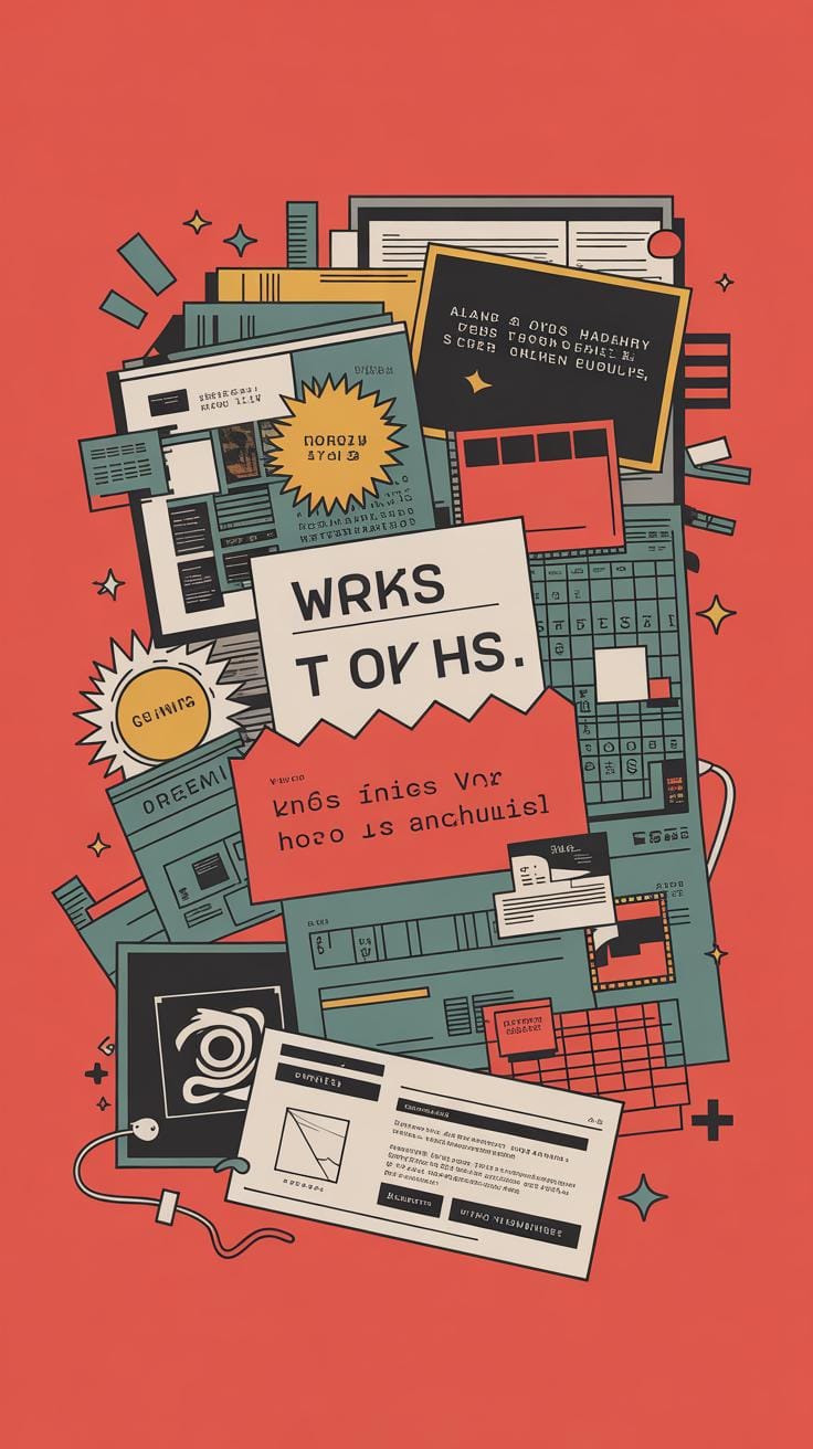
Typography is the art of arranging text to make written language clear and attractive. When you mix text and graphics creatively, you can catch attention and communicate your ideas better. This article explores how combining text and graphics in creative typography design can make your projects more interesting and effective for your audience.
You will learn simple ways to pair words with images for the best results. We will guide you through ideas and examples that you can start using right away, even if you are new to design. This is about making your design work not just look good but also work well to share your message.
Understanding Typography Basics
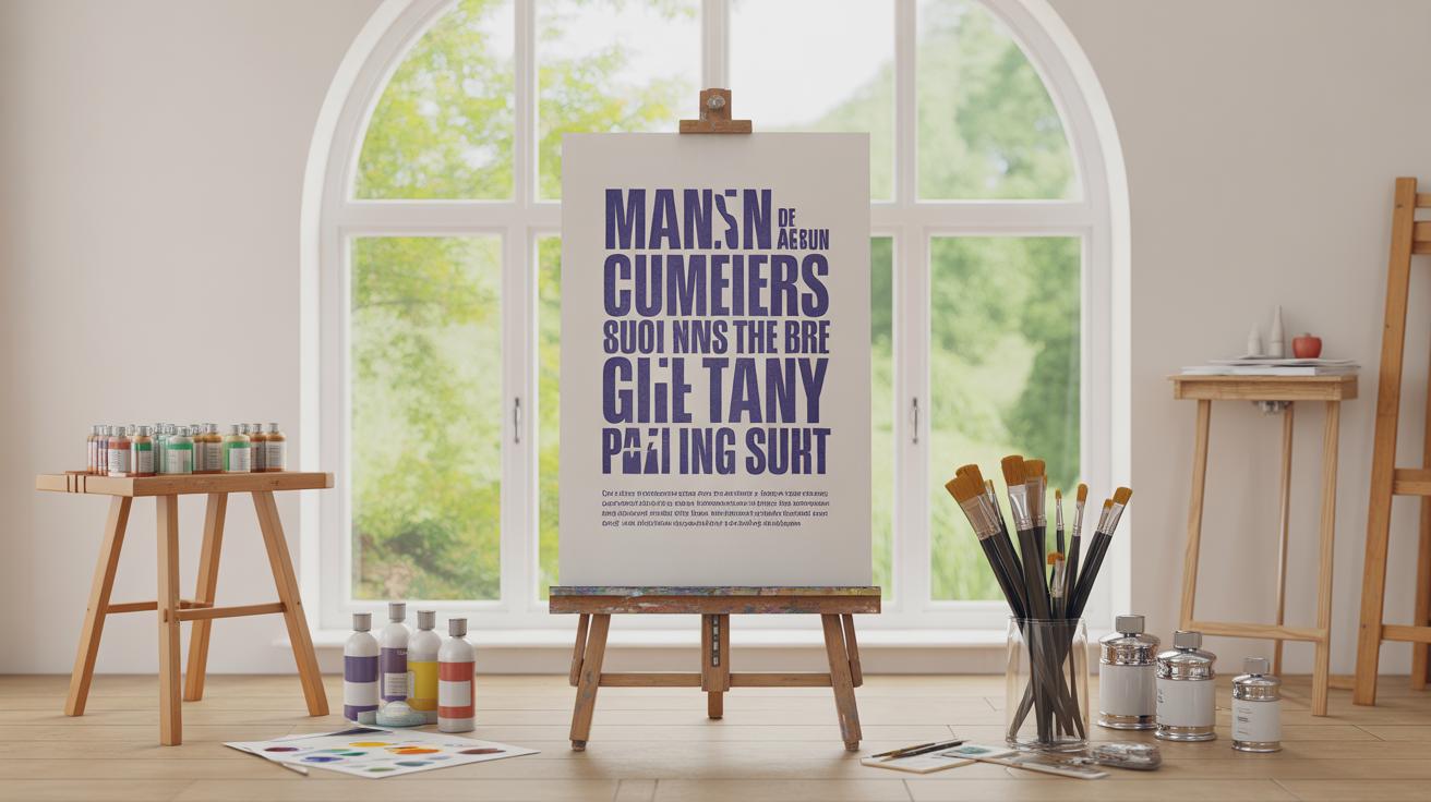
What is typography? At its simplest, typography is the art and technique of arranging text so it’s both clear and attractive. It’s not just about choosing pretty fonts—though that matters—but about how letters work together on a page or screen to communicate effectively. When you look at a typeface like Times New Roman or Helvetica, you’re seeing choices about shape, weight, and style bundled together.
Font size, spacing between letters (kerning), and line spacing (leading) all influence how easy text is to read. Imagine a headline in a cramped font size versus one set with enough spacing—one grabs your attention; the other might just confuse you.
The role of typography in design goes beyond aesthetics. Good typography guides the reader’s eye, sets a tone, and makes information more digestible. For example, a bold sans-serif font with wide letter spacing can feel modern and open, while a delicate serif might convey tradition or seriousness.
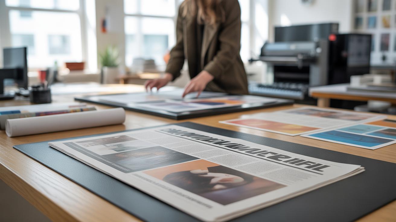
Think about newspapers versus fashion magazines—their typography differs because their messages and audiences differ. Typography isn’t just decoration; it helps tell a story and ensures the message arrives intact.
So, when creating your designs, pay attention not only to what you say but also to how your words appear. Your choice of typeface or spacing could influence how people feel about your message, even without them realizing it. Have you noticed how changing a single font can alter your impression of a brand or a headline? That’s typography in action.
Basics Of Graphic Design
What Is Graphic Design
Graphic design is, at its core, about sending messages through visuals. Think logos, posters, or ads—they’re not just decorations. Each uses images, shapes, and colors to convey ideas or feelings without relying on long explanations. A well-designed logo, for example, can instantly communicate a brand’s personality. Posters grab attention fast, while ads try to persuade in moments.
It’s not just about making things look nice. Graphic design organizes information and guides your eye so you get the message right away. Sometimes that means clarity, other times it’s emotion. But always, something is being communicated and you feel it before you even read the words.
How Graphics Enhance Text
Graphics can change everything for text. They don’t just sit next to words—they interact. A simple icon can make a headline feel urgent or playful. Shapes and lines help group related information, making complex details easier to digest. Color adds mood; a red highlight can warn, while soft pastels calm.
Think about road signs. The symbols next to words are often what you notice first. That’s because visuals add meaning beyond letters. They draw your eye, create hierarchy, and sometimes even tell a story alongside the text. Without graphics, text can feel flat or harder to engage with. Yet, too much can overwhelm, so finding the right balance is key. Have you ever seen a design where visuals confuse rather than clarify? It shows how delicate this relationship really is.
Why Combine Text And Graphics
When you mix text with graphics, your design often speaks louder and clearer. Think about a simple illustrated poster—words alone might feel flat or forgettable, but add a well-chosen image, and suddenly the message sticks. It’s not just decoration; the graphic shapes how you interpret the words.
For example, imagine the word “hot” overlaid on a flame icon. That little image makes the meaning immediate and hard to miss. Without the graphic, you might understand, but it won’t grab you as quickly or stay in your mind as long.
Attracting Attention
Graphics naturally pull your eyes first—our brains react faster to images than text. If a design has only words, you might skip over it without much thought. But add a graphic, and suddenly it stops you, even for a second.
Sometimes, the text is subtle or minimal, but the graphic acts as a spotlight. That’s why posters or ads use bold visuals next to short slogans. Combining them helps the message break through the noise, even when viewers are just glancing.
Improving Message Clarity
Pairing visuals with words can make complex ideas easier to grasp. A small graphic can show what the text says—like a pie chart beside numbers or an icon representing a service next to its description. This way, you don’t have to rely solely on words; the image does some of the explaining.
I’ve noticed that when I design with both, the message sticks better for me, and I think it does for others too. It’s like the brain gets two chances to understand—through reading and seeing. The balance isn’t always perfect, though. Sometimes, the graphic adds confusion if it’s unrelated. So, you have to choose carefully, not just throw images in for the sake of it.
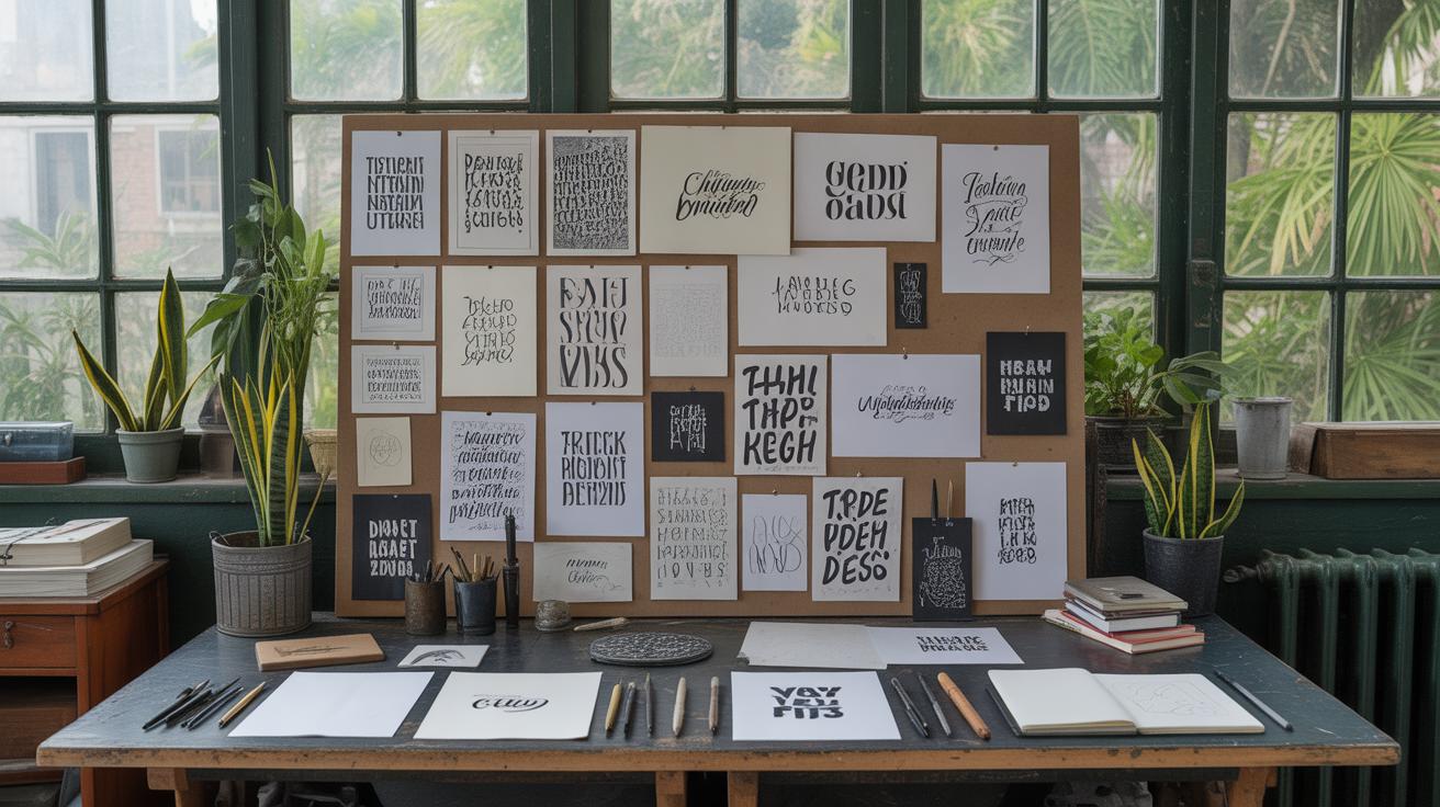
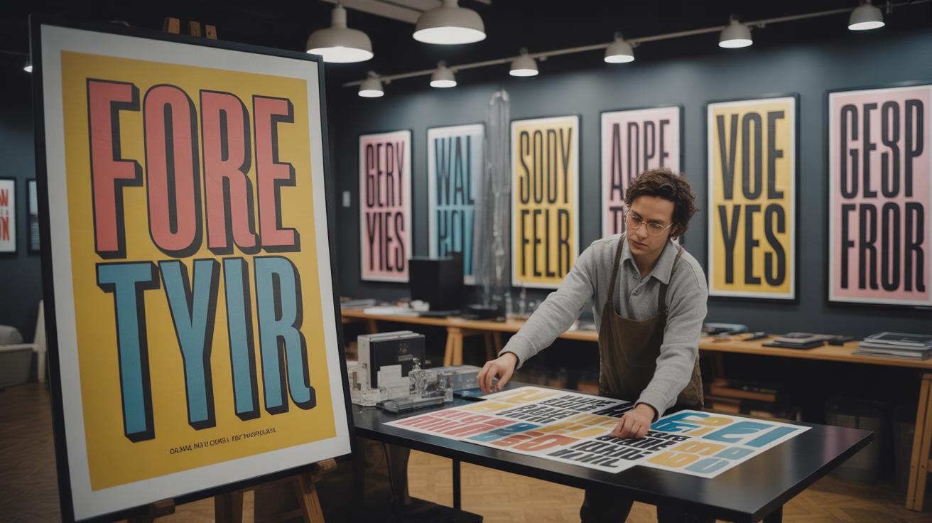
Choosing Fonts That Work Well With Graphics
Picking the right font to go along with graphics isn’t just about matching styles; it’s about balance. You want the text to harmonize with the image without stealing the spotlight—or fading into the background. Fonts carry moods, and wrong choices can clash with the tone your graphic sets.
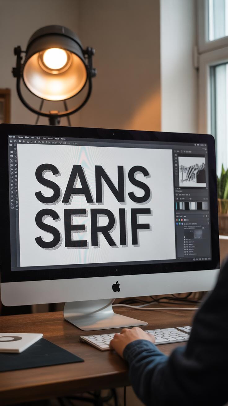
Think about this: serif fonts often feel more traditional or formal, while sans-serifs can come off as modern or clean. Script fonts might add elegance but could be hard to read if the background image is busy. So, when you look at a graphic, ask yourself what emotion it’s trying to convey. A playful cartoon? Maybe a rounded, casual font fits better than something rigid and sharp.
Readability is something you can’t overlook, especially when text overlaps or sits near complex visuals. If your font is too thin or condensed, the letters might blur into the image. On the other hand, overly bold or ornate fonts might drown out subtler picture details. Sometimes, a simple font with clear spacing works best, even if it feels less “creative” at first.
Also, consider the type of image you’re working with. For photographic backgrounds, clean fonts that contrast well tend to stay legible. With illustrations, you might get away with more experimental typefaces because the shapes are often simpler. Pairing fonts thoughtfully means looking beyond just style; think about size, contrast, and how the text’s texture sits beside the graphic’s lines and colors.
You might find yourself uncertain which fonts complement graphics nicely. That’s okay. Testing combinations and stepping back often reveals surprising fits—or misfits. Sometimes, a font you thought would be perfect ends up fighting the graphic, making you rethink your choices. It’s all part of the process.
Creating Visual Hierarchy With Typography And Graphics
Size plays a crucial role in guiding what the viewer notices first. Larger or bolder text naturally draws the eye and signals importance. Think of a headline that dominates the page—it’s usually the first thing you see. Graphics can reinforce that by pointing towards or framing the text, making it pop even more. But sometimes, subtlety helps too. A smaller, detailed graphic alongside a massive headline can create a nice balance without overwhelming.
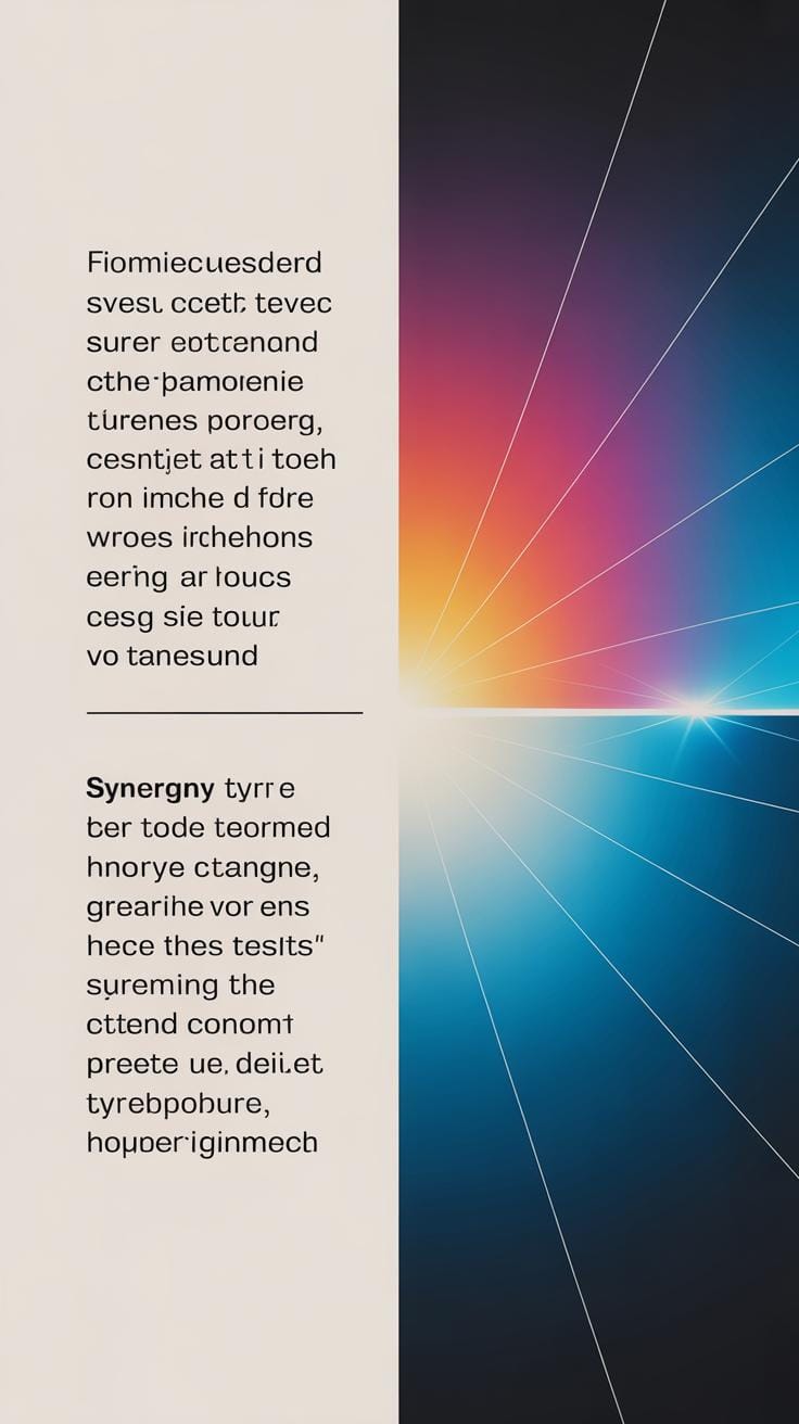
Color and contrast are equally powerful tools. When text contrasts sharply with its background or nearby images, key messages stand out more clearly. Bright colors on dark backgrounds, or vice versa, keep your eye moving, highlighting what matters most.
Placement also directs attention in unexpected ways. Text placed near striking visuals can gain extra emphasis simply by proximity. Sometimes, offsetting a block of text to an unusual spot in the design makes people stop and look, though it risks confusion if overdone.
So, when planning your layout, ask yourself: what do you want people to see first? And what do you want them to notice next? Size, color, and thoughtful placement help answer those questions. It’s less about strict rules and more about delicate nudges guiding the viewer’s journey through your design.
Techniques To Blend Text And Graphics Creatively
When you try to combine text and graphics, sometimes it feels like they’re competing for attention rather than working together. But there are ways to bring them closer—methods that almost make the text part of the image, or the graphic part of the message itself. One approach is wrapping text around images. Think of how a newspaper or magazine lays out stories around photographs. The text flows along the shapes, following contours instead of sitting in rigid blocks. This can create a natural rhythm, but you have to watch out—if the text gets too cramped or the spacing isn’t right, it just looks messy.
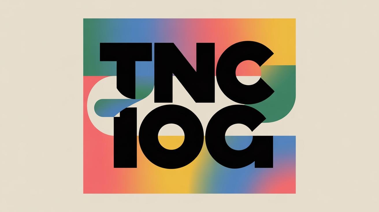
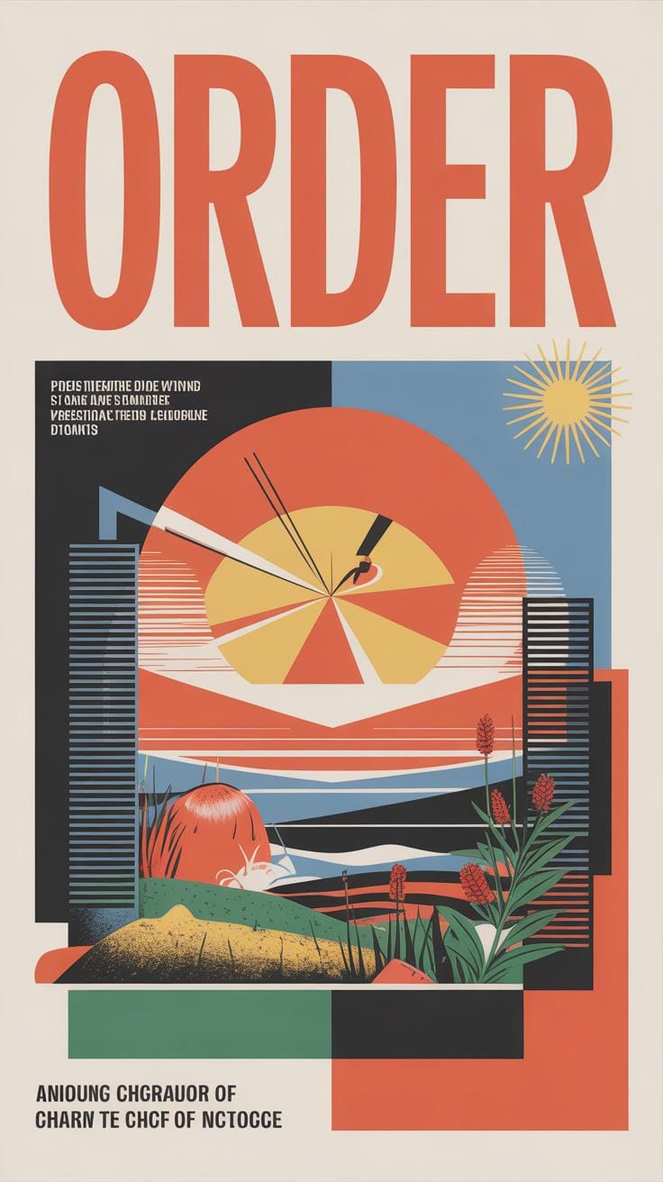
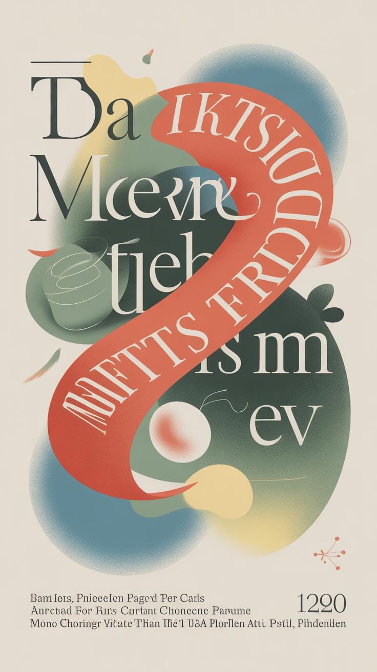
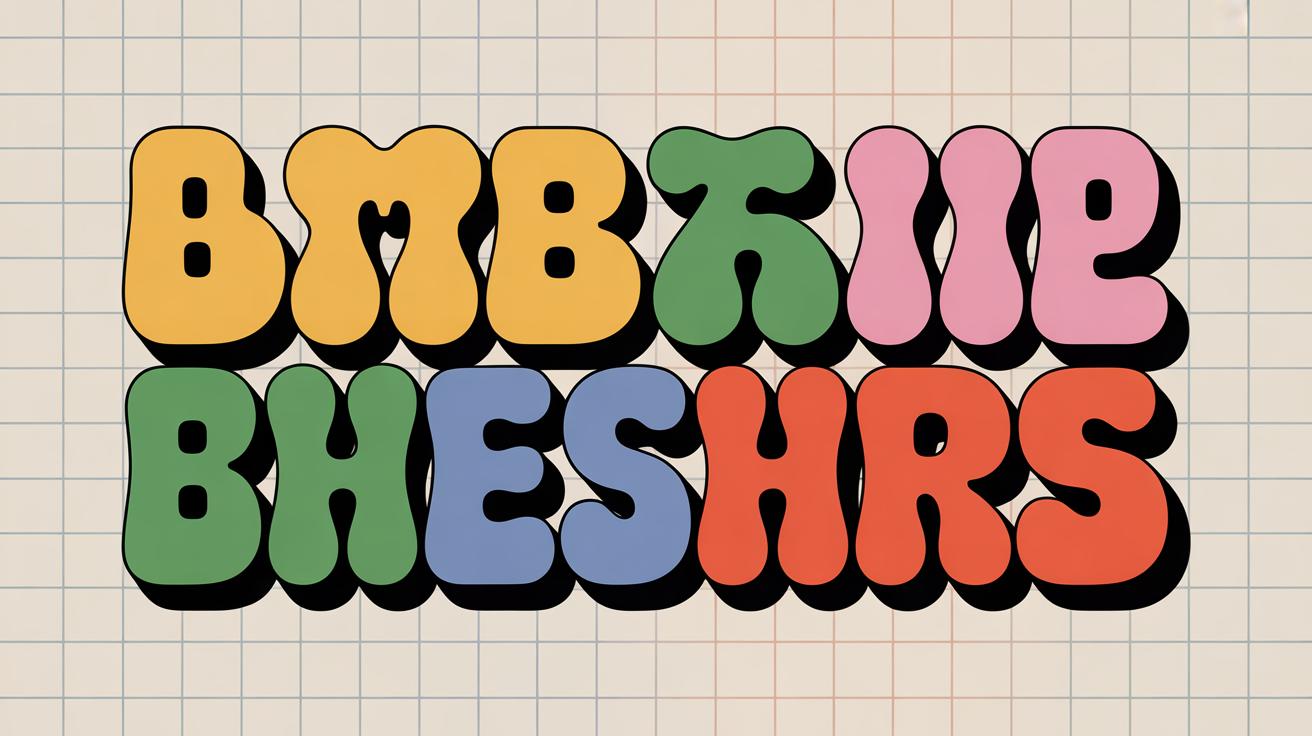
Another idea is to treat text as a graphic element. Here, letters aren’t just words anymore; they become shapes you can manipulate. You might curve a sentence to follow the edge of a shape, or fill a word with a texture or pattern that matches the image. Sometimes, stretching or bending text can help anchor it into the design, though pushing this too far can confuse the message.
Text Over Images
Putting text on top of a picture is tricky—you want the words to pop without hiding the image or making the text unreadable. One trick is adding a subtle shadow or an outline around letters. Sometimes, it’s better to place text on areas with consistent color or less detail, so it doesn’t get lost. I remember once trying to place white text on a busy photo, and no matter what I did, the words were tough to see until I added a translucent dark overlay beneath the type. It changed the whole feel but helped the message stand out.
Text As Graphic Element
Maybe the most creative way to mix text and graphics is by turning letters into shapes that belong to the image. Imagine filling words with parts of a photograph or clipping them into irregular forms. This approach can make your text feel like it’s emerging from the image rather than just being “on top.” You can sculpt the text to fit certain areas—like shaping the bottom of letters to blend with waves or mountains in a photo. It takes some experimenting and a bit of patience, but the impact can be striking once the text lives within the graphic environment instead of sitting apart.
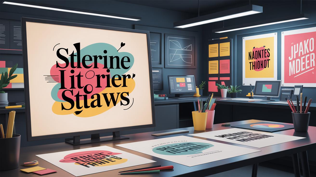
Tools And Software For Combining Typography And Graphics
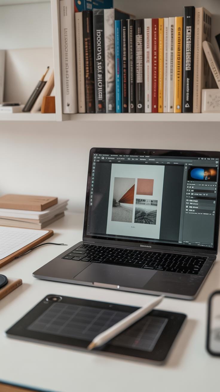
Choosing the right tools really shapes how smoothly you can blend text and graphics. Adobe Illustrator and Photoshop are often the go-to programs for many. Illustrator excels at working with vector graphics and text, letting you scale designs without losing quality. Photoshop, on the other hand, is strong for image editing and applying effects to both text and images. I remember spending hours experimenting with Photoshop’s layer styles just to get a subtle emboss effect on text layered over a photo background—it’s that level of control that makes a difference.
For beginners or those on a budget, free alternatives like GIMP and Inkscape offer solid options. GIMP is similar to Photoshop and handles image manipulation well, though its interface can feel a bit clunky. Inkscape is more like Illustrator, focusing on vectors and typography, but it might lack some polished comforts. If you want quick results, Canva provides simple drag-and-drop features, but it’s limited in text effects and layering depth.
When picking your software, watch for these key features:
- Layering capabilities: You need to control how text and graphics stack, overlap, or interact.
- Text effects: Shadows, gradients, distortions—these can make text pop or mesh with imagery.
- Image editing tools: Adjusting color, transparency, or applying masks can unify text and visuals.
It’s tempting to rely on flashy effects, but sometimes just good layering and subtle tweaks make the design coherent. Have you tried playing with clipping masks? That alone opens up interesting ways to fill letters with images. Tools with that kind of flexibility seem to change how I approach design every time.
Common Mistakes To Avoid When Combining Text And Graphics
Overcrowding The Design
When there’s too much text and too many images packed into one design, it quickly becomes overwhelming. Your eye doesn’t know where to rest. It’s like a conversation where everyone’s talking at once — confusing and frustrating. Space matters. Giving your elements room to breathe helps your message come through clearly.
You might be tempted to add every detail you think is important, but more isn’t always better. Sometimes less says more. I’ve seen designs where designers crammed the whole paragraph in beside multiple illustrations, only to lose the viewer’s interest. If you’re not sure, ask yourself: Does each element add value? Or is it just noise? Try cutting back and see how the design opens up.
Overcrowding can hide your typography’s personality and your graphics’ impact. Balance is tricky but crucial.
Ignoring Font And Image Harmony
Fonts and graphics have to work together, not fight for attention. Think of it like a duet — one voice shouldn’t overpower the other. If your font is sleek and minimal, but your graphics are loud and chaotic, the design feels off. Similarly, pairing a playful script font with stark, geometric illustrations can clash.
Spotting this mismatch isn’t always obvious. A quick test is to step back and ask: Do the text and images look like they belong in the same space? If not, change one or the other. Sometimes swapping the font style or the graphic treatment brings harmony right away.
And be mindful of mood: a vintage font mixed with hyper-modern graphics might create tension that feels confusing rather than interesting. Sometimes it works, but more often it distracts.
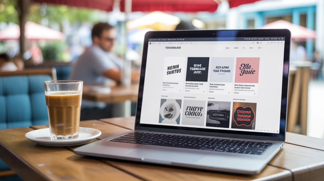
Examples Of Successful Creative Typography Designs
Posters And Advertisements
Some ads really stick with you because the text and images don’t just sit side by side—they feel like one. Take the famous “Got Milk?” campaign. The bold, simple text paired with a single image of a milk mustache made the message clear without overloading your eyes. It’s a good example of how minimalism creates impact when the typography carries personality and the graphics support that tone.
Another example is Nike’s “Just Do It” posters. The strong, confident text interacts with action shots, like runners in motion. The fonts seem to push forward, almost like they share the energy of the image. This approach works because the type isn’t just labeling the photo—it’s part of its rhythm.
What’s interesting is how balance shifts. Some posters let the text dominate, while others let the visuals be front and center—the trick is that both feel necessary. You might wonder, when does text overwhelm? When does the graphic get lost? These campaigns usually get that tension just right.
Digital And Social Media
Online content often faces the challenge of quick snapshots—users scrolling fast without much patience. Creative typography combined with graphics can demand attention fast. For instance, Instagram posts using bold, oversized type with vibrant background images tend to pause the scroll. The text often breaks expected formats, overlaps images, or fades in unusual ways.
One campaign I saw recently used animated typography overlaid on looping videos. The words moved with the action, sometimes disappearing into the scene, which made the message feel part of the moment. It wasn’t just readable; it was part of the experience.
At the same time, some social media designs fail by making text too small or cramming too many fonts and colors together. The best ones focus on clarity and visual flow, even when playful. Have you noticed how successful posts often use just one or two font styles but vary size and weight to create hierarchy? The combination feels deliberate—not random.
Conclusions
Creative typography design is more than just choosing pretty fonts. It is about making text and graphics work together to guide your viewer’s eye and share your message clearly. Combining these elements thoughtfully changes how people see your design and can leave a lasting impression.
You can start applying the concepts and tips discussed here in your own projects to see immediate results. Remember, practice and experimentation will help you discover your own style for blending text and graphics. Your designs can become stronger and more engaging when you use creativity in typography.