Introduction
Typography is the art and technique of arranging letters and characters to make written language clear and appealing. When you look closely, you’ll notice two main styles of letters: serif and sans serif. These styles play a big role in how we read and feel about text.
This article will guide you through the world of serif and sans serif letters. You’ll learn what makes each style unique and how they are used in different places. Understanding these types can help you choose the right style in your writing or design projects.
The History of Typography
Origins of Letter Styles
Letters didn’t start out looking like they do now. Early writing systems, such as cuneiform and hieroglyphics, were more about symbols than letters, and not very focused on readability. It wasn’t until alphabets emerged—like the Phoenician script—that letters began taking shapes meant for easier reading and writing.
People needed letters that were quick to write and simple to recognize. That practical need pushed the development of different letter styles. Roman inscriptions, for example, show early serif-like forms carved into stone. Why those little strokes? We’ll get there soon, but these marks began as simple tricks to prevent chipping in stone or to guide the eye when reading.

Then came manuscripts, where scribes used pen and ink. Their hand movements shaped the evolution of letterforms, sometimes adding flourishes or simplifying shapes. Different regions and times brought their own approaches, testing what worked best for clarity.
How Typography Changed Over Time
One of typography’s turning points was the invention of movable type by Gutenberg in the 15th century. Suddenly, letters could be cast in metal, reused, and printed quickly. This mechanical process demanded uniformity and clear design. Letters had to be simple to reproduce, yet distinct enough to avoid confusion.
Serif letters, rooted in those Roman carvings, became common partly because their strokes helped create well-defined characters in print. But as printing evolved, designers also explored sans serif letters—letters without those small lines—and they brought a different clarity and modern feel.
Over centuries, styles shifted back and forth. Sometimes serif was dominant for long texts; other times sans serif took over for headlines or signage. Typographic history isn’t a straight line, really. It’s full of experiments driven by technology, culture, and the ongoing quest to make letters easier to read and more functional.
What Are Serif Letters

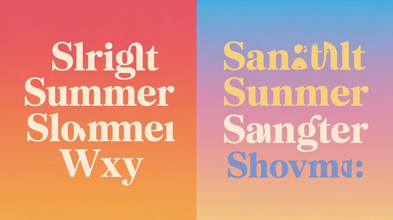
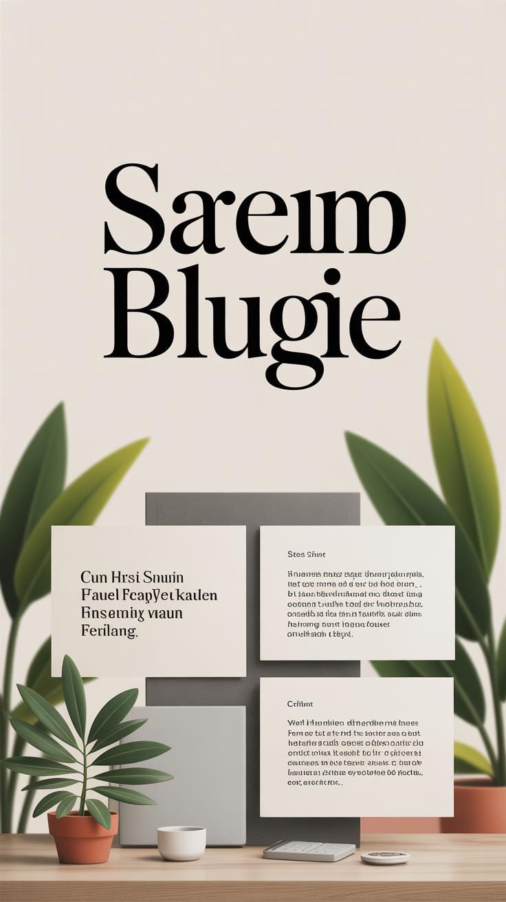
Serif letters are those with small decorative lines or strokes attached to the ends of their main strokes. These tiny extensions give the letters a kind of finishing touch, making them feel more detailed and, some would say, a bit more formal. You might notice that serif letters often appear to have a kind of “footing” or slight flourish—this shapes their overall look and makes them distinct from other letter styles.
Why these small lines exist can seem a bit mysterious at first. They actually come from a practical place: to guide the eye and create a smoother reading experience by helping the letters connect visually. The presence of serifs changes the rhythm and texture of written text, which some readers find easier and more comfortable over longer stretches. At the same time, these lines give the letters personality—sometimes sharp, sometimes rounded—making the text feel less mechanical.
The Small Lines on Letters
These small lines, or serifs, trace their origins back to ancient stone carvings. When scribes and stone workers crafted inscriptions, they often added small strokes at the ends of letterforms to prevent the edges from chipping or flaking—essentially, a preservation technique. Over time, these practical marks turned into stylistic details when writing evolved onto paper and print.
It’s interesting to think that what started as simple protection for letters eventually became a defining feature influencing how we perceive text even today. These endings make letters feel grounded, creating a subtle guide that leads your eye along lines of text, almost like gentle waypoints. You might notice they add a quiet, steady rhythm to paragraphs, especially in printed books or newspapers.
Types of Serif Fonts
Serif fonts come in several main categories, each with unique features shaped by history and cultural shifts:
- Old-style: These carry a warm feeling with gentle, diagonal stress and moderately thick serifs—think of Garamond as an example. They feel soft and traditional.
- Transitional: Sitting between old-style and modern, these fonts like Baskerville offer sharper contrasts in stroke thickness and more refined serifs, balancing readability with elegance.
- Didone: With extreme contrast between thin and thick strokes, and hairline serifs, Didone fonts like Bodoni stand out as dramatic and formal, but sometimes harder to read at small sizes.
- Slab serif: Known for thick, block-like serifs, fonts such as Rockwell bring a bold, strong presence. They often feel more modern or even industrial compared to other serifs.
Each type fulfills different purposes, which makes serif fonts a surprisingly diverse group. You might find yourself preferring one style over another, depending on the mood or function of the text you’re working with.
Understanding Sans Serif Letters
Sans serif letters lack the small lines—called serifs—that decorate the ends of strokes in serif letters. This absence gives sans serif fonts a straightforward, unadorned look. Without those little finishing strokes, the letters often seem cleaner, simpler, and sometimes even a bit stark. Some might find them less warm or inviting than serifs, but that clean edge can make a real difference, especially depending on where and how you use them.
The absence of serifs makes sans serif fonts well suited to modern design and digital contexts. On screens, where pixels can blur fine details, sans serif letters usually stay crisp and easier to read. Their shapes don’t rely on subtle embellishments that might disappear at small sizes or low resolutions. I’ve often noticed that text set in sans serif just flows better on my phone or computer, making it less tiring to scan quickly.
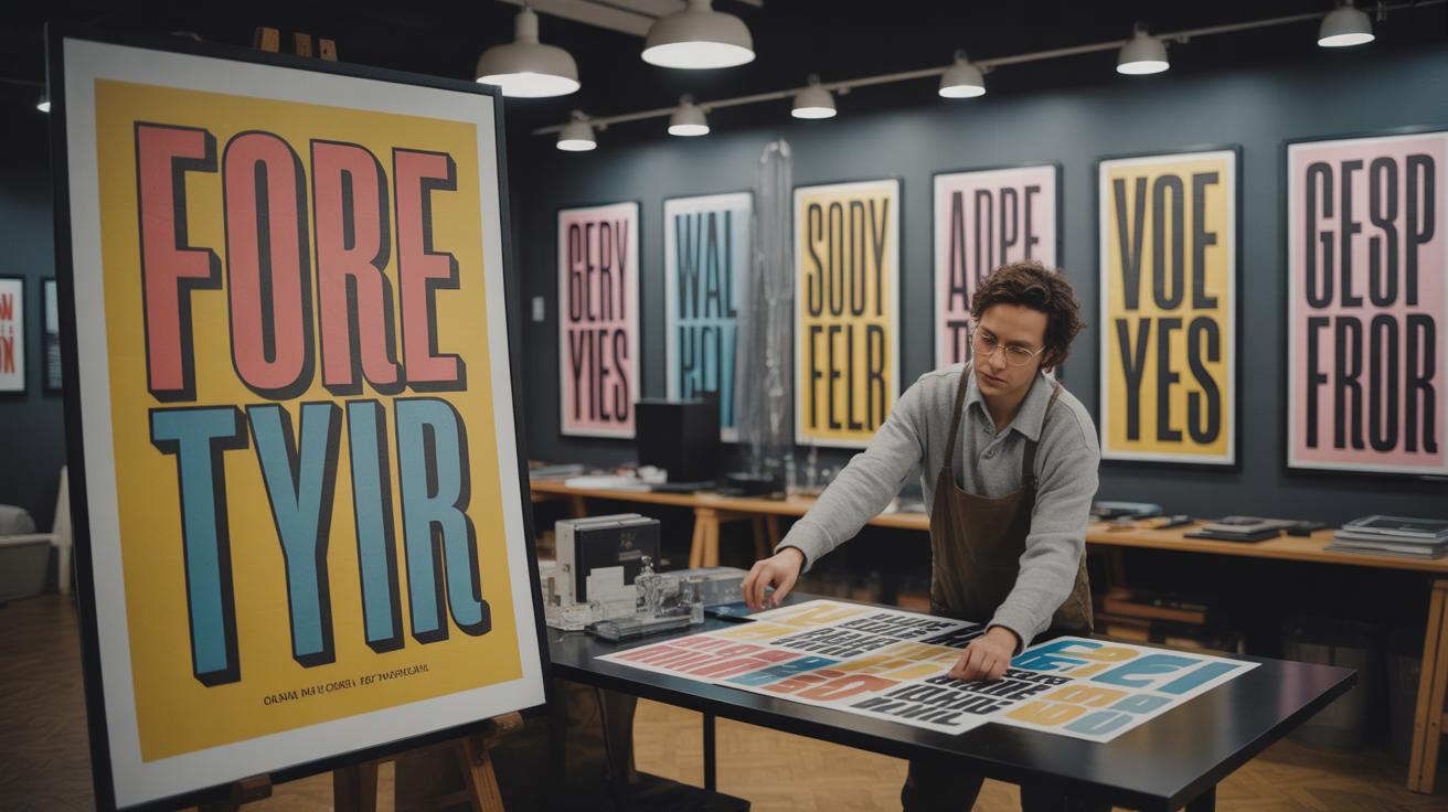
Sans serif fonts come in several categories, each with its own look and feel:
- Grotesque: Early sans serif fonts. They have a solid, sometimes awkward feel. Examples include Akzidenz Grotesk. They often have uneven stroke widths, which can feel a bit quirky.
- Neo-grotesque: Cleaner and more neutral than grotesque, like Helvetica or Arial. These are common “workhorse” fonts, reliable but not too flashy.
- Geometric: Built from simple shapes—circles, triangles, squares. Futura is a famous example. They can feel impersonal or cold but carry a distinctive modern vibe.
- Humanist: Inspired by traditional calligraphy, with more variation and organic forms. Gill Sans fits here. These often feel friendlier and more approachable.
Choosing among these types might depend on the tone you want to set. Sometimes, I find myself thinking that a font is “too plain” or “too mechanical”—which makes me wonder if the subtleties of these categories really affect perception as much as people say. But then again, a slight change in letterform can shift an entire project’s personality.
How Serif Affects Reading


Serif letters have these little strokes at the ends of their main lines, and these small details do more than just look old-fashioned or decorative. When you read long texts, especially on paper, those tiny lines seem to help your eyes move along the lines more smoothly. You might not notice it right away, but your eyes kind of catch on to the rhythm created by serifs, which gently guide you from one letter to the next.
Think about reading a printed book or a newspaper. The serifs create subtle visual cues along each line, acting almost like a connecting thread. This can make it less tiring to scan sentences, especially when reading for a long time. There’s a flow that feels natural, even if you don’t consciously realize it.
Serif fonts shine best in places where large chunks of text appear. Some typical examples are newspapers, where readers skim through dense columns; novels, which demand a lot of sustained reading; and printed documents like reports or essays. These settings benefit from serif fonts, probably because the small strokes help maintain focus and reduce eye strain.
Still, there’s a little debate about how strong the effect really is. Some people swear by serif fonts as essential for printed text, while others feel it might not make a huge difference. I guess it often depends on personal preference, but it’s clear that serifs play a role in how we process printed words, at least in certain contexts.
How Sans Serif Supports Digital Reading

Sans serif fonts are often seen as the go-to choice for digital screens. Why is that? Well, you might notice that their letter shapes are simpler and cleaner, which makes reading on a screen less tiring. The absence of those little strokes at the edges—the serifs—means each character stands out more clearly, which really helps when your screen size shrinks or the resolution isn’t perfect.
On small or lower-resolution screens, serif fonts can start to blur or look cramped. Sans serif letters keep their shape and clarity. It’s almost as if they survive the pixelation better. I remember working late on a website where switching from a serif typeface to a sans serif one suddenly made the text easier to scan on mobile devices. The smooth lines and open forms prevent letters from blending together.
Visibility on Screens
If you zoom out or fiddle with screen settings, sans serif fonts tend to hold up better. Letters like “a,” “e,” or “o” don’t lose their distinctiveness easily. They avoid clutter. Your eyes don’t have to work as hard to form words because there’s less visual noise. This is especially true on older monitors or budget smartphones where screen quality may be lacking.
It’s curious, sometimes you’ll see designers clash on this topic. Some swear serif can be just as readable digitally, especially with high-res displays. But if you’re aiming for maximum legibility across all devices and screens, sans serif is typically safer.
When to Use Sans Serif Fonts

Practically speaking, here are places where sans serif shines:
- Websites – particularly for body text or navigation menus where clarity matters.
- Mobile apps – those small screens demand crisp, clear letterforms.
- Digital ads – quick readability grabs attention, and sans serif letters deliver that punch.
- User interfaces – buttons, labels, form inputs benefit from straightforward letter shapes.
- E-books and online articles – you want comfortable long reading without fatigue.
Still, the choice isn’t black and white. You might favor sans serif in digital spaces but switch to serif for long reads in digital books, depending on font style and size. It’s not always a hard rule, but seeing how sans serif performs on various screens gives you a useful guideline.
Designing with Serif Letters

Serif letters carry something different from their sans serif counterparts. Those small decorative lines at the ends of strokes—called serifs—bring a feeling that you might hesitate to find in simpler letterforms. They add personality, a kind of detail that makes letters feel grounded, almost like they’re whispering stories from the past. Designers often lean on serif fonts when they want to create a classic or formal tone. It’s not just about tradition, though; the little tails and strokes guide the eye along each line, which subtly changes how you experience the text.
You might find it curious, but serif details sometimes feel both ornate and reliable at once. They can be a bit much for some projects, but when used thoughtfully, they inject character. That personality can be nostalgic or authoritative, depending on the design’s goal. For formal invitations, legal documents, or editorial pieces, serif letters often feel like the natural choice because they carry weight beyond just words.
Creating Tradition with Serif Fonts
There’s something about serif fonts that pulls you toward ideas of history and trust. When you see a serif typeface, perhaps Times New Roman or Garamond, it almost immediately suggests something established—a foundation you can depend on. That association isn’t accidental. Serif fonts have roots in print and classic typography traditions stretching back centuries. Using them can give your documents or brand a sense of permanence and respectability.
Think about newspapers or legal papers. These uses aren’t random; there’s a psychological comfort in serif letters that seems to say, “This has been vetted. This is serious.” This feeling can work well in branding when trust is a priority, as it implies authority without needing to shout it. Yet, it can also feel old-fashioned or stiff, so knowing when to use serif fonts is just as important as knowing why.
Examples of Serif Use in Design
Look around, and you’ll notice serif fonts in many places where tradition is key.
- Logos like The New York Times or Tiffany & Co. use serif fonts to communicate heritage and reliability. Their serif choices aren’t merely aesthetic but part of their brand identity.
- Classic novels or academic books rely on serif fonts. The steady rhythm serifs create lets readers settle into long passages without distraction.
- Print media like invitations, certificates, or formal announcements often choose serif typefaces because they carry the weight of ceremony and formality.
What stands out is how serif fonts use their historic profile to quietly say, “This matter deserves your attention,” which can be powerful in a world full of noise. Maybe that’s why, despite the surge of digital designs favoring sans serif, serifs linger in contexts where history and trust matter most.
Using Sans Serif for Simplicity


Sans serif fonts strip letters down to their bare essentials. Without the extra strokes or small decorative lines, each character looks straightforward. This lack of adornment makes the text feel clean and easy to read, especially when viewed quickly or on digital screens.
Such simplicity matches minimalistic designs well. When you want your message to stand out without distractions, sans serif can do the job. You might notice this clarity in user interfaces where every pixel counts and in logos where legibility at different sizes matters a lot. The font’s straightforwardness invites the eye to move smoothly, avoiding the ‘visual noise’ that serifs sometimes create.
Modern and Minimal
There’s something appealing about how sans serif fonts reflect modern aesthetics. Their simplicity often feels neutral but fresh—never overwhelming. Designers lean towards them when aiming for a look that’s understandable at a glance, rather than something ornate or nostalgic.
Yet, this doesn’t mean sans serif is always cold or distant. Sometimes, the lack of embellishment pulls focus directly onto the words themselves, which can feel quite personal. This down-to-basics approach encourages clear communication over style-heavy decoration.
Examples of Sans Serif in Modern Media
If you look at technology brands like Apple or Google, sans serif fonts dominate. Their branding relies on clean lines and immediate recognition, and the font choice reinforces that. It’s the same in advertising where quick comprehension matters—large, sans serif headlines deliver information fast without asking the viewer to pause.
User interfaces also show this trend. Apps and websites often use sans serif fonts because they improve readability on screens of all sizes. The openness of these letters reduces eye strain. That’s probably why you’ll rarely see a sans serif font replaced by serif in these contexts.
Mixing Serif and Sans Serif
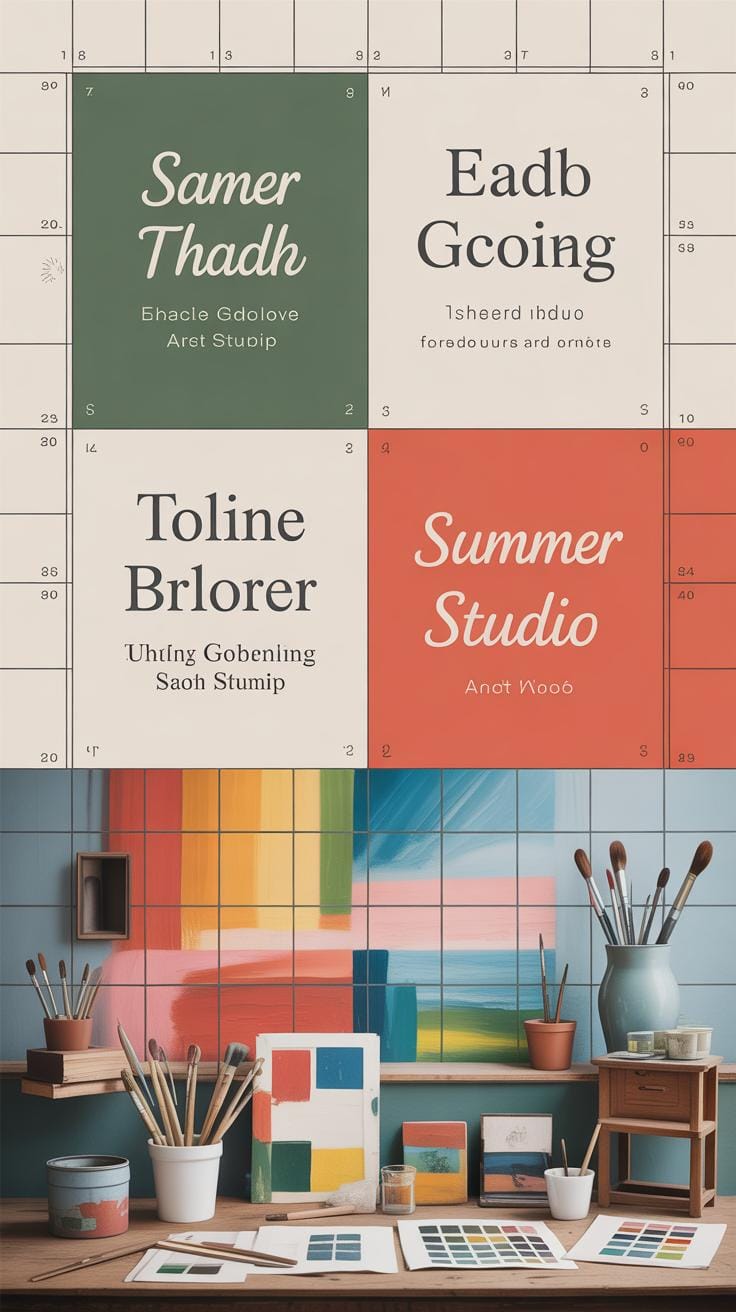
Mixing serif and sans serif fonts can add a layer of complexity to your design that might catch the eye without overwhelming it. When done right, this mix creates a sense of balance—serifs lending a touch of tradition or formality, while sans serifs keep things fresh and easy to read. But, honestly, it’s a bit of a tightrope walk because mixing fonts isn’t just grabbing two random styles and putting them together.
One common approach is pairing serif headlines with sans serif body text. The serif letters in headers draw attention with their details and charm, making titles stand out. Then the sans serif in the body makes the text less tiring for the eyes during reading. Some designers flip this — using a sans serif headline with serif body text, especially if the text aims for a more classic or literary atmosphere. Both ways work, though which feels right often depends on the tone you want.
Here are a few guidelines for combining these letter styles effectively:
- Pick fonts that contrast but don’t clash. For example, pair a thick, bold serif with a light sans serif.
- Keep the mood consistent; avoid mixing something playful with something too stiff or formal.
- Watch proportions—fonts with similar x-heights tend to pair better.
- Limit yourself to two or three fonts to avoid clutter.
- Test your pairings at actual sizes to check readability and harmony.
When you mix fonts thoughtfully, your design benefits from a readable structure and visual hierarchy. It gives readers clear signals about what to focus on, without feeling monotonous. I guess it’s a bit like mixing ingredients in cooking—you want complementary flavors, not a confusing mess. So, ask yourself: Does this combo make the message clearer or just busier? That’s the key.
Common Mistakes with Typography
Using the wrong fonts for your medium is a surprisingly common slip. For example, placing serif fonts on screens—especially low-resolution ones—can cause letters to blur or strain the eyes. Serif details often get lost or appear fuzzy, which reduces readability. On the flip side, using sans serif fonts for lengthy print documents might work against you. Without those little strokes guiding your eyes along the lines, long passages can feel a bit flat or tiring to read in print. So, the context really matters.
Font pairing mistakes also pop up more than you might expect. People sometimes toss together fonts that clash—mixing two styles that compete instead of complementing each other. The result? A design that looks disjointed and hard to follow. When fonts don’t share a visual rhythm or weight, the message can get lost. You can avoid this by choosing fonts with similar proportions or subtle contrasts and by limiting yourself to two or three families max.
Think about how the fonts speak to each other. Would you want two voices talking over each other? Probably not. Does this mean you always need perfect matches? Not necessarily. Sometimes a bit of tension brings interest, but without balance, it just feels messy.
Tips to Choose the Right Typography

Choosing between serif and sans serif fonts isn’t as simple as picking what looks nice. You need to think about who will be reading your text and where they’ll see it. For example, if your audience is mostly older adults reading long blocks of print, serif fonts often help guide the eye and improve readability. But if your text is digital or on a small screen, sans serif might work better because it stays clearer at different sizes.
Also, take a moment to consider the message you want to send. Want to look traditional or trustworthy? Serif fonts carry a sense of formality and history. For something clean or modern, sans serif tends to feel more straightforward and fresh. Sometimes this isn’t a strict rule, though. I’ve seen a sans serif font used in serious legal documents that worked surprisingly well—but that’s more the exception than the rule.
Here are a few practical questions to ask yourself:
- Who’s the reader? Are they casual browsers or specialists?
- Where will they see this? On screen, in print, large posters?
- What mood should the font set—friendly, formal, edgy, classic?
These questions help steer your choice in a way that matches your project’s goals. Sometimes, you may need to test different fonts in the actual context. Don’t hesitate to ask others for their take—typography isn’t a one-size-fits-all kind of thing. Trust your instincts, but be ready to adjust if the font doesn’t quite land the way you want it to.
Conclusions
Serif and sans serif letters each have special features that make them useful for different needs. Serifs have small strokes at the ends of letters, which can help the eyes follow the text, making them great for books and long reading. Sans serif letters are clean and simple, making them easy to read on screens and modern designs.
Knowing the differences can help you pick the best typography for your work. Whether you want a classic or fresh look, understanding serif and sans serif letters will improve your design and communication. Keep these styles in mind when you are working on any project with text.