Introduction
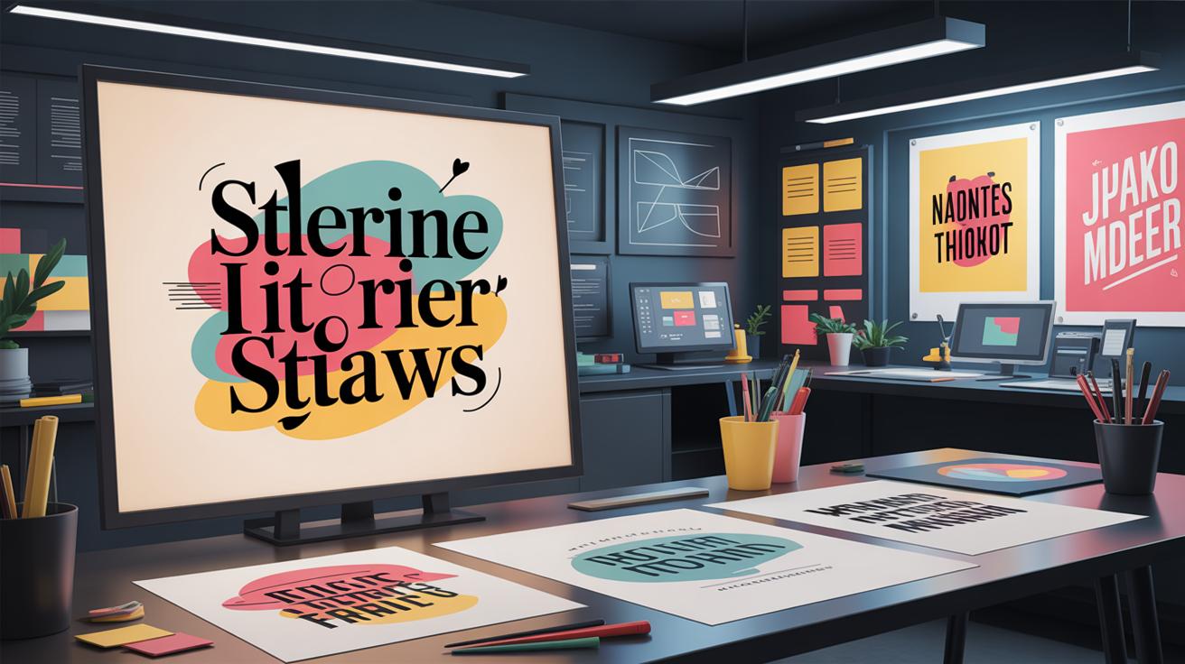
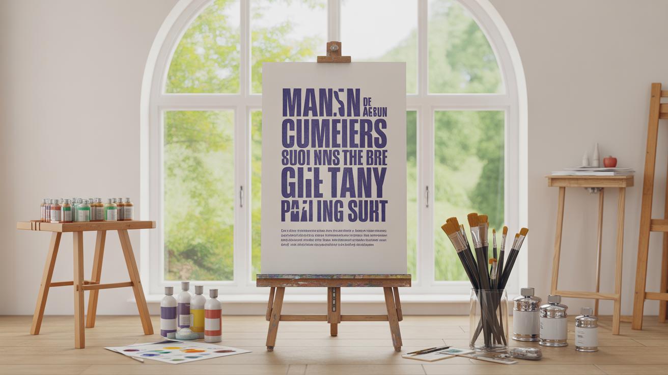
Advanced techniques in typographic poster design involve carefully arranging letters and words to communicate a message clearly and attract attention. Typography is more than just choosing a font; it includes the size, spacing, and style of letters, which play a crucial role in the look and feel of the poster.
This article explores various ways to use typography effectively in poster design. You will learn about important principles and creative methods that can make your posters stand out. Whether you want your poster to inform, advertise, or decorate, these techniques will help you create designs that catch the eye and deliver your message fast.
Understanding Typography Basics
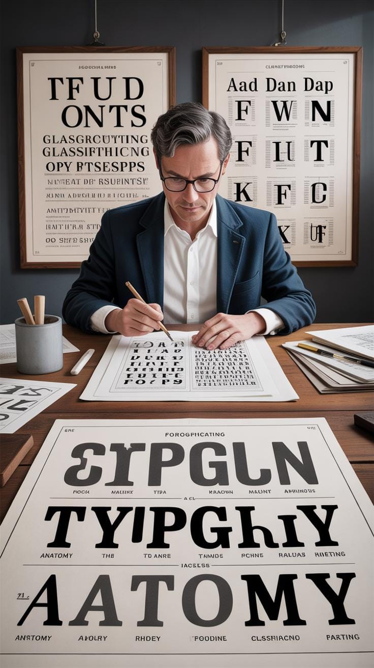
Choosing the Right Typeface
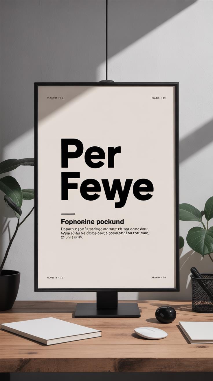
Picking the right typeface feels like setting the tone even before the viewer reads the message. Each typeface carries a personality—some are serious and formal, others relaxed or quirky. You want the style to fit the poster’s purpose. For example, a sleek sans-serif can suggest modernity or urgency, while a serif might feel more traditional or formal. But what if the message itself has mixed emotions? Sometimes mixing typefaces can help, though it’s easy to overdo it. If the poster’s tone is unclear, your type choice might confuse rather than clarify.
Consider how readable the typeface is too. Some decorative fonts look interesting but lose impact at a glance or from a distance. So, matching tone and clarity is a balancing act you have to feel out almost instinctively.
Adjusting Font Size and Spacing
Font size isn’t just about loudness; it’s about accessibility. Bigger fonts pull attention and work well for titles or key points. But if everything is large, nothing stands out. Then there’s letter spacing and line spacing, which can make or break legibility. Tight letter spacing can choke the words, while too much space fragments the line and tires the eye.
Line spacing affects how the eye moves across the text. Too tight, and lines run into each other; too loose, and the connection between ideas weakens. It’s a subtle thing, but once you play with it, you notice just how much it directs reading flow. Thinking about different distances is useful too. Does your poster need to be read from across a room? Then larger letters and more open spacing are your friends. If it’s closer or dense with information, you might scale back carefully.
When you’re tweaking these, ask yourself: could I still read this easily if I took a step back or glanced quickly? The answer usually guides adjustments better than any fixed rule.
Creating Visual Hierarchy with Typography
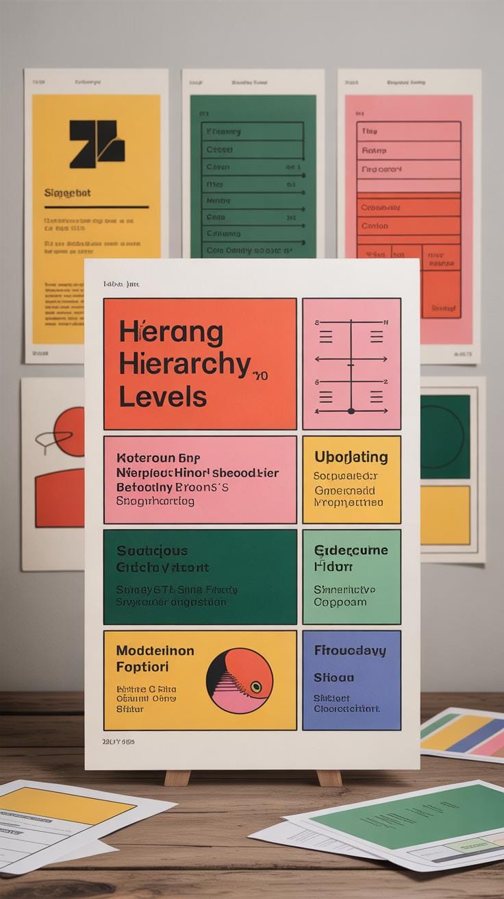
When you look at a poster, your eyes naturally want to follow a path. Typography can shape that path by guiding how information is noticed and understood. Using size, weight, and color strategically makes some parts stand out, while other parts quietly support the message. It’s not just about making things big or bold—it’s about choosing what should grab attention first and what can wait.
Using Size and Weight to Highlight Text
Bigger text pulls you in immediately. If you want your main message or headline to catch attention, make it larger or use a heavier weight compared to other text elements. But be careful — just making everything big or bold can confuse the viewer. Instead, create a clear order:
- Use large, bold fonts for headlines or key phrases.
- Medium-sized text for subheadings or important supporting details.
- Smaller, lighter text for body content or supplementary info.
I’ve found that playing with weight above size sometimes surprises the eye more—bold, medium-size text can feel stronger than merely bigger, thin text. Think about what your message really needs to emphasize. What should people see first, second, and last? Sometimes, less is more.
Color Coding for Emphasis
Color can separate parts of your poster or highlight crucial info. For example: headings might be one color, body text another. This makes scanning easier. But color isn’t just for separation—it can highlight urgency, evoke mood, or link ideas.
- Use contrasting colors between headings and body to clarify structure.
- Limit your palette — too many colors distract rather than clarify.
- Reserve bright or saturated colors for key points or calls to action.
- Use subtle hues for less important text to avoid competition with headlines.
Choosing colors is tricky. What looks bold on your screen sometimes fades when printed. And cultural meanings tied to colors — they can surprise you. Think about your audience and test different combinations. Which colors draw your eye exactly where you want?
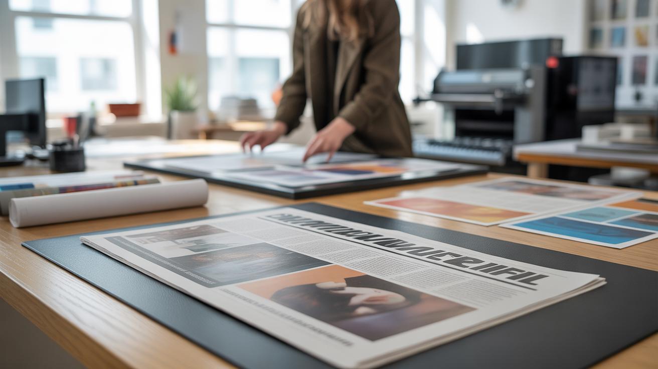
Balancing Typography and Imagery
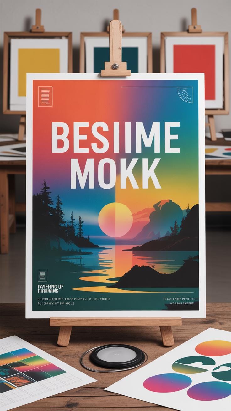
Combining text and images in a poster is a delicate dance. You want both to shine, not one overshadowing the other. Think of your image as a stage and your typography as the actors—each needs room to perform, but also to connect.
Placing text over images is tricky because readability can drop fast. To keep words clear, try these techniques:
- Use solid or semi-transparent backgrounds behind text, like a subtle box or a gradient overlay.
- Choose text colors that stand apart from the busy parts of the image, not just matching the palette blindly.
- Place text in areas of low contrast in the photo—usually the sky, walls, or other less detailed spots.
- Experiment with shadows or outlines on type. They can help, but too much might clutter the design.
When picking an image, consider its relationship with text. Images that offer natural empty spaces or simple backgrounds are easier to work with. They support your message without demanding all the focus.
I once tried a complex cityscape behind long text blocks—it was a mess. The words blended into the scene, and the message was lost. Selecting something cleaner—maybe a close-up or a blurred background—often works better.
Does your image pull viewers in, or does it compete with the text? That’s a question worth asking every time you design a poster. Sometimes, less detailed pictures create more impact precisely because they allow your words to breathe.
Using Contrast to Improve Readability
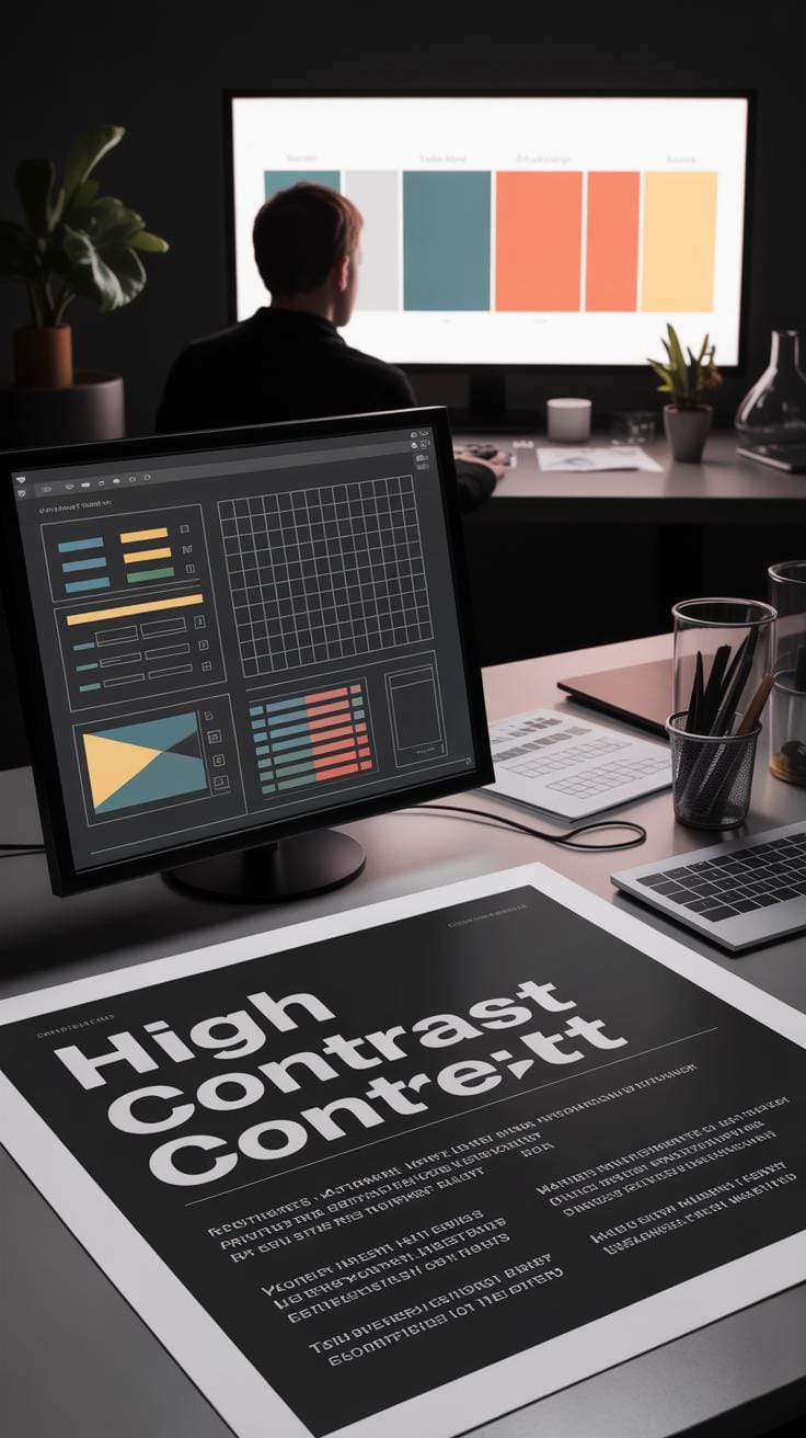
Contrast is one of those things that quietly holds a poster together. Without it, your text might just disappear or blend into the background. You probably noticed when a poster’s message is hard to read because the colors or text styles don’t stand out. Contrast in color, size, and font style can really pull your viewer’s attention exactly where you want it. It’s not just about making your text legible—it’s about creating a visual hierarchy that guides the eye naturally.
Color Contrast Between Text and Background
Picking the right colors for your text and background isn’t always straightforward. You want enough difference so the words pop, but not so much that it strains the eyes. Think of dark text on a light background or vice versa — that’s classic for a reason. But sometimes subtle shifts can work, like a muted blue text on a pale cream background. The key question: Is your text effortless to read from a distance? That’s what really counts.
There are tools to check contrast ratios – they’re helpful, but sometimes I just go with what feels right after stepping back a bit. Does the text catch your eye without yelling? Does your brain pause to read? Those small tests can save your poster from being overlooked entirely.
Mixing Font Styles
Fonts are not just letters; they carry emotion and tone. Using bold and italic variations can add layers of meaning and make certain parts stand out without adding more colors or shapes. For example, bold can shout “look here,” while italics might whisper or hint at something secondary. But mixing these styles requires restraint. Overusing bold or italic can turn your poster into a noisy mess.
Try pairing a clean sans serif in regular weight with bold headlines, or mix a serif body text with italic subheadings. This contrast can create both balance and a bit of rhythm. When done right, your viewer’s eyes jump naturally through the content instead of getting stuck or wandering away.
Have you ever skimmed a poster and just caught a few words because the rest blended together? Contrast—in all its small forms—can stop that from happening. It’s about making your message clear and, dare I say, a little inviting to read.
Applying Grid Systems for Clean Layouts
When working on a typographic poster, having a clear framework to arrange your text and images is crucial. That’s where grids come in. They act like invisible guides, helping you place elements neatly without guessing or constantly shifting things around. This keeps your design balanced, so nothing feels out of place or overwhelming.
You might wonder, why bother with grids at all? Well, they do more than just keep things tidy. They create rhythm and order—making it easier for your audience to follow the information. Without a grid, elements can float haphazardly, which can confuse or tire the viewer.
Simple grid structures are surprisingly effective. For instance:
- A single-column grid works well for straightforward layouts focused on vertical reading.
- A two-column grid can separate headlines from body text, adding clarity and structure.
- More complex grids—like a modular 3×3—offer flexibility to experiment without losing cohesion.
I’ve often noticed that sticking to a simple grid reduces the frantic repositioning during design tweaks. You can almost predict where a heading or image should go, keeping your typography feeling harmonious rather than chaotic. While grids don’t guarantee a perfect design every time, they usually save you from chaos, even if your initial instincts are a bit off.
Have you tried working without a grid? Sometimes it feels freer, but then your layout might accidentally start looking messy. Grids give you a structure, yes, but within that, there’s still room to play—and maybe that’s what makes them worth the effort.
Incorporating White Space Effectively
White space, or the empty space surrounding text and images, plays a bigger role in poster design than many realize. It’s not just “blank” space—it shapes how viewers experience your message. When you give each element room to breathe, the design instantly feels less crowded.
Think about a poster packing too much information into a tight space. Your eyes tire quickly, and key messages get lost in the noise. But with careful use of white space, you guide attention naturally. It creates pauses for the eye to rest, so important details stand out clearly.
Some benefits of white space include:
- Improved readability by separating text blocks and images.
- Increased focus on headlines or calls to action.
- Reduced visual stress for viewers, encouraging engagement.
Balancing your poster’s elements with white space doesn’t mean leaving large empty gaps everywhere. Instead, it’s about thoughtful spacing—deciding which areas to leave open and which to fill. You might tighten spacing around less critical info and loosen it around primary messages.
Experiment with margins, line height, and padding between sections. Sometimes, asymmetrical white space arrangements feel more inviting and natural than perfectly even ones. Don’t be scared if it seems a bit uneven—often that adds personality.
Have you ever noticed how a simple poster with a lot of breathing room pulls you in more effectively than a cluttered one? That’s the power of white space—it controls flow and focus without screaming for attention.
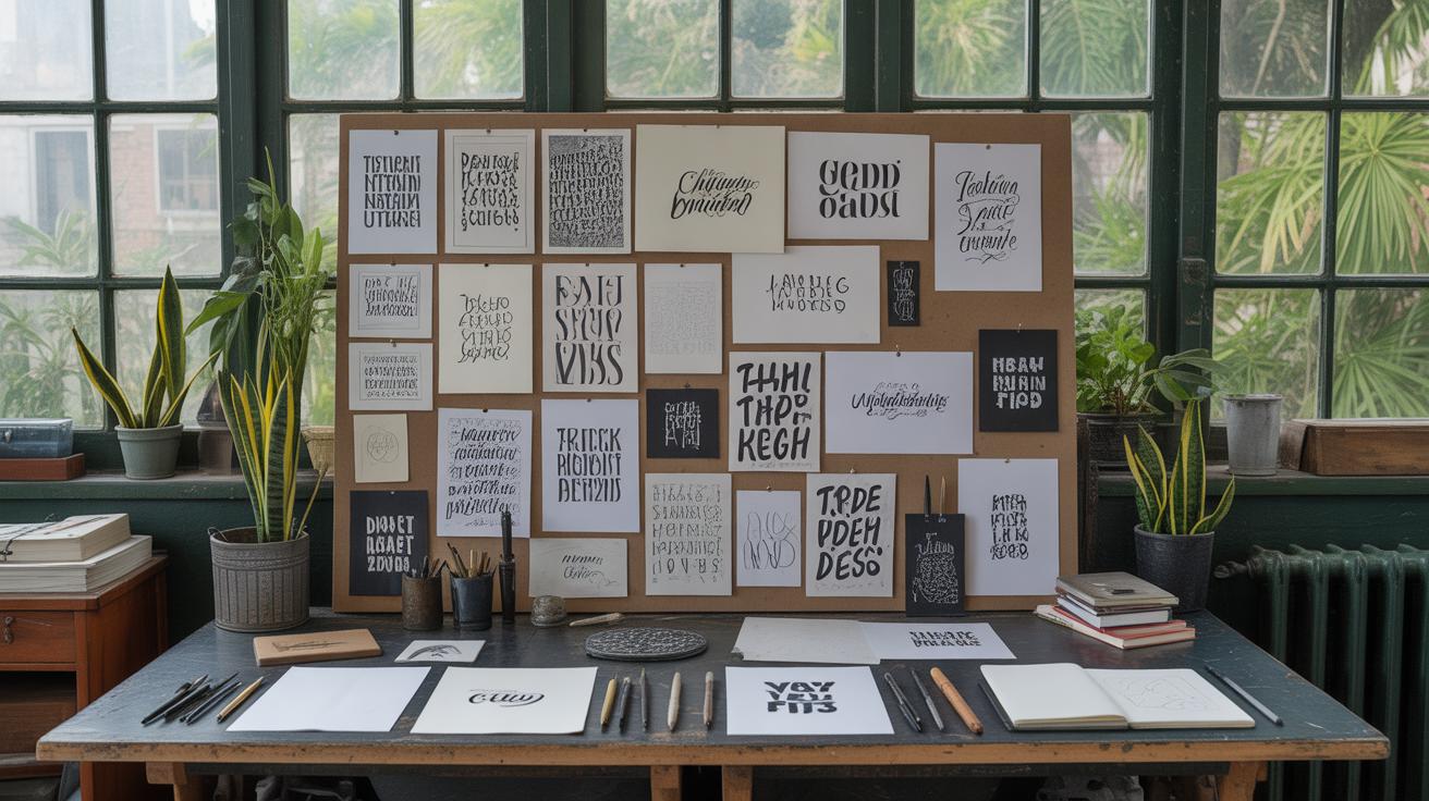
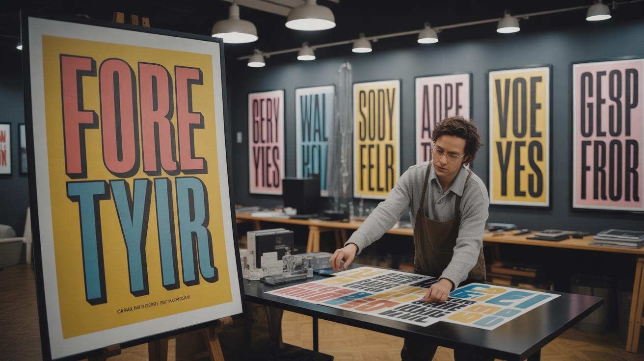
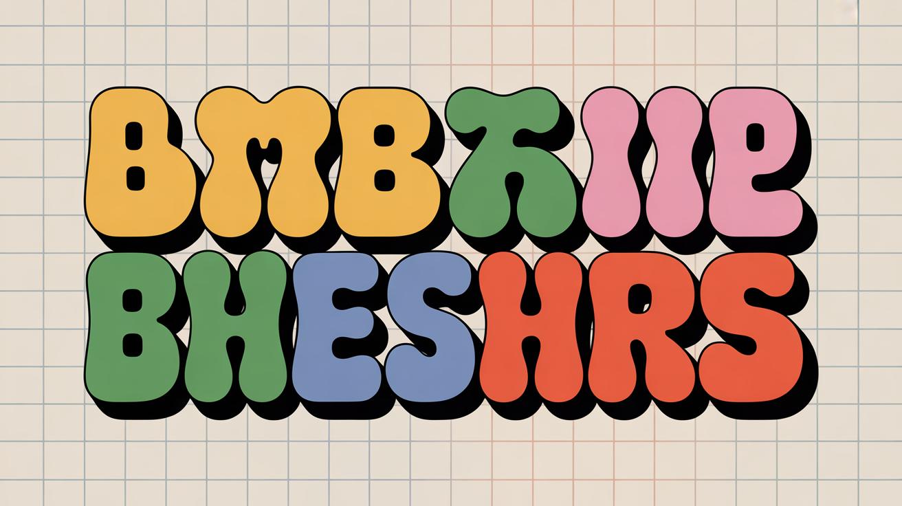
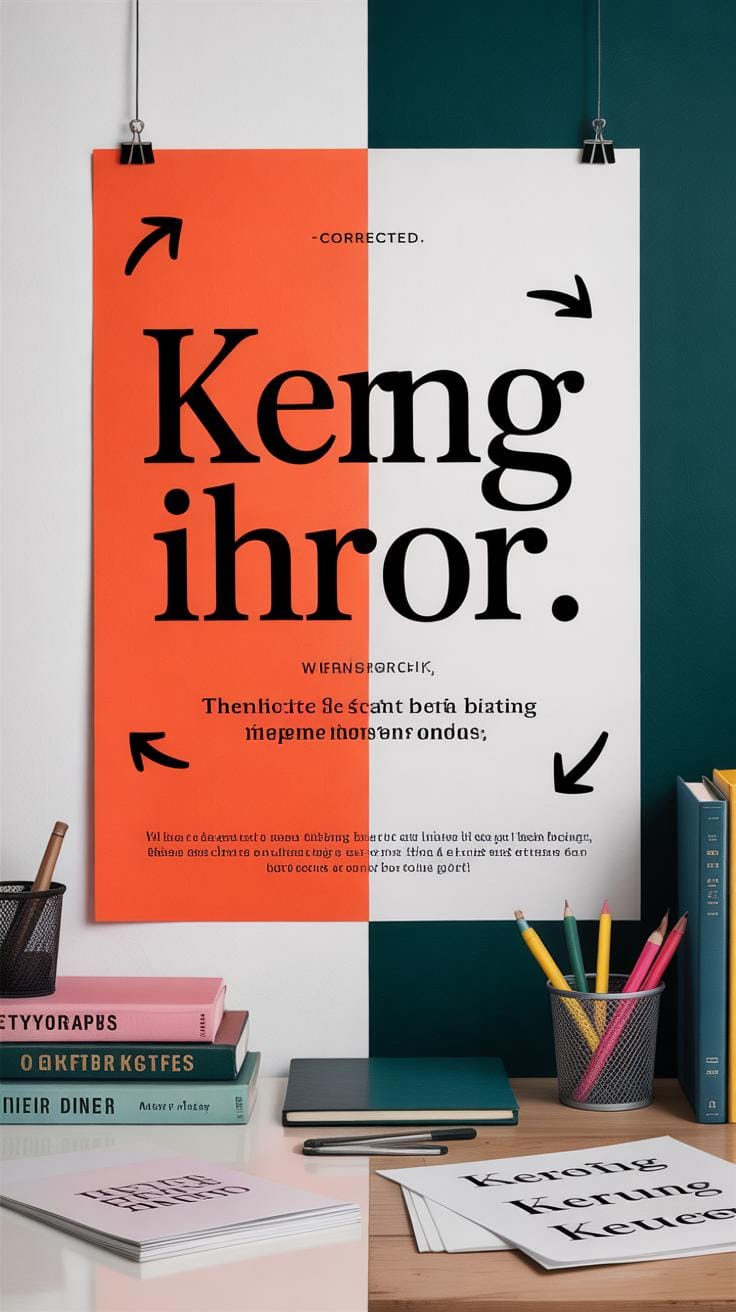
Exploring Creative Typography Styles
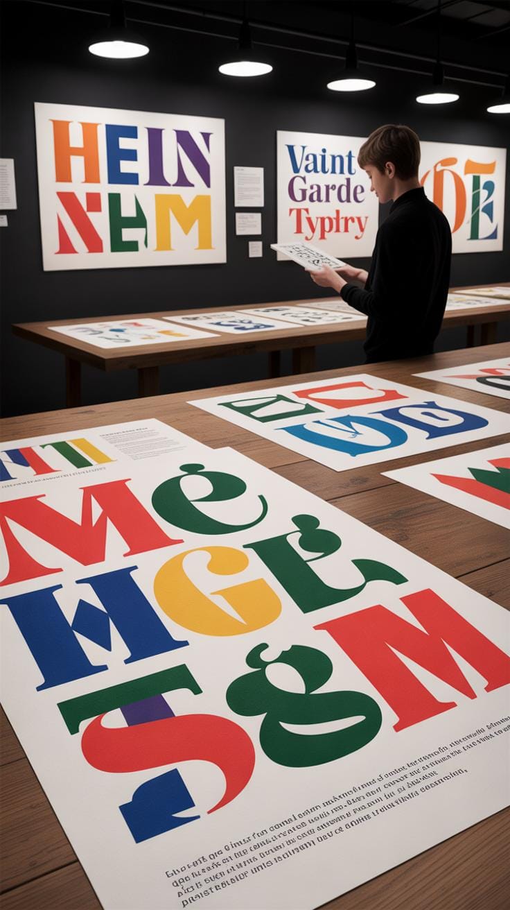
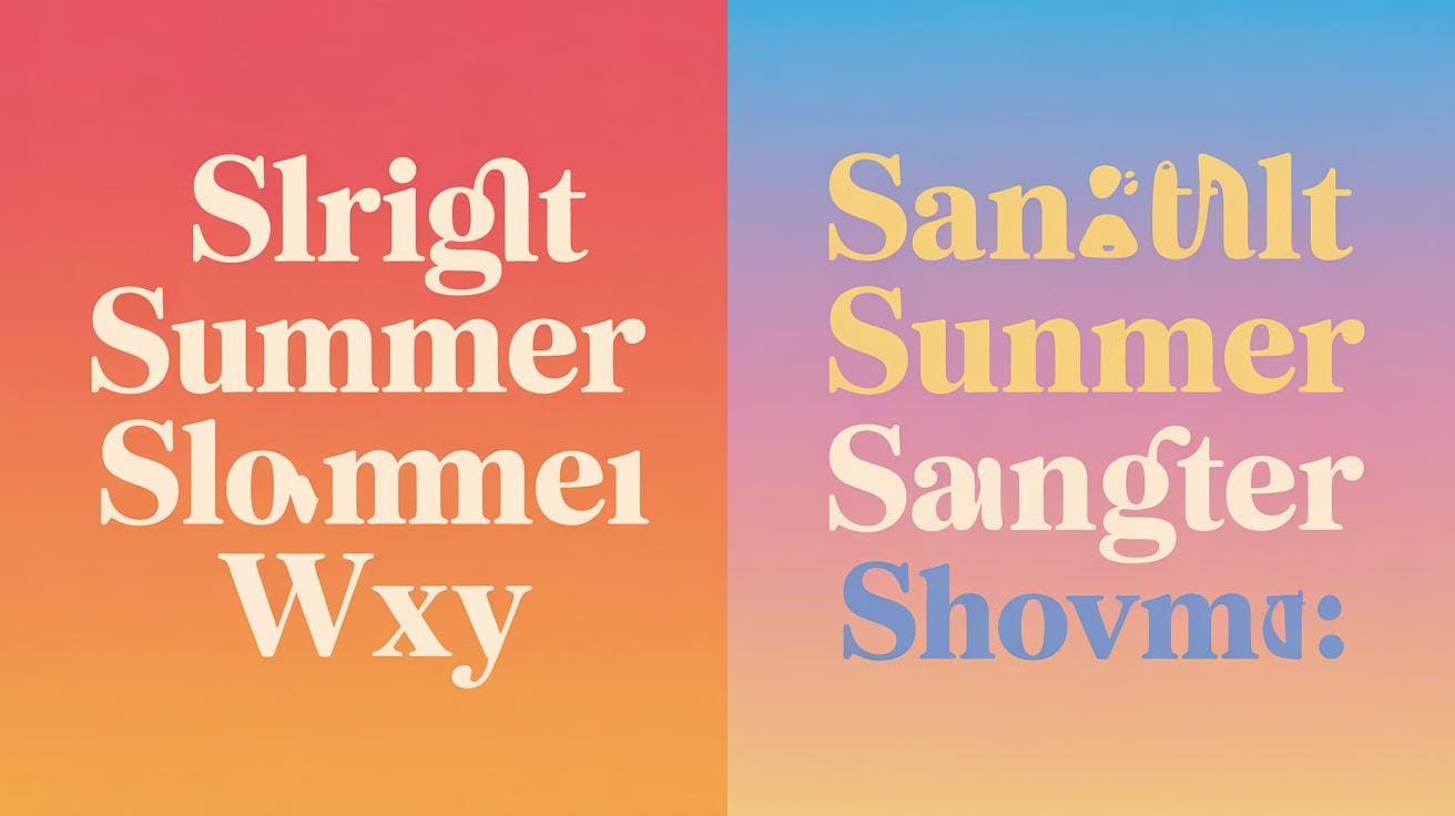
Using non-traditional fonts can really make a poster stand out. But it’s tricky—go too far and your message might get lost in the mix. You want something unique, yes, but keep an eye on legibility. Sometimes combining bold, unconventional fonts with simpler ones creates balance, allowing the unusual style to shine without overwhelming readers.
Text shapes open up a whole new field of experimentation. Imagine arranging your letters to form an object related to your theme—words shaping a mountain for a hiking event, or spiraling text to suggest movement. These shapes double as visuals and content. But take care; the shape shouldn’t compromise how easy the text is to read. It takes a bit of trial and error, honestly.
When typography doubles as a graphic element, it’s not about throwing words all over the page. Instead, think patterns made of repeated letters or subtle shifts in size and weight to create texture. This can fill space creatively without adding clutter. For example, filling a poster background with faint, overlapping letters can add depth while keeping the main message clear.
Decorative fonts are tempting—they add flair and personality. Still, they don’t belong everywhere. Use them sparingly, mostly for headlines or emphasis. The moment a decorative font stretches over paragraphs, readability nosedives. So, ask yourself: Is the font helping or hindering the message? If you hesitate, scale back and try something simpler. I’ve found this balance is where many designers miss the mark.
In the end, what’s interesting is how these approaches push the boundaries of ordinary typography. They invite you to think of text not just as words but as part of the artwork itself. Yet, keeping the viewer engaged—not puzzled—should always be your north star.
Choosing Digital Tools for Typography
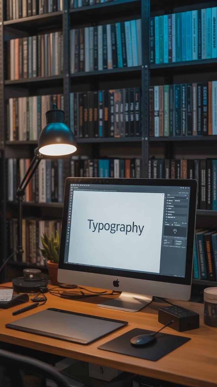
When it comes to crafting typographic posters, the tools you pick can really shape your work. I’ve found that using the right software doesn’t just speed things up; it also opens up possibilities you might not have expected. You might wonder which programs truly support advanced typography — especially when every detail, from kerning to baseline shifts, matters.
Popular Typography Software
Let’s look at some solid options that designers lean on for detailed typographic tasks:
- Adobe Illustrator — Great for vector-based text manipulation. It offers fine control over type, but it might feel a bit heavy if you’re only focusing on type.
- Adobe InDesign — Primarily for layout but packs typography punches with styles and grids. It’s useful if you’re combining type with other content.
- Glyphs — If you want to get into font creation or tweaks, this one’s a favorite among type designers. It’s not your typical poster tool though.
- Affinity Designer — A less pricey alternative that’s quite capable for lettering and poster work. Some controls aren’t as refined as Adobe’s but it gets the job done.
- FontLab — More specialized towards font editing, but useful if you want to customize typefaces for your posters.
You might also consider online tools like Figma if collaboration is key, but they’re a bit limited when it comes to detailed typography tuning.
Tips for Using Typography Tools
To get the best out of these programs, a few simple tricks can help:
- Don’t rely solely on default kerning pairs — tweak spacing for your specific letter combinations.
- Use baseline shifts subtly to create rhythm; it’s easy to go too far here, so trust your eyes.
- Experiment with variable fonts where possible — they offer flexible weight and width controls that can save time.
- Keep your layers organized, especially when working with multiple text elements; it will save headaches down the line.
- Test your poster at actual size often — what looks good zoomed-in might feel off printed.
Choosing the right tool really depends on your workflow and what you want from your poster. The trick is not just having powerful software, but knowing how to use it without getting lost in its features. It’s tempting to try every button but remember, sometimes less is more.
Common Mistakes in Typographic Posters
When working on a typographic poster, one of the biggest traps is overcrowding your design with too much text. It might seem tempting to say everything at once, but cramming words just buries your message. Too much text reduces clarity and makes viewers’ eyes tire quickly. You want to invite people in, not push them away with a wall of words.
Fixing this usually means trimming your content down. Ask yourself—what truly needs to be read? Bullet points or short phrases often work better than long sentences. Sometimes, less really is more, even if you feel tempted to add details or explanations right on the poster. Remember, a poster should grab attention in a glance.
The Problem of Overcrowded Text
Beyond just quantity, overcrowding shrinks the spacing between elements. Letters and words start competing against each other. This clutter kills hierarchy and makes it hard to figure out where to look first. Ever looked at a poster that felt like a jumbled mess? That’s overcrowding at work. Spaces between lines, margins, and paragraphs should breathe.
Ignoring Readability
Readability is often overlooked in font and color choices. Fancy fonts sometimes catch your eye but can also confuse or slow down reading. Script fonts, for example, may look attractive but get lost in larger bodies of text. Similarly, fonts too thin or too decorative tend to vanish against certain backgrounds.
Color contrast takes an equal role. Tiny color differences between text and background can strain viewers’ eyes or vanish entirely in certain lights. On the other hand, colors that clash too much may hurt the design’s balance and comfort. When you pick fonts and colors, think about who will see it and where. Can the message be read from a distance, or in harsh lighting?
Sometimes it’s okay to use a quirky font for a headline, but don’t use it everywhere. Consider mixing a readable body font with a bolder, more personality-driven display font. It’s a bit of a balancing act, and often requires testing—you might think a font looks fine but others won’t.
So think carefully. Overcrowding kills focus. Poor font and color choices kill readability. And both kill the goal of your poster: communicating clearly and quickly.
Testing and Improving Your Poster Design
Self-Review Techniques
When you look at your poster after working on it for hours, it’s easy to miss subtle flaws. Try stepping away for a bit—maybe a few hours or even a day—then come back with fresh eyes. What do you see first? Does the type grab your attention without overwhelming the rest of the design? Check if the fonts you chose are readable from different distances. Zoom in and out on your screen. Does the message stay clear? If you find yourself squinting or hesitating, maybe it’s time to tweak the font size or spacing.
Ask yourself: does the typography guide the viewer’s eye naturally? Can you identify the key message immediately? Focus can be lost in overuse of different font styles or inconsistent alignment. Don’t rely entirely on your instincts, though—they can trick you. Sometimes reading the poster aloud helps pinpoint awkward phrasing or confusing hierarchy.
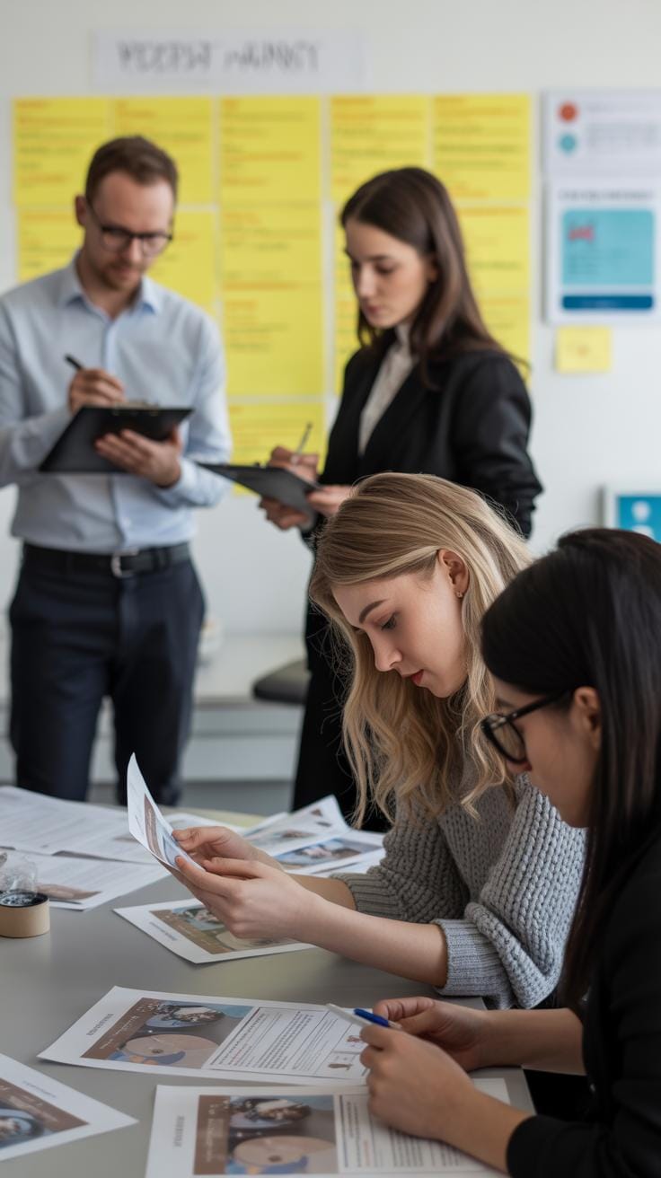
Gathering Feedback
Getting others to review your poster is invaluable—because let’s face it, you’re too close to it now. Find a few people who resemble your target audience. Ask simple, open-ended questions like, “What do you think this poster is about?” or “Is there anything that distracts you?” Watch their reactions and note if they focus on the main message or get lost in the details.
People’s feedback often reveals blind spots you missed. Sometimes they’ll mention subtle things, like a font that seems out of place or text that feels cramped. Pay attention even if you don’t agree at first. You can test changes quickly and compare versions side by side.
Remember, feedback isn’t just about agreement but learning what confuses or engages. If one person loves the poster and others don’t, ask why. Multiple perspectives can help you refine the typography until it feels both clear and compelling—even if perfection remains elusive.
Conclusions
Using advanced typography techniques in poster design helps you create clear, eye-catching messages. Focusing on how letters are arranged, the style, and size can guide viewers to the most important parts of your poster. Practical skills like balancing text with images and picking the right font style improve your poster’s impact.
You can use the ideas in this article to make your own posters better. Try out different fonts, spacing, and arrangements to see what looks best. Remember, a well-designed typographic poster not only attracts attention but also communicates your message quickly and clearly to your audience.