Introduction
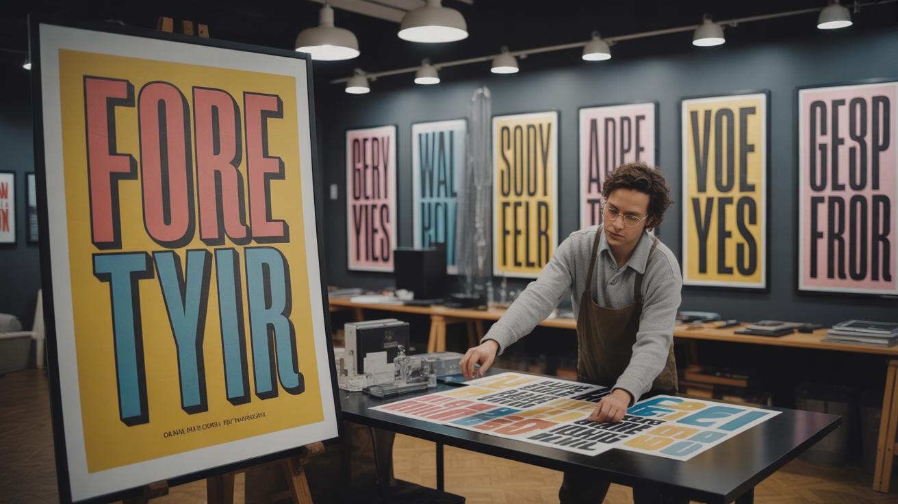
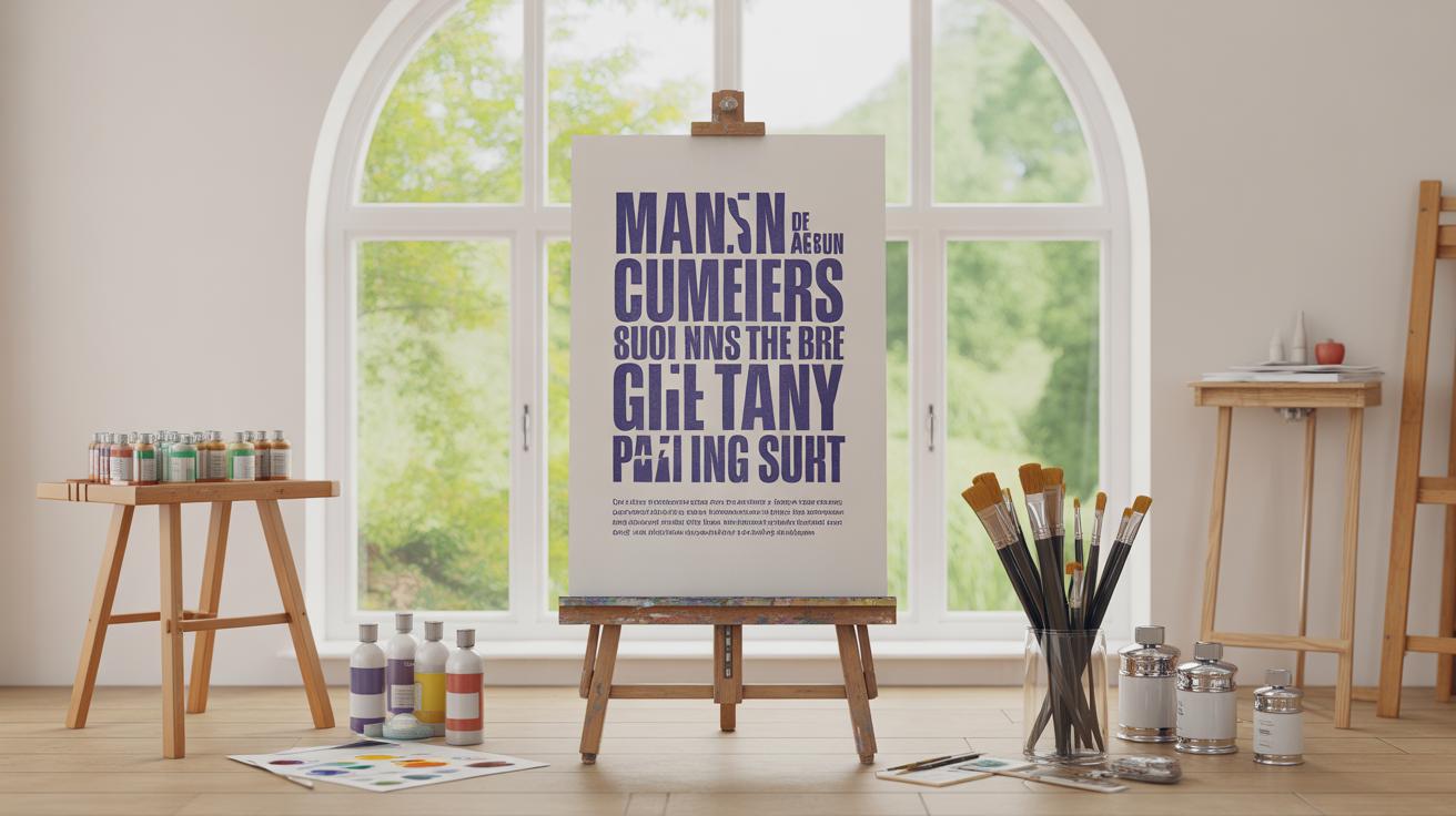
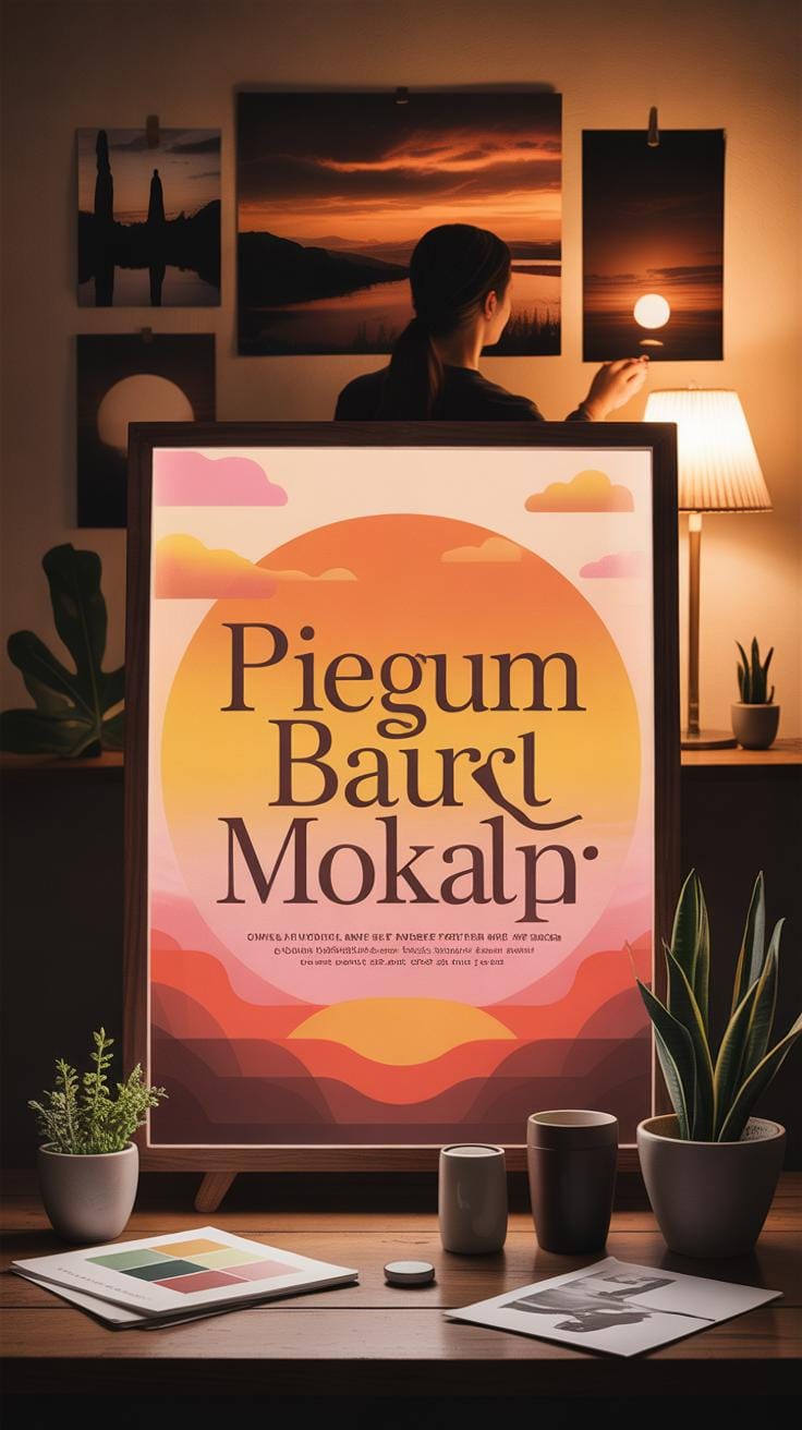
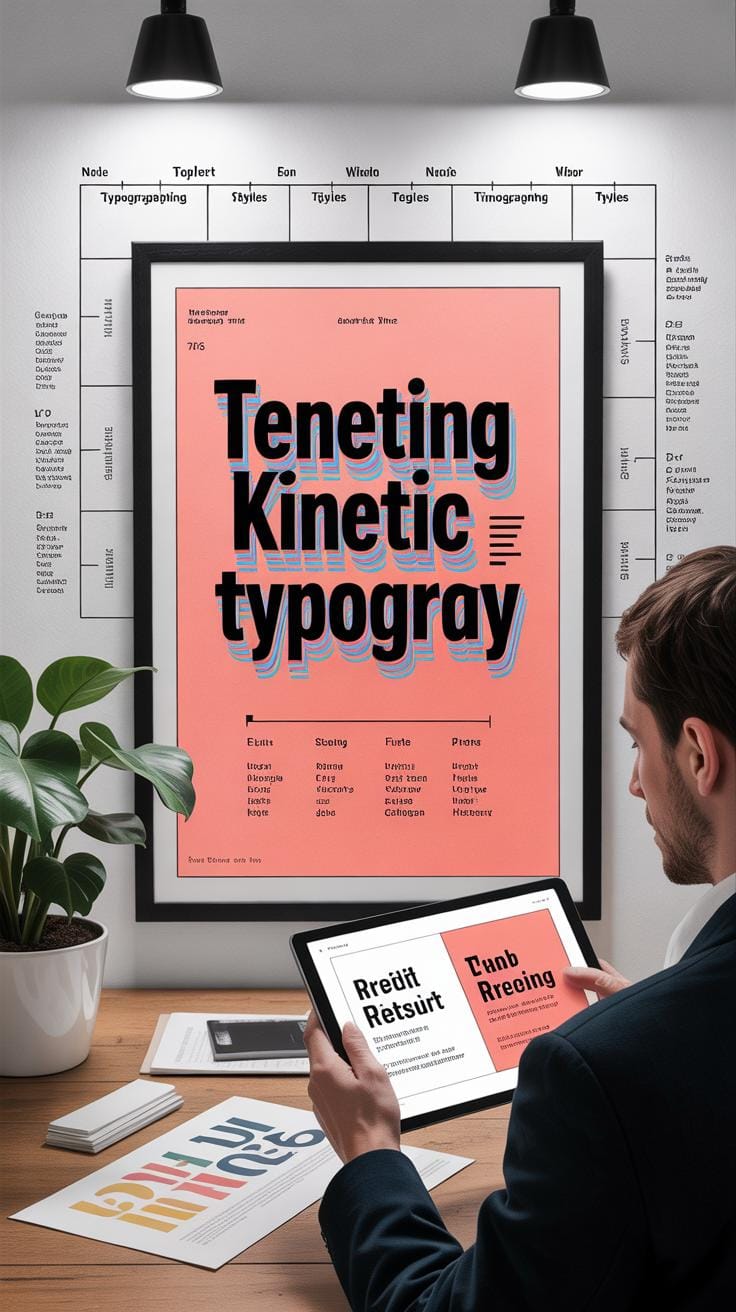
Bold typographic poster concepts are a way to grab attention and communicate your message clearly. Typography is the art of arranging letters and words to make them easy to read and impactful. Posters using typography alone, without pictures, can be very powerful if done right. This article will guide you through how to create posters that speak loud and clear with just fonts and letters.
Your poster’s look depends on how you pick and arrange its letters. Using bold, clear type can make your message jump out to the viewer. We will explore the key parts of typography and show you how to use them well in posters. You will learn how to choose fonts, arrange text, and combine styles to keep your audience interested and informed.
Basics of Typography in Poster Design
What is Typography?
Typography is, simply put, the art and technique of arranging type to make written language readable and visually appealing. It’s everywhere you look—on street signs, menus, books, and posters. Think of it as the voice of written communication; it shapes how you interpret a message before you even read it fully. When typography works well, information feels clear. When it doesn’t, words can seem confusing or off-putting.
In poster design, typography does more than just provide information. It sets the tone, grabs attention, and guides your eye through the visual hierarchy. Without it, posters would be dull and harder to understand.
Key Typography Terms
Here are some crucial terms you’ll encounter:
- Typeface: The design style of the letters, like Arial or Times New Roman. It’s the general look of the characters.
- Font: A specific version of a typeface with size and weight, such as Arial Bold 12pt. If typeface is the family, font is one member of that family.
- Kerning: The spacing between individual letters. Good kerning stops letters from feeling too squished or too far apart.
- Leading: The vertical space between lines of text. This affects how easy and comfortable a block of text is to read.
Imagine a poster where the title’s letters are too close or too far—that’s where kerning changes meaning. Or imagine a paragraph where lines cramp together, making it tiring to read; that’s leading gone wrong. These small details impact whether a message clicks or misses.
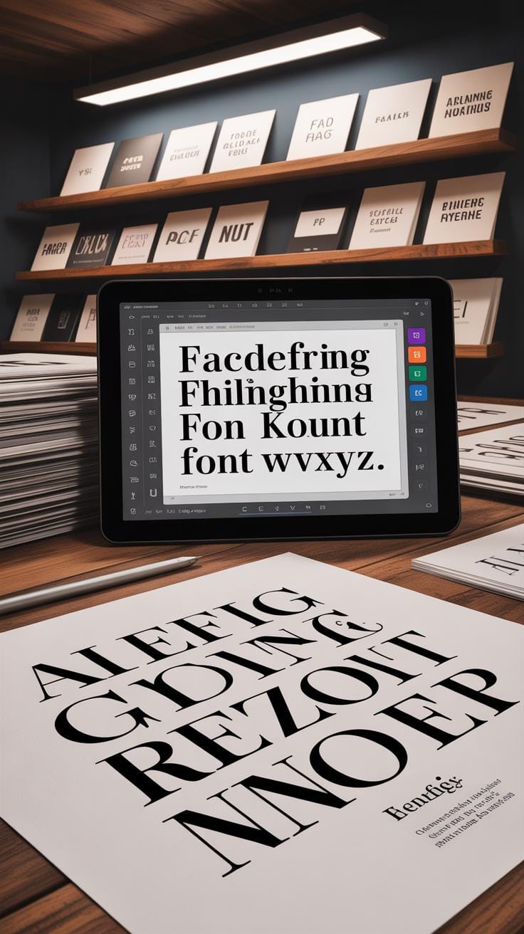
Choosing the Right Fonts for Impact
Serif vs Sans-Serif
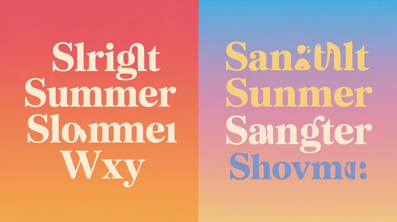
Serif fonts have small lines or strokes attached to their letters. Think of Times New Roman, with its classic, slightly formal look. Sans-serif fonts, like Helvetica or Arial, don’t have those tiny flourishes. They appear cleaner and more modern. This difference isn’t just aesthetic—it affects how people read your poster.
Serifs can guide the eye along the text, which may help with long passages. They often give a tone that feels traditional or serious. Sans-serif fonts tend to be easier to read at a glance, especially from a distance or on screens. They bring a straightforward, more casual vibe. Choosing between the two depends heavily on what mood you want to set and how your audience will interact with the poster.
Combining Fonts
Font mixing can add depth and interest, but it’s tricky. You want contrast without clash. A common approach is pairing a serif with a sans-serif—one for headlines, the other for body text. For example, a bold serif title with a clean sans-serif subtitle can work well. But sometimes mixing fonts that clash in style or weight just makes the design feel chaotic.
Keep things simple: limit yourself to two, maybe three fonts at most. Avoid combining two fonts that look too similar or both too decorative. Try to match fonts that share some characteristics, like an x-height or stroke width, so they don’t fight for attention.
When in doubt, test your combinations by stepping back and squinting at your poster. If the fonts seem to compete or confuse, adjust until they feel balanced. What fonts are you drawn to for your next project? Experiment a bit. It’s often about trial and error, and what might seem unusual at first can turn into the perfect pairing.
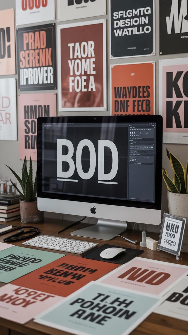
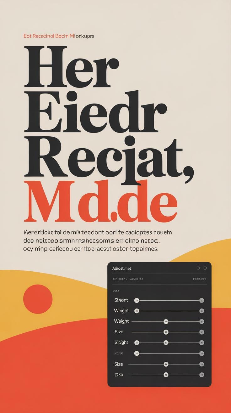
Using Size and Weight for Visual Hierarchy
Importance of Visual Hierarchy
Visual hierarchy is about guiding the viewer’s eye through a poster in a way that’s logical and clear. It decides what you see first, what grabs your attention next, and where your eyes eventually rest. Without it, a poster can feel chaotic—like everything’s shouting for attention at once. You don’t want that. Think of a poster with a giant headline, a smaller subtitle, and then body text. That’s a simple, clear hierarchy. The large headline pulls you in, the subtitle adds context, and the smaller text fills in details. This structure helps your message come through without confusion.
Why does this matter? Because people rarely read posters word-for-word. They scan. Good hierarchy makes scanning effective—it lets your audience catch the essentials fast and decide if they want to dig deeper or move on. When you mess around with size and weight, you create that path, yes, but also add rhythm. It’s not just about being loud or quiet; it’s about tone and pacing too.
Size and Weight Choices
Size and weight are your best tools here. Big, bold text demands attention. It’s like a beacon on your poster. Use it for headlines or any key point you absolutely don’t want missed. But you can’t just go big everywhere—that’s where smaller, lighter text helps. These support the main message without competing with it. Think of a concert poster: the band name stands out in heavy, large type, while the date and venue info appear smaller and lighter but still readable.
Weight matters beyond just “bold” and “regular.” Semi-bold, light, and even extra-bold choices allow you to play with subtle differences. For example, if you want to emphasize a single word within a paragraph, make it semi-bold instead of jumping straight to full bold. Also, sometimes a lighter weight can feel more elegant or approachable, depending on your message’s tone.
So, the challenge you might face is balancing these sizes and weights without overdoing it. Too much contrast can fragment your design. Too little, and everything blurs together. There’s no perfect formula, but experimenting with these variables brings your poster to life—and makes it easier for your audience to follow.
Color Choices in Typographic Posters
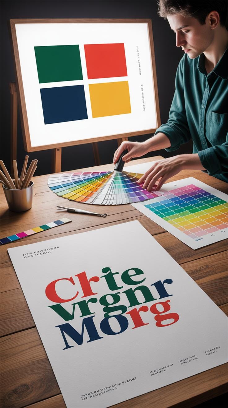
Color can completely change how you feel about a piece of text. It affects mood and perception in ways that sometimes feel subtle but can also be quite direct. Think about red—it often makes text feel urgent or loud. Blue feels calmer, maybe more trustworthy. Yet, these aren’t strict rules; colors can feel different depending on the context or even the viewer’s mood.
What really matters in poster typography is contrast. Without enough contrast, your text might fade into the background or become hard to read. For example, light gray on white might look elegant but becomes almost impossible to read from a distance.
So, when picking colors, you want combinations that draw the eye without drowning out the letters. Some pairs just work well together: black and yellow, white and blue, dark green and cream. Those links between colors often balance catching attention and keeping the text approachable.
On the other hand, watch out for colors that clash or sit too close in tone. Bright red on bright green may grab attention but quickly becomes a headache—and not the good kind. Low contrast combinations like soft pink on pale peach might look nice but rarely deliver strong readability.
Choosing color for typography means juggling mood, visibility, and harmony all at once. Maybe you’ll find a combo that feels just right, or maybe it’ll be a bit off and need tweaking. Either way, keep testing how your colors work in different lights and contexts. Sometimes what seems perfect in one setting isn’t quite the same in another.
Layout and Spacing Techniques
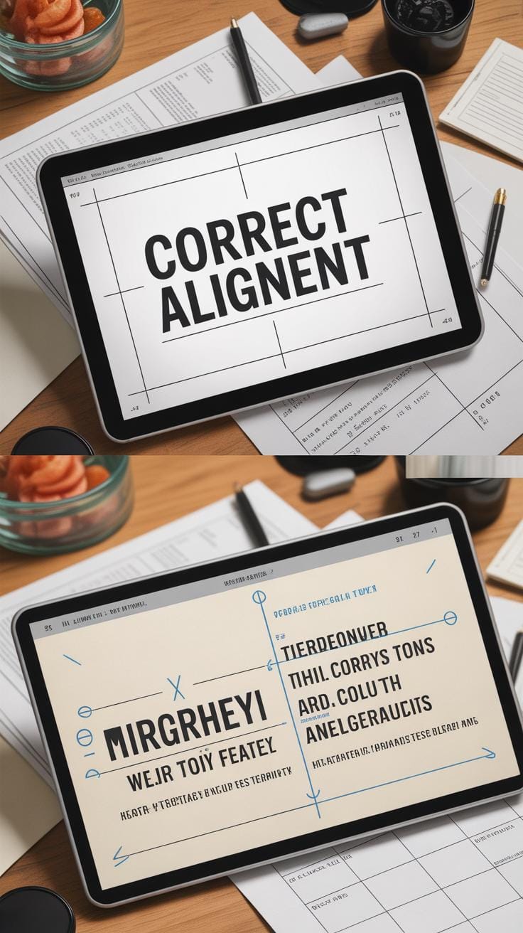
When you look at a typographic poster, the way text is arranged plays a huge role in how you understand it—sometimes more than the words themselves. Layout and spacing aren’t just about making things fit; they steer the reader’s eye, set a rhythm, and create a tone before a single phrase is read fully. Terms like alignment, kerning, leading, and white space might sound dry, but they shape your experience more than you might expect.
Take alignment, for example. It’s not just about lining text up left, right, or center. Each choice sends a subtle signal: left alignment feels orderly and approachable, while center alignment creates balance but can slow reading down. Right alignment? Less common, yet it can give a design a quirky, unexpected vibe—though it risks looking scattered if overused.
Kerning controls space between individual letters. It might seem minor, but poor kerning can jumble words or make them look too loose. I once saw a poster where letters nearly collided; the message got lost in the chaos. Leading adjusts the vertical gap between lines of text. Too tight, and reading becomes tiring; too loose, and the design feels disconnected—like the text is floating without purpose.
White space deserves its own spotlight. Empty space around text may seem wasted, yet it lets the eyes rest and focuses attention where it matters. It creates breathing room and prevents the poster from overwhelming your brain. The balance between filled and empty space can be tricky, but when right, it lifts clarity dramatically.
Try thinking about your own reading habits—have you felt drawn to a headline because it “felt right”? Chances are, it’s a layout or spacing trick quietly working behind the scenes.
Expressing Mood and Tone Through Typography
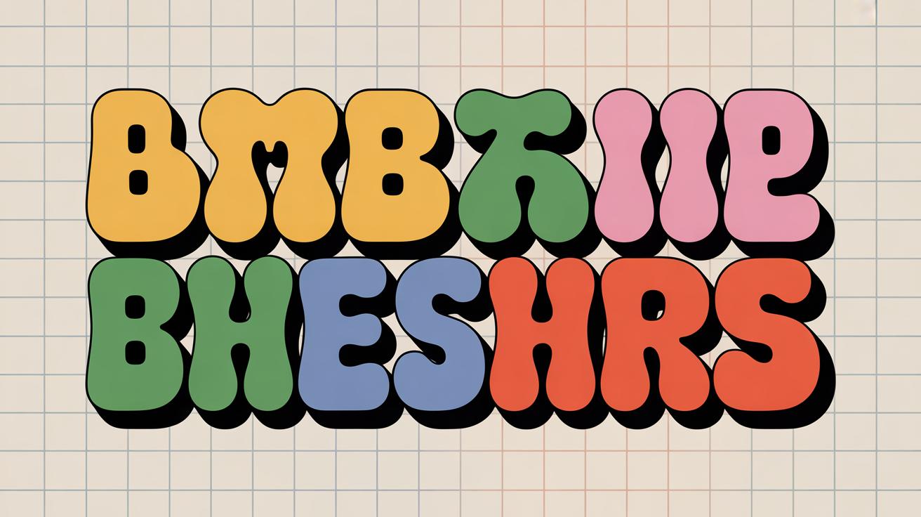
Typography does more than just display words—it sets a mood. The style, size, and color of fonts can shift how you feel when looking at a poster. Think of a playful poster using rounded, bubbly letters in bright colors. It invites lightness, fun, maybe a bit of whimsy. Now imagine a serious poster with tall, narrow serif fonts in deep black or navy. That feels formal, maybe even a bit intimidating.
Font size also contributes. Large, bold type shouts urgency or importance. Smaller, delicate text tends to feel subtle or refined—though sometimes it risks being overlooked, which is a tricky balance. Color carries its own emotional weight too; warm tones tend to energize, while cool colors calm or distance.
Fonts as Mood Carriers
Fonts really act like carriers of mood. A heavy slab serif might remind you of old printing presses—solid, trustworthy, a bit heavy-handed. A cursive script, on the other hand, whispers elegance or romance, but overuse can feel overly decorative or difficult to read.
Sans-serif fonts often feel cleaner, more modern, maybe even neutral. Yet, depending on the shape—geometric versus humanist—they can swing between mechanical and warm. So the same category isn’t one-size-fits-all.
- Comic Sans: Often playful but can also seem unprofessional or trivial.
- Helvetica: Cool, clean, but sometimes sterile or distant.
- Garamond: Classic, elegant, with a touch of tradition.
Simple examples like these show how mood hinges on your font choice—a subtle design decision that carries more weight than you might expect.
Combining Typography and Message
Matching your text style to your message sharpens the whole poster’s impact. Imagine a charity event poster using a warm, approachable font to inspire empathy. If that same message were written in a cold, technical font, the emotional connection might falter.
This harmony isn’t always obvious. You might think a bold font works everywhere, but for something delicate—like a poetry reading—a softer type might speak louder. Or conversely, too much elegance on an action-oriented poster might slow things down.
Ask yourself: what feeling do I truly want to awaken? Does my font choice carry that feeling, or pull against it? Sometimes fonts say one thing while the message says another, and that tension can confuse or alienate viewers.
In the end, typography should act like a tone guide—leading readers into the right emotional space before they even digest the words.
Avoiding Common Typography Mistakes
Typography mistakes pop up all the time in poster design, sometimes in ways you might not spot at first glance. Using too many fonts, for example, can make a poster feel scattered. Imagine a flyer with five different typefaces—does it feel unified or chaotic? Most likely, the latter. Too many fonts dilute your message and distract the viewer.
Poor spacing trips up many designers. Letter spacing that’s too tight or too loose creates an uneven texture that pulls your eye away from the content. Line spacing is just as crucial; crowded lines make reading tiring, while too much space breaks flow.
Contrast issues are common but often overlooked. Low contrast between text and background weakens readability, especially in different lighting conditions. Light grey text on a white background might look sleek, but harder to read on a smartphone outdoors.
Here are some quick fixes to keep your typography on track:
- Limit fonts to two or three. Stick to one font family and use variations like bold or italic to add interest without chaos.
- Adjust spacing carefully. Use tools like tracking and leading to create consistent, comfortable white space.
- Check contrast under different settings. Try your poster on various screens and lighting to ensure text stands out.
Have you noticed your eyes wandering off a poster? Maybe a spacing issue or too many fonts are the culprit—little tweaks here can make a big difference. Sometimes, less really is more in typography.
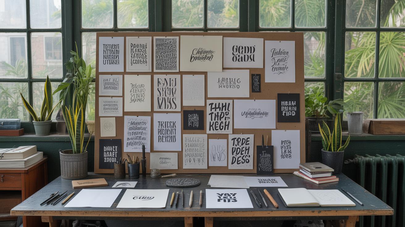
Incorporating Typography Trends Wisely
Understanding Trends
Typography trends are patterns or styles that gain popularity in a certain period. They often reflect cultural shifts, technology advances, or changes in how people consume information. Sometimes, a font or layout catches on because it feels fresh or matches a particular mood. Other times, trends emerge from the design community experimenting with form and function. But trends rarely last forever. What seems cutting-edge now might feel outdated in a year or two. So, following trends blindly can be risky—you might end up with a poster that looks dated rather than relevant.
For example, oversized serif fonts became popular recently, giving posters a dramatic but readable look. On the other hand, minimalist sans-serifs with tight spacing have been trending too. As you watch these shifts, ask yourself: does this trend serve the message? Or am I just chasing what’s popular?
Balancing Trend and Timelessness
Mixing trendy and classic elements can be tricky but rewarding. Think of it like seasoning your design. Too much trendiness can overwhelm or limit longevity. Purely timeless fonts—like Helvetica or Garamond—offer stability but might lack punch. Combining the two helps maintain freshness without sacrificing usability.
Consider pairing a bold, current display font with a clean, reliable body font. Play with trendy layouts, such as asymmetric grids or unexpected letter spacing, but anchor your hierarchy in proven methods. For example:
- Use a trendy font like ‘Satoshi’ or ‘Canela’ for headlines.
- Stick to classics like ‘Futura’ or ‘Baskerville’ for supporting text.
- Experiment with layering text and images but keep legibility high.
Ultimately, trust your judgment. Ask if your design still works if the trend fades. If yes, you’re likely striking the right balance. If not, maybe that trend can wait for another project—or a moment when it truly fits.
Tools and Resources for Creating Typographic Posters
When it comes to designing typographic posters, the tools you choose can shape your whole process—and sometimes your final result. Adobe Illustrator remains a favorite for a reason. It offers precise control over type, letting you tweak kerning, tracking, and even create custom letterforms. But yes, it also has a steep learning curve that can feel overwhelming if you’re just starting.
If you want something more approachable, Canva is surprisingly powerful for typography, especially in its paid version, though I find the free one quite handy for basic layouts. It doesn’t offer the same depth of control as Illustrator but allows you to quickly experiment with fonts and compositions without a steep learning curve.
For free design alternatives, apps like Inkscape or Gravit Designer might not be as polished but do a decent job juggling text and visuals once you get used to their quirks. They’re worth exploring if budget’s tight.
Now, about fonts—finding the right one feels like half the battle. Google Fonts is a trustworthy starting point, with plenty of free, web-friendly choices that suit poster work well. But maybe you’re looking for something more unique. Sites like Font Squirrel and DaFont offer many options, though you’ll have to double-check licensing if it’s for commercial use.
Want to sharpen your typographic eye? Fonts In Use is a great spot to see real-world examples and learn what makes certain choices work. Also, reading through the Typography section on Typewolf or browsing guides on A List Apart can provide solid basics—and sometimes, those subtle tips you wouldn’t find elsewhere.
It’s easy to get lost in endless fonts and apps. But maybe that’s part of the fun—exploring, experimenting, and, occasionally, deciding to stick with something simple because it just feels right.
Conclusions
Typography is more than just letters; it’s a way to communicate vividly and simply on your posters. By focusing on clear font choices and good arrangement, you help your message stand out. The bold typographic poster ideas discussed here offer practical tools to engage your audience without clutter or distraction.
Think about your message and how typography can shape how people feel about it. Remember, it is your design choices that create the impact. Keep your lettering clear, your layout neat, and experiment with styles to find what works best for your message. Applying these principles will make your posters more effective and memorable.